#lmao I did more in the unshaded version
Explore tagged Tumblr posts
Text
Character design and step-by-step process for my Torchship Commission. It involved character design, posing, starship art, rendering, and a LOT of work. This is, so far, my biggest and best commission yet. I thought it might be interesting to look at how I went about drawing this.

Initial character design sketches to get the feel of the characters correct. I used more of a lower decks style especially in the eyes at this step, but they would be more detailed by the time i got to making the final drawing. I had to do Martin in color because of the psychic energy being in her head.
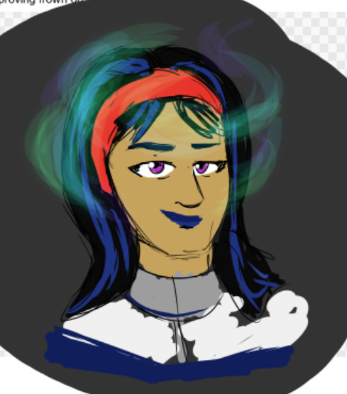
the actual line-art is pretty rough here. in retrospect a big part of that is simply the neck placement relative to the head. but that wasn't the point. the point is cool whispy aura/halo.
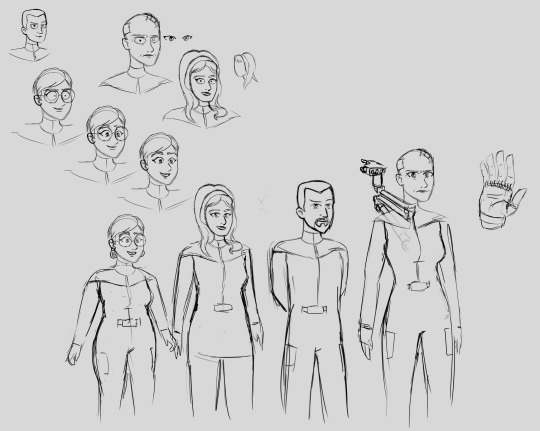
Iterating on the faces, putting them on bodies with relative heights Holmes is a career spacer and so very tall; Yureli is a martian, and martians are all very short. Also, I forgot Stevens' goatee, so that had to be added! The facial expression on Martin had to be changed to be more "bedroom eyes" as per client feedback. :P
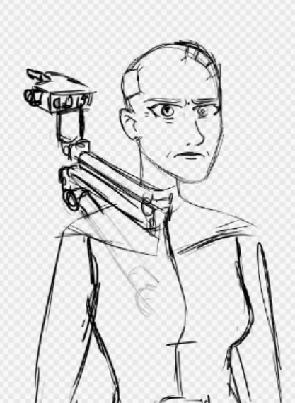
note how Holmes' robot arm attaches to her spine down her back. The robot arm was not specified in the commission info, but I thought something that resembled a NASA rover robot arm, or maybe Canadarm, would be really cool and interesting.

Mockup with the sketch mostly finished. I was asked to lower Martin's ACER pistol to be more like a secret agent kinda pose.
And after more tweaks to placement and proportions and cleaning of lines, the finished sketch:
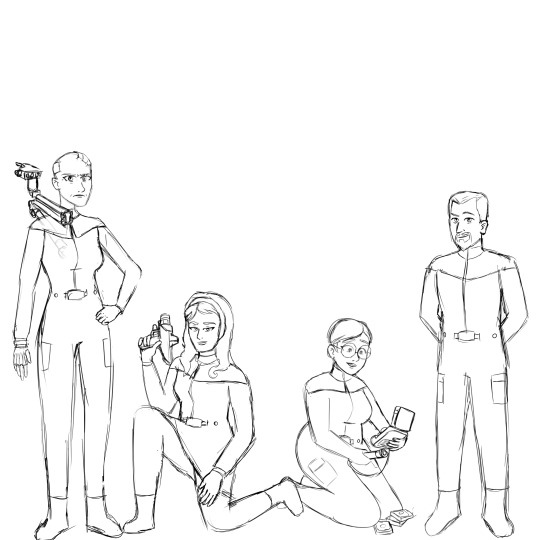
and then i realized I'd made a terrible mistake.
sorry i just noticed a bunch of technical errors in my previous sketch. this is so embarassing. i had to fix this. here's a fixed version

/joke.
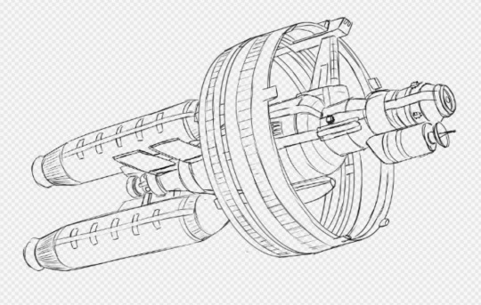
Mary Gilham 32 was started on a separate project file. I started by tracing the basic proportions of the Mary Gilham from one of the reference renders I was sent, then I added a lot of the details. The warp rings were made by using the ellipse tool to construct the different pieces of the rings and move them into place; way better than freehanding it.
Now, I had procrastinated starting this project for a couple days, but by the time I actually got to working on it I could not stop. I had started the concept sketches at 2:44 PM and I finished the line-art and silhouette for the Mary Gilham at 10:48 PM. Job well done for the day, I went to bed.
And then got back out of bed because I couldn't sleep, lmao.
I finished the line-art for the characters, and the silhouettes.

and finally, at 1:00 in the morning, I sent this full color unshaded drawing and. surely i went to bed right?

...I sent this at 2:00 AM.

yeah my brain was broken. i spent another hour rendering the rocket. I considered just using the CGI render by Holly, but the visual mismatch would have been pretty bad. Plus, I like how I did the Cerritos in Guzcomic, still looking both metallic and realistically lit but also storybook kinda feel. The sunlight shading was simple enough, but making the self-illuminated parts of the ship shine was really cool. The glowing bits use a combination of normal blend modes and blurred Screen blend modes on top of the line-art layer to look a little like bloom. I'm not fully happy with the radiator illumination, it looks a little on the unconvincing side, but the radiator emissive glow looks great, and the illumination coming from the cloak ring and the warp rings looks great. By the way, the red glowing end-caps which look like star trek's bussard collectors are just big warning lamps indicating a radioactive nuclear or antimatter rocket. The nacelles are rocket tanks and engines; the warp drive is one of the big rings.
THEN i went to bed, for real this time.
In the morning all that remained was to add the flags on their shoulders and do the final shading/rendering on the crew.
[redacted spoilers about shading a really interesting texture]
and finally I finished the job. There were a few touches I saved for last, like rim highlighting from the engines on the characters, and colored reflections from each other's uniforms, but that didn't take too long. Oh, and Martin got her psychic energy being in the last hour too. Overall I worked from 11:00 AM to 1:00 PM that day.
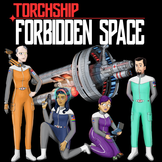


The final drawing has some easter eggs to look out for that would never appear in the format of a podcast thumbnail. So feel free to zoom in and look around. I like placing little easter eggs and visual gags in my art. :)
DM me for commission info. I need money to survive!
#commission#art#digital art#drawing#painting#Torchship#Torchship Podcast#Torchship: Forbidden Space#Spaceship#Cosmonaut
7 notes
·
View notes
Text
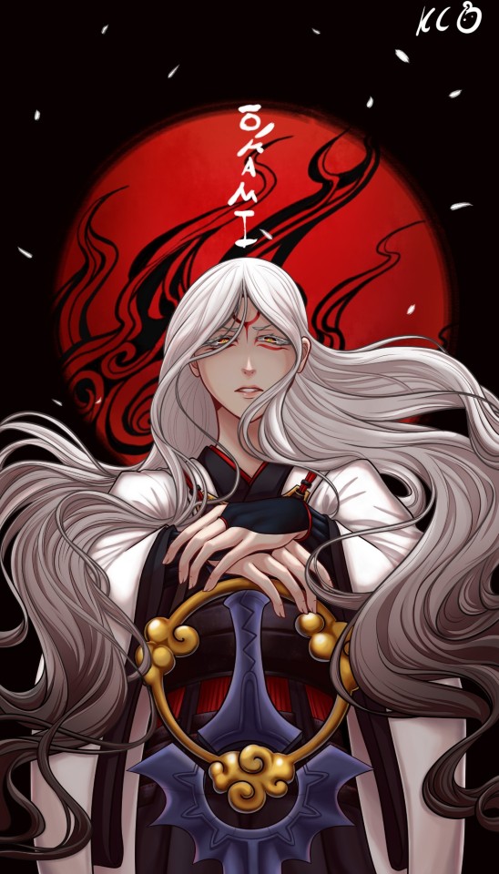
#okami#human version#Amaterasu#tsumugari#well I tried my best#practicing shading#lmao I did more in the unshaded version#like the face has more detail without the shading#idk if I should repost with the lighting facing in front and not the back#I love both versions tho#my god metals and shadow povs hurt my brain#I also tried to do a different style of nose as u can see#I got rly tired when I got to the background and sword btw#so its not the best I could do#but I lost motivation
49 notes
·
View notes
Photo


I looked through volume six comparing pages and panels one at a time. Generally the biggest differences between the versions that went to print in the magazine and the book involve new art for blank or nearly blank panels, more detail for less detailed panels, and improved art. I noticed some sound effects or additional narration was added or removed but nothing too significant. Some pages were dropped when chapters were merged. To me the most noticeable difference is the quality; the magazine scans I’m using end up taking a significant dip in quality, particularly in contrast, in attempting to eliminate dust and defects in the poor quality paper. The digital version of course doesn’t have to deal with any of that, so you see the artwork exactly as it was originally intended, often with a great deal more detail.
I selected some of the more interesting differences I noticed, here are my notes for these starting in the upper left and moving down to the lower right:
Chapter 35 was the most heavily retouched with a lot of new artwork and revised artwork. Hyoudou had his pupils shrunk for almost every panel he’s in, for some reason.
The shot of Yuki getting his shirt pulled up has been significantly retouched to improve the artwork... but also I think to make him look a little older, LMAO.
Chapter 36 has a good amount of new panel art but the biggest change from the magazine is that a great number of yakuza with unshaded hair got shading in their hair.
This flashback of Rei and Chang got a really nice screentone pass.
A number of cityscapes were added or adjusted, such as these pages of Tetsu chasing Handa.
A number of blank panels or panels showing props or background objects have been filled in or swapped out with shots of people.
These panels of Odajima being shot have some new artwork. What’s funny is the “kararara” sound effect of the pistol spinning was present in the original, but the pistol was missing; I knew it was a spinning sound but had no idea what it was referring to, so I went with the “ting” sound of the bullet casings hitting the ground, despite there being no such thing in the panel.
A bunch of lovely Ryuu flashback art, hahaha, and another example of a blank panel getting filled in.
Um excuse me but why did this window not have this adorable art of Tsubaki and Yuki to begin with??
This last one is the most recent big difference I could spot and most likely I’ll be using the book version, so this is the only way to see the unused art, haha. I’m not sure that cart would have been much easier to draw than the group shot, so this is an odd change.
Anyway. I’m fascinated by this stuff because obviously I spend a ton of time staring at every single page while cleaning scans, so I spot the differences right away. I’m not judging the mistakes but appreciating the changes and fixes. I relate to that feeling of wanting to make sure my work is perfect and take the opportunity to fix my mistakes, so I appreciate everything Kyuugou put into making sure the book version was just the way she wanted it. I feel a little self-conscious about the quality of my work, of course, but it just encourages me to say once again, please consider buying the actual book. You’re missing out on the better quality artwork for sure.
57 notes
·
View notes