#like it’s a pretty niche specific detail of one tiny texture in a very large game
Explore tagged Tumblr posts
Visit Tumblr Blog
Explore Tumblr blogs with no restrictions, modern design and the best experience.
Last Seen Tumblr Blogs


Fun Fact
Tumblr Inc. is funded by 13 investors.
Text

They finally added pork to the Pork n Beans! That deserves a line in the patch notes, don’t you think? RIP to the classic Ambiguously Halal Beans, you will be remembered fondly with Fluffy and the mismatched spray paint can colors
#the long dark#signal void#how long has there been pork in the beans? most recent update or what?#like it’s a pretty niche specific detail of one tiny texture in a very large game#it had to be an intentional change
6 notes
·
View notes
Photo
The Realm of Gouache
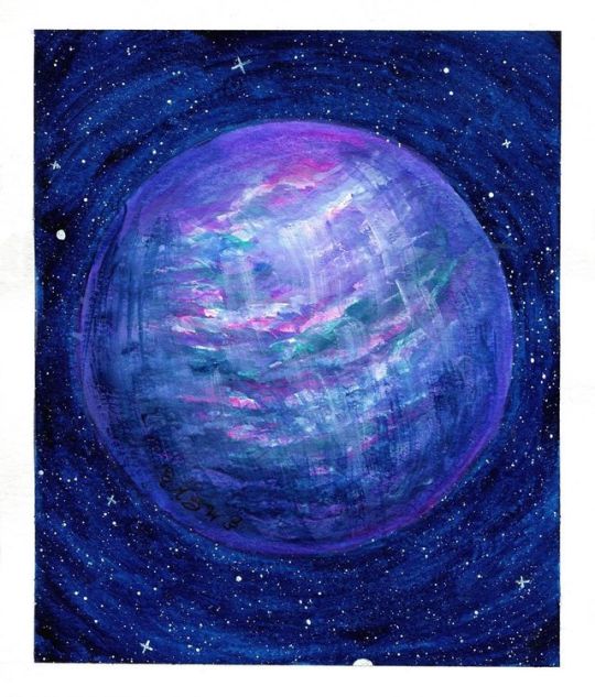
I did it! I finally got that gouache set I'd been eyeing down the way my cats watch their food containers! The gouache I'm referring to is this Miya/Himi Gouache set of 18 for anyone who's curious. It seems to have sort of taken the art community corner of Youtube by storm lately, and that combined with the way the set is designed, I've been really wanting to try gouache lately anyway, and it's pretty reasonably priced at around $20, depending on where you get it, it seemed like a good place to start with the medium. Gouache, to those that might not know, is a cousin to watercolor. (Well, traditional gouache is, anyway. There's also acrylic gouache, which is a closer cousin to acrylic paint, but that's a discussion for another day; I'm focusing on the typical kind of gouache here) It's made with the same binding agent--water-soluble gum arabic--but usually it's processed differently. Most companies use more pigment (the substance that gives any paint its color) and larger particles of it in their gouache compared to what you would find in watercolor, and there's usually some additional chalk-like additive to make the paint more opaque than watercolor. You'll sometimes even see gouache referred to as "opaque watercolor." For the same reasons, gouache is usually more expensive than watercolor or acrylics and while with a little patience you can make it into cakes/pans, it normally works much better fresh from the tube, and so it's much more often sold in tubes. What does all that mean, though? Well, gouache paint is more opaque and less transparent than watercolors without much water, giving it the color and covering power one might expect more from acrylic paints. But you can reactivate gouache with water, so you can also water it down and use it more like watercolors if you want to, and when you start layering it you can reactivate the layers underneath to aid with blending, which in my opinion is a trait that reminds me a little of how oil paints are praised for their slow-drying, "superior" blending capabilities. Based on that, personally, I continue to be surprised how little-known and how much of a niche painting option gouache seems to be. The only real "culprit" to me for why that is is the usually higher price tag, but even then...I don't know, it still doesn't make sense to me. The qualities it has that put it somewhere between acrylics and watercolors just make it seem like a really good beginner's choice to me, since you can learn some techniques for both and then if you branch out to one of the other two, it might make the transition easier. But I digress; we can debate on the finer points of gouache's place in the art world some other time. This was my first time using gouache at all, so I can't really give a proper review on this specific set of gouache (as I have nothing else to compare it to and I have no experience with the medium; it just wouldn't be fair), but I can give my thoughts on working with gouache in general and give a first-timer's perspective on it. Although I do have to say I found it interesting that there is pigment information available for the set online, even though the actual set doesn't have the pigment information or color names printed anywhere. (At least not in English.) Most lower/student-grade art supplies don't list that information anywhere. This specific set of gouache also stands out because the gouache isn't in tubes, but rather in little 30ml. cups that look like tiny jello or pudding containers. These cups all have their own slot in a very sturdy plastic case with a lid that snaps shut on both sides and a mixing plate that fits inside the lid. And I cannot stress enough that when this thing is listed as being about 2.5 lbs, they're not kidding! I was surprised by how heavy it actually was when it came in the mail, and after taking all the gouache cups out so I could peel off the little foil seals (most of which did try to take some paint with them, but I saved them short-term to try and make use of as much of it as possible before chucking them in the trash), I can confirm that most of the weight is coming from the paint itself. And it's really nice actually since most paint sets that come with a lot of individual containers of colors (usually tubes), the standard size is anywhere between 5 and 22 ml. By comparison, 30ml. seems pretty generous. The color choices in the set are pretty interesting, but also pretty well-rounded for a smaller, possibly more beginner-oriented set. You get both a warm and cool of the primaries (red, yellow, blue), a black, two whites (which we're going to talk about more in a moment), some earth tones in the form of a darker brown, a rust color, and an ochre color, and some "convenience" colors including a purple, magenta/hot pink/rose color, a teal, and some greens. Now about those whites... I'll try and spare you the nitty-gritty details of pigments and their uses, but in general most well-versed paint companies have more than one type of white paint on offer, and not all white paints and/or pigments are equal. Usually, you'll find a "Titanium White" and some other variation of White, possibly a "Zinc" or "Chinese" white. Normally, Titanium White is a specific pigment that's different from the other whites, but that same pigment can be processed differently in order to look and function more like the other white pigments (and other white pigments don't always have to be listed if they've been added to it). This matters because "Titanium White" is the most common type of white, and it's meant to be used primarily as white by itself because of its specific traits. The other whites are usually more transparent and work better for mixing with other colors. This is most likely why this set and others you'll find come with two whites; in this case, one specifically labeled as "Titanium White" and the other as just "White." One so you have a white color, and one for mixing. (Don't you just love how amazingly confusing pigment information can make things! ) This is fine and actually preferable to me, as it keeps you from using twice as much of just one white, so hopefully, you won't go through it quite so fast. The only problem I have with this is that I feel like my two whites might've gotten switched at some point since so far my "Titanium White" seems to act more like a white for mixing, and my "White" seems to act more like a traditional Titanium White. I did take all of the paint cups out at one point so I could open them and put them back in the palette/container, but I tried to make specifically sure I didn't get any of the colors mixed up. Still, accidents happen, and it could be they were switched before my set even arrived to me, if they are indeed switched. I intend to do some more testing to try and make sure if that's what happened or if it's some kind of user-error in using them. Anyway. After I did my swatching and a tiny bit of extra swatching/playing to get a taste of how the gouache worked beyond what my research beforehand had told me, it was time to play with it in a more proper art setting. I had a piece of Canson XL watercolor paper leftover from another project that I sliced in half to make it a more manageable size, and I used a circular cardstock insert that I saved from a roll of tape to give me a nice large circle to work with. I figured a planet out in space would provide a good opportunity to play with gouache's more watercolor-like properties and it's more opaque unique properties. And plus a cursory Pinterest search told me that when you're making fictional planets there's not much in the way of right or wrong, which was comforting since I barely knew what I was doing. So I masked off the circle and started out with a couple of coats of the beautiful Prussian Blue from the set (seriously, I don't know why but I was really enamored with this color) and varying amounts of water to do the sky. I had already found out that while you technically can use gouache without water, it feels a lot better to me if you add just a little to make it flow and spread more readily, and this was no different. I'm just not an expert yet at getting just enough to smooth it out without also thinning out the color. Still, I actually really like this stroked look for this piece, which is why I didn't try harder to layer it up to make it more solid. And I wish I could describe my process for the planet itself just as concisely, but I really just started going in with the colors I liked the most from the set--Ultramarine, Violet, Rose, Jade Green--and layering up thinner washes of color a little at a time in lines and curves to try and get a visual texture that makes sense for a planet. The most issues I had here were really my fault and not the paints', as I was trying to any color mixing pretty straight-on the paper and I had a tendency to put some color down and try a little too hard to blend it out, to the point it was just kinda mixed into what was already there. And I will note here that it seemed like the less watered-down the gouache was, the more quickly it dried. and the more water was added to it, it dried very noticeably more slowly. Now to be fair, that's usually how paint works anyway, but it just felt a lot more noticeable here for some reason. It could've been the paper, or the paint, or just me, or a combination of all of those things. I'm not sure. At that point it was getting late, I was getting tired, and I felt like the painting could probably benefit from being left to dry overnight before I played with it anymore. The next day I came back to it, starting with some spots of white since one of my whites did have a tiny circle in it where some of the binder had separated from the paint and it was bothering my brain to leave it unmixed, which naturally ended up in me having some white paint loaded on to my brush to use. I don't count that against the paint though since even some professional quality paints can settle out from the binder, especially if it's been sitting unused for a while. Usually, you just have to mix it back in and it's fine. The white was a wee bit too intense just sitting on top, so then I went back it with a little here and a little there of the colors I'd been using before and tried to fade out a bit of a curve shadow with the Prussian Blue. I even went as far as to try using a different, flat, brush and blending it a little bit differently, which created this effect that kind of reminds me of a waterfall in some areas. Then was that was dry, I decided that the planet itself was pretty much done. Which meant there was one more thing I needed to try... I masked off the circle again and went back to the "titanium white" and a little water, and starting tapping my brush against another brush to make splatter-stars. I was actually kind of surprised by how well this worked since I usually use my white ink, which seems to spend all of its usable splatters a lot faster than the gouache did. (For instance, I could usually get about 3 taps out of the ink before I'd have to dip back into it; the gouache I was able to get about 5+ good taps per dip.) And fortunately getting the water-to-gouache balance wasn't as hard as I thought it would be for effective splattering, and I managed to not get too much any one time so I didn't have any notable spots or problems from that. I did, of course, go back and add a few extra star details with my white gel pens, but that's standard practice even when I use the white ink. It may not be the most complex or thorough usage of the gouache, but for a first attempt, I felt pretty content with how it came out and to what ends I'd explored the properties of the gouache. That said, anyone who knows me knows I already have plans bubbling for some more involved tests/projects involving the gouache. Some of which I even decided on before the gouache got here in the mail. But either way, so far I really like the gouache and I'm looking forward to playing with it more and really seeing what it can do. Thanks to watercolors and alcohol markers, I've gotten pretty used to working from light to dark, but it is really nice to be able to add light back in a lot more easily if you need to. And I really love that the gouache reactivates the way that it does; Usually, I can get my watercolors to reactivate but I have to be exceedingly careful to keep from getting back runs or waterlines. I didn't seem to have that problem here at all, so I'm hoping this means I'll have an easier time trying to blend certain things when using gouache as opposed to watercolor going forward. Time will tell, I suppose. Now if you'll excuse me, Inktober is upon us and I have work to do! ____ Artwork © me, MysticSparkleWings ____ Where to find me & my artwork: My Website | Commission Info + Prices | Ko-Fi | dA Print Shop | RedBubble | Twitter | Tumblr | Instagram
1 note
·
View note