#keeping the environment somewhat in tact but the fight super readable
Explore tagged Tumblr posts
Text


I'm honestly so done with people pretending that RWBY still looks like it did in Volumes 1-3.
Like, I'll completely admit that Volume 1 kinda looks like shit, because they had no budget and were working with nonstandard software that wasn't built for animation.
But come on. Look at this.
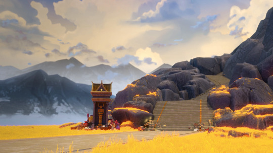
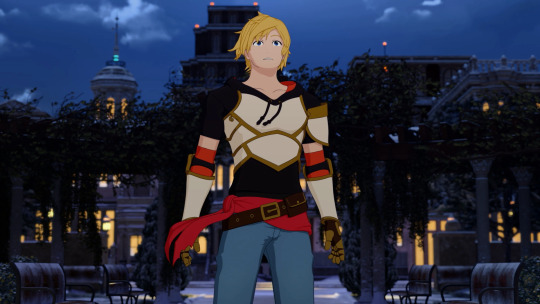
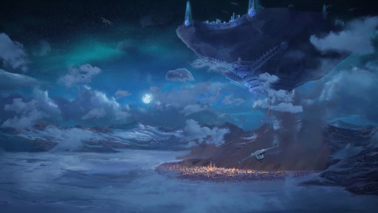

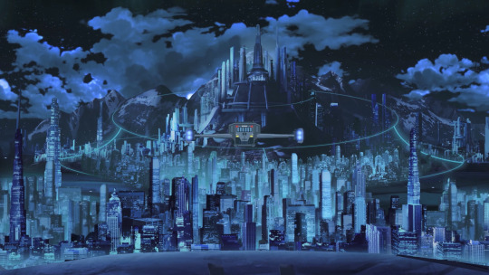

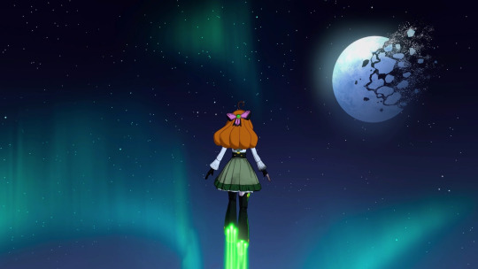
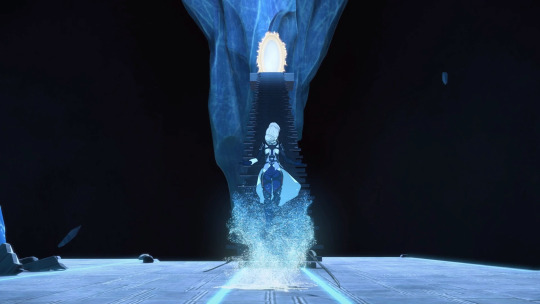

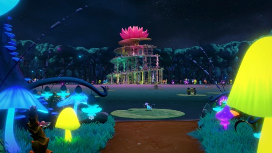
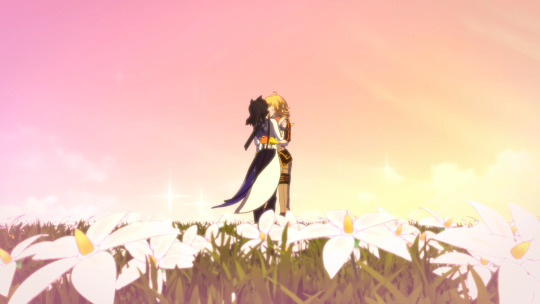
Anyone who says this is visually bad is fooling themselves.
#unearthing these from the tags. i also have things to say about the animation#COMBAT wise. rwby from v1 was always about the stunning fightscenes that monty could pull off.#the show hasn't decided to co-opt that style and that doesnt make me very satisfied with the show's quality#like 3d model animation can feel a lot better than what they put out#i dont want my 3d models to have unreal poly count that makes their fit look great when someones animating a fight scene#but they might be using the same ones#hence the environment during the fights look super plain and they stick to one continuous camera angle that does funky things#frames become unreadable#in order to save on processing power#they should be readable first and foremost!!!#rwby v1 to v3 does this super well with realignment of the scene with fast cuts mixed in with camera and long animated fight movements#keeping the environment somewhat in tact but the fight super readable#like hrhfhjfhhfjfj
2K notes
·
View notes