#just. this is amazing. I haven't seen anything like this since the early 2010s and I miss it so badly
Explore tagged Tumblr posts
Text
every female character in recent history (not animated) tries to be Marguerite Krux (multidimentional, allowed to be a real person with real feelings and reactions and, most importantly, flawed, imperfect, and allowed to make mistakes and learn) so hard and yet they miss the target by half the distance between here and the sun, when everyone in studios should just understand that perfect doesn't mean better, quite the contrary
#i a m rewatching sir arthur conan doyle's the lost world and I am always amazed at how constantly selfish she is and how she's in#it for herself and literally sold into marriage the girl who saved them right into the first episode. and kind of unflinchingly sells her#companions almost every other episode to save her hide#she's greedy and will do anything to amass jewels gems and other such things. taunts the people living with her daily. lies every other wor#and thinks first and foremost about herself#but then. then you see her playing the people she was cozying up to to save her friends. plays as summerlee's dead wife while he was out#of it and was almost certain to die of poisoning. puts herself at risk again and again to help her friends becomes more empathetic as the#episodes progress. help literal strangers even though there's nothing in it for her#just. this is amazing. I haven't seen anything like this since the early 2010s and I miss it so badly#also marguerite krux definitely first woman crush ever now that I can look back at my childhood with the right lenses#I mean have you seen her??????#not double but triple agent. black widow of vienna. heiress. gemmologist literal reincarnation of a goddess???#poilyglot version of supersayan. certified badass. super mysterious past. orphan just to add that tad of angst and by god#rachel blakely is hot#the lost world#marguerite krux
11 notes
·
View notes
Text
LONG post featuring my opinions on this design and her concept and also Vivs character design decisions in general
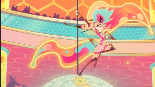
This design singlehandedly made my account rise from the fucking dead because of how much opinions I have on it
TO NOTE : I LIKE Helluva Boss as a show. Is it perfect? No. Do I think it has issues from both writing and design aspects? Yes. Do I like it regardless? Also yes. You can like a show and still have criticisms of it. Also Viv has answered some criticisms about Beelzebubs design and I will talk about them too
Final warning cuz this is LONG and rambled at points
By this point we are all aware that once a new character gets revealed in Helluva or Hazbin , there's always opinions on it.
But Beelzebub truly takes the cake on how divided people are on her design. People either adore it or hate it with a blinding passion (and some just don't like it cuz they have a Viv hate boner).
I have to say I actually really like it as a stand alone design. Remove her from the story and context it's genuinely an appealing design with fun and bright colors. I personally don't mind the early 2010's sparkle dog look. It has a nostalgic charm to it and if you followed Viv for long enough you know she really likes that aesthetic. She has good colors and color placement and my main real dislike is the weird hair.
And she's animated BEAUTIFULLY !!! Real props to the animators for being able to make this design look nice in motion because god lord is it complicated. This will be a criticism later, but again, its really amazing on how they made this design look good even though we all know this must have been a real bitch to animate.
The real issue that come to me with her design is when you put her in the show and have to think about who she is, what she is, what her lore is ect.
Firstly: Her not being 'lore accurate' kinda falls flat given that none of the designs thus far have been accurate to what they're based on. Like Asmodeus has elements that tie him to his demon name counterpart (with the rooster tail and 3 faces) but they're more allusions then design inspirations. Lucifer is literally just a top hat twink and Mammon (even tho we haven't seen his full design yet) is clown/jester themed. Viv has made it clear that this version of hell isn't supported to be an accurate depiction of biblical hell. So she can really do whatever she wants with her interpretation. Her not being an insect, although disappointing since we don't really have that in the show, is only just a matter of personal taste.
HOWEVER there's still a lot of discrepancies with her design.
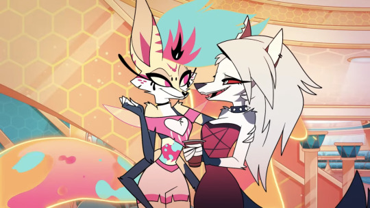
So she's supposed to be a Bee-Fox hybrid... Where's the bee??? Like take away the hexagon background, where is the bee part of her design? She has antenna and wings but... They don't really do much. The antenna are fine and its smart they placed at the tip of her ears, but the wings are straight up not bee wings!!! They look more like pixie wings and they're so small half the time I forgot they were there. Couldn't you have added.. idk some stripes?? she has stripes on her ears but they don't look like bee stripers more so general Viv design details. It's weird given she uses stripes so heavily in other designs yet the BEE character doesnt. Maybe add some fuzz like how bumblebees have?? Maybe trade that stupid lava lamp tail/hair if its too complex. I really don't like how she has normal hair and also a weird liquid part and liquid tail. It adds too much visual noise and just doesn't gel well wit the rest of her design. Her lava lamp stomach too just feels like needless addition of animation work for something that just doesn't add anything. Her colors ( despite being nice) kinda clash against all the other hellhounds who have a muted black/grey/red color pallate. It makes her look like an 13 year olds OC thats been edited in
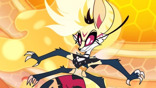
Literally the only things that changed are her colors, size and eyes. In my opinion this should have been her base design because the colors and bug eyes lean into more of the bee aspect. Plus with these colors she fits more with other hellhounds.
Like right now the normal design feels 97% fox with just the most subtle bee elements slapped on. If it wasn't for the background, look me in the eye and tell me this design is a fox bee hybrid.
She also doesn't feel like a prince? She's dressed very casually and doesn't have nearly have enough of an imposing vibe. I didn't know she was a prince until it was said in show. I thought she was just some high rank demon performer. Its kinda disappointing given how grand, larger then life look and energy Asmodeus had. They were introduced in the same way via big song number, but Asmodeus felt like a Prince of Lust, Beelzebub felt more like a performer of Gluttony rather then a ruler.
Also why if she a hellhound in the first place? i saw somewhere on twitter that its cuz her people are hellhounds but that doesnt make sense. Lucifer isn't a human and Asmodeus isn't a succubus, so why does Bee have to be a hellhound? We know that hellhounds are the lowest ranked amongst hell natives, so how do people outside of gluttony feel about her? She is treated like royalty but is also a hellhound, the lowest demon. It causes a needless paradox that makes you question the worldbuilding of the show.
Also why are hellhounds the lowest rank in hell ? and why are they associated with gluttony of all things? I am going to be honest when I say I completely forgot they were native to gluttony because gluttony has a beehive aesthetic and like wtf do dogs have anything to do with it . Like other demons shown have themes that tie them into their respective prince or sin, but we aren't shown why hellhounds in particular are gluttony. Like it feels like a minor thing but when you present information about worldbuilding and show stuff that contradicts it, people will question it.
And why is she dating a hellhound? Or more so why is she so open about it. Like its been shown in the show that Stolas and Admodeus dating imps is a taboo thing so her being so open about her relationship with someone whose even lower then an imp. Again its going back on lore and worldbuilding being contradicted. If you're going to make rules for a show, stick to them.
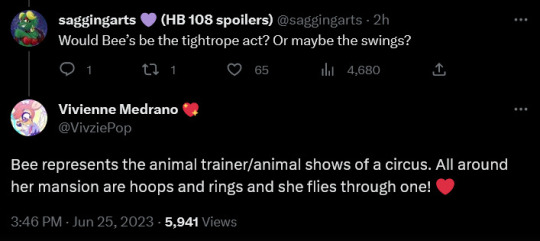
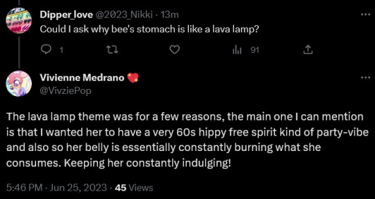
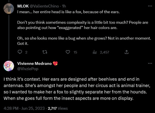
I'm putting these two side by side cuz I have the same complaint about them.
How are we suppose to know this?? First the gluttony ring severally lacks any circus motifs (it has more of a bee theme then a circus one), but Bee ESPECIALLY doesn't have ANY hints at being circus themed, let alone animal trainer.
I knew that all the princes had a circus theme but from I (and from what ive seen in other comments) though she was an acrobat or like dancer of the sort. Literary nothing in her design says she is an animal trainer. And also the hippie 60s spirit is also not anywhere in the design. Just because a design choice is clear to you doesn't mean its clear to everyone else. A good design makes its points across loud and clear so everyone can understand it. This really feels like she's making it all up as people ask. She probably isn't but it really comes across that way. You cant just say something about a design that just isn't in the design or its not shown properly. This is an issue a lot of Helluva and Hazbin Hotels characters have (look up any of their trivia and you'll see how bad some designs are communicated), but with Bee its emphasized tenfold because she's suppose to represent all these different things (fox, bee, prince, party girl, animal trainer, DA sparkle dog, 60s hippie free spirit) at it just isn't conveyed or is put in such a way where you cant clearly tell what it is. It honestly feels like Viv had in mind to have a Kesha pop party girl character and just made her a prince. Shes trying to justify all these things and saying them like they're obvious when they're clearly not!
This design suffers from having too many ideas slapped on it that just don't work and actively work against each other.It makes me less excited for the future prince designs
If youve come this far good for you for sticking around to this way too long of a ramble about a probably one off character in a popular indie cartoon :D
#hazbin hotel#helluva boss#helluva critical#helluva boss critique#design#rant#god this felt freeing to release#seriously it was boiling in my brain for days
217 notes
·
View notes