#just because there’s American flag imagery doesn’t mean it’s patriotic
Explore tagged Tumblr posts
Visit Tumblr Blog
Explore Tumblr blogs with no restrictions, modern design and the best experience.
Last Seen Tumblr Blogs


Fun Fact
Tumblr is used by 21% of adults online aged 18-29 years.
Text
I just saw a post that said Kendrick Lamar’s halftime show was pandering to MAGA…media illiteracy is at an all time high.
#I’m sorry what???#please learn some black American culture#kendrick lamar#superbowl#super bowl#superbowl halftime show#just because there’s American flag imagery doesn’t mean it’s patriotic
46 notes
·
View notes
Text
Ari Drennen at Ari's Threads:
For years, you could predict the politics of a protest just by looking for flags. If they were waving, it was probably a right-wing rally. If they were absent, it was probably a left-wing one. But that’s changing. This Presidents’ Day, protesters in all 50 states marched against the Trump-Musk administration, many of them carrying American flags—some reimagined, some unaltered, all of them a rebuke to the idea that patriotism belongs to one side. A few days later, Chappell Roan rode onto the Grammy stage atop a giant pink horse, drenching Western imagery in queer joy. Earlier that night, Beyoncé became the first Black woman to win Best Country Album for her album Cowboy Carter, making sure that, if there was a battle over Americana, she was walking away with the trophy. These moments might seem disconnected, but they’re not. A new vibe shift is underway. The Left is reclaiming the aesthetics of patriotism, and it’s happening everywhere—on the streets, in music, and on national TV.
A Protest That Looked Like America
On Presidents’ Day, demonstrators filled Washington, D.C., and cities across the country, part of a movement organizing protests in all 50 states on the same day. They carried signs warning of rising authoritarianism, demanding action on democracy, civil rights, and economic justice. And they carried American flags—not as a provocation, not as an ironic statement, just as a flag. Some protesters held them high alongside pride flags. In Denver, marchers passed the state capitol waving unaltered flags next to banners calling for voting rights protections. In Anchorage, a demonstrator draped themselves in the flag like a cape while holding a sign that read, “Patriotism means fighting fascism.” In New York City, a speaker grabbed the mic and made the point plain: "They want us to be afraid of this flag. But it's ours, too." For years, those images have been associated with right-wing rallies, but here they were, held by people who see their country under threat and refuse to surrender its symbols to the people endangering it. The assumption that the flag belongs to one political faction may not last much longer.
The French Left Wrote the Playbook on This
In France, the Left never stopped claiming its own history. The tricolore doesn’t belong to the far-right nationalists; it belongs to the people in the streets demanding higher wages and better protections for workers. The revolutionary motto, Liberté, Égalité, Fraternité, gets invoked by protest movements and strikers, by progressives who see their fight as part of a long and unfinished struggle. The reason this works is simple: Symbols matter. If you abandon them, you let your opponents define them. That’s why French protesters still march under the same red, white, and blue banner that flew over the storming of the Bastille. It’s why they don’t hesitate to remind the powerful that revolution isn’t just history—it’s precedent. That’s the shift happening now in the U.S.—people realizing that if they don’t claim these symbols, the people trying to dismantle democracy will. [...]
A Left-Wing Patriotism That Feels Inevitable
For years, progressives in the U.S. have been reluctant to embrace patriotism, in part because so many of our national symbols have been wielded against the very people fighting for change. But if progressives don’t claim these symbols, they don’t disappear—they just become the property of the other side. Something new is happening. Protesters are carrying the flag instead of abandoning it. Pop stars are turning classic Americana into high camp. And if you look at history, you can see how this plays out: what starts as subversion can become the new mainstream. The cowboy was once the mythic symbol of American rugged individualism; now, at least in Chappell Roan’s world, he’s dancing under a disco ball. The Left’s new approach to patriotism isn’t about blind loyalty. It’s about staking a claim. This country belongs to all of us, and we’re not handing over the flag—or the cowboy hat—without a fight.
Ari Drennen with a solid column on how the US left is learning to love patriotism and its symbols again.
2 notes
·
View notes
Text
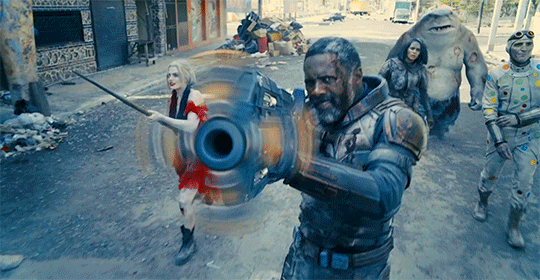
Smokey band Movie Reviews: Wowza
The Suicide Squad is the best film DC has made since The Dark Knight. That’s it. That’s the review. If you want to know why i can say that with unassailable confidence, you can continue reading but from this point on, i am literally just going to gush about this f*cking thing like a straight up school girl. It’s that good and you should go watch it right now. This is about to be a love letter to the best film I've seen all year, mostly because i haven’t seen any A24 flicks, but this thing is a fantastic consolation for that glaring disappointment.
The Inspired
The writing in this movie is easily the best the DCEU has to offer. I say that knowing there are some people who believe BvS is f*cking Shakespeare and MoS is Hemingway. They’re not. They’re both dogsh*t. The Suicide Squad absolutely is everything the neckbeard fanboys want those films to be. I marvel at how well the events blend, how organically the character interact, how real they feel in a movie with a giant kaiju space starfish as the driving conflict for the plot. It’s f*cking inspired and lays solid ground work for very exceptional aspect of this movie going forward. Your film starts on the page and James Gunn understands that sh*t very well.
The emotion in this movie is palpable. I literally teared up toward the end. That’s rare for me because I'm kind of an emotionless monster but that line, “I’m a superhero!” f*cking gut checked me. Gunn has done that to me three times. “WE are Groot.” "He may have been your father, boy. But he wasn't your daddy." It wasn’t Pete swinging in after the “On your left.” in Endgame but it was close. Dude is too good at that sh*t and it’s weird that Marvel is willing to let him go. They better lock that dude the f*ck up!
Chemistry is everything for an ensemble like this and this cast definitely has that. I bought their interactions without having to suspend my disbelief, not like in other, lesser SKWAD films. I particularly like the relationship between Ratcatcher II and Bloodsport. That sh*t was sweet and brought a legitimate smile to my face.
I mentioned how well this film was written but, aside from the brilliant plot that made all of these misfit killers relevant, the character work really goes a long way to selling this narrative. Like, you absolutely fall in love with Polka Dot Man by the end of this thing. They made Peacemaker an irredeemable bastard. Like, do you know how well you have to develop a character played by John f*cking Cena, for people to hate him? He’s the White people version of The Rock! That’s near impossible but they definitely pull it off. It���s like Gunn watched the first SKWAD, saw what they did with El Diablo and just decided to do that. And when i say “do that’, i mean actually write these f*cking characters as people instead of stereotypes and tropes.
The Great
This is an ensemble film, which means it lives and dies by it’s cast. Well, this motherf*cker is living mas! Not a single character was miscast in this. Not a one. From the supporting characters like Alice Braga’s Sol Soria and Peter Capaldi’s Thinker, to the expendable distraction SKWAD. Loved seeing Jai Courtney’s Captain Boomerang again and i even like Pete Davidson’s Blackguard. I can’t stand Pete Davidson. This cast is MCU levels of excellent but, of course, there are standouts.
Joel Kinnaman as Rick Flag does the best work of his career. This dude almost always sucks in the roles he takes on but I'm starting to think that’s because of the direction he’s given because dude kills it as Flag in this. I genuinely liked him this time around. He felt like a real person and not some caricature of whatever the generic US Marine is supposed to be.
Margot Robbie is the live action Harley Quinn. She embodies this character like Ledger did Joker and RDJ did Stark. It’s that good and this version of Harley is easily the best. She feels complete, like she’s finally the Harls in the comics and i love it. This Harleen is who the character should have been from the jump but a lot of that was on Margot. She had to grow into the character, develop her ability because the first time she donned that Puddin’ necklace was rough. She’s come a long way and so has Harley.
I touched on this before but John Cena’s Peacemaker is a f*cking bastard. This casting genius because of the message behind the movie. I’ll get into that later but casting the most All-America motherf*cker to play the villain in a film about US involvement in Sovereign Foreign nations? And for Cena to literally play up his Patriot shtick only to turn out to be an allegory for the sordid reality of America? Bro, this sh*t got over. Cena is outstanding as Peacemaker. This cat really does have the chops to be a movie star. Looking forward to this show they gave him, for sure.
Polka-Dot Man is arguably the best character in this entire film. I love what Gunn wrote for him and absolutely adore how David Dastmalchian gave the character life. He had the best arc in the entire film and i really enjoyed his journey. When he got his moment, i teared up a little bit. Dude deserved that. Dude earned that. For me to have such a visceral reaction to that scene is testament to how well Dastmalchian did his job!
Listen, i love Idris Elba. I do. Cat has all of the swagger. He’s easily as charismatic as Obama and i dig that. However, he just plays Idris Elba. Like, his Bloodsport is literally just John Luther but, you know, murder prone. That’s not a bad thing, it definitely works, but, if I'm being honest, as a character, he’s the weakest of the lot but that’s how good everyone is in this. Idris f*cking Elba is the weakest character in this cast! What?? It’s not even like he’s bad or anything, he just plays the same dude over and over.
And now we get to my favorite character in this flick, Ratcatcher II. Listen, i have no idea who the f*ck Daniela Melchior is, but she is the absolute heart of this film, the moral compass of this team, and she never shirks away from that challenge. She has outstanding chemistry with Elba and the relationship between their two characters is the sweetest sh*t I've seen in a long time. It reminded me a lot of Logan and Laura. Melchior, if he chooses, can have a great career in Hollywood because she’s a real talent.
The Good
The plot to this thing makes sense. It’s not something as intricate as The Dark Knight but it’s head-and-shoulders better than anything the DCEU has produced and objectively sh*ts on the SKWAD that came before it. Destabilizing a small Latin American nation feels more like something Waller would have theses assholes do, rather than trying to kill a f*cking god with boomerangs and bullets. This movie is everything the first SWKAD attempt wants to be.
The violence and gore in this is ramped up to a eleven. There is a lot of grotesque sh*t in this thing and it starts the second Blackguard gets his face blown off. Like, his entire f*cking face. You see ALL of that sh*t and SO much more. Like, it gets grimy and i appreciated that. A SKWAD film needs that blood. This is a team of remorseless killers. We, as the audience, need to feel that and this flick delivers.
James Gunn can direct his ass off. When they announced he was going to be in charge of this film way back when, i knew it was going to be legit. When they announced t was a hard R, i needed it in my life. We’re talking Guardians with murder. Were talking the quintessential James Gunn vision and what a vision it is. Not only did he direct the f*ck out of this movie, but he wrote it, too! Mans has the only writing credit on this production. This is all him! It’s wild seeing the difference between directors on display. Gunn delivered a film that one could argue is the best of the year while Zack Snyder made f*cking Army of the Dead. The discrepancy between the quality of these two films is why i hate Snyder so much and have all of the love for Gunn.
The imagery in this thing is f*cking top tier. There are shot that are legitimate art It's a weird juxtaposition considering how bloody some of these scenes get but, f*ck, is it gorgeous!
I have to mention the editing. I usually don’t bother because it’s always adequate and, admittedly, it feels only slightly better in this film but it’s competent. It’s better than the first and you really feel that sh*t. Like, i watched the movie in preparation for this one and, oh my god, the difference in an actual team of professional film editors really cut a great film. Who’ have thought letting a f*cking trailer house construct your movie that it would end up feeling like a ton of trailers strung together and be bad?
This movie is overtly political. It has a lot to say about the influence of the US abroad. It doesn’t shy away from the realities of our international policy and really hammers home the reality of what the United States is, rather than the way we portray ourselves to be. This culminates in a struggle between Flag and Peacemaker; Both soldiers to the core but on opposite ends of the American ideal. It’s actually really brilliant and, if you aren’t paying attention, will go over your head. This is how you instill your politics into a film. This is how you execute ideals in a narrative. Gunn has a lot to say and he says it in the loudest way, but with the quietest voice.
The Okay
The only beef i can see people having with this is the exposition dumps. There are a few but they kind of stall the overall flow. I didn’t mind them too much because, by the time we get to them, the film has built up so much good will by being just fantastic.
The Verdict
I f*cking loved this movie, dude. Look how long this list of dope sh*t is. I literally itemized all of the reasons why this flick is so great. I can’t articulate it and more clear. I told you at the very beginning, literally the first thing i wrote, that The Suicide Squad is the best film in the DCEU and i mean that sh*t. Grace Randolph is a f*cking hack. Don’t listen to her incredibly bias opinion. Just f*cking go watch it and decide for yourself! It’s in theaters right now and on HBO max for free.
4 notes
·
View notes
Photo
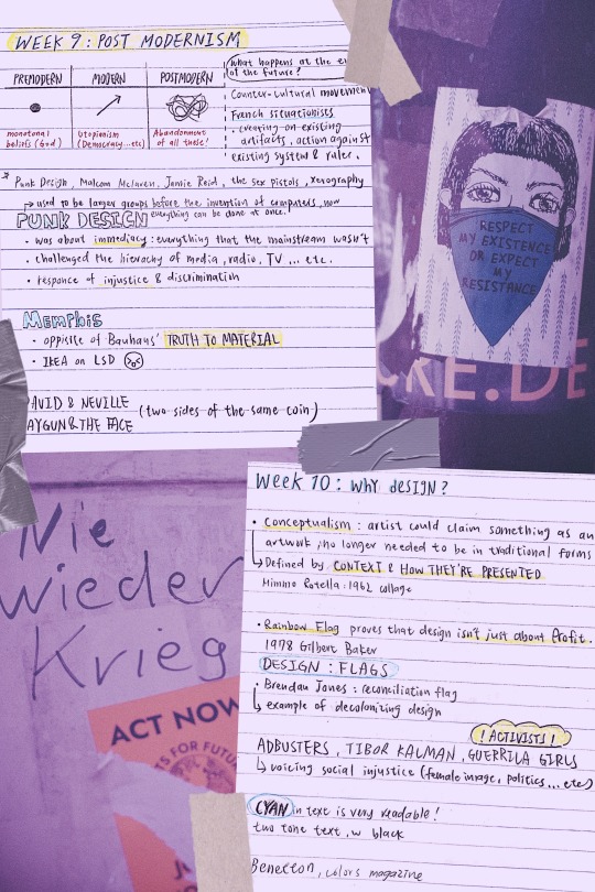
week 9 and 10 lecture
NIE WIEDER KRIEG!!! NO MORE WAR – ACT NOW – Urban street art sticker
RESPECT MY EXISTENCE OR EXPECT MY RESISTANCE - Urban street art sticker
photos from Markus Spiske
I was catching up on past lectures when I realized week 10′s content ties back to what is happening in the US right now, which made me decide to create my cover photo in relations to the event.
My intention is to pay my respect- as well as acknowledge- the rights of the community that is in pain at the moment, and reflect on ways of improvement when it comes to racial equality.
knowing that design is closely related to activism really gave me a new perspective, which is the power of design: the fact that we can make a difference by creating, expressing, and voicing an opinion. Design is so much more than just making a profit, it is a tool that comes with great responsibility and potential. Learning how to utilize it to spread importance is what I shall be thinking in my future years.
----------------
WEEK 9
PUNK: a counter-cultural movement
PUNK DESIGN, A SUMMARY: despise typesetter, prefer DIY
collage-style 1: ripping up and starting again
Takes a commercial image and repurposes it for revolutionary purposes.
collage-style 2: the use of stencils
stencils had frequently been used for their ease of use and acquisition, their association with the underground through graffiti, denoting something raw and urban, as well as its nature as simply being flawed by design.
zines: using illegible and garish styles to shock the viewer out of apathy, the punk movement gave little thought to the commonly perceived ‘good’ design practices.
parody and politics: using images from a media-saturated culture for a new purpose, they meant to trigger recognition in the viewer and include them on the subversive in-joke.
All ripped up: Punk influences on graphic design
MALCOLM MCLAREN: A multi-talented man
promoter and manager of bands the New York Dolls and the Sex Pistols
he was one of the first white music producers to bring hip-hop to a wider audience and one of the first to popularise world music in the west
partnership with fashion designer Vivienne Westwood: SEX
In a new, in-depth biography, Paul Gorman offers a vivid portrait of the postmodernist impresario who conjured up punk’s angry pose, the Sex Pistols, and much more.
Malcolm McLaren's Life of Chaos, Music, and Art
JAMIE REID Jamie Reid’s artworks
A GUIDE FOR ANYONE WANTING TO DO IT THEIR WAY, FROM REID:
Destroy Your Computer: The more we get drawn into this mad digital world, the more we lose contact with each other. “Most jobs are about enslavement, break free if you can”
Study Art: If I hadn’t gone to Croydon I would never have met Malcolm McLaren, not just for what he did with the Pistols but for everything else he did. The irony is that neither Malcolm or I would have got into Croydon if it was today. What does that tell you about what’s happened to our education system?
Have a Sense of Humour
Learn from the Past
Look to the Future: Radical ideas will always get appropriated by the mainstream, people in authority lack the ability to be creative, and they rob everything they can. you have to keep moving on to new things.
Iconic Punk Artist Jamie Reid Has Some Advice for Young Creatives
XEROGRAPHY ART: is an art form that began in the 1960s. Prints are created by putting objects on the glass, or platen, of a copying machine and by pressing "start" to produce an image.
What Happens When a Photocopy Machine Becomes an Art Tool?
MEMPHIS DESIGN (MILAN 1980’S): its aesthetic embodies the 1980s
Simple geometric shapes; flat colours combined in bold, contrasting palettes; stylised graphic patterns defined by black-and-white stripes and abstract squiggles – these are the ingredients of Memphis-inspired design, fuelled by influences from earlier movements such as Pop Art and Art Deco.

10 iconic examples of Memphis design
ETTORE SOTTSASS: One of the most influential and important figures of the last century, Architect and Designer, founded the Memphis group In 1981, a group that has radically changed the scenario of Italian and world design.
Ettore Sottsass’ works
DAVID CARSON: RAYGUN David Carson design
David Carson’s deconstructed style for Ray Gun, was very much a design aesthetic that blurred the lines of visual communication and challenged its readers to interpret the text in their own way. Much like the youths that he targeted throughout the 90s, they were rule breakers themselves that rebelled against society. His use of non-hierarchical text and visually complex, layered compositions, spoke ‘their language.’
“I’ve never used grids; I still don’t. I never studied or learned about them, and when I did I saw no reason to use them.”
STREET PRESS ANALYSIS: RAY GUN COVER — David Carson, Anti-grid Design Icon David Carson Says Computers Make You Lazy, Contextual Studies: David Carson
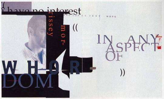
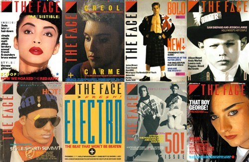
NEVILLE BRODY: THE FACE
The Face, drawing freely for his visually exciting layouts and typography on avant-garde artistic ideas. Brody was thoughtful to the construction of its layouts, with blocks of texts often placed horizontally or vertically on the page, the layouts contrasting strikingly with hand-mediated imagery and photography. Such ideas exerted a significant international impact on the appearance of the magazine, advertising, and retailing design.
POST 14 – 1980's – 'The Face' Neville Brody – Monique
-----------------------------
WEEK 10
MIMMO ROTELLA
'With a Smile', Mimmo Rotella, 1962
Mimmo Rotella - 324
ROBERT RAUSCENBERG
Robert Rauschenberg 1925–2008
JACEK TYLICKI
Jacek Tylicki Art and Artworks
FISCHLI & WEISS
Fischli & Weiss: Flowers & Questions. A Retrospective – Exhibition at Tate Modern
GILBERT BAKER: RAINBOW FLAG
“Our job as gay people was to come out, to be visible, to live in the truth, as I say, to get out of the lie. A flag really fit that mission, because that’s a way of proclaiming your visibility or saying, ‘This is who I am!’”
Baker saw the rainbow as a natural flag from the sky, so he adopted eight colors for the stripes, each color with its own meaning (hot pink for sex, red for life, orange for healing, yellow for sunlight, green for nature, turquoise for art, indigo for harmony, and violet for spirit).
How Did the Rainbow Flag Become a Symbol of LGBTQ Pride?
FLAG IN DESIGN: the lecture talked about how flags influence to power of design, this is an interesting article of how flags can go beyond the rules of design, but still make it work.
7 fantastic flags that break every design rule
ACTIVISTS (ADBUSTER, TIBOR KALMAN, GUERRILA GIRLS, BENETTON: COLORS MAGAZINE)
A Review of COLORS
“Oliviero Toscani and Tibor Kalman launched “a magazine about the rest of the world” for United Colors of Benetton in 1991. It seems only fitting that an unconventional title like this should be documented in an unconventional way.”
“Toscani wanted a magazine without any stars, without any celebrities, and without any news. He decided they’d interview people nobody knew, and they’d use the internet to find stories. This approach- a combination of dynamic graphics, striking photographic imagery, provocative themes, and an unwaveringly global outlook—has become familiar to magazine readers now, they hope to firmly establish COLORS’ status as the founder not only of today’s independent magazines, but of mainstream media as well.”
SHEPARD FAIREY: HOPE POSTER Visual Analysis of Shepard Fairey's 'Hope'
Color: Red, blue and beige are representative of the American flag, illustrating his patriotism. Blue help to define his features, the beige on his face might be to say that race doesn’t matter.
Typography: provides the concept that the poster is trying to communicate. HOPE’s typeface used is Gotham, a strong slab sans serif, the use of Gotham in this work creates a sense of authority and a bold assertive statement in which there is no uncertainty. These clean letterforms grab the viewers’ attention and makes a statement, permitting for maximum legibility and objectivity.
4 notes
·
View notes
Photo

Photo Credit: Getty Images
10 Interesting Facts About Jasper Johns
American painter Jasper Johns is one of the few remaining living artists who made hay out of the public fervor for Modern Art in the mid-20th century.
A pioneer in several artistic fields, including painting and performance art, Jasper Johns’ works are among the most valuable pieces of American art in the world. Getting to know his work will make it easier to spot one of his distinctive pieces in museums and at auction.
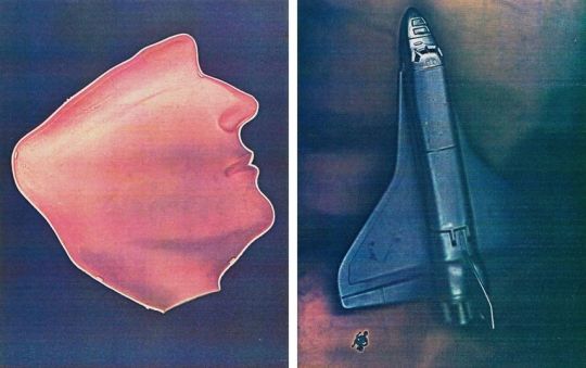
1. His Iconic Flag Paintings Have a Dreamy Origin

Image credit: Whitney Museum of American Art
Johns is mostly known for his bright, irreverent style, but if there's one icon that's most closely associated with this American artist, it's the stars and stripes. The American flag is the subject of many of Johns' paintings, but he doesn't appear to be inspired by patriotism. According to author Isabelle Loring Wallace, Johns was first inspired to paint the American flag because he had a dream in which he saw himself painting a flag on canvas.
2. His Identity as an American Is a Clear Influence

Image Credit: Museum of Modern Art
Though his flag paintings aren't borne from a strong nationalistic identity, it's hard to deny that from a critical perspective, Johns' work would be dramatically different if he weren't an American. Born in the South, Johns wasn't exposed to art as a child. He served in the U.S. Army during the Korean War and moved to New York City upon his return. There, he met the artist Robert Rauschenberg who became his long-term boyfriend and major partner in both life and art.
3. Abstract Concepts Rather Than Abstract Imagery

Image Credit: tes.com
Johns painted flags, numbers, targets, and other recognizable symbols because he specifically wanted to use, "Things the mind already knows." Ultimately, Johns' own feelings about his work seem to discourage the viewer from thinking too abstractly about what they see. In a 1955 interview, he said that, "Looking at a painting should not require a special kind of focus like going to church. A picture ought to be looked at the same way you look at a radiator." In this way, Johns' connection to the concepts of subversive art movements like Dadaism and Pop Art becomes clear.
4. Rebellion Through the Mundane

The Dada and Pop Art movements were both iconoclastic efforts to knock the stuffy art world off its axis and elevate everyday objects to the sublime by giving them status as art. These kinds of works still challenge viewers who want to see something they recognize as beautiful and special, like 19th century still-lifes and portraits in museums. Though Johns worked with recognizable imagery, he chose mundane items — body parts, utensils, stenciled numerals — that challenge the viewer by declining to indulge their expectations for what art "is."
5. His Works Deserve Closer Inspection

Image Credit: Museum of Modern Art
Johns' paintings often look flat and one-dimensional in photographs, but when you get closer, you see a world of detail under the surface. Many of Johns' works, particularly his early flag paintings, feature built-up newspaper scraps as a layer on top of his canvas. This creates texture in both a literal and figurative sense, adding a unique landscape to each work and giving the viewer something additional to inspect up close.
6. Even the Margins Can Be Significant

Every artist a relationship to their chosen work surface, and in Johns' case, every inch carries equal weight. His flag paintings occupy every centimeter of real estate on the canvas, meaning that what you see on the margins can be just as significant as what you see in the center. Traditional rules of composition give way to a flattened, one-dimensional surface in which an entire visual world is contained.
7. He Stood in Opposition to Many of His Famous Artistic Contemporaries

Though artists often collaborate with other creatives, Johns wasn't very impressed with the works of some American artists of his generation. He seemed to want to position himself as something of an antidote to abstract expressionism and the movement known as action painting. The works Jackson Pollock created from the early 1950s up to his death in 1956 are perhaps the most recognizable examples of the style Johns sought to avoid.
8. His Works Broke the Same Auction Record Twice in One Year

Johns' works are hot items for collectors, but in November 1988, the 1955 multi-panel White Flag sold for a record-breaking $7 million, becoming the highest price ever paid for a work by a living artist. Of course, artwork prices have skyrocketed since then, and White Flag would likely sell for at least three times that price if it were auctioned today. That skyrocketing price point for modern works is present in a subsequent November auction, when another Johns piece, False Start, broke the auction price record White Flag had set just a short time earlier, bringing in $17 million.
9. He Received the Presidential Medal of Freedom

In 2011, President Barack Obama honored Johns with the Presidential Medal of Freedom. This award honors those who have, "Made an especially meritorious contribution” to the United States. This is the highest civilian honor awarded by the U.S. Government and is given to those who don't serve in the military but are believed to serve the interests of the nation. Johns was the first studio artist in three decades to earn the honor.
10. He Was on an Episode of the Simpsons

Johns' colorful style is a natural fit for modern-day cartoons, and he actually made an appearance in a 1999 episode of The Simpsons titled, "Mom and Pop Art." The episode focuses on Homer and Marge's interactions with the art world, and Johns plays a comic version of himself.
If you love Americana and pop art, Jasper Johns work may be the ideal fit for your art collection. With sales from across the country, EVERYTHING BUT THE HOUSE may have your next once-in-a-lifetime work of art.
0 notes
Text
New Post has been published on
New Post has been published on http://hypnotherapyhypnotist.com/luxlady-natural-rubber-mouse-padmat-with-stitched-edges-9-8-x-7-9-image-id-32286866-psychology-abstract-background-colourful-vector-illustration-design-element/
Luxlady Natural Rubber Mouse Pad/Mat with Stitched Edges 9.8” x 7.9” IMAGE ID: 32286866 psychology abstract background colourful vector illustration design element
Luxlady Natural Rubber Mouse Pad/Mat with Stitched Edges 9.8” x 7.9” IMAGE ID: 32286866 psychology abstract background colourful vector illustration design element
Product Description
Manufacture:
MADE IN USA. Designed, Printed and Shipped out of our California Facility.
Features:
Our mousepad is made of natural rubber with Fabric. High quality cloth weave surface bonded to a special NON-SLIP 100% natural Eco-Friendly rubber base to enhance precise tracking, effortless control, steady surface support and extended durability. The weave also provides a nice, comfortable feel under your hand, Minimizing Fatigue over extended periods of time.
Works With Any Standard Mouse. Low Friction and Ultra Smooth Fabric surface optimized for better Mouse Gliding.
Warm Tip:
After being tested, we found that color might seem a little different (lighter or darker) on different monitors.
After-sales Service:
1. 30 days warranty by Luxlady. Free return of or replacement within supported if defective.
2. “ Your satisfaction is our highest priority”. If you have any problems about this product or your order, please feel free to contact us.
Contact Us:
Log in Amazon account>find the order>click “Get help with order”>choose specific subject>click Ask Seller.
Price: $9.98
Natural rubber base with smooth silky texture for fast gliding. 1 piece per order. Size Measure 9.8 x 7.9 x 0.1 Inches
Durable cloth surface is dust and stain resistant. Soft front, non-slip backing. Work for All Mouse Types. Amazing image design that makes your mousepad unique
High quality silky cloth surface can absorb sweating or spilled drinks without making a mess. HIGH RESOLUTION and exceptional image Quality and will not fade or scratch off
Easy maintenance: Hand wash with mild soap and dry thoroughly. Long lasting and extremely durable. Ideal size for Gaming as well as daily use
MADE IN USA. Designed, Printed and Shipped out of our California Facility. Please search “Luxlady mousepads” on Amazon for other unique offerings from Luxlady
Monica Vance Professional Hypnosis logo
youtube
The meaning of the Monica Vance Professional Hypnosis logo
Mystical Hypnosis Logo Template https://cmkt-image-prd.global.ssl.fastly.net/0.1.0/ps/1500674/580/386/m1/fpnw/wm0/mystical-hypnosis-logo-01-.jpg?1469856075&s=f21a3baf4ab04ac20235f3884f40eef4 https://cmkt-image-prd.global.ssl.fastly.net/0.1.0/ps/1500675/580/386/m1/fpnw/wm0/mystical … News story posted on 2016-07-30 There are no original ideas. Our imagination is fueled by outside elements. And forget about the lie of freedom of choice you’re just one of a few Jungian character types directed by 13 propaganda absolutes. Propaganda techniques such as testimonial, plain folks, bandwagon, card stacking, fear and name calling hardly even scratch the surface anymore and it’s almost laughable that Edward Bernays was able to tower as the standard in perception management and propaganda facilitation for so long. Perhaps that’s why the industry experienced zero qualified growth and is even now still riddled with wannabes. The industry has evolved to persuasion via subliminal awareness, scent science, color psychology and covert hypnosis via staircase conversation and targeted tonality. Many PR firms and advertising agencies try to make use of these concepts but few get it right.
Advertising hacks who have the sense to see the subliminal messaging behind logos and global campaigns by top ten conglomerates often try to mimic what they see but fail because they don’t see the full picture. Take into consideration the more recent Burger King logo that is demonstrative of ‘motion’ that pushes traffic through their drive through while the aroma of faux flame broiled goodness gets pumped out of the rooftop exhaust. TV commercial producers with a modest comprehension of subconscious stimuli via imagery interruption fail to close out the concept at the end of the 60 second ad leaving the viewer only partially stimulated and without triggers for call to action. Even presidential campaign advertisers, the creme de la creme of subliminal messaging and campaign cohesion still fail at this concept of Memetics and neo social engineering. Don’t even get me started on McDonald’s or the KFC’s ‘Snacker’ commercials.
I think the most blatant and unqualified attempts at these techniques are more relevant in the political sector. Remember the Bush Campaign ‘Rats’ commercial? Watch from .20 seconds to .25 seconds and you’ll see the word ‘Rats’ flash up on the screen, actually you won’t see it but your subconscious mind will, slow the video down and see if you can catch it. This is a clear case of a desperate advertising agency trying to play catch-up and they left the subliminal stimuli on the screen too long just before the verbal stimuli of ‘Bureaucrats’ backed up by the visual stimuli of ‘Bureaucrats’. The beginning of this 30 second segment lulled the viewer in with tranquil music and confused the subconscious, whether they intended to or not, with motion via video clip and text. Next the first stimuli, the emotional association of patriotism via the American flag with bush standing at its center. Then a concentrated visual of bush with seniors pulling the viewer in by shadowing the circumference of the screen to zero the attention of the viewer in on the text and association with the target market ‘seniors’.
Listen, the truth is that without the test subject classified with a Jungian character profile, Socionics profile, LUsher test done hourly throughout the qualification and an honest background on the subject representing that particular character type in the public marketplace, you’re wasting your time. Once you’ve done the above you still need to constantly test anxiety and sincerity levels with micro expression and body language definitions per subject. It doesn’t matter if you are attempting to profile a target market for a brand, political campaign or angles for passing socially and economically difficult to digest legislation without the full gamut of tests, checks and balances your attempts are futile.
OK, let’s say that you have qualified talent, which is virtually impossible, to facilitate the above, now you need message delivery. Taking into consideration that subliminal implementation is a reality, color and scent psychology is relevant and from a verbal perspective tonality, intonation and background frequency (binaural beats and solfeggio frequencies) will expedite the tunneling beneath the critical faculty and tap into the subconscious mind you’ll need more. Ring in Memetics. The implementation of an interruption, soon to be a mainstay, that assists in dictating how the mind defines new concepts and ideas. Memetics needs reinforcement that caters to the psychological profile of the target and for this you’ll need a fat pocketbook or a lot of media contacts. You’ll use these media mediums to stimulate the concepts when the emotional state of the target is at ease and peace; this is when access to the subconscious mind is easiest (by media I mean auditory stimulants such as radio, podcasts video and other digital means).
Next you’ll need to use the new science of subliminal awareness to pave the daily path of the target with reinforcements for your desired outcome. In an urban situation you’ll have access to billboards, posters etc. Suburban regions will need a higher budget. Suburban regions will typically be more conservative thus radio talk shows will make up for the visual stimulation that the urban community has access to. The idea is to bombard the target with a message using traditional propaganda techniques.
Crisis management scenarios, personal, corporate and political are absolutely dependent on pure comprehension of the above. Missing even one ounce of minutia will render the entire campaign pointless with zero effect. If you’re a politician running for reelection, civilian being targeted by ethics vampires in a lawsuit or a corporation in crisis management mode or brand defense you’ll most likely need to hire professionals from different firms to make up the whole as listed above.
Find out more about practical use of Socionics and Memetics and other topics at the Princeton Corporate Solutions blog
0 notes