#joel's colour palette is so much fun to work with
Explore tagged Tumblr posts
Visit Tumblr Blog
Explore Tumblr blogs with no restrictions, modern design and the best experience.
Last Seen Tumblr Blogs


Fun Fact
Users from the US are the majority of Tumblr visitors.
Text
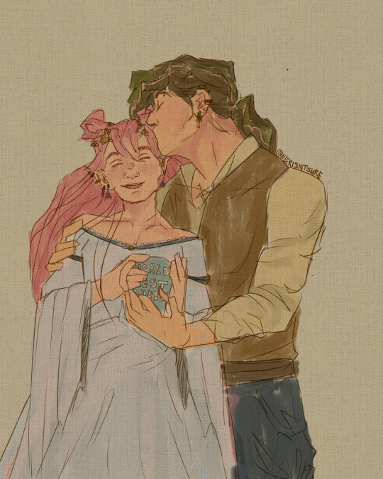
"World's best queen"
#i love them so much#joel's colour palette is so much fun to work with#mellon soup poses used#neeruart#digital art#art#digital illustration#ldshadowlady#joel smallishbeans#smallishbeans#ldshadowlady fanart#smallishbeans fanart
682 notes
·
View notes
Text

LET'S GO OUT WITH A BANG 🚦
taglist:
@ashiyn @single-malt-scotch @goodtimeswithetho @pebbltree @crabbunch @catmaidetho @amethyst-allium @stitchthesewords
sooooo ermm i guess i get to talk about this piece now YIPPEE
i am one of those people who's constantly trying to figure out what their own art style looks like LMFAO. i take frequent breaks from art due to mental health shit so it feels like every time i come back i'm trying to find my footing again.
that being said, i had a lot of caffeine yesterday and started this on a whim and it ended up being something i'm incredibly proud of. i think it helps that i've been redrawing old emotes for a friend's twitch channel, so figuring out which brushes i like right now was really helpful, and i ended up using my personal emote palette like...a lot. that pink in Etho's eye, the purple used for shading, most of the browns are all used in my own emotes. it's wild how much having colours already picked out streamlines things!
Etho is the one i started with, of course, and ended up being one that i went back to re-draw after i'd done...three? or four? more, because the sizing wasn't right and i wasn't happy with the posing. i still wish i could have conveyed him dipping his chin into his coat fluff a little better, but oh well. i thought of the little detail of him looking at Martyn's drawing at the last second (#ethtyn4life) and it made me laugh so i did it. points to you if you caught that!
Joel was the second - life!Joel has always been fey in my head, especially after that season when he just went batshit insane the second he turned red. can't explain it, that's just how it be. i tried to give him an air of subtle menace about him but i think he just looks sleepy 💀 i'd like to do these as individual, larger pieces at some point, so maybe i can work on that more then.
Grian was the third - he reminds me of a Lost Boy here and that wasn't intentional but the Lost Boys always kind of freaked me out and life!Grian's kinda freaky so i think it fits. his little smirk is so creepy and i love him.
i don't remember who i did next after this so we'll just go in order pfft
Bdubs is SO CUTE look at him. one of the few where i couldn't make a menacing expression work, and honestly with how good his profile turned out i barely mind. i did that side profile with no reference, y'all, idk what kind of crack i was on last night. what the hell. this was about the point where i started wanting to do little lore doodles for everybody so i added the clock face - i think it clashes with the red background but what can you do.
CLEOOOOOO CLEO CLEO. i LOVED drawing them, i think their design is one of my favourites of the bunch. her hair has always been snakes in my head and AGAIN i drew those with no reference, can you fucking believe that. i loved the little detail of some of the snakes poking at the people next to her, they're so cute hehe. also Cleo has freckles now, i'm so sorry but i don't make the rules. someone complimented the teeth in the reblogs and THANK YOU!! they're not quite anatomically correct but fuck it we ball and they look cool as hell anyway.
Martyn is so smug, i love him. points if you caught that he's looking at Cleo bc Double Life, i wanted to do something a lil different with him than just another straight up symmetry tool drawing and i think it fits. he is so eye-searing tho sir please tone it down.
Lizzie is fey just like her husband, and also she is smol. i don't think it's conveyed as well as i'd like here but i also didn't want her to look like a straight-up child so i did what i could. she is So Scary with those vacant blue eyes oh my god. and drawing her hair was sooooo fun i love long hair ahh
with Gem i basically smoothed out a rough design sketch i posted awhile back and i'm so proud of the little head cock she's got going on, she looks so cool. also her hair?? idk how i did that. i love her swoopy bangs so much.
Pearl is moth. Pearl will always be Moth. so she got lil antennae and big buggy eyes. drawing that hood was so satisfying, i used to try and draw Raven Teen Titans in high school and could never get the hood to look right so seeing this one come out perfectly was sooooo good. and of course had to include a teensy moon.
that's all i've got, i think - i feel myself crashing LMFAO. maybe at some point i'll come back and say more but here's this for now!
#smallishbeans#ethoslab#bdoubleo100#grian#zombiecleo#inthelittlewood#itlw#ldshadowlady#geminitay#pearlescentmoon#trafficblr#life smp#🚦smp#vse.art#*#image description in alt#y'all doing the alt text for this was an ADVENTURE lmfao#popular? i know about popular.
235 notes
·
View notes
Text
New Inspirations for my creators
Aakifa Chida - Graphic Designer (New Zealand creator)
I was so intrigued when I saw Aakifa talk about her work in the lecture today as this is the route that I want to go to when I design my work and that I feel like also speaks back to me because as I'm trying to research more about Punjabi graphic designers I realised there's not many designers that I can get inspired and although Aakifa is a different religion I love how she shows her belonging of her culture through clean illustrations and proudly represents her cultural writing and getting more into depth and actually exposing how in different countries thee crimes society creates towards the islam. I feel like there aren't many Indian designers overall where these issues can be talked about from a design perspective where it easily catches eyes and attention and I love that this is the direction she went towards as it's very broad but she took control over it very well through her project. I also just love the type and illustration combination that she used throughout her publication as I myself love creating publications.
Rupi Kaur - Poet + illustrator (Practicing today)

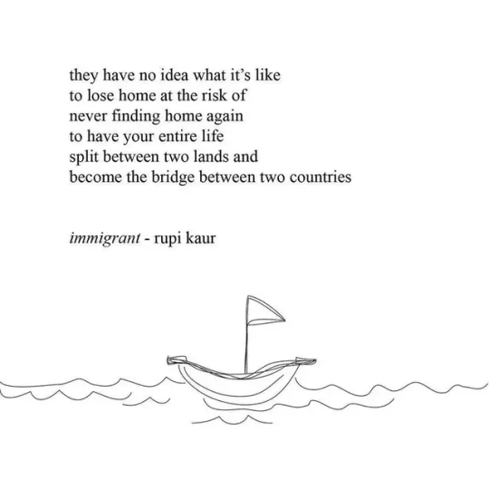
Although Rupi Kaur is a poet she does incorporate small line drawing illustrations which I have slowly started to enjoy designing, but its her poets that related to me more on a deeper level within my culture that made me pick her as one of my creators. Rupi herself is a Punjabi women who had come from an immigrant family herself which is why I feel as I relate to her so much as she tries to show that we aren't alone in experiencing this in a 'desi' household. Even her abstract use of illustrations I can take this inspiration through when I create my poster and how I layout my artefacts. Besides her actual work Rupi as an individual as she feels like your mother or you feminine solder sister when your reading her poets.
Stevan Sagmeister - Graphic designer + Typographer (Practicing today)


I've been inspired by Stevan's work since I was in high school but growing in the design area as compared to thigh school I've also expanded on why I really feel inspired by his work. I love that he expresses his expressions through typography and photography images and the fact he actually uses himself through these projects. As much as I love my work to look clean I love the feel that there's more of a human touch to the work and that's where the handwritten typography comes through and pen/paint marks that are seen in some of his pieces as scribbles and especially for this project of showing my identity as a creative I feel like I use my Punjabi Sikhi handwriting and incorporate them into my pieces. Also my goal for this project is to use real life imagery and although I don't want to use a grid system, I want to attempt combining handwritten typography like Stefan with real life images.
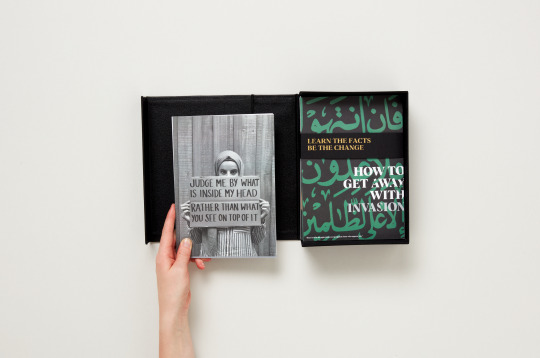
Joel Kitto - Graphic Designer


This project that Joel Kitto worked on with Stevan McCarthy is one of my favourite projects as not only how society got to engage with the pieces but again knowing that it just looks like it's got the human touch and I wanna explore in using bright neon one colour palette, sometimes less is more and that's what this project reminds me of. Not every poster has to be ideally identical when the design system is into play, you can have fun and spread just as a meaningful message.
Bob Gill - Graphic Designer (Dead)

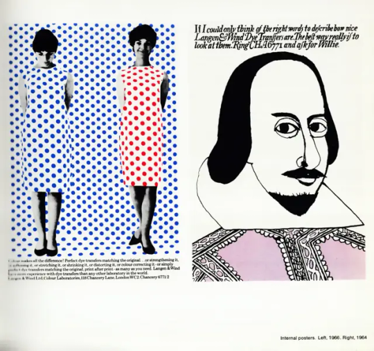
Bob
0 notes
Text
Wizardess Heart OC: Berry Linette
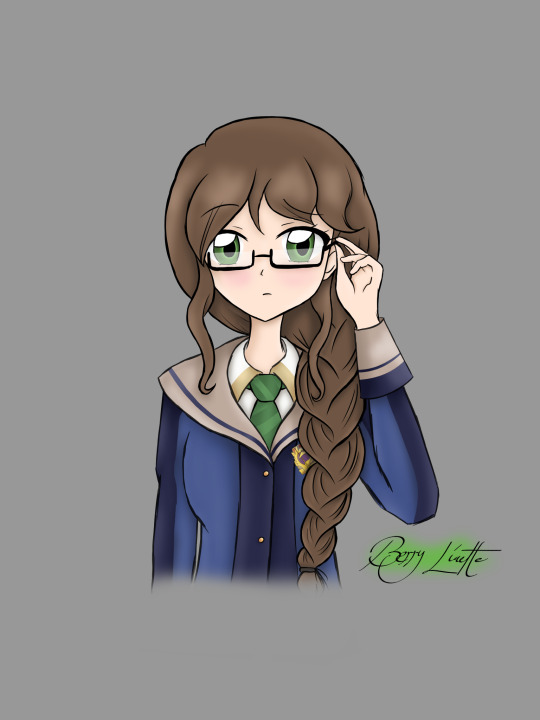
Back at ya with another Wizardess Heart OC! First of Season 3, hope you like!
“I’ll do what I can to assist you... and that’s a promise.”
Likes: Plants and animals, working outside Dislikes: Spiders Hobby: Reading all kinds of books Skill: Great memory and impressive intelligence
By Liz: “I’ve known Berry for a while actually! We grew up in the same village and our circumstances were pretty similar, so I guess you could say we got along pretty well. I know she’s really clever, just not all that good at being sociable. That’s okay, though, because she’s a great friend regardless! Her magic seems pretty interesting, but I know she’s more interested in learning about it rather than learning to use it. She knows so much about magic, it’s actually really impressive! Maybe I could ask her to help me out some time?”
Birthday: 2nd February (Aquarius) Spirit Animal: Owl Friends: Nori Kahuna (Roommate), Yuelia Luminé, Liz Hart
So, Berry this time! Similarly to Clara, I finished her a couple of days ago but felt it was more appropriate to wait until her birthday! I really hope you like her. Berry was my profile picture for quite a while before I switched a few weeks ago. Berry was one of my first ever OCs and holds a special place in my heart, so I absolutely had to do her justice. Plus, I drew her just recently for New Years, so I knew this had to be better! I really hope it is, I really wanted to show I’d improved a bit lately haha She was surprisingly fun to draw actually! And here I thought she wouldn’t be done before the end of the week! Her line art came together much faster than normal, plus I did her colour palette ahead of time so she’d be easier to colour. I really hope you like her!
As my first and one of my favourite OCs, as well as the first of season 3, Berry is obviously paired up with Joel. I know canonically, Joel was Liz’s childhood friend and has feelings for her but cmon, this is a fanfic and I’m not gonna change much! He was still Liz’s friend, but he was also Berry’s too! So I’m just tweaking the story a little 😅 Plus, I think these two would be a really sweet match, without a doubt one of my favourites!
12 notes
·
View notes
Text
Week 12 - project review & thoughts on semester
Hokusai's 36 views of Mount Fuji were all made employing a new pigment that had recently been made available in Japan. That pigment was Prussian Blue (the colour that cyanotypes are), a colour that I have spent the past semester getting to know quite intimately.

This is Yoro Waterfall in Mino Province by Hokusai. While not one of the 36 views, the vibrancy and gradient of the waterfall never fails to attract me when put against the soft creamy greys and greens. It interests me to think how each of these prints would have been different, how the colour gradient would start to fade and the image morph slightly through the printing process on the woodblock.
I began with this print for a few reasons, but most immediate I think is the element of reflection. Having had a few days since I bound my books and laid them on the table, said "thank you" and "goodbye" to many, I wanted to take some time to reflect on the first half of this year, and this project. Despite the intense period of work over these past few weeks, I have come away feeling happy, interested, excited, and also foot-achingly tired.
I think that I have started to understand the appeal, or maybe the purpose of the university much more in this one semester than in all of last year. There are many reasons for this: not being in lockdown, more certain of myself and what the process is, starting anti-depressants, seeing a psychologist, a brief that interests me, and exploring all the facilities available.
Having Spatial Design turn from something that I viewed as largely a thinking, drawing, 3D-modelling experience, into this explorative, "try-as-much-as-I-can-and-see-what-happens" has made all the world of difference. Getting involved, learning new processes and methods, reigning in the perfectionist, negative voice in my head which says "You shouldn't try doing this unless you know you can do it", and instead getting in and making things, and having them not be perfect, and being okay with them not being perfect, has been nurturing. I wish I could explain to you how good, how much fun I had in the bindery on Thursday, my deadline in an hour, but there I was perched on my seat, pulling a needle back-and-forth and loving it. At the end of our second semester last year, I didn't want to think about Spatial Design, I didn't know if I wanted to keep doing it, I didn't want to remember anything I had done. Now since finishing, I want to go back and learn more. I'm thinking, "How could I combine screenprinting, book binding, and pottery into my next semester?"
I would not describe myself as an artist. For some reason, I have a restricted definition of what an artist is, only when applied to myself. I cannot draw or paint to the level that I wish I could, and so I do not consider myself an artist. But I think that perspective is morphing, I am starting to find different mediums and skills that I can bring together and turn into an art form -- maybe I haven't felt like an artist because, honestly I don't think I like drawing that much compared to working and moulding clay, exposing cyanotypes, or marking out the spaces on a cover sheet. Having this definition of myself change is both something exciting, but also kind of scary?
There are some things about this project that I just finished which I am not happy with. I think I forgot to put my scale on my elevations, the lines turning out black in the cyanotypes, and I'm worried that my material palette wasn't really what was intended but that's okay! No project will be perfect, and I'm not expecting them to be anymore. It is a demarcation in time of where I started and where I ended, and I feel like I've grown in that time.
In fact, for once I am less concerned over the mark that I get from this project because I already feel that I have come away so much richer from this learning experience. I had fun, I've opened a lot of new doors, I've made connections with technicians, I've broadened my knowledge and my definition of myself, and that's more important to me.
I'd briefly just like to say "thank you" to Xaiver and Nooroa for all their guidance and support, all the technicians who taught me things, and my peers in studio for helping keep me sane and providing endless opinions on aesthetics.
Thank you for reading my documentation for spatial fabrication 601, I hope that it informed you of the journey this project and I went through over this time period.
Sincerely, Joel
0 notes