#jennet liaw
Photo


Pretty Historic Season 1, Dish Granted Season 3 & July-Sep 2022 misc: Watcher logo closed captions
We Attempt To Decipher British Slang (Feat. Korean Englishman) Jul 13, 2022
We Tried Cleopatra’s Makeup Routine • Pretty Historic S1Ep1 Jul 22, 2022
We Tried The Extravagant Wigs That Killed Marie Antoinette • Pretty Historic S1Ep2 Jul 29, 2022
Shane, Ryan, and Ranboo Play A Horror Game • Part 2 Aug 3, 2022
We Bathed In Wine Like Mary Queen of Scots • Pretty Historic S1Ep3 Aug 5, 2022
I Made $880 Street Food For Ronny Chieng (from Shang-Chi, Crazy Rich Asians) • Dish Granted S3Ep1 Aug 12, 2022
We Made A $514 Cake for Zach Kornfeld from The Try Guys • Dish Granted S3Ep2 Aug 19, 2022
We Made A $270 Breakfast for K-Pop Star Eric Nam (에릭남) • Dish Granted S3Ep3 Aug 26, 2022
Homemade Vs. Microwave: Korean Meals Sep 7, 2022
We Made $500 Fried Rice For Uncle Roger • Dish Granted S3Ep5 Sep 9, 2022
Are You Scared of Smiling? Sep 19, 2022
Logo Designed by Jennet Liaw
Logo Sound Design by Yuta Endo (@yuuutaendo)
[previous]
125 notes
·
View notes
Text
Graphic Design Institute in Pune
Graphic design Institute in Pune helps to communicate effectively with the audience because visual aids are better at conveying ideas. Compared with text, creative designs, informative graphics or pictures can convey ideas and information more effectively.
5 Graphic Design Techniques to Boost Your Creativity
Looking to bolster your toolbox of graphic design abilities? To help you get started, we've gathered the top 5 skills in demand.
Whether you're a seasoned graphic designer or just starting out, it's beneficial to keep pushing oneself in your field. A strong and constantly developing skill set in graphic design not only keeps you on your toes and scratches that itch to always be better, but it also increases your marketability. The following list of five graphic design talents is a wonderful place to start.
1. Creating Actual Merchandise
Using goods to bring your graphic ideas to life is a quick and effective approach to monetise your work. Additionally, regardless of prior ability level, anyone may master this new skill. Designing pins, patches, stickers, t-shirts, posters, and hats—basically anything tangible you can create for other people's or your own businesses—is what we're talking about here. In his new Skillshare course, Aaron Draplin looks back on the previous 15 years he spent producing goods and pulls out the most interesting details. The best vendors that can make your designs a reality, "un-mess-with-able design files," and which on-screen designs transition best into the real world are all things that students will learn how to recognise.
2. Logo design and Branding
Although it can appear simple enough, branding requires a highly refined graphic design talent. After all, a customer's initial impression of a business is frequently its branding and logo, which may affect their desire to learn more about a product. In that way, a company's investment in a well-designed logo and strong branding can pay off. This skill set combines colour, spacing, font, and imagery; it also calls for an understanding of the brand itself and how people react to it.
3. Decorative typography
Graphic designers frequently communicate through visuals, but adding stunning, individually decorated typography to your toolkit as an artist will swiftly advance your abilities. Typography, which is essentially words transformed into art, may frequently be utilised to elevate designs and, occasionally, more clearly (and quite literally) transmit messages. The practise of producing your own letters, known as illustrated typography, offers your design more personality. There are numerous methods you can use to develop your own own illustrated typography, as is the case with every design. For example, Jennet Liaw employs a 3D technique to create "unique-yet-legible" pictures, but there are also more obvious choices, pop art aesthetics, and other things to learn.
4. Motion Planning
Motion design, which combines music and moving images, elevates an artist's ability to communicate with others to an entirely new level. Most types of graphic design communicate to the spectator in some way. It's simply visual storytelling transformed into action, a graphic design ability that may be used to produce eye-catching commercials for businesses, significant campaigns around timely issues, understandable explainers of complex subjects, or just pure beauty. It makes more sense for graphic designers with a broad background to take on motion design because it isn't a skill that can be learned overnight. Nevertheless, the process of learning the art form itself may be very rewarding. You can start by taking small bites and working your way up the ladder.
UX Design, 5.
Our lives exist equally "in the real world" and "online," one would contend. Regardless of your position, it cannot be denied that customers are spending a lot of time perusing retail websites. The user experience, or UX, is extremely important and has many different aspects. The creation of a user-friendly website is the ultimate goal of UX design, thus the designer must seize every chance they can to make surfing enjoyable. This indicates that it is simple to use, provides few cognitive challenges, is stunning to look at and quickly makes an impression, and makes purchasing or learning about the business, the person, or the purpose simple. Having expertise in UX design can make you a sought-after commodity in the market. Many people view it as a hybrid of graphic and web design.
Don't feel like you have to master all five of these graphic design abilities at once because they range from simple to difficult. We challenge you to pick one from this list, based on your present proficiency level, and to start learning it right now.
0 notes
Video
youtube
watching illustrations with Rob Zilla and I'm super excited
#Illustration#illustrator#art#adobe#adobeillustrator#adobe photoshop#nike#rob zilla#jennet liaw#youtube#livestream#graphic art#digital art
1 note
·
View note
Photo


AIGA Rhode Island hosts another series of KnowHER design talks in 2017!
Running on Thursdays through the month of March, each ticketed talk features a designer talking about her work and her experiences.
Bonnie Siegler :: March 2, 2017 (info)
Leta Sobierajski :: March 9, 2017 (info)
Naz Arandi :: March 16, 2017 (info)
Jennet Liaw :: March 23, 2017 (info)
Kelli Anderson :: March 30, 2017 (info)
Are there any upcoming events featuring female designers in your neighborhood? Let us know!
#Bonnie Siegler#Leta Sobierajski#Naz Arandi#Jennet Liaw#Kelli Anderson#women of graphic design#graphic design#typography#graphic design events#female designers#female graphic designers#AIGA Rhode Island
79 notes
·
View notes
Video
youtube
(via https://www.youtube.com/watch?v=zv3ocH-BGUg)
New video up about my character development process!
#discovering nicole#creating a character#character development#original character#oc#writing#writer#inspiration#moodboard#jennet liaw#creative writing#story#california#stanford#youtube#youtuber#smalltuber#art#graphic designer#photographer#student#ut austin#austin#texas#university#video#writers of tumblr#illustration#english major#weheartit
1 note
·
View note

Photo
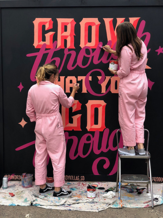

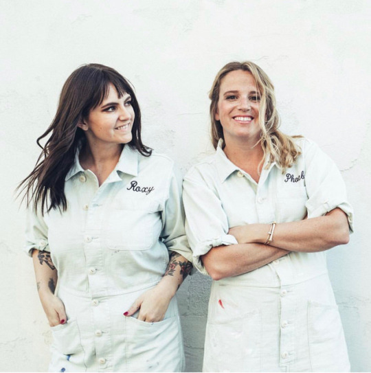

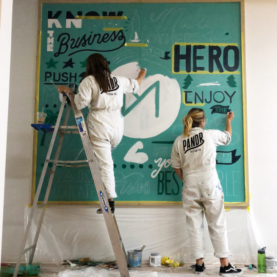


ART SCHOOL | INTERVIEW WITH PANDR DESIGN CO.
Obsessed with typography, bright colors and painting, art duo Phoebe and Roxy banded together after a meet-up group for other lettering enthusiasts to form Pandr Design. Known for their bright colored and beautifully lettered murals, these two bad-ass muralist have painted pieces on various businesses as well as the Albuquerque Mural Fest. We’re excited to chat with them to find out about their motivations, process, and upcoming projects!
Find out more about this dynamic painting duo by taking the leap below!
Photographs courtesy of the artist.
Introduce yourselves.
Our names are Phoebe and Roxy and together we run Pandr Design Co., Drunk on Lettering, and Ladies Who Paint. Pandr is our design business...we mostly paint murals! Drunk on Lettering is our crazy podcast where we interview different creatives each week over drinks via Skype. Ladies Who Paint is the non-profit we recently started. It's the first all female mural walk set to take place in San Diego this September!
Tell folks a little about the work and artwork you both make and what do love about what you do?
Our work consists of different styles of lettering and bright colors. It's usually in the form of a mural, but we also do a lot of social media graphics and wallpaper. We love painting murals because it always has such a "wow factor". Seeing the rendering on a screen is ALWAYS different than seeing it larger than life, in-person.
How did you both start collaborating with each other? What was that like, and why did it justmake so much sense?
We started collaborating when we started a meet-up group for other lettering nerds in San Diego. We were planning and hosting lots of events, and then started creating little products here and there like stickers and post cards. Our styles meshed really well, and we had a lot of fun working together! Then we started getting commissioned to do bigger projects, and it quickly turned in to a business.
A lot of your artwork focuses on typography, color and design. Can you tell us what initially drew you to explore this particular aspect of art, and what was the most interesting thing you discovered as you explored it as artists?
We both were obsessed with lettering on the side of our full-time jobs. We were posting to Instagram constantly and very much obsessed with what other lettering artists were doing on the platform. We used to work with pencil and Sharpie before iPad Pro times, so that's definitely helped to streamline our process and allow more experimentation with color. It used to be that we spent so much time drawing on paper and vectorizing. Now we can draw it instantly on our iPad, mock the design up on a photo of the wall, and boom we have a mural! We're always trying to push the envelope with color in our murals.
When working on a mural or collaborative project for a client, what is your process like? Do you start with research and then fill up your notebooks? What is your approach?
It's always different. Sometime the client has an idea of exactly what they want and other times they have no idea. Our job is to make their dreams come to life in the most successful way possible. Our goal with our murals is to draw attention to the client's business via social media. A lot of the time education has to happen that the mural cannot be an advertisement, otherwise people aren't going to want to take photographs with it.
As for the actual design process... we start with mood boards. The client will tell us which images they're drawn to and that serves as inspiration. Then we start sketching. We provide the client with three finished renderings, mocked up on the photo of the wall. Roxy designs one, Phoebe designs one, and we collaborate on one...that way they're getting three different looks!
What particular collaborative project was your personal favorite and why?We really loved our mural that we did for the Albuquerque Mural Fest this fall. It was a feminist piece and we got to use all the colors we wanted! It had a mixture of different type styles and also played around with transparency.
Finally, what medium haven’t you tried that you’d definitely like to get your handson?
We have never used spray paint and we know that we need to learn. It's a whole different animal than painting with a brush.
What art tools are your go-to?
We would be absolutely lost without our iPads. Pen and paper is great but it is so slow. We're businesswomen so time is money and the iPad saves us hours. Other than the iPad we use FrogTape and whatever house paint we can get our hands on. We're not loyal to any paint brands!
What do you love about where you live, and what is the art community like in your area?
We live in San Diego so there really is no better place on the planet! We were just painting in the rain and wind in Philly and that was pretty miserable. San Diego has year-round amazing weather. The art community is also pretty great. As we said, we've started a non-profit and the community has been amazingly supportive. We're excited to see it take off!
Who are some artists that you’re inspired by and have influenced you throughout the years?
Gemma O'Brien, Ashlee Jones, Georgia Hill, Jennet Liaw, Cyla Costa, Tierney Milne, Pepa Ivanoff, Jessi Raulet, Alli Koch, Mary Kate McDevitt, Rachel Joy, Lauren McElroy, Lakwena... the list could go on forever!
What’s been the most challenging part of your art careers? What’s been the most rewarding?
The first year of our business together was pretty rough. We had no idea how to price, negotiate, sign contracts, etc, However, we figured it out and now it feels pretty rewarding to be financially stable. We moved up tax brackets this year and that's something we could have never fathomed before!
What do you do to keep the balance?
We try to unplug and take off when we can. It's easy to work 24/7 when you own your own business. We also get a lot of massages!
What’s your advice to folks who see what you do and want to pursue it as a career?
There is no certificate for mural painting that you need to have before you get started. The worst thing that can happen if you screw up is that you have to paint it over. So many people get in there head and are too scared to try, but that's a waste of time! You learn better by doing. Just try it out.
What are your FAVORITE Vans?
We are both huge fans of the classic black Sk8-His.
Finally, can you tell us about any exciting things you’ve got coming up?
Many exciting things! We have a goal of painting in all 50 states and we're about to get number 17, we have a book deal in the works, we're doing a TedX talk, and we're about to paint for our first NFL team. Stay tuned!
FOLLOW PANDR DESIGN CO. | WEBSITE | INSTAGRAM
128 notes
·
View notes
Photo


Designer Spotlight: Chip Kidd and Jennet Liaw
For this project, we chose Chip Kidd, who is most famous for his clever book designs, as the professional designer we want to talk about. Among many of his books cover designs, I really love the “Naked”, “Dry” and “Seek My Face” cover. I love that the design is very simple and can convey the meaning of the title and the book itself. In the “Naked” cover, if you remove that dust jacket, on which is an image of a pair of shorts, you will see an x-ray of the hip, as if you have just stripped the book naked. The same literal depiction of the book title is also seen on the “Seek my Face” cover, which has an image of a painted face of a man without facial details. I find this technique very clever and impressive that it makes me want to immediately buy and read the books. In contrast with the literal “Naked” and “Seek My face”, the “Dry” cover shows an effect of melting letters on a plain white surface. The melting contrasting with the title Dry makes it even more interesting and evokes the curiosity of the viewers.
The young artist Jennet Liaw also has many beautiful works with clever ideas. She works mostly with typography and illustrations. One of her illustrations that I chose here is the work called “Phases of An Idea”. I love the unexpected transition from the moon phases to a lightbulb - the symbol of ideas. The design has a rusty effect which makes it even more interesting. I also love her typography of the word Louder, in which she incorporates the increase of letters’ size to illustrate the meaning of the word itself. The values transition reminds me of a combination of gradient and figure-ground technique.
I really enjoy looking into these clever designs and the similar design characteristics of a professional and a young designer. These designs make me think about what to put into my designs to impress the viewers and how I should develop my design ideas in the future.
5 notes
·
View notes
Photo


CHIP KIDD
Well known for his design for the “Jurassic Park”, I am actually drawn to Chip Kidd’s playfulness in this design. I first heard of him actually when I was watching a bunch of TedTalks and his was about book covers. I was immediately drawn in by his dumb clever designs. The thing about Chip Kidd is that his designs are not my particular type, but for some reason I’m still drawn to its slight humor like the hand in the similar form of the fork or the wet typography for the word dry. His style truly shows his personality which I think is the reason why his works still stands out to me.


JENNET LIAW
So Jennet Liaw is someone I casually came across on Instagram back in high school and she was ultimately the person who inspired me to do graphic design. She is from California, graduated from UC San Diego and started off doing small company branding. She was later contacted to work for Nike and help design some of their merchandising. I think Jennet’s background is really cool and humble despite being on the fast track to quickly working with higher companies now like Uber and Adobe. However I don’t blame them. The reason I am so attracted to her works is because there like is like a fluidity to her work. She plays a lot with typography to the point it looks like an illustration at the same time in which was my first introduction of typography and learning how we can take it to further and creative matters. Despite being a new graphic designer on the playing field, she is someone to definitely watch out for and someone I honestly look up to.
6 notes
·
View notes
Photo


Designer Spotlight pt. 2
Jennet Liaw
Kathy brought young designer Jennet Liaw to my attention, and I am so happy she did. After scrolling through her Instagram, I quickly got a good sense of her style. She tends to stick to a pretty neutral color pallet but adds a flare to it. For example in her Uber gift card design (the “Explore Dream Discover”) she uses a brush-like feature and blush color to give the type a creamy, organic feel without distracting from the words themselves. My favorite piece of Liaw’s is her collaboration of the 2020 Olympics with Coca-cola. I think it was very creative to cut the design in the middle. I also like how seamless the combination is, it’s not focused too much on either part but equates them.
I also admire the fact that she uses her art for a purpose, to spread positivity. The “Louder” piece is her take on the ever-growing Women’s movement (that voices are getting louder).
1 note
·
View note
Photo


Puppet History Season 5 + Dec 2022: Watcher logo closed captions
How Hippo Meat Almost Saved America • Puppet History S5 Ep 1 Nov 11, 2022
The Defenestrations of Prague • Puppet History S5 Ep 2 Nov 18, 2022
The Vietnamese Sisters Who Fought An Empire • Puppet History S5 Ep 3 Nov 25, 2022
America's First Black Aviatrix • Puppet History S5 Ep 4 Dec 2, 2022
The Bloody Life of England's Fastest Surgeon • Puppet History S5 Ep 5 Dec 9, 2022
The Dreadful Demise of the Dinosaurs • Puppet History S5 Ep 6 Dec 16, 2022
Behind the Scenes of Ghost Files, Puppet History & the People That Made Them • Making Watcher 4 Dec 23, 2022
Steven Eats Through Korea for 24 Hours Straight Dec 30, 2022
Logo Designed by Jennet Liaw
Logo Sound Design by Yuta Endo
[previous]
39 notes
·
View notes
Photo

I chose two phrases to redefine for my campaign, one of those being ‘Boys will be boys’. This is mainly targeted towards the Gen Z male demographic. Therefore, I drew inspiration from artists like Jennet Liaw and Adam Bosley whose styles are considered “trendy” for the younger generation. I imagine these designs to be used in streetwear apparel that could be purchased; the profit made will then be donated to a cause that targets to combat sexism.
0 notes
Text
A list of Graphic Designers and what I like most about their work
Alex Trochut
Unique use of lettering and typographic practice.
Leta Sobierajski
Mixing graphic design elements with photography. Something I really want to try after seeing her work.
Ben Grandgenett
His work is very clean and simple, little to no colour. In my opinion, this makes a bold statement which makes his work stand out.
Wednesday Holmes
Very bold and bright colours. I love cartoon graphics and simple illustrations. Her work is mixed a lot with streetstyle and fashion which is something I want to do with my work.
Timothy Goodman
Bold lettering and typography, I think his style is very interesting to look at.
Christina Moreland
Fun cartoons, feelings of positivity come from her work.
Steven Harrington
Very modern, cartoon graffiti style. I see his art a lot in street fashion and I think it is very unique and fun to look at.
Luke Choice
Likes to describe his work as ‘story telling through visual design’, I love the 3D shapes and bright colours.
Anthony Burrill
Works with big, bold typography, famous Leeds building mural.
Jennet Liaw
Jennet has really good use of texture in all her art works and this is something I love seeing and what to creating in my work.
Jon Contino
Uses very thick and bold lines. His work reminds me of traditional tattoo styles.
0 notes
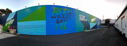
Photo


San Diego Street Art
Artists: Jennet Liaw & Ladies Who Paint
photos Jon Pinter
0 notes
Photo


TOP 10 ILLUSTRATIONS!!
Out of these 10 illustrations, my absolute favorite is Jennet Liaw’s Portland illustration (photo #6). What makes it such an interesting illustration is its combination with typography that truly shows the multiple identities of Portland; instead of plainly listing what Portland is/has to offer, Jennet successfully illustrates on each letter Portland’s weather, food, and locations. Additionally, her unique composition of the words really grabs your attention. Words are usually read horizontally, but she chose to illustrate them floating/overlaying vertically on top of each other. I personally believe a great illustration is one that ventures beyond and captures your eyes; it’s amazing how people can take one item and turn it into another as seen in these other illustrations.
2 notes
·
View notes
Photo


Ghost Files Season 1 (first 4 eps) & Oct 2022 TMS misc: Watcher logo closed captions
The Death Tunnel of Waverly Hills Sanatorium • Ghost Files S1 Ep1 Sep 23, 2022
Evidence of Waverly Hills Sanatorium • Ghost Files Debrief S1 Ep1 Sep 28, 2022
The Ghostly Prisoners of Alcatraz • Ghost Files S1 Ep2 Sep 30, 2022
Evidence of Alcatraz • Ghost Files Debrief S1 Ep2 Oct 5, 2022
The Nightmare Nuns of St Ignatius ft. Garrett Watts • Ghost Files S1 Ep3 Oct 7, 2022
Evidence of St. Ignatius ft. Garrett Watts • Ghost Files Debrief S1 Ep3 Oct 12, 2022
The Devil Baby of The Hull-House Museum • Ghost Files S1 Ep4 Oct 14, 2022
Ryan and Shane Get Drunk and Read Your Worst Nightmares - Too Many Spirits Oct 17, 2022
Evidence of Hull-House • Ghost Files Debrief S1 Ep4 Oct 19, 2022
Logo Designed by Jennet Liaw
Logo Sound Design by Yuta Endo
[previous]
#watcher logo#watcher entertainment#watcher#ghost files#ghost files debrief#too many spirits#simone mallec
39 notes
·
View notes
Last Seen Blogs

managedstaffing
Untitled
marinesvehicles
Elegance Marine Sea Vehicles Jetcar +905331475100

chinaash4
The Journey of Churchill 700

marin-popov
felled in the night by the ones you think you love

chinnacharydev
Untitled