#its a bit wonky but the font fits way too good
Explore tagged Tumblr posts
Visit Tumblr Blog
Explore Tumblr blogs with no restrictions, modern design and the best experience.
Last Seen Tumblr Blogs


Fun Fact
Tumblr.com is the 103rd most visited website in the world.
Text

Inspired by @atherix Midnight Series
-- Click for better quality! Sketch under the cut! --
#Freddy draws#midnight series#hermitcraft au fanart#travel poster#this is the first one i did#the one that started it all#its a bit wonky but the font fits way too good#like actually fits PeRFECTLY#very obviously referencing one part of the story#In general that arc was just anticipation after anticipation after a-
49 notes
·
View notes
Note
⭐️⭐️
Dealer’s choice! I decided to go with Your Own Hands but couldn’t narrow it down to just one bit. So here’s my commentary on two sections instead lol
From #13:
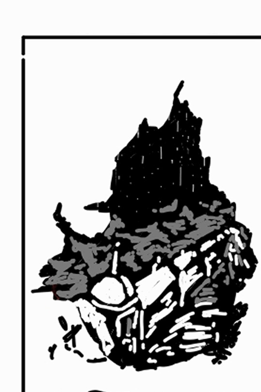
The machine’s base is a vast crucible, stout and steep sided. Pipes conveying in heat encircle the sides. The superheated air above it shimmers, transparent patterns twisting in the air as the molecules writhe. Pooling inside the cup of the crucible is a pool of liquified obtenteum.
Bathed in the fuel’s toxic green glow is Averruncus' heart; an octahedron bigger than a mech, hovering in the air as if it is beyond the purview of physical laws that everything else has no choice but to obey. Each of its identical faces is roughhewn like stone, and a shade of black that seems to swallow all light that falls on it and give nothing back.
Below the octahedron the obtenteum withdraws, repulsed, pressed flat to the crucible and rising up the sides like liquid in a centrifuge. It is flowing up the crucible’s walls like waves on a vertical shore.
Okay, so, I reallywanted the causality-breaking-machine itself to feel unnatural and wrong. What it does is so implausible, like everything depends on cause and effect to exist at all. While plotting out YOH I found that trying to consider what that disruption would do to pretty much anything straight up hurts to think about if you try to do it too in-depth lol. I decided to lean into that and give the machine an appearance that also communicates that this thing should never have been able to exist to begin with.
It was partly inspired by the vibe Tarantulas has in SotW’s too. Stuff like the way that his hybrid organic-Cybertronian nature, and the wonky shape and distinct font of his speech bubbles, frame him as an aberration in the narrative. An intruder into the story. Averruncus is very much Tarantulas’ creation, and I wanted to communicate that by sharing the feeling of wrongness that its creator is marked by – Tara’s hybrid nature inspired the sentence “As the octahedron rises above the lip of the crucible it contracts like an organic heart, the sides dropping back down to squeeze out the liquid,“ as well, actually. Organic imagery where you would expect a more mechanical simile. Also kinda gross, which is a good fit for Tarantulas’ vibe too.
The other big inspiration for Averruncus was the gravity drive from the movie Event Horizon, because that thing looks cool as fuck. I saw EH for the first time while writing Your Own Hands, and the gravity drive had a real impact on me. Mad kudos to all the people involved in designing and building it, I mean just look

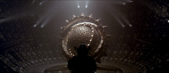
so the gravity drive ended up being part of the creative foundation I built on to design Averruncus’ appearance as well
I also wanted to talk about snippet #2, because the stuff in #2 is actually the very first thing I wrote for YOH; I was originally going back and forth on whether I should sign up for the Big Bang, and decided to mock up a little section of the idea I’d picked out to potentially do for the event to get a feel for what writing it would be like. A lot of the approach I wanted to take to the theme and these characters got nailed down in that trial run (which also made it very exciting that this was the scene ashals-dream chose to illustrate). The section's too long to quote the whole scene, so I’ll do some choice bits:
This time he has relocated to a beach. His lure lies nestled on the sand, signalling while he investigates the nearby rocks, captivated by a tenacious little specimen of Niebla Effusa.
Lichen. The composite of fungi and cyanobacteria – or fungi and algae, of course – that possesses characteristics neither of these individual species do in isolation. Two individuals with one form, like an inversion of the typical Cybertronian’s nature for a single individual to have two forms. He longs to collect samples, but they would only go to waste. There is no time left for passion projects.
This is the point where I started to feel like I’d gotten Tarantulas’ pov nailed down. It felt right that he is constantly assessing the world around him through the lens of a scientist’s curiosity, and in an environment it’s the things that appeal to the curiosity which receive special attention from the narration (the composite nature of lichen is something I learned about from Entangled Life by Merlin Sheldrake, which is a great read. Highly recommend)
Whipped onto the rocks by the buffeting wind, waves crash onto land, reaching for the sky until they dissolve into white foam that falls to fleck Tarantulas’ carapace with salty droplets. Prowl is too distant for the fine mist to reach him.
Distance is something I’m often thinking about with these two. The psychological/emotional distance between them is something of a blind spot for both Prowl and Tarantulas; they each think they have a particularly good read on the other, and in some ways they do… but there are key places where they really don’t, and neither is self-aware about those deficiencies. It gives the two of them a knack for unintentionally taking the absolute worst tact with each other – like how chronologically later in the fic Prowl manages to, from an interpersonal standpoint, completely fuck up in the way he saves Tarantulas’ life and be taken by surprise by the fallout. By noting the physical distance between them in this first meeting, I was hoping to gesture at that interpersonal disconnect too
“And what is it that you need, Tarantulas? Why have you been playing this game?”
Tarantulas walks up the dune, leaving the lure in the sand. He won’t need it again. Prowl is going to say yes. It truly is his only option, this time.
He walks right up until he can see himself reflected in that cold blue optic, until the muzzle of the blaster presses into his chest. There is nothing to fear from the gun. There isn’t a weapon in the world capable of making a difference to him anymore.
“This time, Prowl, I need your help.”
A physical distance that Tarantulas is the one to close, in the same way it’s his decisions later on that puts them on a path where closing that emotional distance becomes possible, and turns them away from repeating their damaging cycle but with Prowl as the person consequences splashed back onto this time around. Also, here’s the first place I decided to bring in the emphasis on Prowl saying ‘yes’ that comes up several times across YOH, to tie it into that thread from SotW.
I also really enjoy Tarantulas’ bring completely unconcerned about walking right up to the gun here. He might have decided that he’s okay with having to die in order to get causality stabilised, but he knows that until then Averruncus’ intervention means that he cannot be killed. Tarantulas’ confidence in the face of a deadly weapon is drawn from the total confidence he has in his own work
#satellite speaks#satellite writes#indexing tags:#tarantulas#prowl#prowl/tarantulas#Your Own Hands#ask meme
3 notes
·
View notes
Text
2020 Maserati Quattroporte review: Where's the emotion?
New Post has been published on https://appradab.com/2020-maserati-quattroporte-review-wheres-the-emotion-2/
2020 Maserati Quattroporte review: Where's the emotion?
The Quattroporte is easily one of the most expressive cars in its segment, although it’s not like the competition appears to be trying very hard.
Andrew Krok/Roadshow
Alfa Romeo and Maserati are two different Italian brands in the larger Fiat Chrysler fiefdom. Alfa feels like its own automaker, with evocative styling and parts you’d be hard-pressed to see anywhere outside another Alfa Romeo. Maserati, on the other hand, is more of a corporate luxury brand, borrowing more from its family in pursuit of creating smooth, comfortable cars. In that sense, the 2020 Quattroporte follows through with its intentions, though I can’t help but wonder if the ol’ trident is double-dipping too many of its chips.
Like
Comfortable cruising
Hushed interior
Excellent infotainment
Don’t Like
Lacks emotion
Chrysler bits everywhere
Drivetrain needs refining
(Almost) all in the family
When Maserati had one sedan, it was easy to figure out which it was — it was that one. Now there are two, though, and it’s surprisingly hard to tell the Quattroporte and Ghibli apart. Perhaps that’s just a sign of the times, considering I havethe exact same issue trying to figure out whether a blur on the highway was an S-Class or an E-Class, a 7 Series or a 5. But while its Teutonic competition has kept things staid in recent memory, Maserati’s styling is at least distinct. The front grille’s odd cut and small opening remind me of the QPs of yore, while curves and cut lines abound from the headlight to the trunk lid, although some of it gets lost in my tester’s base white paint, as delightful and pearlescent as it is.
If the exterior does its best to stand out, the interior plays it closer to the chest. This Quattroporte SQ4 is the GranLusso variant, which ratchets up the luxury to focus on plushness, unlike the sportier-looking GranSport. There’s a whole lot to like in here, whether it’s the matte wood with its tactile grain or the leather that’s just about as soft as I’ve felt in a sub-$250,000 car. It all intermingles on a nice, if simply designed, dashboard. The real visual effort comes through in the door panels and seats, where there are plenty of neat stitching and more high-quality materials. A massive center console splits the car in two through to the back (a $4,000 option), leaving four individual seats that offer plenty of space to get comfortable, and the power-reclining rear buckets in my tester make this car feel equally nice for drivers and driven alike.
I can tell the Quattroporte will go over well with the Sierra Club sort because the interior is filled with recycled materials. The window switches are lightly chromed versions of what you find in the Jeep Cherokee. The wheel’s volume and channel controls are located on the back and feel exactly like the ones in every other FCA product. The protuberant headlight controls can be found by searching “2019 Dodge Charger interior” on Google. If this were any other FCA product, I’d be more inclined to forgive it, but this Quattroporte SQ4 GranLusso starts at $115,685 including destination. Any more bits from the late, great Sergio Marchionne in here and you may as well call it the Chrysler 900.
Despite a body the size of a naval warship, there isn’t a lot of space to put stuff in the QP. The door pockets have tall sides, so you can’t fit a large water bottle in there — or anywhere in the interior, thanks to the small, fixed-size cup holders in both rows. There’s a slot for your phone ahead of the shifter, which you can’t access with the front cup holder full. The center console armrest may as well stay shut forever, because the underlying cubby is shallow and won’t accommodate items thicker than a couple inches. The back row’s center console storage is much more voluminous, which doesn’t do the driver much good.
A mixed bag on the road
I can assume Maserati wants me and all owners to give the Quattroporte SQ4 the ol’ what-for on the road, since it’s loaded with adjustable vehicle modes, adaptive suspension and a plucky turbocharged V6. But the road to hell is paved with good intentions, and the Quattroporte doesn’t captivate me because it rides a weird line between sport and sedate.
The car’s baked-in luxury isn’t hard to suss out. In its default Normal mode, the adaptive suspension offers plenty of damping, soaking up most of Michigan’s nastiness. But the chassis was clearly designed with sporting pretensions in mind, its rigidity acting as a counterbalance to the plushness, a problem that air suspension — available on competitors, but not the QP — would help mitigate. Normal mode also features a throttle so softly tuned that smooth stops and starts are dead simple and repeatable, but it requires a surprising amount of push to elicit appreciable forward motion.
The QP’s cabin is quite nice, but any owner who’s spent time in any other modern Fiat Chrysler vehicle will find a lot of, um, remnants.
Andrew Krok/Roadshow
Most of the time, I leave the Quattroporte SQ4 in Sport mode, which tightens throttle response, holds gears longer and opens up a flap in the exhaust. It’s far more capable of responding to pedal adjustments here, letting the 3.0-liter, twin-turbocharged V6 make the most of its 424 horsepower and 428 pound-feet of torque. Thrust abounds across the tachometer’s sweep, and the eight-speed automatic transmission always seems to know the right gear to be in, even though it chooses to ignore eighth gear at all costs in Sport, even on the highway.
Changing the suspension to Sport all but eliminates body roll, but I wouldn’t call the ride comfortable. And considering there’s no way on Earth to mask this car’s mass, it’s not exactly rewarding to hustle on backroads. The active exhaust, to my ear, only seems to make the car louder after a cold start and during upshifts. Otherwise, those dulcet tones blend into the ether, which is kind of a letdown. I think it’s better for the folks on the sidewalk.
I appreciate that Maserati offers all-wheel drive on the Quattroporte, but I wish it were better. It’s great that the SQ4 trim tends to keep all that power heading rearward, engaging the front half when grip is requested, but I can feel binding within the AWD system at lower speeds, especially when leaving my neighborhood and heading onto a faster road. It doesn’t exactly build confidence, nor do I think it’s indicative of how a six-figure sedan should operate.
Bless you, Uconnect
Look, I know Maserati calls its infotainment system Maserati Touch Control Plus, but I bet it claims those window switches are unique, too. The telematics getup is a reskinned version of Fiat Chrysler’s Uconnect, and guess what? That’s great! Uconnect is an excellent system, with well-placed access to vital pages and menus that aren’t overwhelming in their density. Apple CarPlay and Android Auto are included, and daily actions like setting a navigation destination or pairing a phone via Bluetooth are nice and simple to execute. MTC Plus is far better than what Alfa Romeo came up with on its own — the first time or the second time — and it’s proof that not all parts-bin engineering is a bad thing.
A more elegant reskin would be the only thing I’d recommend change in the QP’s infotainment system. The rest of it is damn near perfect.
Andrew Krok/Roadshow
The second screen, which lives between the physical tachometer and speedometer, is less pleasing to my eye. While I love the sheer customizability of the display, capable of showing me anything from oil temperature to how the car’s all-wheel drive is delivering power, it is once again plucked from any number of mass-market FCA vehicles with little change beyond the background color. I suppose the learning curve is diminished if your other car is a Durango, but at the same time, if I worked my way up the ladder, I’d want something a little more unique. It’s good to have, but man, change the damn font or something.
The Quattroporte SQ4 is also thick with safety tech. Driver assistance comes by way of forward collision warning, adaptive cruise control, lane-keeping assist, blind-spot monitoring, a surround-view camera and parking sensors. The adaptive cruise can work in conjunction with the lane-keeping bits to hold the vehicle in its lane on the highway, and I appreciate the hands-on system’s ability to keep the car’s straight-ahead position without feeling too ping-pongy between the lines.
How I’d spec it
With an as-tested price north of $125,000, my tester is a bit too loaded up for my tastes. The ideal Quattroporte starts with the standard S, eliminating the wonky AWD and saving about $5,000 in the process. I’ll spend $400 to upgrade the wheels to ones that look good, and inside, I’ll ignore my tester’s more expensive leather option in favor of Zegna-branded seats that have a bit of silk in there. Otherwise, dropping $2,000 on a stereo upgrade and $300 for heated rear seats brings me to $113,885 including destination. Keep it simple.
Credit where it’s due: The QP’s key is unbelievably heavy, which makes it feel expensive. Other OEMs could learn a thing or two here.
Andrew Krok/Roadshow
Down to brass tacks
The Quattroporte’s chief competition comes by way of the Audi A8, BMW 7 Series and Mercedes-Benz S-Class, all of which lack the emotion present in the Maserati’s exterior design. However, each brings its own benefit to the table. If you want to feel like you’re in a sleek spaceship full of alien tech, the A8 is where it’s at. The 7 Series offers some decent driving dynamics hidden under its luxury, while the Merc is the choice for the person who strives for the pinnacle of plushness. All four are expensive.
The 2020 Maserati Quattroporte SQ4 offers plenty to like, but the question of whether or not it’s worth it is a personal one. It’s the only Italian executive sedan you can buy in the US, if that sort of thing matters to you, but its parent company may have taken familial resemblance a little too far in some areas. But if you want to stray from the usual pack, the Quattroporte definitely stands out.
0 notes
Text

Aaron Draplin is a graphic designer and author that runs his own design business called draplin design co and he was born in Michigan on October 15 in 1973. He has worked with big clients like ford and is well known for minimalism and more of a retro style.
After watching videos about his design process and analyzing some of his designs I took some notes about how he works and what he is interested in.
Uses simple shapes
Tries to create logos that are timeless
Enjoys vintage things and simplicity
He brings letter forms back to basics
Enjoys minimalism
Starts by sketching
Makes notes on texture and color
Makes sure a design will look good on things like websites and items
works with negative space
creates lots of duplication to help his idea generation and outcome of his product
Makes sure his designs work in all sizes
Experiments with shapes gradients and text
Experiments with different layout variations
3 examples of his work and my thoughts and options on them
Assembly.
This logo is a clean sleek geometric logo. You can see how he has created the icon for this as the letter A completely made out of triangles. Its clever because all of it is essentially triangles making it seem complex but really the shapes and design is minimal and the color pallet consists of different shades of blue with the bass of the design being dark shades of blue then gradienting to a lighter shade at the top. Underneath There is a nice sans serif font that’s not too bold but the weight and thickness of it is just right so you can clearly read it in a small and large size.
Peak Oil.
This logo is very minimal so it is simply a black and white logo. He has created the shape of the logo out of some sort of droplet to represent oil. He has used some techniques to add depth to this logo for example on one half of the droplet lines are taken out of it showing this negative space and it almost works as a shading affect. Another thing that he had done to make the type pop is put it in a black circle so its not lost in the shapes and negative space. For the text he has used a clean geometric sans serif font and used hierarchy with the work peak being larger than the word oil.
Nike.
His Nike logo is very text based and it look like a label. I really like this because it has a very vintage old school look to it. once again the general shapes are very basic and geometric but the lay out of all the different lines makes this logo look very strong and quick. Once again using hierarchy with his text as you can see in a more vintage looking serif nike logo at the top so you know which brand the design is for and about. One thing that I really like is the small iconic nike swoosh at the bottom which just makes a nice composition with the two nike logos being the bass and the top and then the rest of the type being centered in the middle of the box created by the geometric lines. This logo has a very simple color scheme as it just uses a nice bright teal cyan color and relies on negative space to create the back drop.


Saul bass
Saul Bass was born on may 8th in 1920 in the Bronx, New York were he was brought up by his Jewish parents. Saul Bass had a passion for art and he graduated from James Monroe High School in the Bronx and studied part-time at the Art Students League in Manhattan, He then went on to attending night classes with the painter György Kepes at Brooklyn College.
He started working in Hollywood in the 1940s were he worked making advertisements for print for films like Death of a salesman and The moon is Blue. A stepping stone in his career was when the director of The moon is blue asked Saul to design a film poster for the film Carmen Jones in 1954, The director called Preminger was so impressed with his work he asked him to produce the title sequence as well. After creating the title sequence he loved it and realised how it can positively enhance the film to the audience. He then went on to create many Posters and advertisements but also lots of film title sequences too.
Saul Bass enjoyed many elements of design and is mainly known for his posters and advertisements but he also did work creating logos for brands like AT&T Corporation (1969 and 1983) and Frontier Airlines (1978).
It was not just advertisements and logos he was a filmmaker for a while during the 1960s were he was asked by directors and producers to produce not only title sequences for their films, but also to visualize and storyboard key scenes and sequences within them.
I would say he is most well known for his film posters and he created some of his best known posters for films directed by Otto Preminger, Alfred Hitchcock, Billy Wilder, and Stanley Kubrick and more. His last commissioned film poster was created for Steven Spielberg's Schindler's List in 1993 but it was never distributed.
Saul Bass won awards such as Academy Award, Best Documentary, Short Subjects and Why Man Creates. He then died in 1986.

I really like this poster by saul boss, I really like the rough shapes and I think the use of three plain colors could seem a little boring but I think the simplicity of the color scheme and shapes actually work well and looks good I also like how the background colors are not a fully saturated and are a little faded or softer making it easier on the eyes and it also allows the wording within the negative space of the body to pop. I enjoy how the poster looks like it has been cut out of bits of colored paper and then put together. One of the reasons a lot of his work is a little more simplistic is because the printing back then was not as advanced as it is today and this also applies to other elements of design like there was not digital software or it was not as advanced as it is today but I think the simplistic look comes across as a bit modern with minimalism being very popular. I think the large text in the body looks great because It stands out which makes sense because the tittle is very important, I don't like how the text is all messy and wonky but this might have been done so it fits the atmosphere of the poster with its rough cut out look.
It shows that Arron draplin takes inspiration from saul bass in his work in the way that he also works with simple shapes, colors and minimalism to help make things like logos live longer and work in all different sizes on different things.
Stefan Kanchev
Stefan was born on the 6th of august in 1915 in kalofer Bulgaria. He studied mural printing in the national art academy from 1940 to 1945. He worked in all areas of art from book covers to trade marks, advertisements and more. Kanchev participated in many galleries and exhibitions both locally and abroad from Budapest, Berlin, Moscow and much more. His work is said to be well know for his clear composition and his “fellicitiouse relation between fonts and shapes”
His work and dedication to galleries popularized his work and style which led him to wining many competitions for typefaces, posters, trademarks, postcards, telegram forms, book designs etc, and his work became famous and could be viewed in the major applied arts encyclopedias. He then went on to win the “cyril and methodius” 1st calss in 1956, 1963 and 1969 for playing a big part in the development of Bulgarian culture. He proceeded with his work and won the Bulgarian state title of national artist in 1971.
Kanchev grew up around his father that was a info graphic artist which inspired him to do art. He has progressed to become a well known artist and draws all of his logos and work free hand it is said that his last moments were spent drawing and working before he got taken to hospital where he died in on august the 22nd in 2001 aged 86.
“Sadala” — Burgas (Factory for underwater fishing equipment)

This logo is a simple black and white logo. It uses negative space and when you look at it there are only two shapes which are black and then when you add a background color which allows you too see the pattern in the negative it still only looks like there are maybe four shapes. This is a logo for something to do with fishing equipment and you can see how this is represented in the logo by the simple fish created out of negative space. The fish is surrounded by a black oval shape which creates a nice boarder which I think will help this design stand out. I Think from looking at this design you can tell that it is related to fish. I also think because of the simplicity of it with essentially just two black shapes and negative space I think this design would work very well on many things because of its simplicity it could be scaled down and still look good, one thing that I am not a huge fan of is the boarder of the fish is not a round circle its slightly stretched vertically and it might look more pleasing to the eye if it was an exact circle.
Hotel “Shipka”

This design is for a hotel. the design only consists of black rectangles with the layout being one long rectangle at the bottom and then on top of it three rows of rectangles each row consists of 9 rectangles which are individually space out by columns and rows. If you look at the design as a whole its like one large rectangle made out of rectangles. The design is meant to represent the hotel and after looking at pictures of the hotel it has a very geometric shape to it and looks like one big rectangle and then rows of rectangles making up the window. This is a very simple design using a very very limited amount of shapes and black as the only color. I think When you know what this design is for it makes total sense but on its own it might be a bit hard to see its a hotel as it could be a block of flats a chocolate bar or a calculator so I think this design could be too minimal.
“Slavyanka” (Port with fishing center)

This is a design for a fishing port. This design Uses thick line work with a circular border with lines coming off it colliding with other lines creating two fish which can be distinguished by the two small circles for eyes. Once again this design is just black but the shapes and pattern is a little more complex. I really like the flow of the pattern and the thickness of the lines as I feel if the lines were thinner it would be harder to see and if the lines were thicker and heavier the fish wouldn't look right. Just like all three designs this one also uses negative space. I think this design would work in many sizes just like the others as it uses just black and clean sharp line work with smooth curves. I think all three designs use good negative space and are able to express and represent imagery using minimal colors and shapes. But I think without any context it is tricky to understand what these designs are for.
I think his work is enjoyed and works well within the design industry because in most cases its simple but effective. The fact that its so minimal allows it to work on so many different platforms and materials, you could scale it down and enlarge it and it would still hold its form and you would still be able to recognize and identify the imagery and illustration he has created. The best type of design is a design that’s timeless, now its very tricky to create something timeless as the design industry is constantly changing but as of today I feel like his work would still work as simplicity and strong composition and structure is heavily used so I think that his work may become outdated in the future but as of now it would work fine meaning his style of design has already lasted a long time.
I think both designers share certain things in common and one of the two things that they both heavily focus on is simplicity and composition and they are both good at creating design focusing heavily on these two things because when your making a minimal design if you have bad composition or something is slightly off its very noticeable because in some cases there are not a lot of elements/parts to the design. You can definatly see similarities in there styles and work and arron draplin talks about how he loves old things and believes that design is timeless and does not need to be complex and crowded which is something that Stefan Kanchev does very well so he could possibly be taking some inspiration from Stefan Kanchev.
0 notes