#itching to redraw this one someday...
Explore tagged Tumblr posts
Text
OG version, because it's way funnier:


The badass nerd siblings solidarity 💪.
#prey 2017#bioshock infinite#Alex yu#Morgan yu#lutece twins#rosalind lutece#robert lutece#itching to redraw this one someday...
145 notes
·
View notes
Text
something ive been itching to share lately was the fact that i actually did end up watching la tulipe noire (the black tulip) aka the movie that was referenced for norton's black tulip skin (you know the ONE) and the thing that got me the most was the fact that the main character/supporting character and his "love interest" were WAY TOO SIMILAR to constabell and it makes me wanna explode and cry abt it.... let me explain why
the love interest -- caro found julien injured after he fell on his horse. she was actually in the middle of her WEDDING (wow who else had a wedding in her lore????????) so she briefly called off her wedding to help him up while everyone watched and laughed at him (WOW WHO ELSE LAUGHED AT THE POOR MAN WHILE HE STRUGGLED?) and she even bothered to take him back to her home to properly treat his wound (WOW DOESNT THAT SOUND FAMILIAR????????????)

not only that, but the way caro was characterized- her father wanted a son (JUST LIKE IRENES DAD) but since he only had caro, he raised her like a son so she knew how to wield a sword and she was actually the one who taught julien how to use a sword properly. i think thats so cute wkwiwkwiw it reminded me of how i wanted irene to be a little more "rebellious" or "out of her feminine zone" and i even once considered giving irene the skill to fence but never really went with it. caro's actually really tough and independent and i just kept telling myself "omg shes so irene fr" LOLSKSKSKSK
that aside, there was this one scene that came up that made me wanna redraw this someday -- she was treating his wound and then this happened

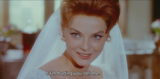

THE STARE? THE TENSION? THE ROMANTIC UNDERTONES? IMPECCABLE. ADDED TO MY TO-DRAW LIST. I LOVE THEM
#its worth mentioning that i already knew that i was gonna make irene's outfit to match the black tulip was gonna be wedding related because#1: black and white contrast#2: that wedding dress is irene's hypothetical ONCE* skin which is also in correlation to her lore#3: castle of cagliostro and la tulipe noire have similar concepts and theres a bride. theyre my inspirations for the dynamic of this au#* to educate: the ONCE skin series are outfits that supposed to portray the alternate ending that the survivors/hunters couldve gotten-#- had they not entered the manor games at all#for an example: luca's ONCE skin is called “graduation day” and he's dressed in a very formal outfit wearing a mechanical eye lens-#- portraying the fact that he's a successful inventor now because he “graduated” from making his greatest invention#and in his lore: he was in the process of making the greatest invention iirc until a commotion happened that caused him irreversible damage#- to his brain. which also led him to jail (hence his survivor title: prisoner)#so basically its a “what if” series#so irene's is: what if she never met norton and succumbed to her marriage#SORRYY I KNOW I KEEP REPEATING THIS LORE BIT A LOOOT OF TIMES but its just so good i love it haha#i come back from the dead and spit some heavy ass lore and never comes back /JOKE#~ rambling
12 notes
·
View notes
Text
Writing Snippet #44
--
It has been ages, and now I am delivering on some Fable 2 fanfic I wrote ages ago since I have a major itch to play the game again. This is ages old and I’ve edited it a good bit from it’s original state. Note: Florence is my hero of brightwall and is a wee kiddo by now.
Now if you’ll excuse me, I’m off to redraw old art and cry over this game once more!
--
“You’re gonna come to my funeral, right?”
The question caught him off guard and an unexpected laugh bubbled up to Reaver’s lips. He raised a questioning eyebrow and Sparrow looked up from peeling his orange, cocking his own eyebrow over a nasty scar on his forehead. The lines of magic and age carved sharply into his face, making him look that much older. His long white hair spilled down his back in loose unkempt waves, once pale warm brown now tainted with age.
“We can’t all be as lucky as you and make sacrifices to other worldly powers for effective immortality.” Sparrow teased harmlessly, his eyes glowing blue with a ring of red looking down as he deftly peeled away at the fruit layer by layer.
“Aren’t you a little young to be planning your funeral?” Reaver jested with a smirk and Sparrow chuckled once, waving his knife in a weak threat, tucking a stray white hair behind his ear.
“Ass.” He jested right on back, garnering a snickering laugh from Reaver. He flopped himself down on one of the plush couches, gaze drawn to the ceiling above. The halls of the mansion were quiet around them; the crackle of the fireplace filling the space, glasses of wine abandoned beside trays of fruit, and rain tapping away at the glass windows were the only company. The waterfront of Bloodstone along with the rest of the small town was only a few blocks away, measly trip down the hill. Sparrow did own the old mansion that belonged to Reaver, but he had graciously allowed him to live in it again…but only if he paid rent.
If there was one thing shrewd that has rubbed off on him, it was that and Reaver couldn’t complain. Well, he could but Sparrow would kindly call him an ass and it was regular enough occurrence for the pair to joke about it.
“But, it’s going to happen someday.” Sparrow reminded him and Reaver waved his hand with an exasperated look, a small tick in his jaw.
“Why worry about it now?” He waved his hand, crossing his legs as his foot bounced. “You have a kingdom to run and Logan and Florence to tend to.”
“Is that your way of saying I have things I need to live for that go beyond money and power?” Sparrow asked with only a hint of a joke and Reaver blew a raspberry at the ceiling.
“I did mention a kingdom.”
“But you mentioned Logan and Florence.” Sparrow shot back and Reaver heaved a sigh, grumbling and huffing.
“You’re making this incredibly mushy, Sparrow.” Reaver droned and he stood, heading towards the fireplace, kicking his feet along the way. Sparrow’s eyes narrowed and he took a bite of a slice of orange, watching his hands fuss behind his back.
“Do you not like this because it’s ruining the mood or because you don’t want to deal with me dying?” He asked and Reaver grimaced, shaking his head like the thought was mere nuisance. He always knew how to get under his skin…maybe it was some magical power like the one that made his skin glow or some other trickery that gave him that halo like he was some saint. Or his kingly dealings made him see everyone for how they were. Either way it was annoying and pretentious and Reaver wasn’t having it.
It was unsightly.
“It’s ruining the mood. The fire was all grand and the wine was good. At least until you started peeling that awful fruit and went on and on about dying.” He waved his hand at the orange that was nearly gone, the peels discarded on a nearby silver serving dish. Sparrow rolled his eyes at the utter indignity of it.
“I would think the rain outside would make it less than ideal.” Sparrow spoke as he played along, scratching the side of his nose as Reaver began pacing.
“It always rains in Bloodstone. You should be used to it since you lived in this house for so long.” He barked and Sparrow sighed, running his fingers through his hair.
“Me thinks thou doth protest too much.” Sparrow teased and Reaver made a frustrated sound at him akin to a whine, waving his hands about.
“Come now, you don’t get to play the villain in this.” Reaver shot back and Sparrow sat back against the plush couch, hands folding across his chest.
“I can’t very well upstage your part since you play the villain so well.” Sparrow gestured with an idle hand. “I have not the skill for it.” He added and Reaver clicked his tongue, shaking his head even as a grin adorned his lips.
“Why I’m the Hero of Skill and you are the one of...” He gestured to the whole of him and Sparrow cocked an eyebrow.
“Of everything...?” He suggested and Reaver rolled his eyes. Sparrow smirked, loving each moment he could take the insults and turn them around. It was a joy to see Reaver flounder at times, especially with how rare it was.
“You do find yourself quite the comedian, don’t you?” Reaver hummed, stopping his pacing to stand before Sparrow.
“I must find the humor in things if I am to tolerate you, after all.” He easily stood, height no match for Reaver. But he more than made up for it in his ability to sling the poor marksman over his shoulder and carry him like a sack of potatoes anywhere he deemed. That or the magic that crackled on his fingertips and marked his skin in long blue lines.
“You still haven’t answered my question.” Sparrow reminded him and Reaver exasperated, clicking his tongue as he ran his hand down his face.
“Tsk tsk, I much prefer the teasing to your insufferable commentary!” He barked and Sparrow rolled his eyes.
“A needed commentary, I might remind you.” Sparrow spoke with much more seriousness in his tone to hint at more and Reaver was the one to roll his eyes, avoiding Sparrow’s eyes. Something they took turns with that was for certain. But whatever Sparrow was fishing for, Reaver would not bite.
“Why does it matter, Sparrow?” He exasperated, spreading his arms. “Enjoy things while you have them the way they are! No need to worry.”
Sparrow looked at him—all jokes gone from his face—the lines of age cutting deep into his face. They might have grown deeper with time, but Reaver was remiss to make notes of such details. Not as if they really mattered.
Sparrow heaved a deep and heavy sigh, like much more laid hidden behind the gesture.
“You’re impossible today....” He scoffed tiredly--like the weight of the taunting had hit him--and waved his hand, turning to navigate out of the living room. Reaver opened his mouth to speak, but the rough slamming of the door behind Sparrow meant his words would fall on deaf ears. He grumbled under his breath, face twisting into a grimace.
Now the mood was ruined even worse...
Ass.
#fable 2#fable#hero of bowerstone#reaver#fable: reaver#owen writes#oc tag#oc: sparrow#oof this was exciting and reminded me why I like the two of them so much#cheeky cheeky banter back and forth and back and forth#that sort of one upping the other#tbh i really do love leaving arguments and banters in some sort of cut off state like there#*this#where they don't have a resolution present#bahhhhh#a ok to rebloog#do any of y'all even know fable? it's GOOD SHIT
14 notes
·
View notes
Photo
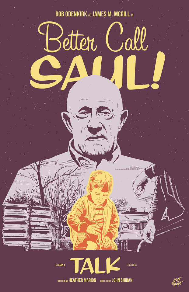
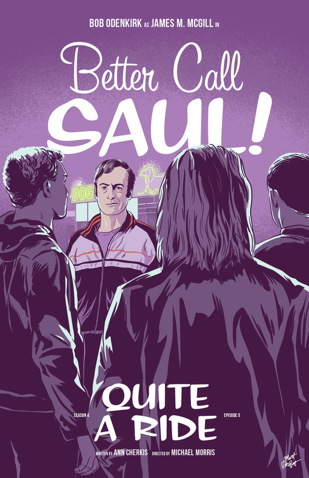
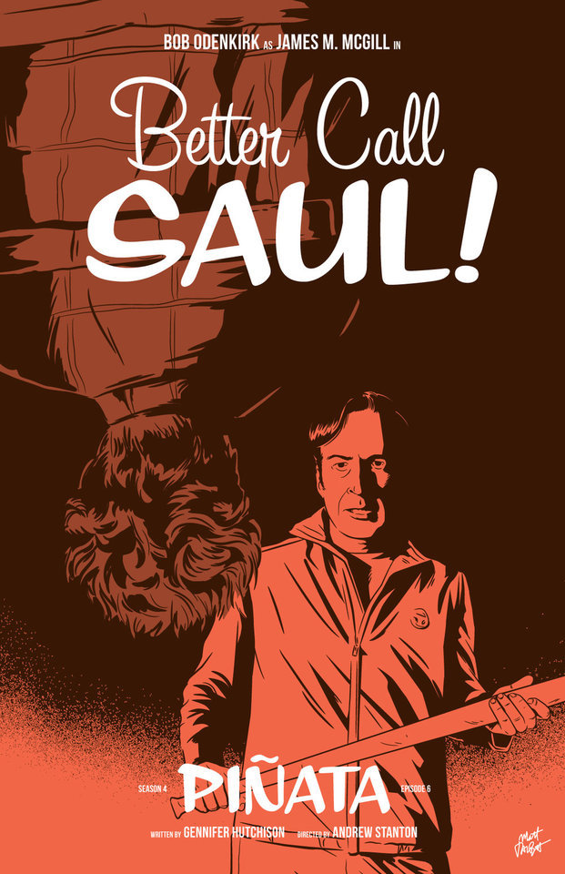

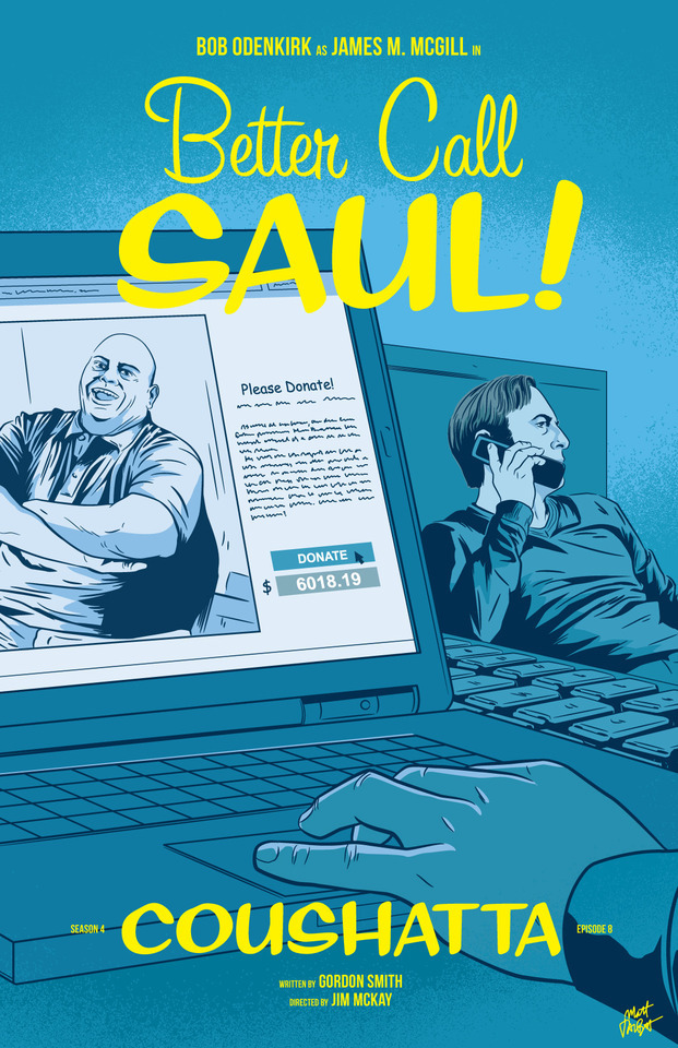
APPRECIATION & INTERVIEW
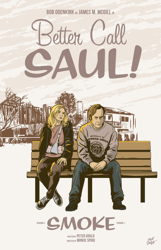
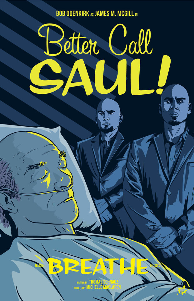
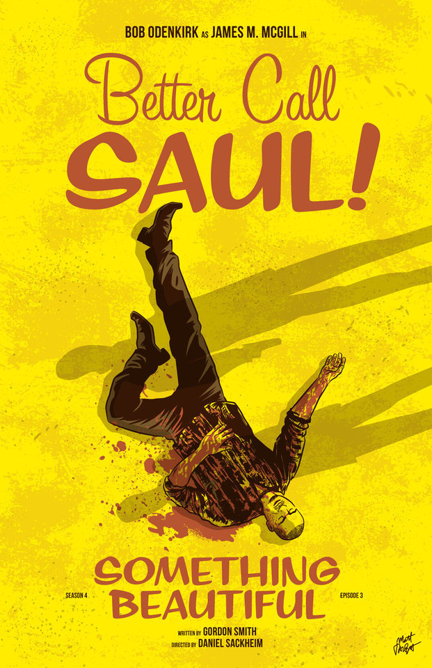
Better Call Saul episode posters by Matt Talbot After 4 nearly years, I thought it was time to catch up with Matt Talbot about his Better Call Saul poster project. The last time we talked during Season 1, Matt was deep in the hustle of making his name as an illustrator: juggling a full-time job, freelance projects, as well as band. Finding time for personal projects like this one can be a significant challenge. (Not to mention surviving the death of your tools: During Season 1 his Mac laptop died, and this season, his Wacom tablet bit the bullet). But despite these challenges, the 43-year-old New Hampshire native has persevered to create a clever and thoughtful series of episode posters that has garnered considerable attention, and brought with it new high-profile clients and art exhibitions.
First, congratulations on all of your success and recognition with this series of posters. It’s well-deserved. What’s been the most gratifying feedback you’ve received? Thank you! Every interaction I’ve had with anyone from the show has delighted me. I've been surprised by all of the cast and crew members who have said nice things – every note I’ve gotten has meant a lot to me. That being said, Michael McKean randomly tweeting at me that he has my poster for Chicanery hanging in his home blew my mind. I was eating dinner when my phone showed the notification and I literally jumped up from the table. I’ve been a fan of Michael’s since I saw Spinal Tap in the ‘80s and never in a million years would I have guessed I’d make something he valued enough to hang in his home.
Tell me about your contributions to Gallery1988 exhibitions. How does that process work? It's a pretty simple process. They invite me to be part of a show, and I make something to send them. I’m very excited for the opportunity to show there, and I feel like it’s a milestone in my art-making career.
Across the 4 seasons, which BCS posters are your favorites? Which one are you most proud of? I’m particularly fond of Rebecca, Rico, Marco, Switch, Sunk Costs and Something Beautiful. Oh man, it's hard for me to evaluate my own stuff. I tend to like the posters where I find a way to get a different take on something they did in the episode. I would say that “Sunk Costs” is also one of my favorites because I did something differently than how they shot it, and because Mike is so recognizable even from the back. I was also pleased with “Off Brand” because it was when I finally figured out how to draw Bob Odenkirk.
How has your process for creating these posters evolved over 4 seasons? When I started this project I had a vague idea that I would focus on scenes rather than portraits or likenesses, but that didn’t even last half a season! The characters were too good not to include. In that way, the posters have evolved in my willingness to draw characters, and also, hopefully, my ability to draw them.
My process is now something like: Watch the show on Monday; think about it on Tuesday, figure out what stood out to me and do a thumbnail sketch or two; draw it on Wednesday night; post it Thursday afternoon. I’m a bit faster at drawing these now compared to when I started. And I’m a bit more decisive on choosing which subject matter to depict.
There have been quite a few changes on the visual side of Better Call Saul over the last 2 seasons. New directors (Minkie Spiro, Daniel Sackheim, and Andrew Stanton), a new cinematographer Marshall Adams, even new cameras. What are your thoughts on how the show’s visual grammar has evolved? Has any of this impacted your posters from Seasons 3 & 4? I try not to just redraw literal scenes from the show, and I don’t need to tell you that they shoot the show in an incredibly beautiful way. I mean, they always, always, pick the best angle, the best shot to capture something. For that reason, it’s sometimes hard to to come up with another take on a moment from the show.
That being said, the visual style hasn’t really impacted my posters as much as the evolving subject matter has. The show, I think, is substantially darker than it was in the early going. It was easier to depict Jimmy’s hi-jinx in the first couple seasons. But with Chuck’s deteriorating mental state, the cartel stuff, Mike going deeper into Fring’s world and of course, Jimmy’s loosening sense of morals, the funny moments are harder to spot. That’s lead me to some more somber layouts and color choices.
We didn’t discuss this in our first interview. Which typeface are you using in your posters, or is this custom typography? The main logo and episode titles are set in Sign Painter, from the excellent House Industries.
The Heisenverse is known for it’s color theory and use of color. How has that impacted your color choices in these posters? I’ve kind of adhered to their blue=good/red=bad symbolism, but I also try to balance out colors between episodes and not repeat myself in sequential posters.
Many of your posters (especially ones this season) use a monochromatic, or simple palette of 1-2 colors. Tell me more about why you chose that approach. Is this a signature of your style? I’ve seen this approach in a lot of your work. You know, in the early seasons, I was trying to use simpler color palettes, but I wasn’t very disciplined and I got away from that. I’m trying to stick to a more consistent style in season 4. It is a conscious decision. I also feel like with the week-to-week nature of this project, it helps quickly set apart each poster. And, I really do love limited color palettes. Giving myself color constraints helps me figure out different ways to solve layout problems.
I’ve heard other illustrators say that Bob Odenkirk’s facial features are tricky to capture. Do you share that sentiment? Which characters are more challenging to illustrate? I do agree with that. I had a really hard time with him at first. I kind of think I have a better handle on it now, but I’m always trying to get better. I feel like if you can get his mouth right, it goes a long way.
I found Hector hard to capture both times I drew him. Mike, on the other hand, is just pure fun to draw. Jonathan Banks is so distinctive and iconic.
What’s been the most difficult poster thus far? Why was it challenging? Maybe it’s because a lot of time has gone by, but I can't think of one that stands out as having been really difficult.
Francesco Francavilla did alternate posters for some of his Breaking Bad posters. Inevitably, when artists look back at their work, they consider revising or redoing it because of a variety of reasons – their point of view has changed, their skill/style has evolved, or maybe they were never truly content with the final product. Looking back at 4 seasons worth of posters, are there any that make you want to scratch the revision itch? Yeah, more than I would care to admit. I would really like another crack at Amarillo. I know I could do a better job and that drawing is just super flat. In season two, I decided to to experiment with style and I kind of wish I hadn't. I like Cobbler, but I wish I had drawn it in my normal style. I would redraw Nailed for sure. Oh man, if I start going down this road it's not going to end well, so I'll just stop.
You mentioned earlier this season you were excited to draw Track Suit Jimmy. Who or what haven’t you drawn, that you are eager to illustrate? Howard! It bums me out to no end that I haven't drawn him, but it just hasn't worked out. And I need to include Kim more. It's kind of criminal that her face only appeared for the first time in a poster this season.
What’s your opinion of Season 4? Tell me about your favorites – episode, scene, character. I think season 4 is brilliant so far. The Kim/Jimmy relationship has deepened so much this season, and feels so real, but full of inevitable heartache. Oh, the flash-forward to Breaking Bad’s timeline was amazing. Mike doing his audit in the Madrigal warehouse. Really, anything Michael Mando does on screen. It's hard to pick. I so enjoy the deliberate pace of this show.
Where’s your favorite place to discuss the show? I honestly don’t talk about it too much online, though I lurk in a few places and read a lot. I actually discuss it mostly with my wife!
I know you get this question a lot, so let’s cover it here so folks understand: Do you have plans to sell any of this work online? I really appreciate that people like it enough to want to buy it or hang it, but I don't plan to sell the Better Call Saul posters online. I’m doing this for fun, not to make a buck off the show, and I don’t own the rights to sell it anyway.
What’s next for Matt? Do you have any other poster or illustration projects in the works? Is you band performing soon? I have several more pieces for Gallery1988 shows coming up. I’m pulling together an art show at a local brewery for whom I design all of their labels and stuff. I’m patiently waiting for a t-shirt I designed for one of my all-time favorite movies to be announced. And for the past several Octobers, I spent the month drawing a horror poster per day. I’m not sure if logistically I can do that again this year, but I’ll probably fit at least a few in. We’ll see how it goes. Sadly, with all of my illustration work, I haven’t had any time for music making, but someday I hope to get back to that!
Follow Matt: Web site / Tumblr / Twitter / Dribbble / Instagram / PosterSpy
– Interview by Shayne Bowman, Heisenberg Chronicles
#better call saul#artist interview#matt talbot#mine#heisenberg chronicles#illustration#fan art#posters#favorites#mattrobot#bcs season 4#gallery1988#g1988#house industries#sign painter
93 notes
·
View notes
Photo

Hello! So.. I don't really have the best of lucks and I have never ever won any contests or giveaways whatsoever but lately I've been trying to push myself to get out of my comfort zone a little and I saw a youtuber saying he was doing one so here was my entry for the Tekking101 GreenBull Art Contest! I didn't win of course, and they had so many drawings to go through and they took for ever but oh well. It's been a month since I drew this, I wasn't very comfortable guessing how the character would look on my own since I know Oda and I have very different art styles and taste so it was mostly just for the funsies, I had a sketch of a male character as well but my friends all voted for the lady so here she is! I kinda miss making One Piece fanarts or redraws of the scenes of the manga but I've been busy and distracted, maybe I'll get back to that someday soon! Would you want to vote on which One Piece character I should pick? My heart goes with Pudding again but there's some itch to try and make something cool this time around.. lemme know what you think!
#onepiece#one piece#one piece fanart#one piece character design#one piece greenbull#greenbull one piece#greenbull#ryokugyu#ryokugyu fanart#ryokugyu one piece#digital art#commissions open#yin miushi#yinmiushi
11 notes
·
View notes