#it's just a booklet of a4 pages but it's a decent amount of paper so i don't want to waste it all
Explore tagged Tumblr posts
Text
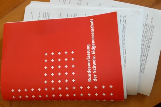
poll time how should i desecrate this excess copy of the swiss constitution i have (i have like 5 other copies in various languages and this one is from january 2021 and thus hopelessly outdated anyway):
1 note
·
View note
Photo
PHOT301 - Mileage May Vary - Work in Progress Zine & Experimental Journal Ideas
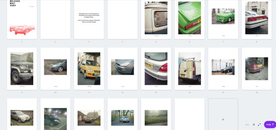
The zine is something that I had mentioned in the formative assessment for PHOT301. I wanted to make this because I was curious to see how this body of work came together in a book/zine/magazine format. One of the end results that I want to have for the FMP is a coffee table style book that can be viewed at Free Range, and contain a multitude of images from this project that clearly shows what my project is about. For this, I need to run a few tests to figure out what I should be creating, and how to make it.
For this, I decided to create a zine style of booklet, displaying images from this project that I particularly enjoy. The rationale for the selection process was selecting the cars that had an air of intrigue within them, whether that be with damage to the vehicle, or that the vehicle is particularly rare to see. I then decided to lay out the zine with the cars in chronological order, going from oldest to newest. However, it finishes with the aftermath of the crash that happened very close to where I was staying during Christmas, but sadly missing its departure only by an hour or so.
The front cover was also something that I was contemplating for a while, and was the most worrisome part of the whole experience. I knew how I wanted to display my images, and how which ones I wanted, but was very unsure on what would represent the front cover. I have always wanted to rejuvenate my graphic design style of work that I undertook during my Access Course and PHOT103.
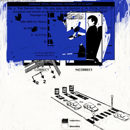
This is my favourite example from Exploded Image, all the way back in first year. This project was mainly a spin on our very alienating, fast paced and transport centric world. It was heavily influenced by Stanley Donwood’s artwork for the ever inspiring 1997 OK Computer by Radiohead. This is a style I have wanted to revive and to place elements of it into my current work - I also find it interesting how a lot of the earlier aspects of my degree are surfacing up again, which is a welcome change to the fairly similar work that was undertaken during year two.
I had an idea of what I wanted to create, but unsure about how undertake it. The graphic elements had to be a part of it to make somewhat of a statement with the front cover. I don’t necessarily want it to be a straight photograph, as it only really tells you about the photograph, rather than the project. Subtle hints to what the project is about, seems like a good aim for me.
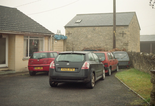
Before
After
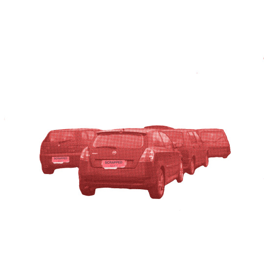
Above, is what I had created. I chose to use the cluster of parked Fiats and Alfa Romeo as it featured a good amount of cars, rather than a singular vehicle in the image. I opened it up into GIMP and erased away the surroundings, only keeping the parked cars. The photograph was then desaturated and then coloured red in a gradient map style, with an added a bitmap style of manipulation. This was the emulate the newspaper print styling of new reports of the scheme, and the red colouring represents the Labour government that brought the scheme to fruition.
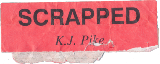
The plates were also covered up with a piece of paper that I found around a while ago. Its a form of tag which was most likely used to detail scrap parts in a yard, by K.J. Pike.
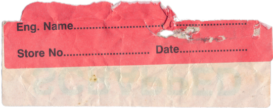
The back features a few options to fill in, mostly in a warehouse setting. K.J. Pike comes up as a company in Blandford Forum that repairs and refurbishes trolleys. Annoyingly I can’t remember where I found it, but I do remember that it was on a rather wet and drizzly day, and it was stuck to the road. I also knew that I had use it at some point for MMV.
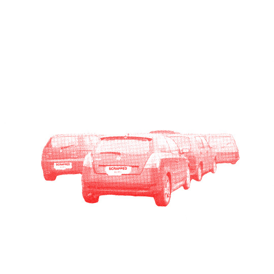
Final Version
There is also a second version which has been edited differently and features no blacks and blends more into the white. For me, I prefer this version purely because it blends more into the whites and the aesthetic is likened to poster design, of which I enjoy. This was created by adjusting the contrast and the lightness of the colouring, with the addition of the ‘scrapped’ tag being merged into the car layer.
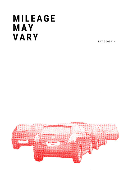
The front cover has been kept fairly clean and clinical. I wanted there to be a lot of white space like a gleaming shopping mall to juxtapose the featuring images, with the cover to represent the entire project in such a way that it doesn’t spell it out - almost having a level of ambiguity to it. I also used Roboto Condensed for all of the writing (albeit minimal) as I rather like the modern sans style font. It also manages to lend itself quite well to the graphic design style of the cover image.
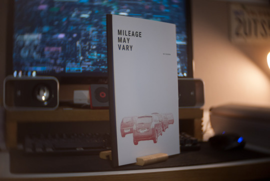
This isn’t just an online zine, it is also a physical one. I wanted to have something physical, as it seemed a shame to not have anything physical apart from a selection of prints. The zine is more of a work in progress publication, rather than what the final thing will look like. I wanted to see how my images work in a physical space, culminated into a small A4 booklet. I decided to print this at The Artside, just so I could have it fastback bound. I didn’t want to have it stapled together, or have it ring bound as I am not a massive fan of both of those options for something that will be a photo book in the end. Stapling the book will make it look like a magazine, and ring binding will make it more of a document. Fastback binding, to me, looks far more professional and sleek, keeping everything clean and low profile. It was printed onto 200gsm satin card with a black card backing.
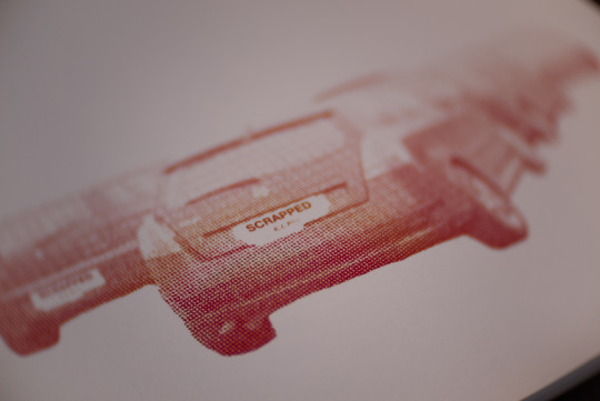
The print quality is pleasing, and perfectly fits the ‘zine’ aesthetic. An example of the front cover here shows the sharpness of the print, in addition to the colour reproduction. The photographs of the zine was taken with my Lumix G1 with a CCTV 25mm F1.4 lens. This lens gives a unique swirly bokeh and the fast aperture of F1.4.
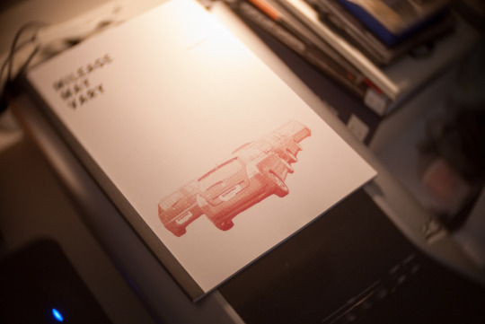
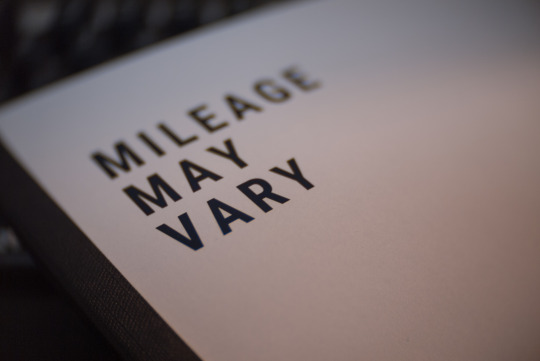
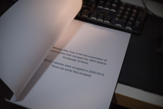
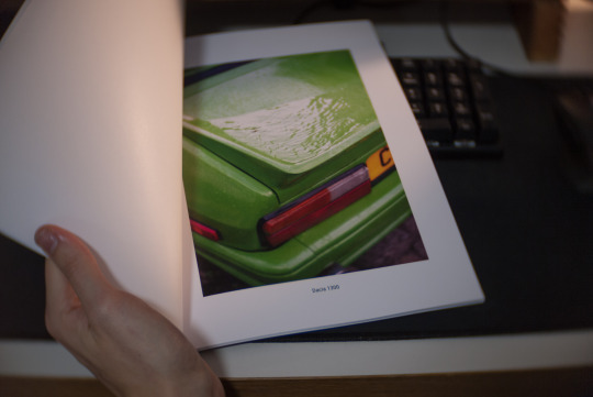
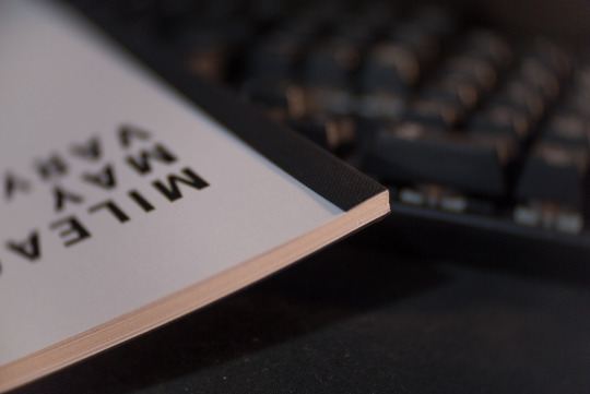
In total, this zine cost me £15 including printing and binding, which I think is a decent price for the end result. Not to mention that it only took around 30 minutes to make, so it was nice to hand in my PDF file, grab a coffee and come back with it all finished and ready to take home. Another bonus to this, is supporting a local business. While it is sometimes nice to order a nice photo book online, I would rather help support local business who still get a good footfall of students come in for there printing - it keeps them in business and provides us with quality products. Whilst this is a good thing, I would also like to invest in a thermal binder somewhere down the line, so I would be able to make my own zines. However, for the time being I am happy to support local businesses and keeping them going. I am also happy with the zines outcome, and I am looking forward to seeing what I’ll be able to create next with the up and coming work flow.
Experimental Journal Plans
The experimental research journal takes on the same form of the zine, in terms of the cover at least. This is to keep a level of continuity within the project. However, I would like to make it more of a manual rather than a journal, and link in some MOT certificate aspects.
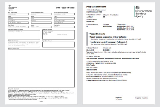
This shows the changes to the MOT certificate back in 2018, with the older version on the left and the new version on the right. I would like to utilise the older version, which would contain details about the shoot/research, with the opposite page showing contact sheets/images and practitioners work. Along with this will be an ‘advisories’ and a ‘reasons for failure’ section detailing things to change and things that didn’t work. These are to reflect the MOT test needed for cars to stay on the road.
The journal will include all shoots, containing the contact sheets and some highlighted images. Practitioners work will also be included with the same advisory and failure sections. These sections will be redacted and kept to a very minimal word count. This blog is very wordy, and I want the experimental/condensed journal to be a cut down version of my shoots and contextual information that advises my thinking. This shall also be created in Canva, following the same front cover and adding the MOT certificate base to form the journal.
0 notes