#it was still a very good practise for drawing fullbodies
Explore tagged Tumblr posts
Visit Tumblr Blog
Explore Tumblr blogs with no restrictions, modern design and the best experience.
Last Seen Tumblr Blogs


Fun Fact
Tumblr was acquired by Yahoo for $1.1B in 2013.
Text

The Guard 🛡️
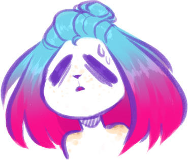
#gw2#guildwars2#guild wars 2#charr#myArt#kying#another “quick” drawing like the one with Wilson#still took me some hours#it was still a very good practise for drawing fullbodies#I also fell in love with that new brush#drawing outlines with the brush feel so smooth#guess its my new outline brush now#was really fun to draw <3#lets see who is my next victim mhm
127 notes
·
View notes
Text
i don't feel like there's much to say about my art improvement this year. however, in 2023, i wrote a long retrospective about my art in which i mentioned my goals for 2024, so let's see if i achieved all of them ^w^
"so for 2024 i want to study some stuff i feel i'm still lacking in. i think i've always had a good eye for composition, but i've never actually pushed it in my finished illustrations - they depend a lot on the poses because i've always been prioritising drawing over everything else. that needs to change this year."
this was actually one of the first things i did in 2024. just around this time of last year, i was in the process of making 7 fullbody illustrations for class, depicting my ocs from a visual novel i still haven't finished. i never shared them outside of artfight (😂) because i get shy talking about my ocs in public, but they are still fire and almost no one reads these posts anyway so...


i had to use so many references for these pictures, from magazine covers to fashion to layout design. i think this was the first time i was actually putting into practise all the knowledge i had learned in my degree, as up to that point i was getting through it kinda passively.
overall, my 2024 was filled with great compositions. who could have known that paying attention to it would lead to better illustrations, right? here are some other highlights i'm still very proud of:


that leblise piece is probably my favorite piece of art i ever did period. so simple yet so delicious and full of symbolism. the aqours fanart is based on an S shape, from "sunshine", and i felt so smart for coming up with it even though it's really simple. and then there's kanadiamari as always - what i really like about that fanart is that i was able to put my design knowledge into good use again.
"i also want to get better at drawing characters from extreme angles. i've always felt like my poses are a bit flat and i think i can study photos taken with wide angle lenses to improve at that."
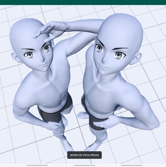
before we get into this let me remind everyone that i trace all the time. sometimes i wake up and forget how to draw, so i open an app called Magic Poser and play with the 3D dolls until i have a decent base for what i'm picturing in my mind. but it wasn't until last year that i started pushing the angles of those scenes so that i could get the best of them.


of course, you need to have good skills in order for your traced pieces not to look like shit. i can work with anime models with innacurate anatomy precisely because i already know where the muscles sit on the body. the suselle artwork is more referenced than traced, in the sense that i first sketched the pose, then re-created it in 3D, then traced it and then re-sketched it. the things i do for yuri orz.
okay this was kind of a tangent. i did improve on this particular point but the reason isn't that i got better at perspective, i just made better use of the tools i have - the result is the same and it's positive, so i'll take it as an achievement!
"and of course i still want to draw faster, which is something i've always struggled with. […] i'm still too slow for the kind of artstyle i want to achieve, which includes having a looser lineart and less details in irrelevant areas of the drawings. i think that overdoing the lineart actually hurts my illustrations, because everything ends up pulling the viewer's attention with the same energy. i also think messy artstyles are neat."
this is a tricky subject. in my 2023 post i showed some examples of what i wanted to keep doing in terms of lineart, and while i certainly got better at not overdoing it, i'm still far from that goal. definitely something i need to keep an eye out for, as i really like it when i manage to get loose with my art.


not much to say here except that i'm sorry i never posted these farcille sketches. they are 12 in total and the rest of them are porn and i'm too shy to share them with the world. also those furry guys i draw a lot (twice) are me and my and my best friend's fursonas, in case anyone is curious.
"as for the stuff i like about my current artstyle, i definitely want to keep the way i color!! and by that i mean the method i have for applying filters that make my colors pop. i could maybe play more with textures too."
i actually think i went backwards here. what i do now is more visually coherent, but my 2024 doesn't shine for the way i use colors in comparison to the previous year. it probably happened because i got too comfortable with the way i post-process my illustrations nowadays, in contrast with how experimental i was when i started playing with filters. a shame, truly, but not a huge downgrade.
"i also like the way i depict intimacy, and people have praised it too. i don't think i'll ever change the content of my art, i eat breathe and speak in yuri. if anything, there are still some ways of conveying feelings that i haven't been able to draw because i lack the skill to do so, but i'll keep trying ;)"
not sure about this one either, but i know it's just because i didn't draw a lot in 2024. among finishing my degree and final thesis, organizing stuff for aqours when they came to spain and preparing for my current job, i didn't have much time for yuri brainrot. my best drawings were dunmeshi and lgts fanarts, and i'm glad i got into both of these pieces of media because they still warm my heart today :)


i'm very proud of all 3 of these artworks, especially the frebkuchen one, i cooked so much there. maybe this skill of mine (the ability to depict intimacy) is the one that's closest to mastery among the ones i have, and that's why i don't see much improvement.
overall, 2024 was a good year, but not my peak. i can't rate it just in terms of improvement, but i can't deny that i like my 2023 artworks more than my current ones either. i think i'm on the right path, and while i don't have any art resolutions for 2025 i hope i can bring better art to the world from now on.
thank you for reading until the end if you did, and i hope you have a nice year!! <3


2024 art summary!! lots of oc art this year :) i also started painting digitally and it's sooooo fun~~~
(template by PEPPERTODE on deviantart)
61 notes
·
View notes
Text
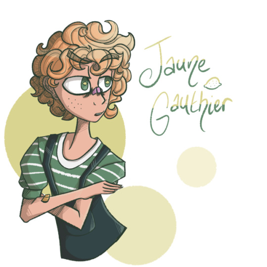
Wow I have Art. Finally lmao
Anyways!! The other night, I adopted a Lemon Boy-themed uhhhh. Boy. From @distac !! I’m really looking forward to using him in all kindsa things.
He’s French Canadian, and his name is Jaune (“yellow”, y’know, like a lemon) Gauthier (in part meaning “tree” y’know like. A lemon tree. Lmao)
So yeah he’s now a guy!! If anyone’s got any questions about/for him then I’d be happy to respond IC or OOC
#Jaune Gauthier#Art#Original art#Original character#OC#Drawing#Digital art#Artist#French Canadian#Canadian#Lemon Boy#Dskfjgj I sized the head down and it Still looks too big dkjgh#Or maybe the arms just look too small#I am not very good at pieces that are not fullbody ones#Just gotta practise I suppose!!
13 notes
·
View notes
Photo
Artist Research - Polaris-Rose
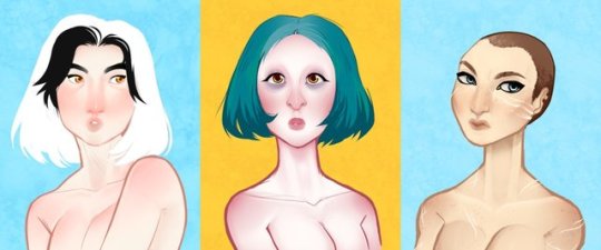
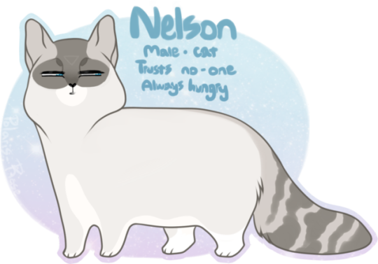
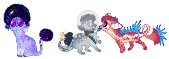
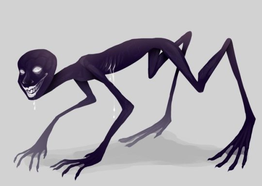
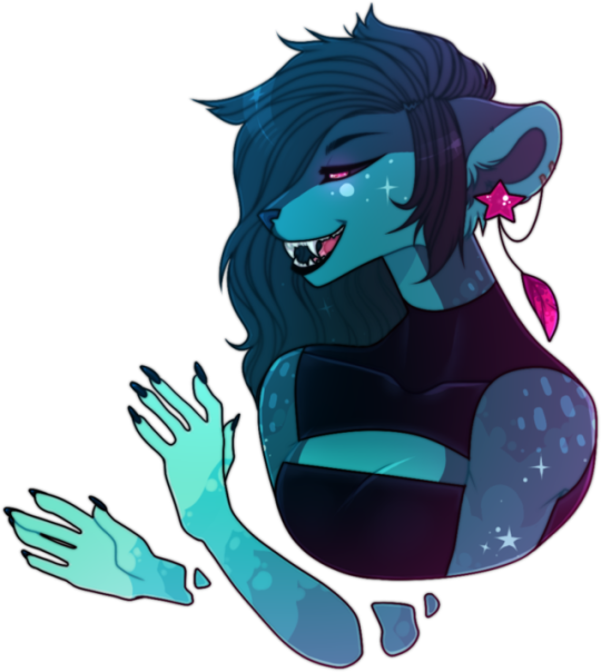
1. Gals: One of my all time favourite pieces of art by Polaris-Rose, these head shot busts are the perfect combination of lineart and painting and they each portray the personality of each character perfectly, as well as representing their ethnic backgrounds in a mature and realistic way. The first character is simplistic, and the style of having no shading on the hair whilst having shading on the body is one I rarely have seen but really do enjoy the look of. It also has a fantasy feel to it, as though her hair is ethereal; but whether or not the artist intended this remains to be unseen. The second head shot is similar, once again having a mixture of both line art and painting styles, however this one's hair has been shaded. This takes away that previous ethereal feel to them and roots them into reality. The third and final piece shows a war-torn heroine, this time with even more detail than the last. She has more intricate shading, more texture with her hair and skin, and her personality shows through rather than the pin-up feel to the other two. I overall love the colours used, the backgrounds creating such a contrast to the humans that are presented on them, even the hair colours compared to the skin tones create such a delicate feel to them. I wish to practise the painting/lineart mix for my own work, as I feel as though it may be a fun thing to try. 2. Me Me Big Boy: This has to be one the cutest pieces of art I have come across during this project, and one that I love for more reasons than it being a cat. Polaris' style brings this kitty to life, showing how they are spoiled with the amount of food they get by adding a slight chubby ness to them, as well as using facial expressions such as the side-eye look to convey the sense of insecurity and suspicion so that even if the information about the character wasn't on the reference sheet, you'd still get an idea about what kind of personality they have. Another thing I love about this character design is the simplicity and the inspiration of real-life cats such as Siamese and tabbies, whilst also adding in unnatural designs such as the upside down triangle on their forehead. Whilst you cannot get a back story from this piece, you can get a sense of what this character would do in specific situations. Overall, I love how they were able to use a cartoonish style to exaggerate the characteristic of a cat to create not only a humorous image, but also a relatable one for people who are fellow cat owners, for they can see their own cat in Nelson. This is something I'd want to add to my work; treatability to my character, even if it's just appearance wise. 3. Kiamara Auction and Flatsale: Another example of a character designer trying a variety of different colours, styles, and designs in order to make characters rather than just sticking to one idea, but rather to be inspired by an idea and creating off of it. For these characters, Polaris-Rose had the idea of space in mind, and from that they created three different designs: Galaxy Afro, Space Explorer, and Alien Friend. These three designs, whilst all holding the theme of Space, are completely different design wise. I love how the Galaxy Afro takes themes of 60's Psychedelia and adds it to the theme of space and using the colours of a galaxy for their pelt. For the Space Explorer, I love how they are based off of the colours of the moon, the only other celestial body that humans have laid foot upon, having the worried expression of the unknown for even though humans are curious about what lay amongst the stars, we have always had a fear along side it. And lastly, the Alien Friend is the most interesting; brightly coloured and wide eyed, giving a sense of uncanny valley, with random feather placements to give it an odd look. This is due to the fact we have no idea what an alien may or may not look like and so we have this perception that aliens may be weird creatures that may look threatening but who may also be just as curious as us; and Polaris has captures that perfectly. Overall, I love how they have chosen to stick with a theme and then create designs based off of said theme, without sticking to a singular idea and not branching out of it. 4. I've Been Feeling Weird One of Polaris' vent-art pieces, this brings us more insight into the creator's own life and personality rather than the character that they've drawn's. In this headshot, Polaris has used what appears to be the marker tool with a different texture setting to make it look as though she has drawn them on paper, or on a textured surface. I love how she has decided to use a purple pen instead of a black one, as it really brightens up the piece as-well-as complements the blue/pink gradient. I also love how the techniques she has used has made it look as though she's drawn this piece in a watercolour marker or even painted it, even if it is but a sketch. Another thing I admire is how she's managed to capture the emotion of confusion and weirdness into a visual form; something not many are able to do due to the emotion being so complex to even explain let alone draw. I think overall, whilst this piece may have a sad origin, it's simple, it's sweet, and it captures the viewer's attention with both the colours and with the hope that the creator is okay. 5. Hello My Dear I had to include this piece in my artist research due to how creepy and unsettling they are, thus proving that a character does not need to be beautiful or approachable, but can be horrifying and make someone uneasy. When I look upon this character, I get the feeling of dread, as though I have done something wrong or that I am about to be hurt in one way or another. It simply screams run, danger. The unsettling, uncanny, cartoonish wide grin and dilated pupils give us the sense that this creature is not in the right state of mind, hell bent on whatever morals they may uphold. The bent and twisted, unnatural way the body contorts and bends sends shivers down my spine - I know something's not right with the anatomy and because it's been exaggerated it puts me on edge. Looking at this creature makes me feel as though I'm not safe, that it could literally jump out of my computer screen at any moment to harm me, and that's why I love the piece. Overall, I think this piece is a good example that characters don't always have to be the hero, or the one you're meant to fall in love with; they can be the ones you despise, pity, or in this case the one's who truly horrify you. 6. River: Not only am I jealous of Polaris' ability to draw hands so well, this art piece leaves me in awe with the creativity and skill needed to come up with something like this. The first thing I like about this piece is the pink highlight on the blue body; it gives off a sci-fi feel to them, the colours fit in so well together, and, from what we have seen, they have been a favourite combination of Polaris'. Another part I love about this piece is how they've drawn the arms. Instead of simply connecting them to the body, they have sectioned off some parts of them, as if they're only partially there or that they have the ability to part some of their body from the rest. It's an interesting way of drawing and is very surreal, taking a piece which could have been an beautiful fullbody or bust and turning it into a beautiful, yet interestingly mind-baffling, one instead. Overall, I'd like to try this sort of surrealism with my pieces to see where it could take me, and what it may inspire. Original Links: 1. http://polaris-rose.deviantart.com/art/Gals-676921306 2. http://polaris-rose.deviantart.com/art/me-me-big-boy-670215759 3. http://polaris-rose.deviantart.com/art/Kiamara-auction-and-flatsale-1-open-604691341 4. http://polaris-rose.deviantart.com/art/ive-been-feeling-weird-668984335 5. http://polaris-rose.deviantart.com/art/hello-my-dear-608135510 6. http://polaris-rose.deviantart.com/art/River-593463980
0 notes