#it has a thing i think is missing in a lot of ''transformative'' modern art pieces (pieces that actively take inspiration from or satirise
Explore tagged Tumblr posts
Text
i love the welcome home project so muchhhh i hope the weird people who are being terrible die off soon so i can actually properly interact with it
#i met it thru the post franky made saying he was going to VA for it and fell in love with art style and dedication involved in the project#it looks so fucking cool and you can feel clown's love and respect for puppets emanating thru every detail#it has a thing i think is missing in a lot of ''transformative'' modern art pieces (pieces that actively take inspiration from or satirise#a pre-existing media. Think RGU to shoujos) that is the fact fhat the creator actually put enough care to properly learn about what their#piece is meant to comment/satirise/build upon. Clown clearly knows theur shit and it's very impressive
0 notes
Text
BLOODBORNE LORE Q+A PART 2: CAINHURST STATUES
part 1
---
THE HUNTER ASKS:

all the statues in yharnam are weird. even the ones that look normal are so fucking weird. nearly every statue in this game hints at something much larger and stupider than we ever could have imagined.
before we start, for clarity's sake, the chalice dungeons are comprised of four major areas: pthumeru (the largest area and the aforementioned "tomb of the gods", it is a city that rose and fell eons before yharnam), the hintertomb (previously explained), ailing loran (a long ruined city whose fate echoes the fate of yharnam), and great isz (a dungeon that is overlapping with "the cosmos" and is of great story importance). they are NOT main game content. some people completely skip them because they appear to be repetitive and are honestly kind of boring. and yet....
this ties into castle cainhurst's "normal" statues. the first clue something is off is that all the knight statues are missing the right leg. all of them. and not in an uneven way that would imply they were knocked off by some art hating maniac.
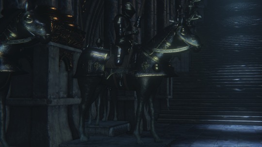
it wasn't until the DLC came out that this became retroactively significant. the item description for the old hunter's trousers reads:
A widespread belief of the period was that "beast blood crept up the right leg," and this led to the double-wrapped belt.
the dlc takes place in the time of the old hunters, the distant past. but the knights predate the hunters, right? they have to. the rifle spear was said to be based on a "lost cainhurst weapon". its a pale and poor imitation of the reiterpallasch. and the statues...
the statues in cainhurst clog up rooms to much that they make moving around difficult. they're all the same 4 statues: a queen, a king, a different queen holding a child holding an orb (?), and a tasteful contrapposto nude. i cannot stress how many of these fucking things are just lying around or shattered around the castle. the depictions of the generic king and queen (in truth, these are recreations of statues around notre dame) match depictions in other parts of the game but absolutely no mention is made of their rule now or in the past.
how old is the cainhurst lineage?
old. really, really, old.
here's the only other place you can find the statues: as gold statuettes in the treasure rooms of the pthumeru dungeons
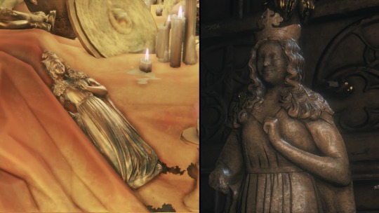
ah, and i know what you're thinking: obviously this is just fromsoft re-using assets in that classic sloppy late game kind of way. but there's. more. a lot more. its not just this.
its so old that the armor you see in the throne rooms and a portrait of a knight in cainhurst castle can be found scattered throughout the lowest parts of the labyrinth.

in modern cainhurst, the fellow above has been transformed through dastardly means into the gargoyle-esque enemy called the "child of antiquity". "bastard of cainhurst" probably would have been a better and more thematically appropriate name.

he is not the only cainhurstian (?) depicted on the this wall of what you probably thought was reused concept art. its probably that. but its something else too. you know who else is in these paintings and also in the chalice dungeons?
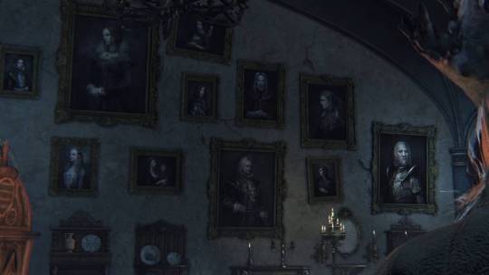
her.
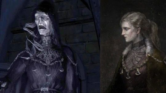
in the sinister chalice descriptions ("sinister" being a modifier that adds her to the dungeon for extra challenge) she is described as a "mad pthumerian". h-how can she be a pthumerian if she's a cainhurst noble?!
have you noticed that bloodlickers will appear in chalice dungeon rooms where you've preformed a visceral attack? the only other place they're found in the game is cainhurst! they're read to be blood drunk nobles who have become vampiric like mosquitos or ticks. why are they in the dungeons??
there's also this cainhurst knight who continues to live and serve his queen. i believe one of his guaranteed encounters is at the very bottom floors of the labyrinth. how did he get down there??
did he get down there?
or...did they come up? the subjects of the portraits are pale and thin.
"The old nobles, long-time imbibers of blood, are no strangers to the sanguine plague[...]"
how old? how long have they been imbibing blood? they've experienced blood plague before?!
why do both the bloody crow of cainhurst (one of annalise's knights who is evidently not a vileblood) and the shadows of yharnam (the entourage of queen yharnam) drop "blood rapture" runes which are deliberately vague about which queen the rune is in service to?
how old is the cainhurst lineage?! WHAT is the cainhurst lineage?! annalise, queen of the vilebloods, is the sole survivor of a massacre that wiped out the rest of the vilebloods (an ideologically charged name imposed on them by the church). she was left alive simply because she could not be killed but she was forced into a mask she cannot remove. but the mask does not prevent her from making us into a vileblood, as we only have to drink her blood to do so.
what could the mask be hiding? why does her dialog change when you unlock the lowest chambers of the labyrinth? how are there two undead queens?! (yucky item from bloodborne warning)
all hail the undying queen of blood!
#long post/#bloodborne#forsaken castle cainhurst#bloodborne lore#this literally only discusses two of the statues in the game. im in trouble
130 notes
·
View notes
Note
Are there any magic system ideas from other stories you have read that you would like to see implemented in Marvel's magic system?
Not necessarily. For one thing, I actually think it's important that magic remain somewhat fluid. The function of magic, specifically spellcasting, is to meet the needs of the story. So, it kind of has to be adaptable. Besides, one of the things I like about Marvel is that is there are so many different kinds of magic, and I think that imposing a universal system would kind of detract from that.
There are already some universal underpinnings in the Marvel world that I like, such as the breakdown of eco-, exo-, and ego-centric power sources. Fine-tuning that concept and using it more consistently would help magic feel more coherent and grounded across the board, but still leave room for each character or realm to feel unique.
Having said that, I think my favorite magic system, ever, is the one from the Young Wizards series by Diane Duane. It revolves primarily around a universal language, called the Speech, that can be used to name or describe pretty much anything in reality. Spells, therefore, take the form of complex sentences, equations, sometimes songs or poems, which describe, in detail, everything involved and what it needs to do, how it needs to change, etc. But beyond having the power command or transform reality, the Speech allows wizards to communicate and form relationships with almost any kind of life, any kind of matter, any kind of energy. It's incredibly versatile, and I really love that while it can be very exacting and clinical, it requires an empathetic, relational approach with a real human core.
Part of what I like about this system is that it bridges the gap between magic and science. It often requires wizards to have a detailed knowledge of whatever they're working with, and it provides opportunities to demonstrate that knowledge to the reader, which is an important part of how you make magic feel earned. That's something that's missing in a lot of modern comics-- we don't get to see the thought process or the effort that goes into spell casting. And because the system is simultaneously complex and intuitive-- it's just language, after all-- once your reader is reasonably familiar, you can actually get away with glossing over the details when you need to keep a scene moving. The reader will infer the detail on their own because you've taught them how the system works. It's just... brilliant. Duane is a genius to me, and I love these books so much.
Using universal language or code as magic works really well for characters like Doctor Strange-- I think they tried to do something similar in the movies, only far less artful-- and the correlation of practical knowledge to magical efficacy is perfect for something like Wanda's hex power. Importing the Young Wizards system into Marvel comics wholesale probably wouldn't work out-- it kind of relies on prose-- but there are a lot of great lessons and helpful ways of thinking about magic to be gained from Duane's writing.
13 notes
·
View notes
Text
For Yuletide this year, I wrote this pseudo-Vox article for @newtsoftheworldunite's gift. The premise is a modern-day feature article in the QT universe where Shakespeare wrote a play about the king who married the queen who cut off his hand, and what the modern discourse about their real relationship would look like in both historian and fandom circles.
I had a lot of fun with it, and I crammed it full of both fandom references and non-fandom references. I made a list of all the ones I could find when I reread it (I'm sure I overlooked a few), which you can check out below the cut.
Princess Bythesea novels by Phresine are a reference to in-world bodice rippers from @hoeratius's Princess Diaries AU, for which both she and @hippolytas have written fic.
The Genny Diaries is a play on The Lizzie Bennet Diaries
The Setran Eugenides & Ira is a nod to my beloved Bride & Prejudice, a Bollywood Pride & Prejudice adaptation (and imo the best P&P adaptation)
Wikipedia talk pages are basically a discussion page on every Wikipedia article to help editors behind the scenes make decisions, fix citations, and discuss what should/shouldn’t be included on the page
Clothing references: the birds and twigs are a canon reference (thanks, Pheris), the wild fennel robes are a nod to a comment on a post MWT reblogged that someone else later made art for (she also reblogged the IRL coats which are beautiful), and the “ornate, traditional” clothing was a reference to Greece's really stunning regional clothing.
The rings were inspired by posy rings, which were popular in England and France in the late Medieval period. The inscription on Irene’s ring—Yours to command—was a legit inscription I found on a list so you can imagine how fast I added it in.
The poem is heavily pilfered from Sappho fragment 94, although it’s been edited to pay tribute to the most beautiful woman on earth
The “life size statue” fights were @hippolytas's idea (among other things in this fic, but that’s what I remember most clearly)
The Friends finale reference is a little joke for myself. Ross/Rachel were *the* will-they-won’t-they couple of the 90s and 00s, and I told some friends earlier this year that I think if Matthew Perry and Courtney Cox had had 20% less on-screen chemistry, the romance narrative might’ve shifted to who Monica would ultimately pick and let that be the big finale moment (and, frankly, have given Ross and Rachel’s storyline more creating room—but I digress).
The RPF fics are all references to QT fanfics. The missing scenes and wedding night fics are obvious, but the two AUs are are this sci-fi one where the Attolia AI trains the guard and one of my own, Where Did You Come From, Where Did You Go?
I'll update the list if I notice any others, but feel free to ping me if you think I've missed one! There are some other easter eggs in there, so if you think you spotted something else—you're probably right!
Thanks to everyone who has kudosed and commented on this fic, and to @thecrenellations and @cartograffiti and @hippolytas for their help and cheerleading, would legitimately have lost my mind if not for them <3
15 notes
·
View notes
Text
I Missed You
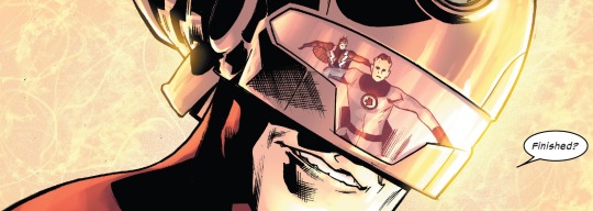
I've been frustrated with US comics for a few years now. Sh*t has been a barren wasteland of content for some time. Well, i can't say that for the entire industry, mostly the Big Two, but they weight the industry down so much, it's hard not to focus in on them. If the two gods bleed, what does that mean for the lowly mortals, you know? IDW puts out pretty solid Licensed fair, though. Their Power Rangers and Sonic stuff is pretty good. I really loved the Transformers comics they produced until Hasbro wanted a bigger piece of the pie and pulled their rights. Still, Image is doing a pretty great f*cking job with my darling Cybertronians now, so I'm not too mad about it, but i digress. This is more about DC and Marvel and how they've finally decided to get their sh*t together. Even if it's not anything in the main continuity.
Fall of X
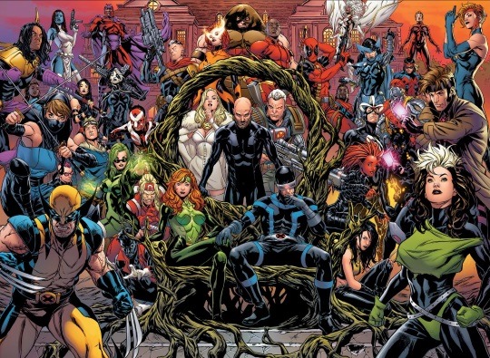
Before i delve in to the return of the Ultimate universe, i need to give a nod to the Krakoan Era of X-Men comics. That sh*t was brilliant. It's been a long time since I've given a sh*t about an X-Men comic so, to see how well that sh*t came together, i was stunned. Credit where credit is due, that man John Hickman has a vision! His world building is insane. I've been a pretty big fan of his since his work on Fantastic Four but what he did with the X-Men eclipsed that near completely. The groundwork he laid for others to move forward with, was strong enough to weather editorial nonsense and, eventually, Hickman's premature departure. It'd always the creatives who suffer but, as one of the greatest comic runs come to an end, i mourn it's loss. There seems to have been a bit of X-resurgence lately but it feels like it all started with those House of and Powers of X comics five years ago. That said, i think i am even more in love with what he's doing in the new Ultimate universe.
Return to Glory
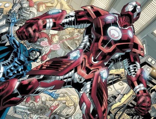
I love the Ultimate universe. Mostly. It is a time capsule of tropes and cliches of the day but the idea of it always appealed to me. Apparently, it appealed to Hollywood, too, because the MCU is based HEAVILY on the modern take Ultimate brought to the comics. When they killed it off, i understood why. Ultimate comics had basically ran it's course. There were a lot of mismatched tone and terribly stories at the time. Some were great, Ultimate Spider-Man maintained a decent quality until it's demise (probably why Miles was allowed to survive Secret Wars) but that thing needed to go. Throw out the entire universe, which they did. Well, several years later, Hickman, apparently, sold the Marvel higher ups on a proper reboot with a limited series title Ultimate Invasion. Another 1610 refugee, The Maker, decided to reboot his home universe and, being a Reed Richards not shackled by morality, did just that. Marvel gave Hickman the keys to an entire branch universe, with branding enough to lured in suckers like, and he has not disappointed. yes, it does feel a little "Heroes Reborn" but that can be forgiven because, so far, it's pretty f*cking good.
Along Came a Spider
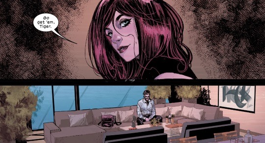
The initial offering of Ultimate comics consisted of Ultimate Spider-Man, Ultimate Black Panther, and Ultimate X-Men. Obviously, Ultimate Spider-Man is my sh*t. I finally got my Endgame with Pete and MJ plus their two kids. I love this book just because of that but there is so much more to it than JUST that. It's written very well. This one is, more than the others, a character driven drama with occasions spurts of super powered action. It's f*cking brilliant, easily the strongest of the three individual books. Did i mention the art is gorgeous? It has that in common with peach Momoko's take on X-Men.
Turning Japanese
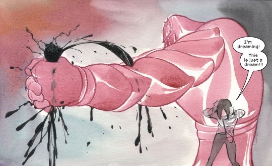
I'm a sucker for manga and anime. A cursory search of this blog will tell you that. My personal style is heavily influenced by Kubo Tite and Toriyama. I stumbled across Peach Momoko LONG ago on an image board somewhere and have been haunting her career ever since. It's f*cking dope seeing Marvel give her a shot like this and, so far, it's paying off. Her take on X-Men seems to be focusing on Armor but with a Coming-of-age twist. It's very unique and i am enjoying where she's taking the character. Hisako is basically Wolverine's fourth or fifth adopted daughter. That's it. That's as far as she gets in the main universe. Giving her the spotlight was an interesting choice, one that allows Peach to kind of juxtapose her mutation with the oft stifling expectations of conservative Japanese society. Plus, Storm is Japanese maybe? Or not because...
Wakanda Forever
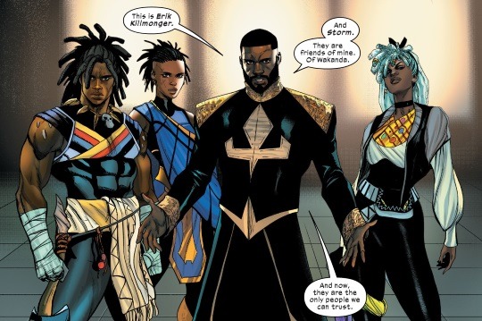
Storm is an integral part of Ultimate Black Panther and is basically classic Ororo but, like, a teenager? Who has teamed up with Erik Killmonger? To save Wakanda from Konshu and Ra? I'm going to be honest, i don't like this book so far. I can't connect with it. It's definitely a slow burn, feels like a covert/espionage, spy thriller type narrative, which is fine, but it's taking WAY too long to get going. There is a ton of groundwork which needs to be laid so we're four issues in and just not getting the principal team together. It's a frustration, for sure, but i get it. Another thing taking me out of this is the Panther suit design. Sh*t is gross. You can tell everything in this Ultimate version of the world is heavily inspired by the MCU films but it's not hitting like it should. Ultimate Black Panther has potential but right now, I'm reading it just to keep up with events.
Ultimates
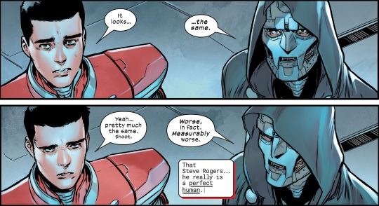
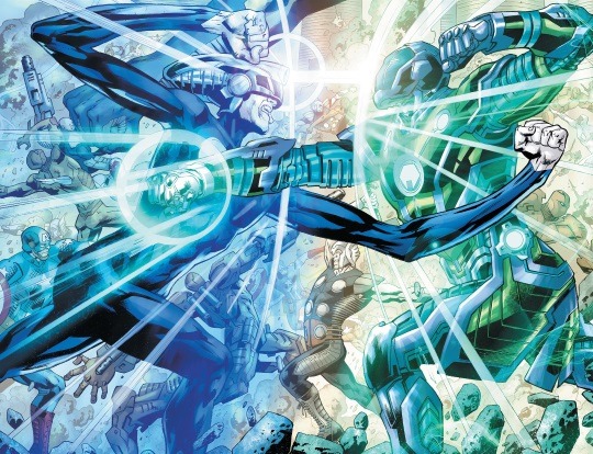
This one just dropped and, i must say, i like it more than any other Ultimates book to date. It's basically the origin of the team and it hits so much harder that any of the other comics to date. Lots of world building in the margins here and i mean that. Read all of the preamble and afterword because it gives you a very clear of what is going on with the current state of world affairs. The comic, itself, is pretty good. Legit shows the efforts to save the fledgling universe from The Maker and the failures. We get to see this take on Ant-Man and Wasp, plus a few licks of what is on the horizon. As a comic, it's underwhelming. As a preview of what's next, it's dope.
I know i said the big two but this one got away from me. I'll have to get to the DC stuff later and, obviously, it's about to be real Bat-Heavy. He seems to get just SO much love over there at Detective Comics Comics. That said, Marvel needs to keep betting on Hickman because this dude is delivering some fresh, fun, and brilliant takes on established characters. We need more of this unfettered creativity. That's what comics are supposed to be about in the first place.
2 notes
·
View notes
Text
LBD rewatch, full show summary
Rewatches will never fully recreate the experience of the first time around, for good and for bad. Sometimes, a rewatch strips away some of the joy from a well executed plot twist. Sometimes, it adds entirely new dimensions that could not possibly have been noticed on the first pass. Sometimes the art itself has “changed” in the interim, due to cultural or technical development. No matter what, the viewing experience will be different.
For popular media - and more specifically popular media with involved fandoms - a huge factor can be the post-show narrative. Any good fan will know that a show doesn’t have to be currently airing in order to have an active fandom (Star Trek, anyone?), but there is immense weight to how a longform story that has grown and changed over time is perceived by its longterm fandom. Some shows have huge followings while they’re airing and then basically disappear from the cultural consciousness soon after they finish, often due to burning bridges with their own fanbase or having endings that don’t live up to their earlier seasons (Game of Thrones, How I Met Your Mother), some shows simply fizzle out and nobody remembers that they still exist (I loved Call the Midwife, but I’m about four seasons behind and it very much no longer has the active fandom it had a decade ago...), and then there are the shows that keep chugging along, maintaining their own moderate success and cultural appeal even years after completion (The Office, a show I expected would not have a lasting impact, remains confidently present).
What’s this to say about the Lizzie Bennet Diaries, though?
When it began airing, LBD felt like a minor media earthquake. The show leaned into its vlog-style presentation, integrated different social media platforms as an active part of its storytelling (”transmedia”), bounced between different accounts without minding if someone suddenly missed a part of the story (but trusting their ex-world media to do the job, and also trusting the viewer to find what needed to be found), and doing so in a way that felt shockingly believable. There’s a reason that LBD sparked the imaginations of so many different young creators across the world, who wanted to emulate this sort of storytelling. LBD set the stage.
A common narrative that’s emerged in the years since LBD ended is one that admires how it set that stage, but then adds a caveat about its implementation. Hardcore fans of what became known as “literary inspired webseries” (LIWs) will often point out that LBD was a “flawed” show, obviously not their favorite, “not very good” in retrospect, and so on. I’ve seen countless posts and tags to this extent and have even on occasion caught myself thinking that too. Of course I liked LBD, I would tell myself, but I didn’t love it the way that I went on to love other shows. As time passed and the LBD-specific fandom quieted down, I accepted this narrative as truth.
And this is where a unique benefit of rewatches comes into play: Rewatches can set the record straight.
The Lizzie Bennet Diaries is, ultimately, still not my favorite webseries. It’s still not what I would call the “best” literary webseries I’ve seen, either. It doesn’t have the best transmedia. It isn’t the best adaptation of a webseries I’ve seen, nor the best adaptation of the original work itself. (Some might argue that it’s not even the best modernized adaptation of Pride and Prejudice, but here I find myself disagreeing somewhat; I’ll elaborate on that some other time.) Lizzie Bennet Diaries was, in a way, eclipsed in my mind by some of the series that came after it.
All that being said, it’s also a very good series. And it’s not a stretch to say that I loved this rewatch.
I’ve gone through some of the show’s features and flaws in my previous posts (parts 1, 2, 3, 4, and 5), but a recurring theme from my recap posts was that a lot of things that I remembered being bad simply weren’t there. I remembered Lydia’s transformation into her Wickham arc being abrupt, but it wasn’t; her loneliness and sense of not fitting in start extremely early on. I remembered Lizzie as being presented much more kindly/positively than what she actually is, in part because of her growth during the series and attempt to be less judgemental (which is all explicitly laid out in the text!). I remembered the show feeling slow, but it wasn’t. I remembered the parts that were/weren’t on camera feeling like MASSIVE stretches, but they’re mostly discussed in-text. I remembered feeling like there was a clumsiness in the show actually feeling real and fresh, especially compared to shows that came afterward, in terms of acting.
A lot of these stem from two main issues: 1) the last part of the show is a lot less well paced than the beginning, and 2) there are acting inconsistencies with the medium. The first of these is something similar to what I described earlier in terms of the end of the show being weaker than the beginning. The second is a problem that recurs across the vast majority of webseries that I’ve watched, but I think I remembered it being worse for LBD is because of how good the good parts are.
So here are some of those good parts: Ashley Clements’ Lizzie is absolutely brilliant. I feel like she’s rarely remembered for being tremendously well-acted, I think because it’s sort of assumed to be an easy role, while someone like Mary Kate Wiles garnered obvious (mostly justified) admiration for the more obvious work she did as Lydia. Meanwhile, Laura Spencer and Julia Cho are also both excellent in their respective roles as Jane and Charlotte, rounding out the main cast in a way that feels almost unbelievably good. Of the lead four, I actually continue to have the most nitpicks with small things in Lydia’s acting (which could also be about directing), but these also feel unimportant in the grand scheme of how her story played out so richly. It seems trivial to say it now, more than a decade since LBD first aired, but the active choice to make Lydia a second lead character is inspired, even if I’m still a little uncomfortable with how some of her story played out. And none of this would have worked without good acting and writing, especially in how Lizzie builds and presents her story.
The acting inconsistencies mostly occur in the side characters and much of that is also down to the show’s insistence on having people show up on camera when they frankly didn’t need to. Having Fitz be a random friend who shows up on camera with Lizzie was fun because he wasn’t a plot-central character, he was just sort of... there. His appearances feel casual. (It’s helps that he’s one of the characters who is clearly most comfortable being filmed.) But I cringed just a little bit every time Bing appeared onscreen, and Gigi too for the most part. It’s not necessarily poor acting, to be clear, but it’s inconsistent with their environment and it makes it harder to buy into the “real”ness of those videos. Darcy, at least, carries his obvious discomfort with being on camera like an absolute burden (which is entirely believable), but this didn’t help alleviate my sense that Lizzie should not have been uploading those videos.
The fact that the ending is weaker than the entire run of the show is a more serious issue, I think, and certainly helped contribute to my sense of the show being less well-paced than it actually was. One of the things I’m grateful for, at least, is that “The End” is an episode that centers around Lizzie, Charlotte, and Lydia. Part of what didn’t work for me with LBD’s end was the fact that it felt like the show forgot that it wasn’t actually a romance, but more Lizzie’s becoming and growth process, with Lydia, Jane, and Charlotte as crucial linchpins during this process. Darcy is an obvious presence in the story, but the Lizzie Bennet Diaries as a show isn’t about Lizzie and Darcy getting together, just like Pride and Prejudice isn’t a romance novel. The problem with ending LBD within a couple of episodes of Lizzie and Darcy getting together is that it makes it seem like that was the whole point of the story.
But on this point, there’s also a reminder of the fact that for the most part, Lizzie Bennet Diaries is a good adaptation. I’d remembered feeling like it was old-fashioned because of things like the Jane/Bing subplot and how Lizzie and Darcy spoke with each other (...stiffly), but the majority of the show does a really nice job of loosening up Pride and Prejudice to match the modern day. The way that many of the romantic gestures end up tied to jobs is a nice nod to the fact that modern women have aspirations and goals that aren’t just about bagging a rich husband (coughcough). I also still really admire that the show decided to fully humanize Lydia, without stripping away the weight of what happens to her. Except instead of it being a burden on others and All About Lizzie, it’s actually a story about the ways in which a young woman’s value can be easily erased and recognizing that event as the abuse that it is. I still don’t love all the ways in which that arc plays out, but the fact that it exists? Excellent.
This rewatch was the obvious choice to start my Great Webseries Rewatch and it earns its stripes; even more than a decade later, the Lizzie Bennet Diaries is a mostly well-made, well-written, and well-acted show. It also has the distinct honor of being a show that had genuine widespread appeal, garnering attention beyond a small fanbase of loyal viewers. LBD set the stage, performed, and earned its standing ovation. The fact that others came up onto that stage afterward and performed their own wonderful art should not take away from its achievements.
#The Great Webseries Rewatch#series analyses#lizzie bennet diaries#lbd#webseries#essays#Longer thoughts
18 notes
·
View notes
Text
I've been thinking about werewolf designs recently, which has basically turned into analyzing my least favorite trends in modern werewolf media
pack focus - with a few exceptions, I find a pack of werewolves a huge downgrade from traditional singular ones (not you, Hotel Transylvania wolfman family-- you're angels and and we're thrilled you're here). How is a guy supposed to feel like a properly cursed and outcast abomination while hanging out with his 2 dozen friends who are exactly like him? "Packs" made up of lone lycanthropes who've adopted each other (for good or ill) is alright I guess, and if a whole family gets cursed The Quarry style, that's interesting at least. But I think getting back to solitary menace or lonely outcast werewolves is best.
too wolf-like - a lot of early werewolf accounts have people just turning into straightforward wolves. Some have a transformation into large, predatory creatures, more or less wolf-like depending on the region and the culture, but with features that differentiated them from wolves-- hybrid anatomy, missing tails, human eyes or other features. In others it's just "a creature," without an explicit lupine connection, or even just literally some guy but Powered Up and eating people. So there's no hard and fast "canon" folklore werewolf. Early monster movies (which established a lot of modern werewolf lore and the modern definition of a werewolf) gave us a creature that simply looks like a furry, monstrous humanoid, and nothing really like a wolf. What I'm saying is there's a lot of room for customization and new ideas. But instead I see very little experimentation or creativity, and a lot of Balto-meets-Van Helsing wolf-head-furry-body-man-pants thing (or worse, mangy pitbull rat hybrids) and a commitment to quasi-lupine traits and behaviors. BORING. If you're not married to literal-wolf werewolves, let's see some creativity! Be adventurous! Get inspired by old school werewolves, or do something completely new! Please!
not wolflike enough - if you are committed to generic wolf -based werewolves or anthropomorphic streetsharks-style man-wolves, at least be accurate about it! Wolves in the wild do not have true alpha-omega hierarchies (a pack in the wild is a family unit-- the parents are leaders, the rest of the pack are usually their children). Nor do wolves bite their mates to "mark" them (in fact, I went and looked into it, and didn't find any species that does, so now I'm curious where this whole idea even came from). ALSO it's kind of petty, but so many werewolf designs seem to look more like dogs than real wolves-- narrow nose bridges, too-close-together ears, etc. Basically, so much werewolf content is committed to this generic idea of werewolves that's not accurate to real wolves, frequently unconnected to any werewolf lore, originated in the last 10 or 15 years, and isn't even interesting for all that (with different versions of "generic" depending on genre)-- ditch it, and do something new, or at least accurate!
ugly = scary/boring = sexy - the two big splits of "generic" werewolves I'm seeing are in horror (movies mostly) and romance. Current horror werewolves seem to be stuck with this ugly, disheveled look-- mangy, molting-looking fur, extremely wrinkly, raw-looking face skin, beady eyes, no tails, skinny, bony-looking bodies, huge feet etc (honestly I think the Underworld designs are the progenitors of this); meanwhile romance werewolves are usually big and brawny, with lush fur and swishy tails and a very cartoony balance of human and wolf characteristics (I think this design is indebted to animated movies and furry art, but also think it was very influenced by Van Helsing's werewolves as well). Basically, I'd like some interesting, potentially scary looking werewolves! A scary design is not going to kill the sexiness! At the same time, a design does not have to be purposely ugly in order to be scary! (Case in point, it's not a werewolf, and much more feline, but I adore Angela Barret's design for the beast in Beauty and the Beast-- unique, bestial and potentially frightening, but also sleek and elegant.)
exclusively abo - I get it, I get it. But like, 90% of werewolf romance stuff is the "claimed as the alpha's mate" variety-- I would enjoy some diversity. Also, if it's heat you're into, that's in no way exclusive to either false real-world alpha hierarchies, or invented fictional ones.
#I have Thoughts and Feelings about this subject#and 90% of what's out there is Unsatisfactory#lore and more#werewolf
16 notes
·
View notes
Text
I Missed You

I've been frustrated with US comics for a few years now. Sh*t has been a barren wasteland of content for some time. Well, i can't say that for the entire industry, mostly the Big Two, but they weight the industry down so much, it's hard not to focus in on them. If the two gods bleed, what does that mean for the lowly mortals, you know? IDW puts out pretty solid Licensed fair, though. Their Power Rangers and Sonic stuff is pretty good. I really loved the Transformers comics they produced until Hasbro wanted a bigger piece of the pie and pulled their rights. Still, Image is doing a pretty great f*cking job with my darling Cybertronians now, so I'm not too mad about it, but i digress. This is more about DC and Marvel and how they've finally decided to get their sh*t together. Even if it's not anything in the main continuity.
Fall of X

Before i delve in to the return of the Ultimate universe, i need to give a nod to the Krakoan Era of X-Men comics. That sh*t was brilliant. It's been a long time since I've given a sh*t about an X-Men comic so, to see how well that sh*t came together, i was stunned. Credit where credit is due, that man John Hickman has a vision! His world building is insane. I've been a pretty big fan of his since his work on Fantastic Four but what he did with the X-Men eclipsed that near completely. The groundwork he laid for others to move forward with, was strong enough to weather editorial nonsense and, eventually, Hickman's premature departure. It'd always the creatives who suffer but, as one of the greatest comic runs come to an end, i mourn it's loss. There seems to have been a bit of X-resurgence lately but it feels like it all started with those House of and Powers of X comics five years ago. That said, i think i am even more in love with what he's doing in the new Ultimate universe.
Welcome Back

I love the Ultimate universe. Mostly. It is a time capsule of tropes and cliches of the day but the idea of it always appealed to me. Apparently, it appealed to Hollywood, too, because the MCU is based HEAVILY on the modern take Ultimate brought to the comics. When they killed it off, i understood why. Ultimate comics had basically ran it's course. There were a lot of mismatched tone and terribly stories at the time. Some were great, Ultimate Spider-Man maintained a decent quality until it's demise (probably why Miles was allowed to survive Secret Wars) but that thing needed to go. Throw out the entire universe, which they did. Well, several years later, Hickman, apparently, sold the Marvel higher ups on a proper reboot with a limited series title Ultimate Invasion. Another 1610 refugee, The Maker, decided to reboot his home universe and, being a Reed Richards not shackled by morality, did just that. Marvel gave Hickman the keys to an entire branch universe, with branding enough to lured in suckers like, and he has not disappointed. yes, it does feel a little "Heroes Reborn" but that can be forgiven because, so far, it's pretty f*cking good.
Along Came a Spider

The initial offering of Ultimate comics consisted of Ultimate Spider-Man, Ultimate Black Panther, and Ultimate X-Men. Obviously, Ultimate Spider-Man is my sh*t. I finally got my Endgame with Pete and MJ plus their two kids. I love this book just because of that but there is so much more to it than JUST that. It's written very well. This one is, more than the others, a character driven drama with occasions spurts of super powered action. It's f*cking brilliant, easily the strongest of the three individual books. Did i mention the art is gorgeous? It has that in common with peach Momoko's take on X-Men.
Turning Japanese

I'm a sucker for manga and anime. A cursory search of this blog will tell you that. My personal style is heavily influenced by Kubo Tite and Toriyama. I stumbled across Peach Momoko LONG ago on an image board somewhere and have been haunting her career ever since. It's f*cking dope seeing Marvel give her a shot like this and, so far, it's paying off. Her take on X-Men seems to be focusing on Armor but with a Coming-of-age twist. It's very unique and i am enjoying where she's taking the character. Hisako is basically Wolverine's fourth or fifth adopted daughter. That's it. That's as far as she gets in the main universe. Giving her the spotlight was an interesting choice, one that allows Peach to kind of juxtapose her mutation with the oft stifling expectations of conservative Japanese society. Plus, Storm is Japanese maybe? Or not because...
Wakanda Forever

Storm is an integral part of Ultimate Black Panther and is basically classic Ororo but, like, a teenager? Who has teamed up with Erik Killmonger? To save Wakanda from Konshu and Ra? I'm going to be honest, i don't like this book so far. I can't connect with it. It's definitely a slow burn, feels like a covert/espionage, spy thriller type narrative, which is fine, but it's taking WAY too long to get going. There is a ton of groundwork which needs to be laid so we're four issues in and just not getting the principal team together. It's a frustration, for sure, but i get it. Another thing taking me out of this is the Panther suit design. Sh*t is gross. You can tell everything in this Ultimate version of the world is heavily inspired by the MCU films but it's not hitting like it should. Ultimate Black Panther has potential but right now, I'm reading it just to keep up with events.
Ultimates

This one just dropped and, i must say, i like it more than any other Ultimates book to date. It's basically the origin of the team and it hits so much harder that any of the other comics to date. Lots of world building in the margins here and i mean that. Read all of the preamble and afterword because it gives you a very clear of what is going on with the current state of world affairs. The comic, itself, is pretty good. Legit shows the efforts to save the fledgling universe from The Maker and the failures. We get to see this take on Ant-Man and Wasp, plus a few licks of what is on the horizon. As a comic, it's underwhelming. As a preview of what's next, it's dope.
I know i said the big two but this one got away from me. I'll have to get to the DC stuff later and, obviously, it's about to be real Bat-Heavy. He seems to get just SO much love over there at Detective Comics Comics. That said, Marvel needs to keep betting on Hickman because this dude is delivering some fresh, fun, and brilliant takes on established characters. We need more of this unfettered creativity. That's what comics are supposed to be about in the first place.

0 notes
Text
Graphics programmer here! I don't work on AAA games but I can provide some comments. Broadly you're right though, expect diminishing returns and shift of emphasis.
There's a million different factors in what makes games 'look good'. For decades, some notion of "photorealism" trumped everything, although exactly what that meant has shifted considerably (currently 'looking like a modern digitally-shot film'). Nowadays I think we're finally letting go of that - in part because of the diminishing returns discussed above - and experimenting with more creative, nonphotorealistic art direction.
Besides simply computers getting faster, in the past couple of decades two really huge things happened in graphics: the introduction of programmable shaders, and physics-based rendering theory. Both of these drastically changed how graphics were done and opened the door to all sorts of inventive new techniques.
I don't think it's likely that we'll see that sort of massive paradigm shift again anytime soon. Newer developments in graphics tend to be a lot narrower in scope. (Yes, even raytracing).
So "graphics" does not progress evenly. We've gotten very very very good at surface shading, and we've built a standardised workflow around PBR that means we can pretty reliably get the computer to simulate what happens when light strikes most types of object. We've also standardised on a lot of sensible ways of doing things - e.g. doing light calculations in HDR floating point and tonemapping which gives it a sort of 'filmic' look (because modern films are also shot in HDR and colour graded in much the same way lmao). These two things are basically solved problems. We are unlikely to render a better-looking brick.
There's a lot of other stuff, though, that is still way too expensive to simulate accurately in realtime - so realtime graphics is still an incredibly complex game of smoke and mirrors.
For example, take water. (I'll be writing a massive article on water rendering soon). If you want to simulate a choppy ocean, there's no computer on Earth that could do an actual fluid sim in real time. But you can make your GPU add up a bunch of Gerstner waves in the vertex shader or even do a fast fourier transform of some real ocean spectra, and instance some particles at the wavecrests to simulate foam, and whack some Fresnel on the speculars, sample the colour buffer using displaced coordinates to approximate refraction, and a handful of other tricks, and you'll get a pretty tasty ocean.
youtube
The stuff that's really hard to do is stuff that involves light bouncing around the scene in multiple ways before it reaches your eyes. Speculars, diffuse interreflection, subsurface scattering, all of that. Rendering a leaf with the sun on the other side is a much harder problem than rendering that brick.
The hot new feature of the latest hardware is raytracing. That will help with all of those things, potentially! But the thing is... we've spent the last decade finding ways to fake it.
Take reflections. If you want to do realtime specular reflections, your options are:
only reflecting the lights: most materials do it this way, but if something is quite shiny, you've got something missing
an environment map: essentially you render the scene onto the surface of a sphere around a point. good if the object is very small compared to the scene, the reflections are blurry, and the object is bumpy. if you just want to make something 'look shiny', this is a good option. can baked in advance (but you won't reflect non-static objects) or updated with a special render pass (expensive, so you try not to do this every frame).
a reflection camera: good for planar reflections like mirrors. you basically render the scene twice, once reflected through the mirror. can also be used with a normal map to get slightly distorted reflections, up to a point. (expensive - you have to render the scene twice, lots of texture reads without mips)
screen space reflections: you raymarch into the depth buffer and then sample the colour buffer. you won't reflect anything that's not onscreen, which can be jarring, but you can do this all in the fragment shader. (expensive - gives your GPU's ALU a workout, lots of texture reads without mips. works well with deferred rendering.)
raytracing: the new revolution that's going to change everything forever! ...assuming the players are really paying close attention to shiny things to notice the difference, anyway. (noisy, mega expensive, requires the player to have a card that supports it)
Besides raytracing, all these techniques are pretty old. Which ones should you use for your game? It depends on so much shit: art direction, target hardware, what else you're spending your render budget on. If reflections are important, you can probably use one of the first three for most situations. But if you can use raytracing, it will probably look nicer. More accurate reflections, more objects reflecting the whole scene.
How much does this affect someone's enjoyment of the game? If they're a graphics nerd, they might be pretty excited. If not... maybe they'll get a general feeling that things look 'more realistic', but you can already get so far with rasterisation, baked lightmaps and screen space techniques that it's not the same sort of dramatic leap that previous generational changes have represented. The difference is actually most obvious in lower-detail scenes with a lot of smooth surfaces, which is the opposite of most games lol.
So on the pure rendering front we're definitely hitting hard diminishing returns.
There are other fronts of advancement, but it's increasingly subtle details. e.g. real time cloth sim has improved drastically in the last few years.
And there's a lot of stuff that while it ought to be simple, still confounds modern games. Although it's become increasingly popular to record huge amounts of mocap data, animation systems have sooo much room to improve. It's really hard to get two characters to interact according to a prerecorded animation in a natural-looking way - either you have to jump a character into place or accept there may be janky misalignments. So e.g. in Warframe, a game that's got all sorts of crazy advanced graphical techniques... if I try and get my character to pet her cat, she will most likely wave her hand somewhere in midair half a metre from the cat. Animations like kisses where two characters squish together and physically interact are especially hard to do well (there's a reason people went nuts about that TLOU2 trailer a couple years back).
There's also a lot of technical puzzles to do with interacting with terrain (foot IK, flattening against walls, squeezing through gaps) and animation blending (with the new hotness being 'inertial blending'). The future will probably involve more sophisticated systems for blending procedural animation (IK, physics sim etc.) with authored animations, but that's a tricky technical problem to solve and cover every single weird edge case. It's been a persistent problem that game characters tend to have much nicer shading models than animation systems, so they look great in a screenshot but move really unnaturally, or can't act expressively, all of that.
Even something that seems as simple as a character picking up an item in their hand is something that is really hard to get right! Most games simply sidestep the problem and teleport the item from the world space to the character's hand/holster/etc. Or if the player can manipulate the world with physics, they hold it with an invisible ray.
How much difference will that make? I don't know. It fascinates me, but I think players have learned not to care too much about a bit of animation jank.
Destruction is also really hard to do well. It's something we're seeing lots of exciting experiments around - take Teardown's incredibly clever voxel rendering, where a different abstraction (voxels rather than polygons) lets them do a bunch of really detailed physics and semi-raytraced reflections without specialist hardware. Boolean cuts are a mechanic explored in some games (quite far back). Or you pre-simulate the destruction, which has been done as far back as HL2E2. But inevitably you have to abstract over it somehow.
The other technical front is like... handling all the data involved in modern games. Both on the game logic side - making most efficient use of threads and CPU cache, 'data oriented' design - and the graphics side, swapping between LOD levels seamlessly - and also especially with loading stuff off the disc and figuring out what to drop from memory so you don't get janky pop-in. AAA games especially pull from a massive worldwide asset production line and nowadays, might weigh in at tens or even hundreds of gigabytes compressed on disc. Streaming all of that off the disc in an open world game is a really insane technical feat honestly - dealing with networking in the mix, customisable costumes etc., even more so. But we mostly recognise it when it goes wrong: animations don't load in when they should so a character T-poses, or the textures look really blurry for a bit.
And just because it's insane that this can be done at all doesn't mean it's necessarily always done well. Making modern AAA games is a ridiculous logistical operation as much as everything. Even with increased use of mocap, photoscanning, and the like, all that data has to be authored, cleaned up and incorporatedi nto the game. The quieter revolution has been the scaling up and Taylorising of videogame production, so you can get a few hundred people in twenty different ocuntries to make the armour plates for your robot dinosaur, or cosmetics for your loot shooter, or whatever. There's a lot of room for improvement on data compression as well, as Fitgirl constantly demonstrates lmao. A lot of games don't go for the level of efficiency we could achieve with modern hardware, just 'good enough'.
Anyway all that said...
Art direction is way way way more important than graphics tech, and rather than chasing diminishing returns of realism, the real leap forward will come when people start applying the tech to other purposes besides "realism".
Take Hades for example. Fantastic looking game - but it's not doing anything super fancy on the technical side, just drawing lots of sprites, some animated vfx sprites, and some low-detail models with a cel shading effect, I think there's a subtle bit of bloom over the top. What makes it look so good is the incredibly strong use of colour and the fantastic illustration style unifying it all. It's clearly a well-engineered engine that loads quickly and runs at a high-framerate, but it's ultimately just using existing tech to strong effect.
Or Disco Elysium - painted backgrounds which have depth, normals and occlusion information allowing real time lighting in a shader, low-detail 3D models with painted textures that unify them with the game's style. And again loads of static paintings and illustrations.
3D? How about Scorn? Made in Unreal, but it doesn't look like any other Unreal game you've played; it looks like a Giger painting, down to all sorts of subtles of how light works. It's full of gorgeously little gruesome animations of your character sticking their hand in squishy ports and things like that. And that effort paid off hugely. The devs of Scorn chose a few specific things to focuse their effort on, tech-wise - exactly the ones most necessarily for the vibe they were trying to set.
So I really hope that games will go the direction animated films are going lately, and start exploring the "nonphotorealistic" aesthetic space a lot more. I think we haven't even scratched the surface of what GPUs can do. I especially think most games on the platform I work on at the moment, the Quest 2 standalone VR headset, are not nearly making full use of the expressive power of this hardware. We don't have to make everything look like plastic.
it becomes a lot more understandable that people claim graphics haven't advanced noticeably since the 360/ps3 era when you remember everyone who says that and isn't just a liar is someone whose only current gaming outlet is phones and/or the Switch, both of which really can only handle 360/ps3 graphics.
432 notes
·
View notes
Text
I was talking to some friends the other day about Sandy Welch's screenplays (North and South 2004, Jane Eyre 2006, Emma 2009) and the ways in which she transforms the source material in such a way that her screenplay is reminiscent of the impressions of some readers rather than the story itself. If adaptators were like art copists, while others would sit in front of the painting to reproduce it, Welch would study it for a long time and then sit outside to reproduce by memory; she produces a painting that is recognizable as referencing the other painting, but that cannot be really called a copy.
I'm not saying this is bad; in fact, I think she has an extraordinary talent to replace book dialogue with more modern sounding language while still not making it feel completely out of place (as adaptations like Jane Eyre 1997 show, this is not an easy skill to master). She also takes adaptational risks meant to A) give context and texture with things of the period that were familiar to the reader of the time but may be lost on us or B) introduce elements of other stories/tropes the audience may be more familiar with.
I used to say a lot that Welch's screenplays take risks that sometimes succeed greatly and sometimes crash horribly, no in between, but was never able to put my finger in the mechanics of it, but I think the distinction above is one that I think is illuminating, specially when it comes to looking at her North and South and Jane Eyre.
Emma (2009) is the one, I think, where less of A) and B) appear. If anything, somewhat anachronistic elements are added, like the preface montage that has a more Dickensian bent. Most of the adaptational elements on this script are there to highly themes and internal connections (Emma and Miss Bates are linked for the audience in the scene where the Bates are the last to leave the Weston's wedding breakfast; Emma's loneliness is showcased in the scene afterwards where she remembers a childhood scene with her sister and miss Taylor, and Mr. Knightley's arrival pulls her back into society).
In Jane Eyre (2006) we can see a good chunk of A at play, but not so much of B. Rochester is given enthomology interests (pointing to the boom of natural sciences in the 19th century), we are shown the fascination with the exotic and "oriental" in Jane's daydreams, we are exposed to the theories about genetics, inheritance, and phrenology that will later on end up in the boom of eugenics... when it comes to B, though, there's little more than a closing of the age gap between Jane and Rochester (he's characterized as a younger man, while Jane is played in a more world-wise fashion, with the presence of a woman in her mid 20s), and an attempt to link A and B through the twins argument (which, IMO, backfires, badly). So, all in all, the story stands on its own, with a few changes to neutralize some of the less likable bits to a contemporary audience (Jane's naivety, Rochester's wickedness at some points, the religious and moralizing tone of much of the story and in particular of Jane and Helen's relationship, the reduction of the impression of age gap between Jane and Rochester, etc).
And now we come to North and South (2004). Now, as those who follow me most likely know already, I'm ambivalent about this series. There's much to love in it and much that I just... no. And I think this is due to the following reasons: the source material in this case has a very different quality than the other two; A sometimes gets in the way of things that are important to the building of the overall story; B is used a lot and obscures much of what makes the original story great. Let me explain:
North and South, like most of Gaskell's best writing, is very little about plot and a lot about the inner lives of the characters and the ways in which they go through life and deal with tragedy. This is, understandably, something quite difficult to portray. Emma and Jane Eyre are, even if the bildungsroman part in them is important, far more plot heavy stories. If you want an Austen comparison, adapting North and South is a lot like adapting Mansfield Park (in fact, this post was inspired by a conversation about what a Sandy Welch script for Mansfield Park would look like). One bit of trivia that further supports this is that the title North and South came out as a request/demand from Dickens, while Gaskell's chosen title for the story was Margaret Hale.
North and South 2004, like Jane Eyre 2006, presents contextual elements, the most impressive of them, the use of actual 19th century cotton mill machinery in a mill environment. I don't really know if it is something that is kept operational in a museum context, but even so, when you stop and think all that was needed in order to get footage of working 19th century machinery AND of people operating it... wow. And it makes sense that they would show this off. But then we have Margaret get into the mill to see it, which breaks one important element of the narrative: all the knowledge Margaret has of the mill situation and the hands/masters conflict is second hand. She listens to Thornton and to Higgins and to Bessy, and like the reader, she needs to make up her mind without having any first hand access to the facts. That narrative tension of the book is lost.
The second big A element of this series is the London exposition. Here we are given a sense not only of the enterprenurial spirit of the 19th Century and the wonders of its inventions, but also of the extent of the power of the British empire at its peak. Which is great except for the fact that it cuts the tension of Margaret not being able to leave Milton. And this is very important because it helps us feel empathy for Margaret, focus on her sense of being trapped, stuck, and then be surprised when, in leaving, we realize the friends she gained, the growth she underwent, and the subtler freedom she had there, once we are brought back to the mental constriction of aunt Shaw's London.
Because N&S sits in this crossroads of psychological novel and social novel, where the marriage plot is structural but not necessarily central, it is here where Welch appeals the heaviest to B: North and South is then filtered and rearranged through evocation of Pride and Prejudice, Beauty and the Beast, and Hades and Persephone. This in turn predisposes the audience to seek for these things in the novel itself, obscuring the things that make it great. If N&S is just a Pride and Prejudice redux with some B&tB and H/P thrown in, then it is, indeed, a pretty mediocre version of it. But it is not!
Helstone is not paradise or eternal spring: there people live very hard lives, with little comforts, stagnation, and lack of education. Yes, it still has the beauties of rural life, but it shares in its drawbacks as well. The same way, Milton is not hell. There's the risk and the desperation and the smoke and the rattle of machines, but there's also change and comforts and opportunities to cultivate the mind (while in the series the ateneum is just an excuse to say how boring Mr. Hale is and that it is all an excuse to have union meetings, in the novel people do actually go there to learn things). Gaskell is not a manichean writer, in the vein of Dickens.
Thornton is not the lonely lord of a world of grief and oblivion: he's a bulldog like no nonsense businessman with a family to take care of, a practical man with an iron will and very fixed ideas about how the world works and should work. It is only at this point in his life that he finally has leisure to cultivate his mind and "have feelings" and that's why he falls so hard for Margaret. And what he likes about Margaret isn't really some sense of freshness or vitality and whatnot, but that she has a regal, commanding air (yes, Thornton is a "please, step on me, madam" man) to her. Likewise, Margaret is not the sunny princess of a sunny realm: she's an observing, serious girl with a fiery temper, very pale and dark haired.
Compare the meeting of these two characters between novel and book. In the novel they meet at a pretty neutral point. Margaret is kind of cold because she's tired and wants to take a nap and WHEN IS THIS MAN LEAVING SO I CAN REST IN PEACE. Whereas Thornton reads this as haugtiness and yet cannot help but be fascinated by her and cannot really leave because of it. It's human, it's silly, and simple and endearing and frustrating all at the same time. In the series they meet at the factory, where Margaret dramatically shows up just in time to see him beat a man into a pulp. Very beauty and the beast, but very little in the end about what makes these two characters suited to each other and what kind of growth needs to happen for them to end up together.
The biggest sign of this problem is Margaret's characterization in the series; she's not a very developed character, and her intentions and motivations seem capricious or at least very hard to grasp... which is something that shouldn't happen in a story about her. Important milestones of her character, like her visit to Helstone where she needs to finally let go of the idilic and naive perspective of her childhood, and the contrast with Mr. Bell's grief for the loss of the world of his active adulthood, are obscured by dramatic points: in this case, the out-of-nowhere coy marriage proposal of Mr. Bell (seriously, series, what tha).
So... is the series bad? no, of course not. It's a beautifully shot, gorgeously scored, well acted, well paced, carefully set in period piece and it deserves the love and praise it gets. What I'm trying to say is that judgements about the novel based on the tropes of the series, in which the final ruling is "the series is better" precisely because these tropes are tangible in it completely misses the point of what the novel is about and the fact that it was never intended to be those tropes to begin with, so it cannot fail at portraying them. You may be more or less interested in what the novel is trying to do, and that's okay, but it has a merit and a value of its own that deserves highlighting and explanation.
Thank you so much if you made it this far XD
#Elizabeth Gaskell#North and South#North and South 2004#Emma 2009#Jane Eyre 2006#Sandy Welch#Jane Austen
150 notes
·
View notes
Text
let's talk about andi mack's worldbuilding
sorry this took forever to make! i've been pretty busy with school stuff and i kind of lost my inspiration for a bit, but i ultimately really enjoyed writing it! i wish i could've included more pics (tumblr has a max of 10 per post), and it kinda turned from less of a mini analysis to more of an extremely long rant... but i hope it's still a fun read!
i've been rewatching the show over the past few weeks (thanks again to @disneymack for the link!), and i’ve been noticing a lot that i never did the first time around. this is really the first time i’ve watched the show from start to finish since it aired, and it honestly feels so different this time - probably a combination of the fact that i’m not as focused on plot and can appreciate the show as a whole, and also that the fandom is much, much smaller now, so there’s a lot less noise. so the way i’m consuming this show feels super different than it did the first time, but the show itself doesn’t - it’s just as warm and comforting to me as it was the first time around, if not more so.
i think a lot of that can be attributed to andi mack’s “worldbuilding”. i’m not quite sure that this is the right word in this context, to be honest, because i mostly see it used in reference to fantasy and sci-fi universes, but it just sort of feels right to me for andi mack, because you can really tell how much love and care went into constructing this universe. for clarity, worldbuilding is “the process of creating an imaginary world” in its simplest sense. there’s two main types: hard worldbuilding, which involves inventing entire universes, languages, people, cultures, places, foods, etc. from scratch (think “lord of the rings” or “dune”), and soft worldbuilding, in which the creators don’t explicitly state or explain much about the fictional universe, but rather let it’s nature reveal itself as the story progresses (think studio ghibli films). andi mack to me falls in the soft worldbuilding category. even though it takes place in a realistic fiction universe, there’s a lot of aspects to it that are inexplicably novel in really subtle ways.
so watching the show now, i’ve noticed that the worldbuilding comes primarily from two things - setting and props, and oftentimes the both of them in tandem (because a big part of setting in filmmaking does depend on the props placed in it!).
one of the most obvious examples is the spoon. it really is a sort of quintessential, tropic setting in that it's the main gang's "spot", which automatically gives it a warm and homey feel to it. and its set design only amplifies this:
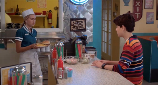
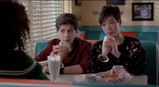
the choice to make it a very traditional 50s-style diner creates a very nostalgic, retro feel to it, which is something that's really consistent throughout the show, as you'll see. from the round stools at the bar, to the booths, to the staff uniforms, this is very obvious. the thing that i found especially interesting about it though is the choice of color. the typical 50s diner is outfitted with metallic surfaces and red accented furnishings, but the spoon is very distinctly not this.
instead, it's dressed in vibrant teal and orange, giving it a very fresh and modern take on a classic look. so it still maintains that feeling of being funky and retro, but that doesn't retract from the fact that the show is set distinctly in modern times.
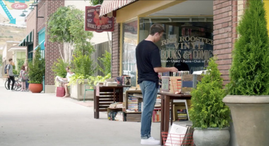
of course, this could just be a one-off quirky set piece, but this idea of modernizing and novelizing "retro" things is a really common motif throughout the show. take red rooster records. i mean, it's a record shop - need i say more? it's obviously a very prominent store in shadyside, at least for the main characters, but there's no apparent reason why it is (until season 2 when bowie starts working there, and jonah starts performing there). a lot of the time, though, it functions solely as a record shop. vinyl obviously isn't the most practical or convenient way of listening to music, but it's had its resurgence in pop culture even in the real world, mostly due to its aesthetic value, so it's safe to say that it serves the same purpose in the andi mack universe.
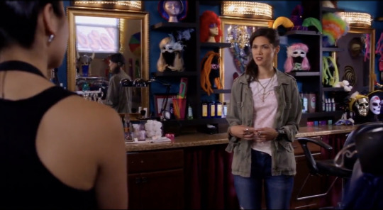
the fringe seems to be nostalgic of a different era, specifically the Y2K/early 2000s period (because it's meant to be bex's territory and symbolic of who she used to be, and its later transformation into cloud 10 is representative of her character arc, but that's beside the point). to be honest, exactly what this store was supposed to be always confused me. it was kind of a combination party store/clothing store/makeup store/beauty parlor? i think that's sort of the point of it though, it's supposed to feel very grunge-y and chaotic (within the confines of a relatively mellow-toned show, of course), and it's supposed to act as a sort of treasure chest of little curios that both make the place interesting and allow the characters to interact with it.
and, of course, there's andi shack. this is really the cherry on top of all of andi mack's sets, just because it's so distinctly andi. it serves such amazing narrative purpose for her (ex. the storyline where cece and ham were going to move - i really loved this because it highlights its place in the andi mack universe so well, and i'm a sucker for the paper cranes shot + i'm still salty that sadie's cranes didn't make it into the finale) and it's the perfect reflection of andi's character development because of how dynamic it is (the crafts and art supplies can get moved around or switched out, and there's always new creations visible).
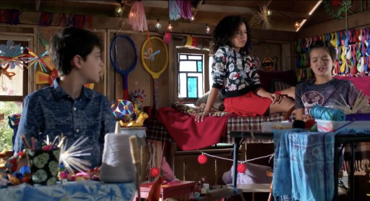
going back to the nostalgia motif though, the "shack" aspect of it always struck me as very treehouse-like. personally, whenever i think of treehouses, there's this very golden sheen of childhood about it, if that makes sense. i've always seen treehouses in media as a sort of shelter for characters' youthful innocence and idealistic memories. for example, the episode "up a tree" from good luck charlie, the episode "treehouse" from modern family, and "to all the boys 2" all use a treehouse setting as a device to explore the character's desire to hold onto their perfect image of their childhood (side note: this exact theme is actually explored in andi mack in the episode "perfect day 2.0"!). andi shack is no exception to this, but it harnesses this childhood idealism in the same way that it captures the nostalgia of the 50s in the spoon, or the early 2000s in the fringe. it's not some image of a distant past being reflected through that setting; it's very present, and very alive, because it reflects andi as she is in the given moment.
some honorable mentions of more one-off settings include the ferris wheel (from "the snorpion"), the alley art gallery (from "a walker to remember"), SAVA, the color factory (from "it's a dilemna"), and my personal favorite, the cake shop (from "that syncing feeling").
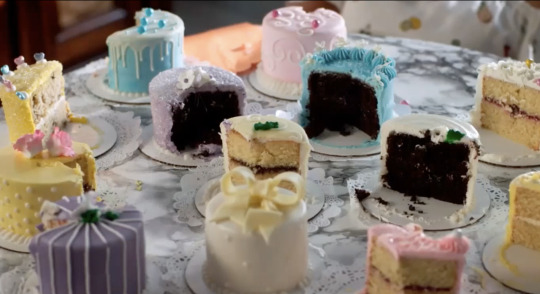
[every time i watch this episode i want to eat those cakes so bad]
these settings have less of a distinctly nostalgic feel (especially the color factory, which is a very late 2010s, instagram era setting), but they all definitely have an aura of perfection about them. andi mack is all about bright, colorful visuals, and these settings really play to that, making the andi mack universe seem really fun and inviting, and frankly very instagrammable (literally so, when it comes to the color factory!).
props, on the other hand, are probably a much less obvious tool of worldbuilding. they definitely take up less space in the frame and are generally not as noticeable (i'm sure i'll have missed a bunch that will be great examples, but i'm kind of coming up with all of this off the top of my head), but they really tie everything together.
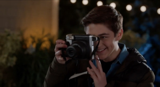
for example, bex's box, bex's polaroid, and the old tv at the mack apartment (the tv is usually only visible in the periphery of some shots, so you might not catch it at first glance) all complement that very retro aesthetic established through the settings (especially the polaroid and the tv, because there's really no good reason that the characters would otherwise be using these).
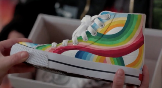
besides this, andi's artistic nature provides the perfect excuse for plenty of colorful, crafty props to amplify the visuals and the tone. obviously, as i discussed before, andi shack is the best example of this because it's filled with interesting props. but you also see bits of andi's (and other people's) crafts popping up throughout the show (ex. the tape on the fridge in the mack apartment, andi's and libby's headbands in "the new girls", walker's shoes, andi's phone case, and of course, the bracelet). not only does doing this really solidify this talent as an essential tenet of andi's character, but it also just makes the entirety of shadyside feel like an extension of andi shack. the whole town is a canvas for her crafts (or art, depending on how you want to look at it. i say it's both), and it immensely adds to shadyside's idealism. because who wouldn't want to live in a world made of andi mack's creations?
and, while it's not exactly a prop, the characters' wardrobe is undoubtedly a major influence on the show's worldbuilding. true to it's nature as a disney channel show, all of the characters are always dressed in exceptionally curated outfits of whatever the current trends are, making the show that much more visually appealing. i won't elaborate too much on this, because i could honestly write a whole other analysis on andi mack's fashion (my favorites are andi's and bex's outfits! and kudos to the costume designer(s) for creating such wonderful and in-character wardrobes!). but, i think it's a really really important aspect of how the show's universe is perceived, so it had to be touched upon.
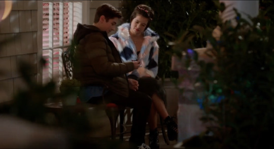
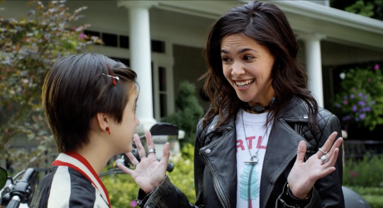
[^ some of my favorite outfits from the show! i am so obsessed with andi's jacket in the finale, and i aspire to be at bex's level of being a leather jacket bisexual]
and lastly, phones. this is a bit of an interesting case (pun intended), because the way they're used fluctuates a bit throughout the show, but i definitely noticed that at least in the first season terri minsky tried to avoid using them altogether. these efforts at distancing from modern tech really grounds the show in it's idealist, nostalgia-heavy roots, so even when the characters start using their phones more later in the show, they don't alter the viewer's impression of the andi mack universe very much.
so, what does all of this have to do with worldbuilding? in andi mack's case, because it's set in a realistic universe and not a fantasy one, a lot of what sets it apart from the real world comes down to tone. because, as much as this world is based on our own, it really does feel separate from it, like an alternate reality that's just slightly more perfect than ours, which makes all the difference. it's the idealism in color and composition in andi mack's settings that makes it so unmistakably andi mack. even the weather is always sunny and perfect (which is incredibly ironic because the town is called shadyside - yes, i am very proud of that observation).
the andi mack universe resides somewhere in this perfect medium that makes it feel like a small town in the middle of nowhere (almost like hill valley in 1955 from "back to the future"), but at the same time like an enclave within a big city (because of its proximity to so many modern, unique, and honestly very classy looking establishments). it is, essentially, an unattainable dream land that tricks you into believing it is attainable because it's just real enough.
all this to say, andi mack does an amazing job of creating of polished, perfect world for its characters. this is pretty common among disney channel and nickelodeon shows, but because most other shows tend to be filmed in a studio with three-wall sets, andi mack is really set apart from them in that it automatically feels more real and tangible. it has its quintessential recurring locations, but it has far more of them (most disney/nick shows usually only have 3-4 recurring settings), and it has a lot more one-off locations. it's also a lot more considerate when it comes to its props, so rather than the show just looking garish and aggressively trendy, it has a distinctive style that's actually appropriate to the characters and the story. overall this creates the effect of expanding the universe, making shadyside feel like it really is a part of a wider world, rather than an artificial bubble. it's idealism is, first and foremost, grounded in reality, and that provides a basis for its brilliant, creative, and relatable storytelling.
tl;dr: andi mack's sets and props give it a very retro and nostalgic tone which makes its whole universe seem super perfect and i want to live there so bad!!
#andi mack#buffy driscoll#cyrus goodman#jonah beck#tj kippen#tyrus#ambi#bex mack#analysis#film analysis#disney channel
94 notes
·
View notes
Text
The Stone Gaze
Summary: Virgil hates that he can temporarily turn people into stone and hopes that whatever the mirror superpower his soulmate has is able to counteract it.
He wasn’t quite expecting the energy and impulsiveness of Remus when they met in an Art Exhibition.
/\/\/\
Virgil hated his powers. He hated a lot of things really, but the power he had was the number one thing he hated and that barely even counted as self-hate or self-deprecation given a lot of the reasoning for it was how his powers impacted his life.
The only time he'd come close to thinking his 'superpower' (as society had deemed things not everybody could do) was when they were studying mythology and had covered Medusa. She had turned people to stone permanently as a gift to protect herself from those who would idolise or attack her. Before they learnt the ending that had seemed like a pretty cool thing to be able to do, but then she was killed as part of a heroes journey and Virgil realised how little people would think of his power should they learn about it. It was mythologically a villains power after all.
Hiding his powers wasn't enough to keep Virgil from the attention of bullies. They picked on him because he always wore his father hoodie after they lost him to illness. They'd call him names because he'd learnt to keep his hair, especially his fringe long enough to cover his eyes so nobody would get accidentally turned to stone. Eventually they'd even harass him to do their homework because his Dad pushed for good study habits.
Refusing to react to their insults or requests only reached the point they tried to beat him up once. When the leader of that group had shoved him against a wall his hair had fallen backwards, leaving a clear gaze directed to the bullies. As soon as the leader became stone the other kids had fled, crying for the teacher to come help.
Virgil's Dad had been called to the school to pick him up and explicitly direct everyone's attention to what had clearly been happening, given the position the boy had been frozen in while refusing to allow any punishment to be given to Virgil. Even once that was accepted by the teachers and school they tried to demand that he wore sunglasses or a visor to school for the safety of staff and children alike.
“I will not police the clothes my son wears because your staff cannot respect someone who doesn't meet their gaze directly. He has found that the long fringe is enough to counteract his powers and given the years he has attended this school without incident that should be perfectly suitable to carry on with.” His Dad has lectured the head teacher that day. He'd given more evidence that Virgil hadn't listened to, but the sentence stuck in his head. Once more his powers were up to him to control and prevent from being used and it felt like an even heavier weight to carry than he'd already found it.
The days of his schooling after that were lonely, isolated as he feared anyone he might befriend would try to meet his eyes. The only hope he had for getting through his life was that somewhere in their world was his soulmate; a person whose powers would mirror his own, and possibly, on the nights Virgil was willing to dream impossible things, counteract his gaze that turned people to stone.
/Over to Remus\
Roman had been the one to bring Remus into exhibiting his work. Honestly, Roman had been the twin to get them both into the art world in the first place. The charismatic, charming artist, whose painting were filled with energy most paintings couldn't capture and dreamt of finding his soulmate. When the art world had discovered he had a brother just as skilled in sculpting they were pulled around and paired together for exhibits constantly.
Remus had originally tried to explain the truth, that their works looked like they held more of life in them because that was what their powers did. Roman could bring paintings to life temporarily, and had often painted portraits of his friends and family so he could still talk to them while they were away. Remus in contrast brought sculptures to life when he touched them with a wish to talk. They'd always be in different positions than he'd awakened them from by the time the power wore off so he got praised for how realistic or believable his positions were.
None of that praise meant anything to Remus though. He sculpted things to feel less alone, to have people to talk to that wouldn't react in disgust or turn away when he said something a little more twisted than society was used to hearing. Each model he made had a mouth to talk and their own way to express their reactions so he could for a while feel accepted by someone other than his brother.
Today he had actually listened to Roman's claims that it's better for their exhibitions when the artist spends times at the display. Of course that didn't mean he was going to dress any differently that normal, just throwing on the torn skinny jeans and an off the shoulder top, with a jacket draped over his shoulders for when the air conditioning got too cold. Art Galleries always seemed to keep the space too cold, Remus swore on it.
“You can't be in here Mate.” An angry voice said, a hand accompanying it yanking him around to face a tall suited man, scowling down at him. “This is an art gallery and I don't care what the fuck you did to sneak in here you're gonna be-”
Remus had already started glancing for a nearby sculpture to reach for when the words cut off. The man whose voice had slowly been raising had now turned to stone, finger raised to point out the door.
“I'm the artist?” He blinked, properly turning now to try and find who else was in the gallery that might have done it.
A few metres directly behind where Remus was, there was a man looking like he would run any second, staring at the floor as though ashamed. “Sorry, I didn't mean to do that.” He mumbled, “The yelling startled me.”
“You're okay, dude. No harm, no wild birds around here.” Remus nodded, reaching back to poke the side of the angry man, focusing on him being alive and calm now.
“Apologies, I probably shouldn't have yelled, but seriously, homeless people aren't allowed in art galleries.” The man who had been yelling declared, having taken a deep breath as the stone released him.
Remus just raised an eyebrow at that. “Just because I haven't dressed all posh like you doesn't mean I'm homeless. And given I'm the one who sculpted most of the statues in this gallery, I believe your judgemental attitude can be taken elsewhere, or shoved up your ass since that seems to be where the rest of your personality is kept. Have your fun in hell, not in my gallery.” He spoke quickly, already directing the man away from the gallery, and nodding to the security guard that wandered between their exhibits.
He didn't delay any longer than that, caring more for the man who had turned him to stone than anything more that could be said. That had to be the complete opposite to his own powers, whether it had been a permanent transformation or just a temporary one, he wanted to know.
Luckily the man was still stood there, blinking at the spot where the angry fellow had been frozen. “He- he shouldn't... That never wears off that quickly.” He was mumbling to himself, not realising Remus had returned.
“Hey there modern day Medusa, you doing alright?” Remus tapped his shoulder, tilting his head when the acknowledgement was for the man to stare at his neck rather than look at him.
“F-fine. Sorry about that though. It really was an accident.”
“Why are you apologising for helping me calm the situation down before he did more than yell? I got him out of the stone and sent on his way. It's all hot stuff in heaven today.” Remus was genuinely confused over what was upsetting the man in front of him. Everything had been sorted out so surely they could move on to talking about soulmates already.
There was a quick glance up, to stare at his ear now, or maybe something over his shoulder. “You got him out of the stone? That wasn't my power just wearing off more quickly than normal?” There was a plea in his voice, as though scared of his own power.
“Yep, and while I can't really prove that here, given everything is already photographed and needs to remain the same to be sold, you can come see my works in progress. I'm Remus, by the way, Remus Windsor.” The offer was easy to give. No matter what people believed about needing to test contrasting powers in public to understand if they're completely opposites, he just wanted to calm this person down. Roman would understand that and hopefully leave to paint in the park or some sappy shit like that.
“Virgil and, yeah, please can we do that?” Virgil nodded, holding a shaking hand out towards him, while the other started pulling the hair that had fallen to his ears back in front of his eyes.
As Remus took his hand he was finally able to meet Virgil's gaze and grinned, tugging on it so they could run out of the gallery together, looking something between art thieves making their escape and teenagers causing mischief.
/To the art gallery\
“Princess, you better get your fat ass and any talking paintings the hell out of here. I've got my Medusa and we need to confirm this shit without an audience.” Remus barged through the doors still tugging Virgil along behind him.
Virgil was astounded by what had occurred in the last hour. He'd only visited the art gallery on a whim, curious over just how lifelike a sculptures positioning could be compared to what he'd seen when accidentally using his own power on people. He hadn't expected to almost add to the exhibition temporarily or to meet someone who could be his soulmate there as well.
Now he could only look around the studio that Remus had explained he shared with his brother. The walls were covered in paintings in various stages of completion. Some looked finished but missing the energy that the paintings back in the gallery had held, others were clearly completely done, but held back. A few canvases were merely sketches or only had their backgrounds coloured in.
Then there was the stone. There were throughout the entire studio several large boulders, some chipped into enough that a hand could be seen reaching out, or the nose of a dog. A few were just legs waving into the air, vague shapes for the rest of the body chipped away but the lips immaculately carved. There was even a potters wheel at the opposite end with a few vases and ceramic models left on a table beside it.
“Remus, seriously, you cannot just kick me out. I'm doing an oil painting.” There was a man identical to Remus stood in front of the only Easel in the gallery, now turned to them frowning with his brush poised to the canvas.
Virgil dithered for a moment before stepping forward. “Oil paints don't exactly dry quickly. You could spare a few minutes for us to figure our if we're soulmates couldn't you?” He muttered, for the first time in years looking up as someone turned to him. He wasn't going to deliberately use his powers without permission now, but having some evidence that Remus actually can reverse the medusa affect straight away would seriously take a weight from his mind.
The painter watched him for a moment before stepping closer, setting his brush down. “I'm Roman. Wouldn't it be more useful for you to prove this on a real person? Although I can understand the uses of turning Remus's sculptures back to stone at will. There's been a few incidents where they've been even worse than he can be.”
“Roman's volunteering to be tortured. Let's do it, see how long we can keep making him stone and real again in quick succession.” Remus stage whispered at him, cackling when Roman flipped him off.
Virgil just nodded, “Only once. I want to know if Remus actually can reverse this.” He cautioned, but turned his head enough to properly meet Roman's gaze, watching as grey stole over his body in a second.
Before Virgil could worry over how Remus would react to seeing that done deliberately, he was leaning forwards to shove his brother backwards, giggling along with the action. Roman was human again by the time he hit the floor, now scowling up at Remus.
“Okay, Rude. I offer to help my darling sibling confirm their soulmate is theirs and you shove me to the floor. I cannot work in such a hostile environment. I'm taking my leave of you, pray it won't be permanently.” He stood up, throwing the glare at them and leaving with all the dramatics of a pantomime dame.
Virgil had to snicker along with Remus as the door was slammed shut. Honestly, half of it was that he had to laugh or he might just burst into tears. In all his wildest dreams he hadn't thought his soulmate would be so excited to have his powers with them.
“Let's try on my figurines! I'm trying to make a dragon witch I can set lose to torment Roman when I'm heading out, and already have my Cthulhu baby, just waiting to be given life. Wanna see if you can turn them back to stone if I wake 'em up?” Remus was once again holding his hand and tugging him to the other end of the room as soon as he finished laughing.
“Before we do that, are you wanting a romantic soulmate, or a platonic one? I don't really care which we have but I'd be happier if we got to know each other first.” Virgil hesitated a moment, tugging back on his arm.
Remus waved off the question. “We'll cross that bridge when we reach it. If you want sex or not I'm making models I can sleep with anyway. They're funny to talk to if they realise how I made their bodies. Come on, meet my Cthulhu baby!” The whine was emphasised by bouncing and Virgil's arm being jumped up and down rapidly.
“Okay, okay, guess that explains why some are so twisted around as though trying to hide their bodies.” Virgil laughed, walking once more towards the table.
Virgil hated his superpower, and probably always would, but perhaps Remus can help him find a couple of things it's good to be medusa for.
85 notes
·
View notes
Text
I've been thinking about this a lot recently, and honestly one of the answers I'm moving more and more towards as to why reading comprehension is so low is actually the insistence on teaching the "classics" like Dickens and Austin at the expense of all else.
Cus if fandom tells us anything it's that there is a great, insatiable desire to analyse literature. I would argue that it is impossible to engage with fandom without on some level engaging with critical analysis of media, whether through discussion/video essays or through transformative art.
But the literature taught in school tends to depict social conventions and situations that become more and more remote from the average lived reality of a highschool student. And this is not in and of itself a bad thing, but it does mean that analysis of the text tends to have to go through a sort of translation first so that the nuances of obsolete social etiquette are understood.
Take the scene in Pride and Prejudice where Mr Collins introduces himself to Darcy, for example, and how thoroughly alien the idea of introducing yourself being rude would be to the average modern teen who has grown up regularly following and DMing total strangers over social media. And not understanding the breach of protocol in the scene, which would have been well understood at time of writing, completely changes the character of the scene and so how you will interpret the characters going forward.
But an equivalent breach of modern etiquette in a modern work would be instantly explicable and so analysis of the media can continue uninterrupted and in the confidence (usually) that you are not missing out on a key piece of social nuance that completely changes the flavour of the scene.
This problem is further compounded by the fact that literary criticism is not a "one size fits all" science, although it may have some broadly applicable principles. The techniques used to analyse Chaucer are not the same as the ones used for Austin, nor for Asimov, and certainly not for someone like Tamsin Muir. I think a lot of bad media analysis can often come down to trying to analyse the media in question with techniques totally unsuitable to it's form and function.
I think one of the main ways we could improve reading comprehension on a systematic level would be to include a much larger range of literature in school syllabuses. Fandom is an incredible expression of people's yearning to involve themselves in the stories they love on the deepest level possible and schools are failing to respond to that even remotely adequately.
I find it soooo funny when people blame low literacy and lack of reading comeprehension on like. Fandoms or whatever. Like surely you do not think that THAT is the actual source of the issue. SURELY.
13 notes
·
View notes
Text
A full summary of “Furious Fu” for my followers who can’t find subs or who would rather look at a summary first to figure out if the episode is okay for them to watch:
- The kwami are arguing with Marinette because they want to go see Fu. Marinette argues against this by saying that his memory was erased. They ask why Tikki can go and Tikki explains that Marinette might need to transform. They offer to hide, still wanting to see him because he took care of them for 100+ years, but Marinette says that they need to let him restart his life with his soulmate, so it's her turn to take care of them.
- Wayzz points out that he understands, but Fu was his friend and he misses him. Marinette relents and allows Wayzz to go, which makes the other kwami upset. Marinette tries to get out of the situation by saying that someone needs to protect the box, and Trixx responds, "Well then only one of us needs to stay, right??"
- Sass suggests letting "destiny" decide (I have no idea what that means), then Mullo suggests Kwami-Kwa-Who, which seems like Eeny Meeny Minny Moe. Mullo lands on Marinette and says that Marinette will have to stay. The kwami go to fly away and Marinette blocks them off, stating that it was cheating and she's the guardian, so she decides what happens.
- The kwami give her puppy dog eyes and Marinette relents, asking which kwami will stay. Barkk calls Marinette "little one" and agrees to stay behind to watch for villains because they have a bad feeling (also being in the middle of watching a knight movie on Marinette's monitor).
- At the train station, the kwami start making noises. Marinette panics and claims it was her phone to any onlookers and that she'll "throw it in the trash" if it keeps talking. An old man is watching her from a garbage can in the distance.
- Fu and Marianne arrive and Marinette greets Marianne with a hug. Marianne asks Fu if he remembers Marinette, stating that "she found you after your boat accident; the one that erased your memory."
- Marinette hugs Mast--she catches herself and calls him "Mister/Sir Fu," and he thanks her for reuniting him with his beloved Marianne.
- Cut to the Seine where Marinette, Fu, and Marianne are sitting on a park bench and having snacks together. Fu explains that he's found that he has a passion for painting and pulls out a piece of art to show Marinette (it looks like splotches of paint in red, black, white, pink, and blue). Fu continues talking and Marinette notices that Wayzz has gotten out of the bag and is slowly crawling his way across the ground to make his way to see Master Fu (Wayzz keeps having eyelashes in some shots and it's really distracting). Marinette tries to be subtle in grabbing Wayzz, but Fu notices and picks him up, asking Marinette if it's one of her toys. She insists that it is and puts Wayzz back in her bag, leading to Wayzz squealing happily, "He touched me! He touched me!" Marinette panics and tries to claim that the toy talks, pulling him back out and trying to talk like a ventriloquist to make it seem like he talked.
- The old man from before is hiding in a box on a bicycle and spying on them.
- Fu wants to paint and goes to get set up, telling Marinette and Marianne to act like he's not there. The scene cuts to a painting Fu did of the two of them.
- Marinette comes home to find that an old man is suddenly in her room. Barkk re-states that they had a bad feeling and the man notes that Marinette had the Miracle Box (which is now in his possession). Marinette glances over to her hiding spot for it, seeing that it's indeed been opened, then asks who the man is. Tikki confirms that this is the previous owner of the Miracle Box before Fu, Su-Han.
- Marinette is skeptical and asks how he found her. He explains that his Guardian staff leads him directly to her Miracle Box. Marinette asks why she doesn't have one and he explains that she's not a real guardian. Marinette argues that Fu handed it to her, leading Su-Han to go off, calling Fu "chicken legs" and mocking the fact that Fu couldn't even do the fasting and that didn't meet the expectations he had for him.
- Marinette, annoyed, says that Fu has protected the box all this time and sacrificed himself to save Paris, and he even became a great painter. Su-Han starts to argue, then looks around and notices that there are missing kwami. Marinette explains that Fu had lost the butterfly and peacock, which leads Su-han to ask where Plagg is and Marinette answers that he's which Chat Noir, who she doesn't know the identity of because their identities are meant to stay secret. Su-Han notices her earrings (somehow? I guess guardians can sense miraculouses?) and starts to go on about how "OH I GUESS THIS IS THE MODERN WORLD" and continues on about how Plagg is "flying free" (he's not but go off I guess) which led to the end of dinosaurs and dragons and such, and that guardians aren't meant to hold miraculouses.
- Su-Han pulls out the Miracle Box and demands that the kwami return to it. The kwami sigh and pout, but ultimately go back into the box. Su-Han then takes a book out and starts reading off all the rules Marinette broke: Kwami aren't allowed out of the box, guardians mustn't hold miraculouses, and you mustn't lose a miraculous (Marinette technically lost the Bee but he'd have no way of knowing that; either the writers didn't realize this or Su-Han is blaming Marinette for Fu's mistake). Marinette argues that Fu used a miraculous and he explains that this is the exact problem; they keep making their own rules and children shouldn't be allowed miraculouses anyway.
- While he's talking, the knight movie Barkk was watching is still playing, and Su-Han thinks the knight is a person trapped in Marinette's monitor, nearly attacking it (presumably, no knowledge of technology since the order has been away for 150+ years). Marinette explains that it's a movie and Su-Han clearly doesn't get it, but cuts to the chase and asks her to lead him to Chat Noir so they can hand over their miraculouses. Marinette asks Tikki if it's a good idea and Tikki is unsure but states that he is the celestial guardian and whatnot, so maybe she should listen to him. Marinette sighs and transforms. They leave together.
- Su-Han and Ladybug meet up with Chat Noir. Su-Han demands that they hand over their miraculouses, to which Chat says that it's not a funny joke and he’d know because "he knows them all." Ladybug questions how he plans to defeat Shadow Moth and Su-Han explains that he'll hand the miraculouses over to adult holders who are fit for the job.
- Chat Noir is skeptical of Su-Han at first, but Ladybug insists that the kwami confirmed him as a previous guardian, even suggesting that this might be the right thing to do because maybe this is why they haven't been able to defeat Shadow Moth yet. Chat Noir tells Ladybug to trust herself like he trusts her, and agrees to hand over his miraculous, but only if she says so because she's the real guardian to him.
- Su-Han accepts these terms and demands that Ladybug order him to take off his miraculous (they're on a roof so I don't know how they plan to get down from there afterwards?), then she'll relinquish her guardian status to him. Ladybug asks if this means that she'll get her memory erased like Fu, which prompts Chat to suddenly pause in shock and ask specifically if she'll forget him. Ladybug doesn't answer and Chat Noir suddenly changes his tune, demanding that Su-Han come and get him if he wants his miraculous. Su-Han agrees and Ladybug panics, trying to get Chat Noir to calm down.
- Su-Han readies himself and explains that guardians are specifically trained to fight against miraculous holders, then takes Chat Noir down (Chat Noir makes a side comment about how "Master Fu was nicer"). Just before he swipes Chat Noir's miraculous, Ladybug throws Su-Han with her yoyo and is now on Chat Noir's side, insisting that she's guardian and that neither of them will be giving up their miraculouses. They fight, with Ladybug and Chat Noir managing to get enough of an upper hand (Ladybug puts the knight movie on her phone to distract him) to swipe both the box and staff, getting away.
- Shadow Moth senses Su-Han's negative emotions and sends a butterfly.
- Su-Han leaps after Ladybug and Chat Noir, muttering that this would be a simple task if he had his staff. Coincidentally, he spots Fu (who Marinette had to confirm the identity of, so I imagine that Fu never went to the temple like he said he would in "Feast"; "that old man was Fu/chicken legs?") and Marianne over by a fountain, Fu painting with one hand and his cane in the other.
- Su-Han descends and grabs Fu's cane, starting to tug-of-war with him over it. Marianne comes by and starts whacking him with her cane, telling her to leave her beloved alone. Su-Han then spots the akuma and quickly backs away, performing some sort of technique that causes him to be surrounded by a blue aura, repeating a phrase akin to "my anger is mine but my anger is not me." The butterfly is repelled, but Su-Han goes after Fu's cane again, opening the top to reveal some sort of orb inside, confirming that this is a proper guardian staff.
- Fu asks Marianne if she's okay, then glares at Su-Han and walks after him, demanding that he apologize to her and return his cane. Shadow Moth senses a new negative emotion and the butterfly goes after Fu instead. Su-Han quickly flees as he realizes that Fu is being akumatized(akumokized?).
- Shadow Moth gives ye ol' generic speech (plus a "we meet again" which obviously Fu doesn't get) to Fu about revenge and blah blah blah miraculouses, but Fu is confused and asks Shadow Moth to repeat himself. Shadow Moth sighs and simply asks if Fu wants revenge, which Fu answers affirmatively.
- Marianne sees Furious Fu and approaches, insisting that this isn't worth it. Fu spouts some Chinese saying (there's a LOT of that in this episode from both he and Su-Han), then pulls out some paper and starts writing on it in Chinese with his akumatized object (his ink brush). It says "Find" and Fu shouts as much, throwing the paper away and then leaping after it as it pursues Su-Han.
- Ladybug and Chat Noir are hiding in the football (soccer; sorry, I’m a filthy American :P) stadium, talking about what to do about the situation, when Su-Han shows up and demands their miraculouses. Ladybug notes that the cane he's carrying belongs to Fu and then Furious Fu shows up. Furious Fu writes "Thunder" and sends it into the sky, leading the sky to fill with dark clouds and start blasting everyone.
- They dodge while Su-Han and Ladybug fighting over the Miracle Box, leading them to send it flying a small distance away. Shadow Moth notices this and tells Furious Fu to retrieve the box, so Furious Fu gives chase. Ladybug drops the box and kicks it to Chat Noir as if they're playing soccer, so Chat Noir starts running away and keeping the Miracle Box at his feet. Chat Noir sees Furious Fu and Su-Han at both sides of him and panics, kicking the Miracle Box at the goal. Chat Noir stops to cheer that he achieved a goal, then Ladybug runs past him and he realizes oh, and chases after them.
- Furious Fu writers "Teleport" and attaches it to his head, which teleports him to the box's location. Furious Fu latches the box to himself and readies himself to fight, leaving Ladybug and Chat Noir standing there while Su-Han suddenly cowers and sneaks away. Ladybug and Chat Noir fight Furious Fu, but are clearly outmatched as he blocks their attacks and sends Chat Noir flying. Su-Han makes judgmental comments about their fighting from the sidelines, leading Chat Noir to point out that he's not doing anything. Su-Han explains that guardians are trained to fight holders, not the magic that a holder might make. Ladybug asks if they have to fix his mistake then (calling him out for causing Furious Fu in the first place) and Su-Han is unable to argue. Furious Fu then sends Ladybug and Chat Noir flying away.
- Furious Fu then challenges Su-Han directly and Su-Han has no choice but to fight back. They fight and Furious Fu writes, "Statue," sticking it to Su-Han and freezing him in place.
- Furious Fu retrieves his cane and Shadow Moth reminds him of the miraculouses. Furious Fu doesn't understand and even calls Chat "a bat without wings."
- Meanwhile, Ladybug explains to Chat that it's not important to defeat him, but to make sure he doesn't defeat them. Chat Noir doesn't understand and Ladybug tells him to keep Furious Fu busy while she makes a call. Chat can do that much so he leaves to fight.
- Ladybug uses Lucky Charm, changing her suit to its "upgraded" state and giving her a pair of pliers. She notes Chat Noir's ring, then a bin of soccer balls, then her yoyo, then the pliers. She rushes to enact her plan and Furious Fu notices her. He kicks Chat Noir away, sets his cane down, then writes "Vision" and sticks it on his head, making him see what Ladybug noticed earlier. He says that he sees what she's planning and pursues her, but Chat Noir knocks him down. They fight and Chat Noir calls for Cataclysm, but Ladybug screams for him to stop, running at them both with a soccer ball. Su-Han grabs Chat Noir's wrist, then puts Chat Noir in a hold, Chat held to his chest with one hand on Chat Noir's arm and the other hand on Chat Noir's wrist, trying to get him Cataclysm'd (which is a little strange since he seemed confused about the whole concept of fighting him earlier and doesn’t even know Chat Noir but I digress).
- Ladybug throws her yoyo, which Furious Fu catches in his mouth. Ladybug pulls herself to him, but he grabs her wrist with his hand (the one that wasn't holding Chat Noir's wrist), leaving her dangling. Ladybug smirks, catches the soccer ball with her feet, and shoves it against Chat Noir's elbow, preventing Chat Noir from using Cataclysm on himself as there's now too much space between his hand and chest. Furious Fu comments that neither of them can defeat him in this state, to which Ladybug replies that they're not going to.
- Marianne pops up, taking the brush from Furious Fu (it was tucked behind his ear) and snapping it in half, talking about the call she got from Ladybug. Ladybug smiles and thanks her, assuring that she did perfectly.
- Ladybug opens her yoyo to purify the akuma (as I notice that SHE HAS ACTUAL SOLES NOW IN HER UPGRADED FORM!!!), then uses Miraculous Ladybug, which throws her object in the air and her upgraded outfit goes with it, changing her back to normal. Su-han returns to normal and Ladybug, Chat Noir, and Marianne go to "pound it" before Chat Noir realizes that he's still got Cataclysm active. He Cataclysms the soccer ball from earlier and they do a proper fist bump now.
- Ladybug opens her yoyo and pulls out a Fu-colored amulet She gives it to Fu and assures him that it'll protect him. Fu says that he'll use it to remember her by (just a line to rub salt in the wound I guess) and thanks her along with "Mister Bat." Su-Han then shows up and apologizes to Fu for taking his cane, almost calling him "crybaby" before he corrects himself, claiming that he "mistook" Fu for "someone he knew long ago. Fu forgives him and they do the Chinese bowing thing with the fist against the palm.
- Back at the train station, Fu comments on the "adventure" of sorts and Marinette praises Marianne, having "heard that she was the real hero of the day." They both smile at her and the scene cuts away to Marinette in her bedroom with the kwami and Su-Han.
- Su-Han has two things to tell her and begins with the first thing, going on about her relying on a human with no powers, which is a huge no-no, and how she has the gall to invent her own rules... but that they strangely seem to work. That gets Marinette's attention and Su-Han goes on to talk about the second thing: that she has amazing natural instincts which is an essential quality for a guardian, so the "crybaby--er, Master Fu" may not have made such a bad choice after all. He talks about how this Miracle Box is the most powerful and the first, and that he can't imagine what would happen if they fell into the wrong hands.
- Su-Han tells Marinette that she can keep the box, but if she makes one mistake, he'll come back and take it again. She smiles and goes to put the box away, then Su-Han talks about how he'll be staying in Paris for a while; he needs to get used to the modern world as a guardian, after all. Marinette tells him that he'll "need these" for that and offers him a pair of shoes. Su-Han looks down at his current shoes, which are currently torn open at the fronts (they've been like that for the whole episode). They laugh and the episode ends.
56 notes
·
View notes
Text
The list of names
*scary music playing* Ok, guys, in the light of American Middle Eastern policy, that has once again brought me to tears, I decided to do something a bit happier (this is me trying to influence my followers to read the news and fight for the right thing and all that jazz). I’ve got a lot of asks recently, mostly from people new to the world of CC, about which creators are the best, so I’ve made this little list of the creators I download and use the most. This is not in any way a complete collection, I might have forgotten someone (and there’s also plenty of creators I haven’t discovered yet). Also, these are all build creators, mainly creating alpha CC. Please feel free to add to this list. Also also, the description I’ve used for the artists are totally my own making, so if you are a creator and feel like I am describing your work in an unfair way, go ahead and punch me in the face. If I was a new simmer, I would check out these creators: Retired: MXIMS - Makes modern, real life furniture with the best quality. Has many downloads left on their website. MINCSIMS - Similar to MXIMS (with some amazing collabs), also with a beautiful talent for doors and windows. Not many objects left in orbit, but google is your friend. DAER0N - Done everything from noodles to palms, but the recent Daer0n I would describe as gold, dark and modern, with 3D modeling skills out of this world. Retired, and much of the old stuff is gone, but some can be found at bloomingrosy. DOX - Similar to Daer0n with a slightly stricter, more wooden approach. The most underrated one of the retired giants. Has some downloads left on their website. ANBS - Super clean aesthetic. Modern, real life furniture. Many downloads left on their website. SLYD - Mostly known as a CAS creator, but has the amazing shoes and bags available as decor. All downloads left on the website. HVIKIS - Wallpapers and wall art. All downloads left on the website. VIIKIITA - Recolors to die for. Not many objects left in orbit, but google is your friend. Active (I think. I hope. I don’t know): ARSBOTANICA - Previously simshamlet. Does really lovely, vintage aesthetic perfume bottles and amazing flowers. SLOX - A personal favorite. Modern, I’d say. And realistic. But often with objects you didn’t even know you needed, that ends up being the main inspiration for the whole build. Like some folded shirts, or a stack of books. 13PUMPKIN - A long with Artvitalex this is the best wood creator in the community. The sets are kind of like “small-lovely-family-home”-style, but can be used in big, modern builds with equally outstanding results. WONDYMOON - My by far most used creator. The most organized one too, I’d say. All sets match eachother, and are easy to find (and are all named by elements, this guy is a rock star). PYSZNYDESIGN - The Kilburn set is to die for. MEINKATZ - Literally replicas of real life furniture, with their history and all. Honestly the coolest thing ever. Also, a really nice person. PRALINESIMS - The best floor and wall creator, hands down. I don’t know if this is really the person I should tag tho, so I’ll tag @cross-design and hope for the best because I honestly still don’t know who is who. I love them both tho. THE TSR GIANTS: SEVERINKA, KARDOFE, UNG999, SIMMAN123, PILAR, ARTVITALEX, ANGELA, DOT, BUFFSUMM, SHINO and NYNAEVE - Yes, a lot of the creators I mention here are active on TSR and a lot of my TSR giants are active elsewhere, but I still, maybe arbitrary, like to put these under the TSR flag because they represent that wonderful vibe of big sets, certain room types and signature colors. PEACEMAKER - a true legend. Some of the CC is borderline MM, but that is what makes them so perfect. They go with both themes. MIO - This is the first creator I downloaded from and they will always have a special place in my heart. Brilliant conversions, flower sets, seating, everything. NOVVVAS - A way too humble person that claims she is not the best in the game, when she truly is out of this world. RIGHTHEARTED - who I have been referring to as neiden my whole life because I am an idiot. TINGELINGLATER - Does a lot of things but blessed all of us with windows and since then I am in love. ANYE - Pinkbox Anye, to be correct. Lovely person. Lovely sets. Unique eyes. Adore this one. FOREVERDESIGNS - Will literally transform your bedroom. And kitchen. And life. BLACKMOJITOS - Build sets and sexy, stunning posters (and a basket every now and then). Also up for commissions, I just noticed. Go throw money at her. She is amazing. KAI-HANA - Has a totally unique style, where everything is alpha, but still has a beautiful, clayish touch to it. Underrated. AROUNDTHESIMS - A bit on the MM side, so if you’re looking for that MM/alpha mix, this is for you. Extremely productive. Does everything and more. CHERRY-SIMS - A part from the CC, this is also the best picture editor I’ve ever seen. I am a huge fan! CONCEPTDESIGN - Did someone say trees? YUMIA - Soft flowers, old school touch, vintage AGGRESSIVEKITTEN - Literally killed half the community with the recent brutalism set, which without a doubt will be voted best CC of 2020. Also, where else would you go for both beautiful, vintage objects AND a tarot card reading? Weirdly obsessed with seals. Makes amazing lots. I love you. DSCO - I gave up trying to spell this creators full name after the sixth attempt. I would describe the CC as cute. But not in the condescending (that I could spell) way. More in a bad-ass-I-need-all-of-these-objects-kind-of-way! KKB - My ignorant and uneducated ass wants to call it Korean, and I am sorry if this isn’t the right way to describe anything. Soft, pastel but at the same time very cool, with rattan and wood. DR GREENIE - Former Green Girl. Mostly MM, but has made some of my most used decor objects. HELEN - Extremely productive. Does everything. NIKADEMA - Has made my favorite sink! PQSIMS - Makes sets. Usually light wood. LUNATICAVILLAGE (2SIS) - Another underrated favorite. Everyone should go here and show as much love as possible! LAVI3ENROSE - A creator that entered my world quite recently. Art deco. Bronze. Gold. And the best wrapped Christmas presents of 2019. DDAENG SIMS - Another giant that recently changed their name (used to be dreamteamsims). FELIXANDRE - The best historical creator (as in making epic shit that would create the most wonderful castle). Sometimes a bit on the MM side with the furniture, and that contrast makes it, in my eyes, even better. SIMCREDIBLE - Sets. Color matching. Often light and modern. I use their decor stones in every single one of my . SOLORIYA - MM creator. But even for us alpha bitches there are wonderful stuff (I think this is the case for most MM artists, I just don’t know so many of them). XELENN - Also does literally everything. One can scroll this blog for hours. OWL-PLUMBOB - Amazing build objects. SANOYSIMS - A long with MXIMS, I’d say this is one of the most “realistic” artists. WINNER9 - To me, this creator is all about the amazing wall art. But of course they make other stunning objects too. Marble tables, anyone? SJAMBOKSIM - My most used concrete walls (and I use concrete A LOT). AIFIRSA - Totally different style from everyone else. Absolutely love this aesthetic. VIVIAN STUDIO - This sounds weird, but their onions are the best object in my game. Don’t judge. HEURRS - A quite new creator who blew my mind with some recent candles and earned my first reblog since 456 BC. Love you. I am forgetting so, so many. Please, I sometimes can’t even remember my own name, so don’t feel hurt if I missed you. PLEASE comment your favorite creators below! Where would you advice new simmers to start looking for good CC? Love you guys!!!
#sims 4#sims 4 cc#the sims#the sims 4#creators#sims 4 creator#sims 4 creators#sims 4 cc finds#the sims 4 cc finds#sims cc#sims cc finds#sims4#thesims4#thesims
2K notes
·
View notes
Note
Henlo! I'm curious what your fave Sonic character(s) is ^^ and do you have any headcanons for them?
oh boy! okay i'm going to do my best to answer this but i have been in this fandom forever and could write a dissertation on just like,,, one character. so instead i'll sparknote some cute things about my top 4 and if you want to hear a more elaborate response i can do separate posts for each of them! it was hard enough to pick a couple characters since i love them all 😊
1) espio the chameleon
i love this little purple man so much oh my god. for starters, i'd like to think he isn't as serious as a lot of people make him out to be. yeah he seems chill but let's be real, he's arrogant and i love every second of it! he definitely radiates hot topic vibes but we're talking ronnie radke, hollywood undead vibes. definitely an e-boy but not in the fake alt way, he just radiates soft-grunge vibes? he's bisexual with a male lean and definitely dated mighty at some point, but i personally ship him with wave (more on that in a second!) his best friend is silver (i ship them too tbh) but his friends are rouge and shadow for the most part. he's the character closest to shadow (personality wise, not emotional proximity) and i adore their interactions in shadow's game so i sorta ship them too...? ahhh this is supposed to be about headcanons! anyways, i think he's fun to be around and has a thing for people with good stories to tell: wave about the past, silver about the future, and rouge/shadow with the present as agents. i think the cooperation between the chaotix detective agency and GUN is something people should write more often! oh, and he likes green tea boba ✨
2) wave the swallow
god, she made me realize i like girls and i still absolutely adore her. it was taken down but at one point years ago, her birthday was listed as november 11th which makes her a scorpio, and as a fellow scorpio i stand by it! she's also definitely bi but with a female lean, and her best friend/occasional partner is rouge. they remind me of maddy and cassie from euphoria, but wave isn't as bitter as maddy ofc. i feel like people forget that storm and jet are pretty damn incompetent without her, she literally does everything for them and that's a big nod to her people pleasing. yeah she's arrogant, but she's not wrong in being self absorbed because she keeps things running! she radiates hayley kiyoko, p!nk, 100gecs, and paramore vibes. she's a baddie but a softie! i think her and espio would be amazing together (even platonically) because he loves learning and debates, and she has a lot to say and needs someone to respond, as opposed to zoning out. i feel like she could be a famous rollerskater on tiktok or something, and would have her own line of custom gear! she might be cold and competitive, but she's really sweet and just has no way of expressing it... poor girl. i think her and sonic could be amazing friends, and i'd love to see more art of them being pals and going on adventures together!
3. shadow the hedgehog
hehehehehe oh boy, as the current love interest of my fixation character, shadow is getting more attention than usual these days! i always liked him but my fave boy and girl were espio and wave for the longest time, so finally getting to fixate on shadow is great for me! shadow is neurodivergent, basically in canon. his memory issues are both trauma related and just a part of his programming. something that i admire about espio and shadow being friends is that the former loves authority and doesn't need it, but the latter despises it but needs it. shadow was created to obey, and so even if GUN wrongs him a thousand times, he needs them. it's why he keeps going back to eggman, and helps sonic when asked. shadow might not admit it, but he has a saviour complex! although i agree that with modern music he'd listen to like mcr and pierce the veil etc, i think he'd also resonate with sex pistols and other music from the decades he missed while in stasis (footloose is probably one of his fave movies just because of the killer soundtrack!) he loves flowers and does his best to take care of plants, has nervous tics, and the reason his quills turn upwards is because of all the chaos energy he has! super sonic's quills turn up when transformed, and shadow is constantly tapped into that energy: even with inhibitors it's a lot to manage. shadow also loves reading, and i think his favourite book would be The Wars by Timothy Findley (amazing read, please check it out because it reminds me so much of Shadow oh my god)
4. INFINITE!!!
okay i have to keep this one short but he is currently my favourite character, and i could talk about him forever. i know SEGA claims his real name is Infinite, but i headcanon that in the village he came from he wasn't given a name because he was considered a burden and a curse (due to his heterochromia and other reasons). for me he was called araperi or ara (nothing/no in Georgian) because they only referred to him via negative reinforcement. the scar on his eye is because either he or another jackal tried to claw it out when he was little because it made him an outcast and he wanted to belong. he only started school when he was in highschool and never really learned how to read english (i base a lot of his village lore around Georgia and my experiences with Georgian culture- even though my culture was erased when i got adopted lol). he only learned english through musical theatre, and is fluent but not very literate in english (can't read or write very well). he radiates younger sibling vibes so i headcanon that he has 4 older sisters who all treated him pretty bad on varying levels. after a year or two of highschool he ran away with some friends and after meeting more nomads, squad jackal was eventually formed! infinite (or finn as i sometimes call him) was definitely into theatre (his favourite musical being sweeney todd) and he's an AMAZING singer, acting too (which is sorta canon because he adopted shadow's personality and fighting style after their first encounter and rehearsed a whole monologue lmao). his singing voice sounds like clem turner's but with a bit more rasp, probably because i feel like he'd listen to bring me the horizon and kim dracula! infinite is actually a big puppy once he likes you, he's just secretly awkward and insecure as hell (maybe the last part isn't a secret, haha)
wow, this was longer than expected and i feel like i hardly said anything, but this is sorta where i'm at with these four! i could talk about them forever though, so feel free to ask follow ups or request a full post for them, any ships i mentioned (or didn't) or if you want a post about anyone else!
#infinite the jackal#sonic analysis#wave the swallow#espio the chameleon#shadow the hedgehog#i love them so much#asks open#thank you for this
21 notes
·
View notes