#isn't the first screencap painting on canvas?
Explore tagged Tumblr posts
Text
*puts on my Delusional thinking cap*
Okay so... I feel like the painting Will gave Mike in the van is not the same painting in the first ep of season 4
Here’s a comparison
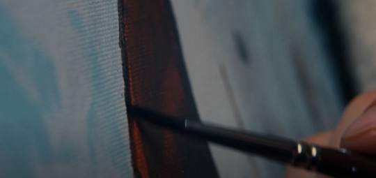
What we first saw
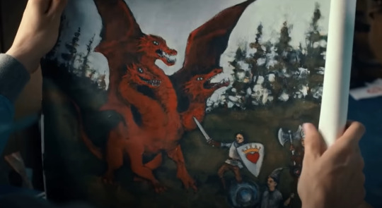
What was shown
Both paintings show the same colours - black, brown, crimson, someone with black hair, a stick (something thin at least). Those are the most distinguishable features
But it strikes me as odd that, in the progression shot of the painting, the crimson and brown of the “dragon” is so thick. Looking at the dragon on the bottom picture, I can’t think of anywhere where the thick bold lines fit on the dragon except it’s wing (where the red line is)
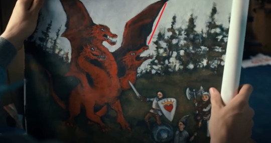
But even then, the angle shot in the first screencap suggests the black blob and stick are opposite of the red, next to it at least, whereas the wing is up in the air and not at all near the character who is supposed to be Mike
If that thick crimson in the screencap was supposed to be a part of the dragon’s body, then it doesn’t match. The red on the dragon is lighter than the brown and crimson are. If Will were to try and blend the colours together and then paint the shape of the dragon, that would be one thing, but what he is painting in the first screencap is so dense that I just can’t see any way that that shape would become the dragon
So, I honestly think this is a fake-out. Both paintings have the same features shown - a big crimson colour, what looks like a person with a blob of black hair, some kind of stick that could be mistaken for a sword or a weapon, and other figures next to them. The angle in the first screencap is just wonky enough to make you maybe not question the placement of everything. It has enough of the same colours and shapes to make you nod and think “yeah, they’re both the same one”
But it’s not the same. I’m so sure those are different paintings
Which makes me wonder if 1 of 4 things happened
1) Will mistakenly picked up the wrong painting but ran with it once he realized
2) Will’s dragon painting is a sort of fail-safe. Like, he painted both of those pictures but took and showed the commissioned dragon one because it was safer than revealing all his vulnerable feelings with such a heartfelt painting as the one in the first screencap
3) Will got home from the airport and painted over his first painting
4) The dragon painting is not Will’s painting at all, it’s some kind of poster he bought, but he played it off like it was his own
Perhaps it is just me being delusional but... I really don’t think they’re the same one
#also#i'm not incredibly familiar with painting as much as i'd like to be but#isn't the first screencap painting on canvas?#i'm just going off texture here#then again i've only ever painted on canvas so idk about any other materials you could paint on that look exactly like the first screencap#anyway my moneys on the fourth option being likely#which i think would be very funny if true#will byers my son that is COPYRIGHT#stranger things#stranger things season 4#stranger things 4#byler#byler tumblr#will byers#oh lord i'm back on my bullshit again#mettys posts#metty posts#volume 2 spoilers#stranger things spoilers
50 notes
·
View notes
Note
Hello! I was wondering if u wouldn’t mind sharing a tutorial on how u making ur icons?
Hi sure thing! This is long and screenshot heavy so the tutorial is below the cut :)
First I find a shot of the character I want for the icon and take a screenshot of it. Typically I look for shots where the character isn't obstructed by anything/anyone and make sure nothing is cut off in the cap
Then I put the screencap into this website and it removes the background for me. This works pretty well for most images :)
Then I open the image with the removed background into photoshop and crop it into a square.
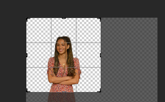
after cropping I resize the square to 200 x 200 pixels
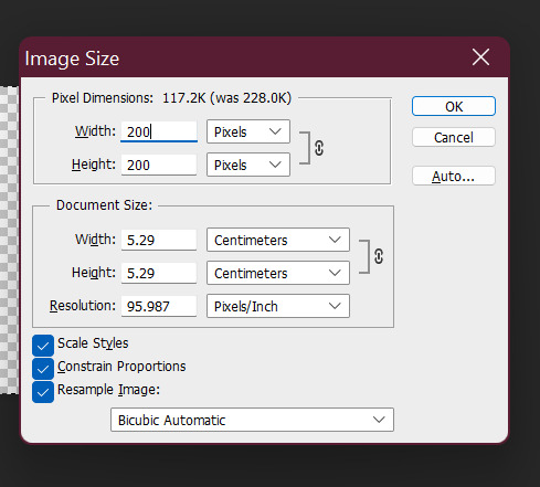
after resizing I run my sharpening on the image so it becomes clearer.

After sharpening, I colour the image with curves and vibrance (as per my basic gif tutorial)
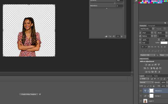
I then select all the layers and Convert to a Smart Object - this step isn't necessary but I just find it is easier for me.

After that I create a new layer underneath for the background and I use the gradient tool to add the background in.
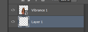

^ that is the gradient tool - if you can't find it right click on the paint bucket and you should be able to switch to it.
The settings for the gradient look like this. To change the colour click on the coloured gradient bar.

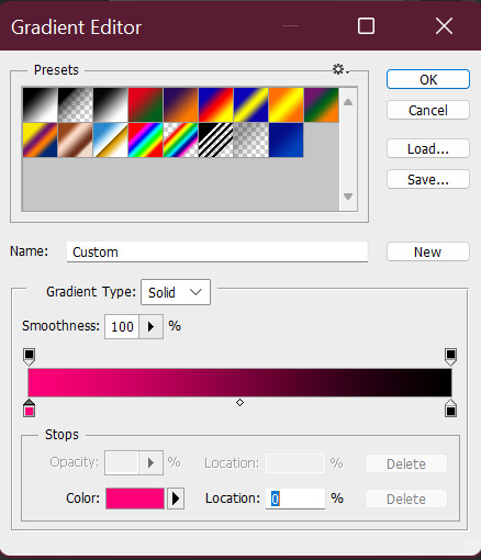
After clicking the gradient you will get a dialog box like this:

basically just click on the little colour tabs on the gradient bar to change your colour. Typically with my icons I like to go from the colour to black or white.
For this icon I am doing pink :)
After you have picked your colour click the ok button
To draw you gradient click and drag a line on your canvas

This gives you comething like this:

I prefer the dark spot to be on the bottom of the icon so I'm going to redraw over it in the opposite direction

this gives us something that looks like this:
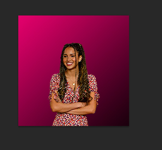
did it a couple of times to end up with this:

I like the colour background of my icon to match the clothes (I just think it's cute). So I'm going to use a bit of selective colour to make Gina's dress more pink.

So I create a selective colour layer (the one I've hovered over with the two triangles).

After making the layer I right click on it and select "Create Clipping Mask" so that the layer only changes the colours on Gina and not the background. Yow will know this has worked because there will be a little arrow pointing down.

Given Gina's dress is red I will be changing the reds in this image. When changing reds and yellow you have to be careful because they are the undertones of skin tones (why I chose this one as an example). As you can see below Gina's skin has changed with the dress and we obviously don't want that.

To fix this we use a layer mask so only the dress changes colour. The layer mask is the white square that shows up next to the layer name Selective Colour. We basically just grab a black paint brush and draw over the parts we don't want changed on the selective colour layer.

Then basically the icon is ready to be saved as a png for use!
If you want to make different colour versions of the same icon what I like to do is add another selective colour layer on top (no clipping mask this time) and change the colours again :)
So for example to turn this icon purple I adjusted the Magentas in the image like so:
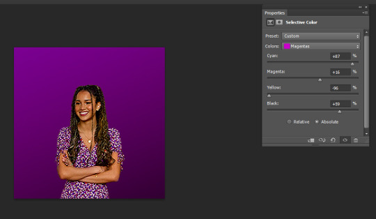
To turn it more of a blue-purple I added another Selective Colour on top and adjusted the Magentas again like so:

and basically I just play around until I get the colours I like :)
You can also add textures on top of the background if you like - typically I will just google something like "grunge icon texture" or "cute icon doodles" or whatever I might want to put on top and find one I like and use it.
So I copy and paste it and put it on top of our gradient layer and adjust the blending mode of the layer as I see fit. This is the texture on top without the blend mode adjusted.

Here I've changed it to Exclusion, which I like - but usually I just play around with the blend modes until I find one that looks good

Here's a heart one I found and put on. For this one I used the magic wand tool to remove the white bits of the background and then set it to Exclusion.

And that's my basic process - I hope it makes sense :)
#asks#resources#ps help#usergif#allresources#yeahps#completeresources#resourcemarket#dailyresources#tutorials#photoshop tutorial#*mine#ok hope this helps :)
58 notes
·
View notes
Note
Hey! I absolutely love all of your gifs and your tutorials are so helpful (especially your coloring and sharpening ones!) and I was wondering if you could do a tutorial, or if you have one you followed, on how to put two gifs together like the top and bottom gifs of this set (/post/634126681865650176). I've looked at a few other tutorials and can't seem to find one that gets the effect I want, like how you do it! I hope this isn't a bother!
Thank you so much, anon.
Here’s your tutorial about how to make this type of gif

The first thing you need to do is to make screencaps from 2 scenes. Make sure that both scenes have the same number of screencaps. For this gif, Cas’ scene is 35 and so is Dean’s.
Once you have your screencaps, load them in Photoshop by going to File ➡ Scripts ➡ Load Files into stack. In this case, I loaded Cas’ scene first.

Now, go to Image ➡ Image Size and type the size of the gif. (I use Tumblr’s old sizes because I’m freaking stubborn, so if you use the new sizes, you’ll have to change these values)

Then, go to Image ➡ Canvas Size and make the width and the height smaller to avoid having a white edge on the gif

What we need to do now is move the screencaps to the left side so we can add the other gif later. For that, make sure to select all the layers and then go to Edit ➡ Free Transform (or just ctrl+T)

Up on the X value, I typed 160,5 px (if your from USA or UK you probably have to type 160.5, here in Spain we use commas for decimals)

Don’t worry about that white space now. We’ll take care of it later.
Now, we sharpen all the screencaps like you do with every other gif. Once you’re done sharpening your gif, make sure you are on the top layer of your gif and create a group

I do this to ease the next steps in which I’ll have to work with 2 gifs.
I name the group Cas and I drag all the layers into that group

Now, save the psd and load the screencpas of the other scene, in this case Dean’s scene, in a new file.
After all the screencaps are loaded, do the same as you did before with Image size and Canvas size.
Now crop the gif and select the whole gif

We do this because when you add the layers to the other gif (Cas’ gif), Dean’s gif will have a size of 503x283. It won’t be too noticeable given that both gifs have the same sizes, but if you ever want to make something with different sizes, it will be better if you crop it.
Now, we select all the layers, go to Edit ➡ Free Transform (or ctrl+T) and on the X value, we type 310,5 (or 310.5 depending on your country)

We sharpen every layer, and after that, we create a group, which in my case I named Dean, and we drag all those layers into the group

We go to the animation window and we click on the menu options and click on select all frames

We clcik on the same menu, but this time, we select the option copy frames

We now go to Cas’ gif. Make sure that all the frames on Cas’ gif are selected, just like we have just done with Dean’s gif.
On the window animation of Cas’ gif, we click on the same menu as before, and we select paste frames

This window will appear. Choose the option paste over selection

Here’s how our gif looks like now and how the two groups with the layers are on the layer window

In order to see both gifs, we select Dean’s group and on the layers option, we select Screen

Now, we can see both gifs, but given that we moved Cas’ gif to the left, we now have a part of the gif that looks semi-transparent

In order to fix this, we open Cas’ group and we create a new layer on top of all the layers that are on Cas’ gif

With the brush tool, we paint the empty area in black

Here’s the comparison in between not having and having that are colored in black

Now, we add our coloring on top of both groups

This is how our gif looks like

There’s a little bit of semi-transparency on Cas. Sometimes, you don’t notice these things until you have added your coloring, but don’t worry, it’s easy to fix.
Go to Dean’s group and add a new layer. Use the brush tool to paint the area you don’t want to be semi-transparent

It’s a subtle change, but it makes the gif look better

Now all you have to do is select the time in between frames, save your gifs, and there you have it

110 notes
·
View notes