#internationaltypographicstyle
Explore tagged Tumblr posts
Text
What is Swiss Design?

1 note
·
View note
Photo
(FRIDAY 15TH - TUESDAY 19TH MAY 2020)
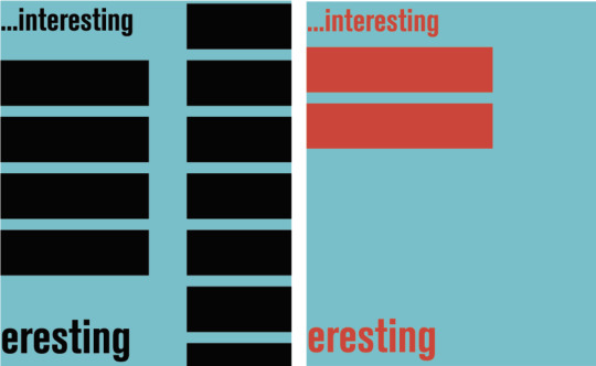
Over this past week I have been attempting to create page layouts for the current zine project. For ages, I was set on creating quite an illustrative zine, however, recently I changed that plan, and chose to base my page designs off the International Typographic Style/Swiss Style, as it speaks more to the time period that Akzidenz-Grotesk was most popular internationally. This change also enabled me to develop a question in my set. Instead of asking the typeface about the hallmarks of the International Typographic Style - which I would be visually depicting in my layout - I could ask about an artist who primarily used Akzidenz-Grotesk and whose work grew from the design period.
I have done a lot of visual research about the International Typographic Style, to understand the way that typography and shape is used in the design. I remember hearing in a lecture recently, that we should be posting both our successes and failures to this page, so I have compiled a few images that explore some of the different directions so far that I considered.
These two images depict some early drafts for my layouts. I played with layering shapes and reducing the opacity of layers to create another colour. Apart from the fact that it (left) looks....weird, this approach wasn’t a method used by designers in the period. Shapes were coloured solid, and didn’t normally fill the page, particularly as using the negative space in a concept was popular. I also trialled a variety of shapes, including this four-pointed star (right) and triangles, but they were really challenging to work with, and frankly, weren’t exactly the shapes used by designers during the International Typographic Style period...so I went back to rectangles.

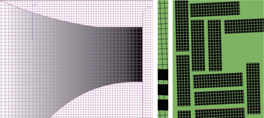
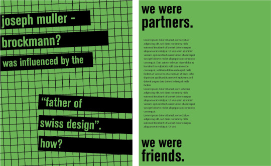
Grids were a hallmark of the International Typographic Style, so I felt that it was important that I feature one in some way. A week or so ago, I reblogged a post from @estacabronseryo , that depicted a tiled pink room that bent round a corner. I really liked this concept, and attempted to recreate (top, left). I struggled a lot and was very unsuccessful in the end. Later, I rescaled the grid I had created for my last attempt, recoloured, cropped and rotated it, and simply placed in on a green ground colour. I didn’t find creating this page (bottom, left-side) particularly challenging...more or my issue was creating the right-hand-side page. It was important to me that these two pages looked related and mirrored the same colour palette and idea, but I didn’t want them to be the same in any other measure. I did have a variety of trials, but this is the only picture (top, right) I have from this process. In the end, I settled on a less chaotic design (bottom, right-hand-side) as I thought that a double-page spread covered in grid may be a bit overwhelming for an audience and hard to focus on the written text. Additionally, while I wanted the pages to share elements, I wanted them to be strong by themselves and compliment each other. I think I achieved this.
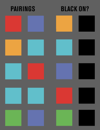
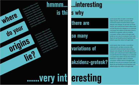
I tested a variety of colours in this design, including walking away from clean contrast pairings between a bright colour and black, testing legibility and overall appeal. In the end, I found that using black was essential, as it created a base for another brighter colour and enabled it to be quite prominent in the design. Also, the typography should be the primary design element, and therefore, neither the elements of colour or shape should detract from the type. I also trialled different shapes, but ultimately returned to the rectangle. I just think it worked better in the tests that I did and was easier to manipulate. Similar to the green spread, I wanted these two pages to illustrate a relationship, hence why I also maintained the same colour palette. Asymmetrical balance was also prevalent during the design period so I wasn’t really restricted in my choice of design beyond the colour scheme. I furthered the pages’ relationship by depicting a voice (’hmmm...interesting.......very interesting’) travelling between the pages, as well as linking the question/answer on the left page, to the question/answer on the right page through ‘is this why...’.
#rmit#communicationdesign#zine#akzidenz-grotesk#swissstyle#internationaltypographicstyle#contrast#wip#WK11
3 notes
·
View notes
Photo
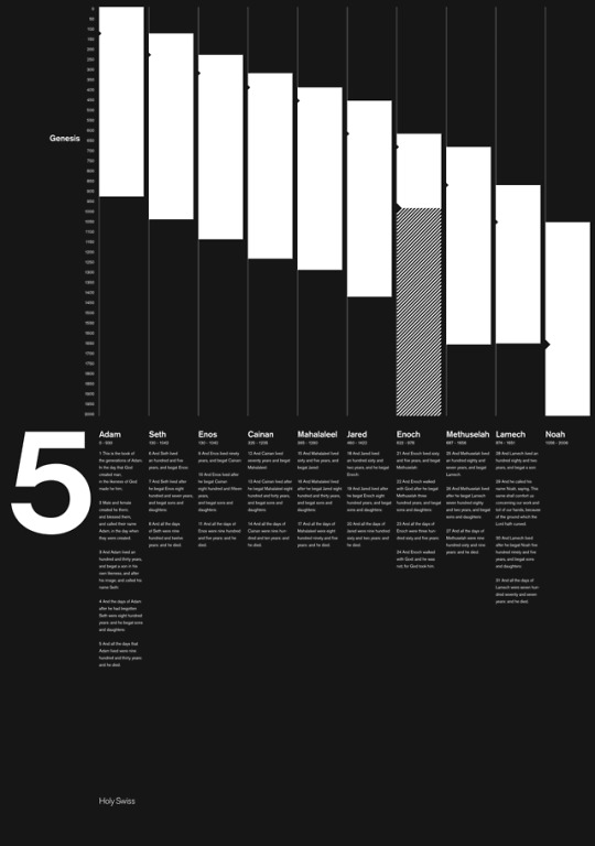
Follow @holy.swiss on Instagram
#holybible#holyswiss#genesis 5#rodrigomendes#bible#bibleverse#gen5#design#grid#poster#typography#swissgraphicdesign#internationaltypographicstyle#akzidenzgrotesk
1 note
·
View note
Photo

No Style: Ernst Keller (1891-1968), Teacher And Pioneer Of The Swiss Style / Available at www.draw-down.com / Graphic designer #ErnstKeller taught at the #SchoolofArtsandCrafts in #Zürich from 1918 to 1956. Frequently referred to as the “Father of Swiss Style” (later known as #InternationalTypographicStyle), his many students established this particular current in #graphicdesign and went on to make it world famous. His graduates also included protagonists of the New Graphic Design movement (Richard Paul Lohse, Jose Müller-Brockmann and Carlo Vivarelli). This book presents Keller’s biography and an extensive collection of work, including previously unknown projects. His fundamental contribution to the development of innovative, non-academic didactic principles in design education are also described. Keller’s teaching is considered one of the world’s first systematic programmes for graphic #design. (at Zürich, Switzerland)
11 notes
·
View notes
Photo

I make a lot of black and yellow and white things I guess. A poster listing Biden’s Cabinet picks, in German, because International Typographic Style.
Copyright 2021
#yellow#blackandyellow#poster#posterdesign#biden#cabinet#46#presidentbiden#executivebranch#graphicdesign#internationaltypographicstyle#minimalistdesign#minimalism#bumblebee#design#affinitydesigner
0 notes
Photo

#Repost @hydrogeneportfolio ・・・ 🤘🏼- Urdu Typography featuring Metallica. . . Purchase on my Redbubble store! (Link in bio) . . . . . #UrduTypography #ArabicTypography #MinimalistArt #MinimalistPoster #UrduPoster #PakistaniArt #BrownArtist #MinimalistUrdu #UrduArt #DesiPop #Typography #Mininalism #MinimalPoster #MinimalArt #PinkFloydArt #Metallica #MetallicaArt #MetallicaPoster #BrownGirlDraws #GraphicDesign #DesiDesigners #Desi #MLID #DesiTypography #internationaltypographicstyle #urduartarchive (at Karachi, Pakistan) https://www.instagram.com/p/CBx_rtFJ90h/?igshid=893w4vib74l9
#repost#urdutypography#arabictypography#minimalistart#minimalistposter#urduposter#pakistaniart#brownartist#minimalisturdu#urduart#desipop#typography#mininalism#minimalposter#minimalart#pinkfloydart#metallica#metallicaart#metallicaposter#browngirldraws#graphicdesign#desidesigners#desi#mlid#desitypography#internationaltypographicstyle#urduartarchive
0 notes
Photo

Year 2 Graphic Arts portfolio printed with time to spare #swiss #minimal #internationaltypographicstyle #slicedtext #uni #graphicarts #projects #graphicdesign #design #typography http://ift.tt/2oUYCCM
0 notes
Photo
(SUNDAY 1ST - MONDAY 2ND JUNE 2020)
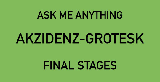
At the weekend, I put the finishing touches on my ‘Ask Me Anything’ zine. It was quite exciting to see it all come together in the end. I had designed each spread on individual Adobe Illustrator documents, so I hadn’t really seen how they all looked together. Luckily, I didn’t hate it :)
I took a lot of steps forward and backwards during the development of my zine. Sometimes I felt like I made a lot process, and other times.... it was like I was banging my head into a brick wall. I took a couple steps forward earlier on, establishing my questions, but really falling backwards again when I didn’t think some of them had large enough areas for me to expand upon. I was in this ditch for a while - I only really figured out my final question a week ago, which really frustrated me. I also had a lot of potential directions that I could have taken for my zine layout/design. I played with a lot of them, but they all fell a bit short of my expectations. Eventually, I chose to design the zine in the style of the International Typographic Style (ITS), as Akzidenz-Grotesk was really popular during this design movement. It also meant that I wouldn’t necessarily have to have a question specifically about the movement - I could instead just reference it here and there. Coming up with each page spread seemed to take more and more time, but I’m glad I took the time because, I’m really happy with where each page ended up. I was constantly referencing these ITS-inspired music posters, really focusing on the way the typography was used and its relationship to the shapes and space around it. I think it helped a lot, especially when I was really lacking direction on one of the final pages. I also struggled a lot writing the responses. It wasn’t to do with the research, I had enough, but I just couldn’t match the character’s voice. I don’t know why I did this, but from the start, I just imaged that Akzidenz-Grotesk would be this really grouchy, arrogant and impatient character, and it really threw me off when I came to actually having to write responses. I know that I had the opportunity to take any direction with his (I imaged him a he) voice, but I just had a feeling it wouldn’t translate well - I wouldn’t be able to portray the emotion I would imagine while writing, and it would all be a bit of a flop. So I left it. I re-created Akzidenz-Grotesk. This typeface is just over 120 years old, and has paved the way for many other typefaces, so I tried to make him seem more humble, appreciative and accepting. On one of my page spreads, I talk about Josef Muller-Brockmann being influenced by Ernst Keller. When crafting my answer, I wanted to reiterate the relationship between Muller-Brockmann and Akzidenz-Grotesk, so I only referred to Muller-Brockmann as Josef. I questioned if this was a good choice, considering I was using ‘Keller’ in the same paragraph, but in end, a friend would never really call their other friend by their last name, so I don’t think I made the wrong decision.
I also wrote the questions and answers in Akzidenz-Grotesk (of course), because it was quite fitting and also aligned with the International Typographic Style-d design. I’m also genuinely quite proud of my type anatomy pun at the end. I trialled about two others and the one I used sounded the least weird.
I produced a zine by saving an Adobe file as a PDF but I don’t know if this is the best approach, and whether I should be refining it in InDesign. I am also questioning if I should add in a contents page - I’ve made one, but I don’t know if it’s necessary and if it is common of zine-formats. I am quite keen to attend the pop-up class on Wednesday, just to get some last minute feedback on everything before final submission.
I really liked this project though. It was quite fun, looking back. I learnt a lot about design movements, famous and key graphic designers, and some history about typefaces.
2 notes
·
View notes
Photo

Follow @holy.swiss on Instagram #bible #bibleverse #Isaiah6 #holy#swiss #design #grid#poster #typography#swissgraphicdesign #internationaltypographicstyle #akzidenzgrotesk
0 notes
Photo

No Style: Ernst Keller (1891-1968), Teacher And Pioneer Of The Swiss Style / Available at www.draw-down.com / Graphic designer #ErnstKeller taught at the School of Arts and Crafts in #Zürich from 1918 to 1956. Frequently referred to as the “Father of #SwissStyle” (later known as #InternationalTypographicStyle), his many students established this particular current in #graphicdesign and went on to make it world famous. His graduates also included protagonists of the New Graphic Design movement (Richard Paul Lohse, Jose Müller-Brockmann and Carlo Vivarelli). This book presents Keller’s biography and an extensive collection of work, including previously unknown projects. His fundamental contribution to the development of innovative, non-academic didactic principles in design education are also described. Keller’s teaching is considered one of the world’s first systematic programmes for graphic design. Designed by Coande / Published by Triest Verlag / 254 pages
10 notes
·
View notes
Video
vimeo
A Brief Introduction to Swiss Style
7 notes
·
View notes
Video
instagram
DU™️ #Repost @formgrapher ・・・ ▓▓▓ ANGRM™ TOKYO ▓▓▓ »»»» LΘG-ØØ16 «««« :::: RUN THΞ GRID :::: _ AGM-11 [@angrm_tokyo] HTTPS://ANGRM.TOKYO/ _ SRC: CYBER PUNK _ ANGRM: BURN PC_KEY _ <!------------------------------------- NOT APPLICABLE TO REGULATIONS_ ---------------------------------------> Graphic Design|@formgrapher Lookbook Photo|@bcstrike Sound Design|@ohlwjinzaemon Web Development|@kempvt_ © MMXX A DYSTΘPIAN CYBΞRPUNK NΞΘ-TΘKYΘ _ _ _ _ _ #angrm #anagram #アナグラム #sciencefiction #matrix #cyberspace #cyberpunk #cyberpunktokyo #neotokyo #dystopia #deadtech #streettech #techninja #techwear #graphicdesign #typographic #typography #typeface #typefacedesign #typedesign #wimcrouwel #vormgevers #gridnik #grid #gridsystem #layoutgrid #swissstyle #internationaltypographicstyle #modernism https://www.instagram.com/p/CED2brpFbXI/?igshid=1rgepn8zctddo
#repost#angrm#anagram#アナグラム#sciencefiction#matrix#cyberspace#cyberpunk#cyberpunktokyo#neotokyo#dystopia#deadtech#streettech#techninja#techwear#graphicdesign#typographic#typography#typeface#typefacedesign#typedesign#wimcrouwel#vormgevers#gridnik#grid#gridsystem#layoutgrid#swissstyle#internationaltypographicstyle#modernism
0 notes
Text
EMIL RUDER


3 notes
·
View notes
Photo


ASK ME ANYTHING’ PROJECT - AKZIDENZ-GROTESK QUESTIONS
(WEDNESDAY 6TH MAY - THURSDAY 7TH MAY 2020)
I prepared five questions in relation to my topic - Akzidenz-Grotesk - in preparation for a discussion in Wednesday’s tutorial. I created five questions, some of which I really liked, and others which were subject to change after peer review.
As of Wednesday’s class, these were my selected five questions:
Question 1: Where do your origins lie?
I chose to use the word ‘origin’ because I think it makes that question more open. There is still a lot of confusion regarding the creator and the exact location where the typeface was designed, and therefore, this wording would enable me to explore multiple locations more easily.
Question 2: Your family is arguably H. Berthold’s most celebrated family. Why?
Akzidenz-Grotesk is widely regarded as H. Berthold’s most celebrated typeface family, but there is no definitive and singular answer to why. I will be personifying the typeface in my zine, and while it could be interesting to hear how they respond, I haven’t figured out how I will exactly answer this question.
Question 3: Where were you after the war? Dead or alive?
I really like this question. Although it is slightly grim in the way that it pairs its growth in the design world to soldiers at war, I think it highlights its evolution, that largely stemmed from a post-war world.
Question 4: What are the hallmarks of the International Typographic Style? ***
I initially starred this question because I wasn’t sure if it related enough to the topic, even though the typeface saw a peak in popularity during the movement. After class review, I would still be able to feature this question, but I would need to try and link it back to the typeface.
Question 5: Why are there so many variation of your typeface?
There are many variations of the typeface, extending beyond the physical form of the letters, and excluding bold and italicised versions. This relates to the origin question, as the foundries produced different versions of typeface. I think this question is weaker than the others as it wouldn’t necessarily portray enough information of the topic.
During discussion, it was suggested that I create a new question about the foundries in Germany at the time, or tie in this information with the first question relating to origins.
ERNST KELLER
After the class discussion, I decided to do more research to see if I could develop or change some of my questions. Ernst Keller’s name had come up in my searches previously, but never in depth.
Ernst Keller’s is widely regarded as the “Father of Swiss Design”. His teachings at the Swiss art school, Kunstgewerbeschule, from 1918, were shown to mark the beginning of grid systems and his belief that design should place a larger focus and importance on the use of typefaces. Some of his students would become leading designers in the International Typographic Style movement:
Armin Hofmann and Emil Ruder
Josef Müller-Brockmann
Max Bill and Otl Aicher
JOSEF MÜLLER-BROCKMANN
Müller-Brockmann, featured the grid system and the Akzidenz-Grotesk typeface heavily throughout his work. He took over Keller’s teaching position at Kunstgewerbeschule, but later opened his own design firm, helping to spread the Swiss Design aesthetic beyond European borders by establishing the Neue Grafik (New Graphic Design) journal. This journal was a trillingual magazine that was co-edited by Franco Vivarelli, Hans Neuberg and Richard Paul Lohse.
I have decided that I may alter my original set of questions. I could feature the Berthold’s question/answer as part of the origins question, and create a question that centre more around a designer, such as Josef Müller-Brockmann, who was popular during the Swiss Design period/International Typographic Style, and heavily used Akzidenz-Grotesk.
[The included images have been individually referenced. They are visible when the images are viewed in presentation mode]
#rmit#communicationdesign#ernstkeller#josefmullerbrockmann#swissstyle#internationaltypographicstyle#akzidenz-grotesk#WK10
4 notes
·
View notes
Link
AKZIDENZ-GROTESK (ASK ME ANYTHING FINAL)
(THURSDAY 4TH JUNE 2020)
So I finished finished.
...which is good - I’m happy :)
Technically... I finished a couple days ago, but I made a few minor changes in terms of detail since then, so I finished again today.
I had a few issues with the consistency between each page, in terms of formatting and the the black I have used throughout my design. I thought it was an export issue which I thought would be really hard to solve, but luckily my tutor had some insight into why it may have occurred, so it was a pretty easy fix in the end.
I saw a couple of my peers publish their final products on ISSUU, so I thought, why not? I was only going to screenshot each page to upload here (Tumblr), so I digital upload seemed much more practical.
In a previous post where I wrote about my zine progress, I omitted my last name. I kind of regret doing that now. I am really happy with where my zine ended up, so I would rather have my name on it...than not at all.
1 note
·
View note
Photo

No Style: Ernst Keller (1891-1968), Teacher And Pioneer Of The Swiss Style / Available at www.draw-down.com / Graphic designer #ErnstKeller taught at the School of Arts and Crafts in #Zürich from 1918 to 1956. Frequently referred to as the “Father of #SwissStyle” (later known as #InternationalTypographicStyle), his many students established this particular current in #graphicdesign and went on to make it world famous. His graduates also included protagonists of the New Graphic Design movement (Richard Paul Lohse, Jose Müller-Brockmann and Carlo Vivarelli). This book presents Keller’s biography and an extensive collection of work, including previously unknown projects. His fundamental contribution to the development of innovative, non-academic didactic principles in design education are also described. Keller’s teaching is considered one of the world’s first systematic programmes for graphic design. Designed by Coande / Published by Triest Verlag / 254 pages
2 notes
·
View notes