#interior design architecture
Explore tagged Tumblr posts
Text
we've found it folks: mcmansion heaven
Hello everyone. It is my pleasure to bring you the greatest house I have ever seen. The house of a true visionary. A real ad-hocist. A genuine pioneer of fenestration. This house is in Alabama. It was built in 1980 and costs around $5 million. It is worth every penny. Perhaps more.
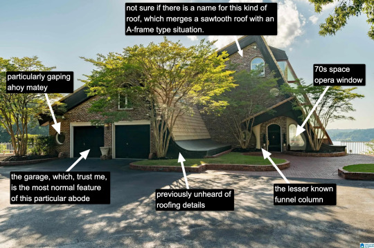
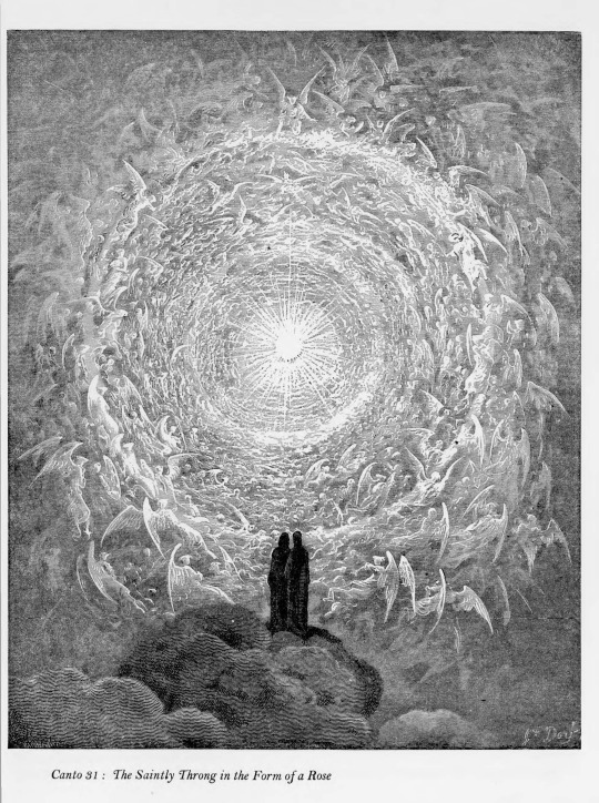
Now, I know what you're thinking: "Come on, Kate, that's a little kooky, but certainly it's not McMansion Heaven. This is very much a house in the earthly realm. Purgatory. McMansion Purgatory." Well, let me now play Beatrice to your Dante, young Pilgrim. Welcome. Welcome, welcome, welcome.
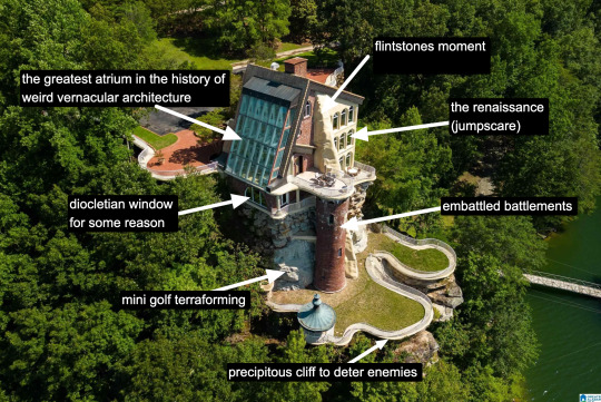
It is rare to find a house that has everything. A house that wills itself into Postmodernism yet remains unable to let go of the kookiest moments of the prior zeitgeist, the Bruce Goffs and Earthships, the commune houses built from car windshields, the seventies moments of psychedelic hippie fracture. It is everything. It has everything. It is theme park, it is High Tech. It is Renaissance (in the San Antonio Riverwalk sense of the word.) It is medieval. It is maybe the greatest pastiche to sucker itself to the side of a mountain, perilously overlooking a large body of water. Look at it. Just look.
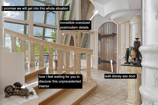
The inside is white. This makes it dreamlike, almost benevolent. It is bright because this is McMansion Heaven and Gray is for McMansion Hell. There is an overbearing sheen of 80s optimism. In this house, the credit default swap has not yet been invented, but could be.
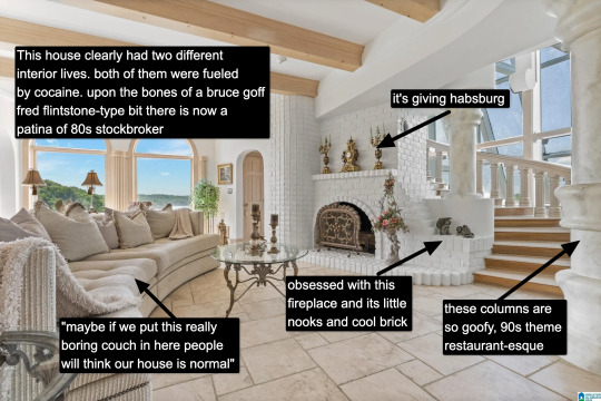
It takes a lot for me to drop the cocaine word because I think it's a cheap joke. But there's something about this example that makes it plausible, not in a derogatory way, but in a liberatory one, a sensuous one. Someone created this house to have a particular experience, a particular feeling. It possesses an element of true fantasy, the thematic. Its rooms are not meant to be one cohesive composition, but rather a series of scenes, of vastly different spatial moments, compressed, expanded, bright, close.
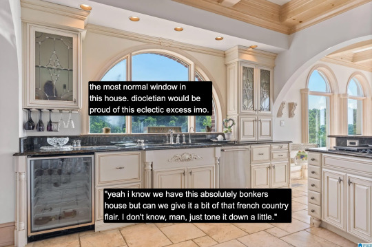
And then there's this kitchen for some reason. Or so you think. Everything the interior design tries to hide, namely how unceasingly peculiar the house is, it is not entirely able to because the choices made here remain decadent, indulgent, albeit in a more familiar way.

Rare is it to discover an interior wherein one truly must wear sunglasses. The environment created in service to transparency has to somewhat prevent the elements from penetrating too deep while retaining their desirable qualities. I don't think an architect designed this house. An architect would have had access to specifically engineered products for this purpose. Whoever built this house had certain access to architectural catalogues but not those used in the highest end or most structurally complex projects. The customization here lies in the assemblage of materials and in doing so stretches them to the height of their imaginative capacity. To borrow from Charles Jencks, ad-hoc is a perfect description. It is an architecture of availability and of adventure.
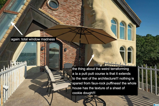
A small interlude. We are outside. There is no rear exterior view of this house because it would be impossible to get one from the scrawny lawn that lies at its depths. This space is intended to serve the same purpose, which is to look upon the house itself as much as gaze from the house to the world beyond.
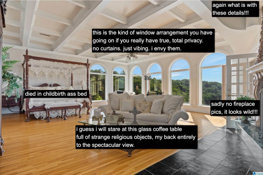
Living in a city, I often think about exhibitionism. Living in a city is inherently exhibitionist. A house is a permeable visible surface; it is entirely possible that someone will catch a glimpse of me they're not supposed to when I rush to the living room in only a t-shirt to turn out the light before bed. But this is a space that is only exhibitionist in the sense that it is an architecture of exposure, and yet this exposure would not be possible without the protection of the site, of the distance from every other pair of eyes. In this respect, a double freedom is secured. The window intimates the potential of seeing. But no one sees.
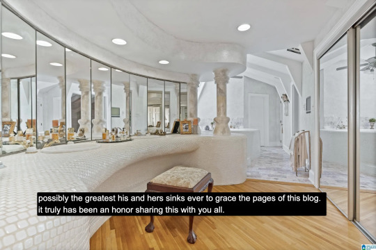
At the heart of this house lies a strange mix of concepts. Postmodern classicist columns of the Disney World set. The unpolished edge of the vernacular. There is also an organicist bent to the whole thing, something more Goff than Gaudí, and here we see some of the house's most organic forms, the monolith- or shell-like vanity mixed with the luminous artifice of mirrors and white. A backlit cave, primitive and performative at the same time, which is, in essence, the dialectic of the luxury bathroom.
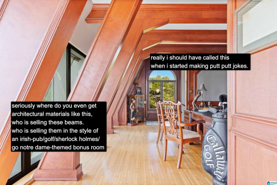
And yet our McMansion Heaven is still a McMansion. It is still an accumulation of deliberate signifiers of wealth, very much a construction with the secondary purpose of invoking envy, a palatial residence designed without much cohesion. The presence of golf, of wood, of masculine and patriarchal symbolism with an undercurrent of luxury drives that point home. The McMansion can aspire to an art form, but there are still many levels to ascend before one gets to where God's sitting.
If you like this post and want more like it, support McMansion Hell on Patreon for as little as $1/month for access to great bonus content including a discord server, extra posts, and livestreams.
Not into recurring payments? Try the tip jar! Student loans just started back up!
42K notes
·
View notes
Photo
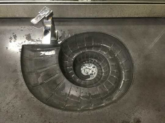
Fossil sink
23K notes
·
View notes
Text
Top Interior Design Architecture in Andheri, Mumbai | Architects India

Experience top-tier interior design architecture in Andheri, Mumbai, with Milind Pai Architects. We combine innovative design concepts with architectural expertise to create spaces that are both beautiful and functional. Trust us to transform your environment with precision and style.
For More Detail Visit Us : https://www.milindpai.com/
Phone no: 91-7710888000 | 91-8082320002
0 notes
Text
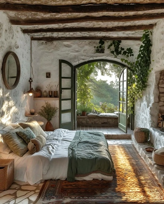
#Bedroom#Luxury home#Luxury#luxury life#luxury living#aesthetic#decor#home decor#lifestyle#lifestyle blog#photography#home & lifestyle#architecture#classy#classy life#home#interiors#home interiors#interior design
18K notes
·
View notes
Photo

Artistic Bird-Shaped Canopy Bed Follow Research.Lighting on Tumblr
#vintage#midcentury#retro#modern#design#product design#home#decor#decoration#home decor#home design#interiors#interior design#living room#bedroom#kitchen#buildings#architecture#furniture#furniture design#industrial design#minimalism#minimal#living rooms#lighting design#lights#bathroom#contemporary
9K notes
·
View notes
Text
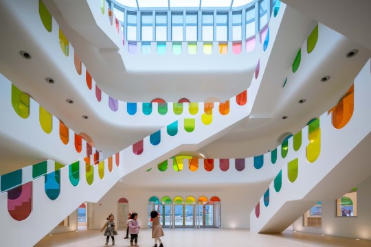
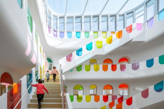

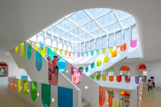


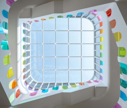
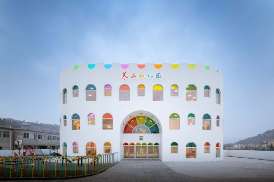
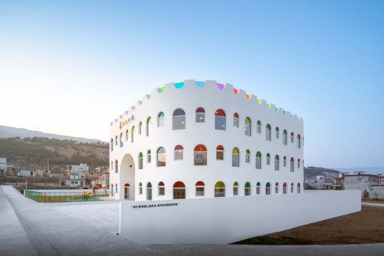
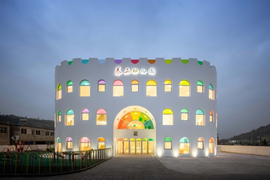
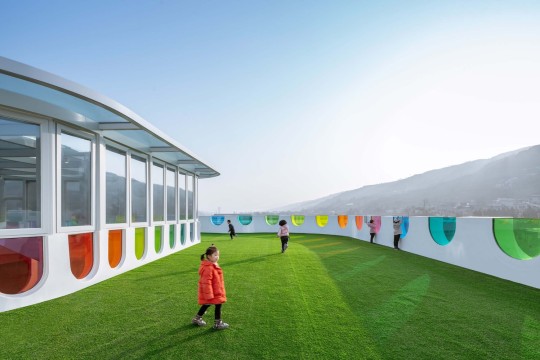
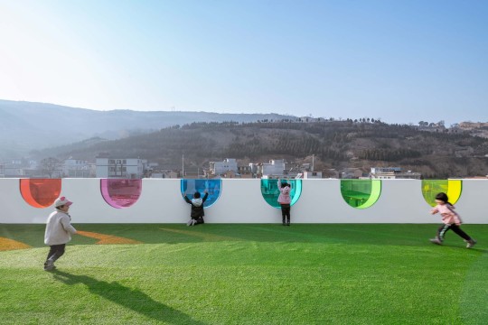
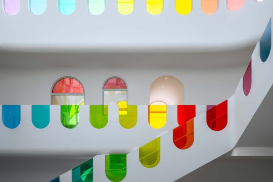
Kaleidoscope Kindergarten (Tanshui Kindergarten), Tianshui, China,
Designed by SAKO Architects
#art#design#stairwell#architecture#stairway#staircase#interiors#stairs#staircases#kindergarden#playroom#stained glass#china#tianshui#tianshui kindergarten#sakoarchitects#glassart#fun#colors#kaleidoscope
16K notes
·
View notes
Text
4K notes
·
View notes
Text

Country Kitchens, 1991
#vintage#interior design#home#vintage interior#architecture#home decor#style#1990s#kitchen#aga stove#farm animal#tile#stoneware#hunter green#painted cabinets#dinnerware#country#farmhouse#spongeware
3K notes
·
View notes
Text
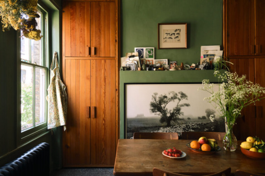

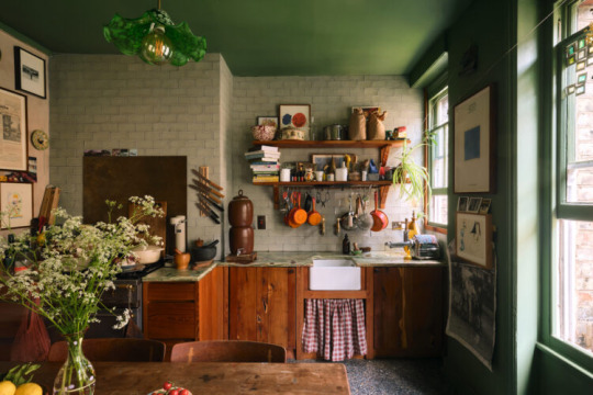


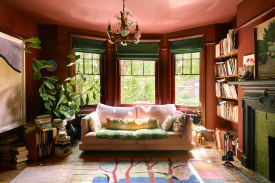
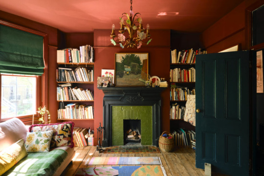


#living room#interior design#interior#bedroom#dining room#kitchen#grove mansion#grove mansions#victorian architecture#Victorian
16K notes
·
View notes
Text
namesake mcmansion
Howdy folks! Today's McMansion is very special because a) we're returning to Maryland after a long time and b) because the street this McMansion is on is the same as my name. (It was not named after me.) Hence, it is my personal McMansion, which I guess is somewhat like when people used to by the name rights to stars even though it was pretty much a scam. (Shout out btw to my patron Andros who submitted this house to be roasted live on the McMansion Hell Patreon Livestream)

As far as namesake McMansions go, this one is pretty good in the sense that it is high up there on the ol' McMansion scale. Built in 2011, this psuedo-Georgian bad boy boasts 6 bedrooms and 9.5 baths, all totaling around 12,000 square feet. It'll run you 2.5 million which, safe to say, is exponentially larger than its namesake's net worth.

Now, 2011 was an anonymous year for home design, lingering in the dead period between the 2008 black hole and 2013 when the market started to actually, finally, steadily recover. As a result a lot of houses from this time basically look like 2000s McMansions but slightly less outrageous in order to quell recession-era shame.

I'm going to be so serious here and say that the crown molding in this room is a crime against architecture, a crime against what humankind is able to accomplish with mass produced millwork, and also a general affront to common sense. I hate it so much that the more I look at it the more angry I become and that's really not healthy for me so, moving on.

Actually, aside from the fake 2010s distressed polyester rug the rest of this room is literally, basically Windows 98 themed.

I feel like the era of massive, hefty sets of coordinated furniture are over. However, we're the one's actually missing out by not wanting this stuff because we will never see furniture made with real wood instead of various shades of MDF or particleboard ever again.

This is a top 10 on the scale of "least logical kitchen I've ever seen." It's as though the designers engineered this kitchen so that whoever's cooking has to take the most steps humanly possible.

Do you ever see a window configuration so obviously made up by window companies in the 1980s that you almost have to hand it to them? You're literally letting all that warmth from the fire just disappear. But whatever I guess it's fine since we basically just LARP fire now.

Feminism win because women's spaces are prioritized in a shared area or feminism loss because this is basically the bathroom vanity version of women be shopping? (It's the latter.)

I couldn't get to all of this house because there were literally over a hundred photos in the listing but there are so many spaces in here that are basically just half-empty voids, and if not that then actually, literally unfinished. It's giving recession. Anyway, now for the best part:

Not only is this the NBA Backrooms but it's also just a nonsensical basketball court. Tile floors? No lines? Just free balling in the void?
Oh, well I bet the rear exterior is totally normal.

Not to be all sincere about it but much like yours truly who has waited until the literal last second to post this McMansion, this house really is the epitome of hubris all around. Except the house's hubris is specific to this moment in time, a time when gas was like $2/gallon. It's climate hubris. It's a testimony to just how much energy the top 1% of income earners make compared to the rest of us. I have a single window unit. This house has four air conditioning condensers. That's before we get to the monoculture, pesticide-dependent lawn or the three car garage or the asphalt driveway or the roof that'll cost almost as much as the house to replace. We really did think it would all be endless. Oops.
If you like this post and want more like it, support McMansion Hell on Patreon for as little as $1/month for access to great bonus content including a discord server, extra posts, and livestreams.
Not into recurring payments? Try the tip jar! Student loans just started back up!
#architecture#design#mcmansion#mcmansions#ugly houses#interior design#mcmansion hell#bad architecture#2010s#maryland
5K notes
·
View notes
Photo

One of the iwan ceilings of Fatima Masumeh Shrine in atabki sahn, Qom, Iran
9K notes
·
View notes
Photo

A Glimpse into Modernist Elegance: JACQUES COUËLLE's Cannes Apartment and Studio, 1960
6K notes
·
View notes
Text
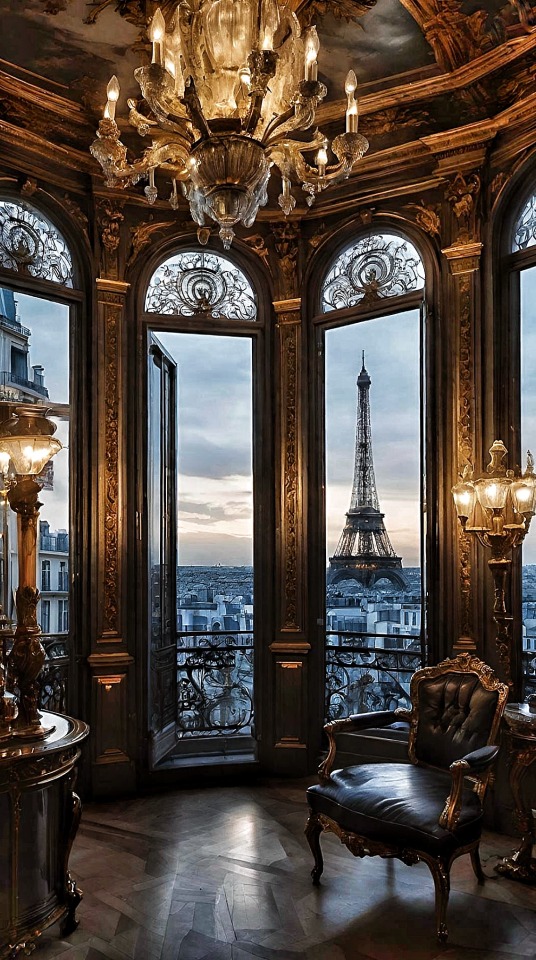
#Paris#Luxury apartment#France#France love#Apartment#Parisian home#Luxury#luxury life#luxury living#aesthetic#decor#home decor#lifestyle#lifestyle blog#photography#home & lifestyle#architecture#classy#classy life#home#interiors#home interiors#interior design#Eiffel Tower#tour Eiffel
5K notes
·
View notes
Text

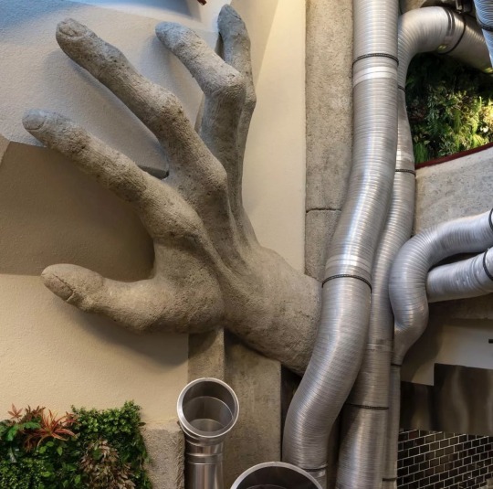
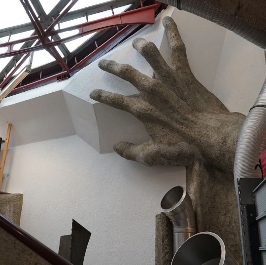
Günther Domenig: Zentralsparkasse Bank (1979) Located: Vienna, Austria
#Günther Domenig#Zentralsparkasse Bank#sculpture#hand#art#architecture#design#interiors#interior design#vienna#austria#1979
8K notes
·
View notes
Text


The Serenity House, Lake Lucerne, Switzerland,
Courtesy: Fatemeh Abedi
#art#design#architecture#minimalism#interiors#interiordesign#brutalism#brutalist#lake house#luxury house#luxuey home#serenity#lake#switzerland#lucerne#fatemeh abedi#concept#render#luxueylifestyle
3K notes
·
View notes
Text

5K notes
·
View notes