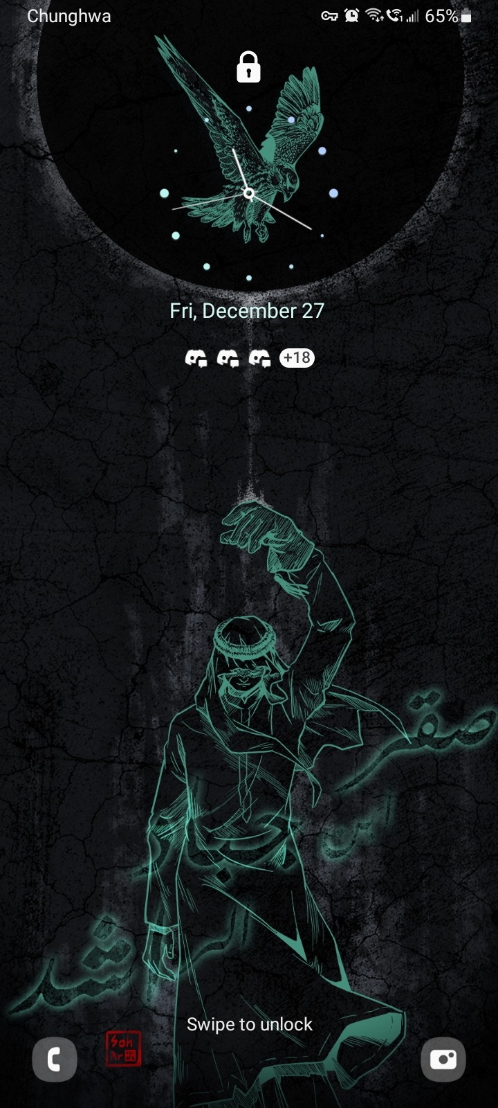
#in the end i went back to the font download site and put his name in for the custom text preview and then just screenshot that and edited it
Explore tagged Tumblr posts
Text
anyways just to show off. I think it looks pretty rad on my particular phone
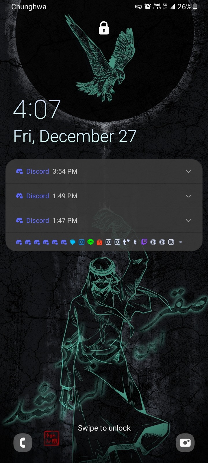
Merry Tanabemas @riboku!! Here's what's intended to be a phone wallpaper of Saqr (obviously you don't need to use it in that way if you don't want)
It's my first time drawing Saqr and also my first time drawing someone with their nominal bird (shocking??) and I had a lot of fun! I hope you like it!
#prev yeah!! its his name!!#honestly one of the most difficult parts of this tbh because i had to go looking for Arabic fonts i liked#and then when i found one that was good i tried copy pasting the Google translate version of his name into clip studio paint#but Arabic is a right to left script and csp doesn't support right to left scripts...#so the letters which would normally connect in a kind of cursive way wouldn't connect at all...#in the end i went back to the font download site and put his name in for the custom text preview and then just screenshot that and edited it#i feel like this is the first time I've ever felt the limits of clip studio paint so clearly...#anyways HUGE shoutout to bread for checking the text for me on this one. i love you bread mwah mwah#birdmen#saqr bin jabad al rasheed
23 notes
·
View notes
Text
Julius Thompson Interviews International Book Cover Artist Kellie Dennis from London, England!
Julius Thompson’s Q/A Session with Kellie Dennis!
JT: Please tell us about the life of an international book cover artist.?
KD: Busy—really busy, I always have something to do, my mind always has ideas floating around. I could be working on one cover and scrawling through lots of images on a stock site and I will suddenly see an image that I really like or that may work for another cover I have on my list. I will end up downloading it and sometimes even leave the cover I was working on because the new ideas are there. Then going back to what I was previously doing.
Designing covers is a bit like writing books; you must be in the right frame of mind to even start work and sometimes this can take a few days to get really into the mood to start designing.
JT: What is the process of developing a book cover?
KD: Every cover artist works differently but for myself the first thing I do is ask the author for the title, authors name, series and/or tag line lines, then I need to know more about the book: where it’s based, what the genre, and most importantly what the main characters look like, also if there’s any items in the book but could be used on the front cover.
I always recommend authors stay away from trying to re-create a scene from their books for the front cover unless they have a picture or images that they have written the scene around, it’s very hard to find the exact image that an author would have written about. And we all know the readers love to pick holes if something is not right.
From the information the author’s given me, I will then have a look on stock sites (like Shutterstock, iStock, Adobe Stock and places like Period Images) to find the perfect images. I say images because many of my covers have anything from 1 to 10 images to create the perfect single cover.
For authors that want exclusive book covers I would contact model/photographers direct to see what they have image wish. These images can cost anything from $200-$2000 per image.
Once I have the images I would then start the design process. This can take me anywhere from 30 minutes to a full day’s work—it’s a case of laying the images over each other to get the layout I want, then the process of cropping images removing them from backgrounds touching them up and adding the finishing touches like colour, tones and magical glossy look that lot of my covers are known for.
JT: What exciting covers are you working on now? How do you know when you are finished with the cover?
KD: All my covers are exciting I love working with first-time authors where everything is new. When they first see samples I send them, they get so emotional and can’t believe that I have brought their world to life. I’ve had a lot of authors say that I’m a mind reader.
I do have an exciting series of covers I am designing for USA Today Bestselling author, Lexy Timms, using model Nathan Hainline images. Lexy is a great author, and I have designed close to 200 covers for her so far.
When I started designing covers I was watching a YouTube video on how to do something. I always remember the guy that was in the video said something along the lines of “as humans we have a tendency to over doing things so whatever you doing to an image if it be make it lighter/darker adding colour, once you think you have finished reduce it by 10%” and that’s what I always do to finished a cover, I’m a great believer in less is more.
JT: Please tell us about your life as a book of artist in England?
KD: It’s probably the same as everywhere else in a sense. Maybe in England we get more rain and it’s a lot colder but I don’t find being in England to have an effect on my business. Most of my authors know my times zone are different and are willing to work around it, I’m also not a great morning person so I don’t mind working late into the evening once the kids are in bed, and sleeping in a little in the morning.
JT: When did you first consider yourself an artist?
KD: Probably not until recently. My son had to do some schoolwork where they had to google the parents pictures and when my son put my name into Google loads my book covers appeared and his teacher asked him what they all where and he said, “My mum designed them and she the artist.” Also, recently this year me and my husband went to a book signing and at the after party I got chatting to quite a few different people and I was shocked at how many people knew who I was and they all had books that I have my designed.
JT: How long and when did you start your work?
KD: I’ve been doing graphic designs for almost 10 years. I started off doing adverts and website design and got into designing books covers around four years ago now. It wasn’t even on my horizon to design covers; I literally fell into the job. It started with my mum telling me to read this book and I had a look at it on Amazon and was like really mum because the cover was not great. That’s a big factor for me when buying books (I freely admit to being a cover snob myself) Anyway, I bought the book and loved it and end up staying up really late reading it and going on Facebook and liking and following the author. She popped up and said thank you for becoming friends. We got chatting and talking about her books I told her that the book had been recommended, but not one I would’ve picked up if I’d been browsing Amazon on my own. I nicely explained that the cover didn’t really appeal to me, one thing led to another and I remade her a new cover that got shown to another author who then ordered a cover and so on so on.
JT: Do you work full time? If so what’s your workday like? If not what do you do other than design and how do you find the time to do this work?
KD: I am a full-time cover designer. This is my only job. My company, Book Cover by Design, has been around for 4 years and became a limited company over year ago.
A normal work day for me usually involves answering around 20 to 50 emails and Facebook messages. Then I usually try and do all printable wraps that may need finishing and little odd jobs like update blurbs etc. I think I spend anything up to 2-4 hours a day on stock sites looking at images and contacting the models and photographers.
I normally design between 2 to 5 covers a day. I have been known to do up to 15 covers if they are part of a series as these tend to be quicker. Once the text is laid out and in place, it’s just a case of changing images and editing images etc
I always try to finish designs the same day as I start them as I can find it quite difficult to get back into the flow of a design once I have stopped.
JT: What would you say is your most interesting artist quirk?
KD: I talk/shout at my PC a lot, lol. I’m not the most patient person in the world so if the Internet go’s slow and I need to get images downloaded I can get loud.
With my actual designs I personally prefer a more realistic looking cover then the really fantasised painted affect covers you see a lot. I’ve become really good at saying no that won’t work in very creative ways. There is only so much that can fit onto a 6x9 space that gets view in thumb nail size more that full size.
JT: As a child what did you want to be when you grow up?
KD: That’s a hard question... I didn’t have a clue.
When I was 11 my parents moved us from Essex to Wales and in the school I was really badly bullied. So when I was 14, my parents pulled me out of school. We had 14 horses and a livery yard stables so I spent time training the horses, working on the farm etc, but when I was 15 turning 16 I really got into drawing and applied to go to college where I was accepted a year early because of the work I had shown the professors in the interview. While I was at college I got diagnosed with dyslexia, which answered a lot of questions of why I struggled in school. I spent two years learning classic art using watercolours, oil paints and charcoal, and after finishing college I started working in retail sales, and worked for a few big company working my way up to store management all before I was 21, after meeting my husband I started my own business making handmade wedding stationery from there I moved onto digital art, which led me into designing the covers.
JT: Anything additional you want to share with the readers?
KD: Just to say big thank you to the authors and readers that continue to use my services and love my covers. Without you I would not have designed over 5000 book covers in the last four years.
My favourite saying is never judge a book by its cover... but why not?
JT: What advice would you give to people that may want to go into this profession?
KD: Make sure you know the laws around copyright licenses for images and fonts, read the terms conditions on all stock sites you may use.
Google images should never be used to find images for book covers.
Watermark your work and never give out your psd files.
You need to have very good computer equipment and a good knowledge of photoshop. If you don’t want to go to college or do online courses there are plenty of helpful videos on YouTube on how it works.
****************************************************************
1. Kellie Dennis Contact Details
2. Book Cover by Design Ltd
3. Email: [email protected]
4. Website: www.bookcoverbydesign.co.uk
5. Facebook: www.facebook.com/bookcoverbydesign
6. Twitter: @bookcoversbyme
0 notes
Photo
I am almost an entire month late in doing this, lol, but here it finally is! It's pretty fun to put this all together and see what my focus was for each month~ Thank you all for sticking with me throughout the year and thanks to all the newcomers who've joined me in my journey of art <3 Here's to another great year of art! \o/ I have a lot planned and I'm probably too ambitious, but here we gooooooooOOOOOOOOOOO!! I'm gonna give little blurbs about each month's piece or what I remember going through each month haha, so feel free to read over my ramblings and such >w>
January -
I chose this piece because of the lighting and the expression. I really liked how the torn down wall turned out behind him and overall this is one of the best completed works of that month. It was a hard choice between this one and one with a sunset behind a female crocodile woman, but I ended up choosing this one for the color in the hair and that it was furry while the other one was a human with crocodile features. (both were not my commissions)
February -
This is probably one of the best pictures I've ever done to be honest haha. I still love the idea of it, the layout, the lighting, ALL of it. I even entered it into a scholarship contest and WON. But the best part of that contest was that it was for my university and this is KIRBY FANART xD that still kills me! haha
March -
Every time that I hang out with my friend :userVibrantEchoes: I end up drawing either Kirby or Pokemon stuff and this piece came from one of my sketches I did while hanging out with her. It was really just something I pulled out of files to work on after completing commissions in a stream but I experimented with lighting and I remember switching between two versions of my preferred art program (because a new update was released that changed nearly everything about the main tools I use) in order to get used to how the new version worked. This was a complete experimentation for all kinds of things but it turned out to be the best piece of the month (in my opinion anyway lol)
April -
Apparently April was when I started to get REALLY into Overwatch, haha. All the work I had available to choose from was Overwatch related and most of those were sketches or colored sketch style comics that I had done at the time. So I went with one of my FAVORITE colored sketch pieces where I had included a big ol' essay about Hanzo and how I adored that character and for what reasons, applying all I'd learned in my psychology classes as well as my own personal experience with depression and loss of family and difficulties with siblings to my claims. Then I tied in how McCree works really well as either a good friend or a lover for him based on their pasts. People seemed to LOVE it too! Though I honestly was expecting some sort of hate for that analysis of him but lots of people commented (this feedback is mostly on tumblr, btw) and messaged me about the analysis or left tags on their reblogs about how they were thinking similar things or that I did really well with it. I love getting feedback on anything, but the sheer amount of it for THIS post... it was amazing and totally worth it.
May -
I shipped a few different pairings from Overwatch >w> Pharmercy is also one of them~ This piece was a pun on how Mercy's line in the game says "healing stream engaged" and I put a ring on her finger and titled it "Healing stream (and healer!) engaged!" ...unfortunately no one commented on that :'c
June -
This is around the time that I started switching from drawing BnF artwork to drawing furry art almost exclusively. I had been MAJORLY involved with the BnF roleplay community there for a while and did a lot of work for people on that site between doing my own roleplays. This was done for a dear friend of mine from that site of one of his new characters. Tagging on from the Pharmercy piece in May - I had become really drawn to doing a glow effect for some reason and wanted to do some sort of magic piece. So this one came about. The character himself was a mimic octopus, hence the designs on his skin and the almost tentacle texture to his hair.
July
-
In July I spent a LOT of time sketching and doodling furry stuff so I didn't really have any "fully finished" things to choose from for this month. After attending Texas Furry Fiesta in March I wanted to get more involved with the furry community but I didn't know how. I downloaded Telegram and tried talking with the artists/friends I had met at the convention but nothing was really sticking with me because I barely knew anyone local. But July was when I found out about the local Texas chats and started attending furmeets and events, made friends, etc. I started making LOTS of stickers for myself of my brand new fursona design to use in the chats (after years of having two separate sonas I combined the species into one that feels like ME rather than characters). Overall it's been a fantastic experience and I've made SO MANY new friends in the local furry community, it's great. BUT! Splatoon 2 had also come out and I discovered Marina because of one of my new furry friends who was/is obsessed with Splatoon and fell in love with her design >w> so I did a little bit of fanart for her during this month~
August -
The last month before school starting up was also the last time that I drew the kemono design of Dimitri with his BnF boyfriend Onnen the elk. At this point I had fully decided that I was moving on from BnF to get more involved with the furry community and I had mostly stopped drawing Overwatch fanart all the time too. I believe my computer was broken at some point and the game had to be deleted, the drive wiped and such. I lost a lot of files that I had been working on... but I didn't re-install the game and ended up not playing anymore because school started up at the end of the month and it was my last semester so I had some pretty big classes that needed my attention more.
September -
I'm really amazed that I had next to NOTHING for this month to choose from. All I had done in September was school work, some Telegram stickers, and maybe some sketches here and there. So what I chose for this month is an example of one of my favorite stickers that I had completed during the month (for Siber) and one of my projects during that month was to use Adobe Illustrator and design a sign or logo then use the laser cutters at the school to both do etching and cutting. And I redesigned my logo from about a year before and included elements that are super important to me (bunny and dragon, since I'm a dragunny, and the star since my last name is Starr). I also created my own font for the actual letters in my username too, which got me big points in my critique in class. It totally went to my head when everyone in there was just blown away with my design of it x3 I was struttin' the rest of the day~
October -
This piece is super emotional for me. As some of you may be aware; I lost my dad a few years ago. For some reason the thought came to mind that when/if I get married I'm not going to have my dad around to dance with me during the traditional father-daughter dance and then I tried to remember if he and I had EVER done that together and I'm pretty sure we never did. Maybe when I was very very young, but I don't remember ever going to anything like a "father-daughter dance". So... this is a drawing of a moment that will never happen. Also - my dad's fursona is a lion with a "chipped" afro, by the way. He loved the character I designed for him too x3 It's just kind of hard to see that in this drawing since it's cropped and he's mostly behind my sona's head
November -
I didn't have much to choose from for this month as I was still super busy with school, but this is when I started getting back into traditional art and began making badges for people~ One of my first commissioned traditional badges was for a local fur and I really like how it came out :3c so that's the one I chose to represent this month! \o/
December -
Another piece with Siber here, haha. But this one had a bunch of elements in it that I really enjoyed doing. There's the "magic" effect with the music around him, the color scheme is super wintery, there's foreground and background elements that I think really make the picture work well, and I really just like this picture haha. I think it's a strong representation of my styles mixed together since all I'd drawn of him up until this point was stickers so I was pretty set into a certain way of drawing this character. But this turned out really well and I just really like it haha
Boy that was a lot of blurbing >-> lolol Thanks for reading if you did! I'd love to read your comments on what month is your favorite or if you had a piece from last year that is definitely one of YOUR favorites that I didn't include (I'm super interested in that actually, please let me know lol) Do you think I chose good work for this? :3c Do you think I over-explained my own reasons behind choosing these? lol Lemme know what you think in the tags or comments or through my inbox! \o/ I DO definitely read all of that ~ ❤❤❤ And thank you again for following me ❤❤❤
#art summary#art summery 2017#art summary 2017#2017 art#2017#art summary meme#furry#anthro#anthropomorphic#kirby#meta knight#magalor#metalor#pokemon#mother#child#marowak#cubone#overwatch#jesse mccree#mccree#hanzo shimada#hanzo#mchanzo#sad#crying#pharmercy#pharah#mercy#fareeha amari
3 notes
·
View notes
Text
Episode 107 : La Rivincita Del Classico Bravo Ragazzo
"Tried to be a citizen...they wouldn't let her."
- Kermit
I had a trip to Italy this month, and when I was in Pisa an album cover popped into my head! With this month being the eighth anniversary (already?) of the passing of Guru, I was glad to be able to get my own version done in time for this episode's cover art. Thanks to Lisa for the original photo (yes, I really was in front of the tower for this shot), Damian for font advice and Sabrina for the translation!
This month, the show of course includes something from Guru, as well as selections influenced by the disgusting treatment of the Windrush generation (help however you can), some new releases and a few old gems, as always.
The Mouse Outfit are playing in Manchester on May 18th - tickets here!
Twitter : @airadam13
Playlist/Notes
Ruthless Rap Assassins : And It Wasn't A Dream
With everything that's been in the news over the last month - but which has been going on for a very long time - this is a perfect record to pull out of the archives. Manchester's Ruthless Rap Assassins emerged from the pioneering Broken Glass crew, and released their debut LP "The Killer Album" is 1990. This track was a single from that album, and sounds very much of its era - but even twenty-eight years down the line, the subject matter cuts just as sharply.
Ludwig Göransson : Killmonger
Easily my favourite track from the "Black Panther" score, which starts off gently and then builds along the way until it bangs out into full trap mode, reflecting the violence of the character. Great work from Göransson and the African musicians he worked with on this.
Ocean Wisdom ft. Method Man : Ting Dun
I didn't know about Camden's Ocean Wisdom until my man Didjit told me to check him out, so I went to have a listen to the "Wizville" album. This track stood out as an immediate favourite, and to my mind Ocean absolutely dominates the track, despite the presence of a legendary MC who has known to slay guest appearances in his time. Meth does do a nice turn in tilting his vocal style towards Ocean's, and together they put in a great vocal performance over the Basquiat beat.
Prhyme : Streets At Night
As I said last month, "Prhyme 2" is definitely an album to pick up, and this is one of the best tracks on it. May not be the obvious Premo style, but he delivers 21st century boom-bap off the back of an Antman Wonder sample (don't worry, it's all cleared!)
Termanology ft. Lil Fame and Ea$y Money : Welcome To The Machine (Remix)
Dug this one from out of the corners of my hard drive, and was surprised I hadn't played it yet. I got this one from the old Spine Magazine site (RIP), but you may be able to find it if you have a hunt around. Artisin is the producer, and the Pink Floyd sample he uses starts in the intro but then winds its way into the main part of the track. Lyrically, Termanology's verse is kind of like his own version of GZA's "Labels", though the audible highlighting of the names of each one was a little heavy-handed. Lil Fame of MOP contributes a solid verse as well, and the third verse is really the only let-down.
Blak Twang : Fearless (Original & 19 Long Time version)
It made sense to share both versions here, with the original coming from the originally unreleased "Dettwork SouthEast" and the refresh being part of the brilliant "19 Long Time" LP, with V-Essence on the hook. A perfect song to play this month, with Tony Rotton addressing the far right, the murder of Stephen Lawrence, and the horror of the Black Holocaust.
[Supreme] Sunz Of Man : No Love Without Hate (Instrumental)
A great example of the work of the man responsible for Sunz Of Man's early production, with some straight boom-bap around a classic soul sample. I've got two copies of the 12", but I'll leave the rest out there for you :)
The Mouse Outfit ft. IAMDDB and KinKai : Feeling High chini defty metro
May 4th will see the release of The Mouse Outfit's third studio LP, "Jagged Tooth Crook", and they were kind enough to send through a preview copy so you could hear a track a little early :) The vocals come courtesy of two standouts from the new generation of Manchester artists, IAMDDB and KinKai, both of whom are getting respect from those in the know, perfectly complementing the vibe of the beat. Production is by Chini and Defty, founder members of the crew, along with Metrodome - a longtime Manchester artist despite his young age. Chilled, polished, quality. Get that album!
Meyhem Lauren ft. Conway the Machine : Venetian Loafers
That new age vintage New York street talk from Laurenovich! This is Queens flavour from his new "Glass" EP, solely produced by Harry Fraud - definitely one to check out, and one I think we'll be returning to for a future episode. Right here, Meyhem and Conway from up in Buffalo, NY give you uncompromising, unapologetic rawness.
Sean Price & Illa Ghee : Metal Detectors
The title track from the newly-released EP from the late Sean P and Illa Ghee from the Mobb Deep family, and it's a killer. The opening verse is definitely one of Illa's best, in my opinion, and it's always great to hear Sean's voice. I've not been able to find out who produced it yet (damn digital releases), but it's darkly beautiful.
Jay-Z : People Talkin'
One that might have passed you by, after it was apparently dropped from the "Blueprint" album. Jay claimed this Ski Beatz track which was originally for someone else, and the finished product finally got a release on the "MTV Unplugged" album as a bonus track - although I'm playing it here from a white label. Always liked this one, right down to the annoyed mumble near the end about Jay never having to sell another record in his life!
T_One : Lot Of Cats Hate My Guts
From the Beatfonics Crew's "Beatxploitation" tape, T_One throws all kinds of samples into the stew for this one!
Geechi Suede : Limozini
This one cried out for a little light juggling before letting it run - not least since it's only a short track anyway. Produced by Nytelife (and taken from the "0.9 Nytelife FM" album), the track is based around a fairly modern sample from one of the greats and provides a bouncy background for Geechi to get busy on.
Black Milk : Could It Be
The new album FEVER is somehow Black Milk's sixth, and he continues to deliver his own interpretations of styles from Detroit and beyond. On this track he brings in a guitarist, bassist, and keyboardist, then plays producer in the traditional sense, guiding them into a cohesive unit playing an irresistible groove.
Gang Starr : Much Too Much (Mack A Mil)
Always one of my favourites from the must-own "Daily Operation" album - the third in Gang Starr's faultless run. Listening to this reminds me how much we miss Guru.
Rottin Razkals : Oh Yeah
Rottin Razkals came up under the wing of Naughty By Nature, with one of the MCs (Diesel) actually being Treach's younger brother. They only released one album, 1995's "Rottin Ta Da Core", from which we have this big single. NBN wrote and produced it, but you can't take away from the energy of the performance by the group themselves!
[DJ Spinna] Jigmastas : Too Ill (Instrumental)
I was definitely a fan of the fact that the "Resurgence" album came with the instrumentals included - it allows me to share gems like this :)
Zion I ft. Pep Love : Warriors' Dance
The "Deep Water Slang v2.0" album may not be one that everyone knows, but it really is quality all around and is well worth seeking out. This track, featuring Pep Love of Hieroglyphics, is somehow both bouncy and a revolutionary anthem. Zion and Pep are a great combination, and Amp Live's production is always inventive and well-done.
Please remember to support the artists you like! The purpose of putting the podcast out and providing the full tracklist is to try and give some light, so do use the songs on each episode as a starting point to search out more material. If you have Spotify in your country it's a great way to explore, but otherwise there's always Youtube and the like. Seeing your favourite artists live is the best way to put money in their pockets, and buy the vinyl/CDs/downloads of the stuff you like the most!
Check out this episode!
0 notes