#im working on full character sheets for my redesigns
Explore tagged Tumblr posts
Text

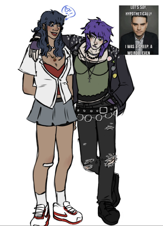
messy mevie doodle that i kinda hate before i go to bed 😎 theyre best friends ur honor <3333 *click for better quality*
#have a mal and jay drawing planned#not meant to be ship but can be if u wish#im working on full character sheets for my redesigns#but thatll take like one million years#disney descendants#descendants#mal descendants#evie grimhilde#mal needs a last name ong#mevie#fanart#descendants fanart#descendants redesign#descendants rewrite#mal x evie
283 notes
·
View notes
Photo


Watch out there’s a new senior citizen in town...
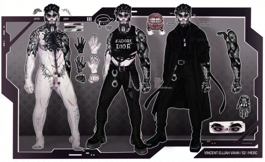
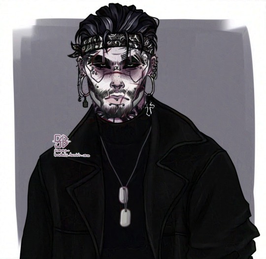
After 11 unfinished concept sketches, 20+ hours of work and 213 layers later I finally finished the ultimate reference sheet of my boy Vincent Elijah 😌
I’m gonna probably hate myself for that cyberarm design later when I’ll have to draw it in detail again but oh well i fucking love it.
I guess this is what 8 months of character development does to you (aka never being fully pleased with how your oc looks)
Updated info about this mf below the cut bc i hate long posts💀
don’t repost my artwork without my knowledge or permission
Short basic bio:
Birth name; Elijah Samuel [REDACTED] Full name; Vincent Elijah Vahn (yeah changed it again sue me) Alias; V, Vince (close friends and partner), Mr. Vahn (whilst working for Vault or during a very formal setting) Age; 58 (born on, November 12th, 2019 at 05:31:11AM ) Zodiac/Chinese zodiac: Scorpio/Snake [more info about it here] Height: 198 cm / 6′6″ MBTI; Logistician ISTJ-T [more about it here] Aligment; True Neutral Anthem; Goliath by Woodkid
[More (kinda?) updated info about him here]
Distinct physical features:
A diagonal scar on the bottom of his right hand from slicing his palm multiple times for a blood pack. He really values this type of „deal”, because „Nothing bonds tighter than blood. Nothing means more than a pact singed with blood. It flows within us, a cycle. Then it repeats until the blood cells die but then new ones take their place. And the cycle continues. Unstoppable and constant until we die and the loop breaks and shatters into pieces. They sink to the ground and rot and rot and rot until there’s nothing left. Words? They just can’t give you enough assurance somebody won’t just screw you over. Blood is a promise, words are nothing.” (cringy enough? lol im such a bad poet dunno if it even makes sense)
Now he has streaks of gray hairs so 😌 he’s a silver fox
Stretch marks on the sides of his buttocks and upper thighs
Deep-set eyes
Big hooked nose
Huge mommy milkers
Thunder thighs
Stretched both ears (40mm)
Chrome plates on his ribs - cyber “scars” from lung and heart transplant
Has the number “444” tattooed on the inside of his lower lip.
Cyberware:
Custom made cybernetic arm, model Nocturne PX* 44 Monarch. The prosthetic is made out of a mix of carbon fibers and a material similar to porcelain but far more stronger. It’s light and durable, performs just like a normal ‘ganic arm thanks to complex joints model. The surface of the arm is matte and smooth. It’s littered with countless microscopic sensors and neurocircuits that send touch signals right up to is brain so every inch of his cybernetic arm feels just like his organic one.
Despite being able to afford the most expensive RealSkinn he opted for the “raw” look of it and instead commissioned his ex-input to engrave and redesign it for him.
*PX - Power X (10) - the strongest and most durable model out of the series.Only few models were ever made. This version of the Nocturne Cyberarm is made solely for private (wealthy) clients who were recommended by (for example) a fixer.
Some updated trivia i guess:
He recently started wearing bandanas around his forehead to keep his baby hairs in check but they still keep on falling on his forehead *heavy irritated sigh*
Mostly wears (black) clothes made out of synthetic leather (unless he thrifted some vintage clothes made out of real leather). He prefers leather to denim.
Has handcuffs dangling from his belt loops (at all times) for you know… catching criminals?
Paints his nails funky patters but mainly sticks to muted colors or just black
And for some weird trivia about him:
Definitely calls people „bestie” (especially in a formal setting) (un)ironically just to piss them off
He’s a self-proclaimed Slut™.Fucks basically everything that walks (or not) and looks like a dude. He’s borderline a sex addict. Sometimes he shows the signs of compulsive sexual behavior (hypersexuality).
Uncensored nsft version: here
Also i made a separate Twiter acc (@b_brutalis) so maybe I’ll also start posting there :^) But if you see me follow you for your nsfw art there no you didn’t
#eat him up ladies gents and fellow they thems#oc: Vincent Elijah Vahn#oc: Vincent Elijah Vigo#yeah i changed his name again so i have to fix the tags again....#cant believe i just drew a full on dick on this man#nervy nervy#pp man#have you got hotsies for him yet? please tell me you have#im a proud momma i guess#cyberpunk 2077 oc#male V#cyberpunk male V#cyberpunk 2077 male V#cyberpunk 2077 V#saevus-brutalis art#brut art#saevus brutalis art
139 notes
·
View notes
Photo

Redesign of one of my dnd characters, Chimera! She’s a mystic-breed catfolk wizard :]c original design + character notes under the cut!
this is from 2017 and im pretty sure i still have a post up of her on tumblr when i first made it.. she wasnt originally meant to be a dnd character and only later got turned into one! (i also dont have a full dnd sheet made for her but it exists in my heart)

i dont draw her a lot but she’s one of my favorite ocs! it’s a wip/not final, but her story is that she’s haunted by some kind of spirit. I havent really figured out what the deal is there but it is a plot point. otherwise she’s a wizard that works alone mostly, but helps out with the druid circle of the moon when their meetings are near town (which involves some of my other ocs, like Petra and Ashe!) she’s a wonderful cook and baker, and takes advantage of the meetups to swap recipes and have people try her own dishes :3 her red scarf is something someone she cares a lot about gave to her (also havent fleshed this out) and she has two books. the red is for her writing/journal entries/poetry, and the green/purple one is for spells and recipes. i havent decided on her age but she’s at least in her 40s thank you for listening to me talk about my ocs :’‘3c
#my art#furry#furry art#dungeons and dragons#catfolk#wizard#all my wizard designs have the same cloak thing going on but its all i can draw....#i cant help it T_T#dnd#my ocs
14 notes
·
View notes
Photo

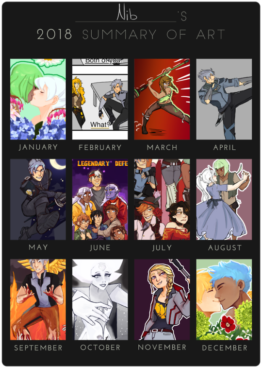
So uhhhh I drew a lot of RWBY this year... only two of these are non RWBY and tbh I could have just as easily put something RWBY for June Template
Retrospective under the cut bc it’s LONG
RETROSPECTIVE January: First piece of the year! I still like this piece and I think it shows how much I improved from the original version of it. Also I just like looking at it bc it's soft content of my rare pair. I do think I made the rose look photorealistic which looks... bad esp with all the other more stylized flowers, and I got lazy with the bleeding hearts by just drawing one set and flipping them. Emerald's hair also could look better. February: I made this around GNG week, which was a fun, good time, long before the server imploded on itself. I got really lazy with the backgrounds, obviously, but I do like the poses in this one, tho it helped that I based it off of screenshots from Young Justice. I also just really like how Merc looks in this one. March: March wasn't a very prolific month for art, I don't think I produced much besides this and one comic piece for GNG week. I'm not sure why exactly, I can't find any specific reason why I would be unproductive that month. I'm gonna just assume I was drained from work all the time and didn't have the energy to put out good art, and also I was getting into a slump bc all my art was starting to look same-y. This piece isn't very good, but I chose it because I did it without a reference, and at this point that was going out of my comfort zone. It's obviously not super dynamic, but at the very least you can tell I intended there to be motion to it. April: This also wasn't a very prolific month for art, not as bad as March, but for the same reasons. I was also really starting to feel burnout from the RWBY fandom, specifically wasps and conflict within the GNG server. This was also when the Art vs the Artist meme was popular, and I realized I didn't want to do that meme because my art was too similar and boring, which also brought me down a peg. Though I put out a few good chibis in April, I chose my Mercury redesign bc I was really proud of it. I could never get the Emerald redesign to mesh quite right, but I can say I'm really proud of how Mercury's came out. May: May had me bounce out of my art slump and in full force trying to expand my skills! Specifically exploring painting. Although May was about as prolific as April, what I did create I put a lot into. It was difficult to pick between this and my app of Edison, because I'm really proud of both, but in the end I went with this commission of Mercury because I pushed myself to try and use an interesting perspective for the piece instead of my usual stand still and face the camera pose. Because I pushed myself out of my comfort zone, this was one of the best things I made all year, and may be my favorite piece of the year. June: TIME TO STRESS OUT ABOUT CONNECTICON! So if you follow me on twitter, you might have noticed I made a lot of posts at the beginning of the year low key throwing shade at myself for drawing my oc's instead of more "important" art. Well, that important art that I was procrastinating was con merch, and con was the second week of July, so I really had to get my ass in gear to finish merch on time (spoiler, I didn't finish a lot of it on time). This piece and July's piece are both posters I made for Connecticon, and while I like July's much better, that doesn't mean I find this piece bad. I really should have known that no one at con would realize it was a goonies reference tho -_-; I also lost a lot of love for this piece after season 6 of Voltron, which I watched while I was about 60% of the way through this piece, so I had to force myself to finish it. July: I love this piece!!!! Don't get me wrong, I know it has flaws, but look at it! The lines are so crisp, the colors look good, Roman and Merc's expressions are mwuah chefs kiss, and I just love all of them!!! ... except for Neo. I really didn't do her justice in this piece, her hair is too fluffy, her head is way to oversized to the point that she looks like a bobblehead, and her eyes are too close together. Really if you take out Neo's head that whole problem goes away. I also love all the tiny details I put in this one, from emerald's chaps to roman's rose to Neo's lace parasol. You can tell I was way more passionate about this piece than I was about the Voltron piece. August: pretty sure this is when I quit my job cashiering, and thank god bc customers suck. If I was going off of sheer popularity, Chibi Pyrrha would have taken this slot no contest, and while I love chibi Pyrrha, I don't think it was the best of the month. I chose this little princess and the pauper au doodle because I tried a year ago to draw these two dancing, and it looked like dog shit. It was flat and ugly. But this has motion to it, and even looking at it now makes me feel warm and happy inside. It's just a good cute drawing of my otp. September: My piece for the RWBY tarot project! I have a lot of mixed emotions about this one. on the one hand, I love how mercury looks, his expression, the lighting, the visceral gore from his legs (ESPECIALLY THE VISCERAL GORE ON HIS LEGS) and the hands of the undead, all look stunning and I don't think I could be more happy with how they turned out. And then we get to the background. The caduceus isn't the worst thing ever, but it's severely lacking in quality compared to the rendering on mercury in front of it, and a lot of it is clearly pixellated from me trying to stretch and squash it just right. And the fire is a hot (no pun intended) mess. It's flat, incoherent, and doesn't lead the eye anywhere. It's a shame too because I wanted to do more with it, but I a) didn't have enough time or patience to figure out what I needed to do to fix it and b) didn't want to go outside of my comfort level, so I gave up and decided to be satisfied with what I had. October: October was another good month for art, I made a turnaround sheet for Moss, painted a full body (and slightly lewd) Rudy, and made a decent attempt at inktober. Ok, so I got like 2 days in, but I improved a lot on inking from last year! Fun fact! this piece was originally going to be fan art of Lindsay Jones, but after I did some thumbnails to figure out a pose, I thought it would suit White Diamond better, and I could also sell it as merch. I love this piece. I think I captured the sinister mood well, and conveyed the story I wanted to without any dialogue (at least the notes on Tumblr make me assume I did a decent job, lotta people really wigged out lol) I really worked hard to get the lighting right on this one, and I think it shows. My absolutely favorite thing about this piece funnily enough, is Amethyst. I think I just did a great job drawing her and I'm proud of myself ok. Stevens bubble and my trouble figuring out how to get WD's leg just right are the only things that I dislike about this piece, but I might go back and fix those. November: IM SO PROUD OF THIS COMMISSION!!!!!! I worked so god damn hard on this chef's kiss poifect, and it really shows. I started using a new brush at this point, the Ojing series on Clip Studio Paint, which I recommend and have been using a lot since. I've also been using this shading technique since drawing this. I love how it sort of fades out but it's still really crisp. I also love all the little details that give this piece character, like her shoes and the stripes on her jacket. This piece really takes a lot of the stuff I learned over the year and combines it into one piece, and I could not be prouder of it. I have absolutely no problems with this one, though I do find the weapon a bit plain, but it's what the client described. December: AND NOW IT'S CHRISTMAS!!!!! I had been working on this piece since August, going back to it every now and then and getting frustrated. I'm really glad I came back to it and finally finished it, since I love this pair and I put a lot of effort into it back in August. However, I'm also really glad I completely overhauled a lot of it, specifically the flowers. Though I'm not 100% happy with the mums in this one, they look a thousand times better than the mums I had originally sketched back in August, and were part of the reason I had such a hard time finishing this for months. I also thought it would be nice to end the year on the same note it started; with a flower couple. I've definitely learned a lot since January, and I hope to continue growing in 2019! 2019 GOALS!
Work on backgrounds for the love of god
Draw more stuff that isn't RWBY
Perspective
Make more speed paints and post more to youtube in general
14 notes
·
View notes
Note
alright! if you are ready, I'm gonna show you my original design of the character, it's iterations, and finaly it's most resent design!(with your sans as the father!!!!!)
so first design is this!(it isnt first first design, but im too lazy to find the actual first drawing rn so versions made on Pastel Friends are gonna have to work!)

the kid of just sans and nagito. and the start of my crack ship au!!!! she at first was a jack of all trades mom friend, she had one normal eye and one skeleton eye, and she was honestly kinda boring... now I did another redesign of some of the other characters before my next re-design of her but I really didn't know how I wanted her to be till a wile later when I picked up the idea again.
then the second iteration was made!!!

where she got a put together personality, and two more dads!!(jfk and Jesus[from the Christian Bible. nothing is safe from the crack-], making a four-ple!) she got nerfed to be shy and very passive, but then I also gave her some pretty powerful powers to up in her character development(she starts with both eyes then things hit the fan one day and now she has sans powers that are out of control and sanseyesanseyesanseye to deal with. she wears a eye patch on one eye after getting the new eye). and that's where I left it! till I realized, that doing the characters colors and design choices from the perants would be cool and fun and make it look more realistic!!!!!! so I had that in my mind then luckily a day later my older bro showed me your sans and I loved it! so I came over here to you to get permission.
and now, what you've all been waiting for... the reveal of the newest version of my oc!!!!!!!!!!!!!!!!!!

this is them! or at least their colors put onto a past version of their model. here's the full color sheet and things I used for the colors(p.s. the heterochromia isnt intentional, I just couldn't choose between eye colors- might keep it tho)

and heres the design made in Pastel Friends again!

('wow! so different!!!' I know I didn't really change anything- I'm still thinking more eabout what I should do with her and the other characters!!)so yeah! hope my oc dosent dissapoint too much, and I hope sans likes his new kid and husbands!!!!!!!!!!!!!!!!
hey, must ask cause it's your intellectual property but may I use your human sans design for a father of a oc? please I will explain why, it makes sence I swear
ya thats fine! 🤝 i dont mind people drawing my human sans x their oc/self insert and all that !!
38 notes
·
View notes