#im gonna be messing around with presets and stuff for a bit
Explore tagged Tumblr posts
Text
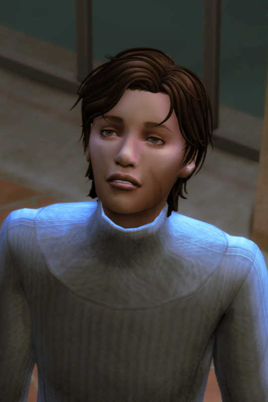
michael (they/them) , for @birdietrait's coven of simblrs !
more info under the cut!
got turned a month ago
21, in college for art history
no one except kyra knows they're a vampire
fears themselves at times
powers are underdeveloped, only power is slightly advanced hearing
got turned by their ex (yikes!)
doesn't like drinking from humans
#ts4#ts4 edit#my sims#oc: michael wilburn#coven of simblrs#i imagine that kyra and mike would have an older-younger sibling dynamic#kyra would be nurturing at times but very annoying as well#these screenshots are my first time using gshade!#btw#this is sumahama by wilderbees just slightly edited#im gonna be messing around with presets and stuff for a bit#locust.png
10 notes
·
View notes
Note
hi! how did you make you banner i love it!! :)
thank you! i’ll give a detailed rundown under the cut! i was actually in the middle of making a new header when you sent this, so good timing!
a quick explanation is that i cut out an image, paste it onto a fresh canvas, edit to my desire, and then use a gif overlay on top to give that snow effect!
so i’m going to explain this in as much detail as possible to try and make it as clear as possible, so hopefully this will be useful no matter how much PS experience one has! i used photoshop cc 2017 to make this! i’ve learned ps pretty much through just trial and error so if i do things weird, im sorry sdklfjdslk
start:
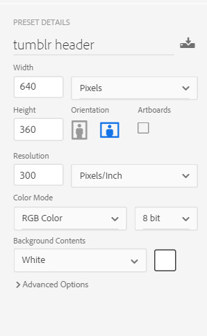
the first thing i do is open a blank document in PS sized to the tumblr header size which is 640x360 on mobile, you can size up if you want, but just keep the ratio the same!
player image:
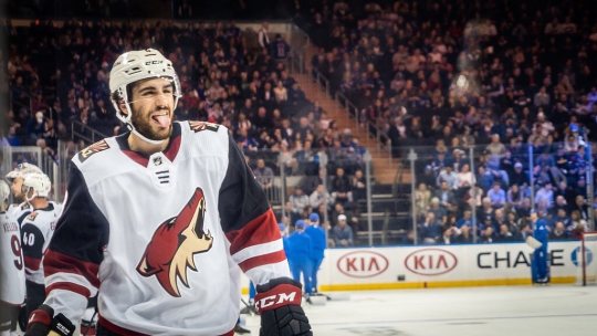
so first i grabbed a picture, and for this i prefer pictures where the player(s) is(/are) isolated, and it’s even better when there’s not much going on behind them because it makes it much easier to cut out the part you want!
the picture i used for this is from this post on the yotes instagram!
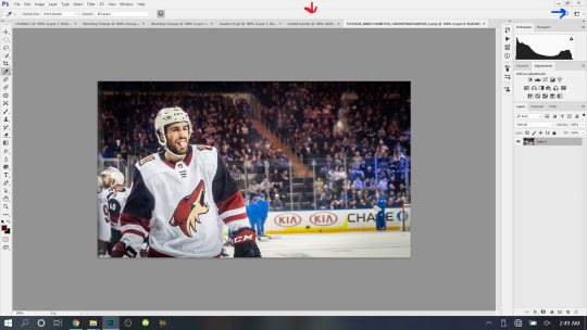
next, i open this up into PS, so i have both the photo and the blank canvas (red arrow) open. the blue arrow points to where you can change workspace presets to allow different tools onto your workspace. i’m currently using the photography preset, but will eventually switch to motion later on.
now i begin cutting out my player. there’s multiple methods to do this and each once has it’s pros and cons. the quickest way for me is not necessarily the best way, but it does what i need it to do, especially when the item to be cut out is isolated in front of a quiet background. i use the quick selection tool to quickly select the area i want with a larger brush, and then i go in with a smaller brush size to clean up the edges and details.


when the option with the plus is selected you are grabbing more area, and when the option with the minus is selected you are are deselecting area. the 22 highlighted above references the brush size, the appropriate brush size, or what is “big” or “small” will depend on the size of picture you’re working on so just play around with what you’re comfortable with!
nick is selected, as you can see below, with the line around his body. this is not quite as careful as i would be if i was actually making this for someone to use, but for demonstration purposes it works. you can zoom in further and use the smallest brush size possible and really be careful cutting things out. you can zoom in but uping the number at the bottom left handside of the screen!

once you have everything selected, right click and choose layer from copy which will create a new layer with just the area you have selected.

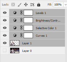
now i turn off the layer with the full picture, leaving only the layer i just created. to do this, click the little eye next to the bottom layer on the right hand of the screen, as seen below.

now you’re left with a transparent player to work with! this is where i do any coloring i want to do as well, so i will quickly do that. i am not great at this part so i will just recommend looking up coloring tutorials if you want more specific help here, or just mess around with different adjustment layers which is what i do lol. once it’s colored to my liking, i merge the layers together, making them into one layer, which means the coloring won’t impact any layers below it once i move it to the canvas where we’re actually going to create the header. you do this by selecting all the layers (ctrl + click all the layers or shift + click the top and bottom layers to select them all), and then right clicking and selecting merge layers from the options.
assembling the image:
now im going to work on the base of the header, or basically the rest of it except for the moving bits! what i want to do here is move the player image over the header canvas, resize the image, decide on the color of the background, whether i’ll use any other images or textures, etc.
first i’ll think about my background color of choice. a lot of people use the color that they use for their mobile blog on here, or something complimentary or matching their accent color, etc. i really like a simple clean look so i used a white background for this header because i think it makes the image itself pop and allows the accent colors on my blog to also pop because i use white as my main color on my blog.
if i wanted to use another color, i normally pull from some part of the image i’ll be bringing over. for this i’d use the color dropper tool (see below), clicking on color on my image i want to use.
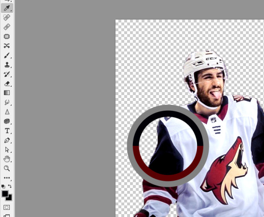
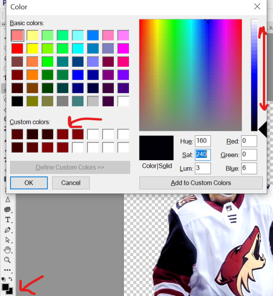
then i’ll pull up the color boxes in order to create a custom color from that color (click define custom colors), and then you can mess around with by clicking different boxes on the color scale along the right side of the panel below, or if you want an unrelated color, click on parts of the entire rainbow scale thing. once you have a color you like, selected add to custom colors and you can work with it. i create a new blank layer and then use the paint bucket tool to color it in. this is where you could also use gradients to jazz up the background a little too.
now i’ll drag my player over into the header canvas. i do this by click + dragging the layer from the right side over to the tab of the header canvas until the screen changes over to that workspace and then i drop the layer onto the canvas.

and
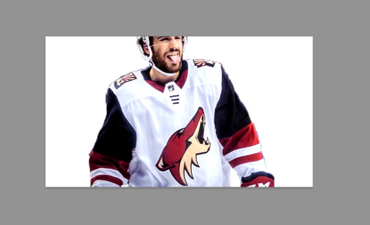
now nick is over on the blank canvas but as you can see, he needs to be resized. so i ctrl + t, which allows me to transform his layer (make sure you only have the layer w the image selected on the right hand side layers panel). i hold down the shift key (this keeps the ratio true) and begin to make him small by dragging the arrows. make sure you do not let go of the shift key too early or it will fuck up the image and make him too long or too wide, etc. then i hit enter, and it completes the transformation. i then drag him to wherever i want him.
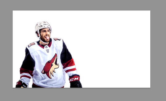
now that he’s resized and where i want him, i mess with the blending options to blend him into the background more pleasingly. now this really isn’t gonna look good since i was so sloppy cutting him out earlier, but just mess around with it until you get something you like. you do this by right clicking on the layer you want to blend and then selecting blending options. i normally do a drop shadow and maybe some other stuff, but i find this changes depending on the image, background, colors, etc.

there’s a lot of stuff you can do here, with the different options and the different settings for each one!
gif overlays:
now it’s time to add a gif overlay which i how get the snow falling effect. there’s multiple posts with these kinds of gifs out there, i’ll be using one from this post (method one) and one from this post (method two). neither are the one i used when i first made this header but i cannot find the one i used then; the principles still apply. now is the time to either add the timeline to your workspace, or change it to the motion preset.
on the timeline section at the bottom of the page, there should be a create timeline animation button, click that.

as with gifs from videos, there’s multiple ways of making these gifs. i’ll run through two here.
method 1: this is the method i used when i first made this header!
if you use a gif overlay, and it comes with frames, create as many frames as that gif comes with to then copy those frames onto. open your gif and see how many frames/layers. this one has 29 as you can see below.
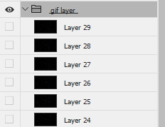
now click the little button with lines at the top right corner of the timeline. it looks like this.
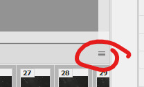
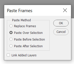
next click select all frames from the menu that pops up, and then select that menu again and click copy frames. now go back to your header and create the frames i talked about earlier, you need 29 (or whatever it may be for your gif). do this by selecting the button below, located along the bottom of the timeline. do this as many times as needed until you have enough frames.

now select all the header frames once again and go back to the menu where you copied the frames and select paste frames this time. a menu will pop up, and choose paste over selection. this will match up the frames/layers so frame one of your header will match with frame one of the gif. adjust the gif size if you need to, once again using ctrl + t, and make sure you still have all the layers selected and that you are still on frame 1. also make sure you move these layers under nick in the layer order.
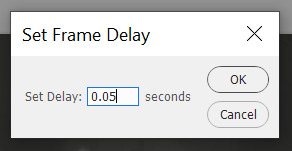
now adjust the frame rate. this will depend on your tastes entirely so test it out. my go to frame rate is 0.05 for everything i do pretty much, as a baseline, and then i adjust from there. to do this, once again select all your frames. next, click on one of these little carots, select other, and input your frame rate in the box that pops up.

method two:
this method is when your overlay comes in timeline form (idr what it’s called) instead of frames, looking like this.

drag the layer from the layer panel onto the header canvas, just like we did with nick earlier. make sure it goes under nick in the layer order. adjust the size if necessary, still using ctrl + f to keep the shape. make sure to click this button at the bottom left corner of the timeline to convert the frame into a timeline.
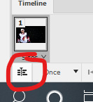
now, make sure to drag each layer to the same length, aka whatever length the gif layer is. make them match!

changing the color of the overlay:
this works with either method above! create a new layer and fill it with the color you want the snow to be. place it below everything except the background layer. add a gradient layer on top of the gif layer. right click on this layer and click create clipping mask. this is what my layers look like, i don’t normally label them but hopefully this is clear.
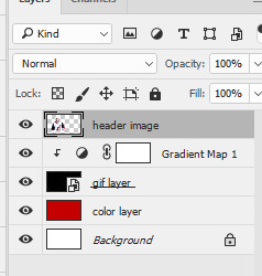
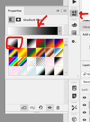
open the properties panel for the gradient map and make sure this gradient is selected and is black and white.
finally, change the blending to lighten on the gif layer! this should do the trick!

final touches:
i like to kind of have my header melt into my blog color, so i like to kind of transition the bottom of my header into whatever color my blog is. to do this, i use a multitude of methods. for this header in particular i used the eraser tool + a textured kind of fan brush to swipe back and forth creating the half erased look at the bottom. the setting seen below are probably similar to what i did when i originally did this header!

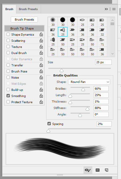
again, this is something that you can play with a lot yourself, especially by downloading brush packs and seeing what cool textures you can create.
saving:
to save, file > export > save for web
make sure you select “forever” and not “once” so that the gif loops!
original:
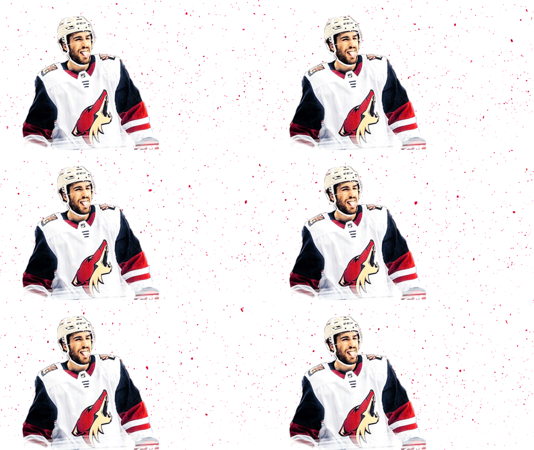
gif method 1:
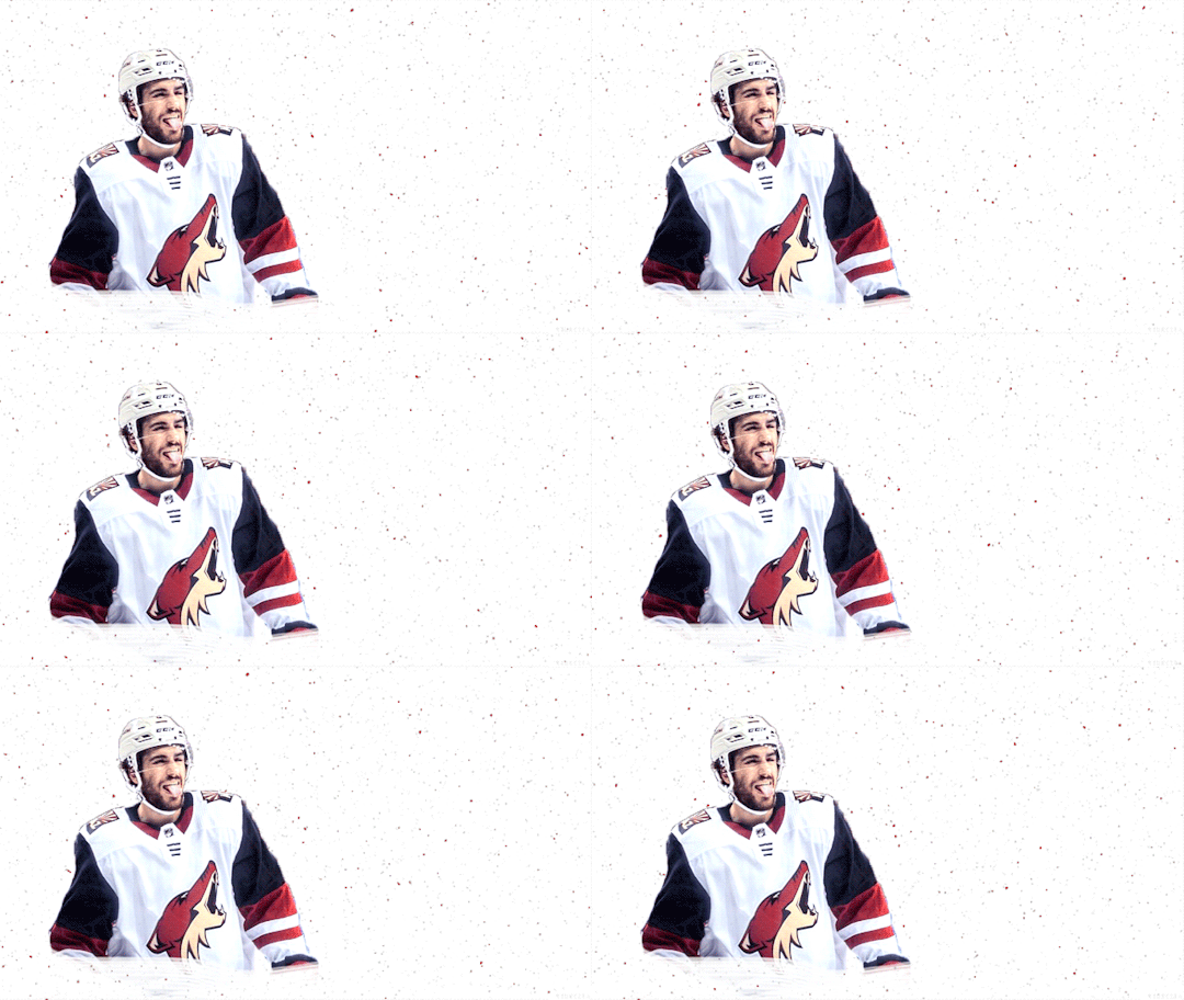
gif method 2:
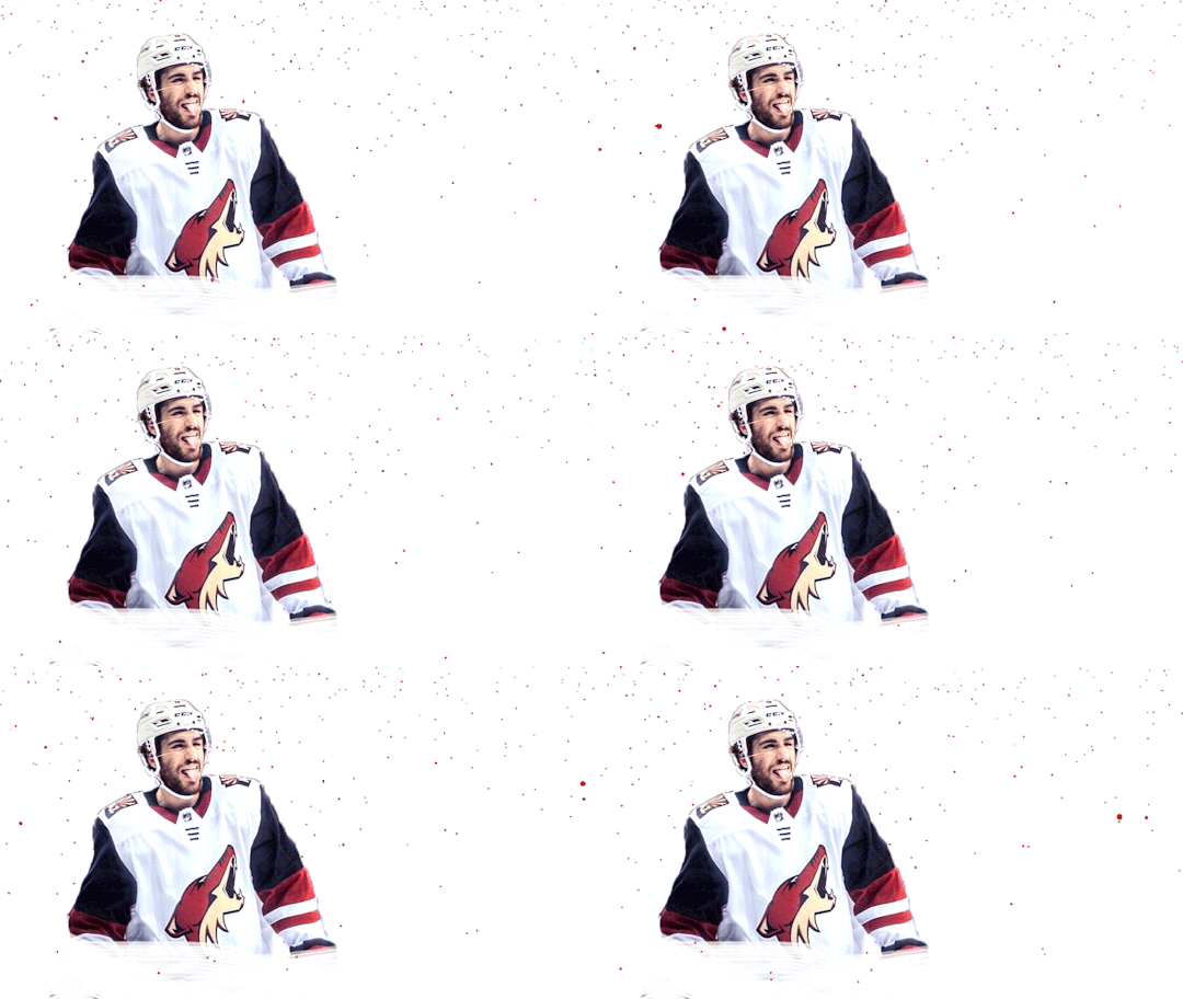
(ignore how this is also different i had to remake it once again bc i didn’t save it lmaoooooo)
5 notes
·
View notes
Note
not to be annoying but did you make your header picture of louis ?? if so could you do a tutorial for that too? i suck at photoshop lol but i wanna make stuff thank you!!
definitely not annoying!! i feel honoured that u want my advice sdfghsjgs
anyway this ones longer and i go into more info on actually cutting a figure out of an image the proper way or how i do it normally but im gonna use the pic in my icon again just bc its faster
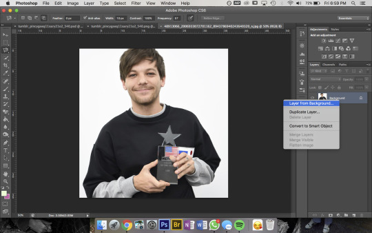
so get ur sister up and make sure shes a normal layer not the bg layer by right-clicking on it bc otherwise you’ll go through all sorts of hell
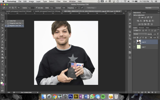
then u wanna use the magnetic lasso tool that i highlighted to remove the background
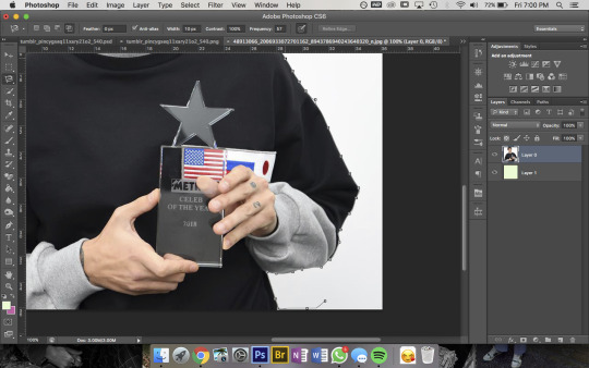
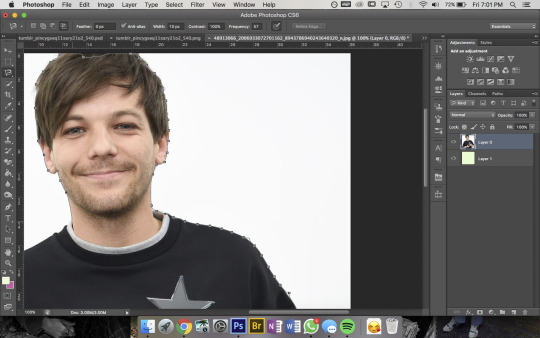
then to use this u kinda just click on the pic and trace around the area you want to select and the computer will try to automatically latch onto whatever you’re outlining. you can also click somewhere to set a point manually- its obvi based on colour values so thats why its way easier for me to do this image than the one in my actual header. im pretty sure i spent a good hour or more doing this piece by piece with that so i recommend doing it on simple backgrounds or being prepared to be one patient motherfucker

then i use the quick selection tool to add/remove any bits that the computer missed- eg. at the top of the pic you can see not all of louis’ hair is selected so i went and added that, then had to remove some bits near his jumper etc etc. this part was Very Extensive with my current header
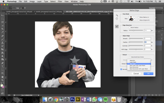
then when sis is looking all pretty u wanna right-click -> Refine Edge and that little box will pop up- thats the settings i had for this pic but it was a really large file so you’ll normally have the radius at abt 2-3px not 7. also if you’re doing a pic where the hair is Super Fluffy then you’re gonna want to focus on the feathering (third slider bar) a lot more
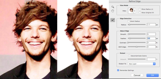
eg. these are my settings when i was doing JUST his hair in this pic. obvi mess around with it yourself to figure out what works for you but a lot of the time i do his hair seperate to the rest of the image bc otherwise its unbearable to look at
anyway make sure you set the output to a new layer itll make a new layer with the selection w/ a transparent bg and itll leave the original layer too
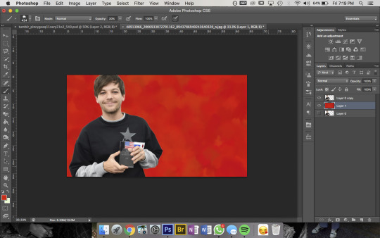
now the fun bit- i picked the colour i want the bg to be and filled it with that solid colour then using this brush pack from deviantart (just click download in the top right corner and it should automatically go into photoshop once u open the downloaded file) i used Texture Brush #2 in the preset size to colour over the top of the bg. that brush changes colour/shape slightly as you draw so thats how i got the mottled kind of effect
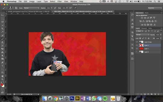
then bc im here for the aesthetic i made a new layer on top and used a slightly different shade of red & a smaller brush size to colour a bit around louis to add some ~dimension~
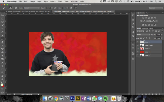
then pick a colour you want for the bottom bit and for this bit i use a mix between Cloud Brush #1 and #2 from the same brush pack. at first you wanna go over the very bottom with 100% opacity to make sure it’ll blend into your blog background
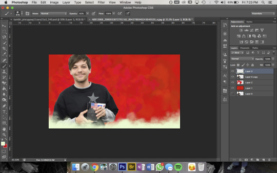
then go over again at a lower opacity to blend it up a bit and just mess around until you think it looks good and sis thats it done!!!
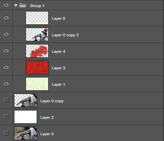
but because im overly thorough here are my layers for my current header file
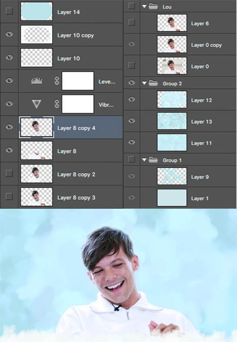
and these are for my last header- here you can see that i cut his head out seperate to his body, did a bunch of layers and experimenting for the background and also am a total layer hoarder who doesn’t know when to let go 😬
#i hope this is helpful and makes sense nonny!#and sorry if the pics dont match the text at any points ive had to fuck with it so much so tungl will let me post it all#but ur defo not annoying and if u want further clarification on anything feel free to ask#also if anyone uhhh wants an icon or header made or smthn pls hit me up im always looking for reasons to mess around on photoshop i love tha#that bitch#ask#anon
9 notes
·
View notes