#if this looks familiar it's because i polished a traditional sketch (as i often do)
Explore tagged Tumblr posts
Text

never too cold for icecream
@drama-glob @enbydemirainbowbigfoot
#bh6 globby#globby bh6#bh6 nega globby#bh6 nega-globby#big hero 6: the series#my art#if this looks familiar it's because i polished a traditional sketch (as i often do)#meeting my ~monthly quota of rendered glob art#this time featuring norbert!#norbert nancy globby gaylord jr. the first#he only has 1 scoop because there were 3 available flavors and he didn't want to have any of the flavors globby did.#so he has his sore loser vanilla. 💜#fun fact this was a scene in early early drafts of Vicissitudes of a Walk in the Park
41 notes
·
View notes
Text
Art Advice #2 - How to beat art block!
Hi again everyone!
This is the second instalment to my Art Advice tag offering hints and tips for artists of any skill level!
This time I’ll be going into ways I’ve found that help me to combat art block or creative ruts. Of course, these may not work for you, and a big part of art is learning about what things do and do not work for you, but I hope it at least offers some advice to anyone who struggles with art blocks!
How to beat art block.
Getting into an art block can be one of the most frustrating things as an artist. Especially if you’ve tried to dedicate a window of time to drawing something, only for your brain to ‘nope’ out and give you no motivation. I’ve found it can often make you feel worthless as an artist, particularly when you see fellow artists continuing to produce countless amazing artworks, and this kind of self depreciation only adds to your inability to produce anything.
And I’m not about to suggest some magical cure of art block, since I don’t believe there is one, but I hope that my advice can at least help lead you towards getting out of these vicious circles of art block & self deprecation!
Tip #1 - Explore other mediums
I feel like as artists we get incredibly ‘comfortable’ in the mediums we’re familiar with. For me, that’s digital and pencil drawing. I’ve been doing pencil drawing for as long as I can remember, and digital for a little over 7 years, so I’ve become very comfortable in using them.
However, I think that a good way to not only help combat art block, but also to expand your art horizons, is to step out of that comfort zone into a new field of art.
Of course, I’m not saying that I expect every artist to go from pencil drawing for 10 years to suddenly picking up a paint brush and doing some oil painting. But instead that every so often maybe just try and dabble in mediums you’ve not used as much, or haven’t used before at all. A lot of shops sell pretty inexpensive paints, pens or pastels nowadays, not to mention a quick Google search will give you tips on how to use the particular medium if you’re not sure how to start.
A thing I want to mention here, too, is that I think it’s important to not to expect yourself to be automatically ‘great’ at a particular medium. For example, last year I did my first embroidery piece. I had wanted to do embroidery for a long time, and did actually enjoy it a lot (even if it was incredibly time consuming lol). But I found myself dissatisfied with the finale result.
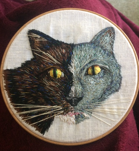
And in a way this is because I expected myself to be perfect at embroidery after just one attempt, which is ridiculous of course, since any kind of art takes years and years to ‘master’. And when I look back, I can’t help but think ‘why does it have to be good in the first place’? Why did I put this pressure on myself to be a sudden Master of Embroidery, when surely the main goal of any kind of art is to some extent the enjoyment of the process?
This is still a mindset I think a lot of artists will relate to, and is something I’m trying to combat myself.
Recently I painted some fake plastic eggs inspired by the Polish folk art tradition ‘Pisanki’. They took a long time, and my neck hurt a lot from being hunched over and painting little dots, but honestly I really loved the whole process of them! Painting on 3D objects isn’t something I do a lot, and I also rarely do purely pattern-based work like this, so it was a real deviation from my comfort zone.

In a way, exploring other mediums is like a creative respite. Giving yourself a break from what you’re familiar with not only helps you to be inspired by a wide range or arts, but when you return to the mediums you enjoy the most, I’ve actually found you appreciate them even more!
(Really, nothing makes me more appreciative for digital art than painting a wrong dot on the surface of an egg and not being able to rub it out...)
Tip #2 - Try different styles
Another tip, similar in many ways to the first one, is to try different styles of art every once and a while.
Like with materials, I think we as artists can get overly caught up in ‘our style’ of doing things. Whether this is a particular stylised or cartoonish way of drawing, or doing realistic art, or even sticking to a particular colour scheme. And I think especially in the world we live in, where artists have to make themselves as ‘consumer friendly’ as possible, which often means having a ‘recognisable brand’, it can feel like we have to do our art in a particular way, otherwise people will lose interest in it.
I think this is harmful for a lot of reasons. Partly, I feel it stifles artists creativity to force themselves to do one style and one style only. I also feel it assumes that non-artists are so single-track minded that if an artist were to post works of art that involve different styles, then they would immediately lose interest.
So my advice to any artist who has a particular style is to once in a while try out some different styles. It doesn’t have to be big pieces, and it also doesn’t have to be the polar opposite of what your style actually is. But instead if can be as simple as doing a ‘style challenge’ (something I’ve done in the past), or even just trying a different way of drawing or painting!
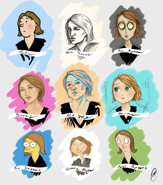
In a way, changing your medium and changing your style occasionally go hand in hand. I particularly find that how I draw people will change with the kinds of mediums I use, or even when I start using a new brush with digital art.
For example, I recently did this super quick sketch of Kiki Layne, because I really loved the reference image, and it came out a lot more stylised than my art usually is. And this is almost entirely down to the brush I used (which was an ‘ink’ style brush, in comparison to the ‘pencil’ or ‘pen’ brushes I usually use for sketching).
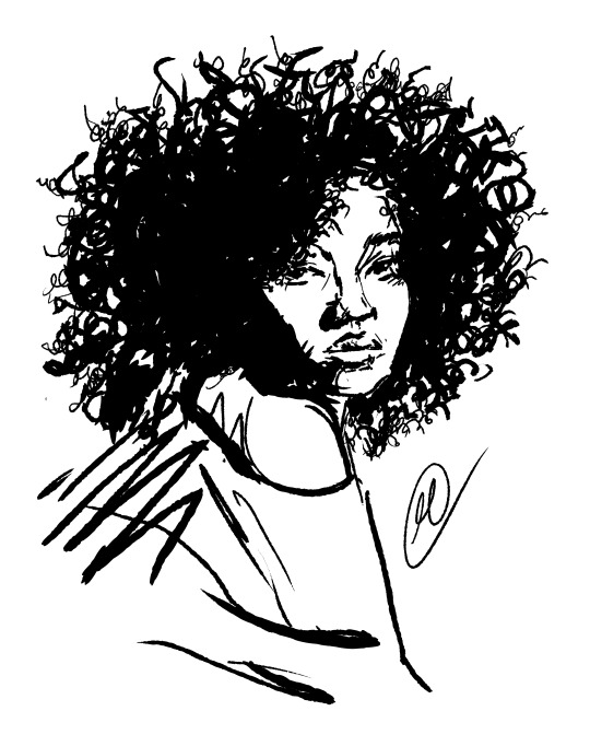
This isn’t a drastic change in style for me, but I do think even trying to do rougher or messier styles of art like this can allow you to see your art in a new light!
(A side note here, but I already pretty much change up my style with every piece because I have no interest in being ‘marketable’ lol... But I’m definitely not suggesting everyone should be like me, just every so often changing up your style I believe can be really beneficial!)
Tip #3 - Changing subject matters
This one is essentially the same as the other two, and I’m sorry if this comes across as repetitive, but I think another great way to help beat art block is by changing up the kinds of things you draw!
Being predominantly a portrait artist, I rarely go out of my way to draw things like trees or birds or cups or whatever. But I know that often when I feel myself entering a kind of creative rut or art block, it’s because I’ve been drawing too many people & my brain is sort of all people-d out lol...
(this is a tree I drew in oil paints midway through last year because I was feeling particular people-d out at that point)
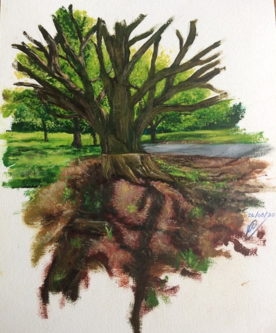
So I think occasionally drawing other things, and going out of your art comfort zone, can help to improve your creativity. And hey, who knows, maybe you’ll end up incorporating something you drew randomly into a new artwork!
TL;DR (/conclusion)
So, remember that exploring other mediums, changing up your regular style and choosing other subject matters can all help in beating art block! Of course, you don’t have to do them all at the same time, but instead just dipping in and out of them as you produce your regular work can be highly beneficial!
I mainly wanted to make this post not to say that by doing all three of these things, you’ll magically be free of art block forever, because that’s just not true. (I’m someone who does a lot of these things pretty regularly, but still gets into art blocks every now and then). I instead wanted to inspire you to deviate from what you are usually drawn to as an artist.
The world is your creative oyster, so don’t be afraid to explore it!
~
I hope you enjoyed this post about ways to beat art block! I may make a part two if people are interested since there are a lot of other things that I think can help in improving creativity!
#art advice#art block#how to beat art block#creativity#art discussion#artists on tumblr#this is about 1300 words long btw#i honestly DID try not to ramble pffffft#anyway i hope someone found this at least slightly useful!
16 notes
·
View notes
Text
Thinking between dribbble design and project business
I'm Wenhao. Sometimes I think designers and comedians seem to be the same kind of people. They are a group of "unsmiling" people who are creating joy, and a group of "uneasy" people who are creating convenience.
Throw questions-think about them
I am new, so often reflect on a problem in my work. “Why is it that it is difficult to move a good design in Dribbble to the current project? “ I believe that senior designers have crossed this threshold. Because of Business Design Need to Understand "Business Requirements”.
Dribbble can inspire our creative inspiration, but a set of beautiful pages can not meet the specific business; In addition, when designing without business needs, Aesthetic Needs will directly occupy the high ground, and viewers will not go deep into your business The first thing that strikes them is the shock and advanced sense of your page design. So I also understand why some designers retain their works with inspirational usually, and then upload them to the homepage of his personal website after fine polishing, instead of directly using the landing project products. Maybe my idea is too one-sided, but it also depends on different products. Some products have very high design requirements for the page,this will give full play to the designer's aesthetic and artistic skills. For example, products related to luxury jewelry / fashion / beauty / video / technology / female / art …In the face of some traditional industries or heavy industry products, it is necessary to pay attention to the specific style of the industry. There will be specific frameworks and rules. For example, the pages of the automotive and chemical industries must take into account its heavy sense. It is a challenge, but I still believe that senior designers do not pick products. Their ability is to prescribe the right medicine for different patients and to integrate their style with the product. The product I came into contact with is an internet video editing tool that requires me to not only be familiar with the business but also pay attention to the beauty. Start from the functional requirements of the business, thinking about product elements, components, pages, interactive animations, and subsequent updates and derivatives must be based on the "how to achieve product requirements with more beautifully", based on a complete benign ecosystem. By no means will the idea be realized only, but the idea will be transformed into an ecological design that can be scientifically managed and adapted to changing needs.
The essence of Dribbble - seeing trends
So how to achieve both elegance design in Dribbble while taking into account business? At present, my level is limited to answer, but we can first analyze the advanced elements of the Dribbble and try to choose some small elements that are suitable for the business and apply them to the project. Regardless of popular trends, the following points are the eternal theme of visual design, which are summarized in four points: 1. "Change", the page must have a sense of change, which must be reflected in the contrast between the elements, mainly a comparison of size, size between fonts, major and minor between modules. 2. "Specification", the layout of each element must be standardized, so that the layout of any element location is justified, and there must be logic between the elements, here will involve the use of grids, whether it is PS, AI, Sketch, through the grid divides into groups, making the whole page look regular and accompanied by changes.3. "Be good at using advanced colors", from the background of the banner to the background of the bottom, the bright color gradient of the advanced color system is an important reflection of the high-level of the page. 4. “Picture selection”, whether it ’s a demo or outputting a high-fidelity page, not high-definition pixel pictures are absolutely suitable. On the contrary, I choose beautiful smaller pictures collected from the Internet. The reason is the small image stored in Sketch will have less memory, which also conforms to the lightweight characteristics of Sketch software. In addition, the third-party software that I use for collaboration is “Abstract”. At this time, if a page has too much memory, both sketch storage and Abstract collaboration are both Inconvenient.
In addition, Dribbble also reflects the current popularity from other aspects, for example, the page needs to maintain breathability and thinness; With advanced gradient color background or illustration background or dynamic video background; Pay attention to the shadow of each element; Emphasizing from layout of small fonts to show the quality of page; Handling of rounded radiua in the page. For the works of major well-known design websites, I personally recommend purposeful browsing, so that our energy will be more focused, more targeted, the ability to grasp details will be enhanced, and the number of decisions made by the brain will be reduced deliberately to ensure each high accuracy of each decision.
Understanding the business-improving landing capabilities
I believe that newcomers who have just entered the design do not like to touch about business needs. So do I. The last thing I want to hear is "understand the business." There is always an illusion that the design attached to the business then loses its style and fairy of itself. But we were wrong. The design without landing will be nowhere to be placed. The design itself needs a platform (stage) for dancing, design and business to complement each other. Not all designs that fit the business are mediocre modular designs, but the high-level design can better serve the product. The design gives the product culture. I believe that every product needs cultural output. The high or mediocre of product culture is reflected through design. Designers must have a kind of pride, that is, my products are advanced. Be brave in confronting something in your heart. Maybe you will find that the previous point of view is a misunderstanding of it, and it is the driving force to help you to a higher level. The same is true of life, sometimes we try to avoid but is what we exactly need. Changing attitudes and improving abilities need time. Familiar with the business journey, delving into business needs, this is a arduous process, but imagine that when designing a product (no matter web or mobile interface)that fits the user's psychology because you are proficient with the business, when the project comes online, because your hard work, you will be very happy and proudly add it to your personal website, because you will probably tell any interviewer in the future that you choose this design because of what business needs are considered. It will also help you to think more comprehensively and design activities more easily when designing any project in the future.
Sweetheart Summary
Last week I was in trouble at work, the exhaustion of design inspiration, and the clutter of the drawing page made me distressed about my design ability. I even doubted whether there was talent, but I believe talent will only make people work easier, but there will not be a big gap in the qualitative manifestation. As long as there is a plan, step by step, daily problems will be solved in time. When you are in trouble, it is also a sign of your stride forward. In any case, as a designer, you must always keep your beautiful, beautiful appearance, a beautiful heart, in order to output beautiful products, live with confidence and pride, because you are a beautiful design person.
Thanks for your attention!
Welcome to wenhaoji.art to know more about me!
See you soon.
2 notes
·
View notes
Text
So, You Want to Codesign?

by Elaine Fath, game designer
Hey, game dev’s! How do these phrases strike you?
“I just couldn’t grok that part.” “The playtest is next Wednesday.” “The rigging on that part’s really messed up.” “The FTUE is really coming along nicely.” “That level is totally unbalanced right now.”
How about these? “We need to set up a way to measure the proximal outcomes.” “I’m really concerned about what kind of far transfer this experience will have.” “We’re wondering about the overall journey map of this experience.”
Chances are, if you’re involved in game development, there was at least one phrase in the first set you were familiar with. That second set? Maybe not so much, depending on your field. These are actual quotes from actual teammates whose field of expertise is something other than making games. Those examples alone are taken from the past three months of collaboration on a health app with experts in Smoking Cessation and Weight Management. If you felt lost and confused, join the club: we were all speaking English, but none of us spoke the same language!
Not all games are made by a traditional game design team. A lot of games need experts outside of our wheelhouse: scientists, UX designers, parents, children, educators, researchers, professors...depending on your experience, it could be anything. If you’re not careful, all of those experts, including you, can get into a room, think they have a productive conversation... and then leave with totally different ideas of what is about to get made.
Enter codesign. Codesign is a field meant to help cross-discipline teams collaborate effectively and quickly. Codesign is a concept taken from UX research and design, and also the more-generalized field of “Design Thinking.” One major tenant of codesign is that meetings are artifact-based: together, always be making something concrete. For an overview of the idea of Design Thinking, I recommend Stanford’s D.School website!
I’ve run codesign sessions before, but running three to five sessions a week for three months in a game-specific context was all new to me. Over the course of the past three months, I learned a lot about what to do and not to do. I want to share some of those takeaways.
WHAT I LEARNED TO DO:
1. Keep a standard lesson plan format so that you don't go crazy every time you need to plan one.
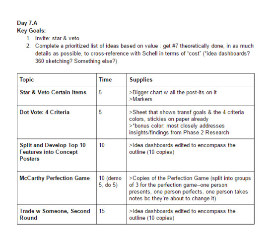
When you’re running regular meetings in which you have to prep supplies, materials, and activities, you run into a common problem for beginner K12 teachers. Picture this: you’ve planned five separate lessons for the day (reading, math, social studies, science, and an essay project). You show up and realize that you’ve forgotten at least four supplies across the five subjects and the lesson plan for the fifth. That’s a recipe for a ruined day. How are you supposed to run the lessons as well as account for the supplies and gauge how everyone is doing?
Having to prepare so many fully-facilitated experiences and then showing up prepared can be a tremendous cognitive load. Especially since you’ll need the extra brain space to get creative during both planning and also during the facilitation. Try to keep a standard format for writing up what you’re doing and what you need and use it to track prep as well as look back on later for time estimates and activity ideas. Otherwise, it will feel like you’re reinventing the wheel every time.
2. Look to Design Thinking and codesign methods for activity-based, generative-focused meetings. Luma Institute's guide for action-based activities is a good introduction.

Often, you’ll have a goal in a meeting--”we need to prioritize these features,” “we need to see what everyone has in their heads about what this idea could look like,” “we need to generate as many ideas as possible,” “we need to narrow down to one idea,” “we need to understand what our goal is here”--but you won’t know how to get there. Starting to develop a sense of what activities exist out there for what goals was something I was grateful for doing, because they served as recipes that I could adjust as necessary rather than having to invent activities all the time.
3. Use the Transformational Framework topics. Write down your answers, then have your experts edit them.
I found that writing down my assumptions and then having the subject matter experts correct me where I was wrong with the workbook pages in front of them was a fast way to get something down early. For example, I discovered my assumption of the audience as 20-to-30 something gamers was completely incorrect. I also discovered that the way I was prioritizing our goals was totally wrong. But if I hadn’t tried to write them down, I wouldn’t have known.
4. Try to take risks by getting things in writing or concrete artifacts as much as possible, even if you think your take is wrong.

Most people can't articulate on a blank page, but can totally tell you where you messed up. A blank whiteboard can feel intimidating to non-designers. It can feel scary for your ego, but take one for the team. Type up the doc. Write an example of what you want to walk out of the meeting or the week with--if it’s a 6-page design doc, write a dummy doc with lorem ipsum in some places and show it to the team at the start of the week. Draw a picture of what you think the flow of the app will be and have others correct it. Bring materials for people to change it. Call out that it’s a draft, make it look sketchy and piecemeal so that people don’t feel bad marking it up or correcting it.
5. Use research papers in your transformation subject area to start developing a shared language between disciplines.
You’ll want to be able to have some shared vocabulary when making things together. A team I worked with published a paper about how to do this last year. The paper is about how to get a team of experts in different fields “speaking the same language” through a mix of reading the same papers, making things together using writing and simple paper supplies, and talking about what’s working using those prototypes.
6. Love & trust your teammates to be experts
Across disciplines, there can be a lot of mistrust that comes from not understanding their work. Here is an excellent GDC talk that includes our CPO Chuck Hoover that discusses tips for how to do this effectively. See: Production is Working at the Heart of the Team
7. Teach them about game techniques using a "video lit review"
If you’ve played a lot of games, it’s easier to “picture” an idea and how it will work in its final form. Something that you imagine with glitter, sparkles, pizzaz, and a universe of context might come across as flat or insane to an expert colleague who has never played Mario Kart. When you're talking about game design terms, it can help to do a 3 minute video of examples of that mechanic in practice in other places--that way, your team has seen examples before and can now talk about them, too. Encourage your other experts to do the same with their field. Maybe they have a talk or PowerPoint they always share, or a paper they wrote that sums up their expertise or what they want for the game.
8. When you’re behind, be brutally honest but don’t place blame.
Teams learning to design together move slowly at the start. It can be tempting to lay blame on people arriving late to meetings or those who don’t seem as checked in, or whatever seems to be happening from your frame of reference. Instead, I took a step back and just conveyed the facts: I had everyone collaboratively estimate how many hours of work remained and cross-reference it with the number of hours we had left together. Then, I asked: what can we do about the discrepancy? And we brainstormed ideas to try. I learned two things. One, there was a ton happening that had nothing to do with my frame of reference of the problem. Two, we picked three solutions to try as a team, and people were far more committed to trying them because nobody felt blamed. We made up the difference and hit the original deadline.
WHAT I LEARNED TO DON’T
1. Don't put off making a visual roadmap of where you're going and WHY you're doing these sessions--people don't read the written outline as "big picture."
I’ve used everything from a post-it wall to sketches to Photoshop to google slides to make this. The format or structure matters less than the fact that it exists and that people understand it. Here are some examples, but generally all you need are dates, what you’re making on that date, and what you’re trying to accomplish/have at the end. I have a hunch that making it in front of everyone and then updating it/moving the “you are here” marker every meeting in a visible place is probably a good idea.
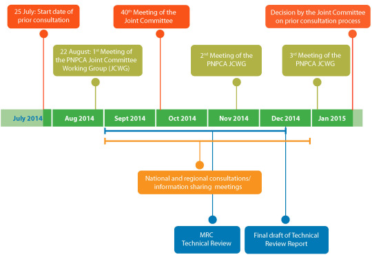
Courtesy of majorindependence.com

Courtesy of template.net
This was a major mistake I made: I got so deep into planning and prepping that I really never shared the big, long-term “why’s” with my clients, and they didn’t have a sense of progress as a result. I thought sharing a dummy outline of what we’d have at the end would be enough, and it just wasn’t. Every meeting, take two minutes to describe where you’ve been, what you’re doing that day, and how it fits into the larger plan.
2. Don't forget to schedule/budget time for open-ended question/discussion breaks at the end of meetings.
Or people will leave confused and feeling like they don't have enough wiggle room to discuss what matters to them. This process is unfamiliar and often people need to feel heard at the start and end of meetings in order to feel comfortable trying something new.
3. Don't forget to frame design as messy, generative, uncertain, full of bad ideas, and not about sitting on it until you get the "right" answer (Stanford's Design resources do a good job of this).
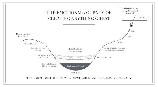
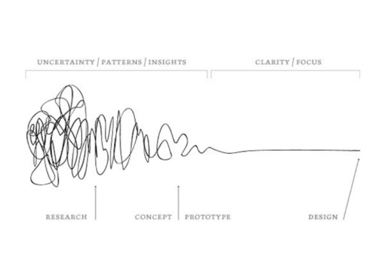
Again, so many disciplines are not steeped in the exact kind of uncertainty that design is, and many clients come from a work culture where you sit on an idea until it feels polished. This is very bad for the creative process because you don’t fully explore the possibilities! But on the other hand, people naturally have a fear of appearing stupid in meetings if they feel like they’re not coming up with “good” ideas or thinking on their feet well. Frame design as messy and be open about your own less-than-polished ideas. I totally forgot to frame the process as rough and changeable, and I had a lot of stressed-out clients for the first two meetings as I continuously pushed them to produce outside of their comfort zone. All I needed was to message that I, too, get heartbroken when we throw away stuff after pre-production, and so does everyone else! But it’s a necessary mess. Lean into it.
4. Don't forget to "test" meeting activities with your internal team when you haven't run something similar before.
We playtest games for all of the reasons it’s a good idea to playtest making activities.
5. Don't forget to give people choices about how to contribute --and if they have a suggestion for changing an activity, try to roll with it, at least sometimes.
I was good about this at the beginning, but when we got new teammates it was easy to forget to check in with them and allow them choice. People will be more creative if they feel like you aren’t steamrolling them with a plan.
6. Don't participate in all of the generative activities unless the content touches on your expertise.
One, because the cognitive load of facilitating means you probably won’t be very creative. Two, you may not have the know-how to generate good concepts until you learn more about the subject matter. Consider coming prepared with a couple examples at the beginning of each activity, or participating for the first minute or two, to level-set what the concepts or artifacts should look like.
Happy codesigning!
Elaine
3 notes
·
View notes