#i've added gifs to the original gifset for a bit
Explore tagged Tumblr posts
Text
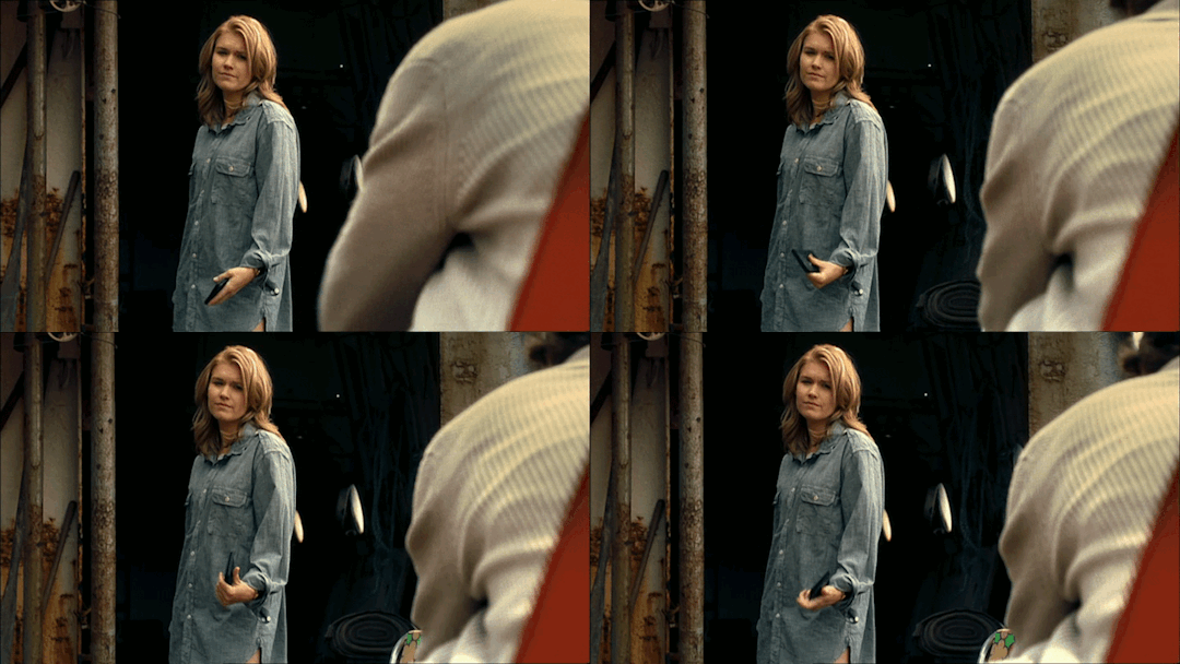
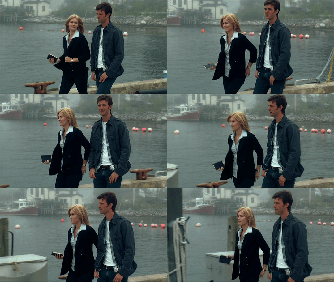
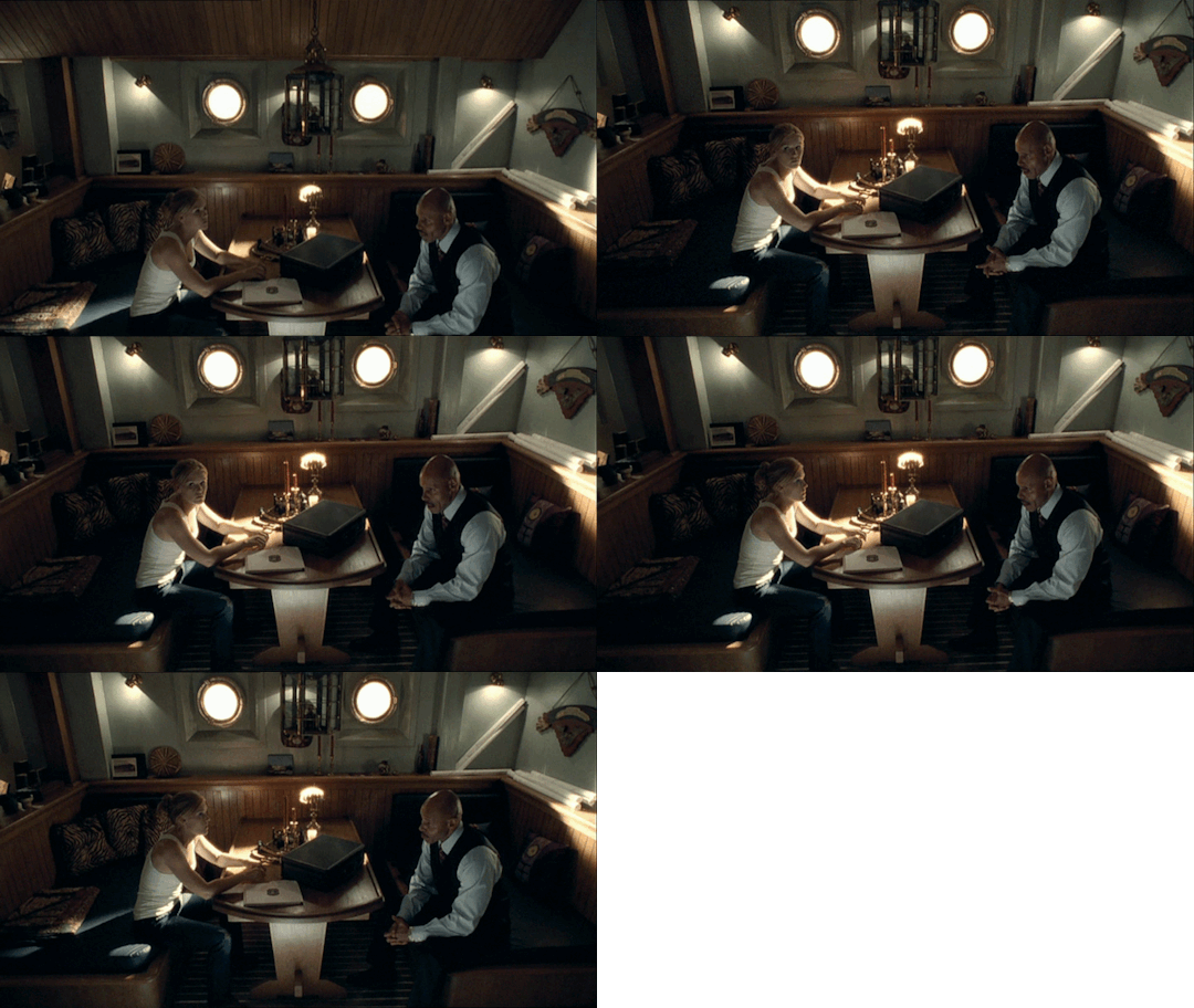


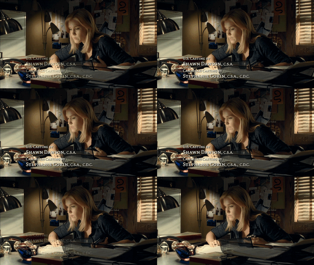


Audrey Parker+stimming
1x1 Welcome to Haven
1x5 Ball and Chain
1x11 The Trial of Audrey Parker
1x12 Resurfacing
1x13 Spiral
2x2 Fear and Loathing
2x13 Silent Night
3x9 Sarah
#audrey parker#emily rose#emilyroseedit#nocticola art#havensyfy#my gifs#redone#i've added gifs to the original gifset for a bit#but i thought to just redo this since i've added for gifs and they were in the wrong order#haven gifs#1x1 welcome to haven#1x5 ball and chain#1x11 the trial of audrey parker#1x12 resurfacing#1x13 spiral#2x2 fear and loathing#2x13 silent night#3x9 sarah
10 notes
·
View notes
Note
your gifsets are perfect, I'm always in awe of what you can do and you're creativity!!! Could you please explain how you made the broken glass gif with different gif in it on photopea? https://www.tumblr.com/dengswei/754916132337729536/userdramas-creator-bingo-green-asiandramanet?source=share and would it be possible to do something similar with other shapes? Thank you for your lovely creations <33
heyy thanks so much!! and of course! i have to admit the way i do it might be a little bit tedious compared to like everyone else (though i don't know how photoshop users or other photopea users might do it 🤣) okay this is gonna end up being so long because of the way i do it so i'm sorry about that and i hope it makes sense 😭
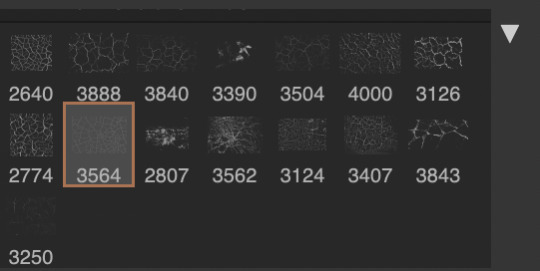
okay i have to admit i couldn't find the texture i've seen people use for the shattered glass effect so i actually used a photopea default brush from this pack
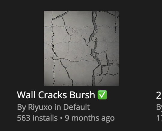
to download the brush set go to window -> plugins -> brush and then search for wall cracks brush (it's literally the only wall related brush set in photopea so it'll show up the moment you download it)
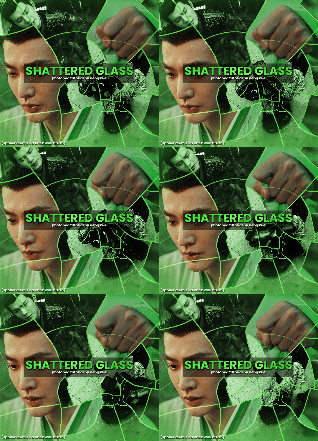
so for the gif i did above i did my giffing the usual way of creating & colouring for different gifs seperatly and then adding them all to one project (it doesn't have to be 4 gifs i just chose 4 because that's what i wanted to show in this gif)
i've done this twice once for this set and another time for this the blood of youth set and i have to say the most important part of this is keep multiple versions of the brush in the position you want as you can so once you've used it to test it out and you like that version keep it because unless you can manage to position the brush in the exact same place every time you're gonna need to reference those (or even use the magic wand tool for it later) and also you need to keep at least a white on black background version for the outline
in the brush pack the one i used was this one: (3564, crack b 9)
for this part i just say play around with both positioning and sizing of the brush, it automatically opens with the size 3000+ which is fine i think with the tushan jing one (the green gif above) i stuck with that size and just kept clicking around until i got the positioning i wanted (this is another reason why i said what i said in the paragraph above because if the brush size is bigger than 1000 it's doesn't come out in the exact positioning as you expect it too
i decide the positioning of the gifs on the way i like the brick brush looking rather than the other way around, this is the positioning i went with if you're curious & would like to use it if that's easier 🤣
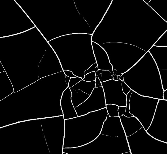
you'll need to keep this as a seperate layer at the top, i had it set to screen and then added a colour fill layer clipped on later so that i had the outline for when i was masking
so to start off i have the base gif which i do nothing to, that stays as it is, with the brush layer above set to screen
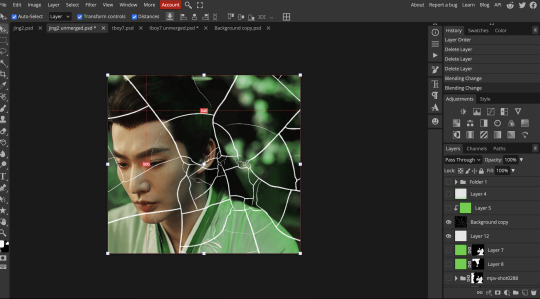
next is where you want to position your other gifs it may benefit to figure this out all at first before doing any of the masking so you know which parts you want to erase and which parts you want to keep
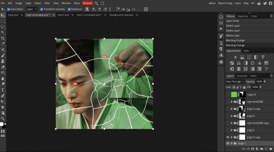
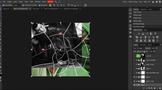
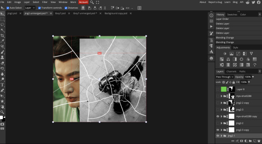
so this is what i decided with my positioning looking at where each of the cracks are
now comes the tedious part, in some ways the way i do this is a lot similar to how i do grid but it's not as easy (for grid photopea automatically locks onto the squares making it easier to mask, here you have to do it all manually)
first put a raster mask on all of the other gifs except for the base gif & use the magic wand tool on the brush layer so you get the outline of the brush and you mask that away from your gif (so if you turned off the brush layer it should look a little something like this: (it's not perfect but it won't matter that much because you should have the original turned on at the end anyway) (you don't have to do this step tbh i just did it because i thought it looked better)
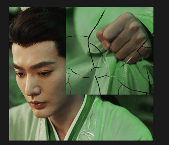
so with the brush layer turned on you can use that as a template to which parts of the cracks you want to erase, you can either use the magic wand or the paint brush tool it really depends on how much of a perfectionist you are and whether or not the sharp edges bother you (plus some of the cracks have small openings so it might erase another part you don't want if you use the magic wand tool so it really is another instance of playing around and seeing what you like, and it might also change once you add the other gifs too)
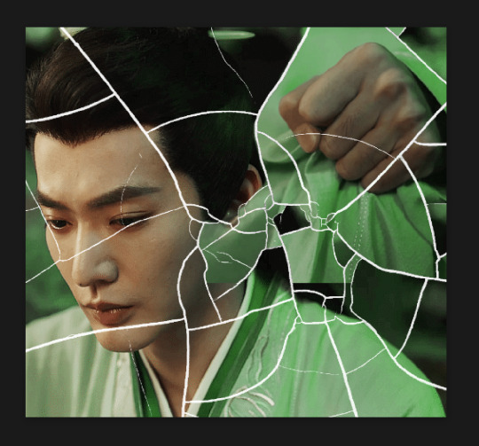
so this is how it looks after i've done that (notice in the middle you can still see the edge of the gif? that won't matter because one of the other 2 gifs i still have yet to mask will cover that) & just repeat the same thing for the other gifs you want to add
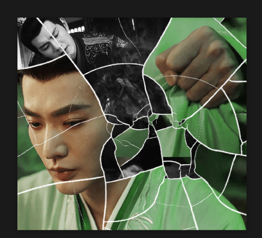
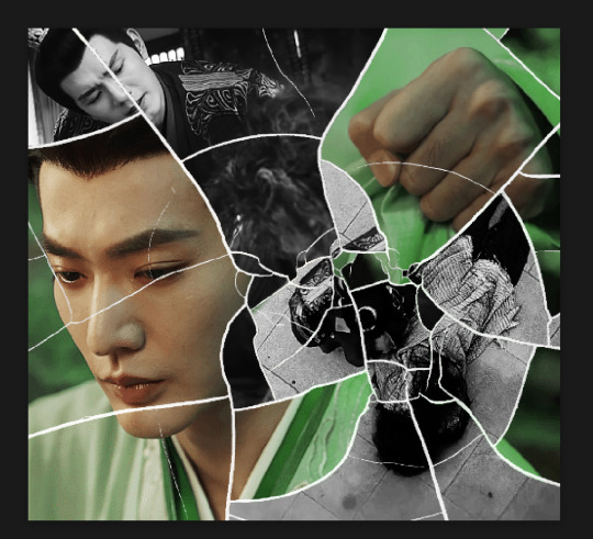
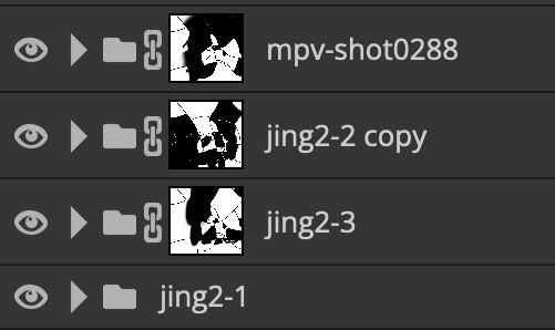
this is how my masking folders look if you're curious
& last but not least i added a green colour fill layer clipped to the brush layer and set that to darken to get the green effect (make sure that the brush layer is still set to screen)
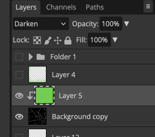
& once you've merged all of the gifs together you should get your desired outcome like the gif above (make sure that all the gifs have the same amount of frames too)
when it comes to other shapes i'm sure you can! like i did a tutorial with the grid version here, i guess it'll just be a lot of trial and error & finding a texture or brush with different shapes to try it out with kinda like how i did with both versions of this (i definitely did it a lot better this time around compared to the first version i did of this)
hopefully this wasn't too long or too confusing, if anything is please feel free to ask me again and i'll try and explain it a little better 🤣
#replies#Anonymous#photopeablr#usergif#tutorials#photopea tutorials#completeresources#mine | tutorials#gif tutorial#photopea#resources#gif resources#gifmakerresource#photopea tutorial#tutorial#gif tutorials
96 notes
·
View notes
Note
hey!! would you mind doing a tutorial on how you blend your gifs? they're so perfect! if not, then that's fine but thanks anyway :)
hi there! first of all, thank you for the kind words, i appreciate it so much! and i'm always more than happy to make tutorials! below the cut i'll do my best to explain my process when it comes to creating blended gifs like these:
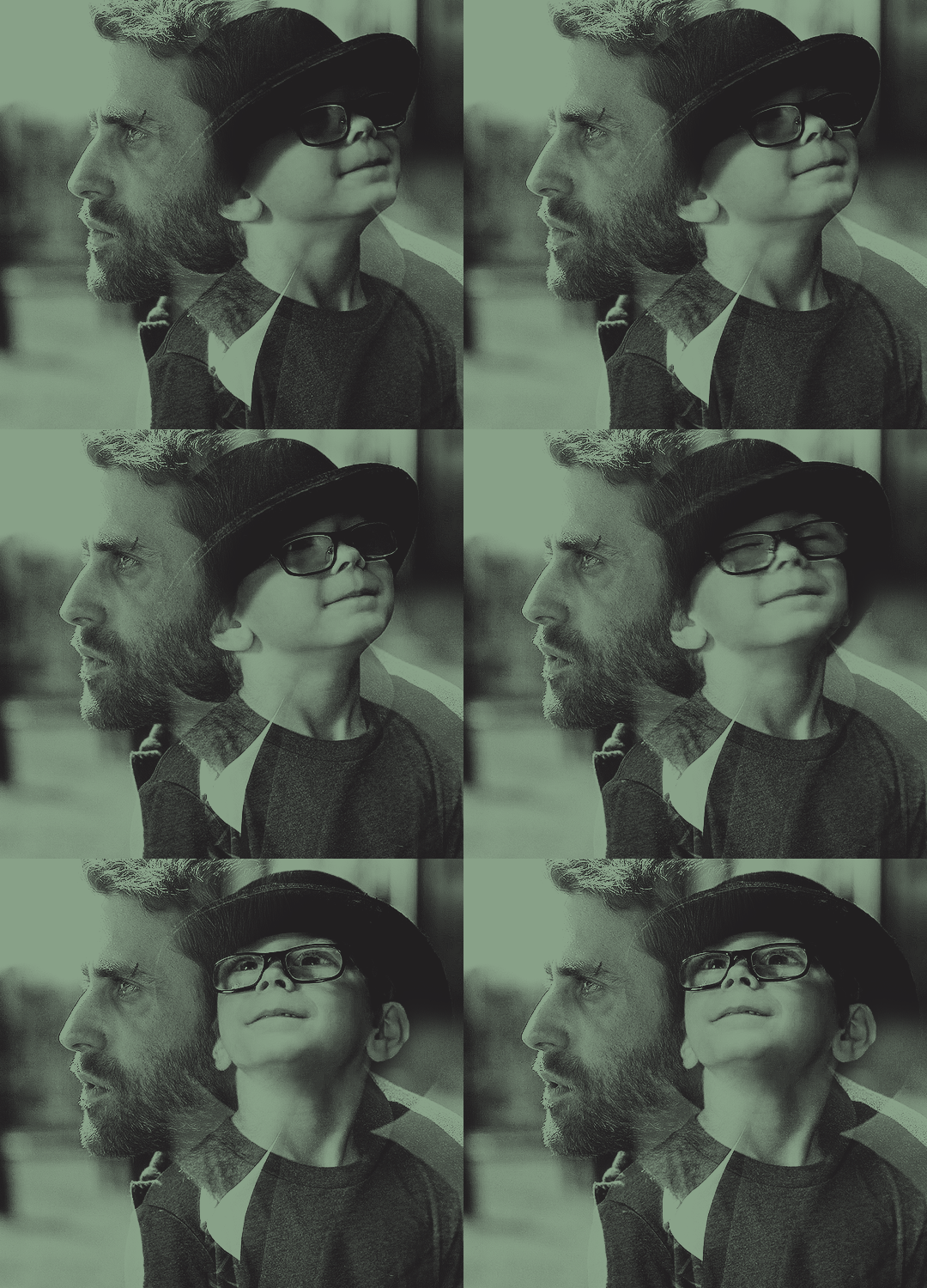
original gifset
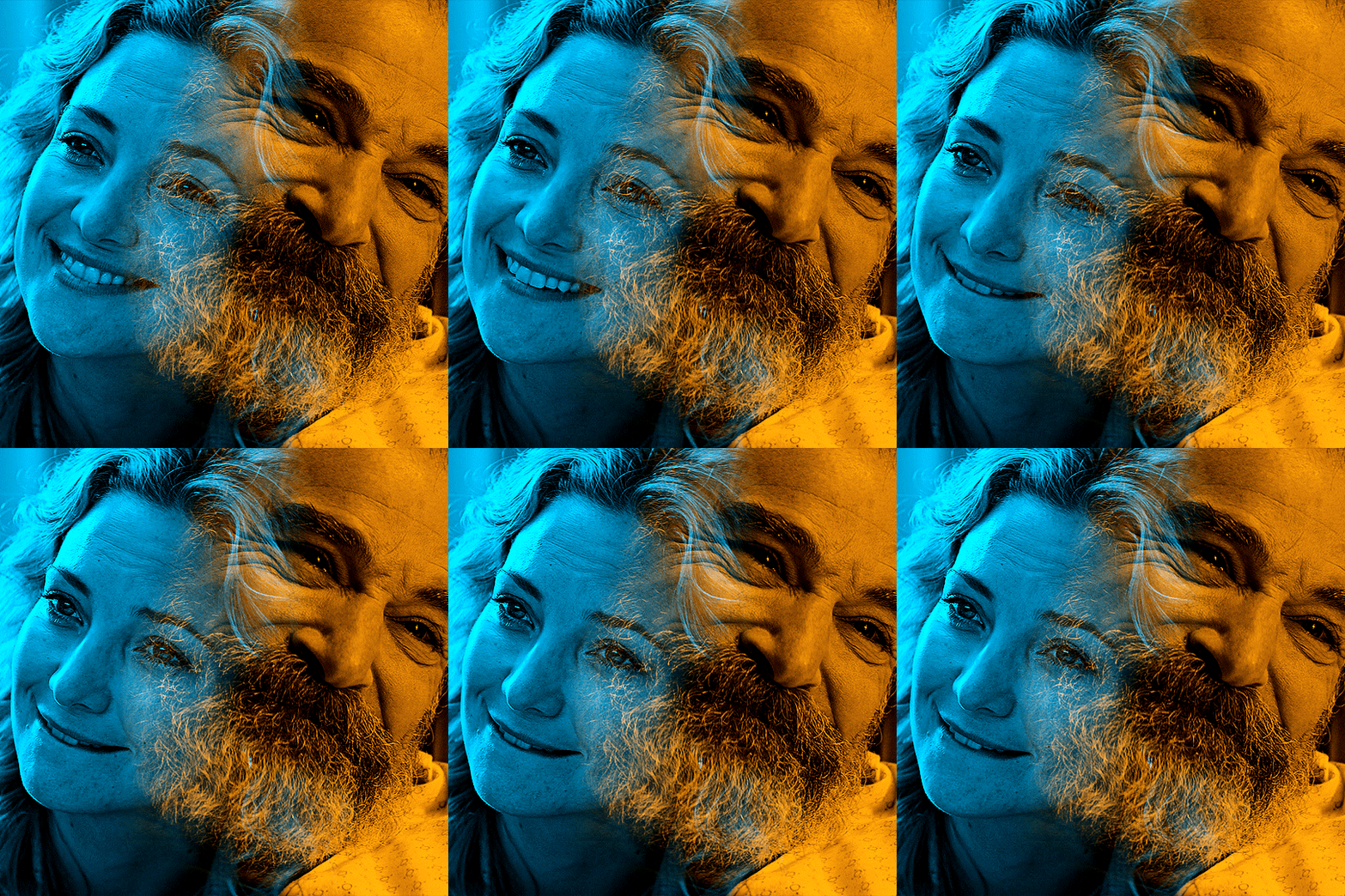
original gifset
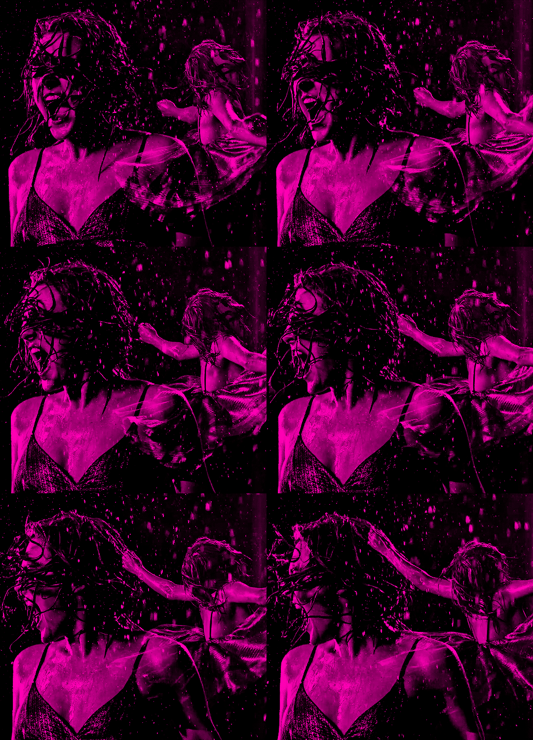
original gifset
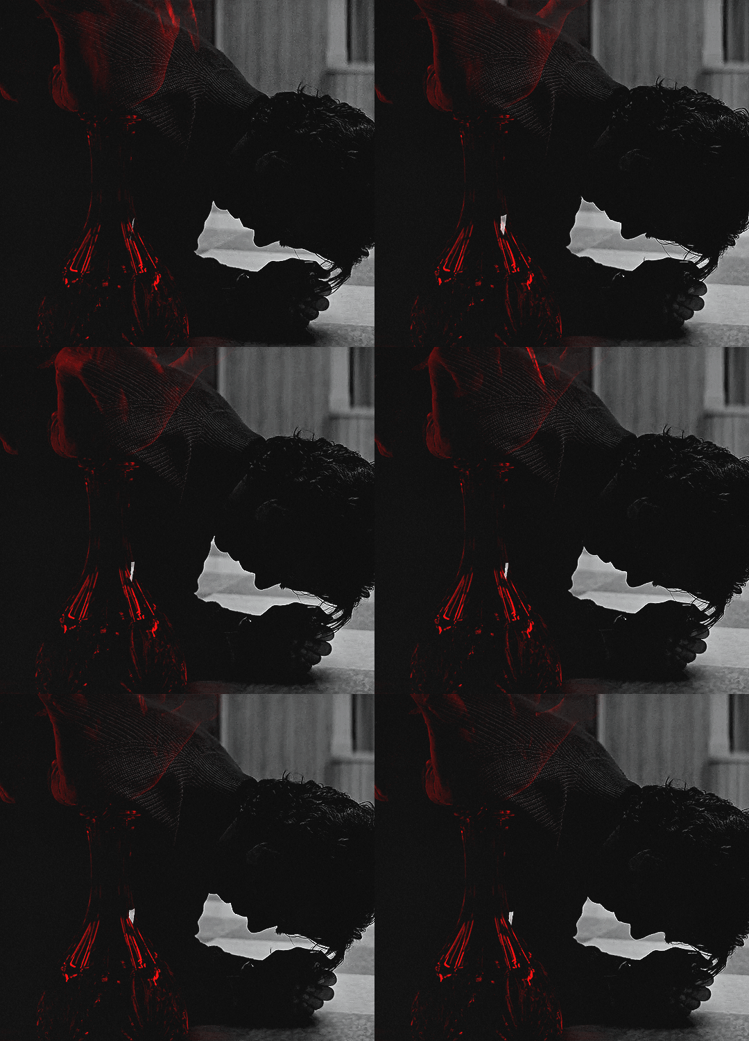
original gifset
disclaimer that i in no way consider myself an expert when it comes to blending. i actually struggle with it quite a bit sometimes and there are tons of gifmakers far more talented than myself. here's a link to all the blending tutorials i've come across for my other blog @gifmakerresource just in case!
when it comes to blending two or more scenes/shots together, i cannot overstate how important the scenes you choose are. i'll go more in depth on this in a moment, but there have been so many times when i'm making gifs like the ones above where i spend ages testing out different scenes together to see if they'll actually work and give me the desired effect.
so, what should you be looking for when selecting your scenes? in my opinion, what's most important (and can therefore cause you the most trouble) is lighting and contrast. dark on dark is what blends best. now, you can obviously tweak these things using adjustment layers, but i think it's best to set yourself up for success right from the very start.
if we look at my first and last examples above the cut (luke in hill house and pruitt in midnight mass), these are the two that show this the best. the scene of adult luke is high in contrast to begin with; we've got areas of bright highlights and dark shadows and the latter are the areas where the blending shows through the most clearly. luke's hair and shirt are darker as is young luke's shirt and hat. the same can be seen in the midnight mass example. both scenes are on the darker side to begin with, but the shot of pruitt praying is silhouetted and makes for very stark contrast, allowing the shot of the angel's blood to be seen most easily in the darkest parts.
now, a lot of this does and can come down to trial and error and i want to make a point of saying that before i get into the actual process. there have been numerous times when i'm working on gifs like these where i have to try out multiple different shots and scenes until i find something that works. sometimes, i just save what i've done so far as a psd and go work on something else for a while, and then i can come back and look at everything with fresh eyes at a later time -- never underestimate the power of doing this, btw. some of my most popular and most favorite sets have happened as a direct result of taking a break!
now it's finally time for what you came here for! how do you do this? i'll walk you through this step by step and for now, i'm just going to be walking through 2 gifs blended into one. i've done 3 and even 4 blended into one, but they are outliers adn should not be counted. blenders georg, who created photoshop and blends over 10,000 gifs a day -- [gunshots]
step 1: make your base gifs. i'm assuming basic gifmaking knowledge, but if you need some help there, here's a tag on my resource blog with all beginner gifmaking tutorials (and i'm willing to make one of my own, personal process if anyone shows interest).
i'm mostly talking converting them to timeline and into a smart object. each person's process varies a little, but i personally use an action i made that converts from frames to timeline and applies the sharpening settings i use all in one. it's entirely up to you if you want to color your gifs before or after you have them on one canvas. in this case, i colored mine after, so this is what i have right now. two separate sharpened but un-colored gifs.
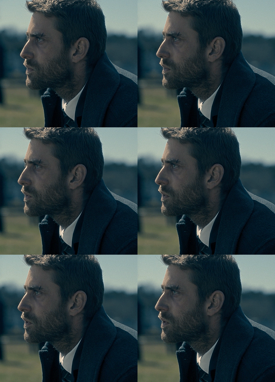
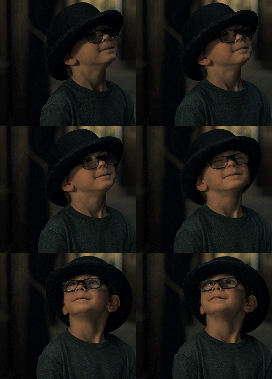
as an added note, when i'm blending gifs, i almost always keep them at their original dimensions until i bring them to the new canvas. i find it easier to position them where i want them and then crop to my desired dimensions. that way i don't have to worry that i accidentally cut something off. but for the purposes of this tutorial, i'm using my psd from this gif, which has been cropped to 540px x 500px.
step 2: bring both gifs onto a new canvas. as i just stated, the dimensions of this particular gif are 540px x 500px. if you're unfamiliar with tumblr's dimensions, i whipped this up. what matters is the width, whereas the height can be whatever you want. i saw something recently (though i can't find it now, of course) that said the middle gif in the row of 3 was no longer 178px and is now also 177px, but take that with a grain of salt! the gutters (the automatic spaces between gifs that tumblr puts in) are 4px.
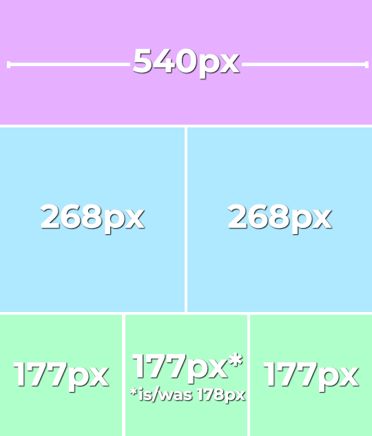
so, since this is a single gif in a row, the width must be 540. bear in mind that the larger your dimensions, the larger the gif file will be and tumblr's upload limit is 10mb per gif. with blended gifs typically being on the larger end, i try to keep mine somewhere between 35-50 frames. this particular one is 35, which along with 40 frames is what i most commonly use.
create a new canvas with your desired dimensions and either copy your gifs to it or drag them onto it. you should have something like this now:
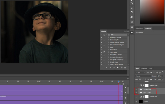
for now, ignore the other layers. as i said, using my psd of the completed gif.
step 3: add a black fill layer. this step is personal preference and therefore completely optional, but when blending, i always add an all black layer at the very bottom of all my layers. i find it helps when using layer masks (more on that soon) to make the blends appear more seamless. play around and see if you like it or not!
to create this layer, i use the keyboard shortcut (i'm on pc) ctrl+shift+N and then press G to call up the paint fill tool. once you have the color selected, just click anywhere on the canvas and it fills it. then drag this layer to the very bottom, beneath all other layers.
alternatively, you can go to layer -> new fill layer -> solid color -> choose your color but i heart keyboard shortcuts.
step 4: set the blending mode of each gif layer to SCREEN. right now, we can only see the layer that's on top. when you switch the blending modes from normal to screen, the blending begins! this is also where you can move your gifs around until you find the best placement for each one.
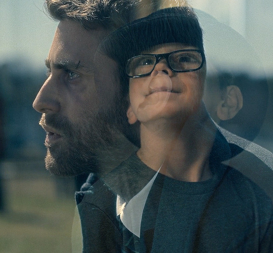
brb, crying about baby luke for the 800th time.
step 5: color! if i haven't already colored my gifs, i would likely do it now. that way, when i go to apply the layer masks, i'll know i'm working with a mostly-finished product coloring-wise. this is what i have now:
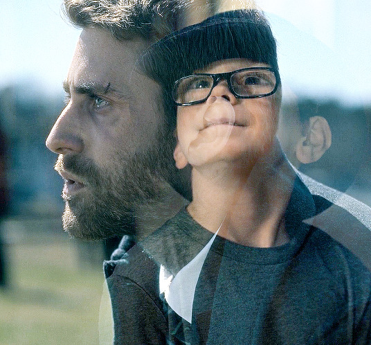
you can see just how important the contrast of lights and darks becomes. look at the difference between how visible the right side of young luke's face/hat is before coloring compared to after. when we lighten the highlights and darken the shadows, the blending becomes much more apparent.
step 6: layer masks! before i even tell you how to use them, we need to know how to apply them. you'll do this a layer/gif at a time. with one gif selected, press this button:

and you'll now have this:
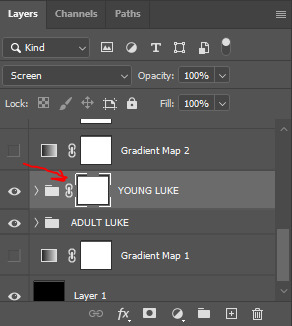
that selected white box is our layer mask. now do the same to the other gif layer. you should see this:
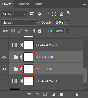
now that we've applied our layer masks, what are they for and how do we utilize them? layer masks allow you to, at their most basic, adjust specific parts of a single layer without permanently deleting them. the beauty of layer masks is that you can get rid of a certain area on a gif and if you realize later you want to bring some of it back, you can! all by using the colors black and white and, in this case, a soft round brush.
the most important part of working with layer masks is that you make sure the mask itself is what's selected. in the last image, the layer masks are NOT selected. in the one before, the layer mask IS selected. you can always tell because of the little borders around the corners of the mask. if you find something isn't working quite right, chances are that's your issue (speaking from personal experience).
as i said, we're only working with black and white here. using your brush tool (press B on your keyboard), select a soft, round brush. i personally set the hardness to 0 for the most gentle fade possible. i don't want hard edges in my blends. the size of the brush depends on how large of an area you're working with. sometimes i'll go all the way up to 150px+ and other times, i'll be well below 50px. the smaller the better for more detailed work. black (#000000) erases and white (#ffffff) brings your image back.
for a visual example, with a black brush, i'm going to mask an area of adult luke:
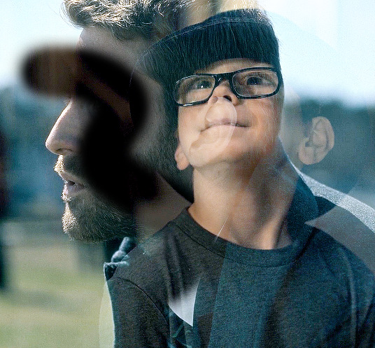
pretty obvious, right? because both layers are set to screen, masking an area of adult luke's gif reveals young luke's gif. because that area of the gif is no longer blending with anything, we see it purely with its coloring. now i'm going to take a smaller brush and switch the color to white (to do this quickly, pressing X on your keyboard will switch between the two colors [foreground and background] on your color picker).
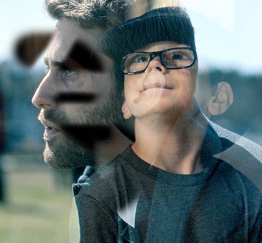
you can see the lines/cuts where i ran the brush through the mask and it brought back the parts of adult luke we'd erased. if we did this same thing on young luke's gif, black would erase young luke and reveal adult luke and white would bring back young luke. i know this might sound a little confusing, and even though i knew a fair bit about layer masks before i started giffing again last year, there was still a learning curve for me.
now that we have our layer masks, we need to identify which parts of which gif we want to mask/erase. for this one in particular, i didn't like that adult luke's ear was smack dab in the middle of young luke's face. to remedy this, i selected the layer mask on adult luke's layer and, using a fairly sizeable black brush, i colored over young luke's face and up into the top-right corner. i wanted to see more of his hat and because that area was so light, i covered that whole part. this is what my gif and layer mask looked like after:
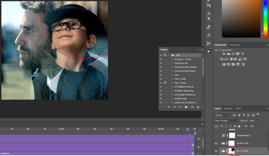
the black on the little layer mask corresponds to where i colored on the gif. now that corner only shows young luke's gif and his face is much clearer without an ear in the middle of it.
step 7: that's it! maybe.
in theory, this could be a completed gif. from here on out, nothing changes as far as blending or layer masks. you could save and export this and upload it and be done. but in this case, i just didn't like the coloring. because mike flanagan wants to see me suffer, his shit is almost impossible to color and i just didn't like the difference in coloring between present day adult luke and 90s young luke. this is also part of a larger gifset with a color scheme.
regardless of that though, i have to confess that i do this almost every. single. time. i make gifs like these. i slap a big fat gradient map on those puppies and somehow they look 10x better to me. i scrolled back through a shit load of my gifs and i only found 2 examples of blended gifs that weren't under a gradient map. oops. maybe this is the easy way out or maybe i just love colors, but idk i think it helps them look more cohesive! if you're interested, read on. if not, that's pretty much it!
if you still have questions or encounter any problems after following this tutorial, PLEASE let me know! i'm more than happy to clarify things or help out if i can! otherwise, check out some of the other blending tutorials i linked at the beginning! if you'd like me to make tutorials for anything else, feel free to send an ask, anon or not! i'm quite literally always happy to help as i don't believe in gatekeeping resources or knowledge!
step 8: i ended up applying two gradient maps on this gif. it's important that these go on top of all your other layers (namely, the gif layers). if you're unfamiliar, you click this to apply a gradient map:
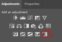
then you'll see this:
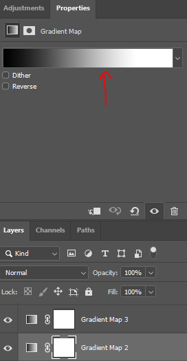
photoshop automatically applies a gradient map using your current foreground and background colors. to edit the colors, click on the map itself (my arrow). unless you're going for an inverted x-ray sort of look, your darker color needs to be on the left and the lighter one needs to be on the right. click on the bottom color points to change their colors:
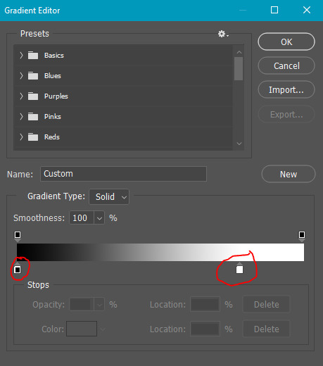
normally, the right one will be all the way to the end, but moving it in will let more white show through and brighten the image, which i wanted in this case.
my second gradient is the green one, which looks like this and goes from #211f20 to #88a188.
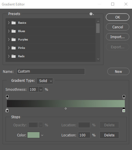
i encourage you to play around with gradient maps. as you adjust the colors, you'll see the changes live as long as you pull the window to the side a little bit. i think they're super fun and can completely change the vibe and aesthetic of a gifset.
from here, i added my typography (lyrics, naturally) and then exported and saved the gif! and here we have this gif that literally made me cry while i made it because HE WAS SUCH A BABY
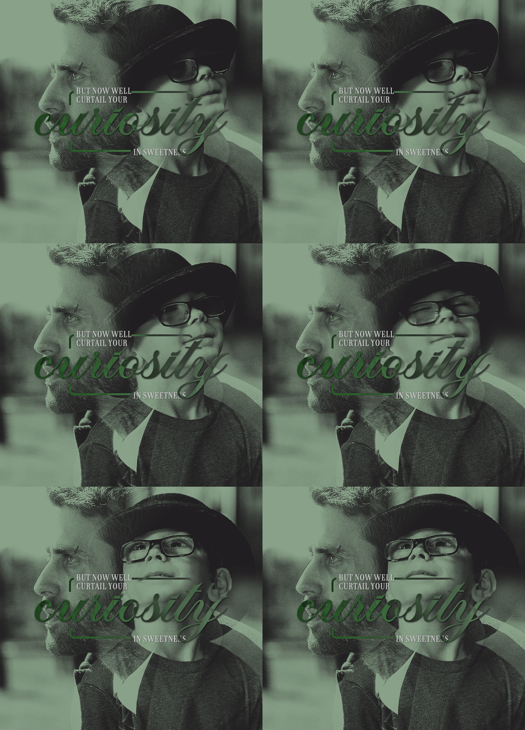
again, i hope this helps and if you have any further or other questions, don't hesitate to ask!
#answered#Anonymous#my tutorials#gif tutorial#gifmakerresource#completeresources#dailyresources#chaoticresources#thanks for being patient anon!#i know it's only been a few days but typing all this took me like 3 hours lmao
64 notes
·
View notes
Note
hi! i love seeing your gifs in tags and how you make the reds pop! could i ask about how you approach your coloring process? :)
sure!! sorry that it took me so long to get to this, anon. disclaimer that most of my Fun Coloring comes from me saving every PSD i've used for a gif before & then re-using them and putting them with other PSDs and then saving that combo as a PSD and then combining that new PSD with a different one but maybe messing with opacity or which layers are visible this time, etc. i'm not coming up with the coloring 100% from scratch every time i make gifs and usually the only thing i do new is the base coloring; i talked a little about that here, but i also put together a quick video on the process that goes into my base coloring!
i used the mav media availability from this gifset as the base as that was my most recent gifset when you sent this ask.

so, in the middle is a gif made with just my base coloring (+ with my usual gif actions; you can see the settings for them in a screenshot in the post linked above) compared to a gif made from the unedited footage (left) and a gif with the base coloring + the coloring i used in the posted gif (as far as i remember 😭 it looks a little different from the posted gifs but that could just be down to the base) (right).
even just doing some simple adjustments to the base helped greens and warm tones stand out in the middle gif — it really doesn't take take a lot to pump up the colors! i'd be perfectly happy posting that middle gif as-is. but if you want to see some of the other steps i add when doing more 'fun' coloring, i go through a little of that process under the cut!

the coloring i used on the original mav gifset was the same coloring i used to make this oskar gifset; i've been using it or a variant of it on most of my media avail gifsets recently so it should generally be a good representation of what my process to enhance reds looks like, generally.
when i say that most of my 'fun' or stylized coloring comes from layering a bunch of different saved colorings from gifsets past, i mean that this particular coloring looks like this:

of those ten (!) folders, three aren't even visible, and four have their opacity set below 100%. there are subfolders within those folders that also have their opacity set to something weird. this is not a super teachable coloring because it's just something ........ built up? from over the years?? but i'll walk through it a little more regardless.
something that i add to pretty much every gif i make is combo of two gradient overlays that flatten or soften the overall appearance of the gif. on this gif, the folder with the two gradient overlays was set to 50% opacity; the gradients themselves are the default black & white gradient set to reverse (white to black vs. black to white) at different opacities — one at 36% and the other at 14%. those numbers mean almost nothing as i'll usually play around with the 'flatter' folder every time i move it onto a gif. the big thing is just making sure the gradient is set to overlay!!

this is what the gif (with the base coloring) looks like with the flatter folder added vs. without it.

this just softens & brightens the look of the gif, smoothing out harsher colors while maintaining the amount of contrast achieved through the base coloring.
then i moved over the next folder from the psd from the oskar gifset, which is a million other folders in a trenchcoat, all of them set to a different opacity.

the final gif uses this folder at 25% opacity which makes like. a negligible difference to enhance greens & warm tones, as seen in the process gif below.

the further i get into explaining my process the less convinced i am that this is actually helpful 😭 i really do just save every coloring i do for a gif and then take bits and pieces and add it back and mess around, over and over again. when giffing the stars, i tend to like to enhance both warm tones and the color green, but with different lighting & backgrounds i have a billion variants for doing that, and then i come to decide later that i liked the way the skin looked in this gif + the way the background looked in this gif + the way clothes look in this gif, so i pick each saved psd over for spare parts and add them back at my leisure.
a lot of this looks like the process i did for the base coloring; just instead of focusing strictly on color correcting, i'll look at using hue/sat and selective color adjustments to enhance or shift the way green looks. and then i'll need to go in & adjust the color balance, and then i want to do something to the vibrancy, and then i want a subtle gradient so that it's slightly darker in the corners & brighter where the guy's face is, etc.
for every folder i add that's a million subfolders, like that 'robo dramatic' psd pictured above, there's a couple like these two, with minimal adjustments just grouped together for organization's sake:

everything i do is very much trial & error and just seeing what looks right with what kind of footage. just play around in photoshop & figure out what works best for you!! save the colorings you like so you can use them (or parts of them!) later!! so on and so forth.
if you have any other questions please feel free to come back to me with them but also please be prepared for me being just as bad at answering them as i was at answering this one 💖
#replies#sorry if this isn't more helpful!!!#i realized as i tried going through Every Part of my process that it's probably like. not actually super helpful#on account of me rarely doing coloring from scratch these days
19 notes
·
View notes
Note
Hi!
I sent this ask to the UserGif blog and they directed me to you. I was wondering how you created this black widow layout set:
https://www.tumblr.com/usergif/709701351905624064/black-widow-2021-dir-cate-shortland-insp
The layout is so cool and creative, I love it so much.
Thanks in advance!
hey! first off, thank you so much i really appreciate it.
now i will attempt to explain it, but i am never the best at these things so if you have any questions, feel free to ask! (all this is assuming everyone has a basic knowledge of gifmaking etc.) we're going to recreate a gif from my original set here.
FIRSTLY, you need your basic layout, now i used the rectangle shape tool to create the space for the big gif, and the little palette boxes, and fill them black so you can see them easily and move them around until i'm happy with the layout. and then move onto my text, the posters i was originally inspired by on etsy no longer seem to be there but the font i used which i *think* is what was used on those (as i wanted to get as close to my insp source as possible) is Nimbus Sans L for the title in bold, and Nimbus Sans Rounded for the rest (semi bold for the director and the genre/date and italic for the starring actors) and once i perfected the layout, and added a white layer for the background i saved that as a psd for future use. (make sure you're in timeline mode, and that the frame rate of this canvas is 23.976 fps - as that'll stop any issues when creating the whole gif.)
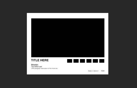
from here, you're free to gif make your first gif as normal, colouring it and putting it all together in a smart object so then you're ready to just paste it into this canvas, clipping it over the big rectangle, resizing as needed and then sharpening. (if you're unsure about clipping masks - this gifset relies on them - there's a handy tutorial here!)
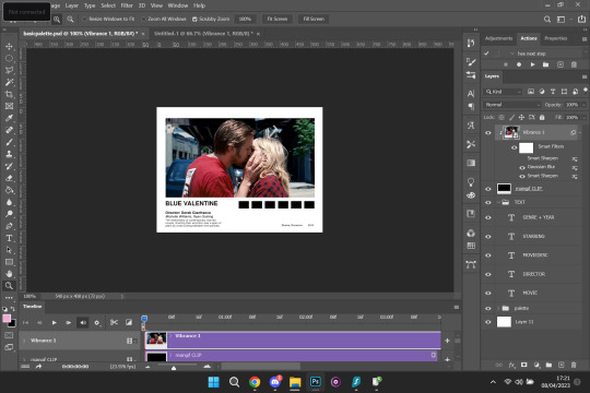
so, here's how it looks with the main gif in place, and i've filled in my movie details for the film i've picked (i try to keep my layers as organised as possible so i recommend labelling things so you know exactly which text layer is which) i put all the text layers in a folder, and make a folder for all the palette rectangle boxes too.
next is the fun bit, or at least it is for me (personally i like to zoom in for this bit) but it's time to colour pick for the palette. before you do this make a new layer for each palette and clip one to each of the palette boxes like below.

like i said, i like to zoom in for this, but select the eyedropper tool, and start picking your colours, i try to do it in a gradient, usually starting with either the brightest or darkest colour etc. for this gif i want to go from browny red to blue. once you pick your first colour, go to the layer clipped to the rectangle you want that colour and fill it with your colour. keep repeating this process until all your colours are picked and you're happy with your palette.

and here is what you're left with. so now, just do what you'd usually do when saving your gifs, i personally put everything back into frames, so i can save with a timing of 0.05. and then repeat for each gif until you've got a beautiful gifset that you love!


i hope this made sense, and is easy enough to follow! sorry if it's a bit rambling and ridiculous, me and explaining things are not compatible.
#ps ask#quirkyresources#usernik#userhella#uservalentina#userrobin#userannalise#userrainbow#usershreyu#alielook#useralison#userives#useryoshi#ask#anonymous#ps help#ps tutorial#chaoticresources#dailyresources#hisources
235 notes
·
View notes
Note
re this post
I would love to see a compilation of your "reject" gifs that don't make it into the set and then don't get posted ever. is it because they don't fit the theme or you have too many for the set?? how do you choose which ones make the cut?
It all really depends! Sometimes I'm just throwing together my favorite parts of a film/show or the most interesting visuals, which can make the process a bit more straightforward—but sometimes I have like a very specific narrative I want the gifset to portray. Like my last Passenger gifset, I was going for another parallel action kind of thing like I did with the one before that. But since there was dialogue involved with this one and 'beats' I wanted the gifs to hit, I ended up adding, replacing, removing, etc a handful of gifs in that set... many times... like it felt stupid after a while lol. Originally that gifset was going to be 9 gifs, then that expanded to 11, then that expanded to 16, and then i cut it back down to 11. I really try to not go over 10 gifs in a set because... idk it just seems like too much after that point lol. I say that but at the same time I don't notice it on other people's gifsets, I'm not counting how many gifs they use, I'm just enjoying their work! But when I'm making my own gifs I'm very self conscious of how many I'm putting in my set for some reason. I don't know why 😭 I know it's dumb So here are the 5 unused gifs from that set:
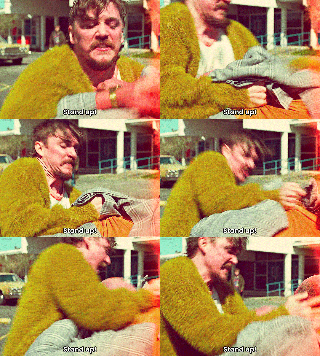
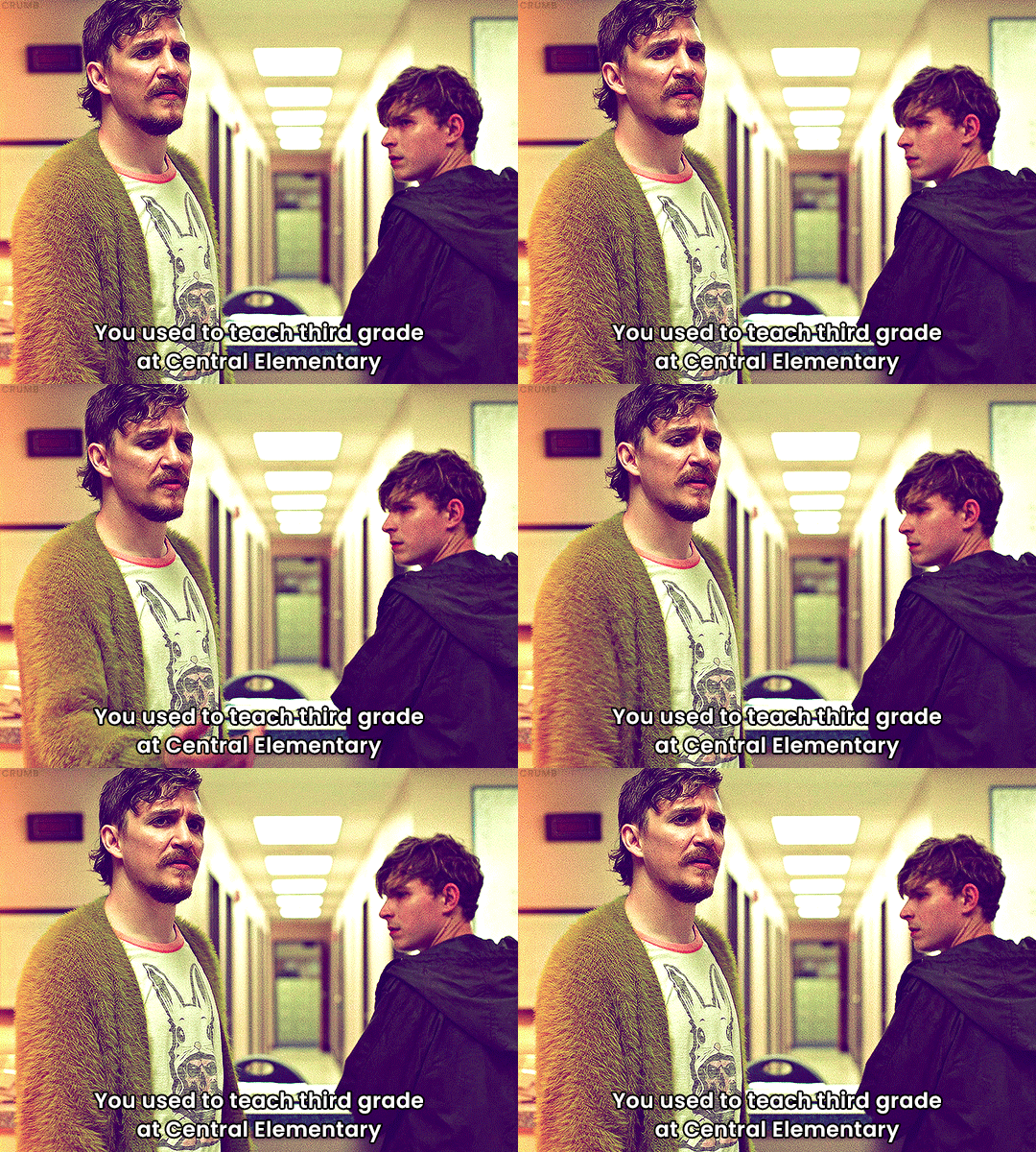
I ended up adding some of the removed dialogue as text under the gifset to flesh it out a bit for people who haven't seen the film and kept the gifs that retained the narrative/context enough on their own.
And an example of how sometimes I'll make several versions of a gif, here's what one of my gifset folders looks like 🫣:
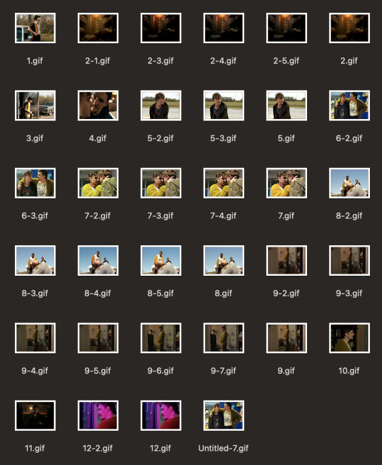
You can see in this one I made at least 7 versions of a gif I ended up not even using in that set because I just wasn't able to get it how I liked while staying under the 10MB filesize limit. I'll probably end up revisiting that shot in another gifset in the future but yeah I just got so fed up I replaced it with a different shot lol. And that's not even the most versions I've done of a gif. there have been times (dark times) when I've done like 15+ versions of a single gif to test out coloring, sharpness, framerate, etc. It's all a ridiculous work in progress and a process of trial and error. And other times I'll get the gifs all uploaded in a draft and they all look great but I'll look it over and end up removing a gif or two simply because it doesn't flow with the others or it's not as visually strong so it feels out of place. Sometimes cutting the fat is simply motivated by vibes lmaooo.
To anyone who ended up reading all this: what do you think about gifsets that are long? would you have preferred it if I kept the 5 gifs in the original set and uploaded all 16 together? Do you prefer shorter gifsets? Like, obviously the main motivation is and should be what do I like but I also enjoy making these to share with others so getting other people's feedback is also something I care about.
12 notes
·
View notes
Text
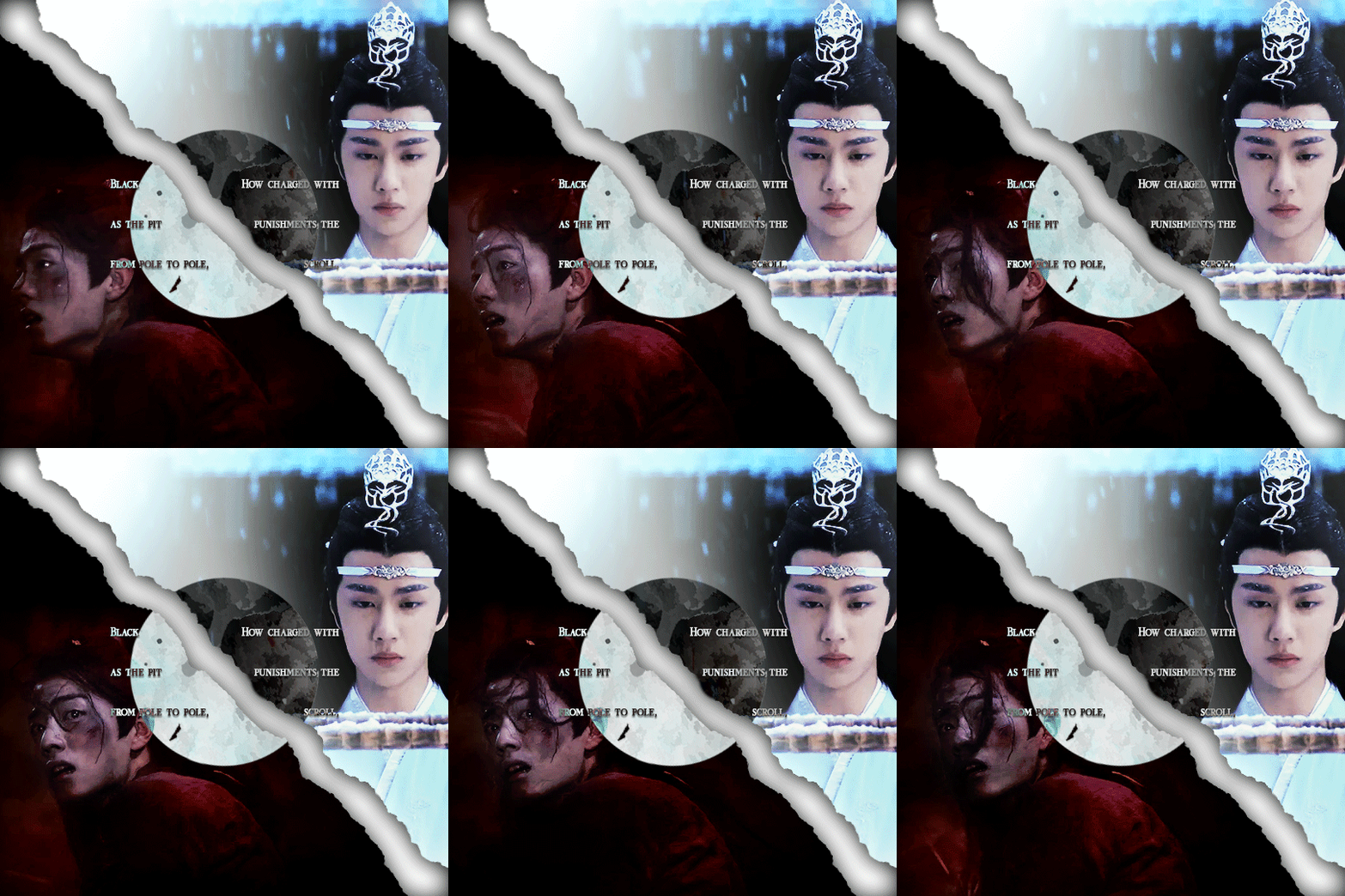
(You can find the set that this gif belongs to here 💙)
From planning to posting, share your process for making creative content!
To continue supporting content makers, this tag game is meant to show the entire process of making creative content: this can be for any creation.
RULES: When your work is tagged, show the process of its creation from planning to posting, then tag 5 people with a specific link to one of their creative works you’d like to see the process of. Use the tag #showyourprocess so we can find yours
I was tagged by @aheartfullofjolllly. thank you so much Pat! it was really fun to reflect about my own process 💗 You can find her post here and @lan-xichens' post that started it all here :)
Also thank you @huigusu 🥰 (who tagged me for my nie brothers set) I'll get to that one in a few days!
Now Pat gave me two sets to chose from to show my process, so obviously I chose the more complicated one :P
I only work in Photoshop CC 2018. I know that there are programs out there for easier cutting and sharpening but I have only just figured out how to do that in PS and I am too lazy to figure out any other programs right now xD
1. Idea and Planning
This set, like most of my sets with lyrics started with me reading the poem, clutching my heart and going "oh shit this fits my favourite characters!!". The idea actually started with me thinking that the first stanza of the poem would go really well with wwx during the burial mounds arc. Then I realized that the last stanza fits lwj better than him and from there came the idea to contrast the both of them next to each other. This is when I realized I wanted to do a dark-light contrast set, though I did not know that I would go with red and blue at that time. My idea in the beginning was just to do a black and white set
I was really impressed by how Pat said that she plans her sets around exact timestamps. Because I don't do that at all ^^ I just get ideas for which scenes would fit (in this case the wwx burial mounds scenes and lwj's kneeling and punishments scene) and then I watch the scenes to narrow them down.
Back when I made this set, I still used a screenrecorder (AceThinker Screen Grabber Pro to be precise. They have a test version that allows you to record up to 3 minutes) and recorded the scenes I needed from Netflix. This worked well enough but now I have the entire show saved on an external drive and it makes a world of difference when it comes to gif sharpness
Now, in this case I had to repeat this step once because when I was almost finished, I realized that I wanted a gif for the lwj corner but let's pretend I didn't do that and that's the way this gif was always going to look because otherwise this post will be way too long ^^
2. Creation
Short disclaimer: The creation process for this gifset was anything but linear. Multiple effects I used here were things I had never tried before. I just had a vague idea and tried to realize it through trial and error. So whenever I say "then I did xyz", it is implied that I ultimately went back to that step several times and changed stuff ^^
I started with the Wei Wuxian part of the gif. I usually use a frame rate of 0,06 (with some variation depending on gif length and size). I work in timeline so I converted all the layers to a smart layer. Then I resized the gif into a square, leaving big chunks of the gif empty (as can be seen below.) I flipped the gif horizontally, so he is looking inwards. This was simple because I felt it fitted the composition better. Then I imported the Lan Wangji part of the gif, again with a frame rate of 0,06. (Image 2)
After that I created a layer for masking in a separate PS document by rotating a square until it was point down (is that a rhombus?). I sized it to match my gif (540x540 pxl) and copied it over. (Image 3) a bit of masking magic and ta da! There's the basic layout (Image 4)
I put a layer of solid black behind wwx to get rid of the transparent bits (Image 5) and then started adding more white and black to both sides by adding solid whit and black layers that i put masks on and changed the opacity as i needed (Image 6)
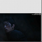
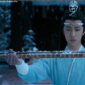
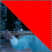
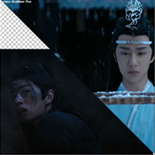
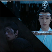
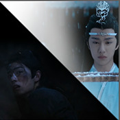
("reading" direction: from the upper left to the lower right corner)
Then I fiddled with the colours a bit. The first thing I always do is using the curves layer to get more contrast. Then I use the colour balance tool and the selective colouring tool to get rid of that cql-typical cyan tint after that it's just trying to have it look "natural" while the colours still fit the overall scheme. This was difficult here because wei Wuxian’s side of the gif was very dark and when i turned up the saturation to see which colour dominated it was a very weird mixture of multiple colours. That's when i decided that I'd just go with red on his side, since lwj's side was already so blue and those to look great as contrasts.
After that just came a lot of fiddling with selective colour layers and brightness and contrast unti I has happy. There really wasn't much to it ^^. (Image 1)
After that I added the text. I knew I wanted the two lines to for a square of some kind. So I tried different fonds until I arrived at the one below. The two lines are in seperate layers so I could move them around and change the spacing between the letters until I was happy with the layout. I also changed the layer mode for the text to "difference" (is that what it's called in english? my PS is set to german sorry ^^), keeping their colour white. (Image 2)
I originally hadn't planned adding anything else but I felt like the gifs (plural because I switched between the gifs of this set) was still kind of empty and lacking, so I added the tear down the middle (a tutorial for that is either coming up later or already posted. I recently got an ask for this :)) (Image 3)
It still felt empty after that, so I tried different overlays. Okay no, first I wasted a lot of time on different free image sides but then I tried out different ones until I chose the one you can see in the finished gif. I liked that one because a) I felt the round shape was a nice contrast to all the straight lines already there and b) because once I applied a black and white filter to it and switched the layer setting to "difference" (again, i hope this is the correct translation) it looked a bit like a moon. (Gif at the top)
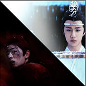
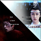
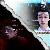
("reading" direction: from left to right)
And that's it! :)
Although in general, these gifs took so much fiddling! I went back and forth between them a lot and sometimes almost redid the entire thing because I had no idea what I was doing in the beginning and by the time I noticed an error, the only way to fix it was ti redo everything. So yeah, this set definitely is the the one that took me the longest out of all the ones I've posted so far.
3. Posting
I save all my gifs to my drafts first to see what they look like put together and to check if they look any different on mobile. Usually i do this several times and change stuff until I'm happd enough with it to hit post. Once i am happy enough, i can't hold back. Doesn't matter if it's at a time when nobody is online, i hit post 😅
And that's it!
Tagging:
@lanwuxiann for this gifset (I adore it so much. I've looked at it and read it severat times since you posted it and the poem just kills me every time!)
@suibianjie for this gifset (The combination of static images and gifs in your gifs is always absolutely perfect! This one is only my favourite of yours because the light coming from behind wwx is just so pretty!!! ^^)
@sweetlittlevampire for this piece (It was soooo hard to pick a piece of yours because I have so many favourites! But this one is just so out if this world, I want to know how you worked that magic :D)
@wei-gege for this set (sparkling shijie! 😭 that set is so incredibly beautiful! I love how you matched the colour of the overlay with her dress!)
@purplexedhuman for this set (your gifs are always incredible! I chise this one because it showcases both your colouring skills and some really intricate effects)
If any of you have already been tagged or don't have the time or energy for this, obviously no pressure to do this at all! 🥰
(btw, I originally tried to place the actual text of this under a "read more" cut but somehow it always messed with the order of the images, so this ended up as a rather long post. sorry!)
39 notes
·
View notes