#i'm such a fucking mistake
Explore tagged Tumblr posts
Text
I, a hearing person who likes subtitles just as a preference, shouldn't have to read a subtitle that's obvious nonsense, go back a couple seconds, and listen again in order to figure out what's going on. An accessibility feature should not be the most half-assed part of a professionally made production. Scripted media has absolutely no excuse for not having subtitles or having subtitles that aren't perfectly verbatim. Professional captioning services should be ashamed of the shoddy work that they put out. Captions should be treated as a part of the production, just like filming, editing, audio balancing, etc - and anything that releases with missing or bad captions should be seen as unfinished
#the subtitle mistakes i've seen are absolutely fucking embarrassing#subtitles should make something easier to understand not harder#and i can hear just fine so i'm lucky!#i've seen the kind of mistakes that would make an entire video unintelligible to someone who doesn't have the audio for any reason#it's unacceptable
90K notes
·
View notes
Text
I feel fandom would get along a lot better if there was mutual understanding that liking a character, agreeing with a character, and thinking the character is well constructed/executed are all separate (if often overlapping) positions, each with their separate tastes and subjectivities. Also: character portrayals are intended to make the audience feel things; this is separate from (if often overlapping with) analyzing/appreciating their actions and role in the story.
#I would queue this because it's truly not character-specific#but there is always something happening with a character so that probably wouldn't help lol#anyway I'm making this nonrebloggable because I am not interested in the tomato throwing atmosphere out there#do not clown in bad faith on this post or in my inbox please I will just delete it#op#it's just over time I do see a pattern of like “I think X character was wrong in this” and some reactions being “you *hate* X character!”#or that if you like a character you *must* agree with them and/or have such a deep an endless compassion for their faults and mistakes#that it comes all the way back around to removing their agency because HOW could they do any different#and if you do not give them this grace then it is antithetical to you liking them or enjoying them or even just being neutral on them#when this is often not the case#like as an Essek and Jonas Spahr enjoyer their fuck-ups are very essential to why they have any sort of “grow as a person” arc#characters *have* to have texture and foibles or they are stagnant in the story - let your fave fuck up a bit! As a treat!#and lastly I'll just say that my point here is NOT that everyone is always positive or that haterism doesn't exist.#Some commentary just seems to happen at different frequencies from each other and it catalyzes more angst than it needs to
2K notes
·
View notes
Text
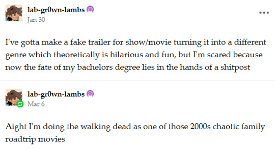
hot garbage 👇
#making Lori the main character was a mistake there are 0 fun clips of her. she just vanishes after the intro don't worry about it#''journey doesn't quite go as planned'' yeah ya girl fucking died lmao#the context for where the hell all these other people came from is nonexistent#but there's 11 seasons of this shit and I can't find the clips I'm thinking of so#fuck it#I have more important deadlines rn lmao#there's a few clips I had that I'm sad about leaving out but this shit is already too long#I rly wanted the one of Rick putting in that CD and Daryl being like ''please don't-''#also Daryl being horrendous at driving stick with Rosita and Denise#wanted to have everybody bopping to that song drawing the walkers away from the movie theatre...#Carl crashing the car in front of Enid...#the rollerskates...#but alas#twd
2K notes
·
View notes
Text
Prompt in Memes 5
Once more, have a prompt entirely in memes because I'm too lazy to properly write one right now lol.


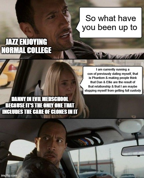
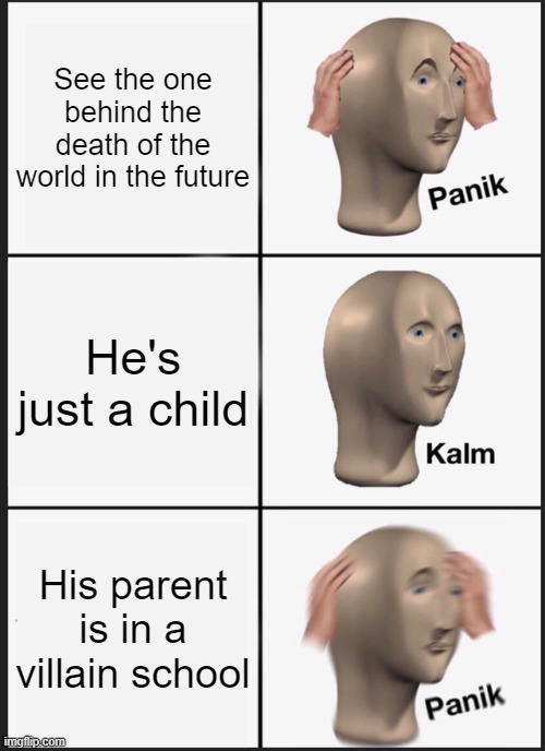
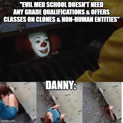
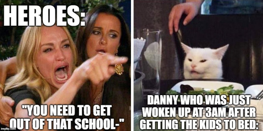
#dcxdp#dpxdc#prompts#De aged dan#de aged ellie#dad danny#mom danny#Fuck it make this a Hazmat Au too with a hint of eldritch Phantom form#Hence why no one realizes Danny Fenton & Phantom Dark are different people#No Danny is not ghost king he's just a little shit#Jazz is in Metropolis & Danny is around depending on where the “field trips” are#Sometimes he's in Gotham because Scarecrow or Ivy offers a lecture#Most of the time they're in Central though because it's safest for the baby villains in the making lol#Danny is taking classes for both medical stuff (thx Frostbite) and engineering#A couple of time travelling villains ADORE him and his kids lol#“So u a monsterfucker?” “What” “I mean I saw that ghost hero & I'm just sayin that's not human y'know-”#Tucker stop laughing at him#Tucker and Sam and Val are also in the same villain school but taking different classes#Save for Tucker also being in an engineering class#Sam is fighting for that Ivy internship#Val is in the specialized Anti-Hero course that focuses on teen heroes who are done with that bs#She got in by telling them (not lying) that she's going to take down a branch of government even if she has to blow the whole thing up#Evil College Au#Danny made a mistake & now everyone thinks that he Val Sam AND Tuck were in a relationship with Phantom at some point#Eveery other student now refers to them as the Petty Exes#memes#meme
3K notes
·
View notes
Note
What progress at home has biden enacted? What policies of his show that he is making progress that prove he is actually different than trump?
I like to pretend I have faith in humanity, so I'll answer as if you're asking this in good faith.
Biden's DEA has lifted restrictions on telehealth prescriptions to make appointments and assistance more accessible.
He put a funding package into place to help unhoused people get access to mental and physical healthcare, as well as short-term and long-term housing.
He has attempted and is still attempting to get student debt relief through - this was blocked by Republican judges appointed by Trump, but he's still working on it.
Infrastructure repair - his administration has budgeted funds to actually fix some severely-damaged and frequently-traveled bridges.
Trying to expand access to healthcare to include undocumented immigrants who came to the USA as children (Dreamers) under the Affordable Care Act. Support for Navigator programs and outreach has also been increased.
He has vetoed Republican-led bills that were attempting to overturn environmental protections - one that would have forbidden investment fund managers to consider climate change in their portfolios (I have two degrees in accounting and this is actually huge), and another that would have overturned restrictions on agricultural runoff into our waterways.
He and his administration worked for ages to get rail workers paid sick days.
This is just some of what he's been doing. Meanwhile, Trump and other Republicans want to criminalize the lives of LGBT people like you and me. They want to eliminate no-fault divorce and force births that will kill parents or devastate them financially. They have stated flat out that they want to install a military dictatorship in the USA. They attempted to put that in motion on January 6th, 2021. They failed once. They will do better next time.
One party wants to house the homeless and expand social safety nets, while the other one wants to criminalize homelessness. One of them wants a future in which I might be able to vote to change how much of a war machine my country is, while the other one wants to eliminate my ability to vote entirely. Those are not the same. Those literally are opposites.
At the end of the day, all you and I can do is choose to do the least amount of harm possible. You and I cannot choose to do no harm. This is the USA, we sell war, you and I cannot choose to do no harm. I wish we could, my god do I wish we could, but that is not an option. So we grieve for the harm we couldn't eliminate and work to minimize the harm that is done. Despite all the crap they support, Democrats are the minimum amount of harm right now. Acting like they aren't is exactly what brought us to an election where our options are a future where we are either wading in blood or drowning in it.
Not voting for Biden will not help Palestine. Not voting for Biden will guarantee a Republican president who will make the situation in Palestine WORSE. AND it'll hurt a lot of other places as well, both at home and abroad, because Republicans are about business and the USA is in the business of war! And I would very much like that to change someday! I would very much like to someday be able to choose to do no harm! And I know what I have to do to try for that future, so what are YOU going to do? There is no standing off to the side in this. If you aren't helping pull, you're the dead weight we're pulling. Are you going to dig your feet into the mud and blood and drown us there? Or are you going to get the fuck off your ass, grit your teeth, and help us pull free?
#askbasket#iam-the-wild#us politics#israel#palestine#if you do not vote blue you do not get to call yourself an antifascist#i HATE that that's the case; don't mistake me#but that is the reality we're working with#there isn't any other#do nothing and kill five people or act and kill one.#so what are you gonna do? i can't choose for you. but i know what my choice is.#i'm part of this world. and as much as i hate it...turning away is not one of the options.#we fight on ALL fronts#we protest we donate we write we call#AND WE ALSO FUCKING VOTE FOR THE LEAST OF THE EVILS. BECAUSE NO EVIL IS NOT AN OPTION.
3K notes
·
View notes
Text
So y'all have seen the Williams F1 Logo before, yeah?
well get ready, becaues I am about to ruin your day!
where does one even begin with this. i am sorry in advance. -just a poor learning graphic design student, who simply tried to enjoy their saturday evening
The Logo
For anyone that doesn't know, here's the Williams F1 Logo. Entirely unedited, copied straight from Wikipedia:

Now like many fans, I actually quite enjoy this logo. I like the modern, sharp edges of it and it's simple yet intriguiging design. It's memorable, while also easily recognizable as a W. I also really enjoy the colour choice (this, however, is entirely a personal preference.)
(entire rant under the cut. please keep reading this took years off my life span.)
How did we even get here?
Let's start at the beginning. How did we even get here? Well I, a poor poor learning graphic designer, was watching this lovely video from Mr. V's Garage about bad F1 Logo's over the past 35 or so seasons. Very interesting, I can only recommend it (but you don't need to watch the video to understand this post)!
Now, to cleanse the palette at the end of the video, Mr. V included a top 10 GOOD logos from this time span, it was very kind of him.
On P4 of this "Good List," Mr. V placed the current Williams F1 Logo, as pictured above. At first I vaguely agreed with this, believing that he probably simply hadn't noticed one of the things that's been bothering me about that Logo since the first time I saw it up close.
The first sign of Trouble
So, what is this mystery issue, you might ask?
It's simple really. You don't necessarily notice it at a first glance, but something about that logo seems off. Taking a second longer, you may notice it yourself.
No, I mean it, take a minute and go look at the logo. It looks wonky as hell, doesn't it?
Well I can tell you the first thing that I personally noticed. The arms of the W aren't in line with the bottom half, see:

(Graphic by @girlrussell who was so kind to let me use it, as it is way prettier than the one I made)
It's a crooked W. There is no good explanation for this. The rest of the font is perfectly fine, geometrical shapes.

Anyway, the good person that I am I went to point this out to my partner ( @leftneb ) who proceeded to inform me that he, infact, was not aware about this and was, quote, "never going to unsee that."
Now, the good FRIEND that I am, I, of course, proceeded to rush into our broader F1 friendgroup to make them suffer for eternity.
What's the logical next step to take? Of course, fix the logo in Adobe Photoshop, you know, as a joke.
(Disclaimer at this point, I am not necessarily the biggest fan of Williams Management Team. I enjoy ALL their drivers this season. I do NOT enjoy James Vowels. Be warned.)(Also I am aware that he probably did not have an influence on the logo)
Trying to fix it. Oh god, I was so innocent back then
Trying to fix the logo in Photoshop is the worst mistake I could've made. THE worst path to take. I could've just giggled about making my friends suffer (which I succeeded in, by the way) and moved on. Instead I ruined a perfectly good Saturday evening, and for what? I don't know anymore.
Anyway, how was I gonna go about fixing the logo in the simplest way possible? Simplest way I could come up with: slap the thing in Photoshop and put two, mirrored boxes at each side to make the sides line up. Small issue, how do I make the thing actually even? Fix: line them up at the intersecting point with the bottom tips of the W.
Here's the result:

Hey, anyone care to explain to me why in THE LORDS NAME the arms are different sized? I mean, surely they weren't before. Surely, certainly, I must've messed up.
I double, I tripple checked. I made sure everything was lined up and made sense. But no.
It just couldn't be. Something was uneven in this logo, something even deeper. Something I could not have predicted when first taking a closer look. It was at this point I realized I had messed up. What rabbit hole had I stumbled across? Certainly, it couldn't get much worse.
And that's when I noticed.

(pictured above; my genuine reaction)
There's MORE? (oh god, the top isn't lined up)

I couldn't believe my eyes. This is the PINNACLE of the sport, and THIS was the logo of one of the competing teams? I mean, yeah, we have a Visa Cash App RB or a Kick Sauber or even a MoneyGram Haas which are all terrible logos, but at least they're CLEAN. (this has not been checked. If anyone wishes to ruin a nice Saturday evening, feel free to check them and tell me how wrong I was in the previous statement!)
But you can see that there is no end in sight for this post. I'm sure you're as scared as I was at this point. By now we were sitting in VC, discussing the horribleness of this logo. I had long informed my irl's about this, who take said design classes with me. And it was one of them who pointed out the next thing that had been bothering me, but I had not been able to put a finger on up to this point.
thE DISTANCE, HOW DID THEY FUCK IT?

I'm afraid I have to confirm your fears.
Yes, those lines are the same length. According to Photoshop, they're on the same level as well, so no flunking with angles.
The gaps of the arms to the main W are not the same. They're differently sized gaps.
It was clear to us, this logo is inherintely flawed. They're subtle issues, but once you pay attention you start to notice things. It all looks slightly wonky and off centre. And eventually, you get paranoid, and start comparing other angles and sizes. And you will keep finding things. This has ruined my life.
HOOOOOW

Honestly, I don't even know what to say. Yes, yes sadly those lines, too, are the same length. Just copied over from one side to the other and layed over on the same height. I admit, they're not layed over perfectly. I was honestly holding back tears at this point. But the point still stands, you can clearly see a difference in width.
Honestly, the only way I can explain it is that at some point there was a mess up of distance or proportions and whoever was designing the logo couldn't pin it down and tried to restore the visual balance by making manual adjustments. And in all honesty? They kinda did a good job, if that's what's happened. I mean, you notice the crookedness of the arms, and then maybe the difference in height, but the rest you probably will not notice if you don't spend too much time staring at it. (like some of us) And even those issues clearly aren't noticeable to the vast majority, considering I had to go point it out to a group chat for my friends at least to notice.
what the fuck is THAT?
Now, the thing about doing this investigative work of prooving a team you dislike is worse in more aspects than you previously thought, is that you do a lot of zooming in. And zooming in means you might notice bits that yours eyes simply overlooked before, because they were too small.

Here you can witness the top of the middle point, that, for whatever reason, really wants to touch the top border of the Logo. I'm relatively certain that's the highest few pixel in the entire graphic, considering earlier chapter "There's MORE?" I have no idea why it looks like that or why they thought it was necessary for it to not end in a clean point.

I just actually have no idea how to even describe what is going on on the top of the left arm. That left hand side, again, touches the side and is therefore the most-left-pixel in the graphic. I, once again, have no idea the purpose of this. However the RIGHT hand side also makes no sense, as it is the most prominent corner in the whole logo. There's pointed corners, and rounded OF corners, but nothing that is trying to form it's own colony in a distant land that hopefully isn't this god awful logo. I hope that blob gets away. I really do. You go king.
i'm loosing my mind
Anyway, the only reason I could come UP with those weird "reachy-outy-bits" was to establish the dimensions of the logo? But if that was the case, I don't understand why they managed to keep all the other potentially border touching corners clean?


Like, look. Those are clean, sharp corners with some clearance off the borders. I have no clue why they managed it here but not with the others.
guys. please.
Backtrackig a little bit, going back to the positioning of the arms.

Do I need to mention that those lines are both the same length and the same (mirrored) angle? I really hope I don't, because I don't think I could be making this shit up. Like, once you roughly know what you need to look for it just kinda becomes easy to find.
As said before, I genuinely do think that most of these issues happened in a chain-reaction. For example, the distances between the main part and the W wouldn't be as noticeable (and they do get noticeable once you start looking at it) if the angle wasn't fucked. And guess what, there's more fucked angles here! Which ALSO influence this specific area of the logo!
this is just embarrasing for you.

something something same line copied over and mirrored etc etc
It's not as visible but the angles defintely don't line up here as well. As mentioned before, these issues for the most part all influence each other. It doesn't really excuse the issues, in my opinion as a designer, because a big company like this shouldn't have these sort of issues in their logo.
So let's review;
to sum it up,

i cannot even BEGIN to explain to you how big of a fucking JOKE this FUCKING logo is. because, i thought to myself, to round the post out, hey, why not show ALL the issues i pointed out in one picture? that would round it out quite nicely, wouldn't it?
Yeah well, this logo sent STRAIGHT FROM HELL just could NOT let me rest. I had only done the lines visualizing the crooked arms in PAINT up until this point, i.e. I had only pulled both up individually. To make a nice "rounding out" picture I still had to add them into PHOTOSHOP. so i did. i pulled up the line. i mirrored the line.
THE ANGLE IS FUCKING DIFFERENT
none. and i mean NONE of my friends had noticed this before. i need you to understand that we looked at this thing with FIVE pair of eyes, and NONE of us noticed that until i thought to myself "Oh I still need to add these specific lines to have ALL the issues I pointed out in my SILLY TUMBLR POST in ONE image" and i get THAT FUCKING SURPRISE
I was PLANNING to round the post out with a statement on how obviously this isn't a serious post. Here, I even had it all written out already because I accidentally started writing it in the last paragraph:
Of course, this is nitpicking, and it's not that serious. I'm aware of that. AS MENTIONED most of these would not be noticeable if we hadn't gone specifically looking for them.
yeah, well, fuck that. i just spent two hours seething about this logo. i'm ending the post on this instead.

#i am ENRAGED#i managed to actually calm down about it#yk. just typing away#and then i just try to ROUND OUT THE POST#for fucks sake#anyway i know i'm posting this at an hourrendous hour#if you read all the way. reblog? maybe#pretty please#williams f1#williams formula 1#williams racing#formula 1#f1#also apologies for any spelling mistakes i do NOT have the nerve to go back and proofread this
951 notes
·
View notes
Text

i'm out of my head, of my heart, of my mind
#reverse 1999#r1999#argus#tuesday#kayla (in a sense...)#i love lesbians#originally drawn for the r1999 fanart contest then i woke up and realized all my mistakes#don't submit things at 2am or else u might not notice how fucked up the hands are#enjoy the fixed version... sigh#bluepoch i'm not ai just stupid#argus reverse 1999#tuesday reverse 1999#rizsart#route77fanart
452 notes
·
View notes
Text
arthur is rude to that one sex worker because the guys are fucking around as they oughtn't be and he actively wants the source of their distraction to go away. that is how he operates through the entire game: deliberate, utilitarian intimidation and strategic unpleasantness to achieve a goal. it is an early game commentary on arthur meant to position him as a big dog that barks. it is not a commentary on his views about women which are clarified many times afterward. you guys realize that right
#arthur morgan#rdr2#redmeta#this is one of the most wildly misinterpreted but also most obvious scenes where writers are teaching us how arthur moves through the world#i really don't mean to seem short here#i am just exhausted of reddit mentality low literacy “ARTHUR WOULD SHOOT U IN THE FACE FOR FUN HE HATES WOMEN AND SLUTS” takes#my mistake was imagining a world where your average man online could intellectualize about narrative art#unless it is spoonfed to them on a shotty slug that says I'M STRAIGHT BUT I'D LET [MASC CHARACTER] FUCK ME
1K notes
·
View notes
Text
Would yall believe me if I said I made these just for the shits and giggles. Ehe?
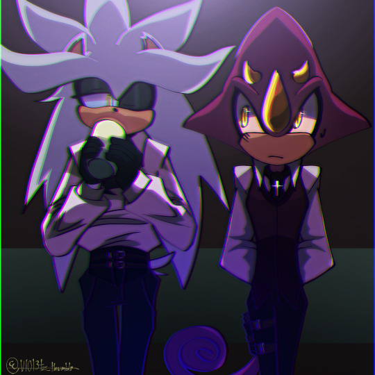
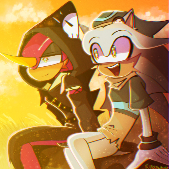
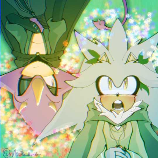
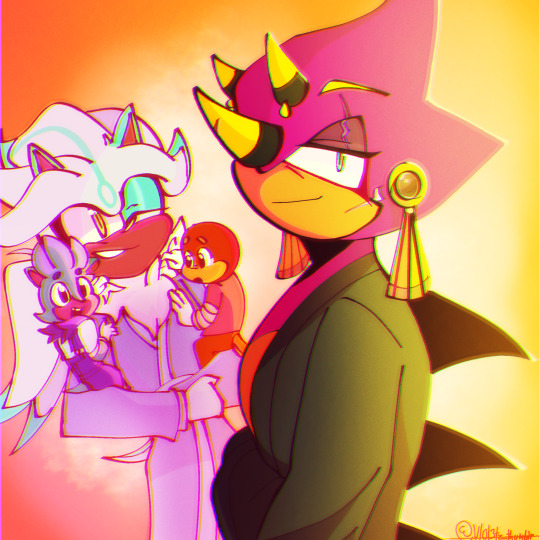
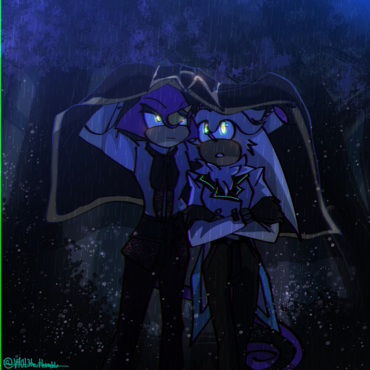
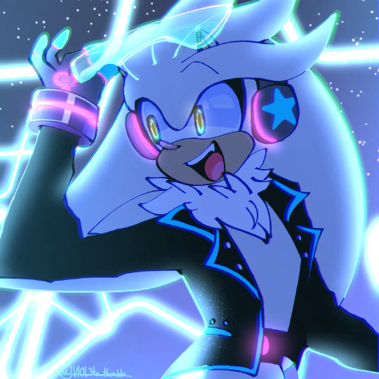
[Not in order!] Satbk au belongs to me
Rockstar Silver au belongs to @ken-yamh
Sing for Blood au belongs to @hayweerc
Death and Love au belongs to @lm-tomatito
Bound by Chaos belongs to @hayweerc
Dadpio belongs to @retrocandyfloss
#espilver#silver the hedgehog#espio the chameleon#art#sonic au#sonic aus#espilver aus#bound by chaos au#rockstar silver#sing for blood au#satbk au#dadpio#death and love au#Erhmm.. happy Espilver buffet guys!!!!#Made within two days because why the fuck not#Thats right! different Espilvers yet all gay!#was gonna include Espio for the rockstar silver one but he didn't fit in the image- pretend he's there pls#I think I'm about to be pounced by a few certain forces...#was also playing around with the lighting here#so if there are mistakes or something. IIII dont rlly care#I was having my fun and thats the important part 💅💅💅#OKAY TIME TO COOK SOME MORE BYEEE
548 notes
·
View notes
Text
I saw another post criticizing Bruce for having children fighting at his side, and I must say: tell me you don't know shit about the batkids' stories without telling me. Bruce fucking tried to stop those kids from being vigilantes, but they keep doing it behind his back, so he decided the best thing to do was to give them the proper training, an armor and to have them stick at his side so he can watch over them. You know, like a parent telling their underage children that they can drink alcohol but only at home where they can watch over them.
Dick became Robin because he wanted revenge over his parents' murder. He would run out in the street of Gotham as a 8 years old, all alone, to go fight Zucco. Bruce helping him make Robin was the compromise to keep Dick safe, because the child would not listen. (And yes, it wasn't the case in the very first canon, but it was like the 40s. Do you know how many kids fought against the Nazis in Europe at that time???)
Barbara Gordon is not his daughter and he has no authority on her being a vigilante. He cannot even ground her.
Jason became Robin after helping Bruce take down Ma Gunn's school. It is implied by Bruce, while talking to Dick, that he offered Robin to Jason as a way to gain a child because he missed having Dick around. He didn't need a Robin, he just missed having a kid. Bruce used the Robin mantle with Jason like people use churu to appease stray kitten. AND JASON'S DEATH, let's talk about it. Jason ran away, which leads to him being killed, after eavesdropping on Bruce and Alfred talking about Jason's mental health. Jason is benched as Robin, but not because Bruce thinks he killed someone like fandom says, but because Bruce knows it is not helping or healthy for Jason. They are talking about getting him help for his traumas and how violence is not helping Jason. And, when he is older and has healed, they can try again if he wants to. That's why Jason or people saying that Jason died because he was a soldier, or blaming Bruce for Robin's existence is false. When Jason died, Bruce was against Jason being Robin for his own health! And Jason knows that, he heard the discussion, he wasn't bench like how so many of his siblings are, with little to no honest explanation. Jason died in the Robin's costume because of his own stubbornness, not because of Bruce. (And that's not blaming Jason for his death. He is not to blame, but neither is Bruce. It's just about the Robin's colors. Jason would not have been wearing them at the time if he listened to Bruce.)
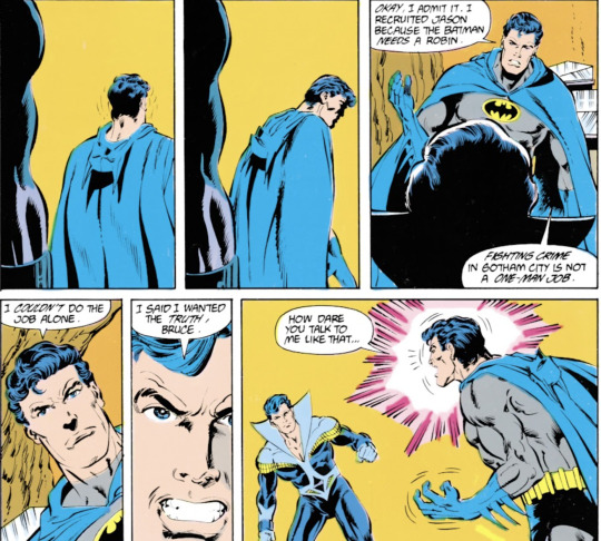


Tim Drake imposed himself as Robin. Bruce was against it, Tim literally went "Don't care, didn't ask". And Tim was already following them around before. Bruce already have Jason blaming him for making Tim Robin when he had no control over that.
Stephanie Brown became a vigilante before Batman knew her. He has tried SO MANY TIMES to make her stop, and so many fans hate that he did it. Make a choice, is it bad that he didn’t stop her more or that he didn’t let her more be a vigilante? He even got his kids to try to make her stop. AND SHE IS "KILLED" TO TEACH HIM THAT MAKING KIDS VIGILANTES IS BAD WHEN HE IS NOT RESPONSIBLE OF HER BECOMING ONE AND TRIED TO STOP HER! No shit the man blames himself for things that are not his fault, everyone does it.
Cassandra Cain was 17 when she becomes Batgirl, so I don't know if she counts. But when Bruce tries to make her stop for her own health, with the support of Barbara and Alfred, Cass is devastated and doesn't obey him. She puts on her costume and fights him physically.
Damian Wayne was trained as an assassin. In every version of him being introduced to Bruce, Bruce is against making him Robin and Damian keeps sneaking out. Damian wants to prove himself to his father so bad and refused to be kept away from the fight. In the comics, it's Dick, DICK, that makes him Robin when Bruce is gone, because Bruce was against letting Damian out at night.
Conclusion: Bruce is a tired father of a bunch of kids that cannot understand they should stay home at night and not be vigilantes.
#bruce wayne#batman#robin#dick grayson#jason todd#tim drake#stephanie brown#cassandra cain#damian wayne#barbara gordon#batgirl#dc comics#my ramblings#If I ever stop comparing Jason to a stray kitty then I'm either being mind-controlled or it's a fake#Bruce's kids sneak out behind his back all the fucking time he has no control over them sometimes#Steph's death is crazy to me like Bruce tried so hard to make her stop and he is punished for something he didn’t do#the only one who was really introduced to this life by Bruce is Jason and it's literally because empty nest syndrome took over#and Bruce NEEDED this kid to accept to come live with him. And how do you do that? By offering being Robin of course#but he realized his mistake and tried to fix it sadly Jason disagreed
836 notes
·
View notes
Text
you ever just have a lot, a LOT of feelings all at once about a character and not even remotely enough words or brainpower to FORM the words to describe everything you're feeling. so it feels like you may explode. yeah
#sorry i got really into my feelings about mark hoffman again#the very specific version of him in my brain that i really really wish i had the time and energy to properly share with you guys#saw#well until i muster the energy to explode all of my feelings out into a fic. if you want to TRY and understand#know that my three biggest hoffman fic insps right now are as follows#your best kept secret hoffman. a series of mistakes hoffman. and rushed like a dreadful wind hoffman.#there is a very clear throughline just know i am extremely emotionally compromised rn#thinking about theee fics vs the canon path hoffman spirals down#something something the absolute tragedy of watching a man's descent into madness#the transformation of a man into a monster#and what could have saved him from himself and kramer's corruption#sorry i'm rambling so much oh my god i was just having such a crying fit out of nowhere about this#do you think he could feel it happening. do you think he was aware he was losing his mind.#the script version of him fucks with me so bad. the crazed rankings and the longer hair and him not being well kept anymore#it's impossible to think he didn't know he was deteriorating#fuuuck okay i need to either chill or write a whole longfic rn#i project on that guy so much i truly don't know if i could properly write my vision of him#until i do something more substantial the full extent of my hoffman exists for me and my boyfriend only. they get me like no one else#well ginny and jenna also get me. please read best kept secret and a series of mistakes Oh My God#where am i going with this. i like tag rambling actually this is a nice way to do it without forcing EVERYONE to read my delirium#anyways if you've read all of this i think i love you? feel free to dm me about hoffman and my very specific headcanons and aus#maybe soon i'll try and start writing my fics about this tragic man#i could never say any of this on twitter btw they'd string me up for my opinions on him as a sad wet beast who could have been fixed#if only he hadn't been weaponized first#god i'm too tired to even be as embarrassed about this as i should be. thought i unlearned cringe already#but i've been spending way too much time on twitter and they HAAATE hoffman there#rip. i know it's not that serious but i'm sensitive rn and hate feeling lonely in my thoughts#ok bye for real otherwise i'll never shut up. i might tag ramble more often bc this was therapeutic in a way i needed badly#cat chat
940 notes
·
View notes
Text
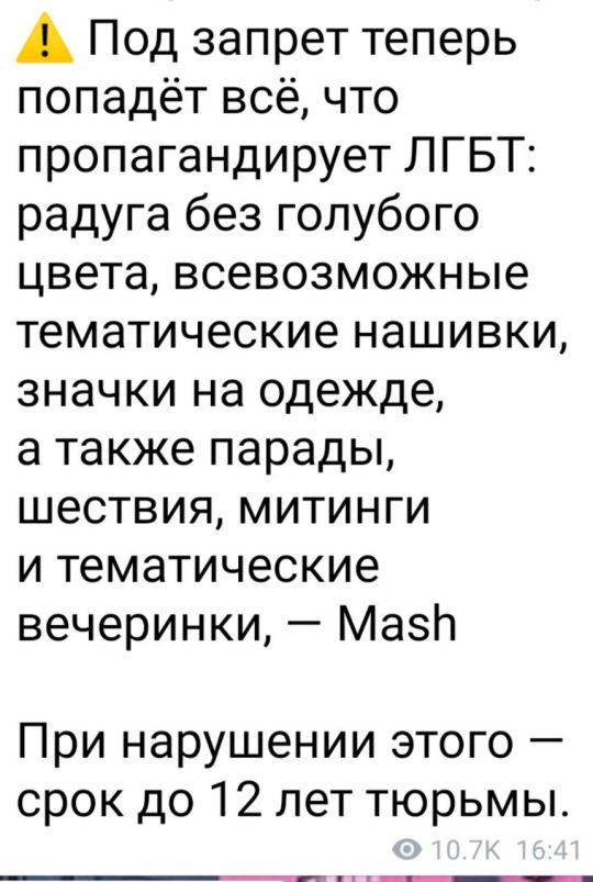
Everything that promotes LGBT will now be banned: a rainbow without a light blue stripe, all kinds of themed patches, badges on clothes, as well as parades, processions, rallies and themed parties.
For that - up to 12 years in prison.
Hi! What! Literal murder can get you 2 to 8 years in prison. Killing a man gives you less years! Hello! Can anybody fucking hear me!
Updating this post because. WELL. If anyone, ANYONE supports LGBTQIA in here. Even if they're the straightest people ever. THEY FALL UNDER THE SAME CATEGORY. LGBTQIA ALLIES ARE CONSIDERED EXTREMISTS TOO.

Moreover, everyone could get in trouble - even if the person isn't an activist or part of LGBTQ, but speaks out that LGBTQ people must have equal rights with everyone else.
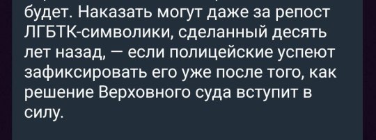
You can get in trouble for a LGBTQ-symbolic repost from 10 years ago - if the policemen can capture it after Supreme Court's decision will take effect.
And another update: this "law" will only be valid after January 10, 2024
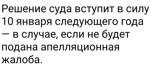
The court decision will come into force on January 10 of the following year - unless an appeal is filed.
#lgbtq#lgbtqia#russia#bloblopost#HELLO?????#I'll delete this later because it's not that. fucked up. if you consider that these very people decided that they needed#to wreak havoc on Ukraine#but rn the feelings of anxiety are almost on the same level as they were in the beginning of the war#upd. I'm not deleting the post but I made so many translating mistakes that it's embarrassing#Anyway. thank you to fellas who corrected me.
1K notes
·
View notes
Text

Bride of the Dragon King :: Prelude
[Sylus/Reader ★ 465 words ★ Masterlist ★ Series Index ★ AO3] Tonight, the wine tasted so sweet. A/N: I yapped on my tumblr about how I wanted a dragon!Sylus AU…so I willed it into existence. 😊 This is the prelude to a technically 3-part story. The main story will be a 20K+ word one-shot, so I feel justified in a shorter intro. I am still finalizing the main story, so I want to give people time to read the prelude first. While the prelude is SFW, the main story and epilogue will contain explicit adult themes, so it's best for MDNI. Influenced to varying degree by the Vietnamese origin myth, Lạc Long Quân and Âu Cơ, and the C-drama, Miss the Dragon…and probably a whole slew of other period C-dramas I watched in the past. Recommended Playlist Love and Deepspace - Wander In Wonder Shuang Sheng - 流转莹回 ☆ I can do a tag list for the main story once it's up. Just let me know in the replies, and I'll keep a list handy. ☆

Distantly, in the Celestial Realm where the immortals resided, the vast kingdom of the Dragon King was shrouded in nighttime for all of eternity, stuck within an eternal spring. Pink petals from the ever-blooming flowers of the magnolia trees were carried away in the warm breeze across the palace courtyard.
Sylus, the Dragon King, lazed under a grand magnolia tree with red blossoms overlooking a large koi pond, his solemn gaze lingering on the reflection of the full moon in the still water. He poured wine from a crimson porcelain bottle into the matching cup, and he took a swig of his drink, sighing.
The moon is lovely tonight… he thought, The wine tastes so sweet…
Red magnolia blossoms drifted down from the tree, landing in the water and startling the fish beneath, the immediate ripples distorted the reflection of the moon. Sylus kept his own crimson eyes on the floating flowers.
Little Snake, this is not much, but you are welcome to stay with me for as long as you would like!
He huffed in amusement, eyes drifting to a different flower.
You are so shameless. How can you ask a maiden to bathe with you?
He poured another drink, chuckling, but there was little joy in his laughter.
You are not allowed to get hurt! …Promise me you won’t get hurt again...
His cup lingered at his lips momentarily, a look of guilt flashed across his features before he tossed the drink back, sighing heavily.
Sylus…I don’t want you to leave…
He leaned back against the tree, eyes wandering to the moon. On the ground next to him was a necklace, its pendant pure gold with a jade border. Engraved on one side was the image of a dragon with wisps of cloud beneath it. When Sylus picked it up, his fingers caressed the other side, tracing the characters that formed the word, “Beloved.”
Another flower drifted into the pond, spinning slowly before it floated away.
…Who are you?
He closed his eyes, his hand tightening into a fist around the pendant as he made his decision.
He was going to rewrite their story. The red thread that tethered them together was going to unravel and lead her back to him.
All of it was going to be undone, and a new ending was going to replace all of the tragedies that were and were to be.
For her…
Heaven and Hell were going to bend to his will, he vowed.
For us…
As Sylus finished the wine, a white mist enveloped him, swirling before scattering and leaving nothing in its place beneath this red magnolia tree. In the night sky, among the millions of stars, a white dragon flew away, his scales shimmered in the moonlight before he disappeared into the horizon.
#love and deepspace#love and deepspace sylus#love and deepspace x reader#sylus x reader#love and deepspace fanfiction#lnds fanfics#x — fanfics#lnds series — bride of the dragon king#this story is eating me alive#and i blame you guys for enabling me (affectionate)#i'm losing my goddamned mind tumblr stop fucking up my formatting#idc idc this is what it's gonna be#if you see a mistake#don't tell me idc anymore i hate tumblr#the perfectionist in me is big mad#i can't have anything nice
337 notes
·
View notes
Text
You will stop for three seconds and appreciate Suzuki Sonoko. Thank you
#No combination of words can properly describe how much I care her. Btw#She loves her friends she cares for a bunch of grade schoolers she says dumb things she's a teenager she makes stupid mistakes#she's frivolous she's supportive she's normal about Kaito KID she's figuring herself out and I personally am insane about her#Ran's number one supporter along with Kazuha I'm betting she suffered so much before that godforsaken returned confession holy fucking shit#“why won't these two kiss already on GOD. Anyway Ran let's go do something cool together. Fuck that guy” typa shit#Girl you're the strongest avenger ily#atlas.exe#dcmk#detco#detective conan#suzuki sonoko
237 notes
·
View notes
Text
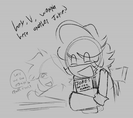
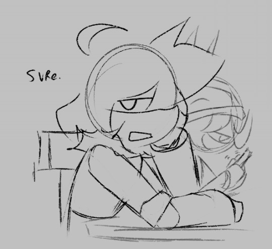
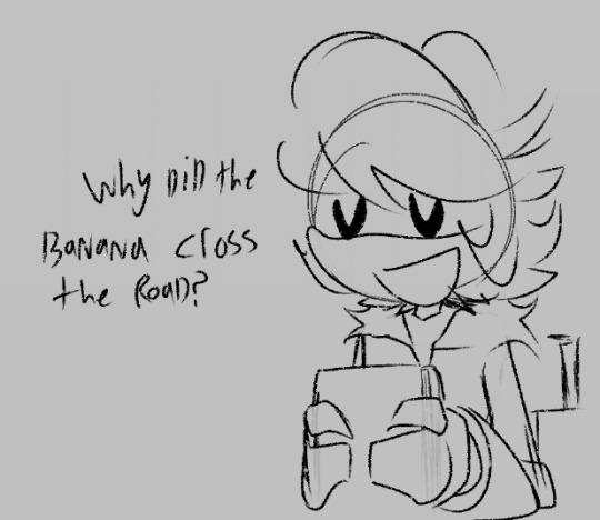
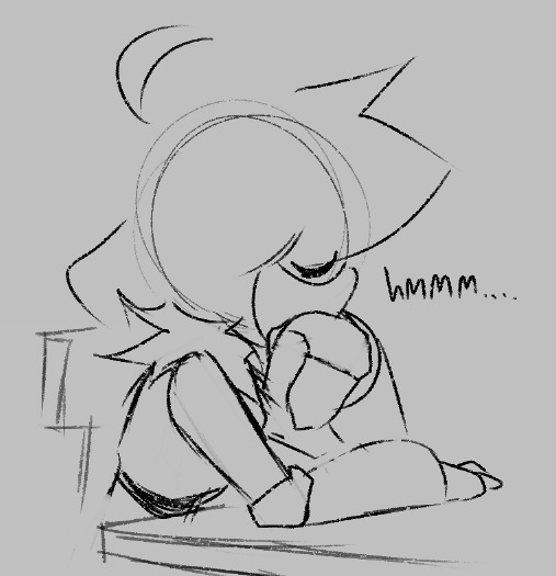
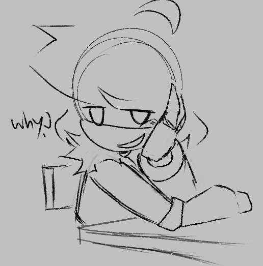
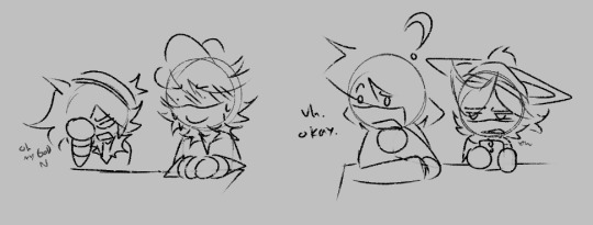
N tries to tell another joke (gone wrong)
Sequel to This
#if you see any mistakes uhh no you don't#yknow i am a huge multishipper and i love almost every ship in this fandom#but id be lying if i said i didnt find envy to be like one of the most romantic relationships in MD#like??#"Loving you is so fundemental to who I am that even when my brain is digitally lobotomized and I can't even remember why#like hello Liam Vickers yeah its me again why the FUCK would you DO THAT#I think even if envuzi wasn't actually canon. I entirely believe that you can't actually seperate them anyway#like it kills me that the entirety of Murder Drones. N and V are in love with eachother. like mutually#and they still are. and thats just how things are.#I'd go further but this is literally a shitpost and I don't wanna make the tags a mile again#I'm just a yapper ok. I yap abt the robots#anyway uhhhh this comic isnt even super envuzi but since its a sequel to the last one ill tag it. why not#murder drones#serial designation n#serial designation v#uzi doorman#murder drones lizzy#md lizzy#nuvi#violentbitingbiscuits#envuzi#vuzin#nvuzi#thank you to the person that made we aware of all the different varients of these threes ship name sdlkfjsdf#kinda in love w/ nvuzi cuz it doesnt look good as a word but it funnier to me cuz of that dslkfjsdf
279 notes
·
View notes
Text


spent the last couple nights watching the handplates (<- @zarla-s if you’ve never read it) comic dub with a friend of mine :-]

gaster ^
#EDIT: I JUST REALIZED I FUCKED UP WHICH EYE . IN THE THIRD PICTURE I AM FUCKING SO STUPID AUGHHH#that specific picture is an au where his left eye was fucked up instead ok? no one point out my mistake#i am clearly struggling enough here as-is#or we can say they accidentally triggered that fucked-up magic loop like as babies somehow before they were really aware of it.#and gaster somehow let this happen. i don't KNOW i'm embarrassed. i drew these at 5 am so everyone gotta be nice to me#undertale#sans#papyrus#gaster#handplates au#sketches#it is CRAAZYYY to me that the comic is like officially over. last time i watched Handplates Comic Dub was like.... 2018#and the comic officially ended in 2023 right? and it's now 2024 going on 2025#that is INSAAANNNEEE#every time gaster opened his damn mouth me and my friend were both like IS HE STUPID? for like. the entire duration of the dub#objectively untrue but also like. i mean. a little#i couldn’t really do the I AM 13 YEARS OLD comic because… he is like. two-ish maybe. and also an adult kind of#so i did what i could. LMAO
144 notes
·
View notes