#i'm just tired of 'style' being conflated with effort and visual appeal
Explore tagged Tumblr posts
Note
This isn't meant to be a hateful ask, but you should probably stop saying you've 'fixed' Rachel's art whenever you redraw comic frames. At first, I could see why your posts were titled that, considering they were just edits made onto a frame, trying to keep in mind the style of the comic alongside it (and let me say, you absolutely nail colors when it comes to your gLOw series, I use your notes for my own art all the time). But it seems like for your more recent posts, you're redrawing panels in your own style and saying that you've 'fixed' the frames. I'm not saying that you can't do that, redraws are a core part of the LO community. But it feels as if you're putting Rachel's art style down in favor of your own. For example, your recent post. Smaller necks and 'googly eyes' (big eyes with small pupils) are usually apart of LOs more cartooney style, they aren't something as bad as LOs men's shoulder to head width, or awkward hand and feet positions, etc. The point I'm trying to make is that you should probably start titling frames you redraw in your own style as that, a redraw, not 'fixing' someone else's art style
EDIT: oh god I totally went off with this, BIG apologies for the essay dump in response to a very simple ask, it's just a topic I'm very passionate about and am willing to talk about at really extreme lengths. I appreciate your takes on this even if I do disagree with them, I just don't make shit easy and I apologize for that 😖 😂
Oookay, so I'm gonna try and answer this as best I can, with as little curtness as possible, because I know you're asking it genuinely, but please understand that this is a topic that comes up a LOT in artist/LO spaces and I'm sorta exhausted with having to talk about it. Often times because it's approaching the argument with a very misconstrued idea of what 'style' is.
Ironically enough, before I get into this, I actually do have a post queued up for tomorrow already that's called a 'redraw' because unlike the panels I'm assuming you're calling out, I actually painted the upcoming ones for tomorrow entirely from scratch. I'm still trying to replicate the LO style, of course, but it's not trying to remain quite as faithful as my edits tend to be because it's meant to be a redraw in the true sense of the word like you're referencing. My edits are often just a normal layer on top of the original that I paint over, which is what the last few posts have been. My redraws are drawn from the ground up, backgrounds, faces, poses, etc. often times with the goal of re-compositing the scene entirely. The ones from the last couple days were not drawn from the ground up, simply altered over the originals - but the unfortunate reality is that some of them simply can't be accurately edited entirely due to the original composition being such a visual mess. That includes this one which was a struggle to edit faithfully without my own anatomical stylizations bleeding into it due to how janky the original was (IMO). Like, the original panel didn't even "look like LO", it's godawful, and it's a stretch to say I'm dissing Rachel's "style" when I'm fairly certain Rachel didn't even draw any part of that original panel, it's INCREDIBLY obvious two different people from her team drew it and there's no way of knowing whether or not Rachel was one of them. I did not touch Hades because he's not the problem with the panel. Hades as you see him in that panel is exactly how he was in the original, I merely tried my best to edit Persephone to look more consistent with Hades and less creepy.
Disclaimers over, let's get on with this.
So here's the thing - if it were a simple matter of "style", I'd agree wholeheartedly with you. I'm not about pitting artists against one another, we're all different people with different takes and inspirations making our own thing.
However, there's a difference between style and execution.
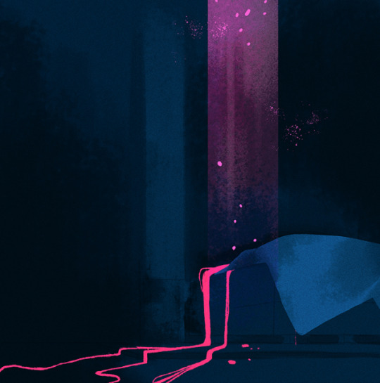
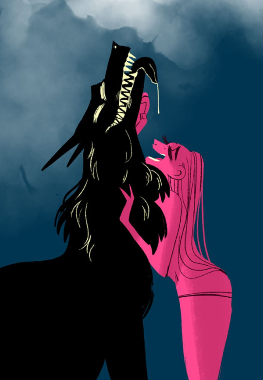
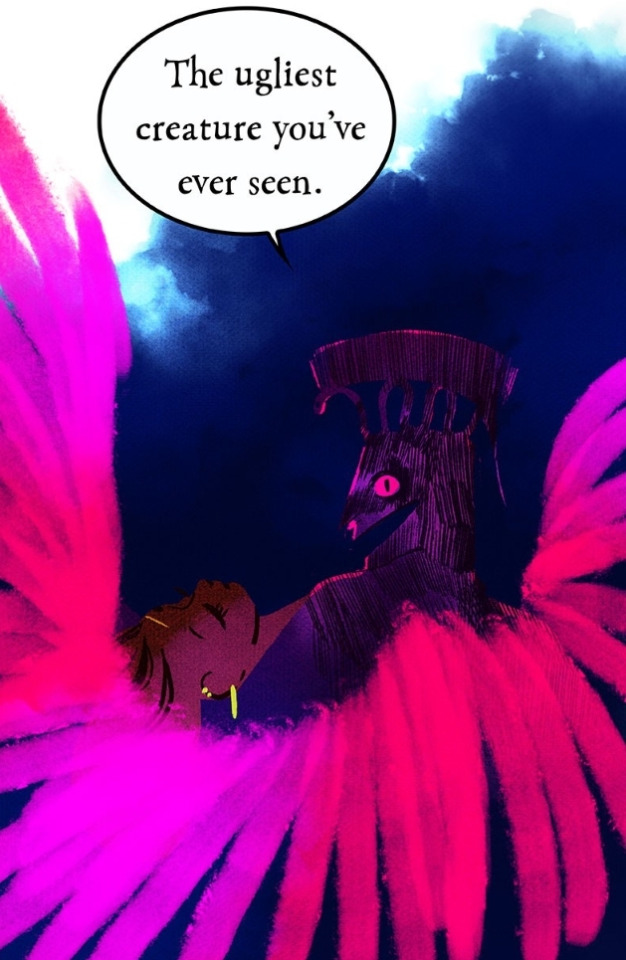
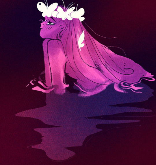
With full disclosure, I do not accept the argument that because LO has a more "cartoony style", then it's "fine" for it to very blatantly lower its quality in technical execution or turn into a cheap copy of what it once was. LO was never 'cartoony', it was more akin to storybook art, like something you'd find in old Disney concept art pieces or in children's illustration books. 'Cartoony' as in 'not realistic', sure, but definitely not cartoony in the way most people envision it or market it (like what you'd see in legitimate cartoon shows). The use of color was vibrant and had thought put into it, compositions were dynamic, lineart was only used where needed to create depth, and overall, there was a vibe to it that many of you can still recognize, it's what a lot of my blog talks about.
When I do these panel "fixes", my goal isn't to go "hey, my style is superior to Rachel's! Fuck Rachel!" Far from it. My goal is to analyze what made the original LO art so special and unique, and help preserve those elements in newer panels through key elements such as color choice, glow layers, composition, texturing, etc. many of which are elements that are outright missing from S2 of LO onwards.
Because, full bluntness, LO has zero effort being put into it anymore.
LO never had perfect anatomy and it's always struggled with creating a cohesive visual narrative, but it hid its issues well with a good balance of color choice, mood/tone, and lineart-less rendering. It wasn't meant to be some hyper-realistic comic, what set it apart were the colorful panels and vignettes and use of 'cutout' style backgrounds and foreground elements.
Stuff like this:
I have spent literally hours dissecting LO's art style, researching and hunting down its brushes, crawling the best and most recognizable color palettes, drawing and redrawing old panels in attempts to replicate Rachel's style and techniques as best I can. I'm not doing all that just to try and be like "I can do it better", more so to preserve what once was and could have been. Because I genuinely miss how old LO looked and so do many others. It's my own way of participating in a fandom that's being torn apart each week by the new episodes that only seem to further degrade the comic's original presentation and why people liked it.
Trust me, if I wanted to just draw LO in 'my style' as some sort of self-gratifying flex (because everyone in the art world nowadays thinks the only point in creating art is to have a "style" that they can pit against other "styles" as if styles are collectables like fucking Pokemon lmao), you wouldn't even recognize it.
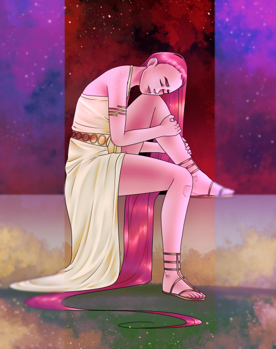
THIS is my "style", y'all. The only elements that I've purely taken from LO is the background and how I did the lighting effects along the side but everything else is my standard 'style' when I draw anything that's NOT LO, especially with my own comics and my day job.
"Style" is not a tangible thing, at least not in the way people nowadays tend to define it. Style is an accumulation of everything that's influenced an artist over years of practice, learning, refinement, and mastery. It is not something any one person can 'own' nor is it something that can or should be 'fixed' in and of itself. Just like how Rachel has adopted elements of her style from inspirations such as Glen Keane and Mary Blair, I've gotten my stylistic inspirations from anime, manga, video games, and other webcomics. Our styles and why we create art and who we create art for are completely different.
I have zero issue with Rachel's 'style'. At its core it's actually freaking gorgeous, when she puts in the effort. Not even just LO, take a look at her even OLDER art that's still available to sift through on her DA:


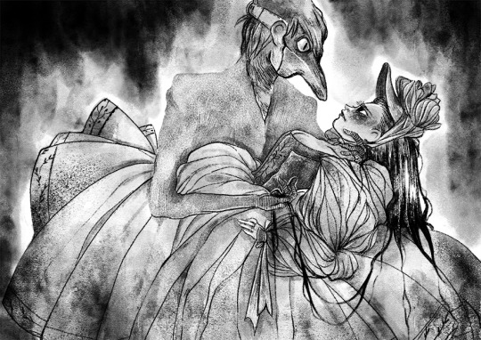
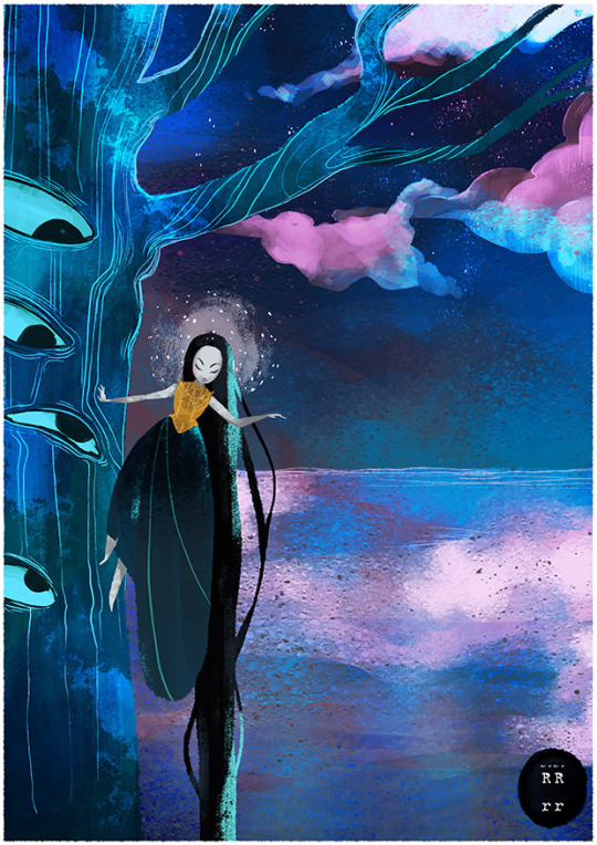
The issues I'm bringing up have to do with the execution of said style, how it's blatantly obvious Rachel doesn't put any effort into the art anymore and often has her assistants picking up the slack in a very disorganized manner that leads to disjointed, bland, weird ass art that often can't even maintain consistency between SINGLE PANELS, like this:
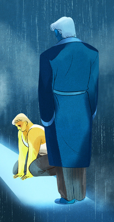

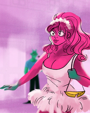

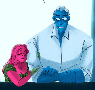

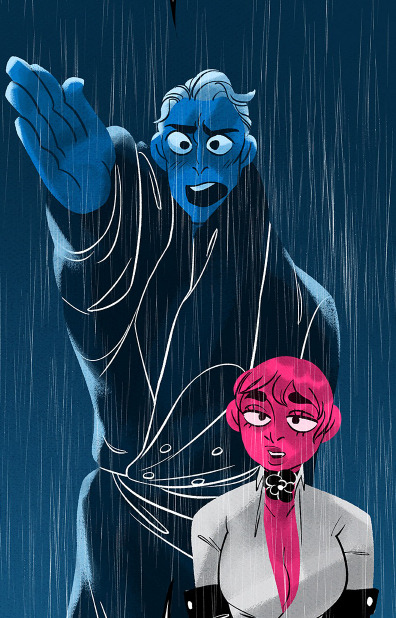


The magic is gone. These are not reflections of Rachel's capabilities in the slightest. She is far capable of so much more, this is beyond being a 'stylistic choice' and falls more under the implication of laziness or lack of care.
What's wild is that she's outright stated that she's "streamlined" the LO creation process to make it easier for new assistants to acclimate - which would be fine, if it weren't for the fact that 'streamlining' shouldn't mean 'downgrade'. There are plenty of ways to streamline the LO art style that can still retain the original charm of LO that drew people to it in the first place without cheapening it. It's not like LO is the only webtoon under strict deadlines, Rachel has more assistants than most working for WT and yet everyone else on the platform seems to only improve in their comic's production workflow and its presentation whereas LO has only declined.
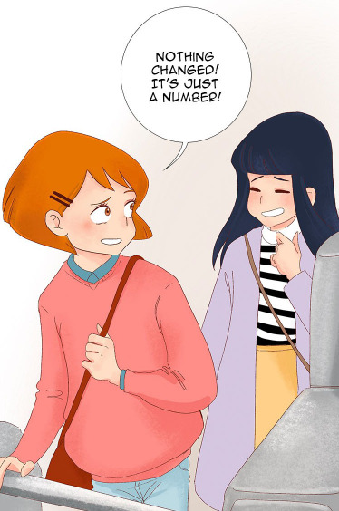

(The Kiss Bet, 2019-Present)


(Tower of God, 2014-Present)
Not every comic needs to make improvements this drastically, and technically LO didn't even have to make improvements in its original execution - but it's so far gone in the other direction that it begs the question, "Why do other creators and comics with less prestige and as many or less assistants compared to LO seem to make such bigger strides in the technical execution of their work?" Regardless of whether the style is erring more towards anime or cartoon or realism, 'style' doesn't make up for poor technical execution and lack of consistency. That's the same energy we get all the time from newcomers to the craft who reject any form of criticism towards their technique and understanding of the fundamentals with "THAT'S JUST MY STYYYYLE". Even many animators who predominantly work on cartoon productions still understand their fundamentals and utilize them in the creation of stylized pieces of work. This isn't even me questioning how much of the fundamentals Rachel knows because, again, she clearly has understanding of it in her older work, she just seems to have stopped caring or isn't doing a proper job directing her team.
I criticize the stick necks and googly eyes the same way I do the inconsistent body types, refrigerator shoulders and same-face syndrome because they're all things that are detracting from and lowering the quality of LO's art as a whole. They didn't always shade whites in the old episodes of LO, but they did often tint them to make them less jarring against the more vibrant colors. They didn't always color in the irises back in 2018/2019, but at least when they were just solid black pupils, they were actually drawn EQUALLY, vs. the solid pupils nowadays which feel like they're each on their own schedule and are never the same size or facing the same direction. They didn't always draw perfect necks and faces, but nowadays it feels like the heads are being stuck on sticks and attached to separate bodies that aren't even consistent with the characters' body types. All of these things are issues, there's no 'hierarchy' of problems, they're each a part of a much bigger lackluster whole.
When it comes to my own panel fixes/redraws/whatever you wanna call them, if they don't look enough like Rachel's 'style', that's either because we're failing to recognize what makes Rachel's art unique due to it being so watered down over the years, or because I'm just not doing a good enough job replicating it. Undoubtedly a little bit of both. I'm still 'adjusting' to a workflow that accommodates the LO style and how it looks. It's not exactly easy to just jump from one style (my style) to another without my own usual biases bleeding in (trust me, I'm not happy that there are people who know my usual art style who can still 'see' it in my LO art, because that completely defeats the purpose of what I'm trying to do lmao)
All that aside, we can't pretend that S1 LO's signature style is still being executed to its fullest potential in S3.
If I can be really brash here, there are WAY more egregious panel 'editors' out there who straight up are drawing stuff legitimately just in their own style. And they're still all great in their own right and get to the point of what they're trying to say even if they don't fit what you would define as a "fix". Don't bug me about mine.
Rachel's style in and of itself is gorgeous and unique. It's the lack of effort in the execution as time goes on that is the topic here. I can never hope to fully achieve that 'vibe' that so many people miss about 'old' LO because that was all Rachel and I can never fully capture the spirit of her work because it's hers, it's the accumulation of everything that's inspired and influenced her in her artistic journey.
What I can do is point out and design alternatives to the many errors, inconsistencies, and technical issues that tries to get it closer to that original look and feel of S1 LO that better reflected Rachel's original efforts. It's what it could potentially look like if modern LO art wasn't so disjointed among its scattered assistants and rushed with as little visible effort possible. It's what could have been if it didn't feel like Rachel has essentially given up.
Does it really matter how I specifically word my posts between 'edit' and 'redraw' in this context when both things are attempting to accomplish the same goal?
#thanks for the discussion#i'll always take a good essay op#i'm genuinely not trying to be a dick#i'm just tired of 'style' being conflated with effort and visual appeal#this is another ask that turned into a fundamentals of art rant#lore olympus critical#antiloreolympus#lo critical#ask me anything
86 notes
·
View notes