#i’ll redraw it someday i hope you don’t mind
Explore tagged Tumblr posts
Text
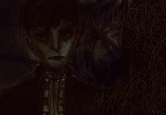
i had a vision but my skill level is too low for it and it’s also like 2am so this is all u get
#pathologic#pathologic classic hd#daniil dankovsky#eva yan#i am eepy#i’ll redraw it someday i hope you don’t mind#making the drawing dark so u can’t see the flaws#jk they’re still there#i’m gonna sleep now see you tomorrow
38 notes
·
View notes
Note
hey, it's me again! I came to pester you with questions!! *there should be a scary laugh, but it sounds more like mean giggles*
(by the way, I’m thinking about sending you such long texts with questions (because I have a lot of them!!) once one or two weeks, if you don’t mind. . . . . . .you don't mind..??? (god, I hope you don’t get tired of me..!) I'm so sorry, please, I'm just very interested!! *qwq*)
ok, let's start with the sweetest part, prelude. ACTUALLY, I DIDN'T EXPECT THAT YOU REPLY SO QUICKLY, GOD, NOT PASSED A FEW HOURS!!!!!! I THOUGHT YOU HAD TOO MANY QUESTIONS SO I DID NOT EXPECT A SO SOON REPLY!!
I’ll remind you once again how much I adore your work (after all, you deserve it!!), and I’ll also say that I specifically shouldn’t talk about posts tagged with the adm, because I’ve read your tumblr and twitter in its entirety several times, I even have a separate album in my gallery with answers that particularly interested me, there are several hundred screenshots there and I don’t regret anything! (sorry if my hyperfixation may be intimidating!!)
*=^._.^= ∫*
and now the questions!!!!
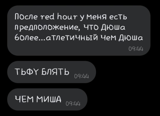
1. my wife doesn’t have a tumblr, but her suggestion interested me and can be seen in the first two screenshots(the translation sounds like: “after the release of “red hour” I have an assumption that andrey is more... athletic than misha. either this is because of ferry’s drawing style, or he really has such wide shoulders")so now we are interested to know about the physique of your characters!! maybe some of them are thin, or vice versa, a little overweight. and what about physical training? did you have any headcanons for this??? ( by the way, when I ask about “characters” I mean not only misha and andrey, but also europe and maya, because they are also worthy of attention <зз)
2. what about the abbreviation "dyusha" for andrey? in russian it is... not used very often, but still, it sounds very cute. so it would be interesting to know how you would feel about this? 3. I also want to hear about the names of the characters!! how did you choose them? I mean........ how did it happen that from ☺europa☺ you switched to 👹MiKhAiL👹?? (I'M SO SORRY, BUT MISHA'S FULL NAME SOUNDS SOMETHING THREATENING. MY UNCLE'S DOG HAS THE SAME NAME EHE- *ᕕ(ಥ▽ಥ)ᕗ*)
4. and lastly, let's return to my wife for another moment. she suggested that andrey was now also in a time loop. what do you say about that? and also in enigma, she noticed that misha seemed to be addressing the second person in the lines: "and if you wanted to be anything more than just free" and "you’ve seen a hundred lies I see that all the time". is this second person a viewer? or maybe one of the previously mentioned characters??
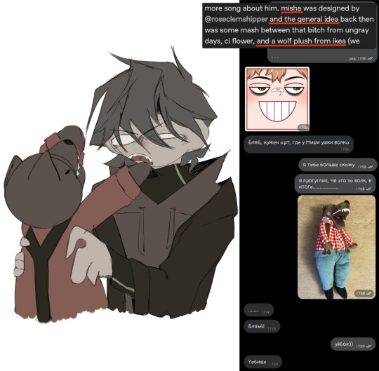
the last photo, by the way, is one of the sketches that I found so far in my gallery! ^^
initially it was planned to attach two sketches, but andrey turned out TOO bad, I’m ashamed to show him. someday I'll redraw it into something normal.... maybe. but! I really like the pic with misha and the wolf(I hope this is the wolf you were talking about lol. google didn’t show me anything else, and I’ve never been to ikea myself, ehe...)
(and I don’t want to post all this yet, because running a tumblr was certainly not part of my plans, haha)) I registered here solely to read your blog, and not to maintain my own)
sorry again for possible illiteracy, and also for the chaotic nature of my thoughts, haha, I don’t know how to adequately express them in english.. and also, I’m really REALLY apologize that the text was too long, next time I’ll try to be shorter...

okay im gonna try and answer everything here in a coherent way so sorry if nothing makes sense
im just fine with lotes of questions :) answering asks and responding to comments is one of my favorite things ever and i brings a verry big smile to my face
on andrei: i consider him to be a skinny little gut but not exactly unathletic, and in addition i think he would have basic combat training and probably be good with firearms. misha is probably a very average bodytype, nothing special, not particularly athletic.
i do not speak russian (though ferry has recently encouraged me to learn so maybe in like four years ill be able to form a sentence) so i dont know anything about the short forms so you can do whatever you want. if you coin it and peoples tart calling him that i will not stop it from happening
i do not name my characters, i usually let me friends name them (i think that the only one i named was europa and his partner). going forward maybe ill try to make it more cohesive
the time loop idea im seeing thrown around alot is really cool and while i havent particularly wrote any of my songs about that in general i see it fitting into the loose narrative i have going on. also in enigma misha is definitely talking to andrei whenever he says the word "you" but it could also be to the listener because the entire theme of enigma is 4th wall breaking and meta shenanigans like that
that sketch is SO CUTE oh my god
16 notes
·
View notes
Text
here comes the

man.
hello

adult man.
welcome

taxpayer.
(/ref)
there he is!!! he is here!!
dude i am SO excited because i have been trying for literal MONTHS to figure out a way to reconcile my headcanons for jareth’s different forms with each other and i FINALLY DID IT!!! i don’t know why it didn’t occur to me before, but at some point i realized that each form could just serve a different purpose or represent a different state of mind. (the art of his beast and goblin forms doesn’t really convey that, and i’m sorry. at the time i was working on them, all i was really thinking about was getting the designs down. i’m also not very good at conveying emotions on non-humanoid beings, but i’ll do my best to get better at that, so i can better demonstrate what these represent in the future!)
anyway here’s a more in-depth explanation. man at this point i don’t even know if this can be called a headcanon anymore because it’s kind of far removed from canon but i Do Not Care, i’m just hyped to share this because i’m really proud of the idea! /lh
in my mind, he has four forms, two (possibly two and a half) of which we see in canon. the route i decided to take was “what better way to handle a polymorphic BBEG than to write his forms like the phases of a video game boss?” so here they are!
Owl — This form can be considered a “phase zero.” Jareth typically uses his owl form to masquerade as harmless, travel between realms, and hide his true nature from humans.
Humanoid — His “first phase,” so to speak. While not usually used in physical confrontations, this form is used not only to dramatically reveal and show off his magical prowess but also to intimidate. This is his favorite form by far; it and the owl form are the only shapes he feels comfortable assuming. While not necessarily happy with his appearance as a humanoid, he finds it to be the lesser of three evils and prefers it over the next two.
Beast - Phase two, and the form we see a brief glimpse of in Masquerade. This form appears to surface almost exclusively in moments of panic or rage, serving as a sort of self-defense mode. To name some more specific examples, the beast form rarely, if ever, manifests itself voluntarily—Jareth hates it far too much for that, as it represents an undignified and wildly emotional side of himself that he isn’t ready to confront. However, it has been observed when he’s been physically threatened, his ego has been bruised by a direct insult, or a situation in which he’s had no visible options left has driven him to panic. In dire circumstances, the beast form may be used to flee rather than fight; eight feet tall at the shoulder, his long legs and quadrupedal gait make it easier to run away from an impossible battle.
Goblin - His final form—not necessarily a true form, as none of these are any “truer” or require any more energy than the others. However, if one were to face him in a proper boss fight, this would be what he reverts to after his beast form is defeated. In fact, the goblin form is symbolic of defeat. Shrill-voiced, diminutive, and usually angry, it’s this form that makes Jareth feel the weakest. It lacks the elegance or intimidation of any of his other forms, and its magical abilities seem limited to casting small illusions or doing things to avoid trouble rather than cause it. He only ever seems to assume this form when he’s been completely outwitted, and there’s no hope left of him winning. There is speculation among goblins that, if this form exists at all—all those who’ve seen it have been bogged before they could tell the tale—it may be used for covert dealings in who knows what. These suspicions remain unconfirmed, as Jareth—as you may have been able to infer—refuses to acknowledge the existence of this form.
im really proud of the art, but i’d like to redraw the second and third forms someday to be more expressive! i’d also like to improve things like shading!
also, in his humanoid form, i did my best to give him a distinct and expressive silhouette. this is why his hair curls in a way that resembles a pair of horns, and why i decided to use shape language for once (/lh). fun fact: that shape language was based on mettaton EX, and i regret absolutely nothing. i should clarify that his vest is slightly altered because in canon it’s so dark that i can barely discern the pattern on it, so i decided to draw it in a way that was easier
also the goblin form was based on @withinthecrystal’s hc that jareth would look like a firey as a goblin, which i really wanted to experiment with, so i did!
#labyrinth#jareth#jareth the goblin king#labyrinth fanart#art#my art#digital art#labyrinth headcanon
4 notes
·
View notes
Photo

I keep seeing HLVRAI OCs and I thought they were cool so I made one too! ..... Unfortunately.... I didn’t take it seriously.... I hope people don’t mind meme-y ocs esfdgfhg. Maybe I’ll make an actual serious one someday. If for some reason you wanna draw these two you have all rights to and if you do please @ me the art I’ll love you forever. Tube is a robot made to assess the neural pathways of a headcrab, which broke away from coding after the scientists died; though they think they are still following the orders they were given, after all; Enhancing the subject gives you more to Assess!!! They are “emotionally” attached to their headcrab subject, Refried Beans, even though Refried Beans is a beacon of hatred and would have killed Tube if it was possible. Tube sports a upbeat personality and literally cannot comprehend what is occurring, everything is fine and they will help you by continuing their research! Refried beans is an enhanced headcrab that now sports a screen on its face so Tube could show people what “emotions” it had. It’s always hatred. always. Refried Beans only knows hatred and wants to latch onto any living humanoid it can find. Refried Beans is a problematic character. I refused to actually put effort into this image since i lost the OG file and had to redraw it 100%, I apologize.
#hlvrai oc#hlvrai#my art#Refried Beans#Tube#I'm sorry all I bring to the community is horrible drawings and horrible ocs i'm sorry guys#I apologize if you expected any quality content here it's just hell!!! just hell!!!#i hope ppl dont get upset that this isnt like.... a normal hlvrai oc but is more crazy one ghgj
29 notes
·
View notes
Note
i hope this doesn't sound insensitive but it is oddly comforting to know that someone else feels the exact same way that i do. i can't stop thinking that if all of us feel the same way then that must mean that we're all wrong. i do find you truly beautiful and i understand the imposter syndrome and i know it doesn't work that way but there really is no place for it. filters don't erase or redraw everything and they don't change someone in a completely different person. i think that if you had the chance to sit down with someone who has the exact same body as you, you would find beauty in it and i really doubt you would think of them as a monster. i know how easy it is to exclude yourself from everybody else when it comes to self love and self acceptance but i am telling you right now and i promise you that a lot of people genuinely find you beautiful. and a lot of women would love to change place with you, and your body would make them happy.
thank you very much lovely. it’s something so difficult to understand, especially when i see myself everyday and just can’t find any beauty at ALL. something that i noticed tho, while looking at old pictures (when i was around 12) is that i wasn’t as ugly as i thought i was. i remember some pictures that back then i thought, fuck, i really am hideous. and looking back i’m like hey, you were ok. so hopefully i’ll get to that point someday with my current looks. i just feel more and more insecure everyday, especially now that i don’t have to show my face in public. the second the pandemic is over and we can take off our masks it’s gonna be so fucking hard to show my whole face. i just hate that i can’t be normal. like i’m just convinced everyone else is so much better looking than me and i’m like, the ugliest person in the world. for real. and i don’t think i’ll ever change my mind. the worst part? i feel like i’m completely ruining my youth. i’m too insecure to go out and meet people or even use dating apps, i feel like they’d be disappointed in real life. i just feel like everyone is always staring at me and thinking damn, she’s ugly, she makes me feel better about myself. like i feel people compare themselves to me when they feel bad about their appearance. and my brain will always tell me that’s how it is. and i honestly believe it. i’m so tired. and i’m so so sorry you feel the same way darling.
#sorry i’m ranting#i just. hate myself. so much. like so so much. it has completely ruined my life lol#and i just can’t sleep now :/#anon#asks 💌
2 notes
·
View notes
Photo

I’m coming with this drawing 100 years later, after the beginning of season 3. I was originally planning to finish it much, much earlier but life got in the way and I really need to stop making promises to myself to finish drawings on time because it never happens.
I know it’s late and ML salt had enough time to evaporate and given the fact that Tumblr Purge happened on 17th December, there’s a possibility that not so many people humour the idea of akumatized Marinette anymore. I get that, I’m probably the only person in the world who wants to see her getting akumatized and “Chameleon” trailer and the episode itself gave me so many ideas how it could go down. So despite all of that, I was determined to finish this piece and I’m happy that I finally had the time to do it.
Anyway, here’s my design for akumatized!Marinette - when I was trying to figure out all elements of her appearance, I couldn’t decide on her name. Eventually, I came up with totally unoriginal one - Dishonest.
I love the fact that Marinette has Chinese roots and it’s a real shame that the show never focused on that more than was shown in “Kung Food”. That’s why I decided to use Chinese symbols and culture in her akumatized design - it’s a part of her character that we technically never see.
Marinette in “Chameleon” was seeking mostly justice, firstly because of seating arragements made by her classmates without her knowledge, secondly because Lila was lying to everyone and getting away with it. That’s the reason I did some research on Chinese symbol of justice, truth and honesty. There are many of them but one caught my attention - Xie Zhi. In short, it’s a name of mystical creature that, according to some legends, was judging human souls by looking at them with merciless eyes that seemed to know everything. And Xie Zhi has also very interesting design - dragon head (with angry eyes), rhino horn at the top of the head, tiger legs, fur of the bear and scales. And I thought that it’s the perfect source of inspiration for my akumatized!Marinette design. Her crown is as high as the horn, the tunic underneath has a texture similar to scales, she has gloves with claws and lower parts of the costume are printed in tiger marks.
I know that this costume is a little bit over the top given all details and there’s no way it could pass to be used in the show. But that’s the beauty of fan creativity, right? And imo, it suits my other ideas for Marinette in akumatized form. I imagine that rather being agressive and dynamically moving akuma, she would have smooth movements, calm attitude and prefer to be static which would be more menacing and unnerving for others. But she still would be a force to reckon with in the fight since her long experience as Ladybug (unknown to others). If she sense the threat, she won’t hesitate to attack.
As for the weapons of choice, I went with fans since she would be more static akuma. But they would have a real purpose instead of being a simple decoration - she can use longer sticks as pins that she throws at someone who tries to escape her, escape the judgement, and freeze that person in place until she gets closer. Now’s the moment to ask - why does she have red eyes? Well, since Xie Zhi makes a judgement by using only its eyes, I figured that Marinette could force the ‘poor’ soul to reveal all of her/his lies and truths just by looking at them with fierce intensity. She can do that because her eyes are the same shade of red as the biggest jewel in the crown - that plus her eyes create a deadly combo that forces anyone to involuntary confess if she/he’s looking at it at the same time. It may seem not that bad unless you consider how harsh words and opinions can be heard from person that fell into Dishonest trap and how they can affect people around that person.
I also have few headcannons regarding Dishonest:
- Marinette’s transformation would be a long one because she would try to slow the process down, hoping that she would calm down before it could be completed. She would even have the time to run from school in the seek of a hideout.
- Hawkmoth would be impressed because no one delayed the transformation for so long and they would get into a really important discussion through their link.
- Tikki would disappear physically at the start of the transformation - I didn’t decide if akuma would go for Marinette’s earrings but I think that this whole mess would trap Tikki in Marinette’s mind.
- Marinette of course would target Lila first and she would have some heavy evidence against her, so it wouldn’t be considered a normal revenge - that would include Lila’s revealation in the bathroom but I don’t know how Marinette would have it recorded. then she would go for her dear classmates, except Adrien.
- at the mention of Ladybug, she would claim that LB won’t come this time to save the day and, to everyone’s surprise, she would pull out the Miraculous box containing earrings - but in reality, it would be an illusion to lower people morals that beloved heroine was defeated and it would instill a fear in their hearts.
- Marinette would hide from Hawkmoth the fact that she’s Ladybug and despite fighting Chat and taunting him about Ladybug’s absence, she still wouldn’t be 100% on HM side.
- Marinette would be strong enough to release herself from akuma’s influence, since there won’t be Ladybug to do it - which would create another problem since Hawkmoth would be definitely more interested in her and keeping an eye on her from now on.
I’m painfully aware that my art skills aren’t anywhere near perfection as some amazing artists here and I’m still learning digital drawing, that’s why I didn’t include all my ideas for this design. Maybe someday I’ll redraw it and actually include some quality lightning and textures of animals that Xie Zhi is made of. But I had to put watermarks on it, juuust to be sure it won’t be reposted anywhere.
#miraculous ladybug#ml#my art#marinette dupain cheng#akumatized marinette#akumatized!marinette#my design#thanks for coming to my ted talk
163 notes
·
View notes
Text
The Big Day
(Part 4..this might be the last, IDK🤷🏻♀️)
✌🏼Hope ya’ll like it.
Kiefer: *Casts Sonorous charm* I remember it like it was yesterday, after that first effortless duel between me...Oh don’t you roll your eyes at me, Merula. Almost everyone here from our year saw me beating your ass in that duel.
Merula: Shut up, Ledrick!
Mcgonagall: *Peeved* Language, Ms. Ledrick!
Kiefer: *Grins* Anyways, here I was, minding my own business, when suddenly this beautiful golden ray of sunshine pops out of nowhere and starts calling me ‘Hero’.

Crowd: *Stares at Penny* Ooooohhh....
Penny: *Thinking* What is she planning?
Kiefer: *Chuckles* Ickle firstie Ledrick, was struck speechless. The most popular girl in my year was talking to me. Me! Oh how I thought it was my luckiest moment when we became friends that day.
Kiefer: *Softly smiles and stares at the blonde* Of course, fifth year me would beg to differ and argue that my luckiest moment would be when I asked her out and she said yes.
Kiefer: Many many lucky moments soon followed after. Like the one after our OWLs and we took a walk by the lake? Pen, just so you know, when I gazed into your eyes that night, I felt even luckier. Because it was during at that moment that I knew that you were it for me.
Kiefer: Which...brought me here speaking in front of everyone. Today, I’m hoping to raise the bar higher and make it the luckiest of all the days I had so far.

Kiefer: *Walks towards Penny and offers her hand* Come up here with me, Love.

Kiefer: Without you, I’ve probably flunked potions—and I can see Snape nodding his head so that proves to all of you how abysmal I can be on that subject.
Kiefer: Moving on, Pen... Without you, life here would’ve been unbearable. You‘re my rock, my anchor...my own personal shining sun that luminates up my path and world. You’re everything to me to the point that I’ll do anything just to be with you and I can’t bear to think of any life worth living if there’s no Penny Haywood in it.
Kiefer: *Kneels* What do you say, love? Will you take up my last name? Will you keep me in line? Will you make me the happiest woman today and marry me?

Penny: *Starts to tear up* First of all Ledrick, no—
Kiefer: *Eyes widens*
Crowd: *Gasps*
Charlie and Barnaby: *Blanches and whispers* Our ship...
Penny: LET ME finish first! I’m saying no on the first question because you’re taking my name—
Kiefer: *Weakly smiles* —let’s compromise later...
Penny: Second, I’m not keeping you in line because I know it’ll probably be the other way around—
Kiefer: *Nods sagely* Merlin, yeah... You’d probably be the reason why I’m in trouble in the first place.
Penny: Lastly, I’m sorry but I can’t make you the happiest woman today—
Kiefer: *Starts to feel faint again* Uhm...
Penny: —because that title belongs to me. I’m the happiest woman right now because of this. Because of you. So yes...
Kiefer: *Shocked as her eyes starts to water* Y-You—*whispers* Yes?
Penny: *Nods as tears too slides down her cheek* Yes, Kiefer. Yes, I’ll marry you.
(A/N: Last photo seems shitty because it was what I drew first, others followed like weeks after. I honestly thought this post was a one time thing and not a 4 part mini comic. I might redraw it someday.)
#The Big Day mini comic#hogwarts a mystery#hphm#harry potter hogwarts a mystery#hogwarts mystery#hphm incorrect quotes#penny haywood x jacob’s sibling#penny x mc#jacob’s sibling#hphm mc#Kiefer Ledrick#hphm penny haywood#penny haywood#merula snyde#hphm merula#hphm snape#severus snape#hphm charlie#charlie weasley#hphm barnaby#barnaby lee
84 notes
·
View notes
Photo
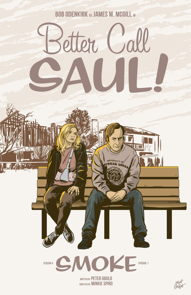
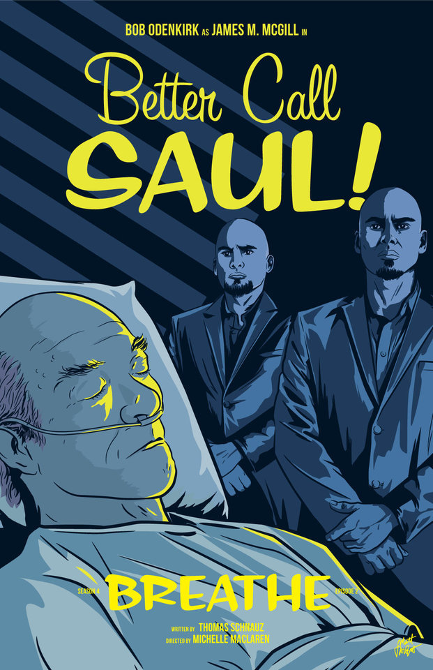
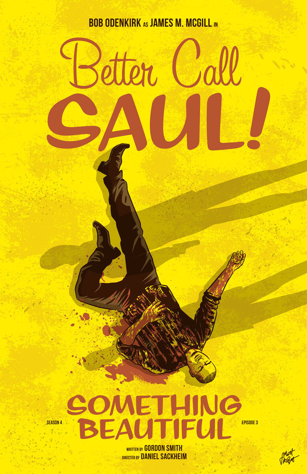
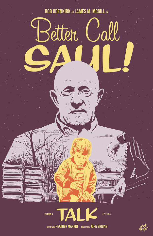
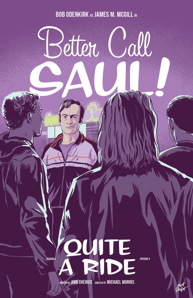
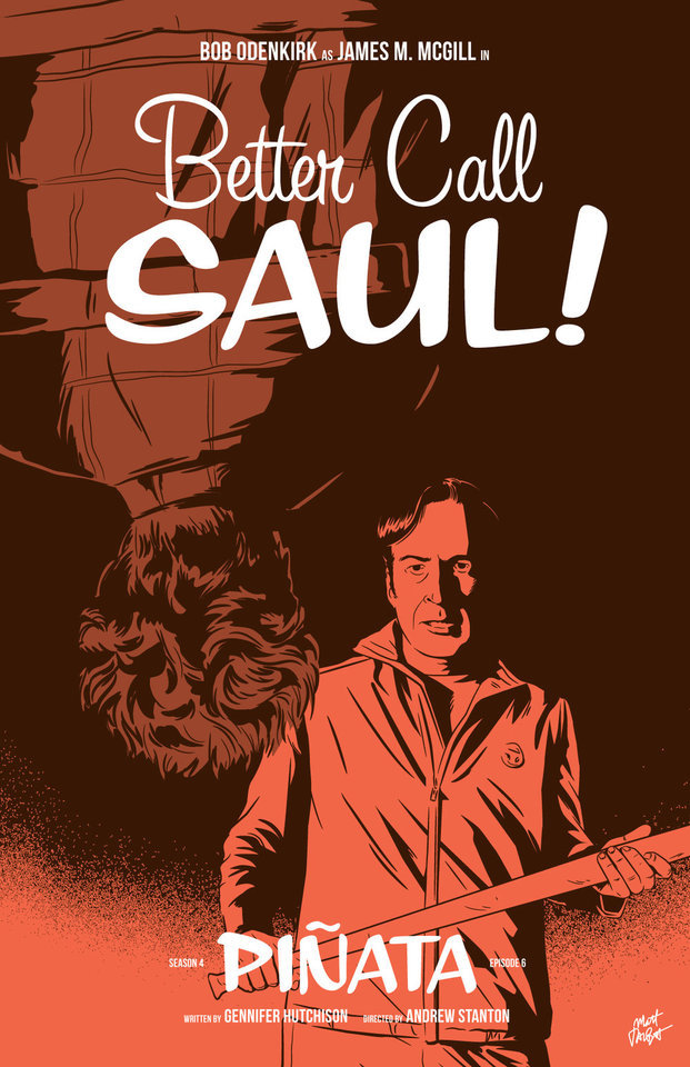

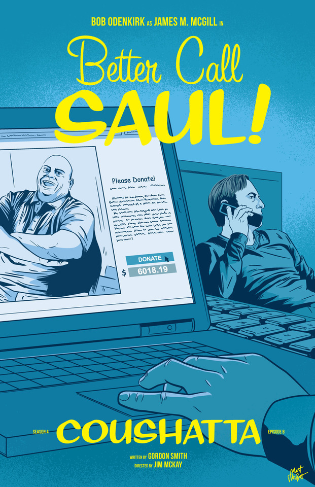
APPRECIATION & INTERVIEW
Better Call Saul episode posters by Matt Talbot After 4 nearly years, I thought it was time to catch up with Matt Talbot about his Better Call Saul poster project. The last time we talked during Season 1, Matt was deep in the hustle of making his name as an illustrator: juggling a full-time job, freelance projects, as well as band. Finding time for personal projects like this one can be a significant challenge. (Not to mention surviving the death of your tools: During Season 1 his Mac laptop died, and this season, his Wacom tablet bit the bullet). But despite these challenges, the 43-year-old New Hampshire native has persevered to create a clever and thoughtful series of episode posters that has garnered considerable attention, and brought with it new high-profile clients and art exhibitions.
First, congratulations on all of your success and recognition with this series of posters. It’s well-deserved. What’s been the most gratifying feedback you’ve received? Thank you! Every interaction I’ve had with anyone from the show has delighted me. I've been surprised by all of the cast and crew members who have said nice things – every note I’ve gotten has meant a lot to me. That being said, Michael McKean randomly tweeting at me that he has my poster for Chicanery hanging in his home blew my mind. I was eating dinner when my phone showed the notification and I literally jumped up from the table. I’ve been a fan of Michael’s since I saw Spinal Tap in the ‘80s and never in a million years would I have guessed I’d make something he valued enough to hang in his home.
Tell me about your contributions to Gallery1988 exhibitions. How does that process work? It's a pretty simple process. They invite me to be part of a show, and I make something to send them. I’m very excited for the opportunity to show there, and I feel like it’s a milestone in my art-making career.
Across the 4 seasons, which BCS posters are your favorites? Which one are you most proud of? I’m particularly fond of Rebecca, Rico, Marco, Switch, Sunk Costs and Something Beautiful. Oh man, it's hard for me to evaluate my own stuff. I tend to like the posters where I find a way to get a different take on something they did in the episode. I would say that “Sunk Costs” is also one of my favorites because I did something differently than how they shot it, and because Mike is so recognizable even from the back. I was also pleased with “Off Brand” because it was when I finally figured out how to draw Bob Odenkirk.
How has your process for creating these posters evolved over 4 seasons? When I started this project I had a vague idea that I would focus on scenes rather than portraits or likenesses, but that didn’t even last half a season! The characters were too good not to include. In that way, the posters have evolved in my willingness to draw characters, and also, hopefully, my ability to draw them.
My process is now something like: Watch the show on Monday; think about it on Tuesday, figure out what stood out to me and do a thumbnail sketch or two; draw it on Wednesday night; post it Thursday afternoon. I’m a bit faster at drawing these now compared to when I started. And I’m a bit more decisive on choosing which subject matter to depict.
There have been quite a few changes on the visual side of Better Call Saul over the last 2 seasons. New directors (Minkie Spiro, Daniel Sackheim, and Andrew Stanton), a new cinematographer Marshall Adams, even new cameras. What are your thoughts on how the show’s visual grammar has evolved? Has any of this impacted your posters from Seasons 3 & 4? I try not to just redraw literal scenes from the show, and I don’t need to tell you that they shoot the show in an incredibly beautiful way. I mean, they always, always, pick the best angle, the best shot to capture something. For that reason, it’s sometimes hard to to come up with another take on a moment from the show.
That being said, the visual style hasn’t really impacted my posters as much as the evolving subject matter has. The show, I think, is substantially darker than it was in the early going. It was easier to depict Jimmy’s hi-jinx in the first couple seasons. But with Chuck’s deteriorating mental state, the cartel stuff, Mike going deeper into Fring’s world and of course, Jimmy’s loosening sense of morals, the funny moments are harder to spot. That’s lead me to some more somber layouts and color choices.
We didn’t discuss this in our first interview. Which typeface are you using in your posters, or is this custom typography? The main logo and episode titles are set in Sign Painter, from the excellent House Industries.
The Heisenverse is known for it’s color theory and use of color. How has that impacted your color choices in these posters? I’ve kind of adhered to their blue=good/red=bad symbolism, but I also try to balance out colors between episodes and not repeat myself in sequential posters.
Many of your posters (especially ones this season) use a monochromatic, or simple palette of 1-2 colors. Tell me more about why you chose that approach. Is this a signature of your style? I’ve seen this approach in a lot of your work. You know, in the early seasons, I was trying to use simpler color palettes, but I wasn’t very disciplined and I got away from that. I’m trying to stick to a more consistent style in season 4. It is a conscious decision. I also feel like with the week-to-week nature of this project, it helps quickly set apart each poster. And, I really do love limited color palettes. Giving myself color constraints helps me figure out different ways to solve layout problems.
I’ve heard other illustrators say that Bob Odenkirk’s facial features are tricky to capture. Do you share that sentiment? Which characters are more challenging to illustrate? I do agree with that. I had a really hard time with him at first. I kind of think I have a better handle on it now, but I’m always trying to get better. I feel like if you can get his mouth right, it goes a long way.
I found Hector hard to capture both times I drew him. Mike, on the other hand, is just pure fun to draw. Jonathan Banks is so distinctive and iconic.
What’s been the most difficult poster thus far? Why was it challenging? Maybe it’s because a lot of time has gone by, but I can't think of one that stands out as having been really difficult.
Francesco Francavilla did alternate posters for some of his Breaking Bad posters. Inevitably, when artists look back at their work, they consider revising or redoing it because of a variety of reasons – their point of view has changed, their skill/style has evolved, or maybe they were never truly content with the final product. Looking back at 4 seasons worth of posters, are there any that make you want to scratch the revision itch? Yeah, more than I would care to admit. I would really like another crack at Amarillo. I know I could do a better job and that drawing is just super flat. In season two, I decided to to experiment with style and I kind of wish I hadn't. I like Cobbler, but I wish I had drawn it in my normal style. I would redraw Nailed for sure. Oh man, if I start going down this road it's not going to end well, so I'll just stop.
You mentioned earlier this season you were excited to draw Track Suit Jimmy. Who or what haven’t you drawn, that you are eager to illustrate? Howard! It bums me out to no end that I haven't drawn him, but it just hasn't worked out. And I need to include Kim more. It's kind of criminal that her face only appeared for the first time in a poster this season.
What’s your opinion of Season 4? Tell me about your favorites – episode, scene, character. I think season 4 is brilliant so far. The Kim/Jimmy relationship has deepened so much this season, and feels so real, but full of inevitable heartache. Oh, the flash-forward to Breaking Bad’s timeline was amazing. Mike doing his audit in the Madrigal warehouse. Really, anything Michael Mando does on screen. It's hard to pick. I so enjoy the deliberate pace of this show.
Where’s your favorite place to discuss the show? I honestly don’t talk about it too much online, though I lurk in a few places and read a lot. I actually discuss it mostly with my wife!
I know you get this question a lot, so let’s cover it here so folks understand: Do you have plans to sell any of this work online? I really appreciate that people like it enough to want to buy it or hang it, but I don't plan to sell the Better Call Saul posters online. I’m doing this for fun, not to make a buck off the show, and I don’t own the rights to sell it anyway.
What’s next for Matt? Do you have any other poster or illustration projects in the works? Is you band performing soon? I have several more pieces for Gallery1988 shows coming up. I’m pulling together an art show at a local brewery for whom I design all of their labels and stuff. I’m patiently waiting for a t-shirt I designed for one of my all-time favorite movies to be announced. And for the past several Octobers, I spent the month drawing a horror poster per day. I’m not sure if logistically I can do that again this year, but I’ll probably fit at least a few in. We’ll see how it goes. Sadly, with all of my illustration work, I haven’t had any time for music making, but someday I hope to get back to that!
Follow Matt: Web site / Tumblr / Twitter / Dribbble / Instagram / PosterSpy
– Interview by Shayne Bowman, Heisenberg Chronicles
#better call saul#artist interview#matt talbot#mine#heisenberg chronicles#illustration#fan art#posters#favorites#mattrobot#bcs season 4#gallery1988#g1988#house industries#sign painter
93 notes
·
View notes