#i wish i was good at drawing with full opacity brushes :)
Photo
Snail pace but we’re cleaning this up lil by lil...
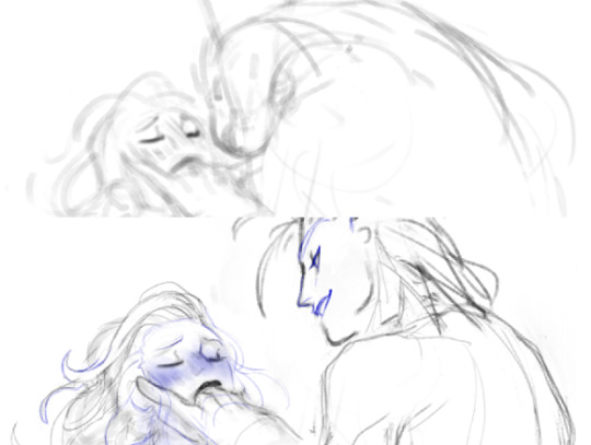
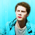
#sylvaina#Sylvanas Windrunner#sylvana#Jaina Proudmoore#jaina#istg sometimes i feel like a sculptor when i draw with this 'style' (more like this specific brush im using)#it takes so long to erase and draw lines bc i have to do multiple passes but at the same time it allows me lil bits of nuance#that I hate not being able to have (even if 80% of them are never gonna be notices and it's okay)#i wish i was good at drawing with full opacity brushes :)#my art#beary art
321 notes
·
View notes
Text


My Art journey so far! @snowglobe-system heard me constantly going "oh I wish I could draw" "If I could draw I'd draw..." And he kept going "then do it." He gave me access to a free art program (FireAlpaca if you're curious). I tried, it didn't work, but I kept it on my laptop. Then one day, we're talking about fursonas, and I say "hey! Maybe I can try that". So as we're having a sleepover, we're sat next to each other, drawing our furry little guys (@snows-realistic-warriors-designs if you want to see their art), I'm constantly going "Hey Snow, how do you do this. How do you do that" and constantly looking at their screen to get ideas on how to draw the body.
Each art piece I took on after that,gave me more challenges. I learned half the art process was "ah fuck, ah fuck... shit." and erasing. but I did it! I completed three pieces! if I get time, next year I might even join artfight!
More stuff under the cut.
With The first one, Flora the Fox the specific things I'm proud of:
the fashion
using the flower tool to put flowers in her hair\
using the opacity to get a better fur colour on the hands and feet
the freckles
the boobs
it's my first successful digital drawing in this era.
With Battle Axe Bee (Yes I know that's a great axe, I mixed it up in the beginning and now I can't change it) the Dwarf.
First humanoid
body type
I took a full hour detailing that cloak
another hour doing each individual flower
I discovered the oil paint brush and it's SO good for details.
I did hands!
I learned how to do shading on the eyes
With Nerali the Tiefling, Zyvan the High Elf, and Smith the Tabaxi.
I learned how to do general shading
hair details!
fur highlights!
the wolf bite on Nerali's stomach!
Nerali's outfit, seriously it slays.
Smith and Zyvan's outfits are really detailed, and Im so proud of that.
Drawing that cowboy hat took FOREVER.
getting Zyvan's pose right was a HASSLE. There was also a lot of reworking I had to do.
the grassy mound
the sky (I put stripes of colour, then blurred the shit out of it)
the clouds
Smith's tail
in general, this one was a lot of time and hard work. I started working on it June 28th, and while there were some days I took away from it, this still took like a MONTH.
#art#proud of myself#My art#digital art#furry#dnd#tiefling#tabaxi#dwarf#fox fursona#art journey#just do it#progress#anthro#furry art
17 notes
·
View notes
Text
tumblr character rate as opposed to twitter’s yada yada. something so magical about doodling mindlessly for 4 hours as an escape from a manic episode only to flip and get extremely upset at myself for drawing so unproductively, putting me squarely back where i started. i wish i enjoyed art but i really, really don’t. “i’ll never get good at art” is needlessly pessimistic and frankly an annoying sentiment but that’s genuinely how i feel and it pisses me off so much. when i’m doodling with brushes i like, using techniques i’m comfortable with, drawing things i’m familiar with, i’m being unproductive and stagnating (my second favorite art quote “you are becoming too comfortable; too complacent” -knight zhang). when i’m challenging myself, using full opacity no taper no texture round brushes, studying anatomy, replicating compositions, freehanding without skeletons, drawing boxes, i’m miserable and not having fun and i feel like i’m always doing it wrong. i cant even bring myself to watch as many study videos as i used to because im just not inspired to get better anymore. im not motivated. pushing myself anyway exacerbates that but it’s the only way i’ll get better. theres gotta be some magic stop sucking so bad at art juice but im not even sure id want to go looking for it because i dont care anymore dog this shit is so unfun and it produces just terrible results
0 notes
Text
quick comparison of free animation software
if you look for software comparisons you just get marketing copy and feature list. this is like my actual experience using them as a beginner hobbyist animator...
krita
Krita has a fantastic brush engine and painting features - which you’d expect since it’s a painting program first. I’ve basically always come back to it, albeit in a hybrid workflow with Blender (see below). This is a big advantage for e.g. painting backgrounds in the same file as the animation frames, or having more complex painted animation frames than you can do with cels.
Compared to the other software, Krita’s animation features are a bit limited, though not terrible by any means. You do have: onion skinning per layer, and a reasonably intuitive timeline for moving frames around on each layer. It can also play back and render frames pretty well.
However, there’s not really any option for a virtual camera, and you can’t really procedurally tween anything except opacity. The opacity tweening interface is also pretty janky (though this may be fixed in the latest version which hasn’t hit my distro’s package repo yet).
Their animation features are under active development and they seem to be aware of all the feature requests and issues, so I’m expecting this will see considerable improvement soon!
blender
I’ve been using Blender on and off for most of my life, and it’s one of the most impressive free software projects around - a generalist 3D suite which can absolutely rival Maya etc., and is running fairly close behind ZBrush with its sculpting features. In the last few years they’ve been heavily developing the ‘Grease Pencil’ system from merely a way to annotate projects, into a pretty feature-rich 2D-in-3D animation system.
Blender’s Grease Pencil is vector based: the Grease Pencil object consists of a bunch of strokes, whose opacity and line weight can vary along the length of the stroke. These strokes can also have fills. Because it’s vector based, you can edit the stroke and fill for many different lines at once (much like the materials system for meshes etc.). It’s possible to automatically inbetween these vector animations.
Blender’s 2D-in-3D system offers enormous potential, and I’ve seen quite a few animators starting to try it out. The big speedbump for me is that, with the way I’ve learned to paint digitally, I end up creating dozens of tiny little strokes to refine my lines gradually, and that is just not well-suited to a vector-based drawing system. If I’m going to animate in Blender I need to get a lot more confident in my lines, or get used to doing my corrections using the sculpting tools rather than partial erasing and redrawing.
It’s also a little tricky to work out how to set up the automatic stroke inbetweening - rather than creating a new drawing, it seems like you need to kind of push the strokes around with the sculpting tools, which is a bit fiddly. That said, I can’t say I’ve tested this thoroughly and there may be a way to identify two different strokes as corresponding to each other.
The huge advantage of Blender is that you have all of Blender’s other features. You can animate any property of any object with the full suite of interpolation options, you can place your drawings in 3D space and move the camera around, and you can trivially put together 3D objects for help with perspective (and indeed fully rotoscope off 3D animation if you so wish).
For these reasons, if I want to create a camera motion, my workflow has become: export my drawings from Krita, create a plane in Blender and set it to an emission material with my drawings as a texture, and move it around in 3D space. In short, I draw in Krita, and composite in Blender.
Then I render out the frames to images with Blender and turn them into a video using ffmpeg. (Blender can export video natively of course, which runs on ffmpeg under the hood, but I prefer the control over format you get using ffmpeg directly). This works pretty good, but it does rely on three different programs and leave a lot of copies of animation frames lying around my file system.
opentoonz
A few years ago, the proprietary animation software Toonz - notably used by Studio Ghibli - went free and open source in the form of OpenToonz. Since then it seems to have seen some improvements to its interface, and gotten some generally better documentation.
I haven’t tried OpenToonz nearly as much as Blender or Krita, so I can’t say what it’s like to use when you’ve familiarised yourself with its quirks. It supports both raster and vector animation, and it has a lot of the features I missed in Krita, like a virtual camera, and a lot more careful consideration of the difference between canvas and camera resolution.
I didn’t switch to animating in OpenToonz though, because its drawing tools are, well, not great. For some bizarre reason you can only adjust brush size in integer increments, and there seems to be a hard floor on the thickness of line you can draw. This may not be the case in vector mode, but I wanted to touch up some frames I’d drawn in Krita so that wasn’t really an option.
I wondered how people can possibly animate like this... and the answer seems to be that they mostly don’t draw in OpenToonz. Studio Ghibli still does all their drawings on paper, and indeed OpenToonz has a lot of features for cleaning up scanned pencil drawings and even converting them into vectors which suit that kind of workflow.
I tried out the vector conversion on my drawings, but the results weren’t great for ‘high frequency’ areas like fingers and toes. I also couldn’t figure out how to do some of the features I was looking for, like non-destructively moving a previous frame so that I could use it for tracing (a feature that apparently exists in paid software like ToonBoom).
So it seems that if I want to animate rasters in OpenToonz, I’d need to draw in Krita first and then import - essentially using it like I’ve been using Blender. And it didn’t seem to offer much greater ease of use than Blender (OpenToonz insists on copying your frames into its rigid project format), so I stopped there.
overall
Unfortunately, none of these programs quite reach ‘everything I need in one program’ (like ToonBoom or similar proprietary animation programs). Mind you, if Krita continues to develop its animation features, or I get used to drawing in Blender, that could change. For now I’ve gotten pretty far with Krita and Blender so that’s what I’d recommend if you wanted to follow me down this road... ;)
6 notes
·
View notes
Text
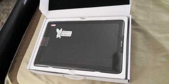
XP-Pen Artist 15.6 Pro Drawing tablet with Screen Review
XP-Pen Artist 15.6 Pro Drawing tablet with Screen Review

I'm a artist who is getting into digital art because I really liked drawing , but wanted something better, both with hardware as well as software. I considered the iPad Pro but feared the price and that iOS would ultimately frustrate and limit me. The Wacom Cintiq 16 is also more expensive. Ultimately I decided on the 15.6 Pro.
XP-Pen Artist 15.6 Pro is the newer model of the Artist 15.6 , but with pen tilt Support , The tilt function ensures that the accuracy of the pen remains the same when tilted, offering a real and natural drawing experience.
Artist 15.6 Pro has been used 120% sRGB in the device to give you more vivid, clear and sharp color quality that also enhances the accuracy of any image.
It has greatly improved on parallax, New optical bonding process that greatly reduces parallax , becuse of new Technology their has No Air Gap.
Compared to the Artist 15.6,the Artist 15.6 Pro features 8 fully customizable shortcut keys and 1 Red Roller Wheel which puts more customization options at your fingertips to suit you preferred work style, allowing you to capture and express your ideas easier and faster for optimized workflow.
Specifications:
Display Size: 15.6″
Aspect Ratio: 16:9
Shortcut Keys: 8
Roller Wheel: 1
Pen: P05R Battery-free Pen
Pen Pressure: 8192 levels
Tilt: 60 degrees
Report Rate: ≧200 RPS
Display Resolution:1920 (H)*1080(V) pixels
Display Color Gamut:120%sRGB
Resolution:5080 LPI
Visual Angle:178°
Input Device:USB
Reading Height:10mm
Response Rate: 25ms
More details: https://www.storexppen.com/buy/artist-15_6pro.html

Package Contents:
XP-Pen Artist 15.6 Pro tablet
XP-Pen P06 battery-free pen
Pen case
Combined cable
USB type-A extension cable (for power)
USB power adapter
Outlet adapters for international power outlets
HDMI to Mini-DisplayPort adapter
Pen nib replacements x8
Anti-fouling glove
Screen cleaning cloth
User manual
Warranty policy and warranty card
Design
XP-PEN Artist 15.6 Pro has 3 buttons along the side which are for power, brightness up, and brightness down. The tablet comes with a pre-applied screen protector which has a very minimal amount of texture.
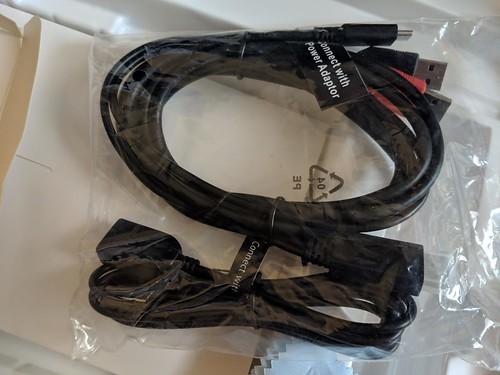
The boxing and packaging is very nice and rather professional looking. There is just one cable for multiple ports(splits from one to three with the one cable as seen in the picture).
The power button will glow with a dark blue light to indicate that the tablet is powered on.
It’s very nice that tablet comes with a stand but it’s not adjustable.
The IPS Screen
The tablet has a 15.6-inch IPS display with full HD resolution (1,920 x 1,080) . It has pairs a superb color accuracy of 120% sRGB 16.7 million colorswith 178 degrees of visual angle.
The screen is awesome, clarity and colors look nice. Using the default plastic nib works great on this new surface, and feels more like a traditional pencil on paper to me.
The screen has a textured matte film over it this is to give your pen more grip and improve control when drawing.
Artist15.6 Pro adopting full-laminated technology, seamlessly combines the glass and the screen, to create a distraction-free working environment that's also easy on the eyes.
If you push hard on the screen it makes some waves, not very noticeable.
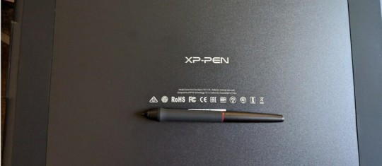
The Stylus(Pen)
With the pressure of 8192 levels, 5080 LPI and 10mm sensing height- the pen is very sleek and makes your drawing natural on the screen as it intensely senses and analyzes every movement.
Stylus (P05R) supports 60 degrees of tilt function, allowing it to easily and quickly sense the gesture movement of the stylus to ensure accurate imitation of a real tilting brush effect.it’s a battery-free device, even with large complex Photoshop brushes or sculpting with high res stamps in 3D, is minimal to the point of non-existence.
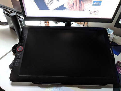
The Roller wheel and 8 express buttons
There are 8 programmable buttons and a Roller wheel. the innovative Red Dial interface breaks through the traditional pen display design for optimal efficiency.
These can be used at the fingertips, can be scrolled, zoomed in, etc.
The buttons are amazing, the round ring in the middle, The scroll wheel can be programmed to control three different parameters (such as zoom, brush size, etc). And the customize-able physical buttons have nice tactile feel.
The buttons are completely customize-able to whatever hot key you want, and with the conjunction with custom on screen buttons, you'll be able to work comfortably without a keyboard..... at least with programs that are designed to be simple for tablets, like Sketchbook or Painter. Even with these keys, I don't think you can get away using Photoshop, or zbrush etc. I think some programs are just too frustrating without a keyboard.
I wish the middle of the wheel was a button but serves no purpose.
The drivers
The driver download is done through their site online.
The XP-Pen tablet drivers are extremely easy to install. Just go download the latest version directly from XP-Pen’s site and remove all other tablet drivers you have on your computer before installing it.
The XP-Pen driver is a simple one page driver with all the important settings in just one window. Here you can set the pen buttons and pen pressure, and choose which monitor the tablet maps to.
I did not need to change any of the default settings as the tablet worked very well with the defaults. I also did not need to calibrate the pen because the cursor properly appeared directly under the pen by default (which surprisingly isn’t the case for some tablets).
To date, the drivers have worked fine with the programs I use most: Adobe Photoshop and Clip Studio Paint.

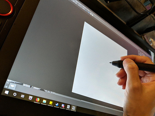
Drawing Experience
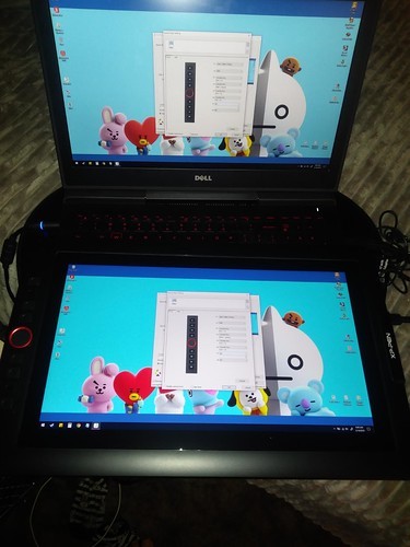
Artist 15.6 Pro was fantastic. It was also very portable so I could bring it with me to libraries and give demonstrations.
On Photoshop , the program recognizes stylus tilt. This allowing you to vary opacity with pressure, but line thickness with pressure tilt. It took me a good hour to get used to using it, it's a bit different than using a real pencil, but I now love it. The line weights, and the look of the pencil lines, makes it feel more like traditional pencil and paper.
Conclusion
XP-Pen Artist 15.6 Pro is an ideal choice among professional artists who love drawing and painting. This device is the best way to step into the digital canvas world. Now you don’t have to worry about colors, brushes, sheets, and pencil anymore, just pick this piece, keep it in your bag and move ahead to the world of art.
They have designed a protector that seems to fit into the premium product space in terms of functionality while keeping the cost to a minimum for beginning artists.
Although this is a bargain of $400, but I am very satisfied with its performance.
Overall, I'm very satisfied with my purchase, and I highly recommend it to anyone looking for a mid-range pen display tablet.
In case you don’t want Pen tilt function, or want to save few bucks and get the Screen drawing tablet for cheaper, it may worth it to check out the previous Artist 15.6 model. Which have similar features, like the 8192 level of pressure sensitivity, the HD screen. And the pro pen with 8 replacement nibs.
If you want to learn more about the Artist 15.6 Pro, check out the link below:https://www.storexppen.com/buy/artist-15_6pro.html
1 note
·
View note
Text
another icon tutorial
so the poll was pretty 50/50, so most likely i’ll make a gif tutorial at some point soon.
please leave any questions or requests you have in my inbox!!
i’m not the best at explaining so bear with me lol
general method
so i’m going to show you how i make these kinds of icons:

tutorials under the cut.
i try to be trendy and give cute tip sections:
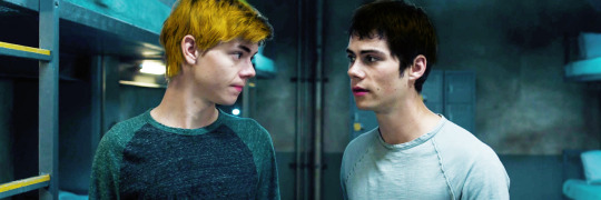
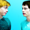
a huge tip would be to make sure your screencap is hd quality. i get my screencaps from (x), (x), or just googling ‘___ screencaps’. remember kids, always pick good quality screencaps.
here is our screencap! two fresh ass beautiful boys, we love a couple
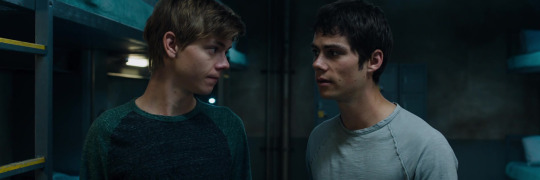
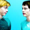
i use a psd for headers, but for icons i tend to just color them myself. i use curves, color balance, vibrance & sometimes a white color fill set to soft light. maybe even some selective color to brighten the neutrals and darken the blacks.
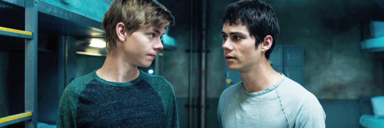
now it’s time for my personal favorite part, coloring the subjects. i take a small brush with 0% hardness in a new layer set to multiply and paint over thomas’ lips. i draw over his eyebrows with a black brush set to soft light. then a brown brush set to multiply or hard light over his hair. :)
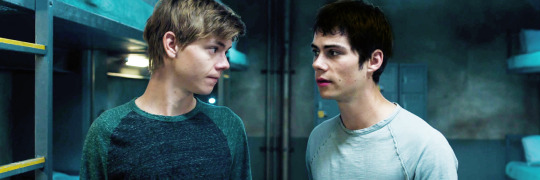
i do the same for newt now, albeit different color choices.
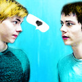
next i crop the image, my icon dimensions are 120x120! you could use 150, 100, 200, but my go to is 120.

now i create a solid fill layer with the color of my choice, i add a layer mask and brush black over the subjects so they’re visible. i then take a white brush with 50% hardness and brush around the subjects until it looks like this.
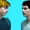
i add a black and white gradient fill, set it to soft light, and angle it at 68.2.
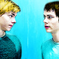
i create a new layer and set it to color, then i paint over thomas and newt’s shirts with the same color i used for the background. then i duplicate the layer and set it to soft light.
and you could easily leave it there with a nice, perfectly good icon, but i like to add my own details and textures and stuff to make them more personal :)
(here is where we go full on crazy, windows vista is quaking in a corner, this is too bright for me to handle bitch what are you doing)
i add more curves, up the vibrance, brighten the image with selective color. (remember to keep darkening the blacks so the icon doesn’t look washed out), keep in mind that all your coloring should be underneath the solid color fill layer. i also duplicate some of the coloring layers i made, such as the hair layers and lips.
this is a lil trick that i use often for darker icons and picspams, it gives a nice glowy look that i like a lot. i zoom in and take a small white brush set to soft light, and paint over the highlights on their faces/hair.
sometimes i create a new layer, set it to screen, and take a big light blue brush and just click lightly where i want there to be more light. but i don’t need to do that for this icon.
i try to be trendy and give cute tip sections:
PSA; always color your icons to fit the lighting!1!! normally in tv shows we get shitty, dark, blue/yellow lighting that looks grainier than a 1950′s tv set. you need to be stealthy and work around the lighting. color balance is your best friend when it comes to yellow/blue lighting. here are some good coloring tutorials to use as techniques. (x) (x) (x)
i take this texture, add a b&w filter to it, set it to soft light and create a layer mask to remove the texture from their faces.

now, u could add lil doodles to it like this;
or you could just leave it as it is. i now convert (only the screencap) for smart filters, and i use a sharpening action (i wish i could remember who made it!! i don’t remember).
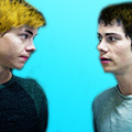
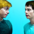
and boom, that is how i make most of my icons.
here is my result:
fancy/longer method!
this method is for when i take twenty years to make one icon, usually for when i make my mobile themes or a request.
examples:
and this will be our result:
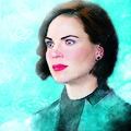
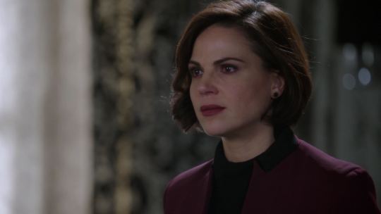
so we have our screencap, i’m using one of regina mills, one of the great loves of my life.
now we do the coloring process i used for my last icon. curves, color balance, white color fills, gradient maps, vibrance, etc.
i follow all the previous steps that i mentioned, the hair and face coloring, changing the outfit colors, cropping, solid color background.
i try to be cute and give trendy tip sections:
tip, follow the curves of the subject’s hair when coloring the outline/erasing the bg!! it just makes the icon look nicer and it flows better. sometimes you can even create your own waves.
next, add the gradients. i use an angled b&w one and then i use one matching the bg layer and angle it where the light would hit regina. i set it to screen, and use a layer mask to remove it in areas i don’t want it.
(just play around with gradients. they can rlly make or break your icon)
here is when i start messing about with lil details. i start highlighting her face with a small white brush on a layer set to soft light to make the icon stand out more, and i even take a tan colored brush (set to multiply, low opacity) and brush around where the shadows hit more; her jawline and where her hair looks darker. look at the difference
here is when i go full whack and add more curves, brightness, saturation, color balance, bring out more of the blacks with selective color and duplicate some of the coloring layers.
now i add various textures, specifically watercolor textures from this pack. (i set them to soft light and using a layer mask, remove the texture from her face.)
now, i usually google ‘tumblr cloud overlay’ or something and add them to my icon. i’m using these three specifically:
(i use them as gifs for headers, but that’s a different process. for icons i just place them over my image like another texture.)


now just duplicate any layers as finishing touches, sharpen, save, and you’re done!
(you could also change the green-blue to different colors.)
main tips;
always keep your screencap coloring as natural as possible until after you’ve added the color background, that’s when you can go crazy and go as far as you can with vibrance and brightness.
different scenes work with different techniques. you can’t follow one coloring tutorial and use it for everything, you have to keep the steps in mind and just merge all the knowledge together.
highlighting with soft light is such a nice detail!! it rlly adds to the soft glowing look
textures are the love of my life! i have a huge folder saved with hundreds of different ones, but i can link you to some that i use a lot. (x) (x) (x)
practice!! icons are fun to make and should be an enjoyable hobby, the way your icons look will progress over time. tutorials are just helpful along the way :)
#icon tutorial#ps tutorial#icons tutorial#ps help#mine#my tutorial#idk if i did a good job at explaining??#hopefully i did
57 notes
·
View notes
Text
AMA Transcript: Leap Year
Next up, @blinkfl0yd, @ahshesgone and @innocentcinnamonbun stopped in to answer questions about their Resbang, Leap Year! Here’s some of what went down!
*Please be advised that this AMA contains one (1) small spoiler for the unpublished part 2 of Leap Year :)*
Q: My first question is for Inno and Ash! How did you choose which scenes you wanted to draw! :)
Inno: Ahh I usually like to draw scenes that have a big emotional impact or are just really funny (Which a lot of scenes in Blink’s story made me laugh out loud pretty hard) I also like to make book cover-like pieces for Bangs I do.
ahshesgone: Ohhhhh I was so in love with that first scene with Spirit and Maka, I HAD to do it, because it set the tone so perfectly for both of them. Then it was mentioned that Blair babysat Maka and I Had To also, bc that right there was a dream I had and I realised it when I read it, and Stein and Marie were just impossible to pass up. Blink writes so vividly, I would draw forever if I had the time.
Q: What was the inspiration behind this story? I always love stories about the adults and we get them so rarely!
BlinkFl0yd: Honestly I just really like the adults haha, I just thought they needed some love. I'd been playing around with a college AU for the adults probably since before Resbang was announced, but I think the biggest thing that kind of inspired where it was going to go was probably learning about anesthesia awareness?? Which is pretty much exactly how it sounds and is actually really terrifying and made me think of Spirit and Stein which is pretty much what kickstarted that whole plotline. So that was sort of the basis for the whole fic. After that it was just... coming up with different shenanigans. The horse head was totally a spur of the moment thing.
Q: This one is for everyone: did you guys have fun working together? Was there a lot of communication? :D
ahshesgone: I really liked working with both Blink and Inno!! They're the awesomest. I guess we could do with more similar timezones though, tbh.
BlinkFl0yd: Oh gosh seconded. ash and Inno are so cool and so talented and it was so much fun working them them.
Inno: I had such a blast working with ash and Blink ;;;u;; <333
Q: Was there anything that you wanted to add but couldn't? Or anything that originally wasn't going to be there that ended up going in?
BlinkFl0yd: So the thing is, as a result of splitting it up for Resbang, I now get to sort of rework some concepts that I had to originally cut out because of the time crunch. I think the biggest thing is that I originally had a whole plotline planned out for Medusa and White Star that I had to cut out or rework for sake of time, but now I get to add it back in and I'm really excited.
Q: bb Maka is SO CUTE AND I LOVE HER, how did you go about characterizing her?
BlinkFl0yd: Oh gosh yes, baby Maka was fun but difficult. I have no idea how children work so…
Q: Yeah like, you didn’t make her too babyish which is a problem I see a lot when people write kids.
BlinkFl0yd: I am honestly not very good with kids, but yeah, it does irritate me when people write kids super babyish, I deadass once read a fic where a ten year old was still making baby sounds and even I know that that is Not Right. I think that's the one thing that helped me with baby Maka and the rest of the kids.
Q: Favorite character to write and favorite scene to write?
BlinkFl0yd: It was a lot of fun to get into Stein's head, and I also had a lot of fun writing Blair's appearances. I also enjoyed Sid a lot more than I thought I would, and Nygus.
Inno: You wrote Stein so well, it made me cry tears of joy.
ahshesgone: Omg I loved them both so so so so much. [And] OH MY GOD Azusa.
[there is much joyful screaming about Azusa]
Q: Artist chans, what was your arting process like once you decided what you wanted to art? I think you both did digital, but I bet there are a lot of differences in how you work!
ahshesgone: Hmmm well my process for these ones was pretty all over the place. They were all started around the same time but I finished all of them at different times so I think all of them came [out] looking pretty… dissimilar? I wish I had made the Blair one look less digital because I think that's what I needed for my art for Leap Year, for it to look??? tactile?
BlinkFl0yd: I honestly cried a little when I saw the first draft of the Spirit and Maka picture.
Inno: Ahh I lay out a gesture sketch, then a normal sketch, then I lineart the sketch, fill the whole canvas with a color that pertains to the mood of the piece and use a low opacity brush to lay in colors then just start blending colors from there to form lighting and shade. After that I sometimes air brush some more color into the piece. :,) Other pieces I just color in the lineart and add basic cell shading :,,) I hope I answered right :,)))
BlinkFl0yd: BOTH OF YOUR ARTS MADE ME CRY A LITTLE.
Inno: Couldn’t have made it without such an outstanding source material blink ;;u;;;;
Q: For all of you, do you think Resbang helped you hone any skills/get better at something, maybe something you decided on trying to work on or something you surprised yourself with?
BlinkFl0yd: Honestly, yeah. I've never never actually worked with other people before for a fic, I've never even had a beta before until Resbang? So that was new.
ahshesgone: Oh, I used a really weird way to sketch the steinmarie thing which I was very impressed with myself for. I think I crosshatched the silhouettes and then just erased where I needed lighter areas?
Inno: I've been trying to get better with perspective and comics as well as drawing backgrounds and resbang definitely helped out getting my butt into gear to practice drawing those things. I did pretty well too on it.
Q: Do you feel like your writing has changed or improved at all during the course of writing this? I'm just curious if you felt that your techniques or style had changed at all.
BlinkFl0yd: I'm not really sure if it's changed much? I think if anything I’ve gotten better at working under a time crunch. I'm kinda a perfectionist, which does not go very well with Resbang, so I guess if anything I've gotten better at just word-vomiting first and editing later.
Q: Were there any particularly difficult scenes or roadblocks you needed to work through?
BlinkFl0yd: Hmmm. I think some of the trickiest scenes to write were the ones with Shinigami and Kami. We know so little about [Kami] so she was probably the hardest one to write. I was coming up with a full-on backstory and personality for her as I was writing, so that was both kinda fun but kinda difficult. And Shinigami is… Shinigami.
ahshesgone: OH BUT THEY WERE SO GOOD. I was shaking when I was reading that fight in the car.
BlinkFl0yd: oop. SPOILERS.
Inno: LOL.
ahshesgone: SORRY.
BlinkFl0yd: That's one thing that'll be in the next parts haha.
ahshesgone: Oh my god sorry I read so many versions of it I’M SORRY.
BlinkFl0yd: It's fine! Lol, call it a teaser.
ahshesgone: t-tt-tadah!
Q: Totally not rushing you, but do you plan on posting some of part 2 soon???
BlinkFl0yd: Hopefully soon. School has actually been horrible.
Q: After this, do you have any other projects lined up? And artists, what're you working on next? >:)
BlinkFl0yd: There's a lot I want to do!
Inno: r e v e r b.
BlinkFl0yd: Oh gosh, REVERB.
10 notes
·
View notes
Text
Corel Painter has been the standard bearer for over a decade. But not everyone has the cash to even purchase an older version of Painter. Not to worry! There are plenty of alternatives out there. The ones that come to mind are Sai Paint Tools, Krita, and Clip Studio Paint Pro. The great thing are that these alternatives also come at a wide range of prices to suit your budget. (Yea capitalism!) Heck, even Corel has gotten in on this action. They are currently offering the budget-minded Corel Painter Essentials 7.
About Corel Painter Essentials 7
What is Painter Essentials 7 and who is it geared towards? I would describe Painter Essentials as Corel’s entry-level digital painting program. The program is streamlined and simplified for beginner artists and those new to digital painting.
If you’re a regular user of the full version of Corel Painter, you’ll notice the vastly reduced number of brushes. Fewer options when it come to manipulating layers. This sucks if you’re an advanced user that’s capable of creating visual magic in a feature-rich monster like Adobe PhotoShop. But for people just starting out, solely maintaining the core features of Painter and simplifying the interface makes Essential 7 a lot friendlier for it’s target users.
Essential Features
Painter Essentials 7 has all of the basic tools that are standard in most digital painting and photo editing programs. I.E.~ Brush Tool, Marque Tools, Fill/Paint Bucket, Eye Dropper, Layers, Etc, etc. Let’s run down some of the most notable features:
Easy Going User Interface
Most computer graphic programs have user interfaces that fall into either one of two categories, super simple or insanely overwhelming. Corel Painter Essentials 7 falls more into the super simple category. That said, it’s simple, easy to use, but still has that professional touch. If you just want to jump in and paint or draw, the interface is rather refreshing.
Click to enlarge.
Brushes
The Brush Tool functions similarly to any other brush tool you’ll find. Just like in the regular version of Painter, you’ll have the option of creating both straight and freehand lines. If you own a graphics tablet, you’ll be able to fully utilize many of Essential natural media brushes.
Now for some bad news. If you love to tweak and customize brushes till your heart’s content, it ain’t gonna happen in Essentials. Remember, this program is geared for newbies. Beyond size, opacity, and grain (simulating the texture of your virtual canvas), that’s it. That’s all a new user needs.
Unlike the full version, Painter Essentials 7 has a stripped down selection of brushes. Or basically any type of natural media a beginner could use. But even if you’re a seasoned pro, will you really use all 500+ brushes found in Corel Painter 2020? (Maybe it’s more, I can’t remember.)
If you have the bright idea of importing brushes from the an older version of Painter or copied from a friend’s version of Painter 2017, Essentials 7 will refuse to recognize them and won’t even launch completely.
I honestly believe you’ll be alright with the current selection of brushes in Painter Essentials 7. But you might be irked by the lack of Real Watercolor brushes. Corel still includes Digital Watercolor package of brushes.
Overall brushes in Essentials 7 are pretty damn speedy. And I’m running Painter Essentials on my slug of an iMac. Most brushes fly in real-time.
Layers
I’m a big layers buff and take full advantage of them in Painter. The Layers Palette in Corel Painter Essentials 7 is much more simplified as compared to Painter. Corel’s just sticking to the basics in this version. That means no grouping and no lifting the canvas to a watercolor layer. You can collapse (merge) selected layers together and drop layers down to merge with the canvas layer. (Which is a quasi-layer. Think of it as an actual surface and your layers are sheets of clear plastic to paint upon.)
Essentials lacks any special types of layers such as natural watercolor layers, ink layers, and FX layers. There’s also no checkbox that allows you to pick up color from layers below. Not the end of the world if you’re a newbie.
You can’t utilize masks with your layers. This is an issue for me because I’ve found masks to be useful due to the fact that you can trim things without destroying them.
RIF Files
Corel has been pretty awesome about keeping RIF files (Painter’s native file format) backwards compatible between versions of Painter. RIF files created with either Painter Essentials or the full version of Painter can be opened by either program.
On a related note, Essentials can also open native Photoshop PSD files. PSD is a great format to use between 2D programs.
AI-Based Photo Painting
One of the latest features being pimped in Painter Essentials 7 is AI-Based Photo Painting. Auto-Painting has always been around, but the big difference is that the AI-based auto painting is more aware of details as opposed to just using random dabs that clone a particular point in the photo.
Corel provides a panel that makes Photo Painting super simple.
This slideshow requires JavaScript.
Recommended System Requirements
Windows:
64 Bit versions of Windows 10-7, with the latest updates applied.
Intel Core Duo or AMD Athlon 64 X2 processor with 4 physical/8 logical cores or more. AVX2 support will help.
8 GB RAM or more is recommended.
A hard drive bigger than 2.8 GB of space.
A DVD drive is necessary if you purchase the physical version.
An internet connection to required to activate and register Painter Essentials.
Mac:
macOS 10.13 or better
Intel Core 2 Duo with 4 physical cores/8 logical cores or more.
8 GB of RAM is recommended.
A hard drive bigger than 1.6 GB of space.
A DVD drive is recommended for the box version.
An internet connection is necessary to activate and register your product.
Should I Buy Painter Essentials?
That depends upon who you are. If you can handle Adobe Photoshop, than Painter Essentials is going to feel pretty limiting. So you may want to save your money for the full version of Painter (which is still pretty great) or consider more affordable alternatives such as Sai Paint Tools, Krita, and Clip Studio Paint Pro. Hell, try Krita first. It’s fully-featured, open source, and FREE!
If your brand new to the wonderful world of digital painting and don’t wish to be bogged down by a ton of features, half of which you won’t use, then I would recommend downloading the 30 day free trial. The trial is available for both Mac and Windows.
It has a genuine focus on just painting. Essentials is simplified enough to where very few will ever be overwhelmed. Once you start to feel good using Essential, you’ll have the option of upgrading to the full version of painter.
If you don’t already own a graphics tablet, I sincerely recommend you purchase one. If you’re not too picky, you can pick one up relatively cheap. I just purchased an XP-Pen Star 03 tablet for $46 USD. It’s not a Wacom. But it does most everything that you’ll want and it’s a healthy size.
Review: Corel Painter Essentials 7 This program is a great way for anyone to dip their toes into digital painting without paying a premium and a massive learning curve. Corel Painter has been the standard bearer for over a decade. But not everyone has the cash to even purchase an older version of Painter.
0 notes
Last Seen Blogs
mimikirklanddaily
MIMI KIRKLAND DAILY

beonu
Lyn-لين

fabricbysinghanias1
Fabric by singhanias

fell-on-black-days
My pain is self-chosen (hiatus)

shum-and-lemon-blog
ShumLem