#i was thinking to recreate one of them in a similar style but now with my improved giffing lmaoooo
Text
I found my almost 10yrs old ff7 sets and I licherally started cryin 🥹💖😭
#personal#I still think they look soo good to me and I'm proud of them?#also the reblog ratio back then 😭😭😭😭😭😭#one of my sets is 11k and like hooooow afsgdhfjdjdj#i kinda wanna reblog them on here but i don't wanna be weird reblogging my almost 10 year old sets agsgdhd#i was thinking to recreate one of them in a similar style but now with my improved giffing lmaoooo
7 notes
·
View notes
Text
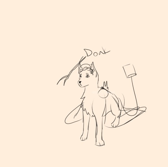
I have successfully made a brush that I adore idk how much I'll use it but I'm definitely gonna make a few drawings with it at least just to mess around
#rat rambles#I was just messing around with some settings and found out how to make some brushes less soft and more pixely#which has made this one brush I drew those last two drawings with from a eh brush to an absolute delight to mw#oc posting#anyone whos ever used a brush in someones art being too pixely as a critique can suck my ass pixely brushes my beloved#I honestly wish I could find a way to recreate super pixely like mspaint style brushes in procreate thatd be fun#Ive tried but I cant find a way to make it work with larger sizes#which is a problem for me the number one thick lineart fan dkfndjdg#I remember having similar problems when I was younger with medibang on my phone#I think I ended up just using the 8bit thing super small to make super little drawings that Id then make bigger#which was too much work I dont wanna do that fnfjdjsjd#but thats actually how I first designes the first of the human kids in eternal gales fun fact#sier was the very first one I designed and then on the same day I designed tali and the snake triplets too#all of them but snek have at this point have had major design overhuals fkdmdkdbd#anyways I need to go to bed now gn gamers
2 notes
·
View notes
Text
We named someone else after you
My second fanfic. Sort of a continuation of the last one, but not really. Hope you like it
Contains topics of fertility issues
^^^^^^^^^^^^^^^^^^^^^^^^^^^^^^^
“He then tried to fly and catch them,” Rhys told you with the biggest smile on this face. “He just gets cuter and cuter.”
He was explaining everything you missed from the Starfall celebration.
You were seated at your usual spot in the usual cafe for your lunch. Something you two had tried to do every week after you got free from Under the Mountain. It was a time for you to be normal siblings, not the high lord and his spy sister.
“We’re quite sad you two missed it,” your brother said with a glimmer in his eyes. “What is it you do every Starfall anyway?”
Ever since your first year together as mated the two of you had spent the earlier hours of Starfall recreating your first date. A picnic up at the mountains eating food made with your mother’s recipes. Since Azriel had been on a mission until the day of Starfall, you decided to spend the evening of Starfall together instead.
You huffed. “We’ve been doing it over 400 times, if you think we’ll start telling you about it now, you’re terribly mistaken.”
“But Feyre knows! It’s unfair that I don’t.”
It’s true. You had told Feyre a lot about you and Az’s mating bond when she spent some days at the cabin trying to figure out what she wanted to do with her mating bond to your brother. She asked questions, you answered, as long as she never told anyone about it.
Rhys then shifted in his chair and you knew what was coming.
“About what Mor said,” he started.
On Starfall, Mor had dressed you in a beautiful blue, backless gown with slits on both sides. You had asked her about the color that looked suspiciously similar to the colors of your mates siphons, but the female only answered that it was “a total accident”.
The dress was beautiful, but extremely different from what you usually would wear.
When you went down to the rest of your family Cassian had basically yelled when he asked: “who are you trying to impress? Last time I checked your going on to your 475th year as a mated female.”
You of course snapped back asking if he had become too old to see the difference between your and Mor’s clothing style.
Rhys, with a comforting hand on your shoulder, asked Mor why she dressed you. “I want to be an aunt again.” your friend answered with a smile. You had tensed, but luckily for you, your mate had come and saved you from the conversation.
“It’s nothing,” you told Rhys.
“Bullshit, I know you. I felt you get tense,” your brother said and you knew there was no way for you to get away from the conversation. “You don’t want kids?” he said that the same time you started speaking.
“I can’t-“ you stopped. “Wait what?”
“I just wanted you to know that if you don’t want kids, I’m sure Mor would understand. You should just tell her and she shouldn’t bother you about it again. I’m sure you two know that.”
You weren’t sure what you were supposed to say. Of course you wanted kids. You had always wanted to have a few young, winged children to run after. And you have loved being an aunt for Nyx, making you even surer that you wanted to be a mother.
“It’s not that we don’t want kids,” you hesitated.
Lucky for you, your brother knew you better than anyone else, except for Azriel of course. He soon realized what you meant.
“You’re sure?” He just asked, his voice barely above a whisper.
“I mean, we have been trying, but never succeeded,” you said looking down at your hands, trying not to cry.
Rhys let out a breath. “I’m so sorry, y/n/n. I didn’t know.”
You let out a small laugh. Of course he didn’t know. You and your mate were spies for cauldron’s sake! If you didn’t want anyone to know, no one would know.
“How long have you been trying?”
You looked up and met his worried eyes. He grabbed your hands and was stroking his thumb over yours.
“If you don’t count during Amarantha, neither one of us has taken the potion since our 100th year anniversary.”
315 years.
“Wow,” was all Rhys managed to say. His eyes staring directly into yours.
You removed your hands from his.
“Did Cassian manage to remove the wine stain from the carpet?”
“No, and Feyre is pissed,” Rhys answered, understanding your attempt to change the topic.
^^^^^^^^^^^^^^^^^^^^^^^^^^
“You never mentioned you would be feeling this bad,” you mate said, holding your hair and stroking your back as you threw up once again.
“I told you it would be like my cycle just lasted four times longer,” you told him back. Your voice groggy.
You were trying a new fertility treatment. You had tried different ones before, but so far nothing worked. This one was particularly bad. After your cycle, you would spend three weeks taking daily potions. The potions didn’t taste too bad, but you would spend the following hours dizzy and nauseous with an aching pain in both your head and stomach.
“I don’t like seeing you like this,” your mate continued. “Your sure you want to keep doing this?”
You had now curled onto his lap. His arms were around your waist and his shadows tried to cool you down.
“I want to give you children,” you just answered, curling deeper into your mate. His comforting smell lowering your symptoms a little and making you tired. “And I want to be a mother.”
“Then I’ll help you through this, but if you change your mind, just tell me, okey?”
You nodded, starting to fall asleep.
^^^^^^^^^^^^^^^^^^^^^^^^^^^^
It’s been another year after your treatment and you had lost all hope.
Azriel didn’t blame you, he would never, but you felt awful for not being able to give him and yourself children. But eventually, you started to feel content in your life without mini you’s. You were the best aunt and uncle to Nyx and Cassian and Nesta’s small babe.
This particular day, you had taken Nyx to get ice cream. Your mate had just days before, left for a month long mission at the continent. You had chosen to stay back home in Velaris to help your brother and Feyre dealing with a particularly busy period.
You had just sat down, exhausted, in Rhys office when you felt sick.
“He loves me! You just bribe him with some ice cream and suddenly you become his favorite! If I knew that, I would have done that all a-“
You had to throw up. You stood up and ran to the closest bathroom, Rhys not far behind.
“What’s going…” you threw up, “…on?” Your brother asked holding your hair away from your face.
“Probably just some bad ice cream,” you said.
“So you haven’t been sick before this?” He asked.
“Of course not, I think I would have-“ you started. But then you remembered that you also threw up after eating breakfast yesterday…and the day before that, and also the day before that. And when you first thought about it, you realized your back pain also had been a little worse than usual these days. “I guess I have been sick the last couple of days, but I’m sure it will pass.”
Rhys looked at you with big eyes. He then took three big breaths through his nose, smelling. He then smiled his biggest smile, shook his head and laughed a little. His actions confused you.
“I think you should go to Madja, sweetie,” Rhys said and basically pushed you towards the exit of his house. “And I’ll get Azriel home.”
“What? Why?”
“You can be quite daft sometimes, you know.”
You started to get annoyed, but then you realized it. The throwing up, the low energy, your brother’s smelling. Your violet eyes grew wide.
“Holy shit,” was all you were able to say. Rhys continued laughing.
You walked into Madja’s clinic and she immediately met you at the door to her office.
“Come here, love. Your brother said you were coming.”
With a comforting hand on your back, Madja guided you into the room. Madja had been with you every step of your fertility journey, so you were quite happy she was there for you.
You laid down and Madja started looking and using her powers on your stomach. She tried to stay professional, but a huge smile soon grew on her face.
“You are indeed pregnant, love. A healthy, winged babe. You’re at about eight weeks.”
You were overcome with joy and soon both you and Madja were crying tears of happiness.
You were still in shock when you walked through the doors of your home. In your hand you held a bag with a small newborn onesie in it. You had never been good at surprises, but a onesie was a good start.
You turn around when you heard the door to you cottage open in a rush. Before you could react, your mate’s shadows were swirling around you. Soon your mate’s hands were on your shoulders and his worried eyes met yours.
“You’re okay? Rhys said you threw up and just asked me to come home as fast as possible. Please say you’re okay.”
You immediately forgot all your plans about surprising Azriel and just blurted it out.
“I’m pregnant.”
You’re never going to forget the joy on your mate’s face. He was glowing and so were you.
“You’re not joking, right?” He asked and you let out a laugh while you shook your head.
You then picked up the bag that you had dropped on the floor and took out the onesie.
“A healthy, winged babe at eight weeks,” you whispered and started to cry again.
“You’re incredible,” Azriel answered with a tear running down his cheek.
^^^^^^^^^^^^^^^^^^^^^^^^^^^^^^^
Even though Rhys already knew, you wanted to wait a little longer before you told the rest of your family. You were quite sure they already knew, because of how protective Azriel, but also Rhys had been ever since founding out.
You were now 15 weeks along and started to become more and more difficult to hide your pregnancy. To your dismay you also still threw up multiple times a day and Madja was seriously considering putting you on bed rest.
You decided now would be a good time to tell everyone. All of you were at family dinner and you had just finished dinner.
“Now?” You asked your mate in his mind.
“Now,” he answered.
You waited until no one was speaking before you started.
“We have something we wanted to tell you,” you started to speak, taking your mate’s hand in yours. “I’m four months pregnant.”
Everyone was gaping at you.
“Gods! We thought you were dying or something!” Mor exclaimed. “We’ve never seen Azriel and Rhys that protective of you before!”
Before you could answer her, Cassian had pulled you out of your chair and into a bone crushing hug.
“Careful, Cass,” your mate hissed at his brother.
But it was too late, Cassian’s quick movements made you nauseous and you were rushing to the closest bathroom to throw up. Azriel of course followed you.
When you came back to the room you were surrounded by Feyre, Nesta and Mor. You asked: “you thought I was dying?”
“We had started to realize that you perhaps could not have children, so when you suddenly became distant and Az and Rhys looked so worried and distracted, we immediately thought the worst,” Mor explained. “But we’re soooooo happy!”
“Your child will be so cute!” Feyre said.
“And so close in age to our babe!” Nesta said smiling.
After a while, Cassian slowly moved towards you wearing an apologetic smile. “I’m so sorry, little one. I’m just so happy you’re finally going to be parents.”
“It’s okay, Cass. You’re forgiven, by me at least.” You gazed towards your mate that still looked very displeased with Cassian.
You walked over to your love and said “our child has the best family” while your hand rested on your stomach.
^^^^^^^^^^^^^^^^^^^^^^^^^^^^^^
The birth had been hard. You were in labor for over 20 hours before you could start to push. You weren’t happy about it, and you grew more irritated by the hour. No less than three times had you kicked your mate out of the delivery room for breathing too loud, stroking your hair too much and asking if you needed something to drink.
But eventually you held your baby boy in your arms. And Azriel held you in his arms.
The moment of peace and happiness only lasted about five minutes, before you started to get worse and worse contractions once more.
You remember feeling scared, annoyed and frustrated when you heard Madja mutter the words “there is another one” to your mate.
Your second babe, a girl, was a lot smaller than her brother, but she also had wings.
“I don’t know how we didn’t see her! She’s a sneaky one.”
With two babes in your mate’s arms and a heart fuller of love than ever before, you finally got some rest.
^^^^^^^^^^^^^^^^^^^^^^^^^^^^
After spending two days recovering from the birth, you were finally ready to introduce your babes to your family.
Everyone was in the living room of the River House waiting for you.
You walked in first, carrying your son.
Your family muttered how cute and how beautiful wings your babe had, but your eyes were set on only your brother.
You slowly sat down beside him on the couch and carefully let your son into his arms.
Rhys and Feyre both looked in awe at the boy that even at two days old looked like a copy of his father.
“I want you to meet Rhyland,” you said with a smile. Doing your best not to cry.
However, the second your brother’s wide and teary eyes met yours, you couldn’t hold it back anymore.
No one spoke for a while. Everyone was just enjoying seeing and holding their new family member.
As Cassian handed your son back to you, he said “I can’t believe you named him after Rhys and not me.”
The comment was obviously meant as a joke, but you had hoped he would say something like that. “You can come in now,” you told your mate through his mind.
“That’s because we named someone else after you.”
The door opened and in walked your amazing mate with your tiny daughter in his arms.
“We also wanted you to meet Cassandra,” Azriel said as he showed your daughter to Cassian, not quite ready to let go of her.
“How could you not tell us you were having twins,” Nesta gaped at you.
“We didn’t know,” you simply replied.
When you got home later that evening, Azriel carried both your sleeping babes and put them in their cribs.
“You’re an amazing father,” you told him. “It makes me love you even more, if that’s possible.”
He gave you a small kiss, before he picked you up and carried you to your bed as well.
“I can’t wait to raise them with you,” he said. “My amazing, incredible and beautiful mate.”
#azriel fanfic#azriel x y/n#azriel#azriel x you#azriel x rhysand's sister#azriel x reader#rhysand’s sister#acotar
530 notes
·
View notes
Text
Jacob and Dottie - XMen Edition

You're all that I can trust
Facing the darkest days
Everyone ran away
But we're gonna stay here, we're gonna stay here
Ahhhhhh, ahhhhh
I know you're scared tonight
Ahhhhhh, ahhhhh
I'll never leave your side
When it all falls, when it all falls down
I'll be your fire when the lights go out
When there's no one, no one else around
We'll be two souls in a ghosttown
When the world gets cold
I'll be your cover
Let's just hold
Onto each other
When it all falls, when it all falls down
We'll be two souls in a ghosttown
"GHOSTTOWN" - MADONNA

SO.
A few days ago, I asked on IG how my mutuals would have liked to see me drawing Jacob and Dottie again (since, you know, it has been since March that I last drew them together in any capacity).
And dearest @memoriesofafallen suggested me to draw them as X-MEN.
Needless to say, my brain starting going like crazy, because if there is something that I absolutely adore in this world, it's X-Men.
They were the first comics I ever read (all thanks to my older cousin who was the one to actually introduce me to the fandom with the old game "Children of the Atom") and to be honest, the only Marvel comics I ever read (I much preferred DC when I was younger).
So, when dearest Tofu suggested me to draw them as X-Men, the brain started brainrotting right there and then.
BUT.
I was faced with a dilemma: drawing them as my favourite X-Men pairing OR as the characters that Jacob and Dottie resembled the most?
Because depending on that, I would have to draw them as very different characters (a huge cookie to the one that would guess how I would have drawn them if I went with the similarity road lolol)
And Tofu suggested me to go with my favourite ship.
SO NOW HERE YOU HAVE JACOB AND DOTTIE AS GAMBIT AND ROGUE BECAUSE FML.
Only, of course, I had to change Rogue!Dottie's hair, so I inverted the colours lololol
Baby me was smitten with Mr. LeBeau when I saw it on tv in '94, and absolutely love Rogue for how tough she was (why do you think I have a white streak in my hair lol)and you can BET YOUR HAT THAT I JUMPED TO THE OCCASION AND STARTED TO SHIP ROGUE AND GAMBIT (we will absolutely pretend that AoA never happened. Nah-ah. That is not canon for me. nope.)
Also, I decided to go a different way with colouring this time around, and instead of going with the soft rendering I usually go with, I decided to try my hand at recreating the style that is usually used in the comic, and good Gods, let me tell you, I had an ABSOLUTE blast and I am SO HAPPY WITH HOW THIS TURNED OUT.
SO HAPPY WITH THE COLOURING, SO HAPPY WITH THE POSE (also a little throwback to the very first artwork I did with them lolol
SO HAPPY WITH EVERYTHING.
I gave it a small "80s Retro" vibes because YES.
Honestly, for once I didn't dread colouring and rendering, and I had a HOOT.
I truly need to practice this colouring more often because I loved it! <3
Well, I hope you will like this!
--Nemo
#X-Men#Assassin's Creed Syndicate#assassin's creed#Gambit#Rogue#Jacob Frye#Dorothea Starrick#Ship:Jottie#Crossover#nemo sketches#my art#my oc#xmen#gambit x rogue
84 notes
·
View notes
Note
CAN WE PLS GET A onyankopon X BLACK READER FANFIC IDC IF ITS SMUT OR FLUFF PLSS
i gotchu boooo. i decided to do the fluff about the reader’s hair not cooperating bc as a black girl ts get real stressful😒
hair struggles
summary: ony comforts you when you struggle to recreate a hairstyle.
cw: fluffff
word count: 678
“cmon baby we gon be late” onyankopon sighed in irritation as he watched you try to redo your hair for the third time today. “if my hair not right we not gon be going nowhere” you were trying to redo a hairstyle you saw on tik tok a couple days ago. the first time it was attempted you looked perfectly fine, but of course that was on a day you had nowhere to go. now that you have this barbecue to be at, it seems like god thought it was the perfect time to play with you.
“ma dukes said she got plates for me and i’m not ‘bout to let them get cold cause you don’t like your hair”
you rolled your eyes at your big ass boyfriend, continuing to fix your hair. it’s not like the style was hard. it was a simple half up half down with a swoop in the front. this should be easy compared to the other styles you’ve tried, but your hair refuses to cooperate today and your swoop just won’t slick down.
“just leave me. i’ll take my car to the house okay?” you mumble as your eyes began to water. ony knows that when you feel your hair doesn’t look right you start to get so frustrated to the point where you’d give up on whatever plans you have for the day, but he seen no reason for the both of you to take separate cars to the same place. he was also really hungry and refused to let your moms great cooking go to waste.
“mama it don’t gotta be slicked all the way. if it waves up a little who really gon care.” ony remembered what you always told him about your curls so he added a lesson you taught him “you told me that wearing slick styles all the time can mess up your curl pattern anyway so what’s the issue wit just leaving it a lil wavy?” he says with a smirk, using your own facts against you. you knew he was right and didn’t really feel like driving so you wiped the tears from your face. you loved how ony always listened when you would talk about your hair whether it be about the products you used or just random facts.
“you right boo lemme finish up so we can go. i know you hungry as hell.” you sigh as your boyfriend smiled. he began to walk out of your shared room to go put his sneakers on at the front door. ony was wearing grey nike shorts with a white tee and his gold chains. it was a warmer day so he decided to throw on a his black fitted to hide from the sun and his space jams . it was the typical barbecue fit and you were expecting to see your brothers and cousins wearing a similar, if not the same, one. you decided to wear a grey romper with black sandals. a simple outfit since you could expect that you’d be walking around a lot and didn’t want to get really hot.
as you finally finished your hair you seen that it still wasn’t slicked down all the way, but you decided to just leave it after you remembered what your man reminded you. you smiled to yourself as you noticed that you didn’t even look bad and you overreacted a bit, walking out of your room to meet your boyfriend by the door. “you ready?” he said nervously, hoping you weren’t still upset. “yea baby let’s go before we late.” ony smiled, happy that you listened to him. he actually thought your hair looked better than the tutorial and began thinking about how your waved up hair kind of reminded him of the waves he had when he was younger. he was going to tell you that, but decided against it, knowing that you’d probably look at him crazy. “good because you look beautiful princess. now let’s go before all the food gone.”
#aot onyankopon#onyankopon x black reader#onyankopon x reader#aot#x black reader#onyankopon x black!reader
632 notes
·
View notes
Text
Sterile Mandalore and my issues with the New Mandalore we see
I want to preface this by saying a lot of what’s wrong with Mandalore and the Mandalorians is fully Filoni’s fault (among a variety of other people involved) for being a bad storyteller. Also between brain fog, ADHD, and a severe anxiety disorder, I’m brute forcing my way to coherency.
This is in no way a defense of Death Watch or the history of imperialism. I won’t tolerate anyone comparing me to a terrorist organization for not liking the depiction of Mandalore under New Mandalorian rule or any particular Mandalorian Character, yes that has happened before.
As an overview, I will be going over the setting of Mandalore we see visually, a few of the characters and what those characters say about Mandalorian culture visually, as well as briefly touching on the Clones, and finally how each of these contribute to the Mandalore we see in The Clone Wars.
Now I wanted to write this because I actually deeply enjoy the Mandalorians as a culture, I think everything from the language to the armor to the Resol’nare, uncertain if thats canon, is absolutely fascinating. However, what we see in The Clone Wars has next to none of that outside of Death Watch, the terrorist organization.
The Setting of Mandalore
Mandalore the planet is primarily composed of harsh, seemingly uninhabitable deserts created from centuries upon centuries of war. What we do see of the civilization on Mandalore is primarily within the domed capital city of Sundari. Now there are a few things I wanna touch on here, primarily certain locations, such as the schools, the palace, and the overall visuals of the city, and the people, as a whole as well as individuals.
Beginning with the Schools,
We see schools on Mandalore at least twice in TCW, once during the poisonings when we see a cafeteria and once during our stint with Korkie where we see classrooms and dorms, and i have always hated the way they look. I will say that you could very well interpret the Royal Academy of Government to be a sort of military school, though given the New Mandalorians are all about peace and pacifism it would be an odd choice to send your nephew there.
Visually speaking, the schools are beyond dull. In the classroom we see Ahsoka teaching in, the entire room is gray, with nothing but the desks and a projector. Look at the kid in the front row! Thats how I feel looking at this room!! These are presumably either teenagers or young adults at a boarding school. Im not expecting much for a classroom but a dull dark gray, empty room is not conducive to learning.

I also want to note that they wear uniforms. Its totally normal for a boarding school to require uniforms, that makes sense, however, these uniforms have one singular interesting component and thats the iron heart. I can’t find an exact meaning behind the symbol outside of reddit so im hesitant to define it here, however what we do know is that the symbol is absolutely ancient. A significant part of Mandalorian history.
The rest of the uniform is similarly a dull cool gray, or perhaps a dull blue. And there doesn’t seem to be much individuality in the uniforms, that is outside of hair and whatever gambit-style headwear those kids are wearing at least, but even then they’re mostly all very similar hairstyles.
Im also electing to ignore that there are seemingly two separate sets of triplets here. I know it’s an animation shortcut. Still, they are still there and I can’t ignore them now.
Now, on to what I’m presuming is either a dorm or some sort of recreation or break room, I don’t remember much of the context and frankly you can’t tell from looks alone. I’m leaning toward a dorm because that was my first interpretation.

Regardless of what this room serves as, be it dorm or break room, its still void of character. If this were a dorm, we would have no indication of whose it could possibly be.
It looks like the light behind Korkie is a map of some sort, or something similar its unclear, but that and the neon lights above Soniee are the only sources of color. The red and blue can mean a lot of things but I genuinely don’t think there is a major purpose behind it. We already saw the two sets of triplets.
However, lighting is meant to mean something. In particular, red can mean many things, but given the visual context it reads as stress inducing, as danger. Particularly surrounding Korkie as it does.
Now blue lighting needed a quick google search, but my results for the meaning of blue lighting where a little unexpected. Blue is a typical calming color, similar to green, though can also be interpreted as depressing and cold like grays, and blue lighting can be representative of isolation and passivity. Ironically, this scene is anything but passive. Again, im not putting much weight into it but I feel its worth noting.
Ultimately, its entirely impersonal, slightly stress-inducing, and only marginally better than the classroom only because it had color. Now onto my most egregious example from the schools we see and my most despised, the cafeteria.

Do you see this shit? Where do i even start? My best guess is that these are approximately middle schoolers. If i went to this school I would willingly drink the poison. Their lunch looks like three tomatoes, three mystery cubes, and debatably either a cracker or a slice of cheese. Horrendous lunch. How is this acceptable to feed to children for a whole meal? Enough complaining about their lunches, though.
The cafeteria itself is offputting to say the least. Pure white. The children, pale and blonde, all wearing the exact same gray uniforms with only variation for the girls, because girl = skirts. It’s the picture of uniformity. Its horrific. The only color outside of the pitiful lunch is the monstrous poison drink nearly all children have. Probably bc theyre lunches are terrible.
This scene has two interpretations in my mind. The first is that its meant to be creepy as all hell, which is unlikely because we’re supposed to support New Mandalore. The second interpretation is that it was meant to look like the epitome of peace and serenity and utterly fails because it takes more than an overuse of the color white to represent innocence, purity, and peace.
How do you manage to make an entire school look like a cloning facility? In fact, I’m certain the cloning facility has more diversity than all of mandalore.
Now the issue with all of these areas of the schools on Mandalore is that they look like no place to teach a child. There are certain things that are conducive to learning and color is one of them! So is fostering individuality! There are specific things that make an environment suitable for learning and these schools have very few of them.
Now onto the Palace,
This will be a shorter segment than the previous. Although I will be lightly critical of Satine here. So to begin, we primarily see the throne room. In fact, im not even sure we see much else in the Palace of Sundari. We do see Satine’s rooms or office but I can’t find a picture of it so i won’t use the example.

Both of these images share a few things in common. First is the dramatic lighting, the otherwise empty throne room save for the chairs that seem to have been brought in, and the only color present outside of gray is Satine and/or her throne. Even Padme, notable fashion icon, is or appears to be wearing gray in these scenes.
The dramatic lighting in the first image is an obvious “Hey! These are the good guys!” and I can’t piece out a relevent meaning behind the second image so Im choosing to move forward because I think it is just that, lighting.
Now the throne room being utterly void will be clearer in the next image I attach. The issue with it being so empty is that it feels almost lifeless, cold. It doesn’t feel like a throne room visually speaking. This ties into the last thing these images have in common. Satine and her throne.
Within the gray permeating what seems to be most of Mandalore at this rate, Satine is the only source of actual color. Her clothes are these vibrant, beautiful blues and greens and purples. Her throne is a glowing beacon above everyone.
What does that say, when every one of her people is dressed in grays, beiges, and pale blues? Or when they all dress the same?

This is a better view of just how empty the throne room is. Theres more of the iron heart design, though still no real idea of the meaning further than it is significant, as well as the portrait of Satine. The only things in this image with color other than gray or biege are indications of Satine. But the throne room itself is almost entirely barren.
Whether or not you think this is any indication of her character one way or another thats up to you. My read on what this shows of her is that she is blinded by her own ideals, she doesnt truly see her people as they are, be that through ignorance or arrogance, and that allows the corruption to seep.
I wanted to show the hospital because I think thats a Good environment design for mandalore but i lost the picture. It is ironic that my example of good design is the one thats meant to be clinical.
Therefore, I’m moving on to the city at large

The city itself is incredibly industrial. I’m torn because I know it has to be like that to a degree but it also doesnt have to be like that. That’s a choice the designers made. The city of Sundari exists within a dome due to the uninhabitable deserts from years of war, that doesnt mean it must look so cold.
It just feels so lifeless. Colorless even. Ive noticed by now, and you probably have too, that my main issue seems to be coloring. Well, I wouldn’t say its my main issue but it’s definitely up there.
We’re supposed to think that Satine’s New Mandalore is Good. That it’s this vision of peace and prosperity. But where do we see that visually? Through industrialization? Thats not good!
Now, I’ll be the first to admit that Satine’s peace is a clear facade for all of the shady bullshit going on behind her back, but we should be able to see that in the enviroment.
We should be able to see the idyllic peacefulness and people’s enjoyment of their city. We should see that face and the shady underside. We shouldn’t just see drab gray with a splash of corruption. It just makes Satine look like a bad ruler.
Characters and What They’re Telling Us
I’m actually not starting this with a particular character. I’m going to begin with the Mandalorian people as a whole.


What a surprise! Theyre all blond white people! See I have a huge issue with the lack of diversity among humans on Mandalore for a few reasons. The first reason is the obvious, it’s fucking WEIRD. The second reason is that we know there are people of color who are mandalorian.
And on the one hand this really demonstrates my point. Everyone looks the same, everything is dull and empty. This isn’t prosperity.
The first example they look like theyre dressed in uniform. Every single one of them is wearing the exact same color. Thats not normal. In the second image, while they aren’t dressed uniformly, they are all dressed in grays and beiges. These people are Satine’s governing council. They’re supposed to high standing officials.
And that brings us back to The Duchess herself
I’m choosing to use her main outfit design for this. There will be no more images from here onwards because there is no space but I’m trusting you all to know what these characters look like.
Satine’s Dress can only truly be described as opulent. She dresses in shades of blue, purple, and green and elaborate headwear and accessories. Her hair is styled in a way characteristic of Kalevala, similarly to Korkie’s friend Lagos but more extravagant. The colors she wears are chosen to appear soothing and to honor the history of Mandalore’s forests and lakes.
But this isn’t something you might pick up on naturally. Remember this is a show for children. You would have to do the research to learn that. Without that information you could interpret her appearance any number of ways.
Between her headress and the color scheme, I would have confidently said she was peacock-like, had I not known the nuances. Character design needs to be something people can infer from. Something that lines up with the environment to tell a story.
That being said what her design is meant to tell us is that she greatly values the less violent aspects of Mandalore’s past. That she is trying to preserve and honor their history and Mandalore’s beauty.
The issue is that (from memory at least) the honoring forests and lakes never really is relevant? We see Peace Park but we’re never shown much about any restoration or preservation efforts of the planet itself. Did they just give up because its a “wasteland”? Were there no other alternatives? We were never given enough context, explicitly or implicitly.
And without the knowledge of what her design is supposed to mean, what is stopping anyone from misinterpreting it. What is stopping anyone from thinking she is just this haughty, holier than thou politician? Especially when you put her next to civilians or even her own council when she is already sat above them on her throne?
Satine’s design is essentially meant to show us her value to peace and progression but we arent really shown much progressing. We’re meant to just believe what we’re told rather than showing us the progress in, yknow, progress.
Now, Bo Katan
I chose specifically to include the sisters in this because I wanted to compare them, also bc obviously they are the most relevant. Bo’s design also demonstrates her values, admittedly way clearer than Satine’s.
She’s a traditionalist, someone who values the warrior ways, and yes also a terrorist. Thats not super relevant. Because she’s a traditionalist, it makes sense that her character design is rather simple in comparison to her sister, but they both honor the history of Mandalore all the same.
Mandalorian armor is equally as historical and significant as the iron heart itself, even so far as to have the two intrinsically intertwined, having the Iron Heart as part of the armor. I think most Mandalorian fans know this already.
Now, I want to take the armor paint color meanings with a grain of salt. Im not certain how canon any of it actually is even if the meanings do seem to hold up withon canon. However, the thing about the armor paint is that it sets the mandalorians apart as individuals while simultaneously tying them together as Mandalorians.
Bo’s armor is painted primarily blue and gray with white detailing and owl imagery to signify her Nite-Owls. Now in the EU the colors have meaning. Blue and gray mean reliabilty and mourning respectively. I think it would be in the Mandalorian culture’s best interests to keep this canon and even expand upon this.
This is because these unique paint schemes allow for individuality, community, and notable artistic expression. I mean, just look at Sabine. This contrasts with the uniformity of New Mandalore which just makes New Mandalore look really bad. Like really, really bad.
Next I want to look at Almec
So, Almec has two designs I want to look at. First is his usual outfit as Satine’s right hand and the second is his own armor.
Pre-betrayal, Almec wears an almost solidly white outfit, with gray, beige, and a dash of gold detailing. This design actually has two iron heart designs, one in his clothes and one in his hair. Outside of the iron heart, the design is very plain. The overuse of white is likely meant to give an illusion of purity and peace again. It doesn’t really work when he looks so clinical, though.
In his armor, Almec’s design is a stark contrast to the previous. He wears a light green, maybe gray, flight suit with black and gold armor. The reason I wanted to include this design for a number of reasons but specifically, the shoulder cord.
The gold shoulder cord gives Almec a more militaristic appearance, even in comparison to other armored mandalorians. This is actually a design detail I really enjoy because the gold shoulder cord essentially means “service to another” in the US military.
The colors black and gold in mandalorian armor represent justice and vengeance. Again, take that with a grain of salt, but I think more importantly this change actually makes Almec a more recognizable character. The armor is more personal than his prior outfit working under Satine as a New Mandalorian. It tells us more about who he is as a person.
On to Jango
Yes he is Mandalorian. I will not debate this I dont give a shit what George Lucas intended with him. I don’t even care what was said in TCW. Jango was canonically a mandalorian foundling. And yes I know they never show up really in relation to Mandalore, but Its important I mention them, I think.
So, we know in TCW, Jango isn’t considered a mandalorian by the New Mandalorians. They insist that he must have stolen the armor, that there’s no conceivable way he could be mandalorian. Except that we now have canonical confirmation that he was in fact a foundling.
See, here’s the issue with this, because in retrospect they’re basically denying a dead man his own identity and creed.
Jangos armor isnt really what I wanted to talk about in relation to Jango himself. Mostly I wanted to talk about what his character means for the New Mandalorians. Jango amd Boba are quite literally The Blueprint for Mandalorians. Except now we get more Mandalorians and they fully deny Jango his Mando-ness.
What, because he doesn’t align with their ideology? Jango wasn’t a great person by any means but being Mandalorian isn’t just a nationality. It’s something you’re taught.
Again this isn’t about the armor, it’s about the fact that he’s played by a Maori man. The first Mandalorian face we see is a brown man and that gives a real bad impression when you have a planet of White People claiming he isn’t even Mandalorian, why? Because he’s adopted? Because he was a bounty hunter?
The Clones
This section isn’t totally relevant so feel free to skip to the next, but i can only go so long without talking about them.
The clones themselves don’t have a strong tie to Mandalore, narratively speaking. However, they do have ties built into their appearances. More than just being clones of Jango.
They don’t speak Mando’a in canon and we aren’t totally sure who exactly trained them before Jango died, but we do have little hints from their character designs that indicate some connection to Mandalore or the Mandalorian culture.
Rex specifically is one of the few with jaig eyes. Jaig eyes are a Mandalorian honor symbol. And he’s not the only clone with this symbol, Blackout also has Jaig eyes on his helmet. Which leads me to believe this symbol is fairly common for troopers since its not terribly common we see clones sharing symbols without a personal connection to eachother.
Further than just that, clone trooper armor, phase 1 at least and presumably onward, is also based on Mandalorian armor. This is primarily because of the armor jango wears, naturally his clones would be fitted with similar. But the clones have also picked up the armor painting. Could this simply be a coincidence? Sure if you wanna believe that. I don’t think I do though because its so significant to both cultures as a means of individuality.
What does all of this say about Mandalore?
And I mean that as what is this telling us visually. What conclusions can you draw from this with just images. Because it doesn’t look great for New Mandalore. And maybe that was the intent. I know my first impression of Satine was just how unprofessional she was acting.
Except we’re supposed to see New Mandalore as the good guys, essentially, right? Riddled with corruption but still Good. That doesn’t translate when the setting is dystopian-esque at best. Its cold and empty and clinical.
When you see an entire planet of people who all look almost exactly the same, wearing the same clothes, the same hair, the same face, the same color skin, it gets unsettling. Its a weird design choice because it’s an American cartoon and America is characteristically individualistic.
The Bad Guy, the literal terrorist organization, caters more towards that visual individuality than the peaceful, progressive Good Guys. It visually reads as a Safety vs Freedom story but thats not the story that they need to be telling. You can’t go telling people freedom is evil.
It makes it incredibly easy to misconstrue what New Mandalore is trying to do because the visuals aren’t supporting them. There’s a reason so many people genuinely think Satine has comitted some sort of cultural genocide against her people because we aren’t seeing any of the culture and when we do see it, its not supported by the narrative. They may have Mandalorian writing but they never speak Mando’a on screen outside of Death Watch. We dont really know what the iron heart means and its everywhere. They may talk about prosperity and progress but they aren’t showing us that.
What I Would Do To Improve
This is the last segment, I promise.
I want to start with what could improve the background. Because a lot of the issue stem from it being dull and lifeless, I think giving it some sort of life would really fix a lot of the issues. Namely, I would say to put more trees, real, lush trees not the tiny ones you’d find in a city. It would help give context to Satine’s homage to the forests of mandalore if we had a visual clue from Mandalore itself. This would also bring in some more color and take away from the industrial appearance. This is more of a personal thing because I grew up around farms, but I think we should have seen a farm or some sort of clue as to how Mandalore is feeding itself. How is it sustaining itself, if not for import?
Another thing I would change would be the overall coloring. Generally, I would push for more color but I’m mostly referring to the color of the buildings. I would replace the cold gray and blues with more of a bronze and maybe a warm orange or even just changed the undertone of the blue could add so much. I would also give the lighting more warmth. Overall I would just add more warmth.
Adding onto this, I would also bring in more color by adding more public art. More murals and statues and the like. We know they have murals and paintings in the Palace at least. We should see them in the city, too. Having more art around the city would also connect it to the same cultural roots that have the mandalorians painting their armor.
In the schools, the main issue is that there’s no color. That these spaces dont have anything that would bring a sense of comfort to a kid. The stark white of the cafeteria is more stress inducing than calming and it would be good to replace some of that with a splash of color to break it up, as well as with some background decorations. Slap a poster on them there walls.
The classroom we see could also use just more decoration, make it look like a classroom. Have posters of diagrams and models. The room is dark so I won’t say much of the coloring except just make it look less cold. The back of the room has a wide, empty space and I think if that space were filled with something it would change a lot of the energy it gives off.
As for the dorm, if that is a dorm, give is an idea of whose room it is. Make it look like someone lives there. If it’s not a dorm, why are these kids sitting in a dark room? The room itself shouldn’t exude this uncomfortable feeling, that should be the undertone.
Overall, I think the Palace is generally fine if only it werent so empty, and again, if there were more color. The detailing and the lighting both look nice but it just needs to feel more like a throne room.
As for the people of Mandalore, for fuck’s sake, diversity is not going to kill you. Again its insane that all of the mandalorians of color we see are either A.) terrorists B.) deemed not mandalorian or C.) future cultists. We should see more black, brown, and Asian mandalorians. Hell, we should see alien mandalorians too.
Furthermore, they should have more variety in their clothes. What society wears all of three colors when they definitely have access to others? On top of that we should see Mandalorians who still wear pieces of armor. Armor is defensive, it’s not inherently violent to protect yourself and it honors the history of Mandalore while still moving forward with progress.
This is of course just my personal vision. These visuals can be interpreted in a number of ways, if you want to think the designs are good and exhibit peacefulness more power to you, I simply can’t see it. I tried my best to keep it to the Clone Wars series with a strict focus on the appearance, though that was a difficult challenge for me.
Anyways, I hope this was somewhat coherent and enjoyable. I’ve likely missed some details but this took me multiple days to organize my thoughts properly so im not pressed about it. Let me know your thoughts! Just be kind and don’t call me a terrorist :)
#sw#star wars#tcw#the clone wars#star wars meta#i guess???#im tagging it anyway#mandalore#mandalorians
35 notes
·
View notes
Text
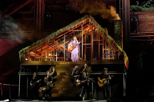
Well, first of all, I have to thank @yridenergyridenergy for selling me the ticket! It was literally the best experience I had throughout the year; I really, really, sincerely appreciate it.
As promised, this is my repo of the gig in Wakayama. To be honest, I’m really a bad recorder as I can only recall the sensation or vibe in general and forget the details every time. Am I the only one?? Anyway, I guess my drawings may not be precise at all and it would be more like a summary of the year.
And this repo will be focusing on Kaoru, Toshiya and Kyo. I’m sorry but I stood on the left in both times.
Kaoru
It’s so strange that I can easily feel my love for him grows with time and what a coincidence! I visited them twice this year and I was right in front of him every time. I always assumed that I would be in front of Toshiya when I checked the hall map in December, but no! It was Kaoru again! It kinda shocked me the time I located my seat and noticed his microphone stand was there, just about 2 meters away.
I think probably it has been known by all of you, the show started with a semi-transparent screen showing some AI-generated footage(sorry, I hate this part). It covered most of the setting but just revealed some shadows. I could only see Kaoru, his side profile, priest-alike gown and silver hair. He looked so focused and indifferent and so good-looking…my hands are still sweating as I recall it now.
That was my first time listening to Rinkaku on-site. I got caught up in emotion when you could easily compare themselves in reality and their sketches in the video. You could see how much they have changed and it also just reminded me a lot of moments, staying at home and staring them on the screen. The real vs the virtual.
Also, at the beginning from the distance, I could only see some sort of marks on his chin that looked pretty much like piercings? It turned out to be his makeup; so brilliant.

Kyo
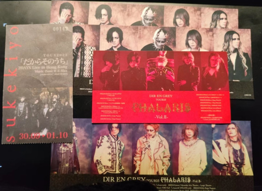
I didn’t see Kyo that much this time, but I feel he is that kind of vocal that you would fall in love with once you’ve actually seen him in the venue. He looked so nostalgic to me this time, maybe bc of the ghost face makeup or the fact that I have seen him too much this year. I also went to HK for sukekiyo this year.
The gig of sukekiyo was more emotional, floating and spacey (and less aggressive, obviously). Kyo’s dedication was so contagious. Although he looked a little bit nervous at the beginning of the Day1, forgetting the lyrics now and then lol.
It is interesting to see the similarities and differences between Diru and Sukekiyo, like looking at different reflections of the same mirror.

Btw probably he is the most inspiring Diru member to me I guess. Idk why drawing kyo always begins with a pretty satisfying draft then it becomes a big challenge to my expertise and patience ahhhh. But yeah, I can improve a lot after finishing it. So, kyo, thx? lol
Toshiya
I’m not quite a fan of his white outfit that day(the one worn in the pic of their tweet on 16th Dec). Actually I even failed to recognize him the first, waistcoat and palazzo trouser are ok but definitely not the most stunning look of him. It seems that his style is becoming more gender-neutral this year, with hair dyed brown, pearl jewelries and feminine makeup.
But I still quite enjoyed his performance, his body language was so beautiful (ugh! It’s such a shame that I can’t recreate it)and he was the first one going to the left terrace and saying hi to everyone. Toshiya is always the sweetest person in Diru to me.
I prefer his encore look more and he took off the shirt and threw it to the gift right in front of him
(and a random sketch)
That’s it! I could have drawn more but, sorry I’m a perfectionist, these pics really took me some time, but I may keep going if I have spare time.
And I’m not used to talking so much on the Internet, it is embarrassing somehow.
The year of 2023 has treated me rly good, I hope it would be the same for all of you and Diru members, see you next year.
92 notes
·
View notes
Note
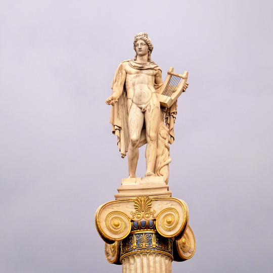
Καλημέρα! I'd like to ask you about the colours of Classical statues and temples. Have you seen any reconstructions you liked? Bless the people investigating them, it seems they didn't wanna assume too hard so they ended up making the statues look somewhat on the very gaudy side. (I sent the same ask to @alatismeni-theitsa just to be sure)
Haha this is a sore spot for me because I really do love the woren all white look!
However, we all have to acknowledge that the preference for the bare white look is largely a bias infliltrating our minds through the presumed superiority of Renaissance Art. The colour of the ancient statues had already faded by that time, making Renaissance artists believe that this was the actual classical prototype that was supposed to be imitated and glorified.
I believe our love for the all-white classical look in sculpture is based on both this bias, but also the aetherealness, distance and solemnity that was believed to be communicated through this lack of colour and the exposition of the work done on the bare luxurious marble. That second reason is what I find beautiful in it too.
Of course, actual Ancient Greek art was coloured. Given that Greek art of antiquity aimed at a naturalistic approach, it is absolutely reasonable that the artists wanted their artwork to have the colours of the real subject / object it was depicting. What you see now are recreations based on whatever colour-tracing methods we have available today, which are not infallible yet. While the general conclusions must be more or less accurate ("this part of the chiton was red and the hair was black" etc), they still remain hypothetical because the methodology cannot perfectly detect hues, paint layers, different pressures on the paint and all those techniques that provide nuance and are integral to art. Having said this, we should also remember that creating paint hues in antiquity was extremely difficult and obviously the paint job done could not be equal to that of the last centuries. Therefore, with our modern criteria, ancient paint job must have often be underwhelming but, again, I believe we also are in a position in which we do not get the precise, fully accurate picture yet.
In a way, this conviction we all have that coloured statues are kitsch is kind of arbitrary, simply because the notion that sculpture reached its peak with the Renaissance is so very deeply engraved to our minds. Think about modern art for a moment: modern paintings, figures and figurines, ceramics with paint... or even sculpture from other cultures of the world outside the Greco-Roman sphere: none of this is considered kitsch, simply because none of this is directly compared to Renaissance scupting. (Although of course other cultures' arts are often viewed derogatorily through this very pervasive presumption that the Renaissance was the peak.)
We also should return back to the considerable probability of poorly made recreations, which lack nuance. Take these examples:
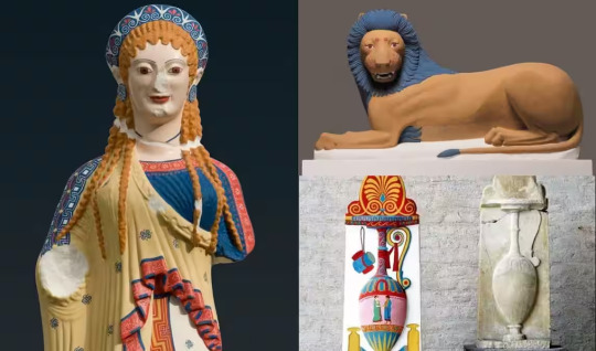
Jesus Christ Superstar
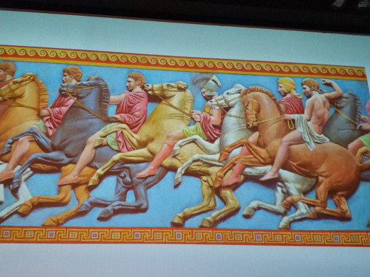
Not the best, right? However, if we see paintings and art from earlier times i.e Mycenaean and Minoan and contemporary ones like rare surviving Classical, Hellenistic and Grecoroman art, we realise that colours were used wisely and there was the concept of layering, shading and creating detail and nuance.
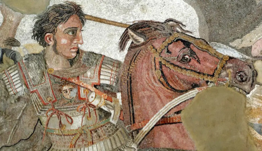
In this art of Alexander (100BC, exhibited in the Museum of Napoli) we can see an extensive use of highlighting, layering and creating shadows, which is very different from the blast of thick paint you will see on these recreations.
There are also recreations which prove exactly that a lot of the responsibility regarding how we perceive them lies on the very quality of the recreation itself.
Source
Honestly, for me this is totally fine. You can find fine modern art - even modern Greek folk art - of similar styles or colouring. The quality of the recreation here is far superior than the ones above.
This one, I am also totally fine with it, especially the last of the colourised ones. It took exactly the same amount of extraneous work for the artist to sculpt plus the struggle of painting it. And it gives us so much additional information about what fashion looked like.
The recreations made for ancient Greek temples prove more how colour could actually be used in good taste:
If I told you this was some late medieval manuscript art, you'd not think of it as kitsch. The idea immediately kicks in when I say it is a recreation of a Parthenon frieze colourised. (Source)
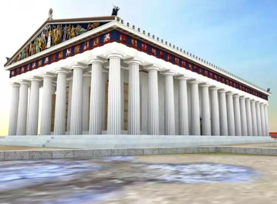
In this recreation IMO the Parthenon looks hella fine!
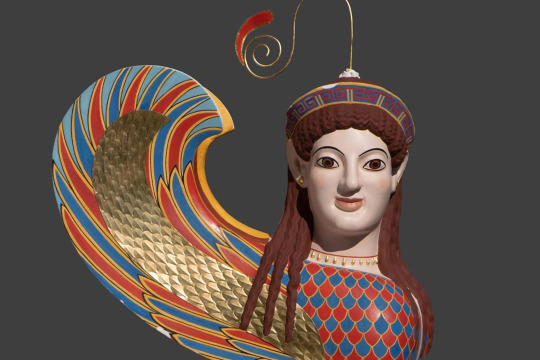
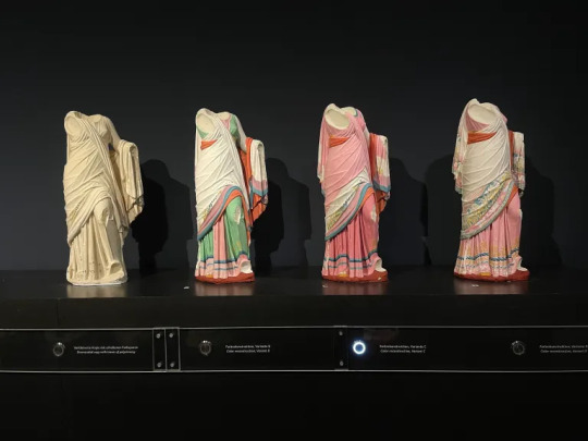
I confess I struggle with the Caryatids of the Erechtheion:
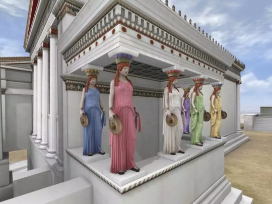
but I suppose it's partly because to us it looks like you took all the redhead Barbies you had and assigned them to carry the building. Without all the preconceptions we have, which are informed by kitsch cheap art of the last decades and the axiom that Renaissance sculpture is the best, Ancient Greeks were probably astonished by the beauty and realism of six different beauties making the temple stand. For me, who I am influenced by all that I have analyzed, my colour tolerance would go as far as having all of them like the Caryatid in the middle, with the white peplos. Apart from that, the paint in the temple is totally beautiful and elegant. (Source)
The neoclassical Academy of Athens uses paint like in antiquity except it draws the line in the statues (and perhaps it uses more gold). The Academy of Athens is exemplary.
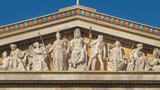
Zappeion also has colour and it's marvelous:
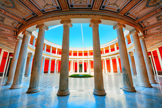
I believe this was the aesthetic ancient artists were going for.
In conclusion, I think ancient artists tried to use paint in the best of their abilities, no differently than how we also almost always add colour to our modern art, except of course there must have been limitations to the qualities and varieties of paint hues that could be produced at the time, which would inescepably sometimes lead to results less than ideal. Regardless of how well or poorly painted any particular ancient artwork was, we are predisposed to view it negatively anyway because we are wired to believe that the Renaissance style set the standards for what is beautiful and what is not and that when it comes to colour in sculpture, less is obligatorily (much) more.
That's all I got to say! From my side, καληνύχτα! (I'm posting this way past midnight lol)
#greece#europe#ancient greek art#ancient greece#ancient greek statues#ancient greek temple#art#renaissance art#greek culture#parthenon#academy of athens#zappeion#athens#attica#sterea hellas#central greece#mainland#anon#ask#tw long post#long post
29 notes
·
View notes
Note
Hi,
Who is credited on those Patrick Nagel digitizations? They aren't photographs, so are they crude scans, or independently made, renderings by creditable artists? Love just about every thing you post, best to you.
Hey, thanks a lot. My Patrick Nagel tag has a couple different things in it, but i think I know which ones you mean. There's a few posts with similar style and presentation that I like a lot. (This is one) Those seem like obvious computer recreations to me bc they're so clean and crisp. You wouldn't get lines like that from a scan. A few differ a bit proportionally from the originals too, so that's another sign. I'd actually never seen them with artist information or packed as part of anything besides cd-rom collections of images before, but I had another look now and actually found a few more, including one with a name :)
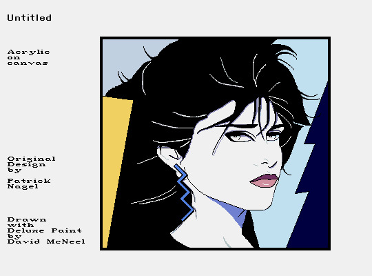
61 notes
·
View notes
Text
"Nice Corpse House My Guy" Remastered Behind Scenes!
The most glaring and obviously annoying thing that's evident in this comic- if you even wanna call it that- are the god forsaken BACKGROUNDS. There was a lot of experimentation going on for backgrounds here. Because the first couple pictures, THAT is what I used to draw backgrounds as. Trees are sticks and grass is flat. I realized that wasn't gonna cut it. I didn't like it at all. So I started experimenting and boy was it messy. It finally sorta settled on the style by the end of the comic. I'm still unhappy with it, but it'll have to do for now.

Here's a small comparison
One thing that I ran into was how I was gonna show that N was in his "killer mode." I could have placed the X's over the pupils, but found it unnatural looking in my style. So instead, it was settled to a concentrated light in the pupils.
Best seen between these two. The second N snaps out of it, the X/light in his pupils disappears, and the normal light returns to his eyes, which is similar to Uzi's.
Another thing I started slowly including was Uzi's little tooth on her beak.
The jutting out portion on her beak is a personal touch. Although it doesn't really matter, I included it to separate her from the rest of the "worker drones." Seen as she's an absolute solver host and has a solver form, something was going to creep up in her crow design, hence the little teeth. Doll would have them too, given I draw her in the form I've been thinking about.
Another thing I ran into, was WHAT WAS UZI GONNA TAKE N DOWN WITH?! This is a bird vs. a dog! No way was a bird gonna decommission a whole dog! Then this scene came up in my recent rewatch of Murder Drones.
And it clicked. Loooong long time ago, I had a very specific hyperfixation: birds. One thing I learned that some pigeons do, was they're capable of doing a somersault. And in mid-air, too!
I was finally set. The SICK AS HELL RAILGUN was downgraded to a simple piece of shiny glass/pebble that attracted Uzi- and crows love shiny things. And the same pebble will be used to launch at N's sensor that made him trip over. Because I was also not going to draw N doggo losing his head. I love gorey and bloody shows and art- hence why I watched Murder Drones- but I honestly had no idea how to recreate that, and I suck at drawing gore in general, I mean, did you SEE the crow N was chewing on? That was my best try honestly.
Here are some progress shots and how the layers worked in the scene where N is bonked with a stick.
As per usual, start with a sketch, this is actually 2nd sketch. The first is much rougher, just some circles and random shapes to outline his body form.
Then, this is all outlined and rendered. Along with some additions like the stick and the little rock.
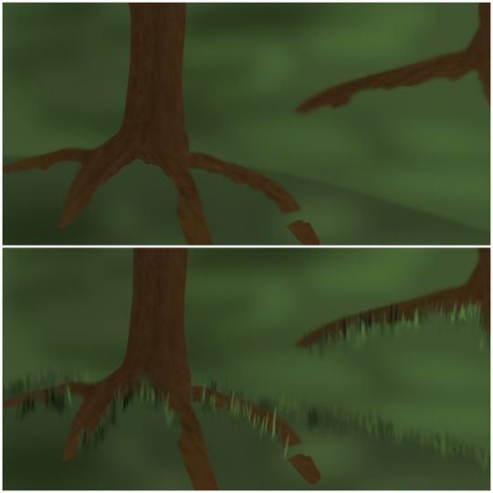
The background was the hardest, aside from some weird angles I picked to draw Uzi and N at. I suck at backgrounds, like I've mentioned many times before. So, this needed a lot of testing and experimenting. Most of this works because I found some cool brushes to use. But aside from that, I honestly still don't like how it looks. It's slightly better than my stick trees and flat grass though, I guess.
Put it all together, add a black layer to simulate nighttime, put some lights to show moonlight through trees and voila, you've got an N doggo that got bonked by a stick! I see this project/comic mostly as practice and testing. Background testing mostly, and some brushes. The background/brush testing actually spilled over into another post of the solver Uzi I made a bit back. I'd say I was pretty happy how it turned out, but brush wise, I was going to test around a little more.
NUzi comic 'Sleep' is my next project. Uhhh, don't ask me when I'm gonna have it out, I have no idea. I'm guessing sometime end of Jan and beginning of Feb. But that might be delayed seeing as Murder Drones ep7 should be out sometime soon too, so I'll need to go crazy about that for a bit and then I'll go back to my usual thing ^_^ 'Sleep' will take place still between the Pilot and Heartbeat.
P.S. I have all 26 pages story boarded... good god what happened to the 'mini' part of the comic 😭
Anyways, why are you still here?! Have a cookie ^_^ you made it! Have a nice day now, bye bye <3
#murder drones#glitch productions#serial designation n#uzi doorman#murder drones fanart#md uzi doorman#md uzi#md serial designation n#murder drones serial designation n#murder drones n#bluginkgo's murder drones as animals#n x uzi#murder drones uzi#md n#n md#md nuzi#murder drones nuzi#nuzi#md biscuitbites#biscuitbites#n murder drones
91 notes
·
View notes
Text
info
mush/noodle · he/him · 21
read the FAQ?
hi. i draw sfw, nonfetish mpreg. of simon petrikov. i dont take requests unless im particular to them + simon related. but im willing to discuss and answer questions you have abt the whole.. mpreg simon thing lol, and you're always welcome to suggest things you want to see pertaining to my content, just uh.. be patient, and be aware im only gonna post simon stuff lol. i dont do a/b/o either. my blog is very fluff + angst forewarning. i aint afraid to touch heavier topics but i try my best to tw them accordingly.
i have a group of running aus and sometimes my content isn't just mpreg.
im extremely uncomfortable with proship. please dont be horny on my art, i will block you. other than that im pretty chill

my art tag is #i have a mproblem, i also have #golbaby and #golbaby +1000 if youre looking for the baby or them in 1000 years. #my style is for works in my non-at art style.
au tags beneath the cut :)
MAIN TIMELINE AUS (morrigan is the child of GOLBetty and the Simon in the show)
#plainvanilla the default timeline. the au color is purple.
#wizardbetty (petrigrof semi-fix it au where simon is brought back in time into an alternate universe where betty survived as a budding wizard in the nuclear fallout, where he has to navigate the apocalypse while pregnant. eventually, morrigan creates a portal back to ooo, and the two try their best to get back to normal life while raising golbaby and trying to relate to humans from a time that is not their own.) the au color is blue.
#spicywizardbetty (similar to wizardbetty but simon is brought to the present day in her au. betty has full MMS and thinks he is her universe's simon come back to be with her.) the au color is the same blue as wizardbetty's.
#replacement dad (morrigan kidnaps an ice king from another universe and uses their transmutation abilities to change the wiring to bring that simon back and change the crown's appearance enchantment to make him resemble their dad. this simon, referred to as Imon or Ice Simon, is kept in morri's pocket dimension while they "fix" him.) this au has no set color.
#bad end. (au where morrigan is unable to break the seal placed on them and is born 6 months after their due date; exhausted from trying to break the seal for so long, they drain the life of everything around them and it ends up killing everyone in the candy kingdom. marcy is a chaos creature now and pb is a monstrosity akin to the mother gum) this one is super angsty! the au color is grey.
#forever seal (au where the seal placed on morrigan is extremely powerful and meant to be permanent, or at least until pb can figure out how to neutralize golbaby's powers; simon runs off shortly afterwards and is desperately seeking some way to break the seal on his baby. a wanted man, he travels ruins and hunts for artifacts and researches spells, while trying not to garner any attention from the townsfolk he lives with.) the au color is dark green.
#creaturewizards (arguably the most canon divergent, where wizards are all different kinds of mythical creatures. simon was turned into a sphinx and retains the species after being digested by GOLB, where betty becomes a harpy before becoming GOLBETTY. when she impregnates simon, he is expecting a whole litter instead of just morrigan.) the au color is brown.
MAJOR AUS (these universes do not feature morrigan as a golbaby, and the simons, betties, etc are different)
#candyworld (au where simon and betty are recreated as candy people, with betty being the candy elemental in pb's place. eventually she gains proper sentience with no candy person dumb dumb and overthrows pb, becoming the incredibly territorial candy witch.) the au color is pink.
#vamparents (au where simon and betty are vampires in the vampire king's inner circle, known as THE HANGED MAN and THE WORLD separately, and THE LOVERS together. betty was ambushed by a vampire before the mushroom war and was turned, before biting simon to save him from death by radiation poisoning.) the au color is maroon.
#lichtrikov (au where the host body The Lich chooses is the corpse of Simon Petrikov, unwittingly incurring GOLBetty's wrath. there is an alternate timeline of this where she impregnates him with a child meant to punish him forever by rendering him useless.) the au color is green.
#magic morri (au where magic betty and ice king stay together and have morri, who is then taken and raised by pb and marcy) the au color is teal.
#dreamtime au (very tiny au following a dream i had once where magic betty turned ice king back into simon successfully after learning he was pregnant. ice king's personality is not entirely gone.) the au color is very loosely dark blue, but doesn't have a set color either.
89 notes
·
View notes
Note
Do you have any other photos of the shawl Meg wears during "Notes"? I'm trying to recreate it and there are different versions but I'm struggling to find pictures that are better than my blurry screenshot so I thought I'd ask the expert. Many many thanks!
I think the good news is that there isn't one specific look. It depends on what version of the shawl you are looking for, which production, which actress, as the shawls come in many forms and colours. Note that it's only in the West End revival and the Restaged Tour that she use the shawl in the managers office. In the original staging it's only done for the Sitzprobe. Which in turn means that the typical Primadonna lineup looked like this:

While the new West End revival lineup looks like this:

They do the same in the Restaged Tour, so I assume it's a clue or two picked up from there. The Restaged Tour has used many different colours for the shawl - originally black, then blue, now pink. The latter is in sync with the West End revival.
The shawl itself, in the original staging, is usually knitted or crocheted, sometimes more lace-like or embroidered silk, with or without fringes, usually cream, sometimes grey or beige.
Janet Devenish, original West End 1986:

Kelsey Connolly, Broadway 2019:

...Paloma Garcia Lee in the US Tour 2010:

...and Kara Klein on Broadway 2012:

Emma Harris, West End 2009:

Georgia Ware, West End 2016:

A similar one, albeit with more structure, could be seen in the South Korean revival 2023, as worn by Cho Ha Rin:

And a plainer floral one worn in Essen, Hamburg, Oberhausen and Sao Paulo - here seen on Theano Makariou in Hamburg 2013:

Last but not least this, worn by Tandi Meikle in South Africa 2004 and later by other World Tour Megs:

For the West End revival they did a more pinkish tone to the shawl Ellie Waite and later Maiya Hisaka wore:

I am almost tempted to think they dyed an elder cream shawl, as it looks very similar to the one Heidi Ann O'Brien wore some 12 years ago, give or take the fringes:

But then an additional change for Maiya Hisaka in 2024, as they fitted her with what looks like a pink embroidered Chinese silk shawl, similar in style to Christine's Aminta shawl. This is what she wore for the West End Live performance:

And here's a better view of the details:

In other words: Unless you are determined to recreate one specific shawl, you have quite the leeway to recreate the look. They come in many textures, patterns and colours. As long as it is square and preferably with some fringes or outline, it is a recognizable look.
A last note: The shawl is usually fastened in a much-used period way. Fold it in half (making a triangle), place it over the shoulders with the large point down the back, and bring the ends over the chest and tie them in the back. For this to be comfortable it's a good idea to stick to a knitted or crocheted shawl, or an elastic material.
Best of luck with the making / sourcing!
21 notes
·
View notes
Text
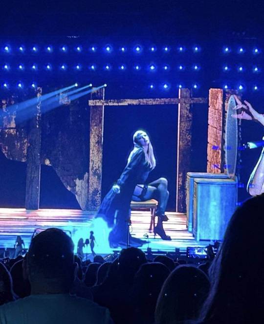
Kaylor : The Eras Tour
First thread I'll import here is this one: Every Kaylor references on The Eras Tour
On Twitter I update this thread from time to time when I find new things, not too sure how it works on Tumblr 😅 But I'll figure it out!
So here's all the Kaylor references I could find while watching the concert, TikTok and by my beautiful moots on Twitter.
Let's start with a Kaylor classic! Daisies:
There is daisies on the necklace she wears during Lover Era.
Daisies on the ceiling during Love Story (Karlie's favourite song)
Daisies on the piano during the surprise songs.
My personal favourite: Karlie's birthday:
During Bad Blood - wich is Track 8 of 1989, there's a 3 light up on the ceiling.
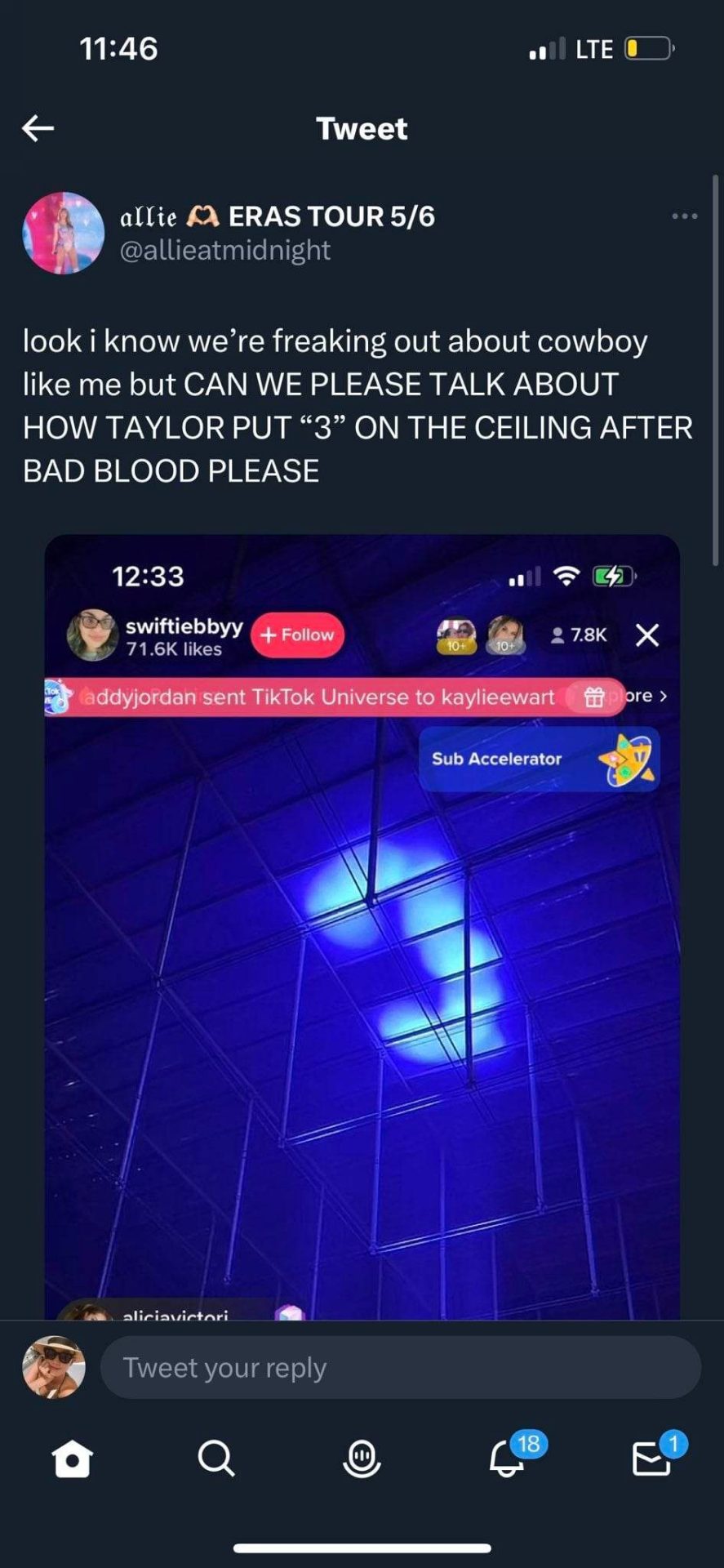
8/3 = Karlie's birthday
The letter K now:
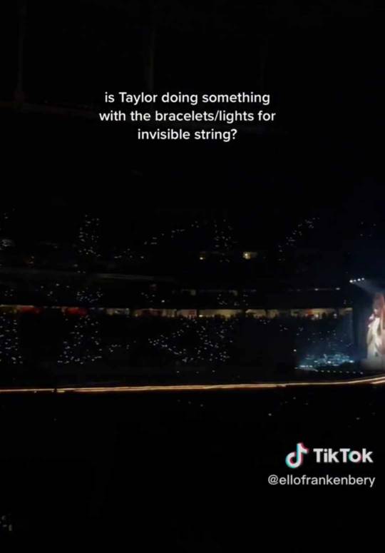
During Invisible String, you can see the letters KK light up in the audience.
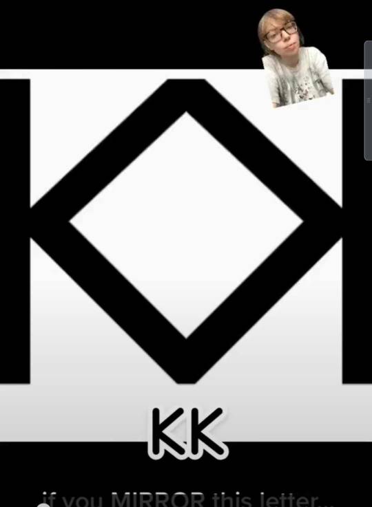
This person found out that if you mirror two Ks, it gives a diamond. Just like the stage.
Sadly I screenrecorded it when I saw it and forgot to take note of who did this, so I can't credit...
Now the 2014 VSFS :
In Bad Blood Taylor on the screen wears something odly similar to what Karlie wore during the 2014 VSFS
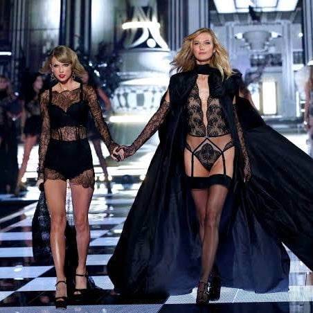
Notice the floor that look like a chess game? Taylor recreated it during the Mastermind set.
And during the 2014 VSFS Taylor sang style and walked hand in hand with Karlie, well she does the same with one dancer.
More than that, with Karlie she walked exactly 16 steps.
With the dancer, she walks exactly 16 steps.
But she also points at the dance in the exact same way that she pointed at Karie.

The Eye Theory :
There's also A LOT of eye theory references during the show.
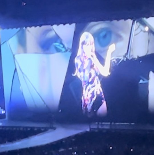
During Delicate
During My Tears Ricochet (PS I don't remembre where I took this picture, so if it's one of you, tell me and i'll credit you)
Also some pointed that the dilated pupils made them think of the Best Best Friends staring contest and Karlie's eyes.
During Illicit Affairs

During Fearless
During Mastermind. At some point the diamond look like an eye.
Other Kaylor Flagging:
During the reputation intro, the hands are not Taylor's, but looks a lot like Karlie's.
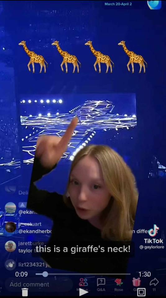
At the end of Delicate, the stage looks like a giraffe neck as pointed out by Gaylolore on Tiktok.
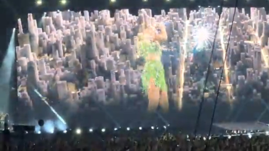
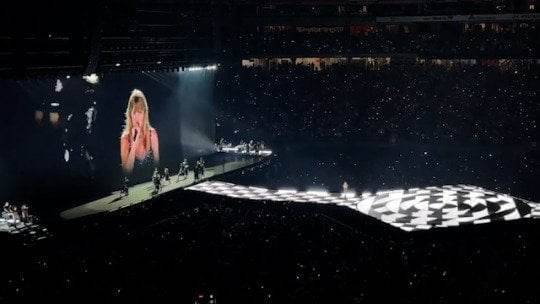
In Style when she sings "take me home" New York city appears on the screen with the sun moving toward something.
And there's a golden path illuminated in the streets.
The sun also appears on the screen during surprise songs.
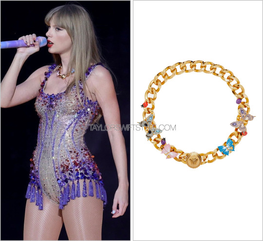
The new Lover necklace has butterflies on it. (In the Best Best Friends video, Taylor described Karlie as a Fairy Butterfly, and there's also the ME! mural...)
The Folklore cabin is a replica of the Castro cabin where both Taylor and Karlie stayed at Big Sur.
Source: Kaylortruther on Twitter
The Delicate performance has a lot or ressemblance to this Caroline Herrera commercial Karlie did.

The entirerity of The Last Great American Dinasty with the Karlie look alike and their interactions.
Ok that's about it for the Kaylor references I could find in the tour visual.
I'll probably do a part two for all the Kaylor Koicidences that happened during the tour too. because there's A LOT.
165 notes
·
View notes
Text
I find Duke's relationship to the Batfam so fascinating. He has three living parents: an evil bio dad and his jokerized parents. He would never join Gnomon, and his parents can't care for him in their current state. There's also very little hope of finding a cure that will completely reverse the Joker Gas effects. That's why he was originally put in foster care: he has no one. Until, of course, Bruce Wayne offers him a place at his family. And what a weird thing that must be for him.
He hasn't had a home in years, actively running away from foster families to try and find/cure his parents. Even now, he visits them despite how awful it makes him feel because that's his family. And now he has a stable place to call home with a couple of adults acting as parental figures and a bunch of pseudo siblings, all of them Gotham vigilantes. How do you fit in?
Even if you're interpreting the Batfam as completely wholesome (WFA style), I don't think Duke would want to fit in, not entirely. This new family going overboard to make him feel welcome and included when he would feel more comfortable with some degree of separation. Not because he has anything against them, those are his heroes, the people he looks up to...but his parents are alive. They are alive and as long as there's a chance, no matter how small, to cure them he's going to take it.
No matter what he does, guilt is just around the corner. If he gets comfortable with the Wayne's, he's betraying his parents. If he keeps his distance he hurts the people that have given him a home after so many years running. There's also the physical distance: all Wayne adopted siblings look quite similar to each other, it makes it easier to feel out of place. They're all perfectly human too, with Duke being also the only meta of the family. Not even his friends from We Are Robin share that with him.
I think Cass and Damian would help him feel integrated the most. Particularly it could be very interesting to join it with Damian's journey into feeling secure in the family. He used to reject Tim and now he tries to make Duke feel part of the family. Also, Bruce is very impressed by Duke despite his usual emotional constipation. I would love to see an arc for the character where he realizes he can have both families. He doesn't need to let go of his parents to be part of the batfam, and this new family will support his love for his parents. Especially considering how Joke tried to recreate the murder of the Wayne's with the Thomases, I think Bruce would make sure Duke knows he's not trying to replace his parents.
Maybe I'm weak for characters that have to deal with loved ones that aren't neither gone nor here, but damm. Also, I hope that the whole "the damage is irreversible" thing was a joke and the Thomases recover. I really need them and Crystal Brown to make a "civilian parents" support group.
16 notes
·
View notes
Text

Thank you for your such warm messages you send me. And thank you for your questions about the WIP World. You have no idea how important it's to me. I'm not always good at creating a world. But when something starts to look good and it turns out that I'm not the only one who likes it, you inspire me to keep creating. Thank you for the energy and inspiration you give me. And to know that I'm also inspiring other awesome creators is just Wow to me! Thank you!
It really turns out to be a hybrid style world. A mix of Romanian, Ukrainian and a bit of Polish architecture. I've been missing something like this in my game and I'm like - why not try to create a world that reflects my roots? I'm recreating the vibe of that. Whether it works or not is up to you)
In all honesty, the creation work went much faster once I had my mind definitely set on the end result. There are so many beautiful worlds with such wonderful buildings. At first I wanted something similar too. After all, I adore English and Scottish architecture. But I was not as good at it as others, to say the least, and I focused on what suited me. I also really like how creators bring pieces of themselves into the world, like objects they create themselves specifically for their world. I want to try that too. After all, it makes their work stand out and emphasizes their attention to detail even more. I guess that's what I think. I also dream of having my own DT and lighting mod. Looks like there's a lot of work ahead) Luckily, there's a lot of good tutorials out there to guide in the community and that gives me hope. I'll post some more screenshots of the world soon and I hope you like them too.
When it's done, I'll publish the world for download.
Unfortunately, the world is untitled for now.
I'm also learning how to convert Sims 4 objects to Sims 3)
As for the birds - you're right, the pigeons are the fog emittor. And the little birds, I like them very much and I decorate my game screenshots with them every chance I get. You probably know, but just in case, here's the link.
Thank you all! And I hope you're having a good day too!
Sincerely, Rachel
@150yroldteenager @sigillumdiabolik
46 notes
·
View notes
Note
For the fan kid thingy, can I get a velvetgatto? (Affogato x red velvet)
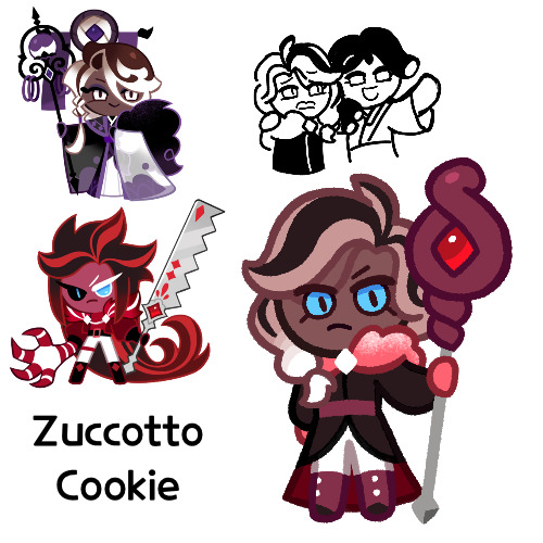
Finally…after an eternity (about 6 months, which Jesus that’s a long time), he is finished. Zuccotto Cookie
So his name. Zuccotto is basically like an ice cream cake, so a combination of Red Velvet’s cake and Affogato’s ice cream. Also, it’s Italian, like affogato. I vaguely recall the name giving me trouble at first, until I realized cake and ice cream was a valid combination and got this
Zuccotto:
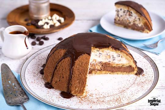
So I had his design sketched out like a month ago, and I think I recall telling you all that I couldn’t figure out how to make his design work. I had left the design I made and just went and did something else, and then today I was looking for something to draw and I said “yeah the design looks fine, don’t know why I didn’t like it” and just drew that
But also this means that I don’t remember all the reasons for his design details, most notably the staff
I mean, I know I based it off the staffs some of the Cake Monsters have, specifically the Pomegranate shamans or whatever they were called. I also know originally I was trying to make it a spork, but I couldn’t get it to look good, so I switched to the other staff. But I admit, it looks a bit out of place. I mean, I changed some of the colors at the end to match it, but I think it still looks off. But I’m not going through the effort of making a new one, I remember that staff being a pain
Anyways, so I think I was trying to give Zuccotto a style more befitting a shaman, but also with a more modern twist to emulate Red Velvet. I think I did it well
But one thing that was a real struggle was the colors, because I had no clue what to do for them. In my mind he had a black and red color scheme, and that’s how I had it at first, but I was having difficulty with putting the reds next to each other, and I changed some of the colors at the end to match the staff, and I think it worked out fine in the end
I feel like he looks too similar to Affogato, at least without colors (I felt that when I was drawing the sketch). But maybe I just need to take some time away from him and come back to really know. He probably doesn’t look as similar as I think
Also I’m just realizing that considering he’s not made of a food that contains coffee, he probably shouldn’t have dilated pupils, but like, both Red Velvet and Affogato have some form of them, so shhh
Anyways, so let’s move on to him
So Zuccotto is part of the Cookies of Darkness (assuming they stay for a long time and/or there’s a new group), and he’s some sort of Cake Shaman, summoning Cake Monsters to do his bidding. Though he has a great respect for Cakes and see them as equals. He’s not necessarily a bad guy, but he’s very loyal to the Cookies of Darkness and has no inclination to leave, feeling that normal Cookies have no respect for Cakes
I can imagine him playing cards or chess with the Cake Monsters, or at least the ones with hands
Now one of the other main things I have for him is his relationship with Licorice Cream, a darklico fankid I did some time ago, and whom you can see in the sketch (it’s supposed to be a recreation of that Toy Story meme). Basically my idea is that they’re both part of the CoD and they’re this duo within the group. Zuccotto is the straight man that gets dragged along into Licorice Cream’s antics and tries to stay the voice of reason. I said in my head that they have a dynamic similar to Mule and Sonia from Berserk, but also it’s been a while since I’ve read the chapters with them, and my mind may have branched off from that initial dynamic. But basically it’s “weird girl and normal dude who has no clue what she’s on about”. Actually that’s probably not accurate, I just don’t know how to describe Sonia, so sorry to those who haven’t read Berserk and don’t know what I’m talking about
Zuccotto’s also generally the more mature of the two, despite Licorice Cream being older (Zuccotto’s like a teenager while LC is an adult)
I feel like I should have more, but really those are the only two bits I have on him, I don’t think he’s that complicated. But I might have more to say about him when I redo Licorice Cream, since I have a better idea of what to do with her now, and they are rather close
But yeah, that’s Zuccotto Cookie, hope you like him and that maybe he was worth the wait!
#I feel like I had something to say in the tags but I forgot#but yeah one down now it’s just Raspberry Jam to go#and then they will no longer plague me#cookie run#cookie run kingdom#affogato cookie#red velvet cookie#velvetgatto#cookie run oc#fankid#fanchild#zuccotto cookie#licorice cream cookie#my ocs#my art#requests#answers
56 notes
·
View notes
Last Seen Blogs

independentmidwesterner
dejdwest

aevum17
Untitled
multipletanksyndrome
Multiple Tank Syndrome

cthylla-rlyeh
Cthylla R'lyeh

aerilizm
`petuny