#i want to get retro midcentury style floor tiles & more wood paneling and build a bar & have a cozy area by the fireplace to hang out
Explore tagged Tumblr posts
Text
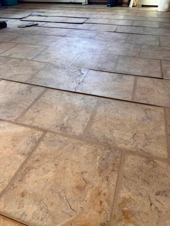
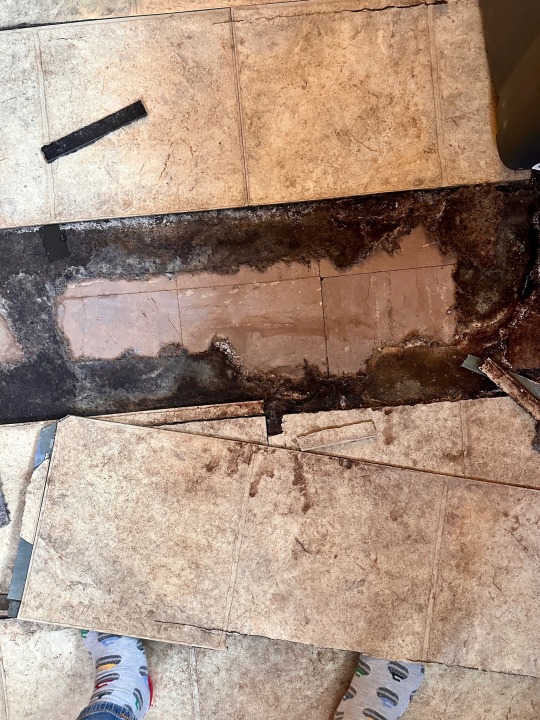
Here’s my shitty basement floor and the original asbestos tiles under the vinyl that I'm finally getting removed soon !! First steps towards finally having a nice clean functional finished basement for the first time in my life omg
#also my curling socks :) still my favorite sport lol#had the asbestos removal guy come over today to take a look and he was so enthusiastic about doing it like heck yeah#he said these are the easiest asbestos tiles to remove so it'll only take him a day & the amount he's charging is super cheap!#at least compared to what everywhere online says it should cost. ALSO he's going to take our shitty broken joybird couch to the dump lol#b/c he's gonna have a dumpster here so he was like yeah y'know anything else you want taken to the dump i'll do it for you haha#also his business card has seagulls on it so yeah this dude's great#but i'm really not kidding i have NEVER had a nice basement! my dad was a hoarder when i was growing up so our basement was awful#it was super dirty with mountains of stuff piled up & a narrow pathway through it all and the cats would shit everywhere#i guess my last basement in EC wasn't that bad but it was really small & unfinished and we just mainly used it for storage#but my basement now has a fireplace & is meant to be an additional living room type area so i REALLY want to get it fixed up#i want to get retro midcentury style floor tiles & more wood paneling and build a bar & have a cozy area by the fireplace to hang out#p
1 note
·
View note
Text
My midcentury modern renovation
After buying myself a duplex in Perth built in 1979, I decided it needed renovation. Little had been done to the house since it was first built so it was looking very tired and starting to collapse in places. Building oversite was obviously not strict at this time as many roof beams were not nailed in place properly and the weight of the concrete tiles was collapsing the roof in the lounge area. This also resulted in the eaves dropping, allowing water to seep into these areas. The glue holding up the ceiling in many of the rooms was also failing and many of the ceilings were collapsing. As such, these were the initial works I had engaged workmen to undertake. After these works were completed the roof was painted a very pale orange colour to reflect the sunlight and reduce the heat entering the roof space and solar panels were added to reduce my power bills.
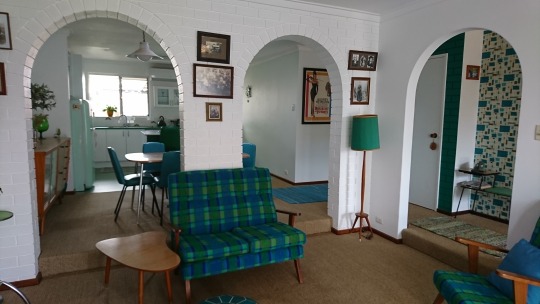
Then it was time to start renovating the inside. The lounge had a large window that overlooked the front garden which was beginning to leak so the first thing I did was replace it with wooden French doors. These open out onto a newly paved patio area with a patio built from the wood used in an old carport that someone advertised on Gumtree. The kitchen and dining room were dark brown brick walls with four arches. As arches were a feature of the retro era, I decided to keep three of these in the lounge/dining room wall so set about painting them with two coats of undercoat and two of a semi-gloss white paint. The bricks all had to be dusted first as they contained 30 years of dust and the whole job took me at least 2 weeks. But it was worth all the work as they now provide a clean-looking, textured wall for this space.
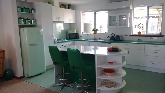
Next, I had to decide how I was going to renovate my kitchen. This small area was walled off with dark brown bricks on two sides and a small archway to communicate between the kitchen and dining room. This limited my ability to interact with guests while I was cooking. After much deliberation I finally chose to knock down both these brick walls, virtually gutting the whole kitchen area. Next came the exciting task of designing my new kitchen. Two large windows and an air conditioner remained on the far wall so I had to include these in my design. I had purchased green kitchen appliances to match a retro fridge I had bought at a second-hand shop a few years earlier so knew what colours I wanted, which is a big help when doing any renovation. The fridge had also influenced my decision to have a retro design for my house. After hours researching retro kitchens, I also knew the features I wanted including: drawers with cupboards underneath, a row of drawers and open, circular shelves at the end of the cupboards. I also wanted a small cupboard with glass doors on the wall, an island and a floor to ceiling pantry.
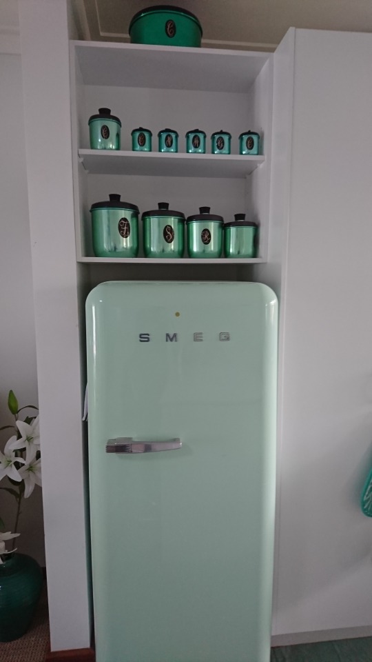
I had already collected some Jason green kitchen cannisters for flour, sugar etc so knew I wanted some shelves to display these. Fortunately, my small-sized fridge allowed room for these shelves to be placed above it. I did a lot of research on-line until I found the right shade of green Laminex Laminate for the benchtop. Simon, at the kitchen renovation company I engaged to do the work, was a great help in deciding what was possible and what materials I could use. I wanted a matt finish so used a white Melamine Sheen for my doors and panels and found some retro-looking handles to place on them. I knew I needed as much white as possible with the dark green benchtop and chairs so decided a white stone benchtop would look best on the island. I found a lovely white stone with a greyish-green fleck in it at the kitchen company which was just what I wanted.
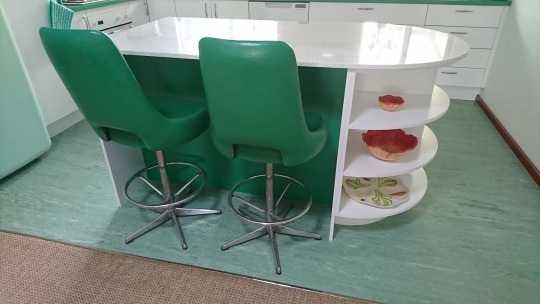
After the walls had been demolished my kitchen cabinets arrived and after looking at them, I realised the white was overwhelming and needed breaking up. To do this I asked for a small strip of green Laminex to be placed on the front of the exhaust fan and a larger piece to be placed on the back of the island where the green chairs would sit. This made a big difference to the overall look of the kitchen as it helped to balance the colours and I’m really pleased I did this. After the kitchen had been installed, I then had to decide what tiles would be placed above the benchtop and what I would use for the splashback.
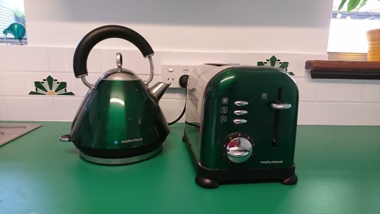
I had visited a small shop in Fremantle that sells hand-made tiles of vintage design so researched their website and found some lovely tiles with a green art-deco design. Having only these tiles would have made the small area look too busy so I decided to scatter a few amongst some white tiles the same size. They were also very expensive so with this design I was able to do the tiling for a more reasonable cost. I tossed up whether to get a lovely picture on the splashback but decided in the end to get a plain colour as I didn’t want it to dominate the kitchen. I decided on a silvery-white look and did a bit of research trying to find something that would give me the look I wanted. In the end I went to a company that designs and sells splashbacks and found one that had a slight silvery sheen to it but it also had a greenish tinge to the glass. When it was installed the green was even more pronounced and it came out looking great with the green benchtop.
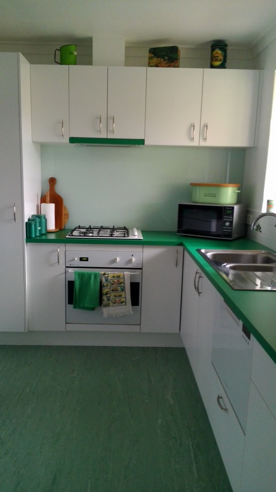
Next, I needed to do the floor. I also wanted to replace the carpet in the dining room, lounge and passage and during my research found a company selling natural fibres which I liked the idea of. These are mostly made of jute, coir, sisal, wool sisal mixes and seagrass. I felt these carpets were more environmentally friendly and thought they might be less attractive to dust mites. After much deliberation I finally found one made of sisal I liked and had this installed. Then I needed to find a lino or tiles for the kitchen that would match the colours and retro look I had designed. I wanted green and white tiles but could not find them anywhere. My research led me to commercial linos and I found one in green that I liked. However, when I ordered it, I was told they had stopped making that design and I was provided with some other samples to choose from. The one I chose has actually turned out to be one of the best decisions I have made for the design of the kitchen. It is exactly the right colour and the pattern is also similar to that found in some older houses. Perhaps some things are meant to be….
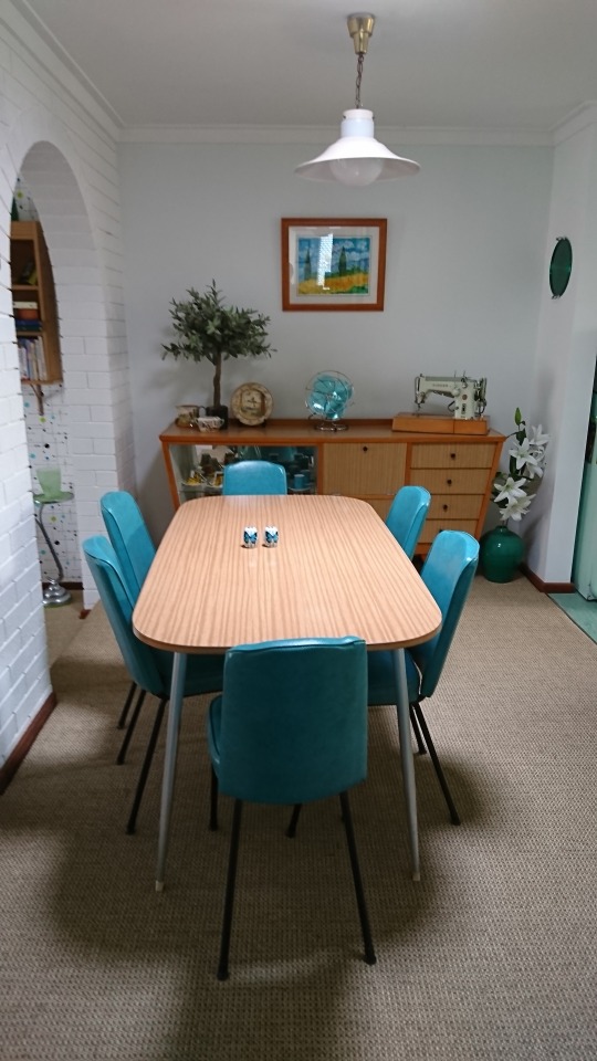
I had been buying second-hand furniture advertised on my local Gumtree website for years as I didn’t have much furniture when I shifted into the house and I like the retro style of furniture. Someone had sold me her grandmother’s sideboard which was lined with a blonde-wood Formica. A year or two after this I found a lovely dining suite in the same Formica style with 6 turquoise chairs that matched the colours in my lounge. This completed my dining area nicely.
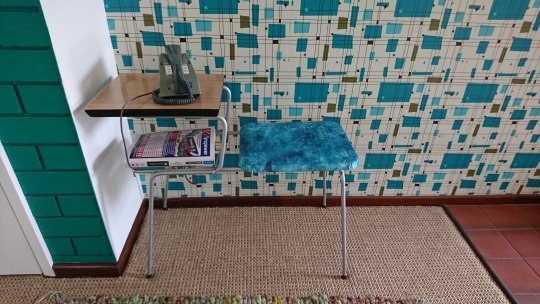
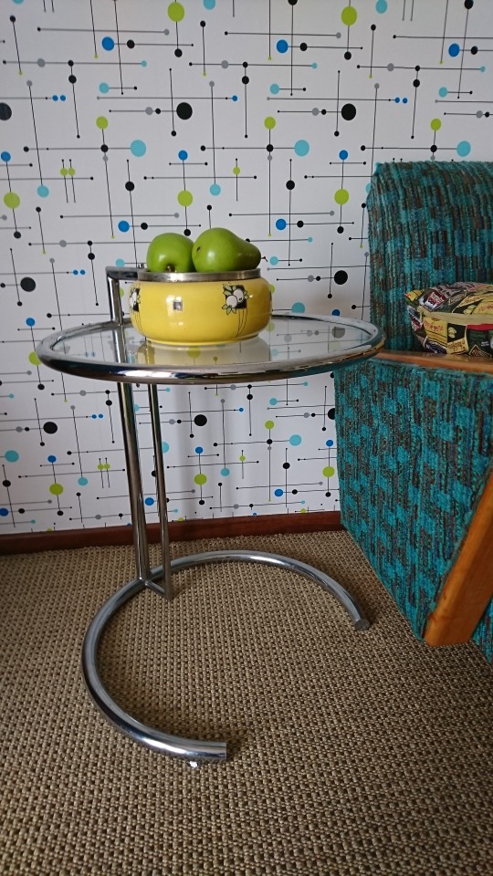
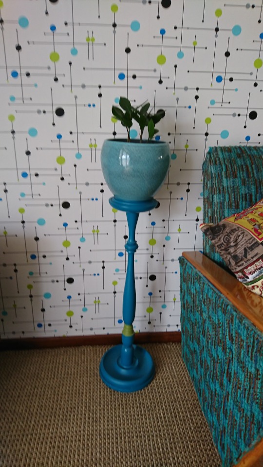
While I was waiting for my kitchen to be installed, I spent lots of time plastering, sanding and painting the walls in the lounge, foyer and kitchen area as these had had a lot of hard wear over the 30-odd years they had been painted. I mixed my own paint so I could get different shades in each room of the house. I wanted very light shades of blue and green which meant a lot of trial and error. (This ended with me having to sell a whole 4L tin of paint for $20 I had tinted but couldn’t use because it was too bright). I then decided to wallpaper the foyer wall. This wall consisted of a few pieces of gib-board that had been placed onto the wall and poorly joined. As a result, I had to do a lot of plastering and sanding. Then I bought lining paper and with the help of a friend, we placed the paper vertically across the wall to help cover the joins. I found that an English website, Spoonflower had by far the best wallpaper designs and after a lot of searching I found a retro, atomic design with the right colours I wanted. I had wallpapered a house before when I lived in New Zealand so had a fair idea what I was doing. I also found the new wallpapers with glue on the back are very easy to slide into place. The design on the wallpaper also helps to match each strip.
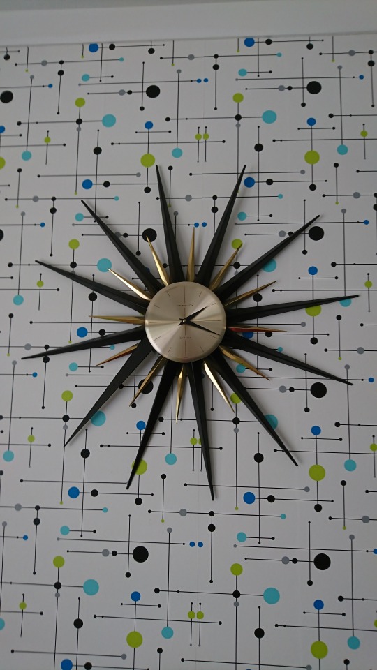
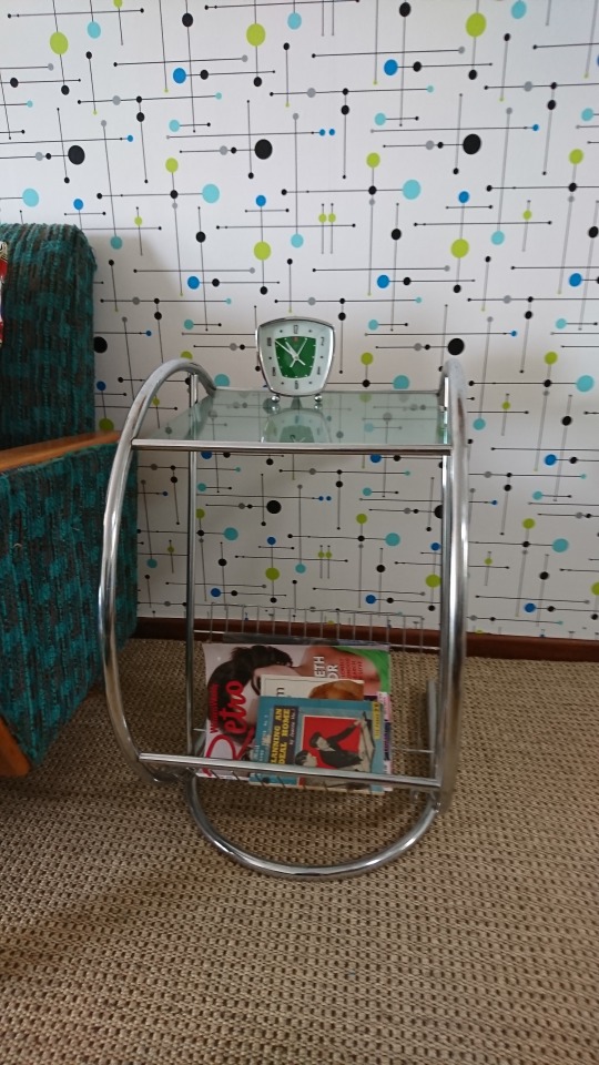
I was so happy with the look of the foyer wall that I decided to put wallpaper on one of the walls in the lounge room. I needed a wallpaper for this wall that wasn’t too bold or bright so that it didn’t conflict with the tartan in my lounge suite and that had an atomic look to it. Another extensive search on Spoonflower ended with me finding a new design that really suited the colours in my lounge suite – green, turquoise and blue.
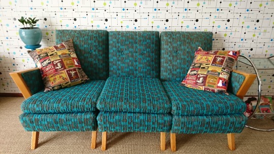
It is interesting how sometimes things just fall into place. Not long after completing the wallpapering of the lounge wall I noticed an advert for a second-hand lounge suite in exactly the right colour – turquoise - that was in the atomic style. I was able to buy this and renovate the wooden parts of it. The upholstery is a little faded in places but it is in reasonable condition for the age of the lounge suite so I didn’t have to spend much on it and it is perfectly suited to the wallpaper on the wall. It was also a plain colour which worked in well with the other tartan lounge suite I had already purchased a few years before.
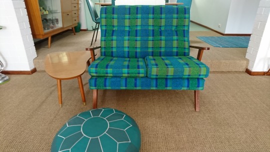
An art-deco style piano, an old stereogram that works and a retro-style coffee table make up the other furniture in this room.
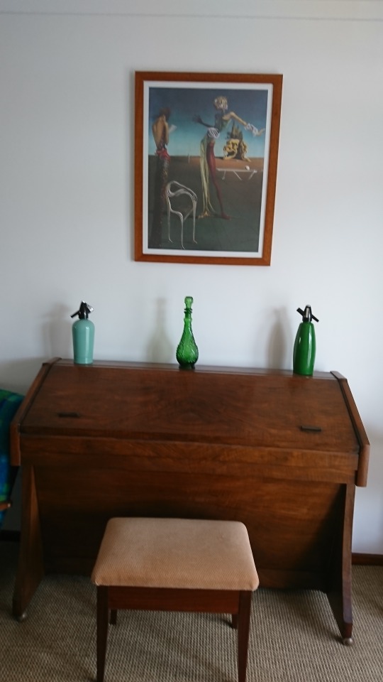
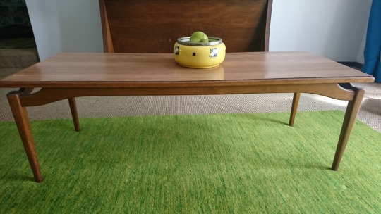
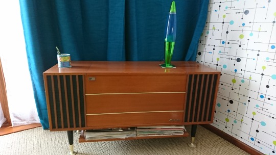
I have also purchased other collectables on Gumtree or second-hand shops that help to enhance the retro look of the lounge room. Bright teal curtains and a green mat have finished off this room nicely. My last job is to renovate the coffee table top.
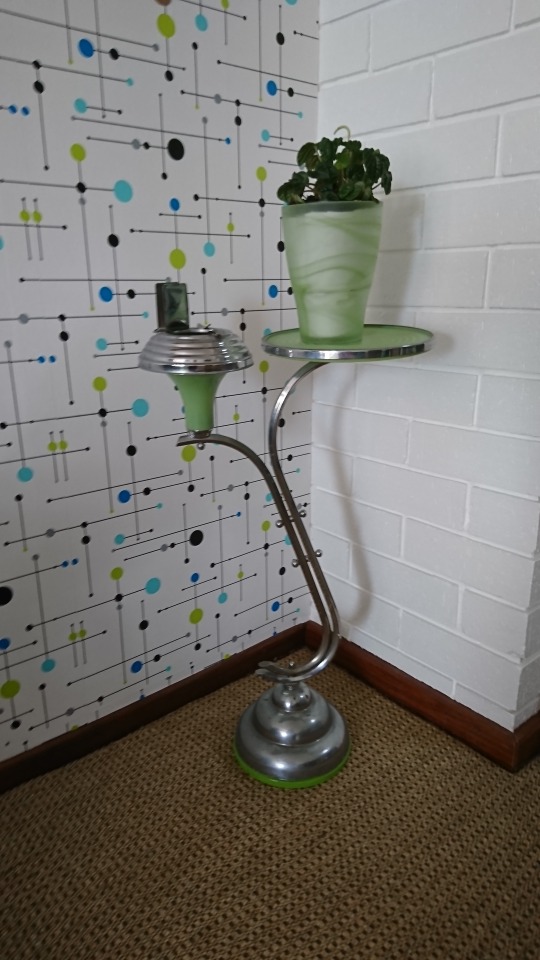
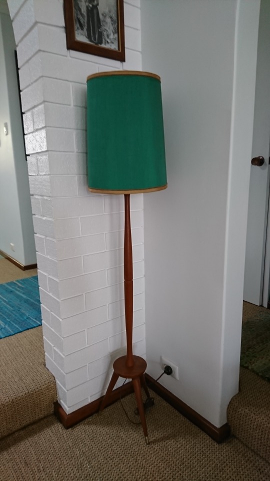
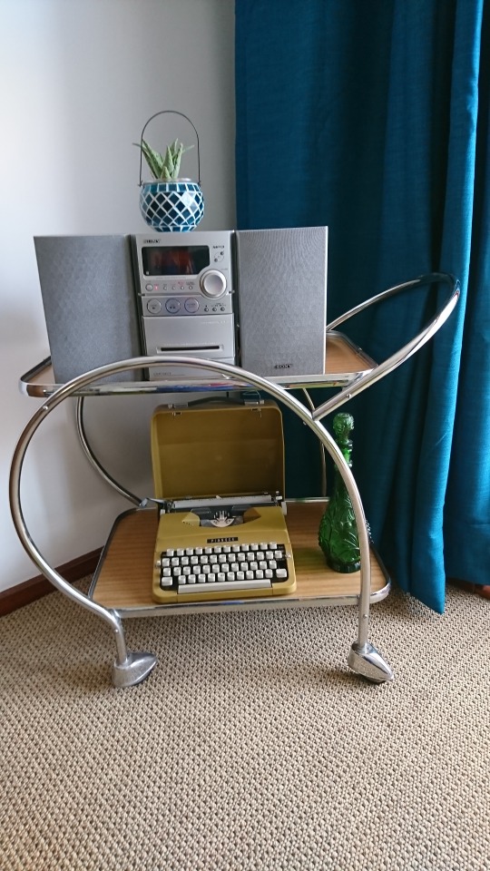
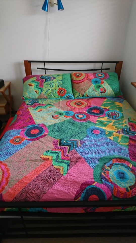
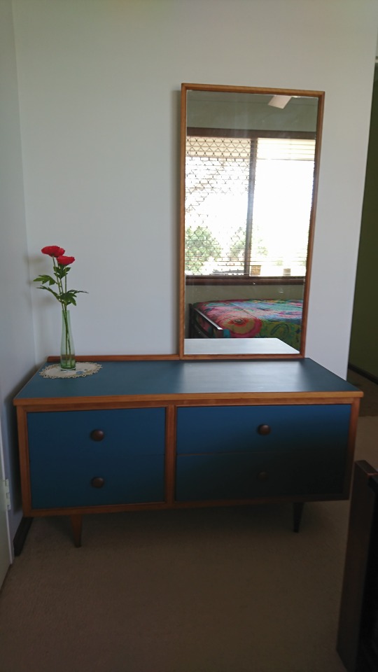
The spare bedroom has also been renovated in a retro style. After fixing up the plaster and painting the walls, then varnishing the windowsill, I proceeded to paint a lovely retro dressing table I had acquired off Gumtree. I also found some interesting bedside lights and altered them to hang on the wall above the bed. Lastly, I have bought a brightly coloured new bedspread to brighten up the room. All that’s left to do is to renovate the bedside table.
This renovation has taken nearly 2 years with many hours of research and work. But it has been achieved using a modest budget. It has been a labour of love and I’ve really enjoyed the opportunity to use my creative abilities to create a home that I really enjoy living in. I hope it gives somebody some ideas for how they can create a midcentury modern look to their home on a modest budget.
2 notes
·
View notes