#i use paint for quick copy and pasting screenshots
Explore tagged Tumblr posts
Text
you are not him

#????#i use paint for quick copy and pasting screenshots#but now the prnt screen button opens a separate program to select the screen manually and copy and its long and tedious. hate it#just screenshot when i press the button why are you opening a program. shut up
2 notes
·
View notes
Note
Hello, do you have tutorial for how you get 3D models into your game?
hi! it's easy, here's a quick tutorial:
So first off you'll need Sims 4 Studio, Blender, and a very general idea of how to use Blender to make CC
Your 3D model needs to be in a file format supported by Blender. I use 2.76 which supports what you see in the screenshot below. If the model you found isn't available in a supported format, there are converters online which can convert models to .obj (anyconv.com, etc.). Just give it a Google
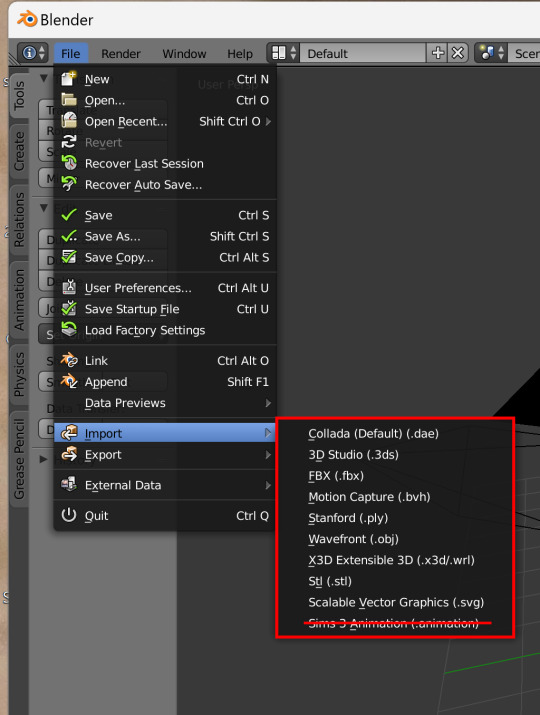
I found a .dae model of an old TV on freepoly.org to use for this tutorial (the download came with a textures folder and a model folder).
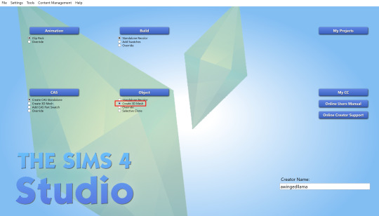
In S4S, create a 3D mesh for whatever kind of model you downloaded (or just a deco object, if you don't want it to be functional).
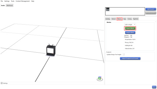
In the meshes tab, export the mesh of the EA object.
Open the blender file of the EA object, and import the 3D model into the scene. The TV model is a collada file, but you'd import whatever kind of file you downloaded.
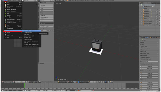
If it looks like nothing happened, don't worry! Your model is there, it's probably just to scale - which means super huge in comparison to the tiny Sims 4 object. Zoom out until you can see it, and then size it down with the 'S' key. Move it to the same place as the EA mesh
Rename UV Map to uv_0. Then, after deleting the EA mesh in edit mode, join the 3D model with the EA object. Shift-click the imported model then the EA object in the outliner, before pressing Ctrl+J (you have to be in Object mode for this to work. Use Tab key to quickly toggle between Edit and Object mode)
If you are using a deco object, you'll be replacing s4studio_mesh_1. s4studio_mesh_0 will probably be a shadow plane, which can be left alone or hidden altogether in your mesh
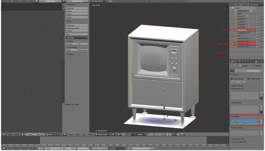
Apply a decimate modifier to the mesh if necessary (some 3D models are pretty geometry heavy – you'll probably want it under 10k polys). Since decimating is destructive, you don't want a very high poly mesh, because it won't look good after the modifier is applied. (you can retopologize the mesh but that's a whole other thing)
Import the mesh in S4S (the higher poly the mesh, the longer this takes), then import the texture that came with the model. This texture was a 4k JPEG, so it needed a bit of work (especially as TS4 doesn't support 4k textures). I sized it down to 1024x1024 and converted it to a .png.

Replace all LODs and shadow meshes. Make sure to import a blank bump and specular map, or else your object will be oddly lined and shiny
This last step is optional, but as most 3D models (that aren't game ready) are made for rendered environments, a lot of the textures don't have ambient occlusion or highlights. It makes for a bit of a plain-looking object in TS4, so I like to add these by baking the shadows in blender and painting highlights in PS. I also used the oil paint filter in Photoshop on the wood to make it more maxis-match.

If you haven't made anything for TS4 this might seem complicated, but once you get the basics it's very, very simple. Like copy-and-paste
the only other thing would be to make sure that the license for the 3D model permits personal use! (and not to paywall it obviously because beyond being crusty behaviour, that is legally perilous)
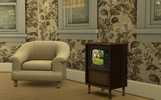
download the TV here if you like
and if you have any questions about specific steps, dm me!
393 notes
·
View notes
Note
Hi! Sorry if you've already answered this but how do you color your art? I really love how it looks, so smooth with the colors sort of blocked in. It's lovely ☺️
omg thank you!! i saved a lil screenshot WIP of the last pic but i usually clump together big blocks of paint and what sort of shades will go there first, and then take a smaller brush to put it all together.

i tried to put something together real quick but i usually start out with a big water color brush and then refine with a rough pen tool (usually a mix of both there) and cut away the excess.


I'll copy and paste my sketch layer a million times as I move thorughout also. probably not the most efficient way to go about it LOL.
i used to try to have a very smooth painterly style and for some reason couldnt put it together despite watching and trying a million tutorials so i decided to just own it and do blocky colors
33 notes
·
View notes
Note
i demand the 3D objects thoughts
Well I put it off to the absolute last possible moment. If you're reading this it's already too late. Paint 3d is dead

You will not be able to download it from the Microsoft store, and let's be honest, it's too shit for anyone to actually archive it (not that I'd even know how given it's a uwp distributed through the store and never offered as a standalone exe)
But let's not dance on paint 3d's untimely grave. As the world's first ever Kafkaesque photo editor it gave something very special to us all. I've come to love it, even if every time I use it I feel a deep and unending desire to become the joker. So let us Eulogize this beautiful mix failed start of a future we were promised but was failed to be born. Let's pour one out for Paint 3d, and explain once and for all what it really means to paint 3d.
What is paint 3d?
Before you can understand Paint 3d, you must first understand ms paint. Microsoft paint, often just referred to as "Paint" is one of the oldest standard programs to come with any windows installation. It's a bitmap editor that was begun long before most tiktok users were even born. It holds a special place in a lot of 90s and 00s kid's hearts for two reasons.
without fail, it will be installed on every windows machine. You will always have paint. It's dependable, fast, easy to get into, and will open corrupted or mislabeled images. It's the notepad of images, quick, dirty and gets the job done. You can copy and paste screenshots into there to quickly crop them
It's a little bit shit. It doesn't support transparency (well it does now but lets not get ahead of ourselves) so if you tried to make a minecraft skin with it you'd get all these solid color blobs. It doesn't support layers, so anything made on it is going to have a level of earnest shittyness to it. Text can't be rotated, bounding boxes have to be predefined shapes, and once something is on the page it's on the fucking page. MS. Paint will put pixels on the page for you, but after that point it won't hold your hand.
Point 2 is really a larger part of how ms. Paint is remembered. Ms. Paint is synonymous with youth, it's synonymous with limited computer time, with ignorance, with having nothing better. The spectacle of doing anything in Ms. Paint lead to the selling point of ms paint adventures which became homestuck. If you want to strawman someone's political opinions, you draw them in MS paint. The early, edgy, ugly look of the 00s web was defined by MS paint just as much as it was defined by adobe flash. The limitations of this piece of shit software defined a generation's artistic identity. We love it because it is shit. We would not have it any other way
Okay but you didn't explain Paint 3d!
Well, gosh, don't interrupt me. Yeah, so what is paint 3d? In 2017 Paint was added to the deprecated feature list. A special update was pushed so if you opened up paint it would ask you if you'd rather switch to paint 3d
Paint 3d put a fresh new stab at the utility, redoing it in the new UWP format and dressing it up in the company's then standard design language. The refresh also added a whole host of nice, modern features such as:

An updated set of tools, some but not all of which are pressure sensitive when used with tablets/touch

The ability to use transparency!
Hurray those are great new features wait what do those other buttons do?

Yes paint 3d lives up to it's name, you can add stock 3d models to any of your drawings and they're all kinda awful
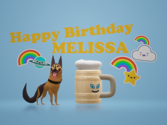
3d text, 3d models, go ahead and place them in your scene. They put the whole project spark asset library in there last year, if you can think of it it's probably not in there but hey there'll be something and it may or may not have a texture because the model may have been intended for 3d printing
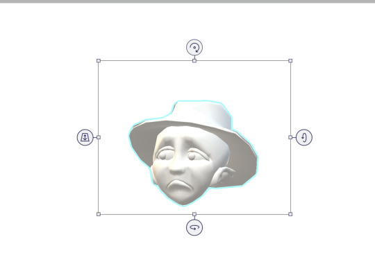
You can manipulate these objects with a slick interface that's completely non industry standard but hey it at least looks nice.

Models can also be painted on and you can pick from these options to decide the albedo/metalic values. No I don't know how to set the custom values, sometimes it's there and if you click off it's gone forever. Good luck
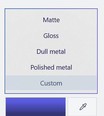

Oh and also when you're painting you're given a very convenient gizmo to rotate the object that isn't available in normal mode. You can multi select objects and group them together but beware it doesn't always work and using the undo key sometimes spawns a new copy at the wrong position and scale but don't worry this is a small bug in a new program and certainly won't be present in the final version on November 4th I promise.

You can put stickers on models and there's a nice little UI to stamp it if you want to put multiple here are all the stock standard stickers
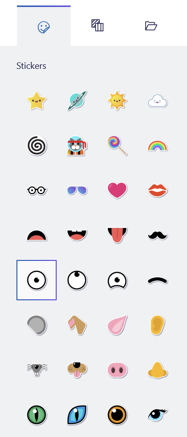
You can also use these pretty tiling textures

Or you can add any png from your hardrive

Those are the only options you'll ever get or need. You can also spawn arbitrary shapes, like cubes and spheres

And in a post launch update they even added the fucking TUBE BRUSH

Look how many tube there is. So many tube You can also edit the points individually after they're created but each tube has a maximum number of points that it can contain and you have no way of knowing until it's too late.
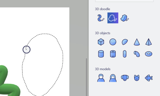
You can also use the 3d doodle to make a shitty potato looking thing, but if you browse the #paint3d tag you'll see a lot of people more talented than me using that tool to it's fullest

As you saw you also have the option to round or point the corners.

At any point you can click the 3d view button and suddenly you're no longer head on, you can orbit the camera and view the scene from any angle. Is it actually good to work with 3d scenes in this program? God fucking no

This scene nearly killed my computer to make, and that thing had okay specs for the time. Placing objects with the non standard (but touch friendly) controls is a pain and the camera cannot be oriented in any meaningful way. There is no frecam, there is no camera scale, you can orbit, you can pan. If you want more go learn blender.
You can also change the time of day

Go ahead, rotate the sun or change the filter, some of them are even minecraft specific. Most of them are objectively worse than the default, but hey you get a lot of options
Okay yes these are all cool features, but I've been dancing around paint 3d's one actually cool feature, the one that drives me mad... because it's a good idea
great even...
...too bad it's shackled to this program.
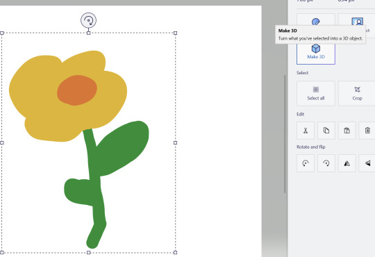
Oh this? This? yeah we can fuck with this. Now we're fucking talking

Now I can move my objects around in 3d, scale them, reorent them and make all kind of cool 3d compositions out of cut out pieces of my 2d artwork. If you look at any cool marketing material this is by far the feature they're most proud of
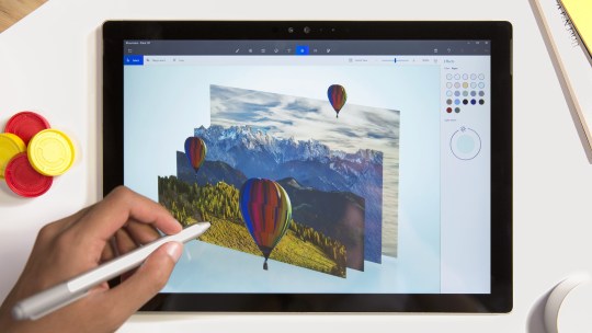
The possibilities are endless... unfortunately they're also frustrating.
See that flower I made has a white background, and there's no magic eraser so I'd need to manually cut it out with the eraser... or use magic select

If you're in a video call while this UI is active and you're sharing your screen it will only show the gif and not the program itsself
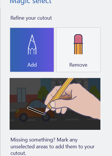

With the add and subtract tools you can provide hints about what should and should not be included. That's fine for something as simple as this drawn with a pen tool, but... well if you like to draw with the pencil? Get ready for pain buckeraroo. You can't manually slice out what you want, you just have to get the AI to guess and it will never guess perfectly. Part of your bat will be left behind on the canvas or it'll start picking up a few extra white pixels
but hey, it's 3d now, sometimes it works. You can choose to content aware fill whatever was behind on the canvas, or leave a weird white empty space behind

But now I have a field of flowers I can move however I like, okay but I think I want to add an extra leaf to one of them
Get fucked. Idiot. Once you cut it out, it's like paper. These 3d canvasses can never be grown, only shrunk and only by the eraser tool which carves in a perfect circle like a bull in a china shop. Now, it's actually very cool how you can recursively create new 3d canvasses out of existing ones, and I'm sure you could do cool stuff but any time the canvas shrinks that's as big as it'll ever be it can never grow
Also, yeah you can't just make a canvas in place, you either have to reserve space on your main canvas or clip it off of a second canvas you make earlier and just... I don't know stash it off to the side out of frame? this is how you use layers and if you want to re-order them put them in literal 3d space? Want to hide a layer? Put it behind your canvas.
This is what experts are calling: "technically a workflow, I guess"
This would be a really cool feature, unfortunately it's just not finished. It's missing that extra 20% that would make it at home in real software versus just a toy. Just like paint you have to sort of plan ahead and make all of your layers. In order... but in reverse bob ross order. See you need to make all of your foregrounds first, then and only then can you start working on your background canvas, and should you ever change your mind and want another foreground you must destroy a space of your background to create it. Oh, also, once it's 3d it can never be re-projected back into 2d... well you can turn it into a sticker, which kicks ass, but that will be flattened, if you wanted to retain the 3d rotation of it too bad. Also, making something into a sticker physically consumes it, so you'll need to copy and paste it first just in case otherwise it's gone forever
oh yeah and sometimes copy and pasting doesn't work, creates extra clones, or places them at the wrong space.
Okay let's save our work

You can actually save it as a project folder. You heard me right, folder. Paint 3d stores projects as individual folders

And they're all just called checkpoint, there's no association with like, which project each one is

And they're all full of undocumented binary files, with the exception of a png thumbnail at the very bottom.
So uhhh, why? You can't send project files to other people, at least not easilly. Is this some library that I don't know about? This all boggles my mind. I mean a .docx file is just a renamed zip file was it too much to ask to make these all renamed zips? Why would you leave it half finished like that and just not make a "new" file type?
Okay sorry I got lost in the weeds. Also I hit the image limit for this post so you're just gonna have to bear with me and use your imagination. You can do this I believe in you.
You can export as a .glb file that goes to your 3d objects folder (put a pin in that), or you can export it as a video/gif. There are few pre-canned animations like bobbing back and forth or rotating on a turntable. They can be sped up or slowed down, but that's about it.
Okay but why 3d?
God damnit I'm going to need more images for this so I'm gonna post this as is and hope I can add more photos on the reblog...
8 notes
·
View notes
Note
If you don’t mind me asking, how do you find all these quotes and images and lyrics? You do a really good job at finding ones that fit together perfectly
Oh ty! Generally, I start a web by looking at the work of other web weavers - for example, I'm currently making a web about learning to love yourself, so I whacked 'web weaving, self love' into the tumblr search. How much there is on each one varies from topic to topic, and I've recently started running into my own previous webs doing this, but it often gives me quotes and art to look into further which might well bear fruit. I also often go into the spilled ink tag, which is used for people's original poems and artwork, again with the topic of my web attached.
Next port of call is goodreads, entirely because of the quotes function; although there is a lot of crap irrelevant stuff that comes up - mostly YA novels, fake deep quotes, misattributions - it does have a pretty solid tag function that lets me go through a large catalog very fast, and half the time it'll even tell me which book something is from. If I'm particularly stumped by a topic, I'll often go to TV Tropes which often includes a wide range of examples with quotes and sources under each specific trope, which again gives me some great leads.
All the quotes I have then generally get run through a quick check that they're legit, and not misquotes or misattributions; some I will find that are attributed to the wrong person, but I'll still include them with the correct name. Other times, I can't find a source, or the sources I find aren't definitive - e.g., if the whole internet tells me that somebody called 'Michelle B' wrote a particular quote, but there is no actual original place of 'Michelle B' writing it (and to be honest, I'm not good enough to track down such a vague citation) then there's a non-zero chance that it's a misattribution that's just been repeated so many times that the original source has disappeared, but I will likely include the name anyway, just with (attrib.) next to it, as it's better to do that than slap it with 'unknown' (imo). Sources do sometimes turn up afterward, but generally if I fail to find it on my first search, I won't happen upon it afterwards.
Then, once I'm (relatively) sure who the author of something is, and where it's from, I turn to the Internet Archive. I started using it last year when I was stuck on at home, unable to go to the uni library, and writing my dissertation. It saved my life then, but even though I graduated, I have never gone back to life without it. It's a godsend, a miracle, perhaps the greatest tool you've never heard of. It lets you read books - FOR FREE - legally, as well as listen to audiobooks, look at old web domains, search metadata... it's genuinely amazing and I tell everybody about it. For the webs, I plug in the name of the book/author and 2 out of 3 times, I can find a scanned in copy of the book, which comes with a search function. As in, I can just type in a fragment of the text I'm looking for, and the archive finds exactly which page it's on for me. I then just screenshot the page, paste it onto Paint 3D, and crop it to my desired specifications. For those sources that aren't in the archive, I usually put them into google docs, put them in a nice font and screenshot again, once more turning to my good friend Paint 3D to smarten it up.
If I know of any film or TV shows that touch on the topic, or I think it would be a good addition, I generally look on YouTube for them first (and, you guessed it, screenshot and then move to Paint 3D where I add subtitles manually if they're not already included/look ugly) and if they aren't there I branch out into streaming services and, uh, other sites. That I turn my VPN on for. If I really have no idea what scenes would be relevant, I often look for those really basic, Buzzfeed or Ranker list articles for 'The Best Doomed Romances' or 'Ten Great Sisterly Relationships on Screen' - they're generally scalped from reddit, but they do have some fairly solid recommendations which I can then investigate further. I also do this with songs - there are so many lists of song rankings around - but often you can just search lyrics in Google and they’ll pop up.
There are other steps I use depending on the specific web, but these are pretty much the ones I use every time - I use TinEye and Google Image Reverse Search when I'm trying to find the name of a piece of art or the source of an image, and this often helps me source things that other people have marked as 'unknown'. It doesn't always work, but it gives results more often than not. And, of course, there are things I add that I know about from my own memory - I really should emphasize, however, that in a web of say ten different excerpts, maybe two are ones I know about beforehand. The main process of finding stuff to put in webs is simply searching in the right places, knowing how to spot a promising lead, not giving up, even if you're on like, the fifth page of the goodreads quotes tag and you feel like banging your head against the wall (the best quote is always, always on page six) and referencing as you go.
Web weaving is something I love to do because it's broadened my literary horizons so much, it makes me better at researching, and I find it super satisfying when a web is completed, but it's not something that you can only do if you have super advanced computer programs or technical knowledge or an eidetic memory - this laptop has been on the verge of death for some time, I regularly go to my fifty-nine year old mum for troubleshooting advice, and my memory is absolutely shot to shit. All you really need to do is stick at it, and it comes together.
#asks and answers#the process#i know that sounds incredibly pretentious i do but i want to have a tag for posts about it so people can find them
92 notes
·
View notes
Text

“I’ve no words for my feelings anymore.
So art, please take over and let me seek shelter in you…”
Nocturne Sans Words
July 24-25. 1:00 AM+
.
—thought process and influences utc
(All this was copied and pasted from my art analysis document, so they’re past feelings in that moment. I’ve moved beyond that point now.)
Time of Thoughts Record: July 25, 2022. 11:47 AM.
Time of Drawing: July 25, 2022. 1:00 PM+
.
Song that kept playing in my head: “Farewell Wanderlust” by The Amazing Devil
Character: poet-swordsman Nocturne (he/him)
Subconscious Influence: Litarnes’ work, “Burnout”
Conscious Influence: IG @/froggylodyte’s swordsman character’s golden sword Olive Branch, IG @/amefurin_’s “Knave sitting beside her bloodied sword on the ground in the snow, with Lumine giving flowers beneath the full moon” KnaveLumi art, my concept design of Stanza’s silver rapier Polaris
.
Layers:
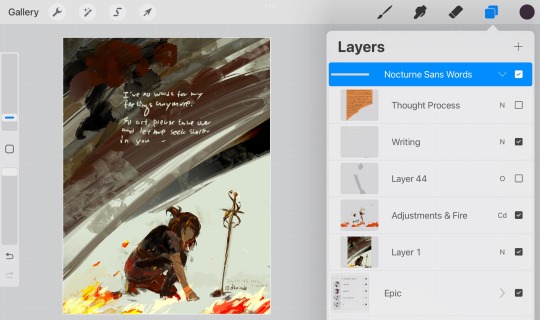
Emotions:
Since this is mostly done on one layer, it felt liberating. Earlier yesterday I talked to my neighbour [who’s an artist] and had a really nice conversation about art and creation with her. This is the closest I’ve felt with art in a long time. I was surprised that Nocturne turned out to be muscular like this.
He had longer hair for most of the painting but I realized he looked like another character, so I changed it to shorter hair instead.

Handwriting:
I didn’t realize, but I subconsciously took inspiration from Litarnes’ Sad Lad works… And the first ever art I saw from them too — “Burnout”. The palette, at least most of [it], ended up similar. I was surprised I shifted the hue to green…
This swordsman… His name is Nocturne. (Well, poet/swordsman)
It’s my first time bringing him into a canvas.
I was miserable and kneeling on the floor alone like him [when] I started painting this… At around midnight. I cried a few times that night…
I write as him constantly in my poetry. The swordsman whose poetry is his sword. He’s usually very confident in his craft and always wins his battles.
But here, seeing him kneeling low [“temporarily forfeit” is crossed out beneath this] before his sword— Things are burning (added afterwards), he seems to be kneeling in snow—
It’s all consistent with imageries I use in my poetry. The medium changed but the message didn’t.
I’m writing this now, as I’m finding my words again in the morning of the next day.
—Dusk
———
“It’s all consistent with imageries I use in my poetry. The medium changed but the message didn’t.”
Man, didn’t Blue Period have a quote like this when Yatora visited Mori’s studio and saw her large piece… “I pray when I draw,” she says…
———
As the layer screenshot shows, this piece is just called “Nocturne Sans Words”, which in terms of definition makes sense since a nocturne is a short romantic music composition or a picture of a night scene, neither of which are literature. But he represents my poetry (sharp and quick like a sword) so he does have a lot of words, usually.
Even though his image looks pretty rough here, the way my poetry is makes him seem more like he’d wear a flowy poet shirt (with a sword still, of course). AFTER ALL I’ve got poems [on Instagram] about him that are called “Loneliness of the night, do not kiss me”, “Be Not Undone By Thine Own Hand”, “The Immature Liege and the Heartless Joker”, “Nocturne of the Scarlet Soirée Beneath a Moonless Sky”, and of course his debut in “Snowstorm Nocturne —Act III: Into the Storm, My Love!”.
——
“Now, knowing that I’m a poet with the style that I’ve got, to say ‘I’ve no words for my feelings anymore. So art, please take over and let me seek shelter in you…’”
——
October 7, 2022. 09:24 PM.
Looking back on this record, it’s all so analytical. The time of record and time of drawing are separately noted, the song that played, the character’s name, and even the conscious and subconscious influences are written down. There’s a— I wrote a transcript of my reflective scribbles on the canvas itself, not even erasing the words but instead crossing it out so even the “wrong” words’ presence is known. It even— I even wrote that part of the passage was written in the moment and part was written the morning after.
5 notes
·
View notes
Note
Sorry if this is rude you don't have to answer but what do you use to make your typography/lyric art? I really love them!
not rude at all and im so so sorry it took me such a long time to answer!! <3
i mostly use photos from stock websites. my faves are pexels, unsplash, and pixabay. there are lots more out there but i can usually find what i'm looking for on those three
for paintings i use rijksmuseum. you can download really high quality images of their public domain artworks. you can even crop them on the site and just download the detail you want. the ui is kind of annoying but i cannot bring myself to complain about it because its such a cool resource
other good public domain art stuff: the art institute of chicago and the met and europeana
for the vintage style illustrations that i edit...i study 18th/19th/early 20th c history so i spend my life reading weird old vintage shit. a lot of time i just see a pretty illustration when researching and im like...mine now, lol.
google books is my go-to when i want to browse for weird books
archive.org is good too
i love to edit photos to look like they're on really old paper... there's usually a few blank pages at the start of these public domain books so i just take screenshots of them and overlay them onto photos
flickr has comically terrible ui but there is so. much. amazing stuff on there. you do have to do quite a lot of digging though but you can find some incredible stuff.
(quick warning though: obviously with so much historical material there is a lot of very unpleasant content. turn on safe search if you don’t want to see nasty victorian racism, or photos of a penis with late-stage syphilis (and yes i am speaking from experience))
tumblr for whatever reason isn’t letting me put in links here so i’ll just copy and paste them like a caveman:
the public domain review (https://www.flickr.com/photos/publicdomainreview/)
british library (https://www.flickr.com/photos/britishlibrary/)
internet archive book images (this hyperlink seemed to work for some reason)
us national archives (https://www.flickr.com/photos/usnationalarchives/)
deviantart also has some diamonds in the rough (and by ‘rough’ i mean page after page of weird furry sonic fetish inflation art that for some reason isnt marked nsfw... but i digress). most of the time it's not worth the effort but you can find cool stuff there if you're willing to dig for it
a couple of cool stock accounts:
https://www.deviantart.com/sdwhaven/gallery/33554170/textures
https://www.deviantart.com/serendipitystock/gallery/all
https://www.deviantart.com/jojo-ojoj
https://www.deviantart.com/chimiyaa
https://www.deviantart.com/redheadstock
always check the details of the accounts though. there are some accounts that just post public domain stuff, some people post original content and are happy for it to be used however, some people allow use but have rules.
also after typing all of this i just realised you might have meant like...which software i use. in which case the answer is photoshop, lmao
and sorry again for taking so long to answer this! (and thank you for your kind words! <3)
27 notes
·
View notes
Note
To your anon asking about TTB promises. She promised no second wedding, no male pronouns or male love interests on Lover, a coming out, Karlie leaving in August, no Josh at holidays, no way they go to awards, absolutely would she not include him in her documentary because it woul be about coming out. The list is rather long. The truth is people left over stopped calling her out on always being wrong. And every month for the last 2 years dont worry, its almost over the girls are fine.
Wow. Great memory.
Let’s list all of TTBs lies, promises and predictions that never came true. For posterity.
TTB promised there would be:
[[MORE]]
1. No Joshlie wedding. At all. And no second Joshlie wedding. (Both happened!)
- in fact the plan, according to TTB was: to gently introduce Kaylor to the public.
- announce engagement > call off engagement > have Taylor be seen providing emotional support to a heartbroken Karlie > after a while, explain that spending time together amid this upset made them realize they were more than just friends!
Oops. Never happened.
2. No male pronouns on Lover (several songs with male pronouns!)
3. No male love interests on Lover (clearly a male interest in Lover. And no, London Boy isn’t satire. It’s tongue in cheek)
4. Karlie being “free” in August each and every year. (and many, many more times)
5. No Josh at holidays.
(Yet somehow they seem to be together for thanksgiving and NYE and several Jewish holidays every single year.)
6. Joe and Taylor not attending awards shows together (so far they’ve attended: Golden Globes, Cats premiere, and NME awards)
7. Joe not being included in the documentary (Taylor literally runs into his arms backstage)
8. The documentary would be about Taylor coming out
I remember (and edited to add other peoples recollections)
9. Taylor was supposed to come out after Rep tour was over.
10. Taylor was supposed to come out the day she announced her new single “ME!” In fact, the announcement was meant to be her coming out, but instead was her new single.
11. Joe would be gone before Rep Tour
12. Joe would be gone after Rep Tour.
13. Joe would be gone before Lover Promo
14. Joe would be gone after Lover release.
15. Karlie would be free from Josh literally too many times to count. She always says that the contract is up in August. Then she says Karlie re-ups.
16. Taylor was going to come out on the last day of Pride month but scrapped those plans and instead released her statement about Scooter and Scott. That the masters changed everything so she couldn’t come out.
Now, had she intended to come out, and changed her mind that very last day upon learning of the master sales, she would’ve had to:
- add 4 new songs about a male
- chang all pronouns on lover from “her” to “him”
- remanufacturing every copy (how many DNAs did that need)
- create and chang diary entries
- all this would’ve had to be done whiles Taylor spent the first week of July with her friends on vacation. And while Karlie was on a yacht with Scooter, posting several instagrams documenting it.
- Then she went straight into filming ‘Lover’ video with a man. All this in a matter of a week or two, while on vacation, right before Lover came out. (Thanks to the anon for help!)
17. She claimed Karlie never followed Joe, when in fact, she did after K’s Rep concert. A week later, she unfollowed him. Also her sisters and Josh unfollowed Taylor in that same time frame.
18. She claims that when a beard wears blue, a breakup will occur and Taylor will be free of her contract. That Taylor plans it this way. TTB has said the inevitable breakup is going to happen when Joe wears blue numerous times yet this has never come to fruition.
19. Any time there is an article about Joshlie or Joe and Taylor, ttb claims its ALWAYS “seeding” a breakup. Yet, the breakup never, ever comes. (And no one in entertainment uses the phrase “seeding”. That’s a pure conspiracy theorist term. Like “crisis actor”).
20. She once promised a nervous anon that Josh and Karlie would never actually marry. They’d only be faux engaged to make it all seem real.
21. Claimed that Karlie and Josh didn’t go to New Zealand together over the New Year. Said Josh went alone and Karlie only flew in one day to take all the pics with him- in multiple clothing changes- to get all the pics necessary for the “stunt”. Even though everyone outside of Kaylorland already believes they’re a married couple and the “stunt” got zero publicity.
22. TTB claimed many times no beard would ever attend an important event or red carpet with Taylor. Then Joe went to the Golden Globes with her, then the Cats premiere, and then the NME awards. Oops! Wrong each and every time.
23. When Joe and Taylor vacationed in the Turks and Caicos TTB claimed Joe was flown in for a quick photoshoot and flown right back out. Except the next day, he was still there and there were new pictures.
24. Claimed for MONTHS after the Joshlie wedding that it was a “photoshoot”, not a wedding. That it would soon show up in Vogue. Then it was Vogue Brazil. (The wedding was never in a magazine)
25. She also claimed it was all a giant ad for Dior. The photoshoot would be one big advertisement for Dior. (The wedding was never an ad anywhere for Dior)
26. After several Vogue magazines came and went after, TTB claimed that Josh was having the article and photoshoot put on hold so that they could release it at a time that Trump made a big gaffe and Josh would need good press. The idea being that if Trump messes up, this somehow reflects badly on Josh, though it never has.
27. TTB and Kaylors claim that the reason why Karlie and Taylor stopped hanging out in public was so as not to tarnish Taylor’s reputation by being associated with Trump. Yet, Kelle went backstage at Rep after Trump was elected.
Anyone who knows about magazines or has seen the documentary The September Issue knows that the magazine layout is planned months in advance and articles and photo shoots are put in in a timely manner. Someone like Josh would have no bearing on getting to hold it back. (The wedding never showed up in any magazine and Trump made gaffes constantly).
28. TTB also claimed that they were no longer being seen in public anymore so that the public would start to ask and wonder why they weren’t “friends” anymore. Which would “seed” a coming out story.
29. Ttb claims she’ll have definitive proof this Monday, 9/7/20/, in the form of “tea” she’s been dangling in front of her followers for months now, that will prove the existence of Kaylor.
And she posted a submission that proved absolutely nothing! Just a screenshot of Karlies insta story from May that shows the reflection of one open white umbrella and one closed white umbrella. Apparently Taylor has two white umbrella near her pool in Beverly Hills. Ttb believes this is definitive proof that Karlie and Taykor have been together in LA for months.
This was wholly underwhelming and easily disputable. Taylor’s jet has been in Utah, with Joe posting a few pics of him hiking there. Her jet has also been in RI. Then the jet went to England. While the jet doesn’t prove Taylor wasn’t in BH the whole time, it sure does make it much more likely than a reflection in glass of an umbrella.
30 TTB claims that josh posted an Instagram on 9/3 of a sunset to indicate the sun setting on his relationship with Karlie. A message sent to Kaylors. No divorce as of yet!
31. Going along with the above, TTB also claimed that she expects Joshlie to announce their divorce on 9/4/20 because it’s the slowest in the news cycle. A Friday afternoon before a holiday weekend. Yet, no divorce news and Trump calling fallen soldiers “lovers and suckers” is dominating the headlines.
32. Prior to the Kushner biography being released TTB predicted/promised that it would mention Josh’s homosexual proclivities in some way: the bearding or Mikey. And at the very least, it would paint him to be the giant criminal that she claims he is.
Instead it did nothing of the sort. It only talked about how strong his love for Karlie was. That despite his parents being unkind and unaccepting to her for several years, he stuck it out with her. It also addressed her conversion to Judaism.
33. Ttb likes to claim that Karlie never converted to Judaism. She says that because Karlie has never spoken the exact words “I converted” that it means she hasn’t. Despite the fact that many Jewish people have told her that when Karlie told Andy Cohen that she “joined the tribe” that, was, in fact, how Jewish people say they converted.
Karlie has also spoken at length in interviews and her own musings about her conversion. Ttb still refutes this and sometimes will post anons who write in questionable and anti Semitic references.
34. There was a period of time where TTB claimed that Josh needed Karlie as a beard in order to get an inheritance from an old aunt of his. This aunt stipulated in their will that he MUST be married to a woman in order to collect the money. Shockingly (to no one) TTB started claiming this right after josh and Karlie got married.
A few months later, the aunt and the inheritance disappeared never to be spoken of again. Which was absurd to begin with considering Josh is reportedly worth $800 million. Which could be off considerably, but even if it is? Even if he’s only worth $100 million? Yeah, he’s good. He doesn’t need an aunts inheritance.
35. These days (September of 2020) TTB is claiming that Karlie is staying with Josh in the contact for bearding willingly. This is a drastic change of narrative from years past when she claimed he was essentially blackmailing her to stay. For the Aunt inheritance, for not telling the world her and Taylor’s secrets, etc.
**** this hasn’t been updated in a few months. It’s now Dec. 1st. I’ll do my best to fill in a couple more below soon. There’s been a handful or two of lies that need to be recorded.****
36. People Mag announces that sources close to Karlie say she’s pregnant with Josh’s kid. Ttb refuses to believe it until Karlie herself confirms it, though in the past she has specifically stated that People is the one mag you can trust as publicists use it as a vehicle to get the truth out about their client.
36. Ttb stated emphatically and multiple times that IF Karlie is pregnant it CANNOT be a Kaylor baby because it would not tarnished by having a Kushner last name and being tied to that “organized crime” family. Nope. Taylor is in no way involved.
And now that Karlie has confirmed the pregnancy, what do uou know? Ttb conveniently changes her time, forgets all she’s said in the past and seems to be firmly on the “oh, it’s totally a Karlie/Tayklor baby. I thought so all along”.
Now, Karlie is there willingly. And when an anon asked whyC her answer was “it’s all part of the narrative.” As if that’s a sufficient answer.
37. TTB said Joe and Taylor’s career paths would never intertwine.
And now they’ve written 5 songs together. One on which he played the piano too.
There’s a lot more especially about Karlies pregnancy but I don’t have the time or energy to fill it in right now. Back soon to do it.
Anyone else remember anything specific? Let’s come up with a comprehensive list.
108 notes
·
View notes
Text
Download MathType crack (license key) latest version 2OCB,

💾 ►►► DOWNLOAD FILE 🔥🔥🔥 First developed in , it can now run on Microsoft Windows and macOS. Its Creek includes four language options. This Developer is a Design Science Interactive Equation DESKI program that lets you create and interpret math geniuses for word processing, desktop publishing, presentations, e-learning, and more. Math Type gives you a keyword shortcut to enter a new equation with a keyword or replace an existing equation with a keyboard. MathType 7. A collection of paints that you can mess around with configurations. That is a complementary desktop program that allows users to create, modify formulas, and insert multiple documents. With this software, students, educators, and professionals can create rigorous research papers and review formulas. In addition, you can view the full list of popular or known jobs and edit them by adding various jobs. Mathtype Crack is a handy interactive equation editor for Windows and Macintosh that helps you create mathematical notation for word processing, web pages, desktop publishing, presentations, learning, TeX, LaTeX, and MathML documents. This software is a powerful interactive equation editor for Windows and Macintosh, that helps you create mathematical notation for word processing, web pages, laptop publishing, presentations, learning, and TeX, LaTeX, and MathML files. You can copy and paste from the editing pane to another application in no time. MathType Crack provides some formatting alternatives to suit a selection of equation types. We have estimated the range of other options available for customizing the app via the preferences dialogue container, and most users need to be happy with this list of alternatives. MathType Serial Key provides tax or latex input equations. Additionally, users can easily change the fonts and colors of prescriptions. Word tool used. Additionally, you can adjust the position of the fence by choosing the best fence model from the list. MathType Keygen , you can edit the equation and add it to the Equation Library or use it in a new file. I had access to password processors, etc. It was simply much easier and cheaper than the automated alternative. Determines the impact of math on your Windows PC. Type of Crack has several features to help you do more, save time, and create better-looking documents and websites. To activate the Word user program, users must request permission to access Office. If the desktop software is installed and activated, this tab appears over the word. Easy to use and talks a lot about your problem in a short and easy way that you will not understand after hard work and consultation with many teachers. MathType License Key is a powerful interactive equation editor for Windows and Macintosh that allows you to create word processing, web pages, desktop publishing, presentations, e-learning, and math advice for tax, latex, and mathematical documents. This app performed well during our tests. Copying and pasting screenshots from another editing panel were easy. The Navigation feature allows you to rotate an equation again every time. MathType Activation Key supports mathematical signals for different educational levels and cultures. Access to any quality solution is essential. It helps readers access scientific content and helps authors create accessible scientific content. Write a complete math fault, making it easy to see all of the equations in your presentation. To create an equation, create an algebraic equation. Create a statistical impression. Also, do several math equations. Add custom notes on tabs for quick access. Main Features: Set the style for text, function, variable, symbol, number, vector-matrix, and additional math. You can easily add or remove rows and columns from a table. Unlimited return and reset, equation input, line selection, distance control. In addition to that, it gives you an additional tab for add-ins in MS Word. Change the color of the formulas. Automatically integrate fonts, style, duration, and location through a set of equations. It is a window type that can access English, French, German and Japanese languages. This is a powerful interactive formula changer for Windows. Macintosh helps you create math notes for sentence performance, web pages, background broadcasts, and presentations. Profession: Different styles automatically when writing. The keyboard shortcut for the most commonly used formulas. Professional results, easy to export. Cons: You can easily download a limited set of shortcuts. Somewhat messy keyboard and more cluttered. Math type key working. More on the dead type: English.
1 note
·
View note
Text
Download MathType crack (serial key) latest version TPCO-

💾 ►►► DOWNLOAD FILE 🔥🔥🔥 First developed in , it can now run on Microsoft Windows and macOS. Its Creek includes four language options. This Developer is a Design Science Interactive Equation DESKI program that lets you create and interpret math geniuses for word processing, desktop publishing, presentations, e-learning, and more. Math Type gives you a keyword shortcut to enter a new equation with a keyword or replace an existing equation with a keyboard. MathType 7. A collection of paints that you can mess around with configurations. That is a complementary desktop program that allows users to create, modify formulas, and insert multiple documents. With this software, students, educators, and professionals can create rigorous research papers and review formulas. In addition, you can view the full list of popular or known jobs and edit them by adding various jobs. Mathtype Crack is a handy interactive equation editor for Windows and Macintosh that helps you create mathematical notation for word processing, web pages, desktop publishing, presentations, learning, TeX, LaTeX, and MathML documents. This software is a powerful interactive equation editor for Windows and Macintosh, that helps you create mathematical notation for word processing, web pages, laptop publishing, presentations, learning, and TeX, LaTeX, and MathML files. You can copy and paste from the editing pane to another application in no time. MathType Crack provides some formatting alternatives to suit a selection of equation types. We have estimated the range of other options available for customizing the app via the preferences dialogue container, and most users need to be happy with this list of alternatives. MathType Serial Key provides tax or latex input equations. Additionally, users can easily change the fonts and colors of prescriptions. Word tool used. Additionally, you can adjust the position of the fence by choosing the best fence model from the list. MathType Keygen , you can edit the equation and add it to the Equation Library or use it in a new file. I had access to password processors, etc. It was simply much easier and cheaper than the automated alternative. Determines the impact of math on your Windows PC. Type of Crack has several features to help you do more, save time, and create better-looking documents and websites. To activate the Word user program, users must request permission to access Office. If the desktop software is installed and activated, this tab appears over the word. Easy to use and talks a lot about your problem in a short and easy way that you will not understand after hard work and consultation with many teachers. MathType License Key is a powerful interactive equation editor for Windows and Macintosh that allows you to create word processing, web pages, desktop publishing, presentations, e-learning, and math advice for tax, latex, and mathematical documents. This app performed well during our tests. Copying and pasting screenshots from another editing panel were easy. The Navigation feature allows you to rotate an equation again every time. MathType Activation Key supports mathematical signals for different educational levels and cultures. Access to any quality solution is essential. It helps readers access scientific content and helps authors create accessible scientific content. Write a complete math fault, making it easy to see all of the equations in your presentation. To create an equation, create an algebraic equation. Create a statistical impression. Also, do several math equations. Add custom notes on tabs for quick access. Main Features: Set the style for text, function, variable, symbol, number, vector-matrix, and additional math. You can easily add or remove rows and columns from a table. Unlimited return and reset, equation input, line selection, distance control. In addition to that, it gives you an additional tab for add-ins in MS Word. Change the color of the formulas. Automatically integrate fonts, style, duration, and location through a set of equations. It is a window type that can access English, French, German and Japanese languages. This is a powerful interactive formula changer for Windows. Macintosh helps you create math notes for sentence performance, web pages, background broadcasts, and presentations. Profession: Different styles automatically when writing. The keyboard shortcut for the most commonly used formulas. Professional results, easy to export. Cons: You can easily download a limited set of shortcuts. Somewhat messy keyboard and more cluttered. Math type key working. More on the dead type: English.
1 note
·
View note
Text
Download MathType crack (license key) latest version J8NI№

💾 ►►► DOWNLOAD FILE 🔥🔥🔥 First developed in , it can now run on Microsoft Windows and macOS. Its Creek includes four language options. This Developer is a Design Science Interactive Equation DESKI program that lets you create and interpret math geniuses for word processing, desktop publishing, presentations, e-learning, and more. Math Type gives you a keyword shortcut to enter a new equation with a keyword or replace an existing equation with a keyboard. MathType 7. A collection of paints that you can mess around with configurations. That is a complementary desktop program that allows users to create, modify formulas, and insert multiple documents. With this software, students, educators, and professionals can create rigorous research papers and review formulas. In addition, you can view the full list of popular or known jobs and edit them by adding various jobs. Mathtype Crack is a handy interactive equation editor for Windows and Macintosh that helps you create mathematical notation for word processing, web pages, desktop publishing, presentations, learning, TeX, LaTeX, and MathML documents. This software is a powerful interactive equation editor for Windows and Macintosh, that helps you create mathematical notation for word processing, web pages, laptop publishing, presentations, learning, and TeX, LaTeX, and MathML files. You can copy and paste from the editing pane to another application in no time. MathType Crack provides some formatting alternatives to suit a selection of equation types. We have estimated the range of other options available for customizing the app via the preferences dialogue container, and most users need to be happy with this list of alternatives. MathType Serial Key provides tax or latex input equations. Additionally, users can easily change the fonts and colors of prescriptions. Word tool used. Additionally, you can adjust the position of the fence by choosing the best fence model from the list. MathType Keygen , you can edit the equation and add it to the Equation Library or use it in a new file. I had access to password processors, etc. It was simply much easier and cheaper than the automated alternative. Determines the impact of math on your Windows PC. Type of Crack has several features to help you do more, save time, and create better-looking documents and websites. To activate the Word user program, users must request permission to access Office. If the desktop software is installed and activated, this tab appears over the word. Easy to use and talks a lot about your problem in a short and easy way that you will not understand after hard work and consultation with many teachers. MathType License Key is a powerful interactive equation editor for Windows and Macintosh that allows you to create word processing, web pages, desktop publishing, presentations, e-learning, and math advice for tax, latex, and mathematical documents. This app performed well during our tests. Copying and pasting screenshots from another editing panel were easy. The Navigation feature allows you to rotate an equation again every time. MathType Activation Key supports mathematical signals for different educational levels and cultures. Access to any quality solution is essential. It helps readers access scientific content and helps authors create accessible scientific content. Write a complete math fault, making it easy to see all of the equations in your presentation. To create an equation, create an algebraic equation. Create a statistical impression. Also, do several math equations. Add custom notes on tabs for quick access. Main Features: Set the style for text, function, variable, symbol, number, vector-matrix, and additional math. You can easily add or remove rows and columns from a table. Unlimited return and reset, equation input, line selection, distance control. In addition to that, it gives you an additional tab for add-ins in MS Word. Change the color of the formulas. Automatically integrate fonts, style, duration, and location through a set of equations. It is a window type that can access English, French, German and Japanese languages. This is a powerful interactive formula changer for Windows. Macintosh helps you create math notes for sentence performance, web pages, background broadcasts, and presentations. Profession: Different styles automatically when writing. The keyboard shortcut for the most commonly used formulas. Professional results, easy to export. Cons: You can easily download a limited set of shortcuts. Somewhat messy keyboard and more cluttered. Math type key working. More on the dead type: English.
1 note
·
View note
Text
post production - merging two animals together exercise
note: I had a post made with more screenshots but tumblr refreshed and I lost it.
for this exercise I first chose my two images, selecting which one would be the background. on my top layer image I used the quick select tool to separate the mouse from the rest of the image. At first I selected the whole body and tried to use that but found the head by itself was better.
These are my original images:

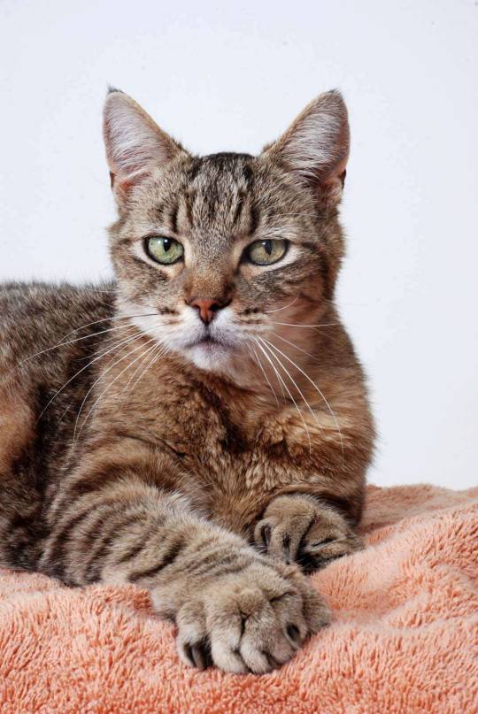
After using the quick selection tool I selected, new layer with layer mask. I copy pasted this into my layers panel on the cat image. Using the transform shortcut on the keyboard I aligned it in size and rotated it.

Using the brush tool I can go on the mask section of the mouse layer and paint it in either black or white depending on whether I want to conceal or reveal.
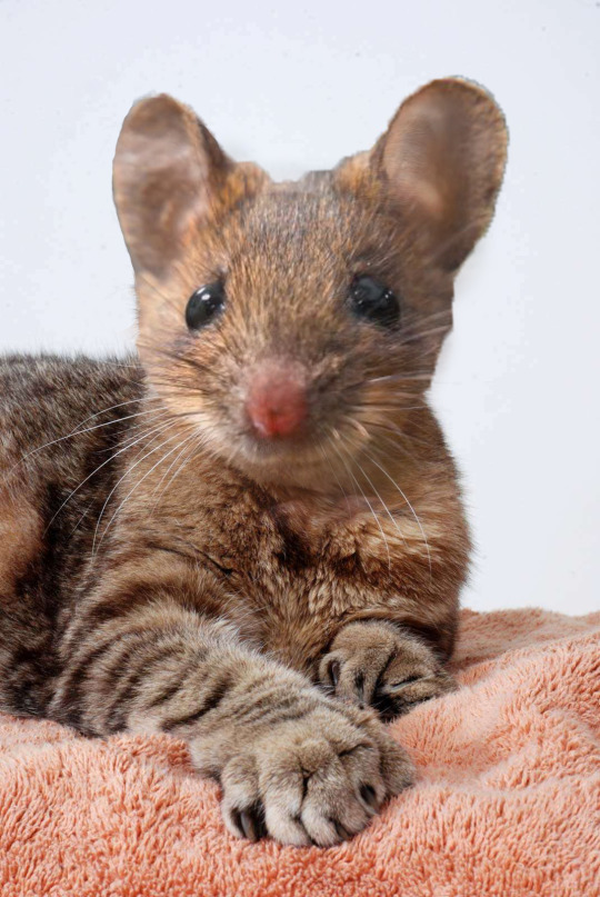
This is my final image with some last touch ups.
0 notes
Photo
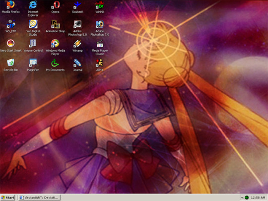
Inspired by @dialup2002 to post some more old stuff. :) This is a desktop screenshot I posted on my DevART account January 2005. Kicking it with Windows XP, but I loved/preferred the classic style that I was accustom to (95-98-ME). I made the wallpaper used, but I’m having trouble finding a copy of it. I’ll prob try to remake it in non-1024x768 resolution lmao. Not sure if this is from 2005. It might have been from 2004, but I hadn’t posted it yet. I did that a lot. Some fun notes about some of the software icons pictured (lots of info):
Firefox - THE FIRST BROWSER TO DO TABS OMG. I was a huge advocate for Firefox, especially in its initial releases. They were doing things on the internet nobody had really seen up to that point, and made it popular! Since I had so many issues (as most people do) with Internet Explorer, I was shopping around for a new browser at the time of this shot. Google Chrome didn’t exist yet. (Can you imagine??)
IE - As stated above, I disliked IE. It was kept for various reasons, however. Such as testing website layouts, since the mass-majority of people used it and things looked different in browsers when you were coding.
Opera - While giving Firefox a try, I also managed to snag a very, very early copy of Opera. I’ve always been the type of person that loved to try out new stuff as early as possible, and this was a very special piece of software that I wanted to give a go. The reason that it was special? You had to send away for a CD for it. That’s right, kids. They snail-mail’ed me a CD because it was considered “commercial software.” I paid to get that browser lmfao. I was super super hyped later in 2005, because it became “freeware” and I was able to more-easily push my friends to try it out. The devs were (and still are) seriously awesome. This is why I still use Opera as my main browser today! Ya’ll should try it if you aren’t already! You can even use your most-beloved Chrome extensions on it. :)
Soulseek & WinMX - Holy crap, you guys! lmao Is anyone here old enough to remember these programs?? XD This was basically where most people went after Napster bit the dust. This was when we were all scrambling, trying to find a new P2P sharing program. This was right in-between the eMule/Donkey phase and before the Limewire/KaZaA fiascos where people’s computers were being overloaded with viruses from companies trying to stop pirating. Ahh, the wild, wild west... Days were so exciting when you spent hours downloading something that could potentially ruin your computer lmao
WS_FTP - Still one of my favorite FTP programs for Windows! Works like a charm! These days I use Transmit 5 for Mac, but this was my first program ever for file transfer protocol. It’s basically a tool for uploading files to my website’s server, because back when I first registered it, there was no web uploader for that kinda stuff. Now I stick with that because it’s easier and I’m used to it lol
Veo Digital Studio - Used to use this for my webcam back before webcams were built into laptops, and before they were common enough to have amazing freeware available for them. (Also this is hilarious.) The quality was horrible, but I was hella excited to take pictures and share them with friends and on my blog at the time. From what I remember, there was something I used after this that was some type of South Korean selca software. Haduri? Something like that. It was really cute and even let you do little animations. :)
Animation Shop - Okay. So... from what I remember, this might have been owned by the people that made Paint Shop Pro? I think it was Corel. I honestly don’t remember where I got this from, but this is what I used to use to make animated gifs (because Photoshop just....didn’t for some reason? I had to use PSP at some point, I remember that. I just don’t remember why lmao. It might have been my copy didn’t allow it, or my computer was just too shit to run it good enough, or just stopped working because....Windows).
Adobe Photoshop 5.0 - I originally got this rip from a friend of mine, whose dad got a CD from his company that he worked at. It was an official/real license, which was really awesome! I think this was the first version of Photoshop I ever owned (!!), which is pretty amazing to think about about! I had that CD copy for a few years. I initially was gifted a copy of the CD around 2001-2002 or so. I know for a fact I had newer versions (7.0 was legend before CS suite came around), so I’m not sure why I was using this one at this point lmao. My guess is, like mentioned above, something happened with my computer and I didn’t want to format it and reinstall everything lol or because it was the fastest version I had installed to boot up and do a quick photo edit.
Adobe Photoshop 7.0 - I do remember this took a long time to start up. I can only imagine this was like a bad pirated copy or something, or was so bloated with new stuff in it, and that’s why I kept 5.0 for a quick boot. I know I used this majority of the time, though. Most of my backups for brushes and fonts are from backups that include 7.0 as a zip. ¯\_(ツ)_/¯ My computer wasn’t the most powerful at the time, despite what I pushed it to do, so this is prob why. But hell yeah! Photoshop represent! lol I still use it today, and its still one of the first things I install on a fresh OS install. Enjoying CC 2017 these days.
Nero Start Smart - I was so excited to make mix CDs and share them! Back in the day before you had stuff like playlists that were sharable on YouTube/Spotify, etc, you had this to share music. Or play in your car. Or CD walkman. Nero was a software you could burn your CD-Rs and make your own laser-etched album art! I begged for years to get a CD burner lmao. Back when casette tapes were still around enough that my parents were like “but why???” lmao. They were not common back in the day like they became over time, just, like, included on your computer. Back then you had to buy one and install it into your computer tower yourself! I got mine I believe.....in 2001? It was the year after the Playstation 2 was released. The first one I got was just a very standard burner. Did a very specific type of CD burning at a low (slow af) speed. It was $700 lmfao. Let that sink in for a minute because my parents didn’t let me forget about it for the next four years lmfao. I saved up birthday and Christmas money and went halves on it. Then I upgraded to the one that this one was! c: Which did the laser etching, and DVD burning! (And you better believe I was burning DVDs of stuff I was downloading online lmfao this was the golden age of the internet where everything was just available everywhere as long as you had the patience to download that shit, because it took forever to download)
Volume Control - My dad and I messed with the wires on all of these random computer speakers and stereo speakers that we had collected over the years and hotwired our own version of a 5.0 surround sound in the room, which was mounted to the ceiling corners and above the computer station. It was lit. I needed Volume Control easily accessible because sometimes the speakers needed redirecting, or I needed to turn the beats down because my mother was tired of my fifth time playing the Gundam Wing OSTs and Miyavi. (It was metal, okay???)
Windows Media Player - I did not use this to listen to media. Let me reiterate that. I did not use it to listen to media on. lol this was specifically used to rip tracks from CDs that friends lent me, because it was the easiest software I was able to use to change the KBPs for quality control and the ID3 tags so I could save it and organize it for use in Winamp and know wtf I was listening to lol. Nobody used WMP for listening to music.... xD
Winamp - The best music player. Period. Still. Nothing beats it. Pls, pls, Nullsoft! Come back and make a native version for MacOS. :’(((( I would buy it! Doesn’t even have to have new features or look different. Classic look, pls pls!
Media Player Classic - Do people still use it??? This player was amazing! Paired with k-lite codec pack, it played everything. It was like VLC before VLC. And it looked good. Clean. Small. Could be installed anywhere which was nice. And the codec packs just made everything look and run fantastic!
Recycle Bin - .... Trash XD
Magnifier - This was for my dad because he had bad eyes and couldn’t remember CTRL +/-/0 to increase the text on pages that he wanted to read.
My Documents - Where I saved all the stuff I downloaded. Not the real My Docs. Just a folder that I named as such, with a custom icon. I don’t know why I wanted it there lol. I think to just have a uniform square on my desktop haha
Journal - I renamed this. I forget the original name of the client, but it was the official client of LJ. It was basically a program that let you write up posts for Livejournal and you could format things, draft them, etc, and post without uploading to your journal/blog. I liked it because sometimes I couldn’t post right away, and it made making drafts a lot easier for me to go back and edit. It also let you edit past posts, which was really convenient instead of looking for it on the web version one post at a time.
AIM+ - I loved AOL Instant Messenger, but over time the ads became too much. I invested a lot of time in 3rd party clients. I was constantly switching between AIM+, Adium, DeadAIM, Pigeon, Trillion, etc. Depended on what I wanted to do that day. Want to clone a SN? Want to skin the colors of the chats? Need transparency? Want to customize your lists? Want to log into more than one msg system at once? They all had their strengths. This was my msg service of choice. Back in the day you were either on this, MSN, or Yahoo!. Some people rocked ICQ and there were a few others, but these were the most common from who I knew/hung out with. I miss those days. <3
You can see WinMX running in the taskbar lmfao so I was prob downloading something at the time of snagging this quick shot. I also had DevART open (prob because I was gonna share this on there). I really wish I had more programs open at the time of this! XD It’s wild to look back at some of the software changes over the years!
Anyway, that’s one of my oldest screenshots that I can find that I’m able to share right now. :) I’m going to be posting a remake of that wallpaper that I did later today for those of you that want that, too.
If you read this far, thank you!! Hope you had fun reading about old stuff!
#*#long post#mine#anime#old anime pictures#old anime images#old#old images#old internet#old web#webcore#the internet of old#windows#windows xp#sailor moon#old windows#old software#old screenshot#screenshots#software#old stuff#2005#2004
2 notes
·
View notes
Photo

♡MAKING CC IN PHOTOSHOP♡
I finally decided to make a CC tutorial. However, after finishing the screenshots I realized why I have been avoiding this. It’s a VERY LONG tutorial and it’s definitely not the easiest! If you are trying to make CC, please do not get discouraged. Keep trying and practicing, none of my cc works out the first or even fifth time! (This tutorial does not talk about meshing!) Keep reading for the tutorial.

Step 1. Open up Sims4Studio and choose Create CAS standalone. Yours may look different if you are on PC (I use MAC).

Step 2. Choose a piece of clothing you would like to work with. I am choosing this skirt because I like the mesh and it’s white so it can be recolored easier. If the clothing is not white, try this photoshop tutorial to make it white.

Step 3. I named this TeresaSkirt inside a folder I created called Teresa and clicked save.
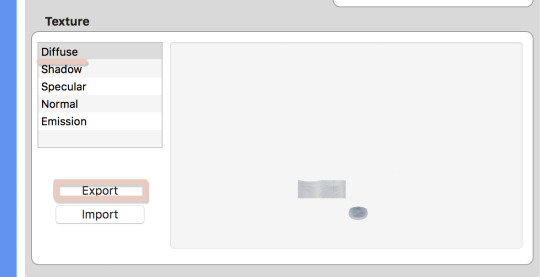
Step 4. Once the display opens, click on diffuse and choose export.

Step 5. I saved this as TeresaBase and clicked save. This is what will open in photoshop.

Step 6. Once I open this in photoshop, I am going to duplicate the layer so I can make the skirt high waisted.

Step 7. On the duplicated layer I am going to select the top half of the skirt with the rectangle selection tool.

Step 8. Next I am going to take the move tool and move this selection up.

Step 9. Before I go any further, I am going to save this photoshop file, do this often while making your file to make sure you don’t lose any progress. I saved it as TeresaBase.psd.

Step 10. Now let’s save it so we can see how it looks in sims4studio. Normally I would save as a .dds file but I will save as a .png just to see how it looks. I always save as test.png, I use this same file to test throughout my cc making.

Step 11. Go back to S4Studio and click on Diffuse and then import. Choose the test.png file. This looks like the height I want. If it wasn’t I could go back and adjust as needed.

Step 12. Back in photoshop I would like to clean up the line between the bottom and top layer. So I click on the erase tool and choose a brush at the size 91px with a hardness of 0. I click on the top layer and erase just at the bottom of the layer so now they look blended together.

Step 13. Next I will go to Layer>>Merge Layers to merge both layers into one.

Step 14. Now to clean up some of the repeated shadows. Since I duplicated the skirt to make it higher, some of the shadows can look weird since they are exactly the same. So I am going to take the Clone Tool, with a brush size of 37 px and a hardness of 0. I also set the Opacity to 85%.
Basically the clone tool will duplicate anything you choose. On a Mac I hold down Option (ALT) and a little Target comes up. I click on the area I want to clone. That is now my source, I now click anywhere, not holding any buttons and I will start to paint over other areas. You may have to play with this tool a little bit to get the hang of it.

Step 15. You can see above the before and after. In the second screenshot the shadows are more varied.

Step 16. Next I am going to create a layer mask to cutout some of the skirt by clicking the “Add Layer Mask” icon.

Step 17. Then take the Polygon Lasso tool to select an area to cutout. I am cutting out part of the hip.

Step 18. Next take the Paint Bucket Tool and make sure the MASK is selected in the layers window. Anything black will be removed and anything white will remain, so I will fill in the selection with black. (Tip: If the mask is selected it will only let you use black or white) Now that selection is gone.

Step 19. Now we need to make sure we still have the selection so that we can duplicate for the other hip. Hold Command and click on the little mask thumbnail. This will select the mask. (It might still be selected from before)

Step 20. Now make a new layer by clicking the new layer icon from the bottom of the layers window. Choose any color and fill in the selection on this new layer using the paint bucket.
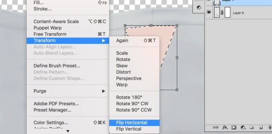
Step 21. Then go to Edit>Transform>Flip Horizontal. This will flip the shape we just made.
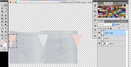
Step 22. Now I am going to duplicate the layer by right clicking the layer and choosing duplicate. I need to because half of the hip is on the far left and the other is on the far right. Now I am going to move each shape to where I want the skirt to be cutout using the Move Tool.

Step 23. I save really quick as test.png again to make sure the shapes met up where I wanted to, looks good! If I needed to adjust I could.
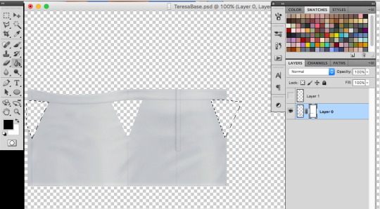
Step 24. This next part a little tricky. I want to add these new shapes to my mask. So first merge the two shape layers into one by clicking merge down on the top shape. Then I will select the shapes by holding Command and clicking the top layer thumbnail in the layers window. The shapes should be selected. I clicked on the little eyeball so I couldn’t see the pink anymore, just the selection. Then I will click on the MASK and fill in the selections I made just with black to cutout the skirt. Delete the top layer with the shapes.

Step 25. Now let’s add some darker edges to those cutouts. Command+click on the MASK thumbnail to select the mask. Then create a new layer, and go to Select>>Inverse. Fill in the selections with any color. I just chose grey.

Step 26. Set the fill to 0%, this will hide the layer but we are going to add a stroke. Go to “fx” at the bottom of the layers window and choose stroke.

Step 27. I chose a stroke of 1px, position is outside and I chose a medium grey. This will just create a little darker edge on those cutouts.
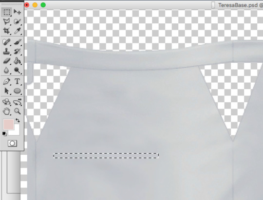
Step 28. Now I am going to add some stripes across the cutouts. Go back to the skirt layer and grab a long thin selection with the Rectangle Selection Tool.

Step 29. Copy and paste this selection onto a new layer and drag it to the bottom, under the skirt layer. Then I am going to go to Edit>>Transform>>Warp. I just chose Arch from the presets on the top bar. I set the bend to 12% so it wasn’t just straight across.

Step 30. I duplicated this layer 3 more times to make more stripes. I moved each one to where I thought it looked best using the move tool. I then held down SHIFT and selected all of the stripe layers and right clicked and chose Merge layers to merge all of the stripes together.
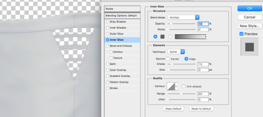
Step 31. I don’t want these to just be solid gray so I added a smaller inner glow. Double click the layer or click “fx” and choose Inner Glow. I set the Blend mode to Multiply, Opacity is at 12%, Choke is 15% and size is 3px. Adjust these until it looks good!
I then duplicated this layer twice (one for the left and one for the right) and added them to the other cutout sections as well. I had to save as test.png a couple of times to check and make sure the stripes lined up. I then went to layer>>merge visible.

Step 32. Once everything was merged, I deleted and sections I didn’t really need. Save this as teresabase.psd for recoloring later.

Step 33. To create a shadow we are going to add a white background by making a new layer, filling it with white and then moving it to the bottom.

Step 34. Now click on the skirt layer and click on “fx” and then choose color overlay. Change the color to white (#ffffff) so the whole skirt is white. Then also choose outer glow. I set the glow to Blend mode: normal, Opacity: 24%, Noise: 0%, the color is #333333, Spread: 5%, Size 4px. Click OK.

Step 35. Save this as a shadow.dds file, I downloaded a MAC .dds plugin from here. MAKE SURE YOU CHECK MIPMAP.
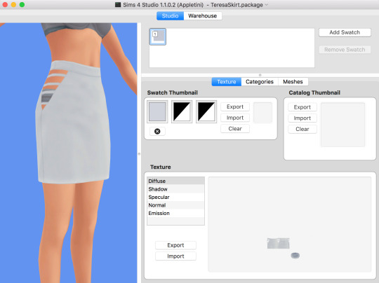
Step 36. Save all of your recolors as .dds files as well (make sure mipmap is checked)
Go back into S4Studio
-- I saved a white.dds file so I imported that into diffuse (this will be my white swatch) -- I uploaded my shadow.dds into Shadow. -- For specular, I just click on make blank. -- For normal use this .dds file to import into normal. -- Leave the Emission alone
Also if you want to import a thumbnail you can use this template: THUMBNAIL TEMPLATE. Make sure the thumbnail is on the first swatch.
You obviously might not have a screenshot yet for the thumbnail, but you can always go back into S4studio and add it later once you have tested the cc.

Step 37. Before you save, go into categories and uncheck Allow for Random.
Once you add all of your swatches you can save and test in game!
A lot of CC making is testing, redoing, trying something else, and failing and trying again so just keep at it!!
#my tutorials#photoshop tutorial#sims 4 tutorial#ts4 tutorial#longest tutorial ever#im sorry#cc tutorial#sims cc tutorial
813 notes
·
View notes
Text
Greenshot App Download

Greenshot Download Official Site
Greenshot App Free Download
Greenshot Image Editor Download
Greenshot Screenshot
Create screenshots of a selected region, window, or fullscreen, with annotations or highlighting
Last updated on 09/14/17
There have been 0 updates within the past 6 months
The current version has 0 flags on VirusTotal
When choosing a free screenshot tool, consider why you're saving screenshots and what you need to do to them. It must quickly and easily capture all or part of your screen. You should be able to obscure, blur, annotate, or highlight parts of the image as you create it. Finally, you should be able to save or export your screenshot just as effortlessly as you created it, including uploading it directly to sites such as Picasa using plug-ins. That describes our new favorite screenshot tool, GreenShot. Recent updates include Windows 8 compatibility.
Greenshot integrates all the major steps in creating and sharing screenshots, putting them under one roof, as part of a single process. Its many screenshot capture options allow you to take screenshots of any kind and for any purpose, while the editing tools obviate the need to open up your screenshots in separate cumbersome Paint or Photoshop windows just to highlight, blur, or annotate.
Jan 10, 2017 Download Greenshot for macOS 10.10 or later and enjoy it on your Mac. Greenshot is a light-weight screenshot software tool with the following key features: - Quickly create screenshots of a selected region, window or fullscreen.
Download the latest stable release. Greenshot-RELEASE-1.2.10.6 09 Aug 2017 Greenshot for Windows is free and open source! Only $1.99 to cover our own costs! In most cases, the latest stable version will be the best choice for you: it has been thoroughly tested by the community and is already used by myriads of people around the world.
Download Greenshot from official sites for free using QPDownload.com. Additional information about license you can found on owners sites. How do I access the free Greenshot download for PC? Just click the free Greenshot download button at the top left of the page. Clicking this link will start the installer to download.
Greenshot Download Official Site
Download Greenshot 1.2.10.6 for Windows. Fast downloads of the latest free software! Download latest version of Greenshot for Windows. Safe and Virus Free. Sep 14, 2017 Greenshot is a light-weight screenshot software tool for Windows with the following key features: quickly create screenshots of a selected region, window or fullscreen; you can even capture.
Greenshot App Free Download
GreenShot's installation wizard lets you choose from a variety of plug-ins to install, as well as huge list of interface languages, most displayed in their own form of script. The installer apparently detected our copy of Office because the Office plug-in was already selected. We could also set GreenShot to open when Windows starts. When it's running, GreenShot sticks to the system tray until you need it. Then you can either click its icon to open an extensive (and nicely rendered) menu, or use a variety of hotkeys for specific jobs. GreenShot's Settings are much more extensive and impressive than most free screenshot tools. For example, the Destination tab let us choose either to select file destinations dynamically (the default setting) or to designate specific choices ranging from Save directly to opening an image editor or Office app. There's also an Expert tab with a checkbox labeled 'I know what I am doing!' that enables options such as checking for unstable updates and specifying printer footer patterns. The system tray menu also has a Quick Preferences submenu for common settings.
GreenShot works a lot like other screen capture tools. We selected Capture region, held down the mouse button and dragged the active area to capture a screen image. GreenShot's green-tinted capture region is pretty cool and makes selections a cinch. We opened our new image directly in the surprisingly sophisticated GreenShot Image Editor, which let us add effects, text and objects; resize, crop and rotate; and even draw freehand on our image. GreenShot is our new choice for screenshots.
What do you need to know about free software?
When choosing a free screenshot tool, consider why you're saving screenshots and what you need to do to them. It must quickly and easily capture all or part of your screen. You should be able to obscure, blur, annotate, or highlight parts of the image as you create it. Finally, you should be able to save or export your screenshot just as effortlessly as you created it, including uploading it directly to sites such as Picasa using plug-ins. That describes our new favorite screenshot tool, GreenShot. Recent updates include Windows 8 compatibility.
GreenShot's installation wizard lets you choose from a variety of plug-ins to install, as well as huge list of interface languages, most displayed in their own form of script. The installer apparently detected our copy of Office because the Office plug-in was already selected. We could also set GreenShot to open when Windows starts. When it's running, GreenShot sticks to the system tray until you need it. Then you can either click its icon to open an extensive (and nicely rendered) menu, or use a variety of hotkeys for specific jobs. GreenShot's Settings are much more extensive and impressive than most free screenshot tools. For example, the Destination tab let us choose either to select file destinations dynamically (the default setting) or to designate specific choices ranging from Save directly to opening an image editor or Office app. There's also an Expert tab with a checkbox labeled 'I know what I am doing!' that enables options such as checking for unstable updates and specifying printer footer patterns. The system tray menu also has a Quick Preferences submenu for common settings.
Greenshot Image Editor Download

Greenshot Screenshot
GreenShot works a lot like other screen capture tools. We selected Capture region, held down the mouse button and dragged the active area to capture a screen image. GreenShot's green-tinted capture region is pretty cool and makes selections a cinch. We opened our new image directly in the surprisingly sophisticated GreenShot Image Editor, which let us add effects, text and objects; resize, crop and rotate; and even draw freehand on our image. GreenShot is our new choice for screenshots.

0 notes
Photo

The power of min, max and clamp
Frontend

Focus
#463 — October 21, 2020 | Read on the web

Introducing Microsoft Edge Preview Builds for Linux — With this release Microsoft’s Edge browser is now available for all major desktop and mobile platforms. This Linux version supports Ubuntu, Debian, Fedora and openSUSE distributions. Here’s what to expect, and how to install it.
Kyle Pflug (Microsoft)
min(), max(), and clamp(): Three Logical CSS Functions to Use Today — If you’re looking for something reasonably simple but powerful to add to your arsenal of CSS knowledge, start here. min, max, and clamp provide some powerful capabilities that enable more responsive styling with fewer lines of code.
Una Kravets
Measure What Matters to Users, Browsers Don't Have Feelings — Page load time isn't enough to guarantee you're providing a solid user experience; your users care about perceived performance. Learn to track interactivity metrics like `firstInteraction` so you can build for impact. Your users will thank you.
New Relic sponsor
Apple Bringing Face ID and Touch ID to the Web — Multi-factor authentication has taken off online in a big way, but can often require clumsy mechanisms like text messages or third party apps to work. So Apple is bringing its native Face ID and Touch ID mechanisms to the Web on top of the Web Authentication API.
Jiewen Tan (WebKit)
Video Processing with WebCodecs — WebCodecs is an API that provides low-level access to media encoding and decoding, so you can work with components of a video stream or unmuxed chunks of encoded video or audio, say. Currently it’s in Chrome 86 only but a Mozilla developer is co-editor of the spec.
Eugene Zemtsov
The State of CSS Survey 2020 — CSS is an ever evolving beast, and this survey (now in its second year) aims to keep track of what the trends are. We’ll be sure to circle back and share the results as they will no doubt prove informative.
Raphaël Benitte & Sacha Greif
⚡️ Quick bits:
Cloudflare want you to try Cloudflare Browser Isolation, a way to run your browser sessions in a sandbox on their data centers.
Building native desktop apps for Windows? WebView2, Microsoft’s new embedded web control, is now avaialble.
You can now emulate authenticators and debug the Web Authentication API in the WebAuthn tab in Chrome 87 (currently in beta).
Microsoft is to support the Google-proposed Manifest V3 in its Edge browser (despite concerns about its impact on extensions such as ad blockers).
The US justice department is suing Google over accusations of an illegal monopoly in search and search ads.
💻 Jobs
Sr Frontend Developer Needed in Beautiful Norway — Ready for your next frontend job? We're looking for a strong frontend developer with an eye for great UI to join our highly international team in the south of Norway.
Snowball Digital
Find a Job Through Vettery — Create a profile on Vettery to connect with hiring managers at startups and Fortune 500 companies. It's free for job-seekers.
Vettery
🧑💻 Looking to share your job listing in Frontend Focus? There's more info here.
📙 Tutorials, Articles & Opinion

Preload Late-Discovered Hero Images Faster — Optimizing for Largest Contentful Paint? Addy explains how preload can be a game-changer for speeding up late-discovered hero images and resources, loaded via JavaScript.
Addy Osmani
I Want My Own Media Queries in Browsers — What if developers didn’t have to wait for browsers to support certain CSS features? Here, Kilian writes about how it would be neat to allow devs to emulate arbitrary media features for testing before the ‘real thing’ arrives.
Kilian Valkhof
Focus Management and the inert Attribute — Managing focus requires some skill and care, but is very much worth doing. The inert attribute can go a long way to making this easier to do.
Eric Bailey
The Most Useful Accessibility Testing Tools and Techniques — A list of tools the author regularly uses to make sure everything they do is accessible for folks with different abilities, “whether they are blind or holding a sandwich in their hand”.
Artem Sapegin
How To Use Face Motion To Interact With Typography — Explores using Machine Learning, variable fonts, and CSS grids to create layouts that respond to the proximity, inclination, etc, of a users face.
Edoardo Cavazza
How to Deploy a Vue.js Jamstack App on Netlify with Automatic Security Updates
Snyk sponsor
How to Create a Realistic Motion Blur with CSS Transitions
Neale Van Fleet
Take Screenshots using Built-in Commands in Chrome/Edge
Niels Swimberghe
Getting Started with Web Push Notifications
Doug Kumagai
Introducing: The Async Cookie Store API
Matan Borenkraout
🔧 Code, Tools and Resources
Layoutit Grid: An Interactive CSS Grid Generator — Can’t remember the various CSS properties to get a basic grid running? Never fear, just lay things out here and copy and paste the code (or even create a CodePen on the fly to experiment further).
Leniolabs
Detect GPU: Determine What Tier of Graphics Performance Users Have — Imagine user-agent detection but for the GPU. This returns information about the user’s graphics capabilities including a simple 0-3 score as to the level of rendering power available, which you could use to turn on/off extraneous visual effects. Demo here.
Tim van Scherpenzeel
15 Tools to Customize Your Terminal and Command Line — Start customizing your terminal or command prompt, and start developing more efficiently and beautifully.
Shopify Partners sponsor
The Good Line-Height — A handy browser-based calculator for getting the perfect line-height for your type scale.
Fran Pérez
SVG Favicon Maker — An online tool to quickly build a letter based SVG favicon which are supported by most browsers, though not Safari. The ‘emoji’ variant didn’t work for me in Chrome, however.
Formito
'This Page is a Truly Naked, Brutalist HTML Quine' — A quine is a program that, with no input, produces a copy of its own source code as its output, and it’s possible with HTML too. File this under ‘fun’.
Leon Bambrick

HitCount: A Simple Modern Website Hit Counter — In case you’re ever in a “Make Your Website Look Like 1999” contest. The code is just an image tag with some optional parameters to customize the counter’s look.
HitCount
ScreenshotAPI: A Chrome-Based Pixel-Perfect Website Screenshot API — 100 screenshots per month in the free plan, then paid plans after that. Images can be downloaded or hosted on Google Cloud.
TechLite
by via Frontend Focus https://ift.tt/35hDlXO
0 notes