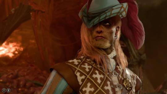
#i slimmed his nose wayyy too much his nose is wider
Explore tagged Tumblr posts
Text

a SUPER loose attempt at making my tav match how he looks in my head. mostly the shadow over the eyes. the hat looks terrible and i am gonna really work on it so it looks. not terrible.
#there r so many issues here i just didnt wanna take longer than half an hour on this#i slimmed his nose wayyy too much his nose is wider#his face and chin r a bit slimmer#his eyes r flatter#the hat is just. bad.#but! its a good start at visualising him i think#bg3#tav#durge#🪓dark urge#🎪chester#🎱tav#baldurs gate 3#screen edit
1 note
·
View note