#i say skin wise bc I'm not great at facial features other than eyes and ears of all kinds
Explore tagged Tumblr posts
Text
painting people of color is easier for me (skin wise) than white people because i can afford to mess up a little more with my layering because the final product is darker.
doubly so when using alcohol markers bc the inks tend on the saturated side (i know pale and pastel markers exist theyre just harder to come by in the budget brands in my experience)
so if you're having trouble learning to color or paint skin try starting with people of color
#my musings#i say skin wise bc I'm not great at facial features other than eyes and ears of all kinds#so many facial nuances go out the window thus far#i specced too many points in the rendering and shading skill tree and not enough in the everything else ones
0 notes
Note


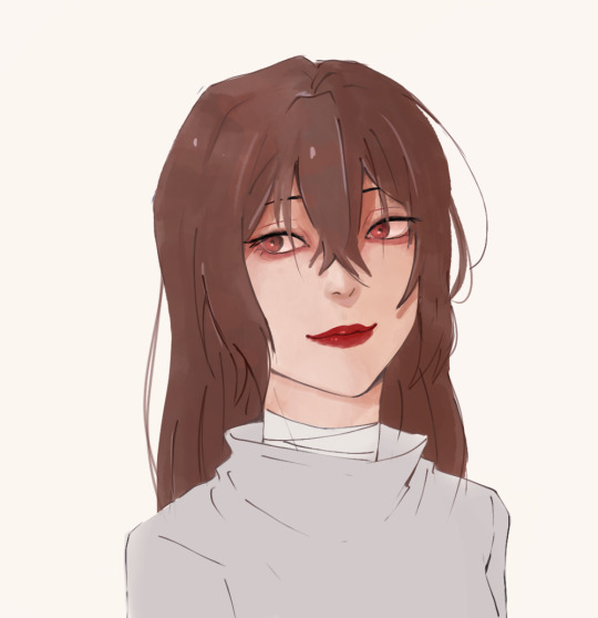
They still feel off specially the eyes i could feel them about to manifest their own life and run off
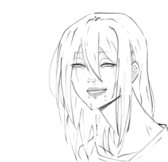
Even my linework is ... Idk what's wrong and it's the problem maybe I'm staring too much but I don't think so

Sorry for bothering alot but i loved your last advice ty
i think the main problem with the first picture has to do with the proportions and anatomy of the lower body area aka the neck and shoulders. i'd make the shoulders wider and add some sort of form to the neck so that it looks believable instead of a flat rectangle shape ( maybe make it slimmer a bit too? although that might be just a stylistic choice so you do you). That's the first thing i'd fix because otherwise the head looks too big in comparison to the rest of the body, and it can throw you off
I actually think you did a great job with the eyes, they have a lot of life and that comes from the fact that they are the most rendered part of your piece, which is not a bad thing. The thing is, while it is true that the eyes are the main focal point of a face and portrait in general, that doesn't mean you can neglect the other parts, so i think it is also a consistency issue or not figuring out exactly what sort of style or rendering you want to go with that holds you back (which is totally fine and normal ofc). So let's pick a semi-realistic stylized rendering style for this since this is the vibe i'm getting from this piece.
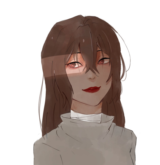
If that's the style we're going for, then the face should have a bit more form. You have to remember that our facial features ( eyes, nose, lips) are connected with each other via the planes of the face, right? So, for a semirealistic style, revisit your reference and try to idenitify what those planes are and how they connect to those features, and most importantly, where the shadows hit, and just accentuate them more, because at the moment they look like 3rd forms plastered over a 2d surface which is not right, our skin has form as well. Color-wise, don't be afraid to go darker with the shadows, they really make your drawings pop. Without looking at a reference, i'd def add some shadow under the lips, a bit where the lips connect to the nose, under the neck, and in the lower body area.
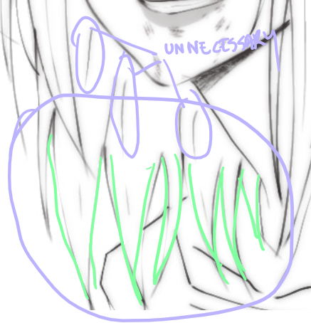
I'm really trying to avoid the most basic answer which is " practice anatomy !!1! " because everyone can say that however, at the end of the day, this is the main thing the face lacks. And tbvh you don't have to actually know anatomy, you just gotta know some proportions things that make the face look believable enough. I feel like the features are mostly just drawn from the reference without an understanding of the structure behind it. Something tells me that in the reference picture, the person had their head tilted a bit upwards, but here it's kinda flat and the features are just painted without following the motion. Try to draw over your reference picture the vertical and horizontal lines and make up the head shape behind it to figure out the way it is tilting and facing, because the lips, eyes nose, etc will follow that same sort of flow, they're not stationary. I'd also make the eyes a bit smaller, or maybe make the skull bigger bc i think they are touching the outer edge too much now, and also narrow the distance between the nose and lips just a bit. Kinda hard to explain without actually doing it myself. But really, try to play with that, and try getting comfy with drawing 3d forms i know it's easier said than done but..... there really isn't any shortcut unfortunately As for the lineart drawing, yes it's actually pretty solid, i like that duplicate blur thing you did, i'm familiar with that technique and it def has its perks so that's great. Im not an expert on lineart, however here i think there are too many " unnecessary" lines that could easily be omitted (purple). Less is more and all that~ The hair strands at the end feel too stiff and identical (green). If you notice, they all just end in this " V" shape and they rarely overlap thus making the image look flat. Try to break this pattern by introducing more spontaneity aka random hairflies, making the strands overlap, adding more shape variety etc

Make sure that the lines connect properly whenever they meet, and also although you already did it and i think that's great, you can make some lines even thicker, go even further and add even more lineweight. As a general thing, usually, the exterior or contour lines are thicker and whatever it is inside is thinner so experiment with that, you can start from the nose- thicker lines for the nostrils thinner for that nose tip i forgot what it's called and also add thin lines that just hint at the form. Lineart is hardd so i don't blame you, but if you're gonna keep the lineart in, try "shading" with black blocks so to speak, make sure the lineart layer can stand on its own, and pay more attention to the lower part area (neck and shoulders) even if it is less exciting to ink
#ok i lied it's long again#these are pretty fun to do can u blame me#ask iztea#you should also check in with other people don't take my word for everything#but since you asked my personal opinion here u go#sorry for any typos if there are any i'll fix them later#long post#ask iztea: art talk
73 notes
·
View notes