#i made two whole arts with a semi-consistent style and design!
Explore tagged Tumblr posts
Visit Tumblr Blog
Explore Tumblr blogs with no restrictions, modern design and the best experience.
Last Seen Tumblr Blogs


Fun Fact
Average visit duration of Tumblr.com is 10 mins and 25 secs.
Text
I finished the Ink Twink!
M o n k e e. Pt6

He was both fun and annoying to draw- Definitely one of my favorites so far:D
#lmk fanart#lmk mk#qi xiaotian#lmk ink mk#fruity ink blob#artists on tumblr#I made him in a similar pose to the last MK drawing i did because yes#i like mk.#im so normal about this lego monkie man.#i swear#believe me please#rendering was so much easier on this guy 😭#tw(ink)#lego monkey kid mk#lego monkie kid#i loove this silly little lego show#lego monkie kid fanart#i made two whole arts with a semi-consistent style and design!#look at me go
81 notes
·
View notes
Text

Edit: I MADE AN UPDATED ONE GO LOOK AT THAT ONE IT'S BETTER I CITED MY SOURCES AND SHOWED MY WORK AND EVERYTHING
Ladies and Gentlemen, Bitches and Bastards, Witches and Wizards, Mothers and Fuckers. Esteemed robot enjoyers, I present to you a semi-accurate height comparison of Bumblebee across the multiverse (as of July 2024). This really helps visualize the truly staggering differences between universes, at least height-wise. Also, three of these characters are Canonically the Same Guy; guess which ones.
I spent way too much time on the chart in the back it's not even funny. I will probably make more height charts for more TF characters and universes in the future. Don't expect it soon though, because when I make these, I am fueled by pure I-Got-Bored-At-Work-And-I-Have-Decided-To-Fool-Around-With-Robot-PNGs, and that fuel supply is inconsistent at best.
Hey Fun Fact, Did you know that Generation 1 Optimus Prime is around 19 Feet Tall? Bet some of you already knew that. I have no ulterior motives for bringing this fact up, what are you talking about.
My height explanations are below the cut, because you couldn't shut me up if you tried.
In an order:
Gen 1 - ~10 feet (the wiki says greater than 3 meters so I rounded up to the first whole number because round)
Netflix Cybertron Trilogy - ~10 feet (He looks identical to Gen 1 so... the reason his photo looks weird is because I couldn't find a good full body photo with him standing straight up facing the camera so I put two images together to make the worst looking photoshop job you have ever seen)
Earth Spark - 10 feet (There is no confirmed height yet but using a screen shot of him standing in front of a barn door I was able to make a reasonable guess.)
Animated - 12 feet (I have no genuine source for this, I think this info is just someone's guesstimate, but it seems reasonable. He's a tiny two door mini car, how big could he be)
New Live Action - 15 feet (The wiki hath declared. Also do we have a name for this universe because we need one I don't want to keep saying like 6 words to differentiate this one from bayverse)
Bayverse V1 - 16 feet (This is like the first 3 movies minimum, I don't remember when he hits his growth spurt. also wiki my love)
Cyberverse - 18 feet (I'm gonna be honest, the only info we have is from a really shitty screen shot of a magazine. SO if any one has a copy of this book from the video below, a high quality scan would be greatly appreciated and I will kiss the ground you walk upon. Yes I found the video where the screen shot comes from leave me alone)
Bayverse V2 - 18 feet (movie 4-5 I can't remember which one, I'm not re-looking this up. I fucking love the bayverse tho, this is the only universe with concrete and consistent this-character-is-this-height info)
Aligned Cont. WF/FOC - 20 feet (video game info screens you god send, kiss me sweetly)
Aligned Cont. TFP/RID15 - 21 feet (I do not know exactly where these numbers were found, but I fully fucking believe them. Just by looking at these characters on the show I can verify these numbers in my mind. They made specifically this universe to be full of freakishly tall robots for some fucking reason.)
And for any one who doesn't know, the three tallest are the same guy. Like the 20 feet tall one and the 21 feet tall ones, same guy. The ones in three wildly different art styles and designs. Let that sink in...
I fucking hate the aligned continuity why is that one my favorite.
#THIS ONE IS OLD GO LOOK AT THE BETTER ONE#All of these numbers are straight from TF Wiki or Fandom Wiki except the ones I specified came from guesses#it looks like a fucking criminal line up#please enjoy my inane rambling and obsessive knowledge consumption#Transformers#maccadams#bumblebee#tf bumblebee#tfp bumblebee#rid15 bumblebee#g1 bumblebee#earthspark bumblebee#tfa bumblebee#bumblebee 2018#bay verse bumblebee#transformers bumblebee#Transformers Height Charts#aka the adventures of a mother fucker with the power point program#personal stuff#I'm gonna die when I do the characters that show up in every universe that's going to be so many tags#opmus I love you but sweet fuck theres like 14 of you
345 notes
·
View notes
Text
Artistic Analysis of Saezuru’s Covers (Vol 1-9)
What I’ve always loved about Yoneda Kou’s writing and art style is her subtlety and attention to detail. Compared to other BL styles, her style is not as exaggerated in its emotions. The characters’ emotions are consistently written and drawn very down-to-earth, realistic, and/or nuanced/subtle (besides the exaggerations in comedic moments). Her art style is simple yet detailed just enough to be very pleasing to the eye.
All of her cover illustrations are clever and rife with detail. In this post, I’ll be examining my interpretation on the meaning of each cover’s design up to volume 9.
Volume 1

The first cover is simply iconic. On a surface level, it shows exactly what type of story you expect you’re getting into, so it draws in its audience. But artistic nuances show that there’s a twist to this story.
Yashiro is caught in a compromising position, arms behind his back, resting his head on some man’s bare foot, which indicates his submissiveness. And that man could be any man, not just Doumeki (or the love interest). This emphasizes the impersonal aspect of sex to Yashiro, which shows that this isn’t going to be your typical romantic BL between two partners. We also learn that Yashiro is in control of all these sexual encounters. In traditional BL manga, the partner that takes the bottom or uke position is typically seen as the “weaker/more timid” individual (which, for some reason, are commonly interpreted as being more “feminine” traits), but clearly this isn’t the case with this story. Therefore, the cover is empowering. At this point, Yashiro is confident and has reclaimed a sense of control over his sexuality.
Volume 2


This cover is bold, in a quiet way.
It deviates completely from the first one, making the whole environment the focus and not the main character. This type of cover design is especially rare for manga, which typically grab your attention with the character(s) front and center. The style of characters being enlarged and shown on the cover is commonly used, as, obviously, it’s very marketable. It easily draws the attention of potential readers (weren’t you captivated by Yashiro on that first cover?). However, the 2nd cover is extremely subtle, and it’s truly the mark of an artist who cares about the story she is telling, not just the hot scenes. It’s admirable. I will never stop respecting Yoneda-sensei for being so confident in challenging established tropes and themes.
This cover forces you to look closer at the details. It’s saying, “Hey, this story isn’t just about lust, but something deeper and more mature.” Upon closer inspection, we see Yashiro standing alone, completely out in the open, soaking in a full suit in the rain. It shows just how little he cares for his own well-being, and the pessimistic desire to not do anything about it. He has been deeply affected by tragedy. He feels empty and insignificant, like a drop in the ocean, which the cover reflects by depicting him as just another person in the background.
The full cover reveals even more details. Others have already talked extensively about the beautiful symbolism of the rain and umbrellas (inspired by kyrieren’s Rain and Aiai Gasa posts). Doumeki rushes from the right, carrying an umbrella to shield Yashiro from the rain, or his semi self-imposed misery. Doumeki bringing the umbrella to Yashiro is symbolic of how he cares for Yashiro’s wellbeing, which Yashiro doesn’t “see” or fully notice the depth of at this point. The theme of seeing and not seeing is established from this point forward.
Volume 3

The body language is everything.
Their position, especially Yashiro’s position with his arms up and feet made bare, reflects a sexual one. This indicates how their relationship is becoming more intimate. But Doumeki still being in his shoes implies that they aren’t that far into it yet. It can also signify how Yashiro and/or Doumeki himself will not let him take off his shoes, or display his full vulnerability. Despite the bareness of Yashiro’s soles, which could imply openness, Yashiro pushes back with his legs and does not look Doumeki back in the eyes. Perhaps he’s, in fact, willfully being “blind” to Doumeki’s feelings and closing off his own. So Yashiro’s position, rather than reflect growing trust and openness, actually reflects how he wants to reduce their budding relationship to a purely physical one (like all his other sexual relationships). In contrast, Doumeki is staring intently at Yashiro, with his arms grasping Yashiro’s hands and pulling down the pants on his leg, keeping him in place. His intent is clear: to make Yashiro his. The way they’re both locked in place almost resembles a dance with its rhythm and balance. They’re both stuck in a position of their own makings, yet in a harmonious way. This cover masterfully conveys the psychological conflict and erotic situation between the characters.
Volume 4

Doumeki is staring determinedly, at whom? The audience, Yashiro, or both?
The cover of the extra story “A Flame in the Distance” makes it clear that Yashiro is not looking back at Doumeki, tying back into how Yashiro is willfully ignoring Doumeki’s and his own feelings.
It’s no secret that Yoneda-sensei puts great care into her symbolism. Both characters being placed in a field of wheat is likely very symbolic, but I could only find a few sources so far to explain the potential connections. According to those few sources, wheat symbolizes life, strength, and rebirth. In this case the wheat or the cover in general could symbolize Doumeki (because his name’s 力 means strength, power, force, etc). With this interpretation, volume 4 could act as Doumeki’s mindset in the story, and volume 2 would be Yashiro’s. In comparison to Yashiro’s gloomy, entrenched, and rainy attitude, Doumeki’s attitude is more cautiously optimistic and determined. The rebirth aspect of the wheat can also explain why they are both in the field; it’s because both have caused immense changes in each other. The brighter colors in the cover show how both have been the light in each other’s lives. Overall, the cover has an ominous or auspicious feel to it, but one thing is implied for sure: things are about to change. Doumeki and Yashiro are becoming extremely close.
Volume 5

Volume 5: the turning point of the series.
The cover’s design is simple, but everything is deliberately placed. We are put into the perspective of Doumeki, which makes the cover very intimate. Doumeki is on top and caresses Yashiro, who is undressed. Yashiro now looks directly up at Doumeki. This time, he cannot look away from his feelings. The last thing to mention is how Yashiro is almost positioned upside down, which indicates how everything is about to change. This all signals what we know is going to happen between them. They’re going to push the relationship to the farthest it’s ever been… and the result will be heartbreaking. A consistent theme among sources I found showed that the color white is symbolic of physical and spiritual purity as well as mourning and funerals. In this case, the white clothing symbolizes the tragedy of how Yashiro has been defiled by Doumeki, and how Doumeki is no longer pure in Yashiro’s eyes. The death of Yashiro’s sadomasochistic facade can also be symbolized with the white, because Doumeki has irrevocably changed Yashiro. Doumeki has made Yashiro fully realize things he never knew he so desperately wanted before: gentle touch, and most of all, genuine loving affection. Simultaneously, this volume has them both experience their best and worst moment.
Volume 6

While being less intimate than volume 5, volume 6’s cover still conveys a sense of closeness. Most of all, it conveys a sense of nostalgia and slight sadness.
Both are walking together in the night illuminated by city lights, Doumeki innocently following behind Yashiro, like how their relationship used to be. The cover’s cleverness comes from how it juxtaposes with the actual content of the volume, in which Yashiro is desperately trying and eventually succeeds in pushing Doumeki away from him now that they’ve gone so far. Volume 6’s cover is a swan song that pays homage to the romantic simplicity and gentle affection of their relationship, before everything changes…
Volume 7 and 8


By themselves, the covers seem unremarkable. But put side by side, the meaning and meta commentary become clear.
Doumeki and Yashiro have become physically separated. Both have grown up and matured. Doumeki is no longer the baby bird we remember. He looks more mature, dresses more seriously, has many scars on his face, and is wearing and surrounded by dark colors. This all reflects his mental growth and descent into darkness, or the yakuza. He is also turned away from Yashiro. Volume 7 is the complete opposite to volume 8. Yashiro dresses in and is surrounded by lighter colors. This reflects how he’s become more of a civilian and how he was actually never been as suited for the yakuza lifestyle as Doumeki. Yashiro has a contemplative expression, turning his head and body in a way to look directly at Doumeki. Now, Yashiro is aware of his feelings more than ever before, but Doumeki is not reciprocating so openly this time. *Forgot to mention, Doumeki is shown pulling off his glove with his mouth, his jacket is hanging loosely on him, and he’s taken off his shoe. He is much more comfortable in his sexuality now. On the other hand, Yashiro is shown to be covered more in his jacket and both of his shoes are still on, which could indicate his newfound impotence. Doumeki’s position is also more open than Yashiro’s more closed off one, showing their differences in confidence. In many ways, their roles have been reversed this arc.
Volume 9

Finally, we have the latest cover. Yashiro and Doumeki are working to re-establish a sense of closeness, but that warmth they possessed with their early relationship has not (yet?) resurfaced.
Doumeki once again looks directly at Yashiro. He is now trying to express his feelings for Yashiro, but at a distance because his hand is still gloved (or his mask of indifference is still on). It seems as if Yashiro is not looking directly at Doumeki, but that doesn’t mean he’s avoiding his feelings like in the previous covers. Rather, he is now trying to hide them. Still, Yashiro not looking at Doumeki shows that he tragically cannot “see” Doumeki’s feelings for him now. There is deliberate ambiguity with how Yashiro grasps Doumeki’s gloved hand, as evidenced by how Yoneda-sensei revealed other drafts with variations of Yashiro’s hand placement. Is Yashiro pulling Doumeki towards him, keeping him in place, or pushing him away from him? This ambiguity reflects Yashiro’s inner conflict and contradictions. Their winter clothing and the desaturated color scheme all symbolizes the emotional coldness of their current relationship. Both desperately want to express their feelings for each other, but both can’t yet, due to each other’s unwillingness to drop their masks.
And that’s where we left off.
#saezuru analysis#sorry couldn’t help but make some edits#saezuru tori wa habatakanai#囀る鳥は羽ばたかない#twittering birds never fly#yashiro and doumeki in love#yashiro#doumeki#with the meticulous attention to eyes each cover#i wonder if the last cover will show both Yashiro and Doumeki#looking at each other?
26 notes
·
View notes
Text
Celeste (2018) - pushing game design to new heights (Developed by Matt Makes Games)

Reviewed on PS4, playable on:
Steam
Itch.io
Epic Games store
Nintendo Switch
PlayStation 4
Xbox One
Introduction
Celeste is a game about a girl called Madeline who decides to climb a mountain to overcome her depression and anxiety, as well as the other characters she meets along the way. Little does she know that Celeste mountain is more than what it seems and, in order to confront the challenges she will face along the way, Madeline will have to come face to face with a part of her that she would have much rather avoided. Celeste uses mostly linear 2D platforming across groundbreakingly designed levels, all with a gorgeous 16-bit art style which, along with a cast of charming characters and wonderfully written dialogue, delivers a truly moving story about self-reflection and overcoming anxieties despite all the odds. Here are my thoughts and feelings on the 2018 critically acclaimed ‘best independent game’ and ‘games for impact’ Game Award winner, Celeste.
Level design
Celeste’s fundamental mechanic is Madeline’s dash ability which propels her in a straight line in a chosen direction for a set distance. The dash can only be interrupted by objects in the environment and it can only be used once in mid air - it recharges as soon as Madeline touches the ground; this is represented intuitively on screen by Madeline’s hair turning blue when her dash is used up and turning back to orange when the dash becomes available. This core mechanic is explored in a different direction in each of Celeste’s 8 chapters. If you explore these levels you can gain access to the far more challenging B and C side versions of the levels which push the exploration further in it’s respective directions, however, you may not even feel inclined to touch these levels as Celeste’s main game alone is likely challenging enough for a lot of players.
Celeste’s side-scrolling levels are broken up into stages/sections that you have to pass to progress through the game. I felt as though each section was designed to push and improve my ability at the game and make me practice and experiment with my approach to each section’s unique challenges.
Each screen/section would have maybe 2-5 challenges you had to pass, one after another, and the game’s instant deaths, fast respawn times and the ability to save anytime meant that there was no repercussion for my trial and error and I could keep trying and trying until I would find faster and faster ways of progressing and, often, hidden shortcuts that I hadn’t seen the first few times round. The gameplay promotes developing a mastery of it’s mechanics. These shortcuts are often found by thinking outside the box and playing around with levels’ systems and mechanics. For players looking for a challenge, as well as cassette tapes with B and C side levels, Celeste’s 8 main chapters are full of collectible strawberries which present a whole load of extra examples of really clever game design. For example, some of these collectible strawberries have wings and will fly straight up and out of the level if you use Madeline’s dash and so you have to think outside of the box and grab the strawberry without using the dash which is usually vital for getting from A to B. It’s this kind of design that stops the game from ever feeling dry or formulaic. Celeste’s levels constantly feel fresh, well paced and engaging.
I’d also like to note that at the start of each level in the loading screen, Madeline receives a different postcard with useful information on it. Two stood out to me: one saying that you should be proud of your death count because it shows that you’re making mistakes and you’re learning; I found this message incredibly uplifting because at times frequent deaths had made me feel a little embarrassed or made me wonder if I was getting something seriously wrong. The other was that the collectible strawberries are entirely optional and only for showing off to your friends if you really want to. I think this was a brilliant move because it gives the player a little more control over the game’s pacing. You get to decide whether you’ll spend some time trying to grab this tricky strawberry or whether you’ll push on with the game and move into the next section.
Accessibility
Celeste is rightfully celebrated for it’s range of accessibility options, from it’s tactful and unobtrusive assist mode - for players who need to fine tune the game to their specific needs in order to get the same enjoyment out of the game, to it’s picture settings that reduce flashing and particle effects for people with photosensitive epilepsy or motion sickness. For more on Celeste’s assist mode, check out Game Maker’s Tool kit’s video on ‘What Makes Celeste’s Assist Mode Special’, you can find the link to that at the end of this post.
Soundtrack
Lena Raine’s soundtrack to Celeste is an audio marvel. Whether it’s daunting, uplifting, mysterious or moving; the soundtrack made me feel tied and invested to every moment. The music was just as much a journey as every second of gameplay. The soundtrack plays to the gameplay perfectly and occasionally leads to some really incredible moments. As well as Lena Raine’s marvellous score, Celeste’s B and C sides have a range of tracks and features by other artists like lo-fi artist ‘In Love With a Ghost’.
Narrative
Celeste deals with heavy subjects like depression and anxiety without ever being tasteless or insensitive but simultaneously the game manages to deal with these subjects in an uplifting way, much in line with the game’s core message. Each level feels rich with meaning and the games narrative is tightly interwound with it’s settings, characters and mechanics in a way that feels seamless and engaging.
Celeste uses profound metaphors to deliver it’s story and discuss mental health in each chapter of the main game. One of my favourite’s was Chapter three - ‘Celestial Resort’ - which had you help skittish spectral maître d’ clean away the clutter in his abandoned hotel. As you tidy away the hotel you find him seeming less anxious than the last time because you’re helping him order the clutter in his mind so he can finally have some peace. This also happens to be what Madeline needs at this point in her story and helping the maître d’ provides her with th clarity she needs to move on. This is one of the ways the game deals with heavier subject matter without dampening the player’s experience of the game and keeping an ‘upward momentum’.
The game’s narrrative, characters, environments and soundtrack all made me feel engrossed in my ascent of Celeste mountain. The mountain has a real sense of place, mystery and history that unveils itself to you as the story unfolds. I felt fully engaged in every setting because it felt like I’d come across something that nobody had seen in a long time. Even with Celeste’s generally fast paced gameplay, it never felt like I was ‘just passing through’ a location because the drive to explore and overcome challenges kept me searching every corner and taking time to explore when I wanted to.
Everything about Celeste contributes to it’s narrative. It’s gameplay pushes you to reflect and overcome challenges. Lena Raine’s soundtrack fits every scene like a glove and fills each moment with emotion in a constantly moving way. Characters will climb out of their Dialogue boxes in some scenes as if they’re really coming to life. Even the ‘chapter complete’ screens, at the end of each level, push the story forward and tell you where Madeline is going next. Celeste is a beautiful and important story,told in an ingenious way, unlike any other game I’ve played.
Is this game for you?
I would suggest Celeste to anyone looking for a new and different gaming experience and an uplifting story. It feels consistently fresh with perpetually ingenious level design and a really wonderful story. I’ve had more fun on Celeste than any triple A game I’ve played in a long time. I’d recommend Celeste to people looking for a hopeful story in what feels like quite a hopeless time because this is a story about never losing sight against all odds, friendship and support, and self-acceptance. It’s clever, inventive, charming and moving and I just love it and I’m pretty damn sure that you will too. Celeste is a permanent fixture of my PS4 library.
Can’t afford it?
I completely understand that lots of people may not have the funds right now or in the foreseeable future to get this game and if you choose to engage in piracy or any kind of swashbuckling then I’ll reserve my judgement but personally I would always rather support the developers so I’ve put togther some links to some ‘let’s-play’ series and videos about the game so you don’t have to pirate the game if you want to get the closest thing to the experience without having to take it illegally and get into legal trouble, damage your computer/console or promote activities typically detrimental to the developers.
Watchlist & sources
Here I’ve put together a semi-curated list of videos, articles and other resources about the game as well as some ‘Let’s Play’s and speed-runs:
GMTK - Mark Brown from Game Makers Tool Kit made two videos about Celeste which were really useful resources for writing this review. It was actually these videos which introduced me to the game in the first place so it’s only fair that I recommend them to you.
Why Does Celeste Feel So Good to Play? https://youtu.be/yorTG9at90g - This video talks about the design of Madeline’s controls and what makes Celeste such a satisfying to play.
What Makes Celeste’s Assist Mode Special https://youtu.be/NInNVEHj_G4 - This video looks at how the developers have confronted a fundamental problem in game design: balancing the design intentions and accessibility as well as player preferences.
More videos - Here are some more videos about this game that I love. The first two are a lot more focussed on the level design and how the game showed you the ropes and guides you to mastery and they’re both really well produced and written and really entertaining. The last one is a short and sweet documentary about Celeste’s development from pre-game to the design and how the story started to fall together.
How Celeste Teaches You It’s Mechanics - Good Game Design (Snoman Gaming) https://youtu.be/lZoQ9a7oPvo
Celeste: Breaking Down Level Design (OK Beast) https://youtu.be/w_aWMxcHrgw
The Story of Celeste’s Development (Noclip) https://youtu.be/c3mbELVqAmo
Let’s plays and speedruns
Celeste: Fruit Brute - PART 1 (Game Grumps) https://youtu.be/iB4KG2wABPA - This series by Game Grumps is really funny but it only covers the earlier parts of the game so if you’re only looking for a bit of gameplay then this is for you!
Celeste Let’s Play [Playlist] (TenMoreMinutes) https://www.youtube.com/playlist?list=PLn5okaoIT7P5KvGs25IWmGPcM5kvowqqh - This series covers pretty much the whole game so if you’re just looking for something to watch then here it is!
Celeste Any% Speedrun in 27:31.4 (TGH) https://youtu.be/g2KqMYWviYk - A really impressive speedrun. This guy’s just trying to finish the game as fast as possible without worrying about the strawberries or the B and C sides.
Celeste All B Sides Speedrun in 26:46 (TGH) https://youtu.be/I76TcmlsRIk - This is another complete marvel by the same guy. This time he’s doing all the B side levels; the B sides really are substantially harder than the main game.
The Celeste Speedrun That Wasn’t Humanly Possible (IGN) https://youtu.be/yEKku8S5-fo - This is a short video about an AI designed to Speedrun games that did a super human run of Celeste.
Links
Celeste game accessibility guide http://gameaccessibilityguidelines.com/celeste-assist-mode/ - This is a great website if you’re interested in accessibility in games, I used it for the accessibility section of this review.
Notes
I may eventually write a piece in more detail about aspects of the game design that I really enjoyed but in the interest of keeping things spoiler free - this is all for my Review of Celeste. This is my first game review and there will be things I’ve done well and, in greater likelihood, things I’ve done not so well and I’d love to do better in future so share your thoughts with me! I’m on Instagram under @Fretened or you can contact me here on Tumblr, I’d love to hear what you think.
If you got this far, thanks for reading Xx
3 notes
·
View notes
Text
My midcentury modern renovation
After buying myself a duplex in Perth built in 1979, I decided it needed renovation. Little had been done to the house since it was first built so it was looking very tired and starting to collapse in places. Building oversite was obviously not strict at this time as many roof beams were not nailed in place properly and the weight of the concrete tiles was collapsing the roof in the lounge area. This also resulted in the eaves dropping, allowing water to seep into these areas. The glue holding up the ceiling in many of the rooms was also failing and many of the ceilings were collapsing. As such, these were the initial works I had engaged workmen to undertake. After these works were completed the roof was painted a very pale orange colour to reflect the sunlight and reduce the heat entering the roof space and solar panels were added to reduce my power bills.
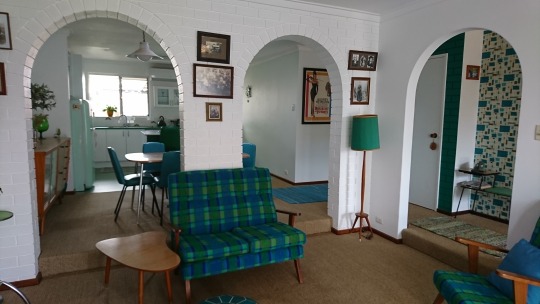
Then it was time to start renovating the inside. The lounge had a large window that overlooked the front garden which was beginning to leak so the first thing I did was replace it with wooden French doors. These open out onto a newly paved patio area with a patio built from the wood used in an old carport that someone advertised on Gumtree. The kitchen and dining room were dark brown brick walls with four arches. As arches were a feature of the retro era, I decided to keep three of these in the lounge/dining room wall so set about painting them with two coats of undercoat and two of a semi-gloss white paint. The bricks all had to be dusted first as they contained 30 years of dust and the whole job took me at least 2 weeks. But it was worth all the work as they now provide a clean-looking, textured wall for this space.
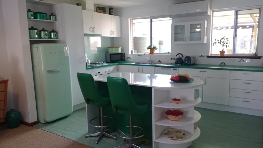
Next, I had to decide how I was going to renovate my kitchen. This small area was walled off with dark brown bricks on two sides and a small archway to communicate between the kitchen and dining room. This limited my ability to interact with guests while I was cooking. After much deliberation I finally chose to knock down both these brick walls, virtually gutting the whole kitchen area. Next came the exciting task of designing my new kitchen. Two large windows and an air conditioner remained on the far wall so I had to include these in my design. I had purchased green kitchen appliances to match a retro fridge I had bought at a second-hand shop a few years earlier so knew what colours I wanted, which is a big help when doing any renovation. The fridge had also influenced my decision to have a retro design for my house. After hours researching retro kitchens, I also knew the features I wanted including: drawers with cupboards underneath, a row of drawers and open, circular shelves at the end of the cupboards. I also wanted a small cupboard with glass doors on the wall, an island and a floor to ceiling pantry.

I had already collected some Jason green kitchen cannisters for flour, sugar etc so knew I wanted some shelves to display these. Fortunately, my small-sized fridge allowed room for these shelves to be placed above it. I did a lot of research on-line until I found the right shade of green Laminex Laminate for the benchtop. Simon, at the kitchen renovation company I engaged to do the work, was a great help in deciding what was possible and what materials I could use. I wanted a matt finish so used a white Melamine Sheen for my doors and panels and found some retro-looking handles to place on them. I knew I needed as much white as possible with the dark green benchtop and chairs so decided a white stone benchtop would look best on the island. I found a lovely white stone with a greyish-green fleck in it at the kitchen company which was just what I wanted.
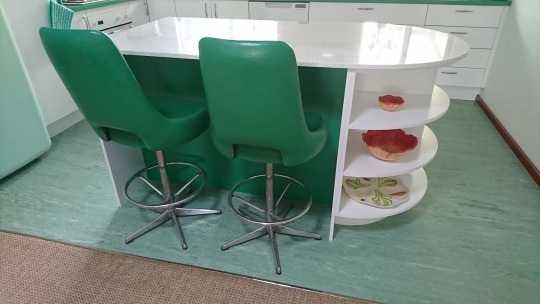
After the walls had been demolished my kitchen cabinets arrived and after looking at them, I realised the white was overwhelming and needed breaking up. To do this I asked for a small strip of green Laminex to be placed on the front of the exhaust fan and a larger piece to be placed on the back of the island where the green chairs would sit. This made a big difference to the overall look of the kitchen as it helped to balance the colours and I’m really pleased I did this. After the kitchen had been installed, I then had to decide what tiles would be placed above the benchtop and what I would use for the splashback.

I had visited a small shop in Fremantle that sells hand-made tiles of vintage design so researched their website and found some lovely tiles with a green art-deco design. Having only these tiles would have made the small area look too busy so I decided to scatter a few amongst some white tiles the same size. They were also very expensive so with this design I was able to do the tiling for a more reasonable cost. I tossed up whether to get a lovely picture on the splashback but decided in the end to get a plain colour as I didn’t want it to dominate the kitchen. I decided on a silvery-white look and did a bit of research trying to find something that would give me the look I wanted. In the end I went to a company that designs and sells splashbacks and found one that had a slight silvery sheen to it but it also had a greenish tinge to the glass. When it was installed the green was even more pronounced and it came out looking great with the green benchtop.
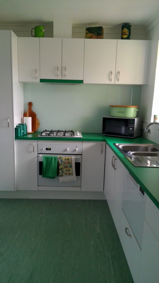
Next, I needed to do the floor. I also wanted to replace the carpet in the dining room, lounge and passage and during my research found a company selling natural fibres which I liked the idea of. These are mostly made of jute, coir, sisal, wool sisal mixes and seagrass. I felt these carpets were more environmentally friendly and thought they might be less attractive to dust mites. After much deliberation I finally found one made of sisal I liked and had this installed. Then I needed to find a lino or tiles for the kitchen that would match the colours and retro look I had designed. I wanted green and white tiles but could not find them anywhere. My research led me to commercial linos and I found one in green that I liked. However, when I ordered it, I was told they had stopped making that design and I was provided with some other samples to choose from. The one I chose has actually turned out to be one of the best decisions I have made for the design of the kitchen. It is exactly the right colour and the pattern is also similar to that found in some older houses. Perhaps some things are meant to be���.
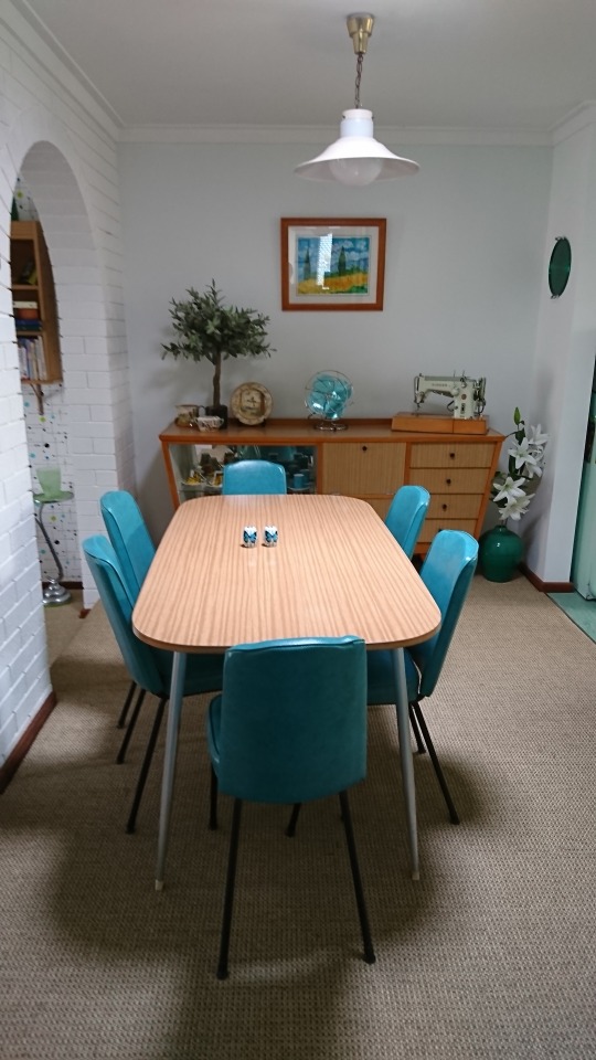
I had been buying second-hand furniture advertised on my local Gumtree website for years as I didn’t have much furniture when I shifted into the house and I like the retro style of furniture. Someone had sold me her grandmother’s sideboard which was lined with a blonde-wood Formica. A year or two after this I found a lovely dining suite in the same Formica style with 6 turquoise chairs that matched the colours in my lounge. This completed my dining area nicely.
While I was waiting for my kitchen to be installed, I spent lots of time plastering, sanding and painting the walls in the lounge, foyer and kitchen area as these had had a lot of hard wear over the 30-odd years they had been painted. I mixed my own paint so I could get different shades in each room of the house. I wanted very light shades of blue and green which meant a lot of trial and error. (This ended with me having to sell a whole 4L tin of paint for $20 I had tinted but couldn’t use because it was too bright). I then decided to wallpaper the foyer wall. This wall consisted of a few pieces of gib-board that had been placed onto the wall and poorly joined. As a result, I had to do a lot of plastering and sanding. Then I bought lining paper and with the help of a friend, we placed the paper vertically across the wall to help cover the joins. I found that an English website, Spoonflower had by far the best wallpaper designs and after a lot of searching I found a retro, atomic design with the right colours I wanted. I had wallpapered a house before when I lived in New Zealand so had a fair idea what I was doing. I also found the new wallpapers with glue on the back are very easy to slide into place. The design on the wallpaper also helps to match each strip.
I was so happy with the look of the foyer wall that I decided to put wallpaper on one of the walls in the lounge room. I needed a wallpaper for this wall that wasn’t too bold or bright so that it didn’t conflict with the tartan in my lounge suite and that had an atomic look to it. Another extensive search on Spoonflower ended with me finding a new design that really suited the colours in my lounge suite – green, turquoise and blue.
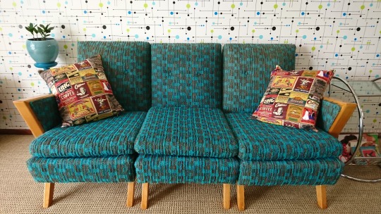
It is interesting how sometimes things just fall into place. Not long after completing the wallpapering of the lounge wall I noticed an advert for a second-hand lounge suite in exactly the right colour – turquoise - that was in the atomic style. I was able to buy this and renovate the wooden parts of it. The upholstery is a little faded in places but it is in reasonable condition for the age of the lounge suite so I didn’t have to spend much on it and it is perfectly suited to the wallpaper on the wall. It was also a plain colour which worked in well with the other tartan lounge suite I had already purchased a few years before.
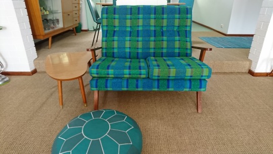
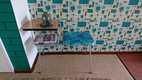
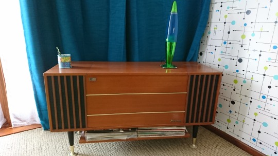
An art-deco style piano, an old stereogram that works and a retro-style coffee table make up the other furniture in this room.

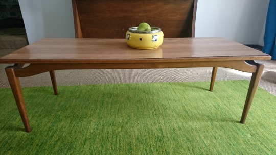
I have also purchased other collectables on Gumtree or second-hand shops that help to enhance the retro look of the lounge room. Bright teal curtains and a green mat have finished off this room nicely. My last job is to renovate the coffee table top.
The spare bedroom has also been renovated in a retro style. After fixing up the plaster and painting the walls, then varnishing the windowsill, I proceeded to paint a lovely retro dressing table I had acquired off Gumtree. I also found some interesting bedside lights and altered them to hang on the wall above the bed. Lastly, I have bought a brightly coloured new bedspread to brighten up the room. All that’s left to do is to renovate the bedside table.


This renovation has taken nearly 2 years with many hours of research and work. But it has been achieved using a modest budget. It has been a labour of love and I’ve really enjoyed the opportunity to use my creative abilities to create a home that I really enjoy living in. I hope it gives somebody some ideas for how they can create a midcentury modern look to their home on a modest budget.
2 notes
·
View notes
Text
What did you just finish? Crazy Rich Asians by Kevin Kwan. A shallow, wealth-porn, frothy bauble of a book, but one which is lots of fun. Rachel Chu and Nicholas Young are both new professors at New York University (Nicholas in history, Rachel in economics, which I have to say seems like a weird choice for a character who spends the whole book being shocked by wealth) and have been dating for about two years, when Nicholas invites Rachel to come to Singapore with him for the summer, so he can participate in his best friend's wedding and she can meet his family. Rachel does so, only to discover that Nicholas is not generically middle-class as she'd always assumed, but rich. And not, like, normal rich, you guys: crazy rich. The rest of the book consists of Rachel gawking at the possessions of Nicholas's family and friends: private jets, personal islands, hotel chains, uncounted maids and drivers and servants, clothes from every top-name designer you can image, antiques and art and mansions and skyscrapers and on and on. Not all is absurdly wealthy bliss, however: various unmarried women try to drive Rachel away so that they can claim Nicholas for themselves, and Nicholas's mother is determined to keep her out of the family. She's shocked enough that Nicholas would marry beneath himself when she assumes Rachel is one of the Taiwanese plastics Chus (such trashy new money!); you can imagine how she feels when she realizes Rachel is actually the daughter of a single-mother real estate agent from Palo Alto, California. Meanwhile, the wedding brings to town every cousin, aunt, uncle, old childhood friend, ex-partner, and business connection from around the world back to town (seriously, this book has an oppressively long character list), and Nicholas's cousin Astrid, who also fell in love outside of the Singaporean elite, is dealing with the breakdown of her own marriage. The whole thing is a bit of a forgettable guilty pleasure, the sort where most of the fun comes from watching people who have such a vastly different lifestyle than me or anyone I know, like Gossip Girl or that Downtown Abbey scene where Maggie Smith asks "What is a week-end?" – except for the fact that pretty much every speaking character is Asian. Still, even if it's silly, it's a fun, fast-moving read. I will confess that my favorite part ended up being the footnotes, where Kwan translates the occasional word or phrase in Mandarin, Malaysian, Hokkien, or other languages and explains references to Singaporean places and people. A few of the ones that made me laugh: Malay slang used to express shock or exasperation like “oh dear” or “oh my God.” Alamak and lah are the two most commonly used slang words in Singapore. (Lah is a suffix that can be used at the end of any phrase for emphasis, but there’s no good explanation for why people use it, lah.) Among Singapore’s upper crust, only two boys’ schools matter: Anglo-Chinese School (ACS) and Raffles Institution (RI). Both are consistently ranked among the top schools in the world and have enjoyed a long, heated rivalry. RI, established in 1823, is known to attract the brainy crowd, while ACS, established in 1886, is popular with the more fashionable set and somewhat perceived to be a breeding ground for snobs. Much of this has to do with the 1980 article in the Sunday Nation entitled “The Little Horrors of ACS,” which exposed the rampant snobbery among its pampered students. This led to a shamed principal announcing to stunned students (including this author) the very next morning during assembly that, henceforth, students were no longer allowed to be dropped off at the front entrance by their chauffeurs. (They had to walk up the short driveway all by themselves, unless it was raining.) Expensive watches, eyeglasses, fountain pens, briefcases, satchels, pencil boxes, stationery, combs, electronic gadgets, comic books, and any other luxury items would also be banned from school property. (But within a few months, Lincoln Lee started wearing his Fila socks again and no one seemed to notice.) The exotic Black and White houses of Singapore are a singular architectural style found nowhere else in the world. Combining Anglo-Indian features with the English Arts and Crafts movement, these white-painted bungalows with black trim detailing were ingeniously designed for tropical climes. Originally built to house well-to-do colonial families, they are now extremely coveted and available only to the crazy rich ($40 million for starters, and you might have to wait several decades for a whole family to die). Overall I'd really only recommend the book to someone in need of a mindless beach read. In particular the ending is left unresolved; I know there's a sequel, but even for a book in the midst of a series I'd expect more loose ends to be tied up than what we got here. That said, I haven't seen the movie yet, and I suspect it's the sort of story where good actors can make all the difference, simply by fleshing out these somewhat-cardboard characters. Driving to Geronimo’s Grave by Joe Lansdale. A collection of six short stories by an author mostly known for capturing the spirit of rural east Texas, both in historical and modern fiction. In the title story, a brother and sister run afoul of a bank robber in Oklahoma during the Great Depression. This one had an excellent first-person narrator and a great sense of humor. In the Mad Mountains is a surprisingly straightforward Lovecraft pastiche, with hints of the Titanic's sinking and Amelia Earhart's disappearance mixing with the cosmic horrors. There's no twists or revisionism here; you could almost mistake this one for actual Lovecraft, except that Lansdale is much better at writing well-rounded characters. Though that's a low bar. Robo Rapid is an old-fashioned, surprisingly cozy YA post-apocalyptic story – more Edgar Rice Burroughs than Hunger Games – with a girl heading out on an adventure across a vast and unknown desert. The Projectionist is darker than the other stories; a noir tale of mobsters and unrequited obsession. Everything Sparkles in Hell is probably my favorite of the six. It reminded me a bit of Django Unchained, having a similar sort of violent humor tucked into a revisionist Western. A black bounty hunter and his Native American buddy track down four murderers, at least until a man-killing grizzly bear and a massive snowstorm complicate matters. Wrestling Jesus is the only story of these that I'd before; it was published in the Dangerous Women anthology and I have to say that I really disliked it there. A bullied teen is semi-adopted by an elderly ex-wrestler, who teaches him how to fight in between preparing for his own big match – he and another man have a rivalry going back decades where they compete for the attentions of a beautiful woman. Read as a story explicitly about a 'dangerous woman' it's a disaster, since a) the woman only appears in one scene, where b) she's literally a prize to be fought over by men. Read by itself, it's a fine story about a father-son relationship. Or it would be, if Lansdale hadn't included a long afterword complaining about the bad reviews he got for the anthology. Don't write a story that so blatantly misses the point and then get upset when people say you missed the point, dude! I hate it when authors I like act like dingbats in their nonfictional writings. But with all that said, this is a very nice collection of stories, with a surprising diversity of tones and settings. I've long been a fan of Lansdale's Hap & Leonard series, but this book would make a good introduction for newcomers. I read this as an ARC via NetGalley. What are you currently reading? Jade City by Fonda Lee. This book has been described as "Hong Kong gangster movie, but fantasy". I just started it this morning so I can't say more than that, but really, what more do you need?
4 notes
·
View notes
Text
Skull Illustration and process
Review:
I believe that my skull Illustration is a really strong outcome because I added quite a few details to it and I followed some of Patrick Seymour’s art to have an art reference. My final outcome of the black and white Illustration had a lot of shadow work and contrast and I really liked it that way because it made it more intricate and somehow looks semi-realistic. Although, I could somehow added the cracks from the skull to the illustration, it would definitely make the Illustration a lot more intricate. I personally loved the last outcome of the colour gradient experiment I did because it was split into 4 separate colours. Patrick Seymour kind of did this concept but he also changed the colour background into a split image, I did not like that concept but I did my own by just separating different colours together.
There some ideas that I could’ve added or some stuff that can be changed, I could explored with different colours more and could possibly animate my skull illustration with different colours and make it into a GIF. I could also add more shapes surrounding the skull but it doesn’t link up with Patrick Seymour’s art style. In addition, I could also possibly make mock up with this illustration as t-shirt designs or a tattoo design for future reference and for showing how we can show our product and be able to make business out of it.

Colour Gradient experiment:
I had some complications went it came to colour gradient because the colour slide in the gradient tool is very temperamental because I have to keep clicking it until I get the colour choices. I kept the same colour scheme from my typography work because I somehow wanted it to be consistent, for the first experiment was a purple and pink combination, it honestly looks simplistic but its still a nice combination together. The second colours are just the purple and blue I used from the same typography work. The third one I really liked because It’s slightly different from others, its a light blue and white colour gradient, it would go really well with the black background like I ‘ve shown down below, I did that by just selecting the rectangle tool in illustrator and I right clicked it and go to arrange and arranged it at the back so we can see the Illustration.
By far my favourite colour combination is the last one because there are several colours that goes really well together, I did this by colour gradient it with pink and purple first and then selected the other half and changed the colour gradient with purple and blue.


Process of creating the Illustration:
I firstly selected my favourite animal skull and I went for a horse skull because it looks interesting to be illustrated. I then placed it in a new document in illustrator, locked the first layer and then created a new layer dedicated to everything else of the process in making my skull illustration. I chose an A3 document that is portrait because it wouldn’t fit with the landscape since the picture is elongated.

I started by the bottom because I wanted to work my way up when I’m drawing, I started where the hole of the nose is, I did the drawing by drawing the outline on a piece of the skull with the pencil tool in Illustrator and I used the blend tool to be able to add the lines created in-between the two lines, you can change the amount of lines created in-between the skull by clicking on blend tool and it should pop up an option of colour changing just make sure to go to specified steps and put the amount you want, the more strokes/lines you add, the darker the part will be. For instance, the hole of the nose is dark because it has some shadows to it, so I added more specified steps to it. To activate to make the lines you just click on the highlighted line to the other line you created, make sure that the two lines doesn’t connect together since it would mess up with the specified steps and would create a weird shape.

I preferred to draw section by section because it created some interesting dimensions which I thought would be a good contrast and shadow works because if I did it by one go It’ll look simple and not intricate enough for me. I also preferred to draw the dark shadows first so that I can visualise the lighter shades with how many specified steps I should do for them.

Sometimes it creates weird shaped lines but it can look sometimes better, if it doesn’t look too great you can simply undo it and select from a different point to another until you’re satisfied with the layout, although I take advantage of it since it looks interesting. I keep continuing to keep sectioning the drawings so that you can see the details of the work.

After finishing one side of the skull, you can simply copy it by selecting the whole thing and go to object - transform - reflect - 90 degrees - copy. This will allow you to copy the exact drawing and it will flip the drawing for you to use for the other side.

I had come across a problem where it left a massive space in-between to make it symmetrical, although I moved the copied version around to see if I can make it work and what I did was rotated the second one slightly and connected it from the top and it leaves it from being slightly crossed over each other but it didn’t look too bad so I decided to go for that, it then left some gaps at the bottom where the teeth are but I just quickly filled it in to make it more symmetrical looking.
0 notes
Text
Arplis - News: Friday, May 8, 2020 Stu Agler
"Brainstorming for New Periodicals" 17. Magazine for masseuses?: ROLF DIGEST. GOLF DIGEST 21. Magazine for nurses?: IV GUIDE. TV GUIDE 26. Magazine for golfers?: PAR AND DRIVER. CAR AND DRIVER 44. Magazine for crossword constructors?: PUNNERS WORLD. RUNNER'S WORLD 38. Magazine for beekeepers?: HONEY. MONEY 51. Magazine for pharmacists?: MEDBOOK. REDBOOK 60. Magazine for farmers?: HEN'S HEALTH. MEN'S HEALTH We have another debut at the LA Times and Crossword Corner. Welcome, Stu Agler ! Rolf Digest was the first themer to fill, but I had never heard of Rolfing. Wikipedia tells me "Rolfing is a form of alternative medicine originally developed by Ida Rolf as Structural Integration. It is typically delivered as a series of ten hands-on physical manipulation sessions sometimes called "the recipe" Who knew ? Consistency in changing only the first letter of the existing magazines may have made this puzzle a bit easier to solve, but it's still funny and punny. Excepting IV / TV, they all also rhyme. Stu probably had more choices and could probably have created a Sunday sized grid with this theme. How about "Magazine for helicopter designers? Rotor Trend. Or, "Magazine for practitioners of animal husbandry ?" Sired. Maybe, "Magazine for Lumberyard professionals ? Wood Housekeeping. I'll stop now and leave it to the professionals. Great job, Stu. We're now going to explore that which remains. And pardon me while I wander and reminisce. Across: 1. Cook Islands language: MAORI. The Cook Islands are in the South Pacific ocean with 15 islands having a combined total land area of about 93 square miles. For perspective, the city of Chicago covers about 234 sq. miles. Los Angeles 469, and Houston 600 sq. miles. The land area of the Cook Islands is about the size of Milwaukee (96), Sacramento (98), Lincoln, NE (89) or Tallahassee (100 sq. mi.). Spanish explorers visited the islands in the late 1500s and named one of the islands St. Bernard. British Navigator James Cook came to the islands in the 1770s, and named one of the islands Hervey Island. The name "Cook Islands" first appeared on a Russian naval chart in the 1820s. 78 % of the people on the island nation are Māori and another 7.8 % are part Māori. The official languages are English and Cook Islands Māori. The capital (and largest city) is Avarua, which might be a good answer in a crossword puzzle. 6. Place for mascara: LASH. 10. Rims: LIPs. 14. Ray __, NBAer with the most regular season 3-point field goals: ALLEN. Retired HOF'er with 18 years in the NBA making 40 % of his attempts from beyond the line for 2973 buckets. Active player Stephen Curry has hit 43.5 % of his 3-pointers during his 11 year NBA career, and is about 500 makes behind. Note the consistency in the non-shooting hand. 15. Northern Oklahoma city: ENID. Known as the "Wheat Capital" of Oklahoma for its immense grain storage capacity. It has the third-largest grain storage capacity in the world. Yes, that is a line of rail cars in the foreground. The place is huge. There were some great shots on The Smithsonian Channel's Aerial America - Oklahoma the other day. If you don't get that channel, watch for it to be shown on The Smithsonian's Aerial America YouTube channel. 16. Legal memo phrase: INRE. 19. Campus area: QUAD. 20. Place with shells: SEASIDE. 23. Informal negative: AIN'T. Isn't wrong. 25. Chopper topper: ROTOR. One of my part time military jobs (ODAA - other duties as assigned)) was working as part of the team at the "Can Point" when I was assigned to Coleman Army Airfield, Coleman Barracks, 70th AVIM (aviation intermediate maintenance) Battalion, 1st Support Brigade (later, 21st Support Command), USAEUR (US Army Europe) at Sandhofen (Mannheim), Germany. My real job was in the computer vans, 3rd shift, feeding stack after stack of 80 column cards into a card reader, and then inserting magnetic ledger stock into the platen feed of an NCR 500 computer system. It was all part of the inventory control system used to keep track of orders and disbursements and stock on hand. Occasionally keypunching new cards to replace mangled cards, and running the 088 card sorter from time to time after dropping a tray full of cards. Tray after tray, night after night, week after week. So monotonous. I digress. Any rotor wing aircraft that went down in USAEUR were transported to the cannibalization point for selected salvage. Rotor wings could not be salvaged for re-use, but were in demand by Air Cavalry battalions and companies around the country. They would be used as art on the hangars or as gate toppers at entrances to Kasernes that housed rotor wing companies. Most impressive and awe inspiring was when the heavy lift helicopters came in for inspection and maintenance. The roar of the engines and sound of the rotors pounding the air was thunderous as the beasts approached and landed on the tarmac. CH-47 "Chinook" on the left and CH-54 "Tarhe" (Skycrane) on the right. The Skycranes were being phased out of military service in Europe in the late '70s when I was there, and many passed through our airfield on their way back to the U.S. 32. Salchow relatives: AXELs. Figure skating. 33. __-deucey: ACEY. A card game or a backgammon game. 34. Hook partner: JAB. Boxing. 37. Gobble (down): WOLF. 40. Coke __: ZERO. Zero calorie, sugar free version of Coca-Cola. Artificially sweetened. I've never had one. 41. __-Caps: SNO. Semi-sweet chocolates topped with nonpareils. White ones, of course. 42. "Be there in __": A SEC. What my wife says 10 minutes before she gets to the door as we are preparing to leave. 43. Wheel alignment: TOE-IN. What You Need to Know About Tire Alignment 47. Weasel cousin: STOAT. Not otter today. A stoat (top) and a weasel (bottom) Stoat or weasel? How to tell the difference 50. "Get lost!": SHOO. 54. Pal of Barbarino in "Welcome Back, Kotter": EPSTEIN. 59. Afterthoughts: ANDs. Oh, and the guy in the lower left is Barbarino and the guy in the top right is Epstein. 62. Leave in: STET. Don't dele. Obelisms. A proofreader knows these symbols. 63. Half of Mork's sign-off: NANU. Mork was the ET from the planet Ork on the sitcom Mork and Mindy. 64. Brew hue: AMBER. 65. __ d'oeuvres: HORS. 66. First column to add, usually: ONEs. Units. The first column of whole numbers to be added in a place-value numbering system. Typically in base-10 (decimal) for most people, and the second column would be tens, the third hundreds and so on. I know you knew that, but I'm building here. Programmers and others in technology use other place-value numbering systems, such as in base-8 (octal) where the columns would be units, eights, sixty-fours and so on, and in base-16 (hexadecimal) they would be units, sixteens, and the third column two hundred fifty-sixes. Quick, what's the first numbering system that comes to mind that is not place-value ? 67. Funny Anne: MEARA. So many roles, but perhaps best known as one half of the Stiller and Meara comedy team. Down: 1. Second-smallest of eight: MARS. Our solar system's planets. The "Red Planet", fourth from the sun. Mercury is the smallest. 2. Ointment ingredient: ALOE. Keep washing your hands and try to find a sanitizer with aloe in it. Does aloe work ? Evaluation of aloe vera gel gloves in the treatment of dry skin associated with occupational exposure. 3. Cantina crock: OLLA. 4. Works the game: REFs. Referees the game or bout. 5. Team with the longest World Series drought (71 years): INDIANS. Should be championship drought. They were in the 2016 World Series, and they were leading it 3 games to 1 in the best of 7 series over the Chicago Cubs. The Cubs won the next two games, evening the series at 3 each. In the seventh and deciding game that many pundits have called one of the greatest game 7s (and series) in MLB history, the teams were tied at 6 runs each after 9 innings. Then the skies opened up with a sudden downpour. After the rain delay play resumed, and the Cubs scored two to take an 8-6 lead in the top of the tenth inning. In the bottom of the tenth, the home field Indians plated one run with two out before the Tribe's loyal fans had their hopes squashed on a weak grounder to third baseman Kris Bryant. It was only the fifth time in World Series history that a Game 7 went to extra innings, and it was the first time the extra inning Game 7 was won by a road team. The series and Game 7 were both dubbed "instant classics". The Cubs won and ended a 108 year championship drought of their own; the longest in professional sports history. 6. Folklore tale: LEGEND. An example of early American literature was Washington Irving's The Legend of Sleep Hollow, but what inspired the work ? 7. Suffix with hex-: ANE. 8. "Absolutely!" in Madrid: SI SI. 9. Best Buy purchase: HDTV. 10. __ license: LIQUOR. 11. Greenland language: INUIT. 12. Madrid museum: PRADO. 13. Where the same questions are asked annually: SEDER. 18. "__ it my way": I DID. 22. Ethically uncertain, in Sussex: GREY. I loved Dash-T's explanation a few weeks ago that, "Gray is a color, while grey is a colour". 24. Spells: TRANCEs. 26. Treat holders: PAWs. 27. Nerve impulse carrier: AXON. 28. HR dept. concern: RELO. United Van Lines packed up my belongings and car when I was relocated from Houston to Chicago in late '87. The company footed the bill for my relocation moving and living expenses. Actually lived for almost two months in a new Holiday Inn that was still in the process of being constructed. Then January came, and I learned fast that my southeast Texas blood and wardrobe was ill-equipped to deal with Chicago's gusting winds and biting cold that would shiver your bones. I ran to the mall and bought thermal underwear and the heaviest lined Burberry style trench coat I could find. I didn't bother to ask HR to foot the bill on those items. I know'd the answer was NO ! 29. Alien from Melmac: ALF. Another extraterrestrial from TV land. Anne Meara played the grandmother in occasional appearances on the sitcom. 30. __ dancing: ICE. Like figure skating, but more freeform and interpretive. 31. "Oy __!": VEY. Oy vey ! This crossword puzzle review has gone on too long. But wait, there's more ! 34. Boo: JEER. Please. Bear with me, it'll be over soon. 35. Seed covering: ARIL. 36. M's favorite agent: BOND. James Bond's boss and head of MI6, portrayed by Dame Judy Dench in eight of the movies. 38. 24 hrs.-per-day retail channel: HSN. Home Shopping Network 39. Wine: Pref.: OEN. From the ancient Greek word oinos. "The translators of the KJV, by uniformly rendering the Greek word oinos as wine, replicated the Greek word’s reference to both fermented and unfermented juice with an English word that, in their day, was similarly general in reference." 40. Wild place: ZOO. The nickname for Gerszewski Barracks in Knielingen (Karlsruhe) Germany, my second station while serving there. The Zoo had an entirely different atmosphere than Coleman. Still the military, but significantly fewer officers and Warrant Officers (mostly helicopter pilots at Coleman) and MPs than Coleman. Definitely more relaxed. Coleman was the home to the USAEUR Confinement Facility, where soldiers in serious trouble awaited trial, were serving sentences up to a year, or for the most serious offenses, were awaiting orders for transportation back to the U.S. to serve extended time at Ft Leavenworth, KA. 42. Jam component: AUTO. Seriously, was I the only one that first thought of pectin ? 43. Type of fastball grip: TWO SEAM. Baseball. Even ardent fans may not be aware of the arsenal that Yu Darvish brings to the mound. 44. Blue Ribbons, e.g.: PABSTs. PBRs, for short. Pabst Blue Ribbon beer. Not my cuppa, but it'll do in a pinch. 45. Monkey used in research: RHESUS. 46. Future junior: SOPH. 47. Big hit: SMASH. As in an exceptionally popular TV, movie or stage show, or for tennis fans such as Sandyanon, the return shot answer to a poorly placed near-net lob shot. 48. :50, another way: TEN TO. Me: "It's ten to five. Are you ready yet ? Are you coming ?" Her: "I'll be there in a sec." 49. Stranger: ODDER. 52. "That's awful!": OH NO. 53. New Jersey university: KEAN. Not familiar. About Yellowrocks, is that near you ? 55. Domesticate: TAME. 56. People Magazine's 2018 Sexiest Man Alive: ELBA. Idris. Hi, Lucina ! 57. Old Roman road: ITER. 58. Dragster's org.: NHRA. The National Hot Rod Association (NHRA) and International Hot Rod Association (IHRA) are the two largest sanctioning bodies for drag racing. The Great Lakes Dragaway in Union Grove, Wisconsin is still going strong. The "Sunday, Sunday, Sunday" radio commercials for drag racing events can still be heard on radio stations across the country. Well, maybe not right now, but they'll be back. 61. Austin-to-Dallas dir.: NNE. For some, I-35 is known as Main Street, Texas. Almost half of the Texas population (and most of my siblings and extended family) lives along this central artery that starts in Laredo, Texas near the Rio Grande, and exits the state just north of Gainseville at the Red River. From there I-35 travels generally NNE all the way to Duluth, Minnesota, comparatively just shy of the border with Canada. The reconstruction and widening of I-35 that started in 2012 is the second largest infrastructure project in the history of the state for TxDOT, the state's Department of Transportation. The first ? Building I-35 in the first place, which started in the '50s as part of Eisenhower's Interstate System. It will be nice, and much safer when it is finally done. Use the Zoom In, Zoom Out buttons on the map to view greater detail or a wider view, and use your mouse to move around. "Ain't Isn't wrong" technology grand ? Finally, here's the grid: #TTP #StuAgler #Friday

Arplis - News source https://arplis.com/blogs/news/friday-may-8-2020-stu-agler
0 notes
Text
Cutie Reviews: Kira Kira Crate Oct 18

Oreo’s ready for this review, are you ready?!
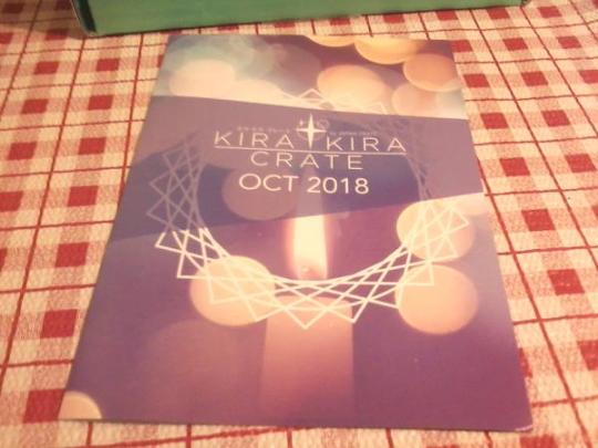
This months theme: Soothing the Spirit
Soothe your own spirit and skin during the month when the spirits tend to be a bit restless. October’s crate is all about keeping any “monster” breakouts at bay and making you look and feel rested for any ghoulish gatherings this month!
Acne Bath Salts

If you’ve been a long-time Reader of the blog you might recognize this item. I say that because not only have I gotten this exact one from an older box, but I got another one in the brand from it too. But this one I’ll give a review because of how long its been.
This brand specializes in producing bath salts mean to heal the body and keep skin healthy. Such as this packet, which focuses on keeping acne controlled with a mix of various herbal ingredients that will heal the skin, as well as smooth any dry patches. You can use this in the bath to soak, or pour it into a bowl and just rinse your face and whatever else.
Rating: ♥ ♥ ♥ ♥
Initially I didn’t think I would care very much about this because the other one I had wasn’t very amazing; it was a plain white powder with a nice scent and some soothing properties for achy muscles. This one on the other hand looks blue in the packet and has a mix of powder and crystals in it, and once in the water it turns a really pretty, vibrant emerald color. I was very impressed. The scent is really nice too, I can’t identify it precisely other than to say it smells like those scented burning sticks.
In terms of how it handles acne, honestly that isn’t actually a big problem for me. Never has been. So I couldn’t really say how it does with that, but it makes the skin feel very smooth and soft and helped soothe my facial dry spots.
Kabuki Sheet Mask

A basic Pure Smile mask that features a colorful Kabuki inspired art design. There was 2 different styles but otherwise were exactly the same as far as I know.
This was one of their “translated“ facial masks, so if you look on the back you can see a whole list of ingredients, like Witch Hazel, purified water, perfume, hydrogenated perfume, etc. It’s main ingredients are Hyaluronic acid, Vitamin E, and Collagen- so typical mask.
Rating: ♥ ♥ ♥ ♥
In comparison to the one from NMNL box this one has a generic scent of lotion or facial masks, it was really nice. Unfortunately I wasn’t really able entirely use the mask too long because it was really bothering my eyes. My allergies struck a few days ago and they’re mainly affecting my eyes, so it wasn’t a very enjoyable experience...
But keep in mind that isn’t the masks fault, I’ve used several facial masks from Pure Smile and other brands and never had any problems like that.
Konjac Exfoliator

I’m beginning to think Kira Kira crate loves Konjac, because I know I’ve seen it before in these boxes. In fact I got the exact same one last time (available in a heart or circle shape, I adore hearts so I’m not complaining about that). But this time we had the option between the original, green tea, or charcoal. So I’m a little disappointed about getting the original again.... although I don’t like charcoal or green tea, so this is kind of like a gift horse situation.
So as you can see, mine was extremely dry. If I recall, when I got this originally it was spongy and moist- that’s the problem with konjac though. Used or not it’ll dry up. The good news is that because it was still sealed, I was able to re-moisten it and sort of bring it back to life for use.
Rating: ♥ ♥ ♥
I’m not really sure if it would have changed my opinion if I got a different one, but never really noticed the appeal behind konjac when it’s pretty much the same thing as any other sponge- at least to me. I never really think much about them or notice anything I wouldn’t have seen using another product to clean my face. It’s a cute shape and I like the possible variety options behind it, but I can’t say it’s my favorite item in the box. It’s nothing new for me.
Acne Medicated Face Foam

Formulated with Hyaluronic Acid, this facial foam works in tandem with the konjac sponge, and has the same theme as the bath salts in that it fights against nasty acne. It leaves the skin smooth and fresh and won’t strip it of its moisture; but it will remove traces of makeup that might be clogging those stuffy pores. It’s also gentle and has a faint floral/lotion scent so it most-likely won’t trigger any sensitivity issues.

Like other face foams/cleaners it has a semi-thick, gooey texture.
Rating: ♥ ♥ ♥ ♥ ♥
I have several facial washes products due to my boxes, and I tend to rate these very seriously if I find one that I really like and try to compare others to them. This one reminds me a lot of the ones I had back when I started ordering these boxes, the Naive Peach for example. It makes my skin feel relaxed and cools it down, which is great for warm weather like this.
It didn’t even activate my allergies like I thought it might, I assume it’s due to the medicated formula? My eyes feel really good right now and aren’t bothering me at all (although they are a tiny bit heavy, I should be sleeping now~).
Hanamaru Eye Cream

This is our final item, an eye cream meant to de-puff those bags and tired muscles. It sinks into the skin and leaves a cooling after effect to rejuvenate it, and it has a faint rose scent.

I was pretty surprised to see this grey-very slightly green tinted product come out of the tube. The booklet says it has a gel-like consistency and I could agree with that. You only need a really tiny amount when using it, as I discovered after taking this picture.
Rating: ♥ ♥ ♥ ♥ ♥
I really don’t know if it was this, the face wash, or using both of them but my eyes feel great. I really like this cream and it smells wonderful- but again it’s very light so it won’t trigger allergies or anything. It also didn’t bother my eyes to use this, which again really surprised me.
♥ Cutie Ranking ♥
Quality - 2 out of 5. The items were fine, and all of it besides the mask is re-usable so I like that. Two of them also had variety which was nice.
Theme - 1 out of 5. Compared to last years box, which actually did have a Halloween vibe... I didn’t see it at all with this one. But I will give them points for trying; I mean, they did have some cutesy spooky puns and stuff...
Content - 4 out of 5. Although I have my complaints about the items above, I’m not saying in any means were they bad items. What really bothers me is how repetitive it was though- if the items weren’t the exact same as previously for me, they were very close.
Total Rank: 6 out of 10 Cuties. Basically, the items are good quality and I liked them. But I was heavily disappointed by the way they handled the theme- especially in comparison to last year. Knowing what they are capable of made me feel underwhelmed by it ultimately.
♥ Cutie Scale ♥
1. Hanamaru Eye Cream - Kind of simple but I liked the white-ish, light green, and grey/silver details. I also love the scent, and my eyes feel really nice after using it~
2. Acne Face Wash - It’s kind of like below in that the packaging isn’t very unique or fun, but the product is really good. I didn’t think much of it until I actually used it and I really like it now.
3. Acne Bath Salts - You can’t really be all that excited about the plain packaging. But the product itself is amazing!
4. Face Mask - the Kabuki inspired designs were fun, but it wasn’t anything special.
5. Konjac Heart Sponge - As much as I love hearts this isn’t one I was very excited to see...
I know I probably come off as being overly critical sometimes (or maybe not enough??), but that will be it on my thoughts of this box. If you didn’t enjoy the review I at least hope the pictures killed some time ;p Next up I’ll be doing the a Gacha Gacha Crate review because it showed up last week and I am very excited about it- so remember:
Open a box of cuteness each day!
0 notes
Text
Kiarostami’s Close-Up and the Facticity of Being

One of the greatest humanists of the cinema in company with Jean Renoir and Satyajit Ray, the Iranian master filmmaker, Abbas Kiarostami passed away last summer. There is no need to blame the world of film for not seeing Kiarostami’s significance before his passing because Kiarostami was not only a genius but he was also widely recognized as such. Reasons are plentiful. As Ehsan Khoshbakht observes in his obituary in Sight & Sound, Kiarostami “found a balance between pure cynicism and deep humanism in his work, as it continually questioned life and cinema.” Khoshbakht’s understated observation in the subordinate clause is vital, I believe, for the thesis made in the main clause. There is never a clarity between opposites in Kiarostami’s cinema precisely because it is always already questioning itself. It cannot articulate without structuring nor can it affirm without questioning. One could pick many moments from Kiarostami’s work to illustrate this, think of the iconic ending of Taste of Cherry (1997, Ta’m e guilass), for example, but it seems most obvious in the case of Close-Up (1990, Nema-ye Nazdik), a good candidate for Kiarostami’s best film, a meta-film about cinema, longing, and, above all, itself.
Made in between of Kiarostami’s breakthrough “Koker trilogy”, consisting of the films Where Is The Friend’s Home? (1987, Khane-ye doust kodjast?), Life and Nothing More... (1992, Zendegi va digar hich), and Through the Olive Trees (1994, Zire darakhatan zeyton), Close-Up situates itself on familiar ground in the Kiarostami canon as it almost seems to foreshadow the meta-cinematic themes of the two subsequent films of the trilogy after the more “intellectually innocent” (think what you may) Where Is the Friend’s Home?. Based on true events, Close-Up tells the peculiar story about a poor Iranian man, Hossain Sabzian (played by himself, as is the case with all the performers in the film) who pretended to be the famous Iranian director Mohsen Makhmalbaf for the Ahankas, an upper-class Iranian family to whom Sabzian told that he wanted to use them and their house for his next film. When Sabzian’s hoax was revealed, the Ahankha family sued him only to drop charges after his intentions proved out to be more complex than those of a traditional impostor.
Kiarostami’s third person narrative not only combines different perspectives but also fact and fiction since it uses documentary footage as well as staged material. The film begins with a journalist and two policemen taking a taxi to see and arrest Sabzian. During the taxi journey, narrative establishes the premise of the story as the journalist tells it to the indifferent taxi driver. Once they arrive at the Ahankha residence, the camera is left to film the taxi with only the driver and the two policemen in it while the journalist enters to pick up Sabzian. This set-up is followed by apparently “factual” scenes where Kiarostami interviews the Ahankha family as well as Sabzian himself and “staged” scenes where the original meeting between Sabzian and the mother of the Ahankha family is retold, the entire trial reenacted. preceded by a staged interview with the judge to acquire the approval to film the trial, and a finale where Kiarostami’s camera follows Sabzian being picked up by Makhmalbaf on a motorcycle to the Ahankha residence to make amends with the family in a semi-cathartic moment where life seems to imitate art and vice versa.
A quasi-documentary in the truest sense of the word, Close-Up challenges the spectator to join the game of roles played by Kiarostami and Sabzian. In a sense, Kiarostami does what Sabzian does: he takes matters in his control and drives the people into playing themselves. The twist here is that the role played is not stranger than anything else as which one might exist. Typically for Kiarostami, the free narrative of this quasi-documentary, free in the sense of free indirect discourse, that is, provides the spectator with diegetic information (information about the fictive world) slowly as the story unfolds -- first the journalist sets up the premise, then the people involved are interviewed about the events, towards the end the arrest of Sabzian is seen from his perspective, and finally narrative embraces an ambiguously focalized perspective as it stages the encounter between Sabzian and Makhmalbaf, providing the spectator with diegetic or extra-diegetic information -- but eventually one comes to understand that more important than what is narrated is narrative itself. Analogously, Kiarostami seems to imply, knowing is more important than knowledge, act is more important than object, and experience of truth is more important than truth itself.
In the objective sense of this narrative, Kiarostami creates a vividly realist aesthetics. Kiarostami uses the telephoto lens in many shots to create flat impressions of space, like in the shot of the rolling empty spray can on the street, for example. Kiarostami’s shots are also mainly long in duration. The camera moves by following characters or remains static as they talk, do nothing, or move beyond the screen space. Most of the shots are also small in scale which enhances the impression of duration and longitude (since usually the longer the take in duration, the larger it is in scale). Though not all the shots in Close-Up are, well, close-ups (there are many full shots, for example), Kiarostami’s cinematographic aesthetics gives out an impressive impression of intimacy because the shots are precisely framed, uncovering only a small portion of the whole space (the front of the gate of the Ahankha residence, the narrow street before it, the hallway in the prison, the court, the living room at the Ahankha residence), and, what is more, Kiarostami does not use a lot of establishing shots. He rarely cuts to movement and uses shot-reverse-shot sequences selectively.
Overall, Kiarostami’s style and narrative in Close-Up give one a veritably neo-realist impression. The story is based on a news item (which was André Bazin’s well-known characterization of the narrative simplicity of De Sica’s Bicycle Thieves, 1948 -- that it could well be a short news item), the characters are authentic in the truest sense of the word, the scenes have been shot on-location quite literally, Kiarostami’s mise-en-scène is naturalistic with a strong presence of natural light and the lack of set design, there is a total absence of non-diegetic music with the exception of the very end, the tone has a sense of “tonelessness” which the alleged objectivity of neorealism was always reaching for, narrative seems to constantly de-dramatize situations, chance plays an integral role in narrative, the long take is used relentlessly, and the events take place in real time. Cesare Zavattini would be proud of the first scene in Close-Up: the camera records the journalist’s entrance to the taxi, the taxi voyage to the Ahanka residence, the taxi driver waiting outside while the journalist enters the Ahanka residence after arriving at the destination, and the journalist’s attempts to find a recorder during which he kicks the empty spray can down the street.
An obvious philosophical theme going on in Close-Up is, of course, the question of the relation between the real and the unreal. This relation seems to appear to Kiarostami as dialectical in the Hegelian sense that the polar opposites entail one another. There is no reality without unreality and vice versa. Sabzian acts the role of Makhmalbaf to the point that he is no longer acting: he merely is. The same seems to stand for the film itself. It imitates life to the point that it no longer imitates: it simply is. There is a constant tension between the real and the staged to the point where the former seems to turn into the latter and the latter into the former.
The reason why the essence of Kiarostami’s cinema lies in his meta-cinematic efforts, which are never mere intellectual show-off, is that they connect quintessentially to the more “human” themes in his films, which is why Khoshbakht’s subordinate clause was emphasized above. It is really the philosophical questioning characterizing Kiarostami’s cinema, which constantly questions itself, that makes his cinema so humanely profound. In Close-Up, the interrelation between the real and the unreal, the entanglement between fact and fiction, engages with existentialist themes of identity, loneliness, and yearning for otherness. The spectator is, for sure, free to interpret Sabzian’s desire to be appreciated and recognized as a director with power in terms of psychoanalysis, but one can also see it in terms of Heidegger’s early existential philosophy as a human attempt to rise from the “inauthentic” mundane everyday living of das Man into the “authentic” being of Dasein. If the being of das Man, the everyday being where one engages with the practical world without questioning it, without acknowledging death and so on, is inauthentic, as Heidegger claims it to be, and the being of Dasein, the being towards death with a deep awareness of existence, is authentic, then Close-Up comes across as a peculiar case where inauthenticity (Sabzian acting) leads to authenticity (Sabzian being). Is this not “real” in the case of the film, too? Film is an artificial artifact which precisely as such -- if we are to believe Felix A. Morlioni’s famous characterization of Italian neorealism -- “reaches out to the real.”
Despite reaching out to the real by venturing into the spheres of inauthenticity, Close-Up has little to nothing inauthentic about it in the traditional sense of the word. Kiarostami’s images are truly of the real in the sense that they seem to be never inhabited by anything supernatural or external to the spatio-temporal reality they capture (in terms of both the on-screen and the off-screen space, of course). Like in the images of Ozu’s films, I see nothing holy or sacred in Kiarostami’s. The material density of the texture of reality drains from them. The empty spray can rolling down the street is not necessarily a symbol for the emptiness of human life, or the void behind the roles we play -- though the kick to it by the journalist would be juicy to interpret as an articulation of metaphysical chance --, but more likely a mere abandoned tool. It is what Heidegger would call Vorhanden, a being-present-at-hand whose factual existence is obvious to us after it has lost its functional purpose, its primordial being as Zuhanden, a being-ready-to-hand that one surrounds oneself with in the everyday reality of practical life. If it is a postmodern alternative to Sisyphus’ rock, it would be more a metonymy than a metaphor; it is a desolate, cast-off tool whose lonely mundane being paradoxically charms us in its banality. It is, what we might call in the spirit of anticipation, the taste of cherry.
Though at first glance the empty spray can might seem nothing more than what film scholar Kristin Thompson calls excess, it really is not or is -- which way one prefers to say it. It is not excess in the sense of being surplus material because nothing in Close-Up is surplus material; or, alternatively, everything in Close-Up is surplus material. I prefer the former option due to its intuitive grasp of the film actually being about something. The empty spray can is not excess precisely because it is an essential element of the material reality or the facticity of its being which Kiarostami’s camera senses. It is this quality of lingering on the phenomenal surface which is one of the greatest merits of the cinema.
Given that Kiarostami’s cinema is always characterized by a profound interplay between the seen and the unseen in terms of a dynamic relation between the on-screen and the off-screen space, it is hardly surprising that his ascetic sound design also embodies this materialism. In the final sequence of Close-Up, Kiarostami’s camera with a telephoto lens follows Sabzian and Makhmalbaf on the motorcycle to the Ahanka residence. The sound keeps cutting off and the window of the car, which Kiarostami is purportedly driving, is broken. Catching the spectator totally off-guard, the constantly cutting sound is suddenly replaced by non-diegetic classical music. Against all apparent logic of narrative and consistency, this is a true stroke of genius. Some might sense an ascent from the mundane everyday to the divine infinity in Kiarostami’s choice of cinematic device, which is fine, but to me it is first about narrative alienation -- the sudden emergence of non-diegetic music coerces the spectator into acknowledging that they are watching a film, focusing on the film itself, its artificiality and structure -- and second about material sublimity. The sublimity is precisely material because the sublimity embodied in the non-diegetic music is smeared by the surface of the material reality which Kiarostami’s camera lingers on as it records Sabzian’s emerging emotions at the trial or follows the rolling of the empty spray can down the street.
To Chaplin, life in close-up is tragic and life in long shot is comic. Kiarostami’s Close-Up might at first seem comic due to its crazy story, but as the spectator resides limp and ravished before the final close-up of Sabzian holding a bouquet at the gate of the Ahanka residence, the attained intimacy (by Kiarostami’s camera, on the one hand, and by his narrative, on the other) can make one shed a tear or two by the ruins of a structured identity, nodding assent to the film’s proposition about the inseparability of the real from the unreal both of which manifest themselves on the surface of the facticity of being. Close-up, either the film or the device, is tragic because it does not try to comfort us by means of contextualization but rather throws a detail, a factual detail, in this case, at us in its strange disclosure. It reminds one of death but also of life, standing as a testimonial to Kiarostami’s genius, a tribute to his cinema which it itself represents.
References:
Khoshbakht, Ehsan. 2016. “Abbas Kiarostami, 1940-2016″. Sight & Sound, web exclusive.
5 notes
·
View notes
Text
Beautiful Homes of Instagram: New-construction Home
As most of you know I have been blogging for many years and I can tell when a home is well-built by a mile away and I can tell this builder is one who doesn’t cut corners. The attention to detail in this home built by Biltmore Co. is truly exceptional. Here, the designer and owner, Liz Amar, shares more details about this new-construction home:
“Honored to showcase our 2020 Boise Parade of Home “The Coronado” with the Home Bunch crowd. The Coronado’s footprint is the same footprint as our 2019 Parade of Home “The Adalaise” that swept all 1st place awards. We had such an amazing response to this style of home that bridges a calm California vibe with Idaho’s desire for a sprawling one story floor plan and we wanted to create that same easy feeling with a totally different layout that checks all the boxes for all sizes of families. This home is great for a growing family or a retired couple who loves to entertain. We were asked several times this year for a multi-generational floor plan that could easily be made smaller where clients needed it to shrink and equally easy to expand for larger lots. The result was “The Coronado” which again won Best Kitchen, Best Master, Best Interior Design, Best Decorating and Best Overall.
Our floor plan goals were to design an overly impressive entrance suitable for both modern & traditional tastes and have a separate entrance to the guest suite. Our three main design goals were: #1: Light. Light. Light.- Let the light in and place lighting fixtures where they’d make the most visual impact. #2: Create a home for our 4-legged friends- We wanted to introduce a dog feeding station at the end of the island as well as a dog wash area in the laundry room. #3: Create many spaces for entertaining and family centered around the kitchen. It’s difficult to pack a punch on a standard size lot when designing a one story floor plan to make it memorable, functional and crowd pleasing and this home does all that. And as you can see from just the kitchen island standpoint, there are 6 different conversational areas to move around to: the island, the kitchen table, the conversation area off the island near the wine fridge, the great room, the back patio off the great room in front of the exterior fireplace, and the outdoor patio off of the kitchen table. Now that’s a lot of entertaining space! We wanted these important spaces to feel extra roomy so we gave them 12′ ceilings. The entry drops down to 10 feet and continues with 10 feet through the rest of the home.”
Make sure to share this house tour with your friends and pin your favorite interior design photos!
Beautiful Homes of Instagram: New-construction Home
Exterior Color: Classic Gray OC-23 by Benjamin Moore on all garage doors, body & trim.
“We used two exterior stones from the same family – Coronado Sawtooth Ledge in Silver Ash and Coronado Sawtooth Ledge in White. Drystacked for a modern look.” – Liz Amar for Biltmore Co.
Garage Doors are Amarr Carriage Court Pinetop with a closed arch. Handles are Amarr Canterbury 10.5″ handles.
“The Coronado” by Biltmore Co. Home Details: Bedrooms: 4, Bathrooms: 3.5, Garage Size: 3, Square Feet: 4,421, Year Built: 2020, Lot Size: .451
Inspiration
“A home built by Killowen Construction was our source of inspiration for our entrance wall.” – Liz Amar for Biltmore Co.
Front Door
Front Door Details: “We used Knotty Alder solids, stained in our own custom stain and lacquered in Minwax Helmsman Spar Urethane in Clear Semi-Gloss.” – Liz Amar for Biltmore Co.
Planters are from Frontgate.
Exterior Lights: Visual Comfort.
Foyer
“We wanted a large entry to show off art and set the style for the rest of the home. We wanted to use this large rug by McGee & Co so there was no use wasting precious installation dollars on setting flooring in a herringbone pattern or something special when we wanted the rug to be the focus against the soft playful painted brick wall. The sconces were an immediate YES to our plan – We love this line for Hudson Valley and placing such a tall vertical mirror drew your eye up to the Currey and Co Chandelier. The wood tone of this chandelier was the basis for the hardwood and stains throughout the home.” – Liz Amar for Biltmore Co.
Painted Brick Wall: Creative Mines Paint Grade Loft Brick painted in Benjamin Moore Classic Gray Semi-Gloss.
Sconces: Becki Owens for Hudson Valley Lighting.
Console Table: here – Other Beautiful Options: here, here, here, here, here, here & here.
Mirror: Pottery Barn Brinkley.
Chandelier: Currey & Co.
Poufs: Home Depot – Also available here – Other Options: here, here & here.
Rug: Estonia Wool Rug – similar here – Other More Options: here, here, here & here.
Picture Light: Mitzi for Hudson Valley.
Hardwood Flooring
Hardwood through the house: Kentwood Brushed Oak Gravelle – Other Beautiful Flooring: here, here & here.
Ceiling Fan: Monte Carlo.
Great Room
“Symmetry. Symmetry. Can you ever get enough? Visually we knew this room would have so much going on with the surrounding seating and 36 linear feet of sliding glass doors that we wanted to keep the eye focused right in the middle of the room, but keep it simple. There’s so many different ways to trim out a fireplace and looks you can create with mantle, hearth and stone looks but we went with a clean stucco finish and tapered the top in framing for a fresh open look. The last thing we wanted was a heavy focal point. We used a fiberglass mesh to reinforce it from cracking. We don’t miss the mantle one bit because the eye goes directly to the open stained shelving backed by vertical shiplap.” – Liz Amar for Biltmore Co.
Sofas
Sofas: RC Willey Furniture Contemporary Natural White Sofa – Pia – Other Sofas: here, here, here, here, here, here & here.
Beautiful Sofa/Console Tables: here, here, here, here & here.
Fireplace
Fireplace: Stucco in Classic Gray OC-23 by Benjamin Moore.
Quartz Hearth: Pental Blue Savoie Honed 3cm.
Bookcase Accessories: Woven Grass Box, Shagreen & Brass Box, Wrapped Leather Tray, White Terracotta Jar, Rectangle Brass Boxes, Backroads Artwork, Fields of Green Artwork & Rolling Hills Artwork.
Vase: here – similar.
Eucalyptus Steams: here – similar.
Bookcases
“Classically styled, we used so many different looks to get a curated feeling. Books, vases, baskets, wicker, greenery, decorative wood objects, ceramic pottery, brass bins and the Visual Comfort sconces just add the right brite look we wanted.” – Liz Amar for Biltmore Co.
Interior Paint Color
“We wanted to keep it consistent through the home so we played off of two colors keeping it calm and airy.” – Liz Amar for Biltmore Co.
Interior Paint Color Walls & Ceiling- The entire house is Benjamin Moore Classic Gray OC-23. Walls are eggshell and trim/shiplap/base moulding is semi-gloss.
Floor Lamp: McGee & Co.
Rug
Rug: Zaragoza Rug 9×12.
Ottoman: Gatehouse Orem Utah – similar here – Other Options: here, here, here, here, here, here, here & here.
Chairs: Available through the designer – Others: here, here, here, here, here, here & here.
Conversation Area
“Right off the entry centered in the room is an 18″ Sub Zero Wine fridge and right in front of that is the best conversational seating area. Perfectly placed to keep your host involved in every conversation as you sit and chill before dinner time.” – Liz Amar for Biltmore Co.
Furniture: Local store.
Custom Cabinetry
The custom cabinetry with classic hardware is flanked by professional panel-ready appliances.
Chairs: Bay Isle Home – similar here – Other Beautiful Options: here, here, here & here.
Backplash
Backsplash: Tile Shop Stow Bianco 4×4.
Cabinet Hardware
Kitchen Cabinet Hardware: Jeffrey Alexander Rhodes Pulls & Knobs. Kitchen pulls has backplates.
Cake Stand: ETU Home Cake Stand – Others: here & here.
Artwork: Backroads Artwork.
Planter: here – similar
Faux Fern: here – similar.
Appliances
Refrigerators: Sub-Zero.
Speed Oven/Microwave: Wolf.
Convection Steam Oven: Wolf.
View
View of Conversation Area, Kitchen and Dining Room.
Kitchen
“A 14 foot island is nothing to mess around with. That’s a long run to design a kitchen around so the eye doesn’t get bored. We opted for a simple straight run even though there’s an invisible seam behind the sink because our perimeter is nothing but plain.” – Liz Amar for Biltmore Co.
Appliances: “We went with Wolf/Sub Zero appliances and love the coffee maker’s convenience.”
Coffee Maker: Wolf 24″ Built-In Automatic Coffee Machine with Integrated Water Tank.
Custom cabinetry is by @greylochcabinetry.
Lighting
Pendants: Hudson Valley Lighting, Large.
Barstools: Lee Industries Custom Stools – Available through the designer – Other Options: here, here, here, here, here, here, here, here, here & here.
Kitchen Cabinet Paint Color
Cabinet Color: “The painted white is Pure White by Sherwin Williams SW7005 and the stained is a custom stain we mixed called Ever Classic.”
Kitchen Runner: Available through the designer – Other Options: here, here, here, here, here, here, here, here, here, here & here.
Pull Out Drawers
Cooktop: 48″ Sealed Burner Rangetop – 6 Burners and Infrared Griddle – Stainless knobs.
Appliances: Wolf/Sub Zero through the whole house.
Pull-out Spice Organizer: Rev-A Shelf.
Pull-out Base Cabinet Organizer: Rev-A Shelf.
Vase: Dipped Flower Pot.
Wooden Easel: McGee.
Backsplash Tile
Backsplash: Tile Shop Stow Bianco 4×4 NRSWBO/44 – similar here, here, here & here.
Pot Filler: Delta.
Countertop
Countertops are Daltile Carrara Capezio 3cm.
Pantry Door: Jeld-Wen 6 Light.
Sink
Kitchen Sink: Kohler.
The kitchen island also features a custom paper towel holder. I told you… this builder does not cut corners!
Faucet
“Baking up your favorite desert and need the exact amount of water in a flash? Ask Alexa! It’s not only a touch faucet, it’s voice activated. Just say “Alexa, tell Delta 2 cups of water” and out comes 2 cups of water. Your alexa needs to be close in proximity but makes measuring so fast and convenient!” – Liz Amar for Biltmore Co.
Kitchen Faucet: Delta Cassidy Touch with Voice IQ Module IQ91977-CZ-DST.
Designed with Everyone in Mind
“This kitchen has not one, but two pot fillers. Can you see where the 2nd one is? Yep for our 4-legged friends. Normally a pot filler fills pots quickly with a lot of output but we added a flow regulator so the only splashes this dog feeding station makes is from happy lapping up of water in their bowl!” – Liz Amar for Biltmore Co.
Kitchen Island Pet Feeding Station
“This dog feeding station has been a huge huge hit nationally and went viral on Josh Altman’s Million Dollar Listing, Bravo TV, and OddityMall.” – Liz Amar for Biltmore Co.
Dog Feeding Station Tile: Bedrosians Magnifica Porcelain Tile.
Pot Fillers: Delta 1177LF-CZ.
Dining Room
The Dining Room features plenty of natural light and gorgeous decor. Sliding doors lead to a large deck.
Chandelier: Hudson Valley.
Furniture
Dining Table: Bernhardt Santa Barbara Extendable Dining Table.
Side Chairs: Hooker Furniture – similar here – Other Beautiful Choices: here, here, here, here, here, here, here, here & here.
Host Dining Chairs: Local store – Others: here, here, here, here, here, here & here.
Butler’s Kitchen
“Who says the Butler’s Kitchen has to be smaller than the real kitchen? We say it should be larger! Make all your messes in here! This is the mixing room, the rolling out of cinnamon rolls room and the room to rummage for healthy snacks! My family would have quarantined here teaching all my kids how to make our favorite family recipes. All this room needs is Grandpa’s Heirloom Butcher Block Island he made Grandma 60 years ago here in the middle. This is the prettiest room, trimmed from wall to wall, ceiling to floor in vertical 8” shiplap. Still keeping that Modern Classic vibe in check, we chose a floor tile traditional in style with its traditional parquet look and neutral color. It’s 24×24 size is so affordable for the look and was absolutely beautiful with every color of painted cabinetry we paired with it. In the end we kept the cabinets cohesive with the interior doors and paired a quartz that blended right into the cabinetry. And let’s chat about the full swing butler’s door from the main Kitchen into the Butler’s Kitchen. I mean, don’t we all want one? They let you go in and out so easily while holding your precious baked goods. We know that a real chef needs lots and lots of refrigerator space. Most people have a 2nd freezer in their garage so we deliberately made our interior freezer space footprint smaller to make a larger refrigerator impact. The butler’s kitchen has a full glass refrigerator to show off your cakes and organic fruits and vegetables– you know, all the pretty refrigerator items.” – Liz Amar for Biltmore Co.
Refrigerator: Sub-Zero 36″ Classic Refrigerator with Glass Door.
Flooring & Cabinetry
Cabinet color: Gray 2121-10 by Benjamin Moore (same as interior doors).
Tile floor: DalTile Cinematic CM44.
Sink: Signature Hardware 30″ Curington Farmhouse Fireclay Sink with flutes.
Large Basket: Verona Vintage Basket.
Pie Cabinet
The pie cabinet with mesh metal door fronts is a great place to store your vegetables and breads. They deserve a cute cabinet too, right?
Countertop
Countertops: Pental Coastal Gray.
Floating Shelves: Custom – Other Options: here & here.
Bottles: McGee & co.
Faucet
Faucet: Brizo Rook Articulating Bridge Faucet with finished hose in Luxe Steel.
Pantry
Pantry Storage Bins: The Container Store, White Nordic Storage Baskets with Handles & Cases of Water Hyacinth Storage Bins.
Beautiful Cutting/Charcuterie Boards: here, here & here.
Powder Room
“We searched for a floor tile and a pattern on the walls that wouldn’t compete for attention in this beautiful powder bathroom. The Bedrosians Blomma was the answer with her soft lines that didn’t fight with the lines in the trimwork. We loved the vertical lines in these Hudson Valley Brookville Pendants that played off the vertical lines in the trimwork.” – Liz Amar for Biltmore Co.
Floor: Bedrosians Blomma in Bianco – Others: here, here, here, here, here, here & here.
Grout: Mapei 101 Rain.
Countertop
Countertop: Pental Quartz Avenza.
Splash: Pental Quartz Avenza with Scoop Edges.
Pendants: (2) Hudson Valley Brookville HUD2384-AGB/WH.
Faucet
“The Delta Dorval wide spread faucet is so playful and classy with their white porcelain handles that played off the white ceramic of the pendants.”
Paint Color
Paint color is Classic Gray by Benjamin Moore in semi-gloss.
Baseboards
Baseboards- We used a taller 7 1/4″. Taller ceilings need taller baseboards from Home Depot.
Family Room
The Family Room is perfect to curl-up with a good book or have the entire family for a movie night.
Rug: Odesa Woven Rug 8×10.
Black & White Artwork: Sketched Seascape & Melancholy Sea.
Get Comfy
Poufs: 24″ Wool Pouf.
Sectional: Available through the designer – Others: here, here, here, here, here, here, here, here, here & here.
Beautiful Artwork: here, here, here, here, here, here, here & here.
Similar Pillows: here, here & here.
Paint Color
Paint color is BM Classic Gray.
Beautiful Media Consoles/Cabinets: here, here, here, here & here.
Console Table
Console Table: here.
Mirror: Uttermost.
Master Hall
A hallway accentuated with vertical Shiplap leads to the Mater Bedroom.
Master Bedroom
“We knew that a standard vaulted ceiling wasn’t going to be enough of a visual impact in this stunning master bedroom ceiling so we framed for a 24” high coffered ceiling then vaulted it. The trimwork is art, keeping behind the bed and the ceiling classic and visual. The furniture is a blend of Alice Lane and McGee & Co with accessories from Feather and Twine Home in Boise, Idaho. Keeping the color palette neutral and soft with black accents on the nightstands, chandelier and barn door was just the right movement for the eye. Oh, that barn door! Love!!! Yes, it’s pretty much the most beautiful master in the world.” – Liz Amar for Biltmore Co.
Rug: McGee & Co Zaragoza 8×10.
Paint Color
Paint color is Benjamin Moore Classic Gray.
Master Bed: Alice Lane Home Francis King Bed – Other Beautiful Beds: here, here, here, here, here, here & here.
Chandelier: Hudson Valley.
Decor
Baskets: Ilia Baskets Large & Small – similar here.
Artwork: Grayscale 4.
Mirror: Anthropologie.
Settee
Master Settee: Alice Lane Home Abigail Settee – Other Options: here, here, here, here, here & here.
Coffee Table: Sold Out – Other choices: here, here, here & here.
Barn Door
Barn Door: Rustica Barn Door – similar here, here & here.
Nightstand
Nightstands: Marshall Nightstand – Other Popular Options: here, here, here, here, here, here, here, here, here & here.
Alabaster Table Lamp: here.
Mirror
Wall Mirror: Dawson Floor Mirror.
Master Bathroom
“Affordable luxury was the name of this bathroom, with a Sub Zero warming drawer, stand alone tub, polished nickel plumbing and a shower large enough to dance in. We were in love the minute we saw Tile Shop’s Garzinnin Marquinia tile line and knew that was how we were going to carry the black into the bathroom.” – Liz Amar for Biltmore Co.
Vanities
The custom bathroom vanities and mirror frames are stained is a custom stain the builder calls “Ever Classic“.
Countertops: Pental Quartz Venoso 3cm.
Large Wood Dough Bowl: here – similar.
Warming Drawer
Appliances: Sub-Zero/Wolf Warming Drawer.
Faucets: Brizo Rook in Polished Nickel.
Tub
Tub: Signature Hardware Sheba 72″ Acrylic Double Slipper Tub.
Tub Filler
Tub Filler: Brizo Rook.
Rug
Rug is one-of-a-king vintage rug from Feather and Twine Home – Other Beautiful Rugs: here, here, here, here, here, here, here, here & here.
Layout
The Master Bathroom leads into a large walk-in closet.
Master Closet Storage Boxes: The Container Store.
Pendant: Becki Owens for Hudson Valley.
Floor Tile
Tile Floor: Tile Shop Garzinni Marquinia Porcelain Tile 12×24 (similar here) set in Herringbone Pattern.
Interior Doors
Interior Paint Color Doors: Gray Benjamin Moore 2121-10.
Interior Door Style: Jeld-Wen Monroe.
Interior Door Hardware: Kwikset Milan Round in Iron Black.
Shower Pan Tile
Shower Floor: Tile Shop Garzinni Marquinia Porcelain Tile 4″ Hex (similar here) on a zero threshold shower entrance for ease of entrance.
Wall Tile
Tile Shower Walls: GBI Statuary Polished 12×24 – Others: here, here & here.
Plumbing: Brizo Rook in Polished Nickel.
Guest Bedroom
This Guest Bathroom features vertical shiplap paneling in Benjamin Moore Gray.
Stay Home
Stay home, stay healthy.
Bathroom
Backsplash Tile: Bedrosians Chloe in Green 2.5×8 Vertically Straight Set.
Vanity Lights: Hudson Valley Fleming.
Mirrors: Anthropologie – similar here & here.
Faucets: Delta.
Cabinet Paint Color
Vanity Paint Color: Benjamin Moore Gray.
Countertop and splash: Pental Carrara.
Hardware: Pulls & Knobs.
Floor: Tile Shop White Elongated Hex – Other Geo Tiles: here, here, here, here & here.
Shower Tile
Shower Accent Tile: Bedrosians Decorative Glazed Porcelain Penny, Matte.
Pumbing: Delta.
Muted Hues Bedroom
I absolutely love this bedroom. Isn’t it inviting? Notice the Board and Batten wall paneling and the soothing color scheme.
Bed: Custom – similar here & here.
Artwork: McGee & Co.
Stool: here & here – similar.
Corvelette: here – similar.
Duvet Cover: here & here – similar.
Create a Comfy Bedroom:
(Scroll to see more)
!function(w,i,d,g,e,t){d.getElementById(i)||(element=d.createElement(t),element.id=i,element.src="https://widgets.rewardstyle.com"+e,d.body.appendChild(element)),w.hasOwnProperty(g)===!0&&"complete"===d.readyState&&w[g].init()}(window,"shopthepost-script",document,"__stp","/js/shopthepost.js","script")
JavaScript is currently disabled in this browser. Reactivate it to view this content.
Pretty Details
Nightstand: Gabby Home Marilyn 4 Drawer Accent Chest – also available here – Other Classic Nightstands: here, here, here & here.
Beautiful & Affordable Table Lamps: here, here, here, here & here.
Mom’s Office
This space is very functional and tucked away. Cabinets are in Sherwin Williams Pure White.
Ceiling
Ceiling Wallpaper: Fornasetti Senza Tempo Nuvolette.
Lighting: Mitzi Ashleigh.
Guest Suite
“Our Guest Suite can be shut off from the rest of the home to give your guests the privacy they want. Having their own exterior door allows them to come and go as they wish without being a burden. The Guest Corridor has it’s own bathroom, living room, storage closet and bedroom. Making your guests feel comfortable is all about giving them the opportunity to feel like they’re on vacation so the palette was calm blues, creams and light grey woods.”
Cabinetry
Cabinet: Ever Classic Custom Stain.
Countertops: Pental Quartz Blue Savoie Honed.
Floor Baskets: Rattan Trunk Basket.
Artwork: 2x Woven Patchwork 2.
Wall Paint Color
Paint Color: Benjamin Moore OC-23 Classic Gray.
Wall Mirror: here – similar.
Built-in Bookcase
This built-in bookcase niche features shiplap and custom shelves in BM Classic Gray.
Woven Basket: Woven Cane Tuscan Box.
Guest Suite Bedroom
This Bedroom feels bright and welcoming. Shiplap adds interest and texture to the space.
Lighting: Hudson Valley.
Bed: here & here – similar.
Beautiful Nightstands: here, here, here, here, here & here.
Duvet Cover: here – similar.
Dresser Styling Ideas
Artwork: Watercolor on Paper 4.
Beautiful Dressers: here, here, here, here, here, here & here.
Tray: Rattan Tray.
Neutral Bathroom
Cabinets: Sherwin Williams Pure White.
Countertops: Pental Carrara.
Floor Tile: Bedrosians Pulpis in Bianco.
Shower Walls: Bedrosians Cloe in Cream 5×5.
Mirror: here – similar
Laundry Room
“Our laundry room is a mixture of functionality from storage, to laundry to washing the dog. An adorable dutch door allows you to keep the bottom closed while keeping an eye on your fur baby. The tile floor from Tile Shop has such a beautiful pattern and pairs perfectly with the Dorian Gray cabinets.” – Liz Amar for Biltmore Co.
Lights: Hudson Valley.
Cabinet Paint Color
Cabinet Color: Dorian Gray by Sherwin Williams.
Floor Tile
Tile Floor: Tile Shop Vintage Decora 7 – Other Beautiful Patterned Tiles: here, here, here & here.
Countertop & Backsplash
Countertop & Splash: Pental Quartz Carrara.
First Aid Box: McGee & Co.
Dog Wash
Dog Wash Walls: Concaved Hexagon tile.
Dog Wash Floor: Bedrosians Gray Gloss penny rounds.
Dog Wash Shower: Brizo H20Kinetic Single Function.
Laundry Cart: Steele Canvas.
“Paws & Enjoy the Good Life” Dog Bed: Mud Pie – Others: here & here.
Backyard
This home is gorgeous inside and out! Notice the vegetable garden beds on the right. How perfect is that?!
Patio Furniture
Deck Patio Furniture: Pottery Barn Sofas, Grand Ottoman/Coffee Table .
Fans: Minka Aire Xtreme H2O 84 Coal.
Chairs
Accent Chairs: Cosette Chair.
Many thanks to the builder for sharing the details above.
Builder & Interiors: Biltmore Co. (Instagram)
Interior Design: Liz Amar, owner Biltmore Co.
Decorated by: Liz Amar & The Biltmore Design Team.
Photography: Doug Petersen Photography & Sunnyskies Media.
Click on items to shop:
!function(w,i,d,g,e,t){if (!d.getElementById(i)) {element = d.createElement(t);element.id = i;element.src = 'https://widgets.rewardstyle.com' + e;d.body.appendChild(element);} if (typeof w[g] === 'object') { if (d.readyState === 'complete') { w[g].init(); }}}(window, 'moneyspot-script', document, '__moneyspot', '/js/widget.js', 'script');
Best Sales of the Month:
Thank you for shopping through Home Bunch. For your shopping convenience, this post may contain AFFILIATE LINKS to retailers where you can purchase the products (or similar) featured. I make a small commission if you use these links to make your purchase, at no extra cost to you, so thank you for your support. I would be happy to assist you if you have any questions or are looking for something in particular. Feel free to contact me and always make sure to check dimensions before ordering. Happy shopping!
Wayfair: Up to 65% off on Living Room Furniture and Decor.
Serena & Lily: Huge Outdoor Furniture and Decor Sale.
Pottery Barn: Flash Sale Up to 70% off!
Joss & Main: Under $200: Large Area Rugs.
West Elm: Premier Event Up to 70% Off.
Popular Posts:
White Home with Front Porch.
Modern Farmhouse with Wrap-around Porch.
Black Modern Farmhouse with Black and White Interiors.
California Beachfront House.
Jaw-dropping Before and After Kitchen Renovation.
Painted Brick Home.
Inspiring Charlotte Home Tour.
New England style Shingle Home.
California House Tour.
Classic Home with Wrap-around Porch.
New-construction Florida Home.
Riverside Modern Farmhouse Tour.
Reinvented Traditional Kitchen Design Ideas.
Lake House Renovation.
California Fixer Upper.
Beautiful Homes of Instagram: Florida.
California Home Interior Design Ideas.
Florida House for Sale.
California Modern Farmhouse for Sale.
Beautiful Homes of Instagram: Modern Farmhouse.
Follow me on Instagram: @HomeBunch
You can follow my pins here: Pinterest/HomeBunch
See more Inspiring Interior Design Ideas in my Archives.
“Dear God,
If I am wrong, right me. If I am lost, guide me. If I start to give-up, keep me going.
Lead me in Light and Love”.
Have a wonderful day, my friends and we’ll talk again tomorrow.”
with Love,
Luciane from HomeBunch.com
from Home https://www.homebunch.com/beautiful-homes-of-instagram-new-construction-home/ via http://www.rssmix.com/
0 notes
Text
Toki Review
Once upon a time during the arcade golden era, numerous games were releasing at a constant pace, each one aiming to captivate young players with pockets full of coins. With so many games to choose from, companies had to distinguish themselves through the latest technologies, custom arcade cabinets, colorful creativity, and other innovative methods.
During this time of wonders, arcade and home console companies like Namco, Nintendo, and Sega fiercely fought to stay on the cutting edge of glory. It was during this time that a small company called TAD Corporation created a surprise hit platformer; a game called Toki.
The glorious Toki title screen, coming at you from 1989 to 2019!
Here’s a little history of the company. TAD Corporation started making games in 1988 and had immediate success with its arcade hit Cabal. This success allowed the next year’s release of Toki; a curious game and a bit different from the competition.
Toki was another sudden success thanks to smart design choices and over-the-top humor. It kept some of the clichés from that era (such as a damsel in distress and an evil wizard), but Toki subverted the concept of the hero. Usually you’d play as the super-muscular and attractive main character, but in Toki you played as Toki, the somewhat ugly protagonist.
The story goes that he was an unlucky Tarzan-like fellow that, while saving his beloved Wanda, was transformed into a hairy primate. He became a sort of antihero, and his new powers (shooting magical spheres from his mouth, obviously!) allowed him to go on a quest to save his love and do battle with the forces of evil, ultimately confronting the wily wizard.
Here we see Tarz…ehm, Toki being transformed by the big baddie!
Given the story context, the game was set in the winning choice of a colorful jungle rather than the common industrial or fantasy settings of the era. Hence, the characters contrasted wonderfully with the nicely detailed backgrounds of each stage, attracting the eyes of wandering arcade-goers.
The nicely drawn world map. A whole jungle world to explore, stage by stage.
The gameplay itself consists of basic platforming by today’s standards. Various jumping patterns and enemy movements can be learned as you go. There’s power-ups to improve Toki’s abilities, including new skills like fire shots and gear like an American football suit to protect him (quite humorous looking).
Even with all this creative and colorful design, the arcade version of Toki unfortunately didn’t become a household name. It was successful, meaning lots of players loved the game, but the Toki brand and mascot never hit the mainstream.
On a personal note living in Italy, the game was quite well known because it was available at so many beaches and camping sites, where all the old arcade games were sent (probably because they were cheaper to rent or buy than the fancy new cabinets).
The first level’s always easy. Notice the use of one of the ‘old school’ video filters.
Thankfully, though, Toki did find more notoriety upon entering people’s homes. Over the next few years after release, the game became available on numerous home systems and computers. Some compromises did have to be made on certain versions in order to make the game run on less powerful systems, creating various levels of quality.
For those who are old enough to remember, one of the biggest publishers and porting houses was a company called Ocean Software which, thanks to its French division, created the best ports of Toki for the two most powerful gaming consoles of that time: the Amiga and Atari ST. With these excellent versions, finally eager players could enjoy the game at home without the hassle of the coin-eating arcade life.
Despite the success of their first two games, in just 1993 TAD Corporation closed its doors, and Toki was relegated to the distant memories of many players, only occasionally being remembered through old cassettes, discs, and random beach bars and arcades.
Under the sea, Under the sea! Nice goggles, Toki!
Then, in 2009, something happened: for its 20th anniversary a team from France–including some of the original Ocean Software people who created the Amiga port–decided to remake the game for modern platforms, thanks to their in-depth knowledge gathered at the time of the original port. Unfortunately, for various budget or publishing reasons, the game never came out and, apart from a few discussions here and there and sparse news, the game seemed to be vaporware.
This finally brings us to the present, with another French company, Microids, announcing a full remake of the game would come out close to the game’s 30th anniversary. First released on the Nintendo Switch in 2018, finally Toki has made its glorious return in 2019 to various modern platforms, to the joy (and surprise) of many.
The remake process has been handled very faithfully by reconstructing from scratch all assets, including redrawing all characters with high-resolution cartoon imagery, while painting the backgrounds in a semi-watercolor style. There’s also a fully re-orchestrated soundtrack that works well to enhance the charming and zany humor of the game.
The first boss! Remain calm and don’t get stomped!
On the technical side, the game plays at a high framerate and is so much smoother than its old school roots. Apart from a few moments of lag (probably my PC’s fault), the game runs great. Other nice features include various video filters to recreate the old-fashioned monitors of our childhoods, a speedrun mode, and a jukebox option to listen to the tunes both old and new.
Being originally quite hard, this modern Toki also allows players to change the difficulty. If you’re like me–platformers aren’t my strong suit–you may have some problems finishing the game even on the lowest difficulty because of tricky platforming and placement of many enemies in some stages.
The second level begins to make you struggle if you’re not a platforming expert.
In conclusion, even if it is a simple game–easy to describe and hard to master–thirty years on Toki remains a work of art thanks to the loving of remake treatment it has received, giving new life to this great old game. We’ve seen this done in recent years with other games like Wonder Boy, and hopefully the trend of quality modernizations of classic games at a budget price will continue.
As a reviewer, it’s hard to review Toki simply because it feels out of time, coming from another age. However, I really hope you’ll love Toki as much as I have loved it. If you’re looking for a fun lower-priced game to play with old school platforming and timeless charm, this new Toki is likely for you.
Beautiful recreated art
Lots of neat new features
Runs well on old PCs
Faithful to original
Budget price
Developed by some of the original porting team
Platforming isn’t for everyone
Simplistic gameplay but sometimes very hard
No option for the original pixel graphics
Playtime: 10 hours total (and counting). Mathieu has not completed the game, but he’s still playing it (and dying lots of times!).
Computer Specs: Windows 10 64-bit laptop computer, with 16GB of Ram, Nvidia 1050Ti.
The post Toki Review appeared first on DSOGaming.
Toki Review published first on https://touchgen.tumblr.com/
0 notes
Text
Where I Work: Sean Woolsey
The work of California-born Sean Woolsey has piqued our interest for a few years now with his impeccably crafted furniture and gaming tables (shuffleboard and ping pong) that are handmade and guided by the Japanese philosophy of Wabi-Sabi. Founded in 2011, the studio’s portfolio continues to grow with design-focused pieces that are handcrafted and built to last for generations to come. For this month’s Where I Work, we head to sunny Costa Mesa, California to the Sean Woolsey Studio to explore the relatively new space and to see how things work.
What is your typical work style?
Ever since having a kid, I have had a pretty regimented M-F work schedule of 9-6 with lunch in there somewhere. Sometimes a workout at lunch, too. I used to work super late into the night, and on the weekends, but am more balanced now. Having more normal hours has been good, and pushed me into a consistency. Usually, in the morning I hammer out all my computer work, then have lunch and try and design/prototype in the afternoons, and then more computer work at home for a bit in the evening.
What’s your studio/work environment like?
I like to have a pretty clean and structured place, it keeps my mind more organized and efficient. There is a place for everything. The natural lighting in our studio is great and the weather is awesome. We are about a mile from the beach, so surfing frequently is a priority. I like to have a fun atmosphere to work in, somewhere that I am pumped to go in every day.
How is your space organized/arranged?
Our studio is broken up into a few different zones – we have a showroom in the front, two offices and our woodshop in the back. One office I rent out to a jewelry designer/maker. I have a large office that looks both into the showroom and into the woodshop. Originally, my office was two offices, and during construction, we blew out the center wall and added a large window and glass sliding door into the showroom.
I have a desk (used for all things digital), and a drafting table (reserved for only analog drawings, sketches, and designing). Also in my office, there are a couple of our chairs, a daybed (for naps) and a bookshelf filled with all kinds of books, magazines, samples, fabric and wood samples, etc. Also, I have a large magnetic whiteboard behind my desk that is my inspiration board. I repurposed an old sail to cover the ceiling and painted on some quotes.
How long have you been in this space? Where did you work before that?
We moved into this space Oct. of 2017 and we were directly across the street for almost 6 years in a shop half the size. It was the easiest move ever, we literally pushed all our heavy tools across the street. Construction in the space took about a month. This new space has a cool history in Costa Mesa. Years ago, the whole building housed Modern Amusement (a clothing brand that I once freelanced for), then there was surfer/artist Andy Davis’ art studio and then for the last few years a friend’s ad agency. I had always loved the building and told him that if he ever wanted to move out to let me know, so we jumped at the chance to take over the space.
If you could change something about your workspace, what would it be?
More space! Haha. We are already outgrowing this space.
Is there an office pet?
No, I wish. Would love to have a couple of dogs. One day! We do have a dog hotel next to us though, haha.
Do you require music in the background? If so, who are some favorites?
Yes, music, podcasts, and audiobooks are pretty much constant. Music is more for designing. I listen to a lot of Jazz while designing and doing art. I listen to everything from Miles Davis to Bonobo to Bon Iver to M83 to Ben Howard. A few of my favorite podcasts are Up First, Planet Money, The Accidental Creative, The Tim Ferris Show, 99% Invisible, The Memory Palace, Invisibilia and Lore to name a few.
How do you record ideas?
Yes, I recently bought a Rocketbook Notebook and am obsessed. Now the whole team has them, and it will most likely be the last notebook I ever buy. I love how it feels to write on the paper, that everything is erasable, and how you can use their app to store a digital file of the pages.
Do you have an inspiration board? What’s on it right now?
Yes, many inspirations, quotes, images and products that we have in the works.
What is your creative process and/or creative workflow like? Does it change every project or do you keep it the same?
It usually starts by drawing quick ideas in my notebook. Then picking what I like best, and figuring out the rough details of the design. Then I move to full scale on paper and will revise when needed. Next is to build a full-size prototype in cheap wood. Then rework the kinks. Lastly, we build the design in the final material, do a photoshoot, and launch the product. At some point, in there we also make a Sketchup model.
What kind of art/design/objects might you have scattered about the space?
In the showroom, obviously our pieces, and some of my art. In the woodshop, mostly tools everywhere, but in semi-organized sort of way, haha.
Are there tools and/or machinery in your space?
Yes, lots. Typical woodworking tools like a bandsaw, jointer/planer, table saw, routers, router table, workbenches, hand tools, drill press, table saw etc. A couple of my favorites are the 1940’s drill press from my wife’s grandpa and my hand tools.
What tool(s) do you most enjoy using in the design process?
I am obsessed and have quite a collection of mechanical pencils. As for designing, I enjoy using my Rocketbook, Sketchup and most of all being in the shop getting my hands dirty.
Let’s talk about how you’re wired. Tell us about your tech arsenal/devices.
MacBook Pro and monitor plus an iPhone. And a good set of speakers that we made in the shop. MasterDynamic headphones for full focus.
What design software do you use, if any, and for what?
Sketchup, Adobe Suite, and Ommwriter (for interviews like this one)!
What’s on your desk right now?
Laptop, speakers, pencils, water, notebook, phone.
Is there a favorite project/piece you’ve worked on?
Hmmm. I usually enjoy the process more than the outcome. Which in a sense is good, because I am always looking for the next challenge. However, I get bored easily and tired of making the same thing over and over. My favorite piece recently would be our pool table, which took a lot of head-scratching and engineering. I also made a Conoid chair (designed by George Nakashima) when I first got into woodworking years ago, and really like that piece, as it represents a lot in my journey. That was the piece that taught me the most about woodworking. As a project, designing and building out our new space has been really fun. We did it in a month which was nuts, and we did everything ourselves. I love to work with space and decide how it should be used, how to make it fun to work in, and maximize its functionality.
Do you feel like you’ve made it? What has made you feel like you’ve become successful? At what moment/circumstances? Or what will it take to get there?
You are only as successful as you tell yourself you are. I like to ride the fence of success, halfway there and halfway not. Comfort is the enemy of greatness. I like the challenge of being the underdog, and working hard to get there, and never being bored. I do try and celebrate the small victories of life, the everyday successes as that brightens my mood and the atmosphere in general.
Tell us about a current project you’re working on. What was the inspiration behind it?
We are next working on a drop leaf dining table for small spaces. It will be easy to ship, and easy to have in a small space, yet easily convert when there are more than two of you at the table. I bought a vintage one a few months ago on Craigslist and I love the adaptability of it and am confident that we can make a fresh one that many people will enjoy.
Do you have anything in your home that you’ve designed/created?
Not much at the moment. We had a dining table, but I gave it to a friend. I did a lot of custom pieces for our house (like a bar, shelving, and a large walnut countertop that goes over our dishwasher). And I made our credenza as a one-off years ago.
Photos by Lonnie Webb and Scott Snyder.
via http://design-milk.com/
from WordPress https://connorrenwickblog.wordpress.com/2018/11/20/where-i-work-sean-woolsey/
0 notes
Text
For many, the season of Fall means pumpkin spice overload, well Boardroom Spirits, a Lansdale-based award-winning craft distillery, is here to break the stereotype with the launch of A, a red delicious apple eau de vie-style brandy and P, a pair of pear eau de vie style-brandies made from D’Anjou and Bartlett varietals. Both spirits were distilled entirely from their respective fruits in the style of Boardroom’s earlier endeavors, B, a 100% beet spirit and C, a 100% carrot spirit. Sold in their Lansdale, PA distillery and available online, A and P are expected to sell out as they were distilled in much smaller quantities than their predecessors.
“We’ve had our sights set on distilling seasonal fruits since opening in early 2016,” said Marat Mamedov, one of Boardroom’s three founders. “My brother, Vlad, and I are Armenian. My wife, Zsuzsa, is Hungarian. We come from families and cultures where brandy is a way of life.” ‘A’ and ‘P’ are the result of years of research, testing, and tasting and pays homage to pálinka, a traditional fruit brandy invented in the Middle Ages. Pálinka is geographically protected and still only distilled in Hungary and parts of Austria. “We’ve taken an ancient practice and married it with state-of-the-art equipment and technology to ensure and control quality, bringing a thoughtfully crafted crop of eaux de vie to market.”
A is distilled from Red Delicious apples grown at local Frecon Farms, just 20 miles west of Boardroom Spirits’ distillery. It takes seven to eight pounds of apples to distill one 375 ml bottle. The brandy captures the harvest-fresh aroma and flavor of the local apples. Each warming sip of 80 proof A transports the drinker to an apple orchard brimming with ripe fruit. Boardroom Spirits achieves this immersive flavor using a whole fruit, European method of distillation that consists of inspecting each apple, removing imperfections, grinding, fermenting, and finally distilling the apple mash. A is clear and smells of subtly sweet and crisp apples. Light and dry on the palate, drinkers will experience a silky, mineral feel that finishes clean and smooth with a long apple persistence and accents of spiced fall apples.
P uses two very different natural ingredients resulting in two distinctly unique products. Processed, distilled, and bottled completely separately, it pays tribute to noteworthy differences between the Bartlett and D’Anjou pear varietals. Each pear varietal adopts a persona that shines through in the finished products. Bold and with an aroma of fresh cut hay and crisp morning air, Bartlett smells distinctly of classic pears, while D’Anjou is soft and subtle with a mature aroma of late harvested pears. On the palate, Bartlett is light and medium-dry, bursting with bright, crisp fresh cut pear flavor. D’Anjou is also light bodied but semi-dry with a juicy, mouthwatering, sophisticated palate with touches of autumnal spice. As with all Boardroom Spirits products, there are no artificial flavors, colors, sugars, extracts, or preservatives added to A or P.
The flavors of A and P lend themselves to endless possibilities. Consumed alone, they make excellent aperitifs or digestives. They also play well with other alcohols to add a fruity dimension to cocktails or even incorporated into sauces to complement both savory (roast chicken with apple brandy gravy) or sweet (poached pears with a pear brandy reduction) dishes.
The bottles embrace the packaging already set forth by this line that embodies the periodic table of elements. Each spirit is represented by a single white letter against a color that corresponds with their root fruit. A is represented with a deep burgundy, while the P labels mirror the two pear varietals. D’Anjou is a bright, crisp yellow green while the Bartlett label gradually darkens from a vivid yellow to a warm red. The distillery deliberately depicts the product with translucent labeling in clear 375 ml bottles to showcase clarity and purity as part of their overall mission to stay as transparent about their process as they are about their products.
“Once I was introduced to Boardroom Spirits’ products and the founders at a charity event in Philly last year, I knew this alliance was a genuine and natural fit,” said Chef Robert Irvine, celebrity chef and namesake of Robert Irvine’s Public House at Tropicana Las Vegas. “Their spirits are top-notch and I am inspired by their entrepreneurism and commitment to creating clean, natural products made from real foods with no added sugars, dyes, or artificial flavors.”
“This is a huge opportunity for us that we don’t take lightly,” said Marat Mamedov, founder, Boardroom Spirits. “We carefully considered all aspects of working with Robert and we’re pleased and proud to work with him as he helps us showcase the benefits of making healthier, better-for-you lifestyle choices.”
About Chef Robert Irvine:
With more than 27 years in the culinary profession, Chef Robert Irvine has cooked his way through Europe, the Far East, the Caribbean and the Americas, in hotels and on the high seas. As the host of one of the Food Network’s highest rated shows, Restaurant: Impossible, Irvine saves struggling restaurants across America by assessing and overhauling the restaurant’s weakest spots. Irvine was previously the host of Food Network’s Dinner: Impossible and Worst Cooks in America, has authored two cookbooks, Mission: Cook! and Impossible to Easy, and one healthy living book, Fit Fuel: A Chef’s Guide to Eating Well and Living Your Best Life. Irvine is currently on tour with his interactive live show Robert Irvine Live and appears regularly as an expert guest on national morning and daytime talk shows. In 2015, Irvine launched Robert Irvine Foods, a company that features a nutritionally improved line of food products without compromising great taste. Irvine established the eponymously named non-profit organization, The Robert Irvine Foundation, in an effort to support military personnel and their families. Now in operation for a few years, the foundation continues to grow and assist those in need. In recent years he was honored with two distinguished recognitions for his dedication to the armed services and our country’s heroes. He was first designated Honorary Chief Petty Officer by the U.S. Navy, and later in 2015 the Congressional Medal of Honor Society bestowed upon him the Bob Hope Award for Excellence in Entertainment and Support of Our Service Members. Continuing his support of the military, Irvine became the first celebrity chef to open a restaurant, aptly named Chef Robert Irvine’s Fresh Kitchen, at the Pentagon in the fall of 2016. Also, Irvine announced the launch of the Robert Irvine Magazine in May 2016, the opening of a new Gold’s Gym in Largo, Florida, in January 2017 and the opening of a new restaurant, Robert Irvine’s Public House, at the Tropicana Las Vegas in July 2017. Irvine’s new daytime talk show, which focuses on conflict resolution, premiered on the CW Network in September 2016. For more information on Chef Robert Irvine, visit http://www.ChefIrvine.com.
Boardroom Spirits A and P Brandy For many, the season of Fall means pumpkin spice overload, well Boardroom Spirits, a Lansdale-based award-winning craft distillery, is here to break the stereotype with the launch of…
0 notes
Text
Farming Hummer For Work

I like Framing Hummer . I began framing prior to air-powered tools and compressors were typical. I dealt with a wall team as a nailer with a huge farm young boy called Emit. He and I would each go through about 2 boxes of 16d nails (that's 100 pounds) a day. We swung huge, 32-ounce framing hammers and might sink a nail in 2 hits. One hit set it; the next sunk it. It's not strained with a cool grip or any unneeded functions. It's a fundamental and pure hammer and it offers whatever you require: a comfy location to put your hand, simple nail pulling, and fantastic balance. Due to the fact that it's made of a single piece of steel from idea to tail, it's likewise unbreakable. The Estwing likewise costs a little bit more than $20-- a little financial investment for something with a tested record of life time toughness. The Bern faucet includes a single manage style and pull-down spray head. It has a contemporary appearance with a stainless-steel surface that matches well with the Frank Fast-In sink we were setting up. The Franke Bern faucet can be found in the design we evaluated (FF20750) and the Semi-Pro design with a sturdy business sized spring (FFPD20850). This faucet fits single hole sinks, however it consists of a base plate for 2- and 3-hole setups. We installed ours with simply the consisted of O-ring for a more simplified appearance. A framing hammer is a universal tool with a great deal of power and ability of taking on huge tasks. Framing hammers are just like conventional hammers other than for a couple of crucial distinctions. Framing hammers are much heavier and have a longer manage than standard hammers, producing a high owning power. This allows you to own a nail into location with a very little variety of swings. It might likewise have a ridged or milled hammer face, to avoid slippage so that the whole head of the hammer is an efficient surface area for nailing. The framing hammer might likewise have a flatter claw, then you would see on a conventional hammer. Framing hammers are created for high efficiency, and prepared to deal with sturdy tasks beyond its standard usage for framing. We actually like the height of this faucet, though it might appear a bit more enforcing than some. The magnificent swan-like shape includes something unique to the kitchen area. Now that all of us utilize air tools for almost whatever, the two-hit sink is practically a lost art. And while hammers might be utilized less nowadays, they're still the conclusive framing tool. Hammer designers are taking their tools to brand-new levels. Today's framing hammers are one part science, one part art, and 2 parts power. These tools integrate difficult products, wise engineering, and sculptural charm hardly ever seen in other tools. Here's an appearance from the field at the current generation of framing hammers. A hammer is a flexible tool to have around your home. It can be utilized for little indoor jobs like tapping in photo wall mounts or more aggressive tasks like changing a piece of decomposed window trim or structure racks in the garage. Hammers are among the main tools for structure, repairing, and demolition, so if you're going to have a little tool kit subjugating your house, a hammer needs to be among the very first products in it (and do not forget our suggestions for a multi-bit screwdriver and measuring tape).
0 notes
Text
Silver jewellery, gemstone, amber, amethyst
Rings: if you are looking for a very matchless mesmerizing showstopper ring , you've got landed on appropriate place. In the event you're searching for reward-worthy types, our number of jewelry includes the whole lot from birthstones and diamond earrings to heart-shaped pendants. In case you're searching for that perfect engagement ring, our jewelry additionally consists of designs for the large day—from excessive-shine bands to indicate-stopping diamonds. From modern black-and-white earrings and simple-but-gorgeous bangles to luxe designer necklaces, our jewelry collection has something for everybody. You may as well find affordable jewellery on our gross sales and offers web page, including flash financial savings on classic and on-development styles.
Three/4/eight cyrstal ball earring combos by revlis and silver toe ring combos by taraash would be excellent for each day put on, except now you may put on a unique design on each different day. Jewelry is constructed and embellished with an assortment of supplies to create distinctive form, dimension, and shine. Modern jewelry displays types which can be standard today, while vintage equipment supply intricate and ornate designs to ship a romantic look from the previous.
Sterling silver jewelry shop could be very inexpensive and with such a small amount of 14k gold, the metal worth remains to be very low. You see, no two gems are precisely the same, so jewellery producers can get away with slight variations like this. All three of these items look good and are priced relatively well for the market and I find that most individuals have a tendency to shop online for fashion and finances first. Positive, these carats of wisdom are essential to bear in mind in whatever venue you're buying jewelry, on-line or in person. For over 10 years, we've bought genuine, traditional, handmade mexican silver jewelry by means of our web site.
We've got a spread of necklaces, rings, earrings for women and bracelets with cranium and cross details or in bold, over-sized kinds. So, always store imitation jewellery in a plastic bag, which might enable retaining it shining and last more than your expectations. Search for the hallmark925, which indicates that the metal is genuine sterling silver.
You can get a really feel for what your merchandise is likely to be price by in search of comparable gadgets in accomplished ebay auctions, or by looking at prices of someone else's used jewellery with similar characteristics. You'll be able to easily discover certified appraisers by way of the national affiliation of jewellery appraisers web site when you locate just a few close to you, make sure to double test their opinions online and see how they stand with the better business bureau as effectively so you recognize you are not walking into a entice. Relying on the place you sell it, restoring your piece of jewellery could make all the difference in fetching a decent worth.
You may get premium sterling925 silver made jewelry items at our online 'silver jewelry shop'. We are in this jewelry business since last one decade and know the art of making handcrafted jewellery studded with gemstones. Most of the people residing in europe, canada and america love semi-precious gemstones, however some are interested in platinum or gold items with precious stones. Whatever you may like, we have every option available. You will get the best at the lowest prices, so buy with confidence while you visit our store.
0 notes