#i like drawing little comicses now....
Explore tagged Tumblr posts
Text


casca and farnese :)
commissionsz
#berserk#farnese#casca#farnese de vandimion#farnesca#i like drawing little comicses now....#me art#comix
23 notes
·
View notes
Text
I wasnt really active that much lately, do i've decided to drop a playlist i made for my programmers au!! (: (on youtube)
Here is the original post about au
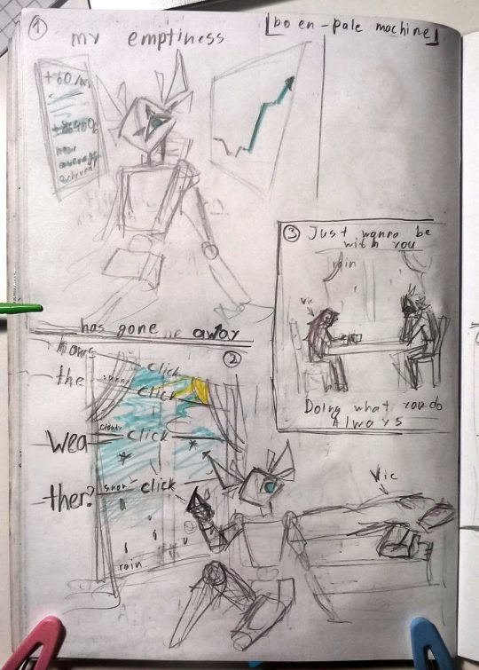
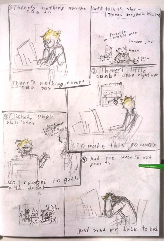
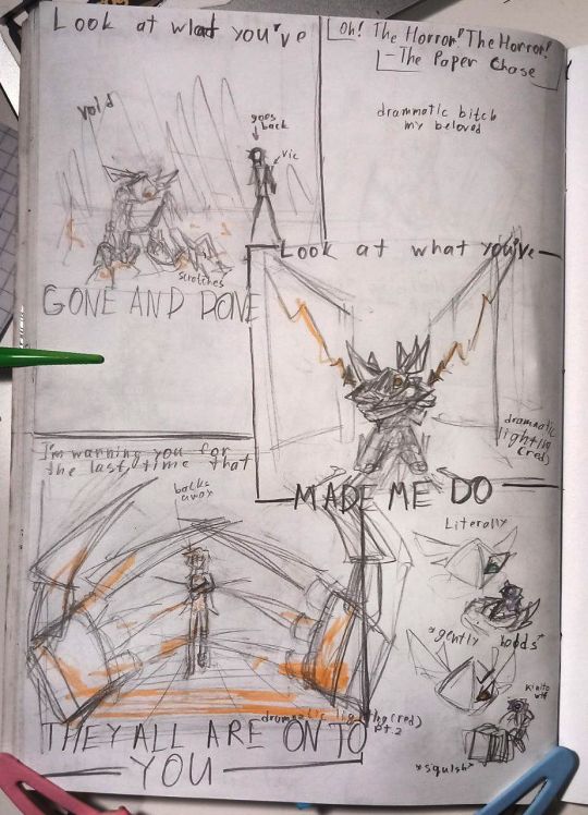
And here is some little song-comics for my favorites of the playlist (all canon btw (; but i tried for the least amount of spoilers i could)
Yapping under the cut
Unfortunatelly, umm, every chapter of the au has a different vibe so it is pretty unorganised and weird, buuut you can theories which songs go where and belong to whose perspective, hehe
I can't really work that much on comics right now (and i plan on dropping the whole first chapter at one so you can get into it and only than wait for more) because of map im working on right now (gonna post some spoilers soon :)) ) and im batteling with "i have no content to post, i need to do something n o w" and "i dont wanna spoil everything before it's time T-T"
Ahem, now to drawings
When i say that kinito here is a number-obsessed maniac, i want you to understand that i mean it. He literally does not have any human in him and i l o v e it. Cruel god is a fun god, as they say (:
Second comic might not seem as important now, but, i mean, every part in accidental making of your worst nightmare is important, lol
Also this way of making comicses (like, block-style, no real placement of panels, etc) is really fast so i'll probably stick with it for the most part (tho, of course, digital and more effort), but im still experimenting
Also, yes, kinito's eyes change color depending on his rewards at that moment ((: blue is good, red is bad, but most of the times they are on neutral purple, here are just two extreme cases
#kinitopet programmers au#kinitopet#kinito the axolotl#kinitopet fanart#sonny chamberlain#prosto cup of art#my pages are so warped that for good photos i use my hairclips#my hairclips are awesome. but still. not their best angle.#damn i hope you still remember about me/this au#my blog is slowly consumed by reblogs#maybe i should make another one solely for reblogs and leave this only for art/au ? i'll think abt it...#kinito pet#kinito fanart
24 notes
·
View notes
Note
I would LOVE to hear your tipsy rant about facial expressions 💖💖💖🤩🤩🤩
A’ight. I’m having a Diet Caffeine Free Coke and coconut Bacardi at about a 1 to 1 ratio, which is the single nastiest drink known to artistkind. (Edit - halfway through this, my roommate has thoughtfully provided me with a mimosa, so I have a less nasty beverage.) I’ve had about half of it so far, and will continue to drink it throughout this treatise on facial expressions in comics. The editing of this post is going to suffer.
Inspired by (in a rage-y sort of way) this post. Everything is under the cut. This is gonna be long, folks. Buckle up.
I’ma start off by saying that I Do Not Care For most Western comics (webcomics and indie comics are excluded). Obviously, there are exceptions, like Habibi, Hawkeye, Tintin, Asterix, Scott Pilgrim, Persepolis, etc., which don’t follow the trends I’m about to harp on. I’m talking about mainstream titles by DC and Marvel… the big ones which OUGHT to be GOOD. But AREN’T. They’re either made as male power fantasies (see why I ADORE Captain America in the MCU, but can’t effing stand reading a single Captain America comic), or they’re made so damn quickly that no one has a chance to make them WELL, OR. OR MY LEAST FAVORITE. Ugh. Or they make comics where the pencilist doesn’t talk to the ink person who doesn’t talk to the colorist. And the results are HORRIBLE. See this post for one small facet of what I’m talking about. Styles don’t match and the results are D-R-E-A-D-F-U-L. Tone falls flat because the color doesn’t match the style of line art.
Now. The Star Trek comic I linked above has lovely coloring, and the technical quality of the lines is pretty good. You can look at those characters and go, “Ah, yes, Chris, Pine-Fresh Scent, as our Good Captain Sunshine, and his very good friend, Karl Urban, Son of Rohan, as the irascible Dr. McCoy.” But the FACES DO NOT SAY ANYTHING. LOOK AT THEM. THEY’RE DEAD, JIM.
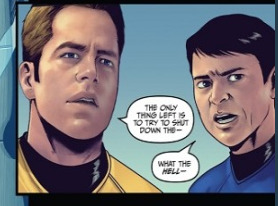
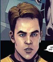
A NAKED MALE AVATAR OF THE USS ENTERPRISE, THE LOVE OF JIM KIRK’S LIFE, HAS APPEARED OUT OF THE AETHER IN SICKBAY, AND ALL THE EMOTION HE CAN CONJURE UP IS THAT FACE?!?!?!?!??!?!?!!!?!
I DO NOT ACCEPT THIS.
So the main things one needs to know about comics (and this is coming from a mostly self-educated-about-comics person, but I do make them on occasion, and my day job is like, storyboarding, among other things, for a vidya game company, so I think I can say I know a couple things about it?) are as follows:
You need movement in your page. This means that you gotta have some… flowyness of line, even if no action is being displayed. The Enterprise’s muscles coming over the skeleton in the link is a good example. Movement! Fluidity!! Hooray! But when you later look at Jim Kirk’s face, there’s no movement there. :( It’s as if they traced a picture of Chris of the Pines. The end.
Because there’s no literal movement, you sometimes have to exaggerate your expressions a little. It’s like in stage acting or voice acting - sometimes, you gotta play that up so the underlying emotion can come across better, because the medium can be limiting in some ways. Like, if you try to use ALL your skills as an actor in a voice acting thing, it won’t work, because your audience can’t see you. You have to put all that OOMPH you would’ve put in your expression and body language - AND BODY LANGUAGE, DO NOT FORGET THAT IN COMICS - into your VOICE. You gotta overdo it to do it right, sometimes. Chris Pine mighta pulled that face off on screen, but that won’t fly in a comic, but in a film, there would’ve been like, dramatic pauses and tonal inflection to indicate surprise and disbelief. But on paper, you gotta at least have like, an eyebrow raise or something. Sheesh.
DIFFERENTIATION BETWEEN EXPRESSIONS I CANNOT EMPHASIZE THIS ENOUGH. Not like every single panel has to be different, right? But this is not the way subtlety is conveyed in comics. One thing I’ve learned in storyboarding and comicsing is like. If the expressions aren’t different, you won’t know there’s been a change. You can’t really have microexpressions. They aren’t different enough for people to see the change.
SO. HERE’S WHAT YA DO.

You alter the head’s position on the neck. You draw in the eyebrows a smidge. You make the eyes widen a touch, and for fictionally dramatic effect, maybe make the irises/pupils smaller. I DID NOT CHANGE THAT MUCH, YOU GUYS. I know the AOS comic was technically a lot more involved than what I just whipped out, but the theory would NOT have been that hard to apply to the inking person, and the colorist would not have noticed the difference in effort.

Like. Bones’ posture is so reserved, as is Jim’s. Jim’s expression is downright ROBOTIC. Has he been looking up youtube videos on How To Emote Like A Vulcan Who’s Achieved Kohlinahr?? Seriously!! It would NOT take much to alter these to have greater impact. See my red lines to the right. They’re not that good cuz I made them with my laptop’s track pad and not my tablet, but STILL. It wasn’t hard to alter the energy with very little effort!! As these were almost certainly colored digitally, it wouldn’t have been hard for either the inker or the colorist to change the line art before coloring. Or after, tbh.
Check out this link on micro-expressions. Seriously. I can well believe that we’d see these expressions (okay, no, I can’t… I’m trying to throw the artists a bone but I simply can’t… this is just bad comicsing) from Pinesol Chris in a movie, but AFTER he’d given us a brief micro-expression. Again, I lie. Pine is a much better actor than this.
AND ANOTHER THING ABOUT WESTERN COMICS THESE DAYS. They’re so hung up on getting characters to look like the movie actors that they hire artists who are “””””technically good”””””” and they either don’t have enough time to adequately create the comic, or they aren’t allowed to let the Strong Male Character Who Don’t Need No Emotions to emote!!!! LIKE WHAT YOU SEE HERE!!! JAMES TIBERIUS “THE ENTERPRISE IS A BEAUTIFUL LADY AND WE LOVE HER” KIRK WOULD ABSOLUTELY EMOTE OVER SEEING HIS SHIP TAKE A FLESH-AND-BLOOD FORM. If OOONLY because he was surprised to see someone materialize in front of his face.
See also: Steve Rogers has more emotions than “I’m in the mood to murder,” but you wouldn’t know it from the comics!!!!! (see why I don’t read them.) It’s like. The artists they hire are good at drawing bodies and good at drawing one (1) expression, and they just. Do that all over the page. Give me Mark Bagley, who at least knows how characters should emote, even if Mary Jane in Ultimate Spider-man DOES look like she’s a 21-year-old Victoria’s Secret Angel when she’s 16! Give me Hergé, whose first Tintin book was a little rough, but who really got there in the end! Give me Walt Disney, who wasn’t afraid to give characters fluidity and movement, imagination!
This is what Eastern comics often do so well at. There’s no subtlety, but you know exactly what’s going on in a manga. Those expressions aren’t messing around.
You want subtlety? Check out Craig Thompson, Marjane Satrapi, Art Spiegelman, David Aja, and even Bryan Lee O’Malley, on occasion! You can do subtlety in comics. Art Spiegelman is a prime example of NOT ALWAYS DOING FACIAL EXPRESSIONS BUT STILL CONVEYING MOOD!!!!!!!!!! Absolute MASTER of the craft. But there’s also a stylistic choice involved there. Here, we just have James Tiberius Kirk the Macy’s Storefront Mannequin. Go away and come back when you have a believable Jim Kirk.
My laptop’s battery is running down, so I must cut this short. REMEMBER, kids, don’t let your characters’ expressions be flat!!!! LET THEM EMOTE 2k19.
#zj has opinions#advice#critique#art critique#seriously i have opinions and this is largely me being frustrated with the comics industry#replies#therebewhaleshere#liss ilu and this is the best ask ever thank you
247 notes
·
View notes