#i know the red and blue is classic but the OG colors always hurt my eyes a little tbh
Explore tagged Tumblr posts
Note
what's your favorite spider suit in the insomniac games?
I love love LOVE Miles' boricua suit!! The bodega suit is my second fave
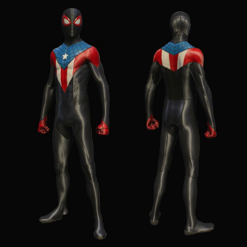
I assume you meant my fave miles suit cuz of my recent tags, but just in case anyone cares, my favorite Peter suit is the advanced suit 2.0 in black!
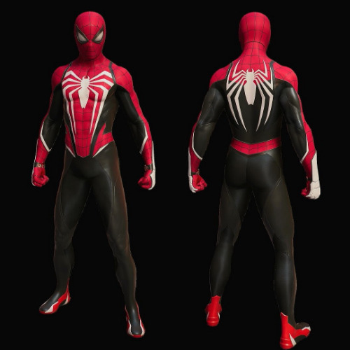
#i know the red and blue is classic but the OG colors always hurt my eyes a little tbh#the advanced suit actually fixed that and picked a red and blue that go really well together!#plus the white is a nice flair ���#but black looks sooo sleek to me#red is my fave color so seeing it on two neutral colors (black and white) makes it pop i just rlly like it ok 😅#insomniac#insomniac spider man#miles morales#peter parker#asks#spider speaks#clips/screens
33 notes
·
View notes
Text
BoXiao : Endorsement CPNs
Just listing a few of my favorites, where we clowned so hard with what appears to be bxg biased signs from brands. Mostly 2020-2021. This was supposed to be a simple post but it got a little bit out of hand. So. Here you go. Enjoy!
Note: If you don’t like CPN posts, just scroll along. If you don’t like BJYX — this is not for you. don’t hurt yourself and skip this post.
1. RoseOnly - I will not add the RoseOnly x Peace Elite collaboration here anymore cause most of the people reading this should be familiar. A little bit of my thoughts on that are here.
Now let’s move on to other clownery, cause when I said we did see some 👀 before, I meant it.
• GG’s campaign with them where he showcased a bunny with rainbow colored flowers. They could be showcasing all the kind of flowers they have or LGBT friendly advertising. After all, All love is love. 🌈
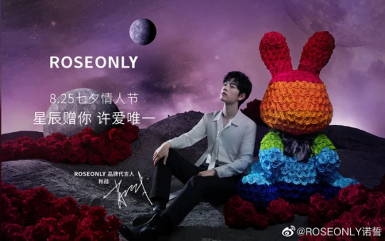
• For Roseonly’s 8th anniversary, GG had a campaign and VCR w/ them and that big 8 flower. 8 means bo. It’s truly used for the anniversary but of course we CPN cause we are clowns.
https://www.youtube.com/watch?v=fwGnDR4zspI
• During Web’s promo for rules of my world and when his teaser photos came out— RoseOnly released a photo of a black rose ( same color as Web’s clothes in the teaser ) with the caption:
You’re the coolest guy in my heart.
• When they were doing a teaser for their new endorser, some people were pointing out that the silhouette looks like Bobo. lol. Twins!

• All the references to the Lonely Planet and Little Prince for this promotion. We all know that they both love LP and whether this is CPN or a personal preference— we’re claiming it!

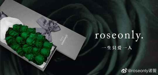
• The green rose they once advertised with the caption I ONLY LOVE YOU. and with the green rose symbolizing innocence, simplicity and forever young. Green and those keywords, who do you remember?
• In 2019, they did a selling bundle with Shu Uemura which was a brand Web was endorsing at that time.
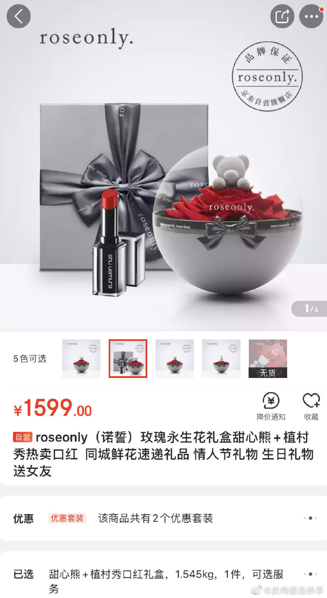
• In a live, the color green and red rose were together — GG and Web colors.

• An Ad in their online store where the display is the Leo rose which is Bobo’s zodiac sign. and GG is holding Libra. Leo x Libra. And with the caption below for their advertisement. We know Web is the Leo of all Leos but it’s still 👀
The proud Leo has a child-like arrogant temper. Some people think they are not easy to get along with, but they don’t know that they just have not entered their hearts. Actually, Leo’s tenderness is only for the right person.

Some other thing that I will add here for reference but I don’t necessarily believe. Link from weibo.
• When GG was announced as their brand spokesperson and Web gave a clue in his post. Also GG making 3 different posts and kadian combinations.
I’m adding in this collab they had with Eleme, the same time Web was endorsing the brand.
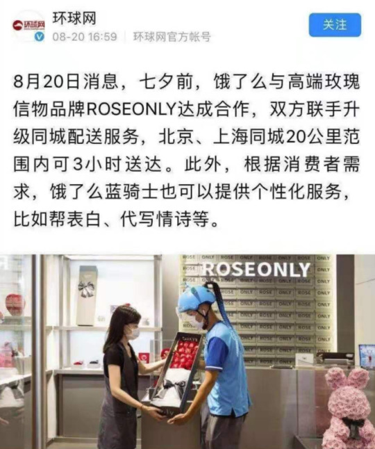
I’m sure I missed a couple more from RoseOnly but that just depends on how clear your BXG glasses are. To me the most important is their Lonely Planet / Star campaign with GG last year.
2. Shu Uemura - This is one of the OG brands that Web endorses and who loves him very much. They signed him when he was not yet a big star and flew him to different countries. They treat him very well. 🤍
• The most recent one is from their Ad with Bobo and a red ribbon which made us all think of WWX. I can understand from an Ad perspective that it’s perfect to pair up with a red lipstick — but our brains are wired to CPN. Soooo. And this is not their first offense with stuff like this.
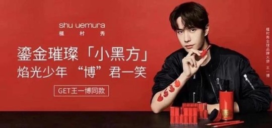
• This Ad featuring Bobo : - "博"君一笑 BJYX.
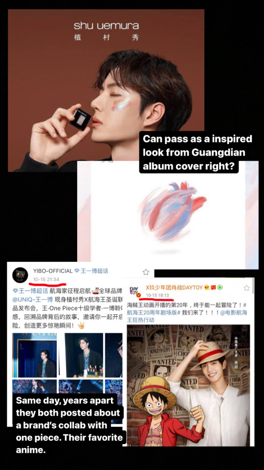
• For the promotion photos of this eyeshadow palette, the colors and look is similar to GG’s painting for the Guangdian album cover. Yes. This was done some time after the song was released.
• This one is more of a coincidence. Years apart, both on the same day, they posted about a collaboration with One piece. It’s their favorite Anime. GG as Luffy & Web as Roronoa Zoro.
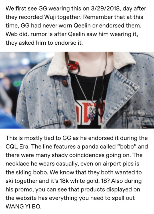
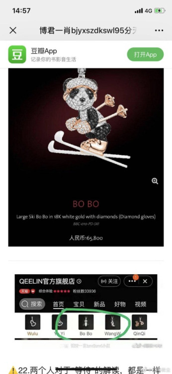
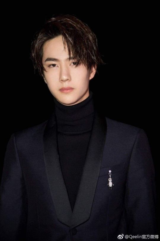
3. Qeelin - will be very lazy with this one and copy/paste from my jewelry post. Take note that this Bobo design is not new and had always been a classic from Qeelin.

4. Kai Xiao Zao - Ah! KXZ! The brand that loves GG the most. So what signs did they give?
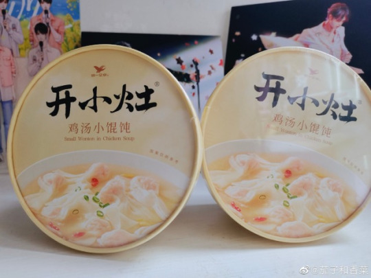
• Their recent new product is wontons. Who do we know that likes wontons? It reminded BXGs of the unofficial BTS when Web was nagging GG to eat Wontons.
• They used a well known BXG idiom:
"你是夏日限定, 也是来日方长"
5. Chunzhen - Endorsed by Bobo, and this is under Mengniu. It caused some drama— cause GG & Web are technically promoting the same company. but like, there are so many other c-ent artists endorsing this brand.
• They posted for this year’s Qixi, stating in the Caption that Bobo is able to balance love and work. Really? How did they know? And they had made a character called XIAO ZHEN for qixi ( a cartoon girl with blue hair ).
• Zhenguoli ( endorsed by GG ) and Chunzhen drinks which are under the same company posted graphics of the two drinks together. 👀
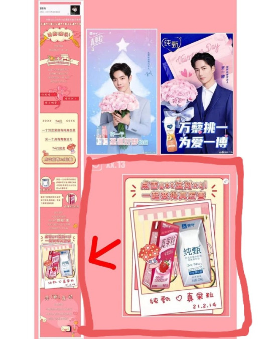
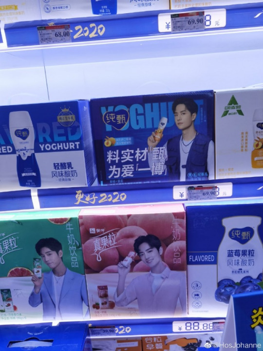
• Also since it’s both under the same umbrella company, and both yogurt drinks— you can see their boxes together in shops.
6. Stride - In Bobo’s box set initial release, 3 flavors were included and one of them is passionfruit or bai xiang guo ( bxg ). Of course, bxgs bought it because we were represented. ✌🏼
Also in a message, the brand acknowledged BXGs but later had to delete it because of well— you know who.
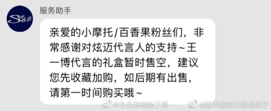
Dear Moto/Passion Fruit fans,
Thank you for your support to Hyunmai's spokesperson~. The gift box endorsed by Yibo is temporarily sold out, it is recommended You first collect and purchase, if it is sold later.
Please buy it as soon as possible~
7. Swarovski - endorsed by Web 🤍
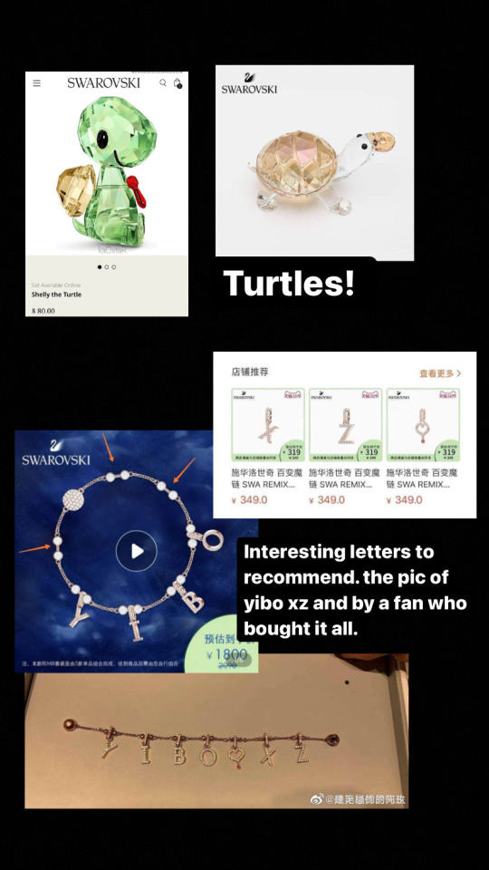
• They had turtle charms and bracelets, which endeared them to BXGs.
• They had a bracelet where you can put charms and in their Ad, it spells YIBO. of course. However a BXG noticed that on their recommended letters to add next, the letters are XZ + heart with a dot.
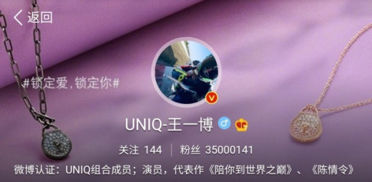
• Last year’s promotion of a lock necklace— Web changed his Weibo header. ‘Lock love, lock you.’
• His May 2020 Mother’s day promotion video that includes a confession (?). I know this is far off but the line used:
“ I love you, want you to see. I am Wang Yibo, this is my unique confession" is so similar to GG’s Bazaar confession.
youtube
8. Budweiser -- What we basically CPN about them is that they are an LGBT friendly brand and it’s always a plus when our boys endorse those kind of companies.
• Here you can find the CPN on the can that GG supposedly created with them.
• Their ad about ALL LOVE IS LOVE.•
An earlier Ad that had two male leads. and another one recently released with same sex couple. 🌈
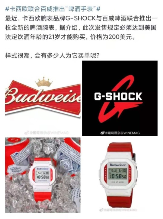
Also they did a collab with G-shock which is a brand that Web endorses.
9. Man Han Feast Noodles
• The most recent one is GG playing the Guqin ala LWJ and looking out the window to see the moon ( again ala LWJ ). Best part is GG looking like he would burst out laughing and they kept in the Ad.
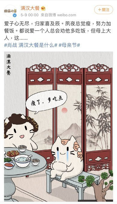
• In their Mother’s Day post one line says “if you love someone you’ll always encourage them to eat more”. Sounds like a familiar gesture right? Who do we know nags each other to eat?
10. Zenith Do I even have to explain this?
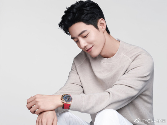
• GG chose a rainbow watch from Zenith collection for Qixi Festival. 🌈
11. Mengniu - Oh well, just last week they had to clarify as an Ad from them was seen with the words: "并肩于雪山之巅" = BJYXSZD. (Side by Side at the snowy mountain top)

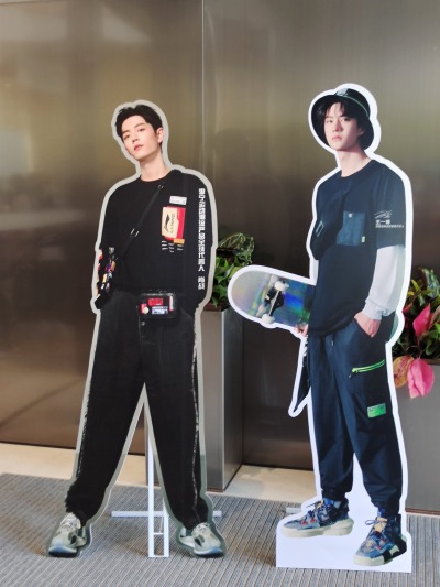
12. Anta/ Li-ning - I’m adding it here cause the store owners in this video brought out GG/Web standees together 😂 Context is, there was a BJYX gathering going on so they took that out cause they knew the attendees loved them.
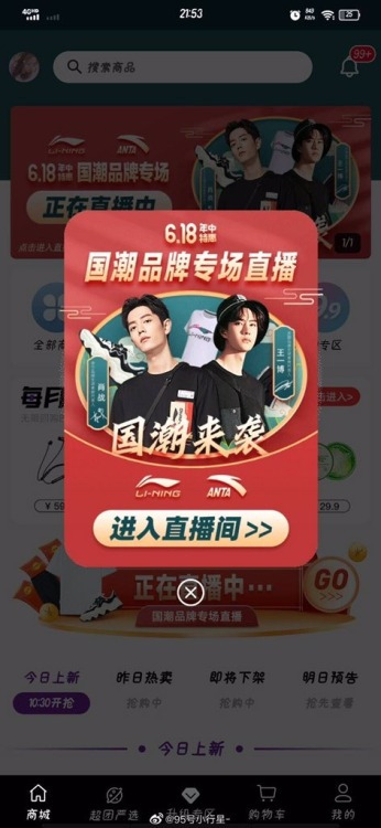
Plus this shopping app that put them together.
I’m capping this post here and will update this sometime in the future. However the ones I added here stood out to me or I experienced when it came out. I wanted to add Luckin Tea / Lays / Olay but that will be for another time.
As with all the CPN, feel free to not believe any of these and just take it as a coincidence. Or people clowning and reading into things more than they should. lol. Whether these are intentional or not, BXGs are always there to support the boys whenever they can. 🙏🏼
118 notes
·
View notes
Text
Character Design (Pt. 1)
The Main Family
I want to preface this by saying I already wrote a post about the designs in this AU, but it was vague, uncertain, and most importantly, deleted by a tumblr glitch after a couple of days. This is an updated version of that. I also won’t put at many pictures; I’ll try to just name episodes and/or condense photos into a collage for a single character.
Anyways, this post is about changes to the design of the main family. Anything not addressed will remain the same. These will also only cover standard, present, everyday designs. Special clothes and flashback designs will be addressed as they come up.
Marge
Marge’s physical changes might be the least drastic. Her hair, still blue, will be one “head” smaller. By this I am referring to her pages in “The Simpsons Handbook: Secret Tips From The Pros.” Marge’s hair is broken into three sections: around her head, one head size above, and another head size above. Let’s level that down to only one “head” above. She’s not hiding rabbit ears anymore, we can do this. As for her outfit, I had a little trouble in deliberation, but I’ve decided on it mostly being the same, except her green dress has a sleeveless turtleneck on top like her orange peplum dress. This is mainly due to her job as a cashier now; her apron would look weird over a tube dress and I wanted her to have the same outfit at work (like how Homer wears a tie over his normal shirt at work). She has two bracelets like her early design (from her sisters) and still has her necklace. I considered maybe adding the flowers from her early design to her dress. After all, she has an art streak not just in painting but in sewing (think of her cute modifications to her pink Chanel outfit) and adding her own pattern onto the dress to “spice things up a bit” would be such a Marge thing. Still, I didn’t want to made her design too busy, and I also didn’t think flowers were super Marge. She’s more into classic looks and solid colors, I think.

Homer
Anyways, Homer’s shirt is pink now! I outlined a ton of reasons for my Homer outfit decision in the original post, but I’ll make it brief. It’s mostly that pink was a strong color in the early stages of the show, that Homer isn’t as aggressive in this AU, and that we know pink with blue (his jeans) is a good color combo on him from his outfit in Stark Raving Dad, his prom outfit, and his suit at Lisa’s wedding. Speaking of Lisa’s Wedding, his bodily appearance will closer resembling that of that episode. It’s only a five year timeskip so he won’t be too different (no eye wrinkles for example), but he’ll be more top heavy, his shoulders and neck getting larger to even out his pear shaped beer belly we have now. His hair will be deteriorating too, instead of a zig-zag on the sides, it’s just individual strands.

Maggie
The children will change the most, as obviously they are growing up. They’ll get taller and their hair will change too to better distinguish them. Maggie’s got fairly consistent hair in her future appearances: longer and parted with three spikes in front and 4-5 in back, depending on the episode. Her hair isn’t that long yet at 5, but it’s certainly parted already. Her face, to help distinguish her from Lisa, has a mouth more like (younger) Homer’s, with the curved upper lip.
So, I have something I’ve added as part of Maggie’s character which I’m only mentioning on this post because it helps inform her design. I am autistic and, although I know there’s a running gag in future episodes that she’s apparently talks a lot, here Maggie is nonverbal autistic. Anyways, I’m bringing this up because of my #1 favorite in-show future Maggie design choice: her pacifier necklace. You wanna know why? Stim jewelry. Now, Maggie has a necklace like Lisa or Marge, but hers only has one bead, and she sucks or chews on it sometimes to stim. Next, what do to about the onesie? I’d like to keep it something comfortable, maybe very loose, because that gag of Maggie constantly dripping over her own clothes can be kinda funny (so long as it doesn’t seriously hurt her, I never liked that trend of just tagging on characters for no reason) A blue sweater (looking like the top half of her onesie) and some bootcut jeans that are too long for her legs is essentially what I wore at that age, why can’t she do the same? All that matters is that she’s comfy.

Lisa
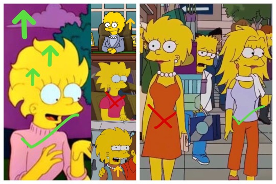
Okay, we gotta talk about Lisa’s dress. A middle school girl in a strapless dress? Has the world gone mad? Yes it has, but in the American public school system, that’s not gonna fly. So what do we do, put straps on her dress or give her a whole new outfit? After a lot of consideration, I decided on a skirt the same color as her dress (blood orange, or is it “fucking red”?) with the spiky bottom too, with a lavender polo. Why lavender? Well, Bart’s imagination in “O, Brother, Where Bart Thou?” gives us a good look at that color combo (complete with white neck accessory) on someone with the almost exact same features as Lisa. We also see Lisa’s dress with straps, which looks okay for adult Lisa, but there’s too much cleavage for what I’d consider putting on a thirteen year old.
In addition to getting taller, like all of the Simpsons children, Lisa’s hair is changing, but it’s nothing we haven’t seen before. In a all her future appearances (much like Maggie, likely to help differentiate since they’re almost identical when grown), her hair is always styled one way: pushed back and down. But specifically I’m going to draw her hair design from, you guessed it, Lisa’s Wedding! What can I say, it’s just a good episode for character design... mostly. But I love the way her hair starts to curl in that episode. If we take the curl as coming from Marge, it’d make sense if she grew to look more like her parents.
Bart
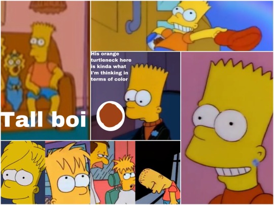
Alright, Bartman! Bartholomew is probably getting the most change, hence why I put him last. After all, he’s changed a lot in the show too (the color of his shirt from blue to... again, is it orange or red?) and his future appearances arguably vary the most. His hair is interesting, because although the design I’ve settled on for it matched fairly close to his 15-year-old self in Barthood, it’s actually based off of the music video for Deep Deep Trouble. He got his head shaved as punishment, and since I saw it I HCed that this happens whenever Bart gets in big trouble, so his hair is constantly a buzzcut because it’s always just growing out. As he matures a bit and doesn’t get caught as often, he can grow his hair out more. As for height... although most of his aged up appearances have him keep that pear shape to look like Homer, I figure since he has a bit more of an active lifestyle, he would shed some baby fat. I particularly liked his lanky look in that one “2006-2013 Family Portrait” couch gag, where he just kinda... stretches. It makes him look like he took after Marge some, which I like.
Clothes are fun. Bart has always been a rebel, and a very creative kid, and I wouldn’t be surprised if he started expressing himself in his clothes more. His lucky red cap and his earring from Simpson tide would almost certainly appear more, but in terms of his clothes, a simple orange shirt won’t cut it anymore. The bright orange might be too close to homer’s salmon pink or Lisa’s warm red, I’m altering the shade to be more brick. The shirt itself will be a floral button up (the pattern being his classic orange and OG blue as an homage) inspired by his clothes in Homer’s Phobia, Bart to The Future (where he also has an earring), and this post by @springfieldblues, which I love.
That’s it for part one! Part two will focus on the nature of how character design will function in this AU as a whole, as well as changes to more minor characters.
#the simpsons#bart simpson#lisa simpson#maggie simpson#homer simpson#marge simpson#character design#simpsons au
18 notes
·
View notes