#i have a coloured version of the bottom sketch but i don't think i like it as much
Explore tagged Tumblr posts
Text


Wave of inspiration hit me suddenly for a hairstyle so I made a girl for it
#i have a coloured version of the bottom sketch but i don't think i like it as much#anyway i love her tbh#splatoon 3#splatoon#art#splatoon oc#sketches#might post the coloured in a rb
4K notes
·
View notes
Text
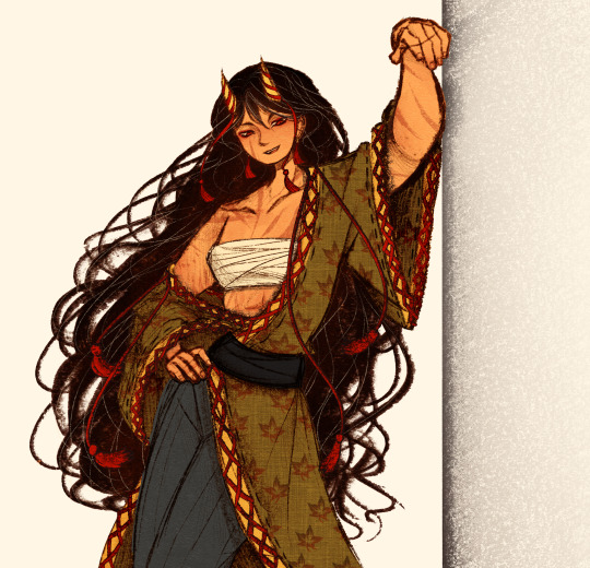
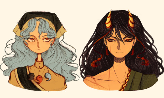
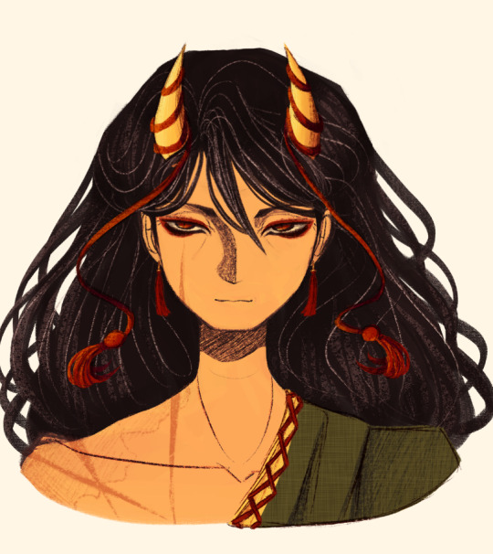
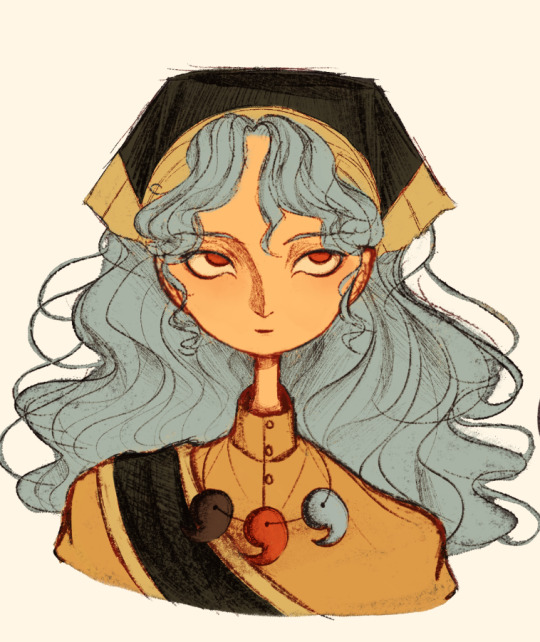
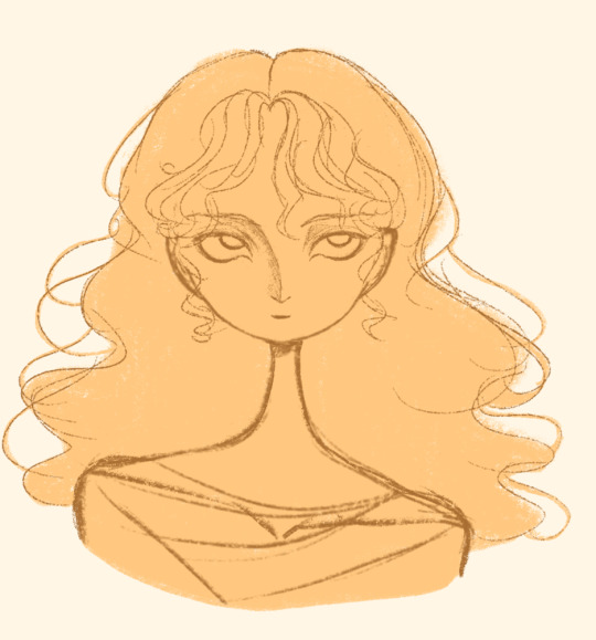
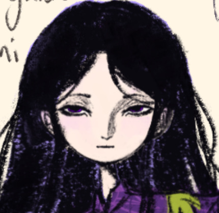
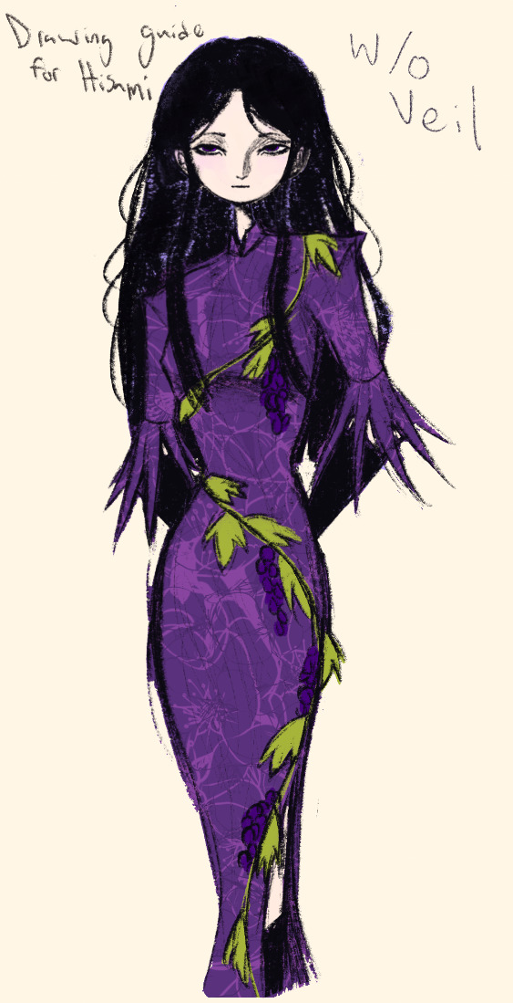
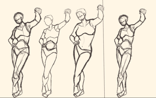
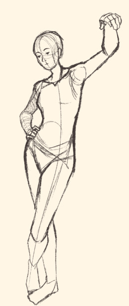
Here's a digital sketch dump of some pose/anatomy practices and some 2hu doodles, I think from now on if I don't have any big final piece to post, I'll just post sketches I liked that I did digitally (might also reblog some drawings of mine that I want more people to see, maybe idk).
Artist's Notes:
Ok so after the recent Hifuu fanart I did, I've been hoping to experiment more with how I draw faces, how I render, as well as how I stylize things. In some of the earlier sketches I did, I had an idea for a pose that I wanted to try drawing, so I took a ref pic of myself doing said pose (the leaning one btw) and then did a sketch over top of it just to get an idea for the shapes, negative space, and silhouette. After that, I wanted to do some simpler breakdowns of the shapes so I can get better at simplifying the body (these ended up being the bottom right sketches in the post). I also did some experimenting with how to push certain parts of said sketches to create a different body type (via liquify and then a more refined version based on that sketch), as well as figuring out what makes a pose feel natural and not stiff. This was also a bit of a foreshortening practice just so I can get more confident with it, and I ended up using the arms from the liquified version for the coloured Zanmu sketch I did since I liked them so much (dw I'll get to that).
The next thing I wanted to try and draw was Hisami, mainly because.... I am very bad at drawing her in my style. Last time I drew her I made her look really creepy and spindly, and it is my headcanon now that she can switch between a more human, and more creepy look whenever she wants. I'm liking where the face is going a lot, might have to refine a few things about it in the future, but it's cute (I also made the blush purple which I think is what I'm gonna do with her face from now on). I also like how her hair in the sketch turned out a lot, but the outfit..... not as much... Ever since I started changing my style to something less cartoony, I've had a hard time drawing her outfit in my style. Especially the flower veil thing she has on, which, I did try to find a way to draw, but I ended up deleting that sketch because I didn't like it. I'm also not a fan of using the colour purple, like, pure purple, magentas are fine, indigos are fine, but not strict purple. I also have a hard time with drawing all the little pattern details on her dress. I also need to find a way to draw the flower veil in a way that looks good because everytime I try it ends up just looking off (very similar to whenever I try to draw Zanmu's blue spears). I think the only solution to this problem is to do what I normally do and make my own version of the outfit, but with adjustments to suit my style while still trying to keep core elements from the original design intact (like I do with Zanmu and Keiki, and yes I am going to get to that Zanmu drawing just gimme a minute).
Ok next up is Keiki, my favourite Touhou character who I haven't drawn since the beginning of the year. Since my style has changed a lot, I wanted to just do a face sketch of her to get a hang of drawing her again, and I..... really really like how it turned out! When I drew her eyes, I realized that a good way of keeping faces too same facey can be via varying the sizes of their pupils, so that's an idea I'm gonna keep in mind from now on. I had a lot of fun with her hair, I initially was gonna do it like how it is in the official art, but I ended up not liking it, so now I'm gonna draw Keiki with wavy heir like this because it's fun and it looks nice. I also included my base sketch for Keiki's face since I was initially struggling with drawing her bandanna, and in the coloured sketch I added some more detail into her hair.
Now to finally talk about the sketches for Zanmu. Good lord was I having a tough time with her face. I also did this sketch before I figured out how I wanted to draw hair, so that's why the rendering on her hair is different (I did this soon after the Hisami sketch actually). Since I changed my art style a lot, I had to find a way to translate her face from my more cartoony style to my more detailed style, so while the face shape, nose shape and mouth was fine, I was really struggling with the eyes. I did get somewhere eventually though, and I am super happy with how it turned out. I wanted to lean more towards the androgynous side of the gender presentation spectrum, mainly because I think that makes sense for her character. Also made sure to include the silver hairs and some wrinkles just to bring some signs of her aging into her face because those are just staple features of how I draw Zanmu at this point lol. You will also notice that I gave her some scars on the right side of her face, and that's because I am a Zanmu-with-scars truther, I fucking love it whenever I see someone give Zanmu visible scars like that it just adds so much omg (I also tried to put a wolf bite mark on her arm in the full body drawing but idk if it reads well). While you can argue that her not having scars sells the idea of her being this "powerful, untouchable mastermind who is impossible to defeat," I'd say that instead of those scars representing times she got injured, they represent everyone who has failed to defeat her.
As I was drawing Zanmu's face, I referenced my sketch of to help with contrasting their features since I made Keiki's face more traditionally feminine. I also didn't mention this in my commentary on Keiki's face because I wanted to save it for here, but giving Zanmu scars also plays into the fact that she used to be human, wheras Keiki doesn't have any scars because she's a god who doesn't follow the rules of normal human biology. Plus I'm thinking about the two of them interacting again (return of Zan/Keik??? (I'm a multishipper btw) maybe???) so drawing their faces together will definitely help me in the future if I wanna draw them together (again, maybe as a ship? I've kinda been ironing out the kinks in their potential interactions (romantic and non-romantic) for a while now so idk maybe expect that in the future lol).
And now for the full body drawing, when I was doing the face sketch I did this little snippet of an outfit, had a vision, and the made it into a reality. I'll admit, part of me was worried that it would end up looking too much like Yuugi's outfits in the spinoffs and mangas, but I feel like I made enough changes to differentiate them. I tried to keep a few of the major details in Zanmu's design (i.e. the red tassles and yellow lining on her shirt) while putting a new spin on it. I also dialed up the scars to 11 since without them the whole thing kinda looked incomplete. Also, while I could say that the leaves on her kimono are "a nod to the fact that technically she should be a tengu because back then people belived that corrupt monks would turn into tengu but no Zanmu is an oni and they're maple leaves because...tengu...ahahahaha" what really ended up happening was that I looked up clothing patterns from Sengoku era Japan, liked the leaves the most because the red picked up on the red from the rest of her design and just ran with it. I also always had the idea to put Zanmu in men's clothing from Sengoku era Japan and while the accurate thing to do would be to put her in a Buddhist's clothes from that era.... from a character standpoint, I don't think Zanmu is pious enough to strictly wear the proper monk uniform, and also since she's basically the king of Hell, she would probably dress herself like royalty from that era. TBH, I probably could've been a bit more historically accurate, but again, this was mainly for conceptual purposes because I had a vision and I needed to see it through.
If I were to draw her in this sort of outfit again, I should probably try and use more references, although now that I look at it, if she were to wear it properly this would maybe, probably look a bit closer to a Kyūtai sugata (a very huge stretch, but it just kinda reminds me of that) just without the layers under and over the main piece of clothing (In the website that I searched up to try and compare the outfit in my sketch to, they name the outfit pieces but don't label them on the image, so I don't know 100% what everything is called) so I will definitely have to use that style of clothing as a reference going forward.
Also, I was kind of inspired by the ToTK design for Ganondorf since I have finished the game a while ago and I absolutely love what they did with his design (it's just so fucking cool omg) and I thought that sort of look would look good on Zanmu, so yeah got some inspo from that.
And those were all the notes for each of the sketches, I'm motivated to draw rn but kinda art blocked, so doing these little coloured sketches helps a lot.
#touhou project#art#fanart#sketches#sketch dump#zanmu nippaku#keiki haniyasushin#hisami yomotsu#touhou 19#touhou 17#unfinished dream of all living ghost#wily beast and weakest creature
345 notes
·
View notes
Text
Concept based on my previous post where i suggested Queen's Killer Queen as a Night Swan and Cygnus duet. i didn't want to make something super detailed so its mainly a sketch with basic colouring, and darkest hour's background

I said in that post that i saw it as taking place sometime around Darkest Hour, so Night Swan has her Leda appearance from there. I didn't know how to make cygnus look younger so i just removed his hat
The poses above would be struck when Freddie Mercury sings "killer" (imagine that Leda's hands are actually in a claw shape here) i probably should've had cygnus point at leda for this instead of into the air, followed by them moving to the opposite side whilst spinning their hands round their faces to "Queen". Lastly at "Gunpowder, Gelatine, Dynamite with a Laser Beam" They'd start doing a marching on the spot motion whilst pointing to the top right and bottom left like in Woof's chorus but more like in the style of a marching band, if you understand what i mean its kinda awkward to explain that motion (theres another map that uses that move in a way thats closer to my description but i can't remember what one it is. I tried to do pictograms in the corner to illustrate what i mean.
During the verses they'd probably have different moves, but i don't know what they would look like. I guess it would sorta be Cygnus acting out certain words and Leda doing more exaggerated movements akin to how she moves in witch. The lighting would probably be darker and the background would probably change location throughout.
Whats funny is that i always envisioned that if they were to do this song that it would be a quartet with three guys fawning over a Killer queen figure. Like it would be the three acting out how she acts wih her mimicking the moves of the one who is currently "speaking", but more exaggerated. The moves that i mentioned above are what i thought would work with this original idea and it just stuck and they're all i can think about when i hear the chorus.
I guess a good way for this hypothetical routine to end would be it turning out to be a memory that Cygnus is having, and him looking ashamed. I definitely do see the relationship that they probably had as sorta romantic, but whether it be romantic or platonic, beggin does make it out that he regrets what he's done and more than likely the time he spent with her. He'd look back on this memory with guilt after seeing what she did during Locked Out Of Heaven and her further plans that come up.
Someone else has definitely suggested this song for the series before, probably during 2017 and 2018 when Don't stop me now and another one bites the dust were relatively new to the series and some were expecting another queen song for 2019, (Though in all the fanmade songlists i've seen on youtube i haven't seen any queen songs mentioned). I'm not sure if i was the first one to suggest this song for these two particular coaches either, maybe someone did last year when Beggin' came out and Sweet Dreams was still believed to be released at some point.
This was just something quick to show what i think it would look like. probably should've made a title card but i might make a more detailed version at some point and include one.
#just dance song concept#just dance fanart#sketch#just dance night swan#just dance leda#just dance cygnus#song: Killer Queen#every time i see moët et chandon i think about this song#of course i follow up a proper drawing with a scratchy looking sketch again lol#jk this was fun to do even if it was just a quick one#wait did JD2019 have a spotlight playlist of the queen songs on unlimited when the bohemian rhapsody movie came out i can't remember#i definitely remember seeing an image of it somewhere
23 notes
·
View notes
Note
Sorry if you’ve answered this already, but what brushes do you normally use for your lineart and/or colouring/shading?
Hey! Thanks so much for the ask :D Disclaimers: - So I use an old version of Clip Studio (which I don't recommend ever since they became a subscription service... use Krita instead!) so the brushes may vary from program to program - I have never taken a digital art class in my life and have no idea how to do things the 'professional' way; so are there better options? probably! I just don't care :D

I really only use the top four for most of my art, but I also provided the bottom four as honorable mentions. To be completely honest I've never even tried half the brushes that are available to me because creature of habit and laziness xD Maybe I'll make a project out of trying them... anyway List n Explanations under the cut because idk how to stfu:

Textured Pen: I use this for most of my lineart and base coloring.

Darker pencil: This is sketching brush, but I also like how lineart looks with this... my brain just wont let me post art I make with it 90% of the time because it looks unfinished/lazy and sketchy- even though my style is very sketchy anyway?? what the heck brain

Marker Pen: I use this for base coloring, since it doesn't texture or overlap/shade itself at all

Watercolor brush: My entire rendering process is 99% JUST this brush. Hair, Leather (cloth in general), Blending, Shading, Highlights, Lighting, Blending, Reflections... you name it, and I probably this one brush, love this thing xD When I hard reset my laptop a few years ago I reinstalled the newest version of Clip and it had NONE of these brushes so rather than scouring the shop for downloadable versions or- god forbid- learning how to use new brushes, I just reinstalled the old version lmao
Honorable mentions:

G-pen: This was my lineart brush before I discovered the glory of the Textured pen. I still use this one sometimes if I want smooth lines, but it's also good for coloring smaller spaces since it has pressure sensitivity and the marker pen doesn't.

Mechanical pencil: This was my original sketch brush, and also my original line brush if I'm remembering correctly. It's slightly different to the darker pen but I have no idea why I prefer that one over this one tbh. Maybe this one doesn't taper as much on the end...?

Milli Pen: I like how this one is stupid. I think it makes my doodles more like 'real' doodles- but for everything else its kinda bad imo. You CAN use it to do color, but the pressure sensitivity is strange on it and I just prefer using it to write instead

Running color edge watercolor: First of all why is it's name so long and second I only really use this one to show glowy effects. It's pressure sensitivity is so low you gotta draw over yourself like ninety times (I'm sure theres a setting to change that somewhere, but am I gonna look for it? nope) so you're better off using the normal watercolor brush
oh yeah, and my eraser:

#hope this helps!#Ive noticed a good handful of people are super surprised to find out I only use four brushes#I do use more when its a more 'professional' peice like the covers#but really only for backgrounds and effects and such#Im very boring haha#thanks for the ask :D#stylus answers#nic stylus#art
5 notes
·
View notes
Text

I'm starting a new project! Calling it my Firefly sweater. This is the 2.0 version because the first didn’t really come out the way I wanted it to and I want some kind of redemption 😅
The main reason and inspo behind this design is Shygirl's song "Firefly" and I guess to an extent her whole album Nymph. The design is informed by the albums visuals and some of the musical/lyrical themes which point to nature. "Firefly" itself is rather whimsical and so I hope to have a smidge of that in the final design. I feel like Bjork's "Joga" is a sister to this.

The idea is basically a long sweater or even a sweater dress of sorts. I’m trying to think of some different silhouettes that I don’t typically find and play around with interesting fit and shape. Nothing too crazy, and I know I'm not doing anything that hasn't been done before, but that’s one of the aspects I like about designing! I’d like to, every now and then, make something beyond the typical cut of sweaters, shirts, or vests.

These are some of the things that come to mind as a point of inspiration and reference to what this may look like in the end.
I don't tend to sketch my ideas, so I don't have a drawing of my vision at this time. When I do sketch (as seen in figure 1) it is often more to help visualize a pattern. In this case the sweater will have two sections. The bottom edge will be the lime green mohair and it will meet and change into the blue wool.
I knew I wanted to revisit this idea and I had a burst of inspiration while on a trip to Newfoundland with my dad this past spring. We drove across a good portion of the island and the landscapes out the window really helped me re-envision the design. I was particularly enamoured with the fjords we passed through, so that is what I hope to emulate at the colour change.

I made a large swatch. It's a little wonk because i was trying to test the best way to add the wool to the mohair. I quickly figured out what would be best so I half stopped doing my test but kinda continued it but then just gave up. But the important thing is I figured out what I'm going to do.
I have never worked with mohair before. I will be holding it double and I hope that things go smoothly 🤞🤞 currently there are hairs every where, in everything.
I'm trying to blog more.. idk. I've always loved tumblr and kinda prefer it over other social media. So I hope to keep posting updates like these. I will also be vlogging this shit as I'm trying to be a youtuber lololol. So look out for this but in video form.
If you read this all thanks!
3 notes
·
View notes
Text
Condor Agate Concept Art!!!☆゚・:*:・。★
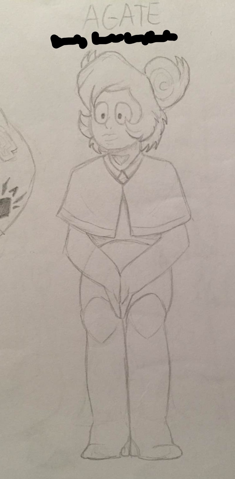

Some very early Condor Agates!!! That first one is THE first picture I ever drew of Condor, so would have been drawn mid-2021. The second one would have been drawn sometime in 2022; still outdated, but definitely an upgrade from the alpha.
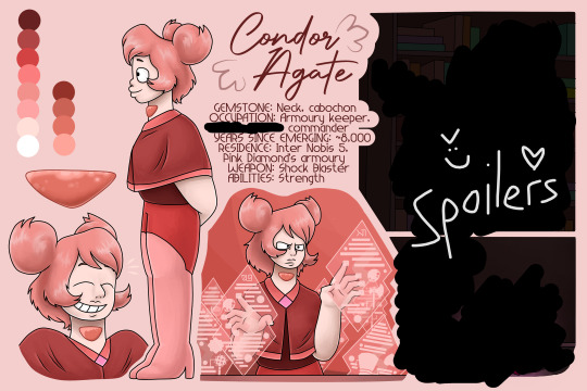
IMPORTANT NOTICE: THIS IS OUTDATED. This is the ref sheet I created for Condor over a year ago as a colour test; hence why I was naïve and accidentally filled half of it with spoilers. (the redacted part in the bottom right corner??? That is an excerpt from a scene that happens IN CHAPTER TWELVE. What was I thinking back then? I dunno. I was a goofus. The top right corner is an excerpt from Chapter Nine, which is better but not by much lol)
But anyways, the whole thing is canon, just outdated. When I upload the final 2023 version of Condor's reference sheet, you'll see a BIG improvement and no spoilers for later chapters! One thing why I didn't like this one as much was because Condor looks too grumpy in the bottom middle, which was too out of character for her. I love the rest of the picture though, since I put so much effort into those hologram panels. Is all of that canon too? It is indeed.
As a sneak peek to the final reference sheet, here's a MUCH more recent picture of Condor based off one of the original pieces. I'm sure you can see some improvement!!! XD

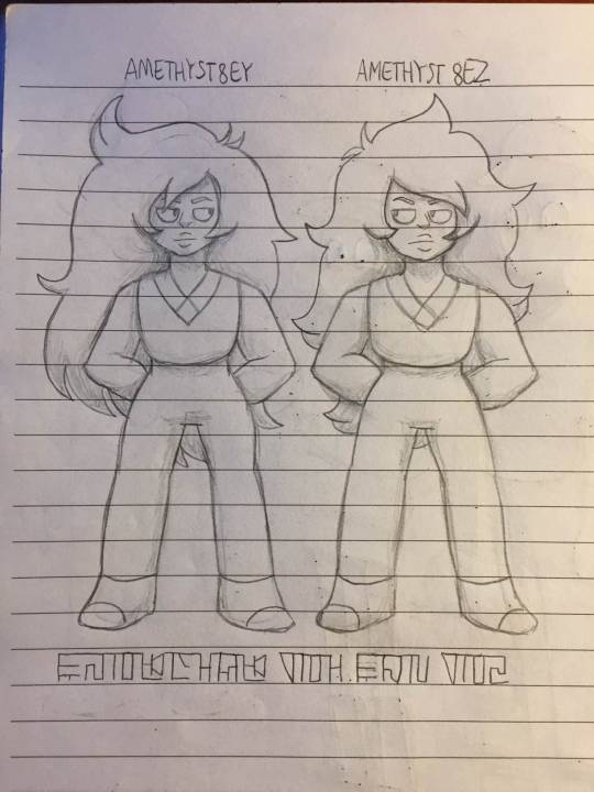
And just to close, I know they're not Condor, but here's the first full sketch I did of Gingersnap and Snickerdoodle. The Gem Glyph at the bottom says "AMETHYSTS 8EY AND 8EZ" so don't worry, you don't have to go using the translator to decipher it. Just thought I'd share these guys here as well, since I was posting concept art. Hope you like em!!!
(Some more PIC-page-related concepts and drafts!!!)
#partners in crime#steven universe comic#steven universe#pic concept art#condor agate#concept art#pic condor agate#amethyst steven universe#steven universe oc#gem oc#slight spoilers
22 notes
·
View notes
Note
So quick question
Would you happen to have a fic with good descriptions of what your version of the colours look like?
Or would you be willing to write that up?
Note: this is long lmao. Quick question, long answer /lh
I don't, as of yet, though one is in the works! It's one of the things I've been really struggling with! So far I have an illustration of Vio done (done by my girlfriend @mydmdcorner ) but we'll probably get to drawing the others soonish! I'm more than happy to give a description though!
They also have slightly different blond(e) hair colours, with Blue's being the palest and Vio's the darkest.
Red (he/him): he's the smallest of the bunch (but really we're talking about differences in millimetres and centimetres here, they're all small)! In A Brief Respite, he's described as the one that looks the most like their grandpa! His eyes are blue, lighter than Blue's. His hair is short but curly/wavy. I'll attach photos and other references under a read-more! He's also got freckles. As for his tunic, it looks very much like the one presented in the Four Swords Manga, though it now has 3/4 sleeves and has a normal hood (to replace the stupid Link hat, I just think it's silly). When he's sleepy or shy, he'll hide in the hoodie. The only reason the tunics are 3/4 sleeve lengths is because he kept burning the ends of the sleeves when they were full. No more long sleeves for Red. He also has some of the same piercing holes as Vio (helix piercings), but instead of having amethyst studs, it's golden hoops/rings.
Blue (she/her): Blue's a tricky case. She got into the Minish magic in an attempt to change her body to fit her gender which had some. Interesting consequences. She's kind of surrounded by a permanent glamour of the weirdest kind, so despite being female, she appears entirely male (short hair etc). She wants to grow her hair out tho (but only to a length that's still practical). She has dark blue eyes. She does not have freckles and her hair has the barest hint of waves. Her tunic is also similar to the manga, but she wears a different, thinner belt higher up on her waist (to make it look like she has wider hips) and her tunic is the longest of them all, brushing the tops of her knees. She currently has no piercings.
Green (he/him): My favourite sleepy boy. He more or less looks exactly like the manga version of Four Swords LInk. He's got green eyes with golden spots in them. He's also ditched the hat, but has the same hood that Four has, with the Ezlo decoration at the end. He's a sleepy boy, so the hood is long enough to fully cover his eyes if he needs to lay down to rest in the middle of the day. The shirt he wears under the tunic has longer sleeves so he can hide his hands. His boots are also more padded so walking is less exhausting/hurts less.
Vio (they/them): Has the longest hair of them all currently. It just brushes their collarbone. The front parts are braided and kept secure with magnetic beads that can be used to clip the hair back. They wear a similar tunic to LU!Four. The bottom part is also flared/split into multiple pieces to ease movement. They wear a thicker belt, but not the same one from the manga. On their hip they wear purple and black kinstone-shaped gems. They've got purple eyes and freckles, although less freckles than Red. They also wear the most piercings in their ears. I might still redesign their tunic some. I really like the tunic design for ASAU!Legend (note: ASAU is rated M/18+), so I might take inspiration from that when I get around to drawing Vio myself.
Hope that helps some! I've left a couple image references below the read more for you! I don't have the spoons to image describe them currently, but I might get that done within the next day or so. If that's an immediate issue, I'll try to get it done tonight!
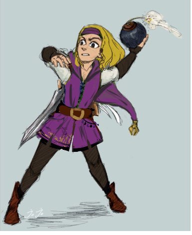
DISCLAIMER: I do not claim this as my art, this is the initial tunic redesign sketch me and my gf did as we tried to figure stuff out. It's redrawn over one of JoJo's (@/linkeduniverse) drawings of Four. Please do not see this as my art. The headband should also not be there for my Vio. Oops.

This is another drawing of Vio. The hair is wrong. Disregard that please. Vio also doesn't have ears. Oops. This is my girlfriend's art. (The Minish you see is Bubble, you can meet them in the first chapter of Dark Hair Significance)
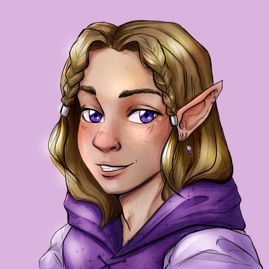
This is my current profile picture and is of Vio! Here you can see the piercings Vio has, too. The Minish tail/feather isn't one they commonly wear. They left that behind in their Hyrule to keep it safe. Depending on the day, they do the braids a little different. This drawing was also done by my girlfriend.

This hairstyle is roughly what I imagine for Red, maybe a bit shorter (Source: Gentlemen's Magazine).

And of course a reference for the Manga.
3 notes
·
View notes
Text
Part 8 - BTS MV outfits
I made one canvas dark because my screen was starting to blind me. but I forgot when I increased the canvas size so oops.


Here's MIC DROP and FAKE LOVE. MIC DROP still feels weirdly recent to me, but I think that's because there was an English version and I think of it as related to the newer fully English songs somehow.
Reminder: S is for steal (I would wear the fit/ 'steal' it or inspiration from it), """ is around my favourite, and :/ for my least favourite (but I probably don't hate it, it's a context or preference thing).
I really loved seeing them back in their hip-hop fits with MIC DROP, it felt like it had been a while. I have 4 different fits from the MVs to judge (although 1 is mostly from live performances I think).
Starting in the top left with the black-red-and-white combination. These fits look cool and comfortable so I would steal most of them. Taehyung's is my least favourite because he's the only one who doesn't follow the colour scheme properly, which washes him away slightly as these colours pop so much on the dark set. Jimin's fit is my favourite, because it has all 3 main colours, and the white makes it pop most (next to Hoseok's but I feel he's a bit too red to be my favourite).
Let's go reverse clockwise and go to the bottom next, where we have a picture that makes it hard to tell what they're wearing but oh well. This has a lot of camo, which I won't wear myself, so no real steals here. Jin's fit is my least favourite, I guess? His colour scheme matches the least, but I don't feel strongly about this. Jungkook's is my favourite, but you can hardly tell what he's wearing so this is kinda just showing you my bias.
Moving right and up, I remember these as the main fits of the MV, and the long shirts under the jackets look so good dancing, but idk how good they would look on me if I was just walking around. I think I'd lose shape, where here they accentuate shape during dancing. Anyway, I would still try with Namjoon's and Yoongi's. Yoongi's fit is also my favourite, I like the sweater and the light pants. Hoseok's is my least favourite only next to the rest, as the colours are alittle off from the scheme everyone else is wearing. With a white shirt under or just in a different context I think it would be better, it's only in context with the rest.
Last but not least for MIC DROP, the top right, where Jungkook's is my least favourite because what is happening with that tied shirt and I don't love camo. I also have to say Hoseok stands out, with his fit being most different from the rest, but it's less confusing than the tied shirt situation with Jungkook. Though Namjoon is a ? because I fully can't tell what he's wearing and I'm too lazy to look up more pictures now. Jimin's is my favourite because that looks the most comfortable, like I'd easily wear that. But it's close with Yoongi's & Taehyung's outfits because black and white just tends to be good for everyone.
Then we move to FAKE LOVE! Black and white and purple vibes? yes please. Let's go clockwise here because why not, starting at the upper left.
The theming here is a bit messy, with most wearing a lot of black, white and grey, but some strong pops of colour. But because of that happening with both Jungkook and Namjoon, and a bit with Hoseok and Taehyung, it comes back together. The vibe is a bit of a painterly/ sketching thing, with the paintsplatters, grey, and patterns. Honestly I really love this because much of what they're wearing looks like something you could do with DIY, which I do a lot with clothes now, so I honestly just want to make some of their outfits (a little different maybe, but the idea of it at least). I don't have a least favourite because they all have a bit of that mismatched but somehow matched DIY energy, and I would wear literally all of them. Jimin's was my favourite by a small margin when I made this, which I do still agree with, but it's also a pretty much impossible pick.
To the righ twe have our little e-boy moment. I think anyway, fits like these with the harnasses & belts, black and white and a tiny bit of red, feel very much e-boy to me, which I absolutely love and also wanna wear more myself maybe. Namjoon's fit is my least favourite, but only by a very small margin because the choker looks a bit out of place as it is not perfectly white (it would look better on Taehyung as he already has some off-white). I'd steal most of the other fits, they look great, black and white and belts is *cheff's kiss*. Jin's is my favourite because the stitches on the shirt & harnass he has look really cool, though it's a close call between him and Hoseok because of the pants & belts.
Moving down we have two pictures with bisexual lighting. They have comparable vibes in outfits to the picture on the bottom left. For Jungkook the fit is different but the jackets are similar, and for Jin the shirt+harness are different but similar in vibes, while the rest are wearing a more completely different fit. I'll compare them to the MV fits (as these are live show fits) more in a second, but first general judgement. Jimin's fit is my least favourite, because the shirt looks a bit weird in the screenshot (it looks better on the left screenshot, but idk, I can't tell what's happening on the right). I know Hoseok's fit is the only one with that much jean-material, so he stands out, but I think it works here. I'd steal most of the other fits, just not Yoongi's and Namjoon's because they're a little too shiny for me. But special shout-out to Namjoon's leg harnass situation because that is the best part of his fit. I guess I just like men in harnasses (jk jk, unless...)
Let's move to the bottom left now, were I don't have super strong opinions. The outfits really fit the MV, I like them, but because some are so shiny glittery I'd only steal Yoongi's, Jimin's, or Taehyung's fits. Taehyung's is my favourite because he has the most harnass-esque situation going on. For a quick comparison, Jungkook's fit here vs the picture on the right of it are similar in vibe, but because he loses the shiny it's a downgrade. On the other hand Jin gains a cool harnass thing and his pants became leather, so his fit is an upgrade to me.
These were fun, so I hope you liked reading my opinions.
0 notes
Text
Armchair Theatre: The Man Who Came to Die
The curse of the old TV fan (at least in Britain) is the prolific wiping of shows, especially black and white shows. I've gone into the reasons at length before, but basically there was a perception that nobody would want to see black and white shows once they were in colour, the video tape was expensive and reused, and there was a culture in television that shows would only be shown once. This last one of course comes from the theatre, and Armchair Theatre made the connection with the theatre explicit by showing actual plays, as did many other shows well into the seventies, even though apparently Armchair Theatre was already perceived to be old-fashioned. The genre of TV plays isn't one that I've ever got on very well with because I prefer ongoing series with the same characters who get developed.

The Man Who Came to Die aired 18th April 1965, and is one of the ones to escape the junking. It is essentially a straightforward detective story about a couple who come home from celebrating their anniversary to find a family acquaintance dead in their spare bed. It is clear that this man is a bit of pest to the couple. The play introduces various other characters in the village, and the local police. You would be right to think that this sounds very much like a classic Christie.
We are gradually told information about what has led up to the death of the man in the bed and a complex web of relationships and conflicts is gradually revealed. For me personally it is much more notable for the characters it reveals. The shifty doctor. The police sergeant who pretends to be incompetent. In fact pretty much all of the characters are among the most unpleasant characters you could wish to meet. And best of all the char who hams it up no end and in fact is more of a caricature of a char lady than a real person. I actually don't mind this because this play has to rise to the difficult task of sketching out some complex relationships in only an hour and so they're all rather larger than life.
There is one major problem with the play, which is that while there is a great deal of misdirection in the play, it is fairly obvious who is at fault from the start. Because I like it as a play I am going to say that this plot shortcoming would only be a problem if you are watching it as a mystery and trying to solve it. If you watch it as an entertainment for the characters, that isn't such a problem.
I have kept saying that this play is a mystery, and in fact there are two mysteries about it which I have been completely unable to get to the bottom of. On both Wikipedia and IMDb this play is listed among the episodes of Armchair Theatre (1956 to 1974). But the titles and bumpers all give its title as Armchair Mystery Theatre (1960 to 1965), but neither Wikipedia nor IMDb lists it among that show's episodes. I cannot account for why it has the titles of one show, clearly fits in to that show's theme, but is listed as an episode of another show. Then there is the mystery that the pirate copy I have begins with the current Studio Canal jingle so looks like it has come from a commercially released copy. Yet this episode is not listed among the commercially released episodes of Armchair Theatre and as far as I know no episode of Armchair Mystery Theatre has ever been released commercially. It's a complete mystery.
So in summary, despite a plot problem, this is a classic mystery/detection play set in an English village populated by a cast of the most unpleasant, eccentric people you've ever met.
This blog is mirrored at
culttvblog.tumblr.com/archive (from September 2023) and culttvblog.substack.com (from January 2023 and where you can subscribe by email)
Archives from 2013 to September 2023 may be found at culttvblog.blogspot.com and there is an index to the tags used on the Tumblr version at https://www.tumblr.com/culttvblog/729194158177370112/this-blog
0 notes
Text
Week 12: 5 Feedback Questions
In week 12 we had a session where we hung up printed versions of our posters and wrote down a question about each other's posters, resulting in 5 questions for each person.
1. What does the colour/registration at the bottom refer to?
The colour/registration at the bottom was to simply show the main colour scheme I used for the poster, as it was inspired by another creative. After analysing a bit more, I decided to remove it since it didn't serve an important enough purpose in my poster.
2. Is the 'e' intentionally missing? Why?
I cut out edge of the 'e' similar to the other letters. This is because I didn't want all of the letters to continue behind the objects. I didn't make the overall word too legible because I wanted it to be 'buried' under the elements, making the scene more chaotic.
3. Have you tried different layouts of placing the elements?
In my initial sketches I spontaneously laid out the elements as I wanted it to be chaotic and playful, but I always made sure to keep the elements central to the desk and chair. In hindsight, I could have experimented more with composition and scale of the objects.
4. How will you continue this illustrative style on the inventory?
For my inventory, I just intend on changing the colours of the headings, as I wanted a simple, rigid inventory to create a juxtaposition between the two sides of the poster.
5. Have you thought about putting the number sequence in the same corner of each illustration?
I believe the number sequence looks like it connects to each specific object in a clear way, so I don't think the arrangement of the numbers needs to be particularly changed.
0 notes
Text
was bored and couldn't get my pea brain to focus on writing after expending so much energy today so here's some half baked rowan charm "plans" (i use that term very lightly here)
halloween charm rowan
• BANSHEE ROWAN? BANSHEE ROWAN............... BANSHEE ROWAN!!
• banshees are just yassified ghosts so tattered white gown + white hood/veil thingy + some kind of waist corset thingy to rowanify it some more.
• hair MESSY and flying out around his head.
• dark and extremely smudgy make-up, maybe some white foundation as well (i don't think banshees have freckles :( sad)
• arms out pose so big ripped sleeves can dangle and be centred
• face like >:] and general heehoo im gonna getcha vibes
baewatch charm rowan
• beeeeeg sunhat, smthing similar to portia's but with darker colours perchance
• they probably didn't have obnoxious patterned hawaiian shirts in ye olden times but he's getting one anyway
• tiny lil dark plain coloured bikini top underneath bc said hawaiian shirt must be oversized + unbuttoned
• either equally tiny full ass out shorts or full transmasc board shorts. might sketch both and see which i like best
• chunky wedge sandals bc he's apparently been short coded, he can't not remind ppl that he is Tall
• pose..... idk but he will be holding a margarita. would be floating in a big donut but too similar to asra's + hides outfit. perhaps crouching by a rock pool befriending a crab
wedding charm rowan
• sitting SEXILY. legs crossed ass and thighs in full view.
• can't imagine rowan getting married at his ingame age/maturity level so make him look a lil older
• longer hair? longer hair. would be styled like his regular hairstyle but Fancier. thinking braided back like muriel's hair in his route
• white + gold outfit obviously but with red accents... red tie? red hair accessories? red lips? red bottom boots? yes
• white ruffly poet shirt showing off hefty amounts of chest... gold underbust waistcoat or corset w red detailing... frilly ass pants with gold embroidery.... white or gold heel boots... fuck maybe a white w gold or just straight gold tailcoat too he is getting MARRIED he should go all out (but on the other hand i don't want it to just be a recolour of his masquerade fit so we'll see)
• fanciest gold jewellery i am willing to spend time drawing
wonderland charm rowan
• i guess rowan is alice?? only thing that really makes sense lmao
• turn alice's skirt into shorts and her apron into a lil waist corset and we have ourselves a rowancore outfit
• pose + background elements; based on scene from the beginning where alice is falling into wonderland - pose rowan partially upside down/falling headfirst perhaps
• have plot important stuff falling with him; the emerald necklace, cards from asra's deck, myrrh pouch, julian's research, red beetles, etc
fruit charm rowan
• rowan is already a fruit and today that fruit will be a mango. red + green + lil bit of goldish yellow fits his aesthetique to a t
• outfits seem to be modern au + matching the fruit's palette for the most part soooooo... slightly slutty punkish dark academia outfit that's red/green/little bit of gold. idk what that would even entail but i'll figure something out
• pose/background details; sitting legs crossed on beeg half-mango "boat" and holding/eating smaller mango?? idk the composition of these charms confuses my pea brain for some reason
potion bottle shaker charm rowan
• finally i do not have to cook up a new outfit. breathes a sigh of relief
• pose.... idk he'll just be sittin. either he'll be a bit slutty about it or takin a nap against the side of the bottle, i could go either way
• heart shaped red bottle with a gold stopper inlaid with a turquoise gemstone(s) to match/reference their necklace. might have some gorse flowers around the top too. perchance.
• contents of bottle: two tarot cards. sammi. a chibi version of the tower (Uh Oh). the notebook that they scribble investigation stuff/General Thots in throughout the routes. a little flame.
tired so i'll plan out the rest some other time
6 notes
·
View notes
Text
The Promised Neverland Art Foreshadowing?!
Ok, so I normally don't post myself just lurk, so excuse me if I screw this up, buuuut... I had to share this. If you are anime-only there will be some manga SPOILERS ahead, so read at your own risk!
I recently got hooked to The Promised Neverland, and even got hard copies of the manga, which is very rare for me.
So as I was appreciating my shiny, newly arrived volume one, and promptly started re-reading, this comment by the author stuck out to me:
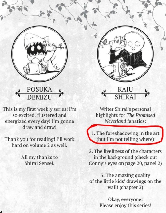
What did he mean? I thought it was something that must have been revealed by now, so I was thinking I must be able to figure it out, and I wracked my brain. But my only suspects were the sketch on the next page where Emma stands on the wall, or the fact that there is a glimpse of the demons wearing a mask over their mouths (it wasn’t obvious to me they wore masks until it was revealed later).
Neither of those seemed like that great of a foreshadowing, so I felt disappointed... until I started examining the cover art for hints, and suddenly it clicked and HOT DAMN, I think I am on to something!
So the cover art of volume 1 is a nice artistic composition with the kids standing on some funky boxes with books in the front in neat bookshelves and Grace Field in the back. Very nice and spazzy, nothing strange, right? So am I talking about the titles on those books you can sometimes barely read? Saying stuff, like NUMBER, RUN, HURRY UP! ?
WRONG
Oh boy, no it's not the small details, LOOK AGAIN, at the BIG PICTURE. What can you see? Ok, I will help by pointing out a couple of things in red:
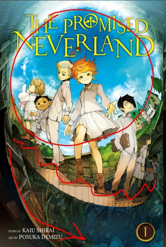
Do you see these children standing on a set of STAIRS leading down into a HOLE UNDERNEATH Gracefield House?!?!??!
It's a bit difficult to see in the colour edition, but the inside of the volume cover also includes a sketch version where you can see that the hole isn't just lined by books, but there are also cogs, and what looks like some old, broken columns... which could be ancient artefacts?
Here, I took a picture of my copy since I couldn't find this art online with a quick search:
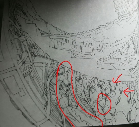
So I thought, could it be that ever since volume FRIGGIN one we had been staring at the tunnel that leads to the human world at Gracefield that we now know about? Also, if that's the case, it's implied the kids will go through it...
Well, knowing these mangakas, I wouldn't put such a ballsy and far reaching foreshadowing move past them, after all, they have showcased some God-tier foreshadowing game throughout the manga in my opinion.
But what REALLY got me thinking that I might be onto something was a quick google search when I was looking for a decent quality pic of this volume art, and then I found these...
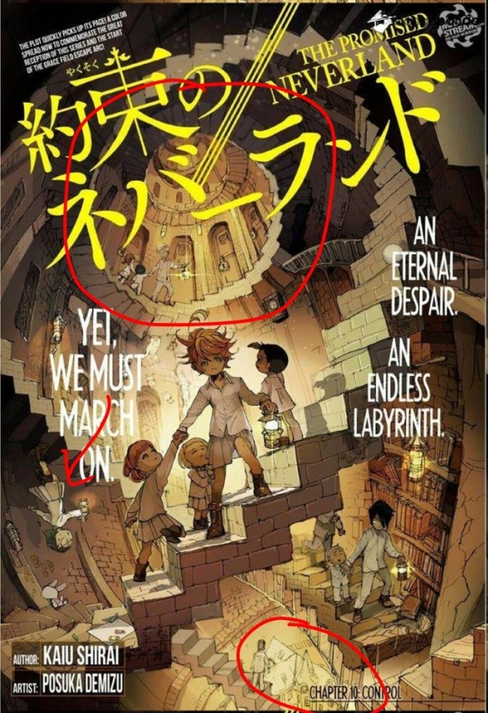
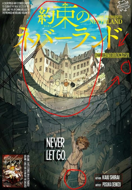
Those are the chapter covers of chapter 10 and 32. Any of you seeing a pattern yet? Regarding a hole in the ground at Gracefield with stairs that the kids all ho through?!?!? Yeah, at this point I don't think it's a coincidence... it would be hard to swallow if it was.
Mind you, if others have already noticed, then please forgive me for this ignorance, but I haven't seen any post on this yet.
A couple other things I circled or pointed at in those chapter arts: Chapter 10's spiral staircase has books again (I wonder if this foreshadows that the secret passage starts in the library? though I guess Plant 3's library would have burned down), and Gracefield is at the bottom, rather than the top. But notice that Gilda is upside down, so I wonder if the world gets switched upside down when you go over to the human world?
I think chapter 32's art supports this, since this one right behind Emma has a gate at the bottom of the whole, which seems to be upside down.
Sooo what do you all think? Has anyone else noticed these details before?
(Also, I can't believe again how great and brave the mangakas are at foreshadowing, true respect to them! They really have their stuff together!)
EDIT: Actuaaaaally, an even wilder thought has occurred to me: could we have been staring at the ENDGAME of the series since VOLUME ONE?!?!
We know we are in the final arc, but so far we have been led to believe that the children has no intention of going to the human world, and right now the only options SEEM to be REFORGING the PROMISE or DESTROYING all the FARMS.
But Author-san has said before that he likes to fool readers. So what if he has planned all along that they would go to the human world in the end, all together (notice how Norman is there with them in all the images), and they had the balls to foreshadow right from the start!
As far as I know Author-san has already written 300 pages script before the illustrations began, so yeah, I think they could have pulled this off!
Or maybe this is too wild a theory? They could just go to the human world temporarily or just for help... but maaan, would it be cool if they had us staring at the ending since right from the beginning!
#promised neverland#yakusoku no neverland#manga#spoilers#cover art#shirai kaiu#emma tpn#norman tpn#ray tpn#the promised neverland#tpn#tpn spoilers#foreshadowing#tpn foreshadowing#tpn theory
2K notes
·
View notes
Text

Hello Folks, I'm not sure how many of you are aware, but amongst other things, I run an SSHG writers' group. Sliding into the start of the year I decided to run a year-long "Fanfiction Write Along" loosely following the marvellous program laid out in "The Weekend Novelist" by Robert J. Ray. Although we are now at week 4, I decided it is probably worth adding the posts here as well if anyone else wants to follow along. Let's launch into this year-long challenge together! I believe we can do this.
Each weekend will focus on a specific task, a model for you to follow in your own work. There will be a definition of the task, an explanation of its purpose and when possible, a writing sample. There might be guidelines or techniques offered to help you on the way as you undertake each weekends' writing exercises that will build over the course of 52 weeks into your novel.
There will be times when the ink flows and the words come easy but then there will be awkward, frozen, days where everything is gummed up when it all feels too hard - we will talk about how you thaw out and push through in future posts.
But for today I hope your spirits and enthusiasm are high so let us dive right in.
Week One.
Starting with a character.
We are going to prepare to our characters to enter the story - some of this may feel a little redundant as these are characters already familiar to us, however, it is worth remembering that our internal version of these characters belongs to us, they may be so clear in our mind's eye but still, vary wildly from the next person's vision of the same character.
For example, my Severus is tall (6'2 or 6'3), rail-thin, occasional smoker (a hangover from his youth which crops up now and then) and secretly still quite likes the proto-punk and pub rock he grew up with like Black Sabbath. The next person's Severus might abhor cigarettes and liquor because they remind him of Tobias.
So our very first exercise is to choose which character is going to be your protagonist and write a character sketch of them. Don't follow canon blindly - think about when and where you envision setting your story. Will that change the way the character dresses? Wears their hair? What sort of lifestyle will the story offer them?
This character sketch is broad strokes to start placing the character into YOUR story. Work fast. Don't overthink. It's not about creating perfection it's about drawing details out of your mind you weren't even consciously aware were there. Later, when you have finished you might see some subtextual clues appearing already - is your Severus still pallid and pinched and pale suggesting he is still living with stress and pressure or is there now a faint hint of colour in his cheeks, a glint in his eyes that was previously lacking, suggesting that his new life is somewhat brighter? If the latter, then somewhere your antagonist/villain is waiting to throw obstacles in his path to steal the light out of his eyes once more...
Although a character sketch is a quick exercise it is important. Writing down the details of YOUR characters begins to solidify what makes them (and consequently your narrative vision) unique. 15 minutes (maximum!) out of your weekend will give you a snapshot of the main player in your story.
Guidelines
* Sketches should be bare bones that generate specific details which then builds to creative guesswork where you will allow your imagination to fill in the framework.
* Possessions provide a clue to the characters current circumstances and lifestyle.
* Stay focused on exteriors - things you could see if they stood in front of you. There is a lot you don't yet know from the sketch and that is important - because it gives you a reason TO know and will help trigger your mind to supply more details, more STORY.
Exercises
* Write THREE (3) 15-minute sketches using the template at the bottom of this post.
* What-if? What if questions set your characters into motion, especially if they set your characters a specific problem to solve. (What if he was hit by a car? What if she went to a party and was slipped a roofie? What happens if they wake up in a strange bed?) Ask the questions and free write as the answers spin out. This is designed to help with story development.
* Play casting director. Now you have your sketches go back and read through them and think about the shape of your story in your head. Choose your protagonist, your supporting role, and your antagonist/villain. If any of them aren't clearly a good fit ask more questions. If they still don't fit the role you want, write another sketch.
Character Sketch Template
Height:
Weight:
Gender:
Hair: (colour, style, length)
Dress:
Body:
Shoes:
Face shape:
Mouth:
Poses: *hands/gestures
* feet/legs
* torso/head
Build:
Arms/Legs:
Imperfections:
Age:
Home: *exterior/grounds/outbuildings etc.
* interior/furnishings/carpets/floors/lighting
Favourite room:
View from the window:
Habits:
Vehicles:
Name:
Motive: (What do they WANT and what do they NEED?)
Good Luck! I am so excited to start this journey with you! I am hoping to be home either tonight or tomorrow but we can review and discuss our sketches next weekend.
0 notes
Note
That's exactly what I'm talking about! I mean I know newer edition but Heroes III was the one. Hard to not love it when u spent half of your childhood with this game and second one with the sims lmao. Ohhh that's understandable, watching streamers often looks like that. I don't play Overwatch but some of my friends do and seeing this screen... I have no idea what's going on and I'm pretty good at keeping focus, sigh.
Blue Totoro didn’t look so bad so I guess it was fine! Ohhhh I’m curious now. My skills end on drawing and baking tho… And yes I did watch Laputa and I really like it (didn’t expect anything other from ghibli lmao). About that show tho! It’ll be called Wandavision I’m sure u can google it. It was announced ~2 weeks ago with Marvel’s 4th phase, so 100% confirmed. Colour of Magic is really fun, so! You definitely won’t regret it.
And h5 on that, I wasn’t able to focus on books for last year? I was too busy with everything else, uni especially. 40C god… It’s around 35C here this summer and I’m ready to cry I truly hate this weather from the bottom of my heart.I was actualy thinking about putting my sign’s flower! But I don’t think pansies look pretty enough. Violets are lovely tho, I’m still thinking about it because I need to choose different studio (they asked 750$ for like 5cm long thing and I died inside).
I love your moodboard, it’s so pretty! Thank you so much. I never tried to put flowers in my Carat Bong and now I’m thinking about it again… My bias line includes hyung line in overall so you don’t have to worry about changing it! Wonwoo looks great there. But Jeonghan is the very first one for me. NO CHARACTER LIMIT WOULD BE HELPFUL HERE but let’s never go back to smaller gifs… as you see I’m being a little late with answering too, but it’s fine! Answer whenever you feel like it!
Right! Sometimes the older versions are just better. I often feel like new version are either overcomplicated or oversimplified, sometimes one of the old versions just has that perfect balance and it’s sad when they fail to replicate that in a newer version. Like, Sims 3 went overcomplicated and AoE III went oversimplified. Still, it’s good they’re trying out new things so they can improve in the next version?
Yeahh Overwatch is a FPS too and those are just terrible to watch lmao. That and battle royale games. Simpler games can be fun to watch, but usually I’m too impatient. I prefer to play the games myself.
Hold on, I’ll take photos for you.
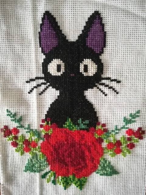
Here’s Jiji:
And here’s the Totoro I’m working on:
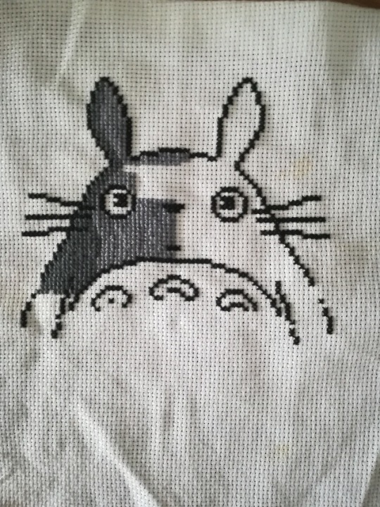
Ohh you draw too? (Wait, did I know this?) What do you like to draw, and digitally or traditionally? Please show me some of your stuff after the reveal :D Lately I’m trying out digital drawing. I did Ten from NCT and am working on Prince Jun (of whom I did the sketch traditionally because that’s easier for me).

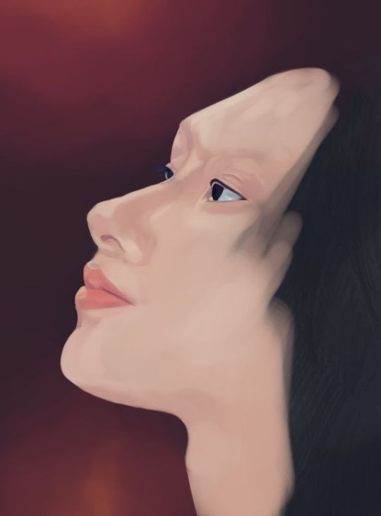
I used to sketch a lot with pencil and I love working with ink too but I haven’t done that in ages rip.
Ohh gosh I can’t believe my babies are getting their own show omg!! Thank u for telling me this!! The other series they’re making also look super fun. I think it was a good decision to make them series and not movies.
Let’s run away and go live somewhere cooler together. We can get a lil cottage and draw, embroider, bake and game in peace!
I think pansies are rly cute tbh, but of course the choice is up to you! Holy crap, 750?? For 5cm?? Dang. Yeah, might be better to find a different studio, tho at the same time if you really really like their designs it might be worth it to go anyway. (tho 750 is a lot)
I’m glad you liked it bb! ♥ Ohh you have a carat bong, nice! I bought one earlier this week after they announced the new ones. I thought I’d better get one before the prices go up because they won’t be manufactured anymore. And yeah, decorating it with flowers is so cute! Carats are so creative with them! What do you think of the new carat bong btw? Personally I prefer the first one, it was very clean and lovely and simple, but I know I’ll end up buying the new one too rip.
Ahh Jeonghan! Our mischievous angel! Did I ever tell you how much I love his voice?? It’s so unique and has such a lovely character, idk how to describe it. I really love his voice lots! And he’s so sneaky but at the same time so thoughtful! Also his broad shoulders *wheeze*
That’s okay! I love talking to you but I also understand if you don’t have the time or energy to send anything because I’m just the same (: I hope your weeks been lovely! ♥
(also i’ll have to take a look at the other missions but one mission every 3 days is so much omg)
0 notes
Text
Armchair Theatre: The Man Who Came to Die
The curse of the old TV fan (at least in Britain) is the prolific wiping of shows, especially black and white shows. I've gone into the reasons at length before, but basically there was a perception that nobody would want to see black and white shows once they were in colour, the video tape was expensive and reused, and there was a culture in television that shows would only be shown once. This last one of course comes from the theatre, and Armchair Theatre made the connection with the theatre explicit by showing actual plays, as did many other shows well into the seventies, even though apparently Armchair Theatre was already perceived to be old-fashioned. The genre of TV plays isn't one that I've ever got on very well with because I prefer ongoing series with the same characters who get developed.

The Man Who Came to Die aired 18th April 1965, and is one of the ones to escape the junking. It is essentially a straightforward detective story about a couple who come home from celebrating their anniversary to find a family acquaintance dead in their spare bed. It is clear that this man is a bit of pest to the couple. The play introduces various other characters in the village, and the local police. You would be right to think that this sounds very much like a classic Christie.
We are gradually told information about what has led up to the death of the man in the bed and a complex web of relationships and conflicts is gradually revealed. For me personally it is much more notable for the characters it reveals. The shifty doctor. The police sergeant who pretends to be incompetent. In fact pretty much all of the characters are among the most unpleasant characters you could wish to meet. And best of all the char who hams it up no end and in fact is more of a caricature of a char lady than a real person. I actually don't mind this because this play has to rise to the difficult task of sketching out some complex relationships in only an hour and so they're all rather larger than life.
There is one major problem with the play, which is that while there is a great deal of misdirection in the play, it is fairly obvious who is at fault from the start. Because I like it as a play I am going to say that this plot shortcoming would only be a problem if you are watching it as a mystery and trying to solve it. If you watch it as an entertainment for the characters, that isn't such a problem.
I have kept saying that this play is a mystery, and in fact there are two mysteries about it which I have been completely unable to get to the bottom of. On both Wikipedia and IMDb this play is listed among the episodes of Armchair Theatre (1956 to 1974). But the titles and bumpers all give its title as Armchair Mystery Theatre (1960 to 1965), but neither Wikipedia nor IMDb lists it among that show's episodes. I cannot account for why it has the titles of one show, clearly fits in to that show's theme, but is listed as an episode of another show. Then there is the mystery that the pirate copy I have begins with the current Studio Canal jingle so looks like it has come from a commercially released copy. Yet this episode is not listed among the commercially released episodes of Armchair Theatre and as far as I know no episode of Armchair Mystery Theatre has ever been released commercially. It's a complete mystery.
So in summary, despite a plot problem, this is a classic mystery/detection play set in an English village populated by a cast of the most unpleasant, eccentric people you've ever met.
This blog is mirrored at
culttvblog.tumblr.com/archive (from September 2023) and culttvblog.substack.com (from January 2023 and where you can subscribe by email)
Archives from 2013 to September 2023 may be found at culttvblog.blogspot.com and there is an index to the tags used on the Tumblr version at https://www.tumblr.com/culttvblog/729194158177370112/this-blog
0 notes