#i feel that the mockups for the subpages are going to be simultaneously easy (similar formatting) but also a complete drag to get through
Explore tagged Tumblr posts
Text
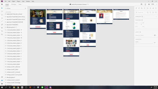
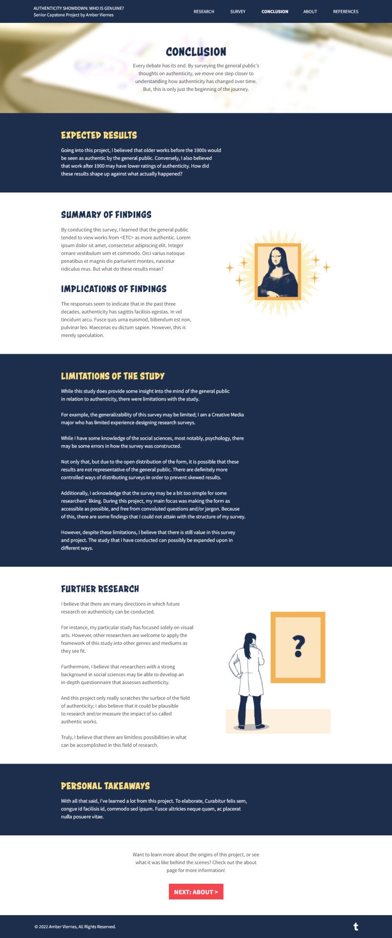
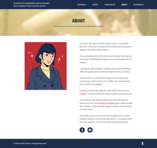
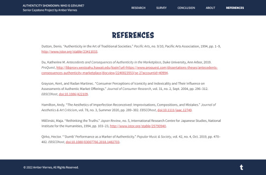
Authenticity Showdown: Website Mockups (v.1), Complete!
Hello everyone! As we've finished the six main pages of the website, here comes the customary compilation post where I reflect on my progress.
Before we get started, here's the previous compilation post, which showcases the wireframes for the six main pages. Basically, the b/w version of these website mockups, without any assets!
To summarize the website mockup process, it basically constituted the following steps:
Integrate color into the wireframes, following the style guide.
Create a list of assets that will be needed for the final website.
Download/gather any assets that cannot be created.
Sketch concepts for the assets listed. (1, 2)
Digitalize the assets (I used CLIP STUDIO PAINT)
For graphs, create the basis in Google Sheets, download the SVG, and modify in Adobe XD (more details here)
I remember starting the mockup process, I had an existential crisis on the background color and whether or not it fit (because the hero image of the homepage threw it off). It's funny looking back on it, because I ended up using the original colors of the style guide; it grew on me! (And for the hero image, I fixed it by darkening it appropriately)
The assets were also a fun challenge too, even if I found them to be not as engaging as the wireframe creation process. I definitely learned a lot from them and it reminded me of the value of people who create clip-art and other graphics that are meant to signal an idea.
In regards to the mockups themselves, I don't think they're perfect. But that said, I'd like to use this post as an opportunity to write what my next steps for the immediate future are:
ASAP: Complete the 14 analysis subpages (assets featured here will be placeholder graphs).
Reflect on which assets do not communicate ideas clearly, and readjust accordingly.
Figure out what to do about the yellow header; determine whether or not the information conveyed in it is really necessary.
Proofread the website with the lens of, "Am I being precise with my information and phrasing?" Revise the website by removing anything unnecessary. (This is super important! Most of my feedback pertains to the vocabulary, not necessarily the design of the website)
Modify the mockups to reflect the change in vocabulary.
Create a PDF of the survey questions for the survey results page.
Once these steps are done, I believe that I can safely transition into the deployment stage which involves putting this website on Wordpress + Elementor Page Builder. The project schedule can be found here; currently, I'd say we're ahead of schedule (especially since the assets took... a lot shorter than expected?).
I won't be providing a concrete schedule of the above steps simply because, tomorrow is the meet-up with the other project students! I may end up needing to add some other steps or do some other revisions. So I'll provide more concrete dates sometime tomorrow, since I'll have more information to go off of!
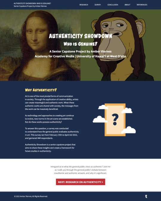
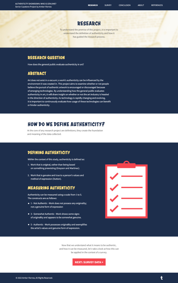
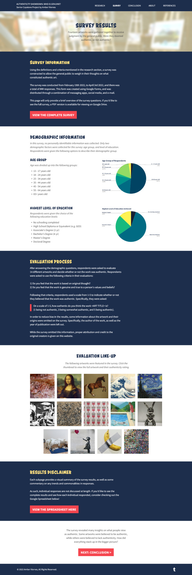
And with that, that's all for this post! If you'd like to read the individual reflections for each website mockup listed here, or see each mockup in greater detail, do check out the links below! ✨
Homepage | Research Page | Survey Results Page | Conclusion Page | About Page | References Page
#amber updates#cm 491#web design#website mockups#having the mockup main pages done is super exciting!!!! this is definitely substantial progress to share in the upcoming class#i feel that the mockups for the subpages are going to be simultaneously easy (similar formatting) but also a complete drag to get through#to elaborate i find that the written content aspect of this project at least on the website... it's a bit.... well.. tedious?#im not the best writer in respects to being precise so im just looking at it and going 'welp time to mentally prepare myself for this!'#though i think having that self-awareness in itself is very powerful and super helpful#for the purposes of presenting something tomorrow i might just focus on the general visuals of the analysis subpages#and not pay much attention to the written content#thats what im thinking for now?? just gonna jump into it after posting this
4 notes
·
View notes