#i ended up going with a kinda woodcut vibe
Explore tagged Tumblr posts
Text
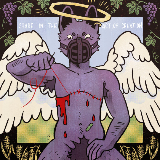
"As my friend Julian puts it, only half winkingly: 'God blessed me by making me transsexual for the same reason God made wheat but not bread and fruit but not wine, so that humanity might share in the act of creation.'" – Daniel Mallory Ortberg, Something That May Shock and Discredit You
#my art#furry#pride#pride month#transgender#transsexual#trans masc#trans pride#angel#angelcore#furry art#lgbt+ pride#lgbt+#lgbt#lgbtq#ive been thinking about this for a while#it def came out different than i thought#i ended up going with a kinda woodcut vibe
325 notes
·
View notes
Text
The art director & the Good Omens book cover tier list of doom, part 2
Part 1 l Part 2
I am your resident Art Director/Good Omens enthusiast, and welcome to my completely meta-free book cover tier list. Listen, making a book cover is HARD. I should know. But while we salute these artists for their hard work and time, I think we can all admit that once in a while, the vision is just not on. And on very rare occasions, publishers seemed to have managed to commission the cover art directly from hell... here's where we left off last time:
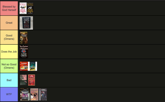
Onwards and upwards, as they say. 11. International paperbacks, Goda Omen
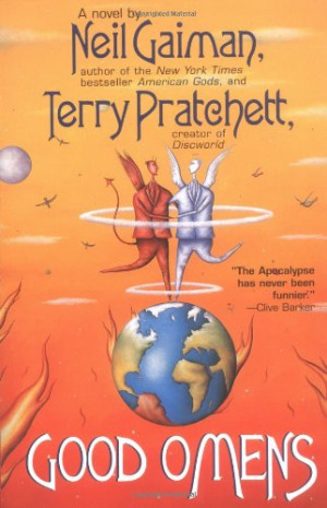
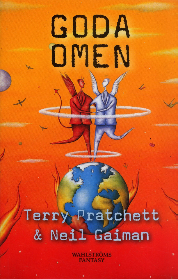
It is inexplicable to me but I LOVE this cover art. It's so sweet and innocent, the colours are contrasty and fun, and the layout leaves enough room for the text. Maybe I would call it slightly inaccurate to have our boys dancing on Greenland while the UK has drowned in a great flood, but hey. It's charming. The international cover gets a thwack with a ruler for trying to fit "creator of Discworld" in between the two wings like that, though. Tier: Great
12. Italian Cover, Buona Apocalisse à tutti!
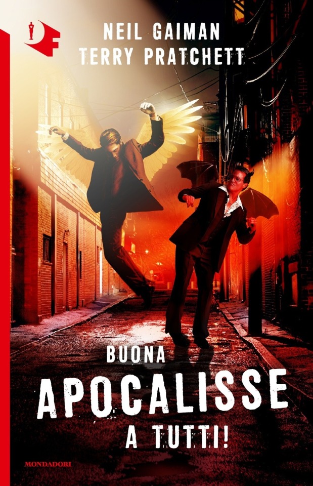
The Italian translation of Good Omens into "Happy Apocalypse to All!" really tickles my funny bone. Unlike this cover which is trying to scrape at it with a dull knife until I'm screaming on the floor. I know demons can only dance badly, but does Crowley *really* have to fracture both ankles while trying? Aziraphale pelvic thrusting his way into heaven is a visual I didn't think I'd ever want. Minus so many points for random murder alley where this is all occurring. At least the designer managed to wrangle the type into one of the best proportional layouts I've seen thus far? Tier: Bad
13. Italian Cover, Good Omens
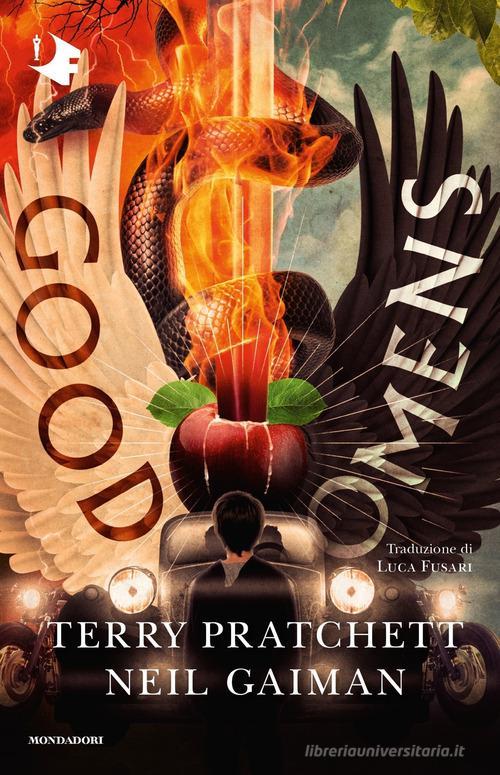
A truly valiant attempt here to rectify a terrifying situation with that earlier Italian version. While this one actually seems much more interesting at a glance, the details kinda get to me. The Bentley's steering being on the wrong side, the word Omens kindasortanotfquite fitting on the black wing, the motorcycles with no drivers... TIMES NEW ROMAN FOR THE AUTHORS NAMES. I don't think it can even be redeemed by the most powerfully rendered Sacred Heart/Cardi B W.A.P. imagery I've ever seen. Tier: Good (Omens)
14. Japanese cover, Good Omens
Look, this designer GETS IT. Crowley and Aziraphale are a pair, a group of the two of us. Do not separate. It's also the only cover I've seen that uses shades of grey! The woodcut vibes are STRONG AND POWERFUL. The type is well placed! I should love this, except the end result kinda looks like a manual for clinical depression in the workplace? It's ending up higher on the list than it deserves, frankly.
Tier: Good (Omens)
15. Japanese cover, Good Omens
This cover might as well be an Ethereal/Occult firemen's calendar. Someone wanted teens to cut off this cover and tape it to their bedroom wall. I can't even judge the typography or the symbolism because I'm just getting hit with waves of pheromones and angst. I can't even tell if it's good but it's going in the Good pile because I can't look at it anymore...
Tier: Good (Omens)
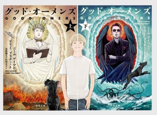
16. Japanese covers, Good Omens

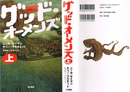
Other people have assured me that this is, in fact, a dual Good omens cover. Alas, I cannot tell. I don't possess compound eyes or even an exoskeleton, and as such lack the ability to decipher these decisions.
Tier: WTF
16. Japanese cover, Good Omens
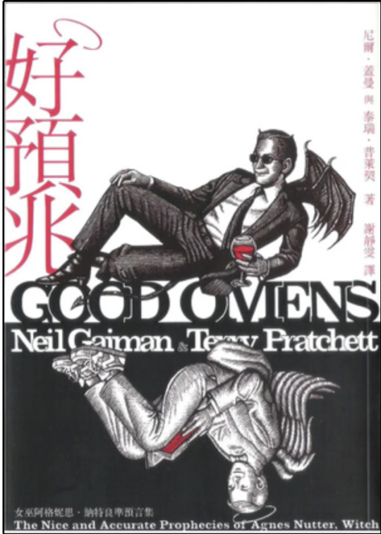
Holy overlap, Batman! I can’t fault this designer for wanting to reuse the wonderful dual illustrations in a Ying-Yang layout, all the elements are there, but there’s a clinginess to the type and positioning that makes me feel like someone is trying to hurt the letters? Is this designer okay? Do they need a hug?
Tier: Does the Job
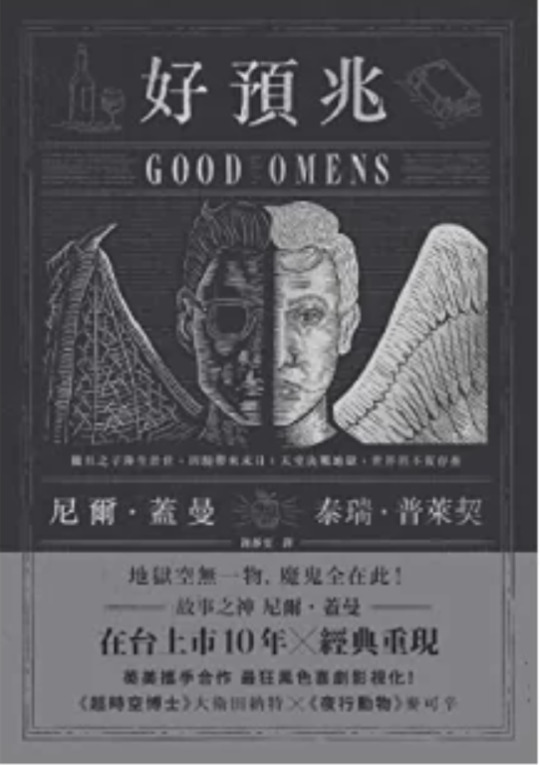
18. Chinese cover, Good Omens
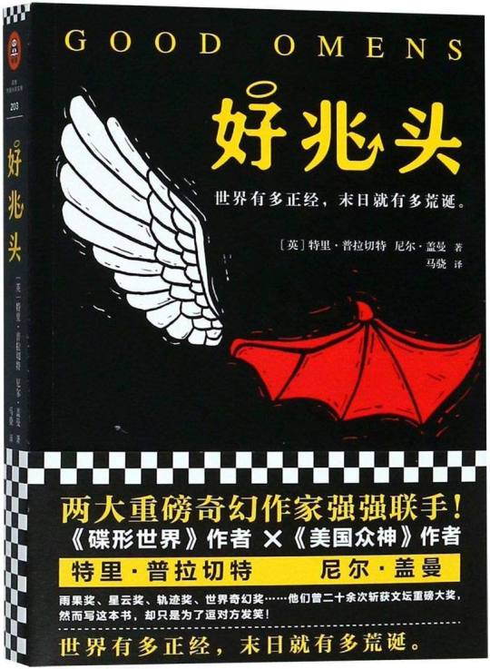
Can I say how charming it is they’ve managed to conserve the halo and devils tale on the Chinese title, as well as the woodcut detailing? However, the simplicity of the cute, contrasting wing design is sadly swallowed by the intense, New-York taxi cab vibes coming off the yellow and checkerboard text block. It could have been so good! Chinese readers: I am mad on your behalf!
Tier: Not so good (Omens)
19. UK 1991 paperback, Good Omens
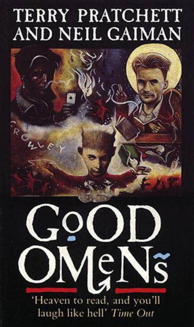
What are we doing here, people. I think I've stepped into a Jungian analysis of what it feels like to have read Good Omens. It's dreamy yet unsettling. Right yet very wrong. And Ol' "Tiny Hands" Aziraphale up there is really judging me for what they found inside my mind. In less upsetting news, we've kept the improved typography and layout of the authors and book title. All is not lost to the nightmare.
Tier: Not so good (Omens)
20. 50 Shades of Gray rip-off cover, Good Omens
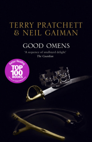
*panic* WHAT ARE WE DOING HERE, PEOPLE...?! Bonus : the guardian quote is almost as much of a mystery as the cover it’s on.
Tier: WTF
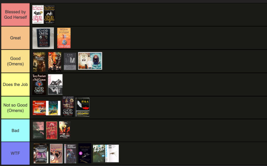
End of round 2.
#good omens 2#art director talks good omens#tier list#good omens#aziraphale and crowley#aziraphale x crowley#crowley and aziraphale#book omens#book cover#go2
114 notes
·
View notes
Text

DAY 14/30 of drawing Rohan every day until the movie comes out! Tomorrow is the halfway point oh my god!! I'm really doing it! I told myself I was gonna go easy today and do something simple to conserve my energy to make something bigger for tomorrow day 15- but I ended up vibing with this drawing more than I thought I would and it kinda came out all woodcut looking! I am happy with it :)
I still don't know how to draw dogs tho- Bakin looks a little weird but that's ok 😂
#岸辺露伴は動かない#岸辺露伴#kishibe rohan#bakin#thus spoke kishibe rohan drama#thus spoke kishibe rohan#jjba#rohan kishibe#hot summer martha#tskr hsm#30 days of Rohan#jojos bizarre adventure#raideo arts#fanart#digital art
44 notes
·
View notes