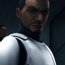
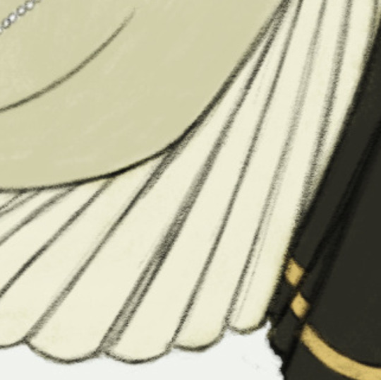
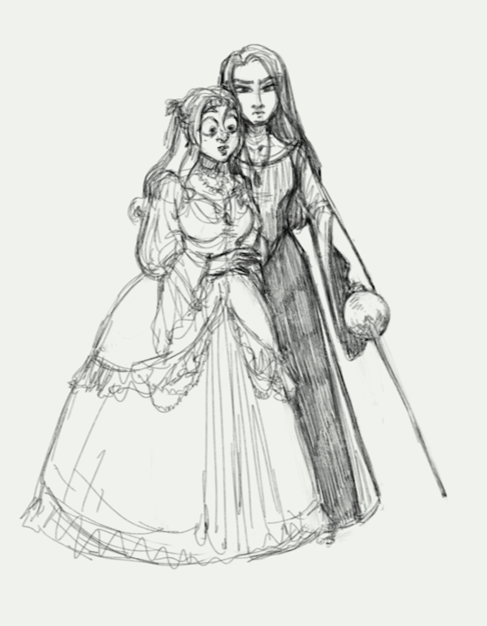
#i drew the pose without a reference sooo
Explore tagged Tumblr posts
Visit Tumblr Blog
Explore Tumblr blogs with no restrictions, modern design and the best experience.
Last Seen Tumblr Blogs


Fun Fact
Tumblr’s reach among the 26-to-35-year-olds in the US is 11%.
Text
so i started listening to the Magnus Archives
i started on MAY 9th it is currently MAY 20th and do you wanna guess what episode i’m on?
126
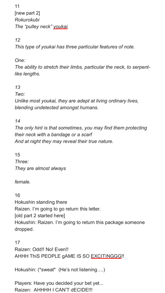
it’s consuming my BRAIN
anyway you’ll never guess who my favorite character is
this was sooo fun to draw
Edit: update its May 21st i’m on episode 137 it’s actually consuming me
Edit 2: it’s May 27 i finished it
AAAAAAAAAAAAAAAAAAAAAAAAAAAAAAAA
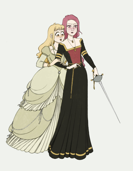
#hyperfixations be hypering#i’m actually really proud of this one#i drew the pose without a reference sooo#tma#michael distortion#the magnus archives#michael tma#tma fanart#my art
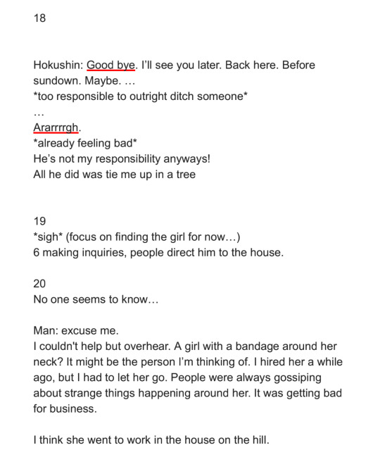
35 notes
·
View notes
Text
@gale-in-space thank you so much for your kind tags omg this totally made my day 🥺💖i love that i somehow managed to give the impression of clean lines when they're actually pretty sketchy when you zoom in! i don't know if you were really asking for tips on my process but i love talking about this stuff sooo
lineart: i use a soft pencil brush and i go over each line a few times, making sure the lines that define an element (the "outline" of the blonde hair, of the dark dress, etc) are closed and very well defined because i will need them later on to fill in the flat colors (kind of like an animation cell - i take a lot of inspiration from old 2D animation cells). then, the lines that go "inside" of the element are there just to add extra detail but they're not needed to make the big picture readable so they can be left looser, sketchier, lighter, etc. because they're secondary
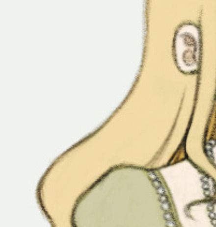
clothes: again i pay attention to the "big shapes" and then i fill them in with "easy details" that follow those big shapes. each dress is just a few big shapes, but i keep in mind while drawing it that i'm drawing a mass of fabric which has weight, so it will suffer the effect of gravity and normally flow in one direction or another. when there's a lot of detail i try to "group" it in big masses that follow the same line of action so it doesn't become visually messy
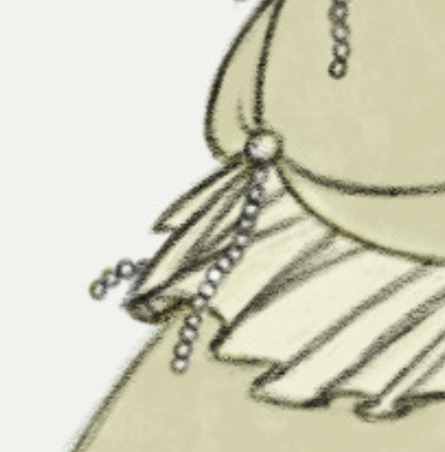
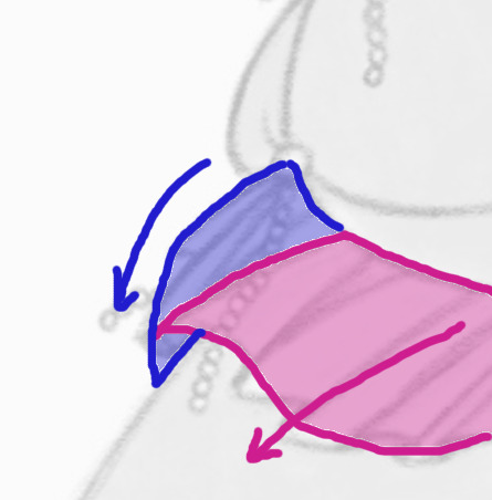
and of course i use a lot of reference for the clothes (normally from photos, movies or old paintings but also from animation for how to simplify those complicated gowns into a few shapes that are easy tok keep track of as you move them around). here is the first sketch i drew without reference vs the final image after i used reference, together with the references. the references are a lot more richer than my final designs but i try not to bite off more than i can chew and keep things simple, otherwise i find i never finish the drawings i start :P
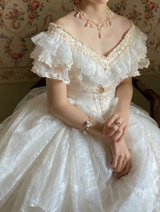
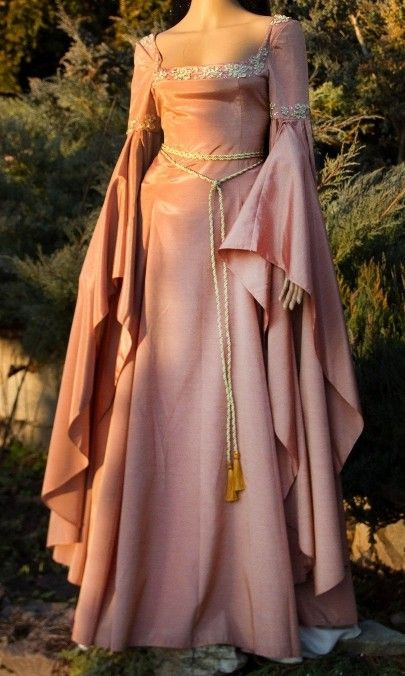
also! first sketch took 30 minutes to 1h, final image i didn't really keep track but i worked on it pretty much all afternoon on the two days of a weekend, there was a lot of drawing and re-drawing the poses and dress designs until i liked them enough to motivate me to actually do the final lineart
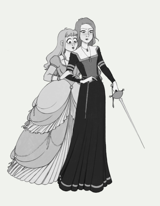
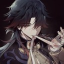
im happy with how my drawings are turning out lately, i might try to do some more complicated poses in this same style soon. once again bg3 OCs
#also!!! i checked your art blog and i love your art so much too !!!!! i love how you draw faces specially the noses and the expressions <3<3#thanks again for your kind comments !!
19 notes
·
View notes
Text
More art for @doverstar 's Chasing the Light!

It's time for a villain spotlight!
I took inspiration from the 2004 Batman show for Rag doll's appearance, but also mixed the costumes of both Peter Merkel (OG) and Jr (His son) and mixed them together. Though I do recall in your written description in chapter 37, he was barefoot and had a once green shirt. I just didn't make the shirt oversized. I just really like The Batman (2004) I don't think it gets enough love. Also he looks creepier this way.
I don't know if he looks better with or without eyes, so I'll just leave it up to interpretation or just go back and re read Chasing the Light.
As for Nimbus I just drew him in the black outfit he wore in the show and made him look more threatening by making him look as if he's always in a partially gaseous state. I gave his eyes and skin a cool sickly green glow, along with black bubbles within the gas to show the toxicity of the gas.

Now it's time for the Crime family duo!
I wanted Snart to look the same, but with a somewhat comic accurate coat with the gold belt and the cool goggles 🥽
Lisa on the other hand looks very different from her Tv show counterpart. I gave her back her comic book blonde hair and gave her a gold jacket, necklace, belt and her gun. I also kept the white shirt since her comic costume currently is gold and white. I feel like she wore more black than gold in the cw show, which is odd for someone called the Golden Glider.
Then again maybe she did, I mean it's been awhile since I've watched the Flash sooo.... yep.
I think I was just having fun making everyone look similar to the comics, but also still giving love to the Flash show. Although, they really need to chill out with the leather and muted colors on costumes. They're getting better, but my point still stands.

Ignore my cyclops OC and focus on Earth-66 Wally West. He has a tool in his hand and is ready to make a difference in the world! He even has his mustard jacket and some red shoes! Even when he's not kid flash he's representing!
Had to find a reference pose for this one. I'll put a link for credit later when I find the reference again.
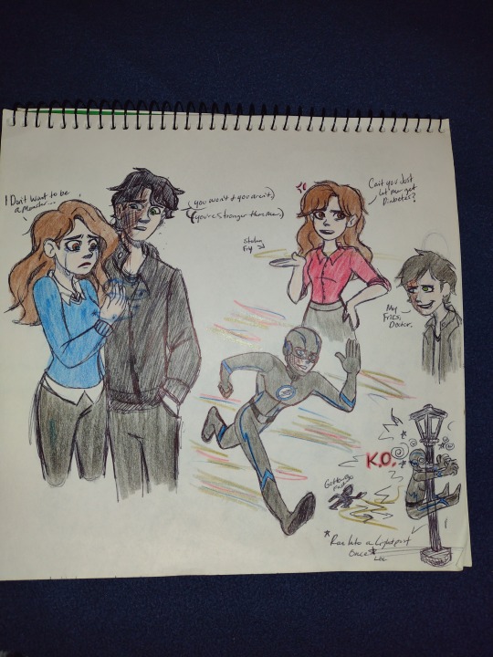
And finally Savisnow❄️⚡
I took inspiration from the simplicity of the Bruce Timm style for his body's running pose and added some cool blue lightning designs to it.
Savitar telling Cait that she's stronger than him, because he knew frost couldn't beat her, UGH. MY HEART! The Savitar stealing Caitlin's chances of getting diabetes, because their HIS fries, but Caitlin knows he doesn't need fries to go to sleep. Smh.
Also, I give you the best for last.
Savitar running into that lamppost. Because we all needed to see that. Lol guess he's not as cool as he thought he was.
Sorry scarebear 🙃 Caitlin loves ya tho!
@doverstar if you see this, I love all your stories from Doctor Who, Mary Poppins, Jelsa to the Flash and Stranger things!
I am currently in love with your HellCheer fic! I wish Chrissy and Eddie got more time together 😭
#Savisnow#Savitar#caitlin snow#the flash#Rag doll#Kyle nimbus#The mist#the flash cw#wally west#captain cold#golden glider#flash rogues#lenard snart#lisa snart#Based on doverstar's Chasing the Light fanfiction#it's so good guys#Y'all need to read it#Doverstar pls tell me if rag doll should have eyes or not idk
26 notes
·
View notes
Note
sooo random question but do u have any drawing tips for beginners?? ✨ i rlly like the way u draw but im so bad at faces and body anatomy lol. thank u ❤️❤️
I do! If you want to get better at faces and anatomy, I'd say to use references. A reference is a photo/clip of (in this case) the human body or a body part in a certain pose you want to draw. For example, here I drew a person sitting without and with a reference:
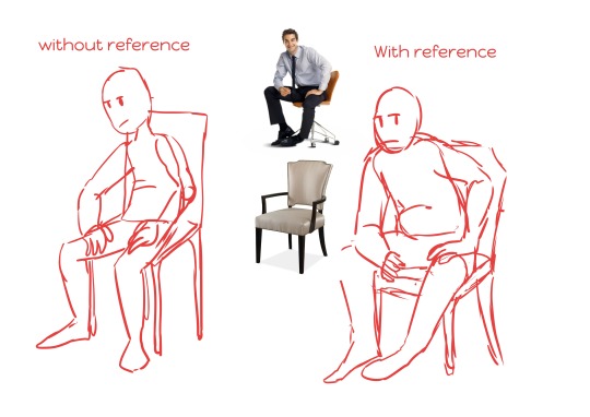
I realised while drawing the way he sat on his chair was really off, so I looked up "person sitting in chair" and found it made the pose much livelier. But I disliked the little office-y chair he sat in, so I looked up another one and kinda frankenstein-ed it together.
For faces you can do the same! Personally, I just use a small mirror or my phone's camera if I need a certain expression for my drawing. This is because 1) I know exactly what expression I need and in what angle 2) it takes much less time to take a few selfies in 10 seconds than browsing the web, hoping you find a good one.
I also do this for hand references sometimes, because hands are weird as hell. It's so nice to finally draw with a references after drawing the same hand 5 times without one in my experience.
But yeah, that's about it I think? Use references for human anatomy, chairs, landscapes, perspective references, anything that can help you with your drawing, as well as for traditional as digital art. If there are any artists that have more tips n tricks, leave them in the comments :D
#experimental#ask#not art#not sims#also also#experiment with your artstyle and different art mediums#theres a reason i have the tag on this blog lol
35 notes
·
View notes
Note
I really want to do your DTIYS but I can't draw full body gestures for the life of me T_T. I somehow drew Alya but am struggling with Marinette. Could you give any tips for drawing fluid postures🤧?
oh i get it for sure! i've struggled for a LONG time with making my poses more dynamic, i'm not the best teacher but heres some things that might be helpful:
• When sketching a pose, stay zoomed out, so you can get a better picture of how fluid it is altogether- u could draw a super dynamic hand that looks awkward with the rest of the body, u know?
• References are your best friend, i personally love getty images bc they just have random stock photos of like...everything? for action poses, gymnasts and trapeze artists make thE BEST references, especially for superheroes
•I don't know your skill level but if you're new to working from reference or just newer at drawing full body in general, theres nothing wrong with doing a tiny bit of tracing, and I don't mean the whole thing because you probably won't learn that way. The tracing i'm talking about is drawing a couple guide lines over the reference image, and then using them lines as your base for the drawing. (I'm bad at words but i included a timelapse example below, its not the best example because i rushed it just now so i could put it in this answer so its not a very accurate study LOL but...you get the idea), it'll help you follow the reference without the daunting blank canvas, u know?
• try not to use too many straight lines, they aren't very fluid and they're quite rare in nature (i think?), man made things are often more straight but nature has a lot of curves, including humans!
• this is a smaller tip but one of my fav things to do is make the tilt of the head exactly opposite to the tilt of the shoulders, it looks soooooo good. it works with other things too, like...hips and shoulders, direction of clothing, hair etc...its hard to explain but i included another example below...just swapping it up a lot looks nice i think :3

thats all i can think of from me directly, however one of my favourite artists literally JUST uploaded a youtube video about dynamic poses so i recommend checking him out, heres the video, i recommend his other videos too though bc he has helped me sooo much and he's a very skilled teacher imo ^_^
i hope this was helpful, &im so happy you're entering aaaaa, im excited to see how your art turns out ;w;
9 notes
·
View notes
Note
do you have any art tips? to people who have just started drawing?
This is what I would tell my younger self:
I’ve only slept like 3 hours, I’m not even sure I’m writing in Eng... so please, forgive any mistakes.
1) Daily practice. If you don't feel like drawing (which is TOTALLY FINE) or you have an art block (again, TOTALLY FINE), just hold a good old pencil and draw some straight lines, some circles, some triangles. Whatever. Believe me or not, you’re making progress.
2) Use reference photos. If you want to draw a very specific pose but you can't find any references, use some pose generator app like Magic Poser and create your own pose. Some lucky beaches people have the ability to visually picture and draw something without using any references. If you're not one of them, welcome to the club! You belong to the 99% of the artists and that means that you need to practice a lot if you want to see the smallest improvement. But it makes you feel sooo good when it happens :)
3) Copying is fine when you copy to learn, for yourself. But then observe, elaborate and make it yours. If you copy to plagiarize, if you copy another artist's work and you claim it as your own... that's very very wrong and you're not learning. If you want to copy to honour an artist make sure to credit them. But then again, if you really want to learn, "steal" some things and combine them to create something new, something you can call your own.
4) One day you will look at your drawings and think "wow that's cool". You will feel like you're doing everything right, you'll love your art style. Then you keep practicing, look back at your favourite drawings and... "What the actual faq? How could I ever liked this sheet?" And you know what? You can be very very proud of yourself, cos that means your visual perception has improved and you can see your "mistakes". So don't surrender and keep drawing. Next level.
5) Don't compare your work to other artists's work. Never. Admire them, praise them, learn from them and then forget about them and draw for yourself.
6) It's never too late to learn. It's never too late to learn. It's never too late to learn. It's never too late to learn. It's never too late to learn. [...] It's never too late to learn.
7) Art tutorial videos are underrated. Watch as many as you can. You always learn something new. And don't you think for one second that you're wasting your time and that you should be drawing instead. The learning process is very long and it’s not all about drawing.
8) Finally I've always wanted to say this: own a sketchbook and DON'T BE AFRAID to use it.
"Aw look at this new sketchbook! Oh my goooood, so pretty. I will use it for my best artworks! It will be perfect! There won't be a single mistake in it. I'm going to use it only when I'm really inspired.
*ink stain*
Okay, now it's ruined. I can't use it anymore. I am a failure. I always ruin everything. I don't deserve this pretty sketchbook.
WAIT... I could use some glue and stick these two pages together so that NO ONE will ever know that I failed! Yes HAHA I am so smart.
*ink stain strikes again*
I'll just throw this thing in the bin and won't buy a sketchbook ever again"
If you can relate, please understand that being like this hypothetical person (What? You thought I was describing myself? God no. Me? Haha. No! I said no. Stop looking at me like that, I have some sketchbooks to burn- FILL. To fill) is wrong. You can do anything you want with your own sketchbook. When you think you're "ruining it", you're simply using it and that's fine. That’s what they’re made for. In art, everything can be fixed. Drew a face you don't like with an ink pen and you can't erase? Totally fine. Use a post-it, stick it where the face is and draw a new face on it. The result will surprise you. Maybe not what you had in mind but cool altogether. Unless you’re Mr Bean in Bean: The Ultimate Disaster Movie:

Look at me dispensing all these wise words. I should learn from them.
#anon#hope you find this useful#good luck <3#I'll be honest#I don't always use a reference photo and you can tell#I'm so lazy#alifetimeaheadtoaskthat#alifetimeaheadtoreply#art tips
32 notes
·
View notes
Note
Do you think it's art theft when people trace cgs? I mean I get it if you're practicing coloring, but when people just trace cgs and say they did it, don't you think it's kind of misleading?
heya! umm they really wouldn’t be “stealing the art” because everyone can tell it’s from an official CG. it’s only art theft if they steal another artist’s work / exact pose etc and claim it as something they came up with themself.
but i get what you mean. it’s not theft but yeah, i guess it’s misleading? i mean IF they specifically said they drew it without tracing then sure, people can feel like they were misled if it’s untrue. deceptive, but it's not really a misdemeanor. i'd prolly just leave it alone, they still worked on it and stuff. but other artists might feel differently~ ✿
sometimes tho, a person might not feel the need to say that they traced in their caption but if you ask them about it, they don’t deny it. sooo it’s really kind of hard to just pass judgement. ♪
while we’re on the topic, there are also some artists who use bases / templates for their work. most times they keep their process to themselves BUT if it’s some other person’s personal template and said person asks people who use it to credit them and the artist doesn’t– that’s a form of theft. ☆
also, if that artist who traces / uses a pre-made base / template (they're diff from references) says they made their artwork from scratch down to the pose, then that’s in the realm of misleadings i guess. (*^^*)♡
14 notes
·
View notes
Photo

Process and wip images for A House That Holds Long Limbs (Part 2)
See Part 1 process and wip documentation
Read the pages for part 2 here (full complete version will be linked from YYH North Bound master post)
As a story progresses, I tend to become more comfortable with jumping ahead and around in my so-called process. This is mainly because the idea of getting deeper into the action is exciting and I want to get to drawing the pages as quickly as possible. The downside is that it usually results in a lot of “oops” and rework on what was supposed to be a final page.
Here you’ll see that script/pagination/thumbnailing and final pages are all starting to drift even more than in Part 1.
The (last version of the) script
Earlier versions were even more point form and incoherent with typos. But, it only needs to capture enough that I can recognize key actions, points of dialogue, the mood, things to draw in the panels, etc. A few specific items to point out:
“[new part 2]”: The script originally had no exposition on rokurokubi - it went straight to Hokushin telling Raizen he was leaving. It occurred to me later, after I’d started thumbnailing, that inserting a few pages of storytelling narrative right here would help to further solidify the kaidan (traditional Japanese ghost story) effect and mood. More importantly, it creates a baseline reference for what the reader will know about rokurokubi for the purposes of this story. I was lucky that Part 1 and Part 2 were cut neatly enough that this wouldn’t be jarring.
I’m still not entirely happy with the text for this section, mainly the “features of note” about rokurokubi. Not just the fact that it’s oversimplification and slight adaptation of actual Japanese folklore - which can’t be avoided unless I want to write a historical essay here. I’m mainly not super keen on how each of the three items has been phrased. It’d be nice to make the three points more parallel in terms of length, but I couldn’t seem to edit, increase the number of points (by splitting them up), or reorder it effectively without negatively impacting other aspects of pacing and information reveal. More points would draw out the pages longer than I wanted, and some points were clearly sub to other points. The final here is the “good enough” version. JUST GET IT DONE ALREADY SO THAT IT CAN GO OUT INTO THE WORLD.
Sooo many word choice changes. The biggest one, done at the last second, was “They are almost always female” to “They are rarely male”. Other phrasings I debated - “They are very rarely male”, “They are almost never male”, etc. Lemme tell ya, it’s easy to get lost in the weeds… Anyways, the main reason for this was because after I drew it and ran the text through my head, the originally-intended juxtaposition of Hokushin on this page with the word “female” felt too subtle. I felt it would create a brief moment of cognitive dissonance that didn’t serve the flow of the story, so I changed it to create emphasis on the same gender instead with the rationale that it will flow more smoothly and allow the reader to focus their attention on the fact “males are very rare” more than the mental hiccup of processing the juxtaposition. DOES THAT MAKE ANY SENSE?? It made sense in my head.
Anyhow, I’m sure there are people who will disagree with many of the decisions I’ve made, but at least you can see what I was trying to do.
Thumbnails
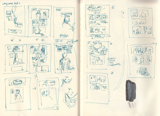
As mentioned, these thumbnails were done BEFORE I decided to insert the exposition at the beginning.
The first two rows on the left hand page are actually the same set of pages - you can see little arrows pointing down or to the right whenever I’m dissatisfied with a thumbnail and attempt to redraw it.
WIPs
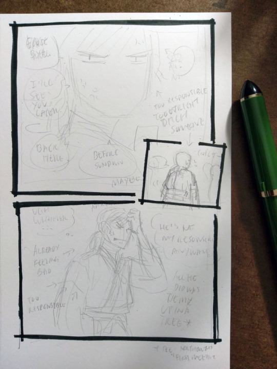
I really like how Hokushin turned out in the last panel here; I like the pencils more than the final inked version. It’s also another example of changing text up to the last second. In case it’s hard to make out, it says (along with what happened to them in the final):
First thought bubble: Ugh, whatever… (moved to the next page, seemed to work better as the end exclamation for this sequence of thoughts before he turns his attention to something else)
Over Hokushin’s head: Aaaargh (moved into the thought bubble)
Second thought bubble: He’s not my responsibility anyways! (no change)
First arrow: *already feeling bad* (no change)
Second arrow: *too responsible* (dropped, since a previous panel already said “too responsible”. Too redundant)
Next to Hokushin: All he did was tie me up in a tree (no change)
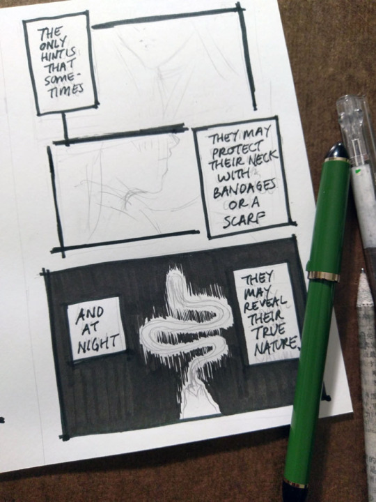
The above panel “And at night...” was a thrilling and scary thing for me lmao. I don’t usually tackle large patches/fills of black, since many of my comics are scribbly in style (pencils, hatching) or colour. I’m too lazy for screentones, traditional or digital. It’ll be interesting as parts of the story coming up will involve poorly lit/dim/dark spaces. I’ve been reviewing how other artists handle it, particularly those with styles driven by pure-ink or minimalist type approaches. Two immediate examples from Yu Yu Hakusho that I’ve been going back to are the dark room fights during Genkai’s successor trials (I’ve taken a similar approach here), and the haunted bedroom case in volume 19. Hardcore cross-hatching seems like a likely route, but that freaks me out when I have to do it over faces. I’d like to minimize or avoid screentoning out of principle, but I still want to create a clear mood, so we’ll see how it goes...

This was my view while inking this page - holding the book in one hand while inking Hokushin with the other. Using the more freehand, sketchy inking style for this comic was so helpful in terms of reducing my inking anxiety and allowing me to work faster.
It’s always great when you can find a reference for period armor (because I find armor very difficult) that is so close to the pose you’re already drawing. There are some small differences - for example, Hokushin’s head is turned more to the right; his left arm is turned and raised more as he’s pulling the sword upwards. But it’s close enough.
Also, spotlight on a few of the books I’ve referenced over the course of working on North Bound in general and this part specifically.
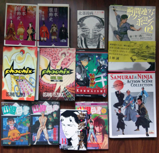
Clockwise from top left:
日本服飾史 女性編 and 男性編 (History of clothing/costume in Japan female and male editions). This marvelous set of books highlights Japanese fashion throughout history. I’ve actually been referencing these photos for a long time before I ever picked up these books - you can see them at the Costume Museum’s website here, alongside helpful line drawings and translations of some of the details. But the books allow me to see a lot more detail.
Hokusai manga vol 1 (this book is published as part of a set of 3). Sketches by Hokusai. This one focuses on “The life and manners of the day” and includes drawings of youkai, including rokurokubi, as well. You can check out the drawings online at places like The Pulverer Collection Online Catalogue.
Action references!! Real Action Pose Collection 02 (focuses on sword fights) and my favourite Samurai & Ninja Action Scene Collection. Not used as much in Long Limbs, but was helpful in some of the other chapters. The time frame is really much later than what I need for ideal clothing references, but it’s helpful for things like movement.
Kekkaishi volume 32. SPOILER a key flashback takes place about 500 years ago, which is actually a few centuries off give or take from but at least it’s closer than the Edo period. I’ve been looking at it for houses, some clothing.
Osamu Tezuka’s Phoenix - Civil War parts 1 and 2. I reference this so much while working on North Bound in general. It has scenes with peasants and commoners and some appropriate street and interior environments, not just stuff focused on the aristocracy or warrior classes. Just have to remember that they flipped all the artwork in the English version lol
Bunch of Yu Yu Hakusho manga and anime references from the end of the series, mostly for Raizen, the kudakusushi and just to check against things he or Hokushin said. The actual clothing and environments are not helpful at all lol
Last minute edits
After I posted, I discovered a few mistakes (of course). I used to freak out a lot and drop everything to fix it. Now I just sigh and laugh (and still freak out a little bit, depending on the mistake) and then decide what’s important enough to fix and what is like, “Oh well, whatever, move on with my life”.
I feel that seeing other artists share their frustrations and mistakes helps a lot of people feel better about it when they realize IT HAPPENS ALL THE TIME TO EVERYONE (including professionals. There are errors like this in professionally published series, like Yu Yu Hakusho, too). YOU’RE NOT ALONE.
So, these ones bugged me enough that I quickly redrew them on the computer.

#yu yu hakusho#comics#fanart#hokushin#process#wip#art supplies#sketches#art by Maiji/Mary Huang#yyh north bound#raizen
6 notes
·
View notes