#i dont usually do thin linework so this was interesting
Explore tagged Tumblr posts
Text
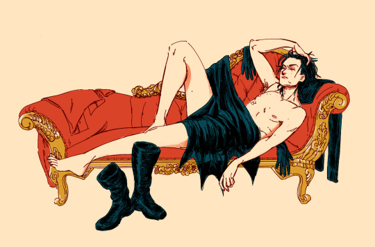
it was a rough patrol
(i've been reading the manga veil by kotteri recently and it's very sweet and absolutely gorgeous, so i guess you could call this a tentative style study)
ref
#tim drake#sart#dc#red robin had a time of it#am i proposing that tim strips and then collapses on a rococo chaise lounge after patrol? maybe#i dont usually do thin linework so this was interesting#this was a break from another long wip that i got too invested in loool#there's also probs gonna be a more self-indulgent alt of this but idk when i'll get to it
2K notes
·
View notes
Note
Can we mention and call attention to how their website looks now? They don't seem to check the final work at all. Some items like Gummy Eye, Shell Pot, and Inchsect are larger than the rest of the items, which makes them stick out of the line, which is just ugly.
Also now the images for forest and grassland locations have just a huge weight, which makes the foraging page take an unreasonable amount of time to load. Guys, I just want to make a couple clicks and go about my business again, why should I have to wait for the site to load because your images weigh so much?
And continuing with the artist thing. Items are drawn in different styles and it seems like the current owners don't think about how things end up looking at all. And I just don't understand why? I thought the new owners were more interested in the quality of the species, but it looks like I was wrong.
This all goes to show that the moderation doesn't seem to check at all how certain pages are displayed and working.
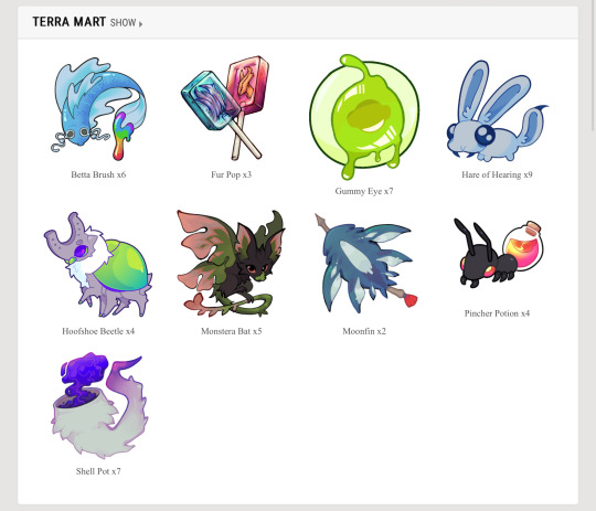
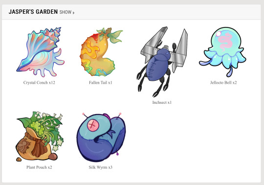
the item sizes thing i remember being way more egregious than this (or maybe it has to do with the fact im on mobile), but the funny thing about lorekeeper is that the size of items and awards and stuff is determined by the size of the image. im pretty sure you have to edit the css if you want the site to automatically resize the images.
the heavy images issue is also something ive noticed, they NEED to compress the images for the foraging locations because if it loads like shit now, imagine what itll be like when they all have insanely large image files to boot up when people just wanna do 3 clicks. its incredibly easy to compress images, you can do it right from your browser and usually theres no way to even tell the difference between a compressed image and a non-compressed (at least when its been resized like the foraging locations are). the same issue comes up with the items, inventories take forever to load now and i think the problem is because EVERY NEW ITEM IS ON A 1000x1000 CANVAS. for reference, lorekeeper recommends 100x100 for items. you do NOT need a canvas that big, and it shows they dont really know how to make items.
listen, i dont mean to hate on terra artists or whatever, just gonna point out examples
the problem with using such a big canvas for items is that you create a lot of tiny details that arent needed for an item icon. think of items in video games, you want to make something visually appealing and recognizable with as little detail as possible. the pincher potion, gummy eye, and silk wyrm are good examples of this, limited palettes, strong linework, and enough contrast/strong silhouette to be recognized from far away. i think the fur pop, shell pot, and moonfin are examples of how not to do items. the fur pop is too overly rendered, and the linework is very thin and small within the actual lollipop. the moonfin and shell pot both have small details (ie. the tassel on the moonfin’s arrow + the bits of fur on the shell pot) and the rendering issue from before. reminder that these are eventually going to be used as emojis on the discord, theyll be incredibly hard to read at such a small size plus incredibly unrecognizable to users familiar with the old items. in addition, the shell pot lacks direction in design, it reads more as an item that would grant a tail trait or a mist trait, not shell/exoskeleton. fallen tail, monstera bat, and horseshoe beetle also have these issues, but theyre similar enough to the old items that people will probably still recognize them.
like, look at these iconic items. they are so popular because theyre simple and recognizable from a distance, you can make them as big or as small as you want, you can see it from 10 feet away and still know what it is. THATS good item design.
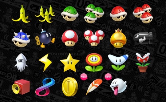
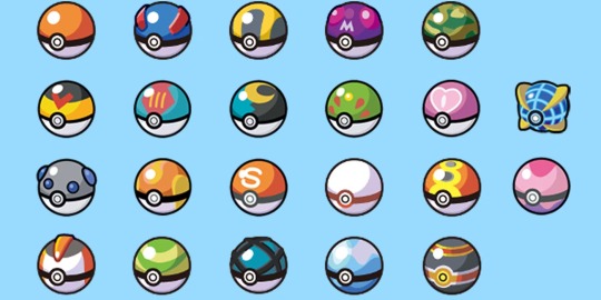
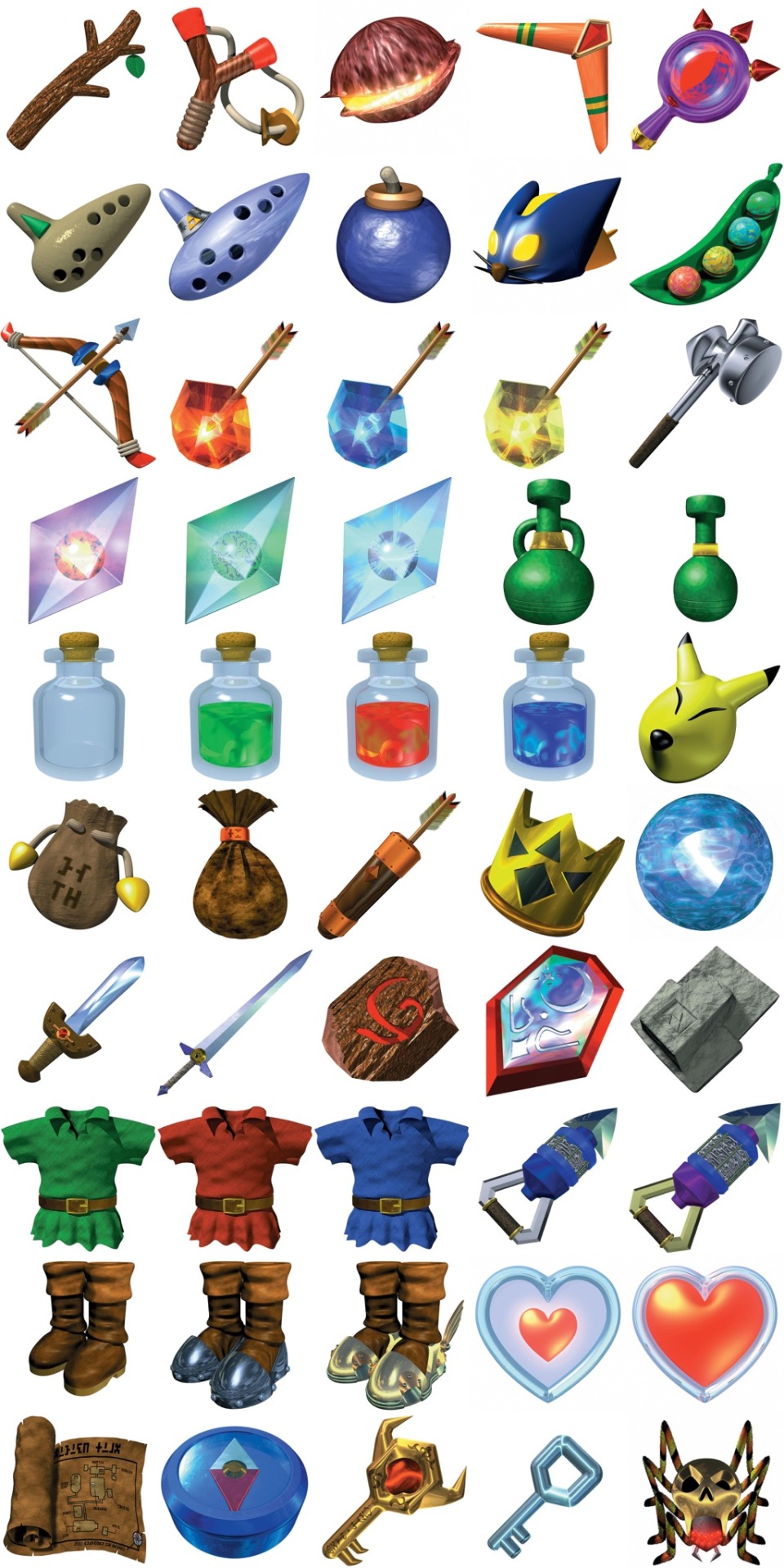
i think this goes back to “mods hiring their friends,” you just pick people on a personal bias and dont consider the level of skill in making specific items because item design is not the same as making fully finished rendered art. it takes a different eye and you need to think of different principles than you would when making a full piece.
and heres the thing, that doesnt even necessarily mean the art is bad. the fur pop for example, has a very distinct and eye catching style; however, the issue is that theres no uniformity WHATSOEVER. these dont look like theyre all part of the same world, if all the items were done in the same gritty rendered style of the fur pop i would say its a great set, its the fact that you have some items that are incredibly simple, some that are “gritty,” and some that are just silly.
if nothing else, at the very least PLEASE make your canvas smaller and compress your images, youre making the site painful to use (and thats especially an issue when your site has so little functionality anyways)
6 notes
·
View notes
Note
saw you were looking for crit on your arcana oc and thought i’d weigh in as someone who also struggled with recreating the arcana style. the first thing that stuck out to me as being different from the arcana style was the brushes you used, your lineweight and the shading.
the arcana game uses a pretty distinct brush set which was once available by a user called like savenkey or something?? you might be able to find the brush set just by looking around online but it definitely comes in handy when getting that slightly textured & tapered linework. as it currently stands, your lines are quite thin, made of a pretty smooth brush, can be a teensy bit wobbly in some places and dont have any tapering towards the ends. to make this close to the arcana style i’d recommend upping the thickness a little bit (if you’re struggling with space between pixels just bump up the canvas size a bit) and increasing the amount of stabilisation. the tapering could potentially be done by hand (ie erasing the ends of lines to make them thinner) but it’s super time consuming so i’d recommend just using the arcana lineart brush (on a side note, if you don’t manage to find the set but are still interested i could try work out how to send them over?). another thing to note when drawing lineart is that the arcana game uses a lot of sharp edges, especially around the elbows, jawlines and fabric folds, don’t be afraid to thicken those approaching edges up, just to create a spike where the two lines intersect
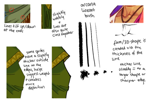
as for the shading, the whole brush thing also comes into play as the arcana style shading brush has a bit of roughness and is on a slight angle, that’s what creates these areas on the in-game sprites. i can also see you’ve begun to alternate between hard and soft shaded edges but i think a few harder, more definitive edges would help it look closer to in-game art. the arcana shading is also all done in a pale lavender colour on a multiply layer. it looks like you’ve done it on the face but it’s also the case for the rest of the body and clothes too & really helps make that distinctive arcana vibe. it can definitely be difficult shading curly hair and i also struggle with it, but curly haired ingame characters (especially those with shorter hair) do still have big blocks of highlights, doing one big swathe across the side of the skull would better mimic the style, with additional smaller highlights (sometimes less is more) to denote extra curls
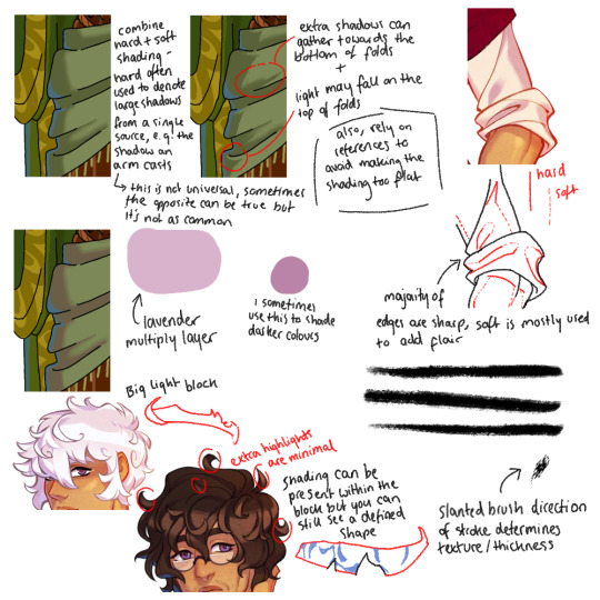
and then a few extra details that might come in handy:
- the arcana game uses a textured overlay over their characters’ images, i don’t know if this is the exact one they use but it definitely works! slap it over your character as a clipping mask with the overlay layer filter (you might need to lighten or darken the grey to ensure it doesn’t mess with your characters colours too much) and then just drop the opacity to wherever you think looks best
- (as far as i’m aware) all arcana characters have fingernails drawn on, adding some to your character (whether they’re painted or not) might be a nice touch
- no matter how small or thin, generally all smaller details like tassels/string ties/jewellery or other metal details are all given lineart and coloured, the details are such a pain in the arse to draw but it definitely makes the final look worth it imo
- i’m not 100% sure how you’ve drawn on the blue details but in-game, they’re usually drawn using a screen layer with slightly lowered opacity over both the colour and lineart, and some of the edges are slightly shaded out

however, as far as art style mimicry goes i can’t recommend bast_art13’s tutorials enough, i’m not entirely sure if they’re still active in the community either (i was mainly active in 2020 and have only just started crawling back in💀) but their tutorials are still up on tumblr i think (somewhere). they really break down how the arcana artists draw faces/facial features and explain recurring stylistic choices, for example, how metal is shaded
anyway! that was a lot and i do want to say that you’ve made a really brilliant effort, the style is really difficult to emulate and the way you’ve drawn your oc is really nice!! you did so well, especially when seeing the improvement between this one and your previous drawing. and ofc it’s needless to say i’m a stranger on the internet, take what i say with a pinch of salt or just completely ignore the bits you think are stupid if you want ! it’s a perfectly acceptable response to unwanted pieces of criticism :]
while i’m here i also want to say that i’m obsessed with ur valdemar fanart + you’re doing the lords work with the amount of content you make for them. with that aside, good luck on your future drawings in the arcana style!! i’m sure you’ll do great & apologies if my handwriting was unreadable! also if you have any further questions feel free to ask :3
ohhhhh thank you! this is all very helpful and I'm grateful you took the time out of your day to share with me what you've learned, I'll definitely be taking this to heart for my future efforts
#this response seems so short compared to what you wrote RAHHHHH i dont mean for it to be i just dont have much to add#just picture me nodding and 🤔ing and such intently as i read this#asks#sco07ut#arcana spam#apprentice finn#helpful
11 notes
·
View notes