#i don't have a poster sized printer.
Explore tagged Tumblr posts
Text
Ive been saving the character introduction sheets for all my favs. I kinda wanna like. Blow them up poster size and print them out. I should look into that.
#i don't have a poster sized printer.#but i could maybe do a staples type deal.#or just print out a bunch of A4 paper and glue it together but that'd look like shit lmao
0 notes
Note
Hello! I was wondering what company you use for your sticker sheets? I bough one from your Ko-Fi shop and really like the quality, and the pricing you were able to sell at is waaaaaay more reasonable compared to any of the companies I've seen and used myself. Is it a POD company, or a mass purchase of them to sell on your own?
Thank you for your time if you're able to respond!
I'm really glad you like the quality, because I actually make them by hand at home! (Please forgive the lighting, my bedroom is my office lmao.)
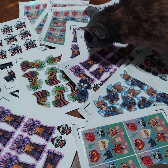
I don't use a company (and Idk what a POD company is sorry!) but making them at home gives a lot more freedom of stock, just be wary it can be very time consuming depending on how many you need to make.
I've had other people ask before, so here's a rundown of how I make my stickers at home: At most you'll need:
Printer
Sticker paper (this is the type that I use)
Laminator and lamination paper (the lamination paper that I use.) You can also use adhesive non-heat lamination paper if you don't have a laminator, gives you the same result, just be careful of bubbles. You will get double your worth out of a pack because we are splitting the pouches to cover two sticker sheets.
Your choice of a sticker cutting machine or just using scissors.
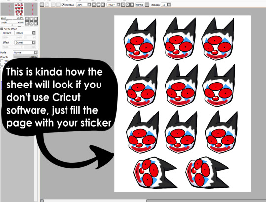
First, I use Cricut's software to print out the sticker sheet with the guidelines around the corners so the machine can read it. If you do NOT have a Cricut machine, open up your art program, make a canvas of 2550x3300 and fill it up with your sticker design with some cutting space between them. This the 8.5x11 size for the sticker page.
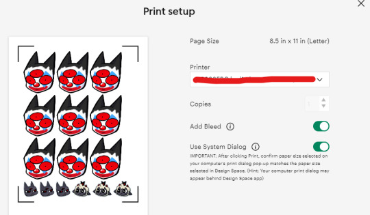
I usually have bleed selected so the cut comes out cleaner. Tip for non-Cricut users below: Increase the border around your sticker design to fake the 'bleed' effect for a cleaner cut.
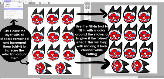
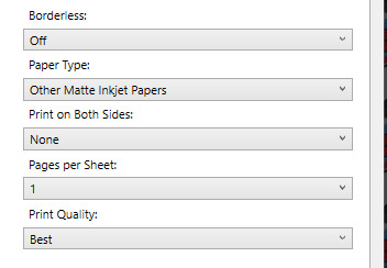
These are the print settings I use for my printer. I use the 'use system dialogue' to make sure I can adjust the settings otherwise it prints out low quality by default. Make sure if you're using the above paper that you have 'matte' selected, and 'best quality' selected, these aren't usually selected by default.
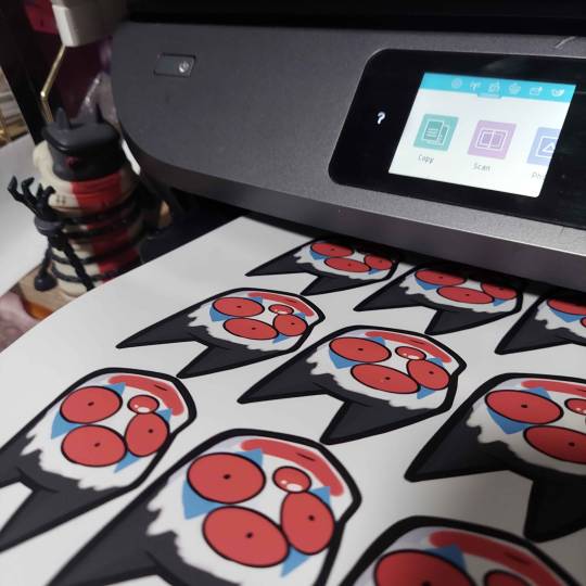
So you have your sticker sheet printed! Next is the lamination part. I use a hot laminator that was gifted to me, but there is no-heat types of lamination you can peel and stick on yourself if that's not an option.
(This is for protection and makes the colors pop, but if you prefer your stickers matte, you can skip to the cutting process.)
Important for Cricut users or those planning to get a Cricut: You're going to cut the lamination page to cover the stickers while also not covering the guidelines in the corners. First, take your lamination page and lay it over the sheet, take marker/pen and mark were the edges of your stickers are, and cut off the excess:
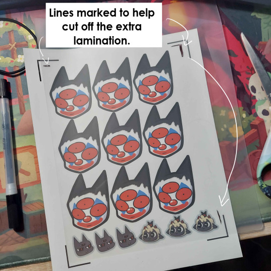
(I save the scrap to use for smaller stickers or bonuses later on)
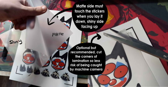
After you've cut out your lamination rectangle, separate the two layers and lay one down on your sticker sheet over your stickers with matte side down, shiny side up. (Save the other sheet for another sticker page)
The gloss of the lamination will prevent the machine from reading the guidelines, so be careful not to lay it over them. It also helps to cut the corners afterwards to prevent accidentally interfering with the guidelines.
Now put that bad boy in the laminator! (Or self seal if you are using non-heat adhesive lamination)
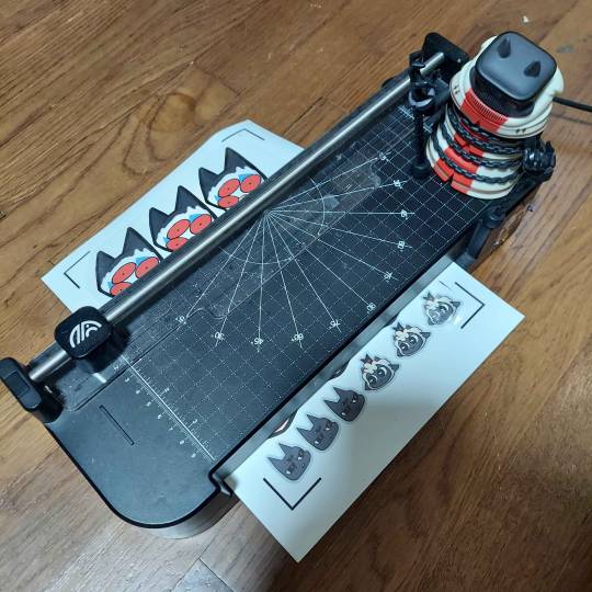
Congrats! You now have a laminated page full of stickers.
For non-cricut/folks cutting them out by hand: this is the part where you start going ham on the page with scisscors. Have fun~
Cutting machine: I put the page on a cutting mat and keep it aligned in the corner, and feed it into the machine. For laminated pages I go between 'cardstock' and 'poster board' so that it cuts all the way through without any issues, but for non-laminated pages or thinner pages, I stick for 'vinyl' and 'light card stock'. Kinda test around.
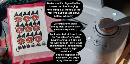
Now I smash that go button:

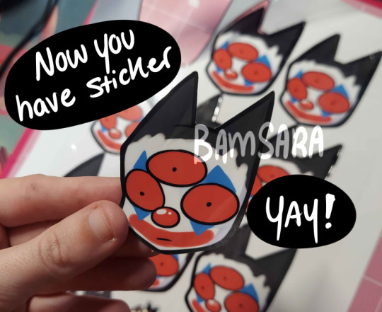
You have a sticker now!
The pros of making stickers at home is that you save some cost, and you have more control of your stock and how soon you can make new designs. (I can't really afford to factory produce my stickers anyway)
However, this can be a very time consuming, tedious process especially if you have to make a lot of them. There is also a LOT chance for some errors (misprints, miscuts, lamination bubbles, ect) that will leave you with B-grade or otherwise not-so-perfect or damaged stickers. (Little note, if you have page mess up in printing and can't be fed into the cricut machine, you can still laminate it and cut it out by hand too.)
I have to do a lot of sticker cutting by hand, so if you don't have a cricut don't stress too much about it. I have an entire drawer filled to the top of miscuts/misprints. I keep them because I don't want to be wasteful, so maybe one day they'll find another home. Sucks for my hand though.
But yeah! This is how I make my stickers at home! Hope this is helpful to anyone curious
1K notes
·
View notes
Note
How are the prints of your art so freaking beautiful? I have three of your 24x36 prints and they're the best looking pieces in my whole collection and I wish I could get my art (digital) to look half as good in a large print but I just can't figure it out. Is there some special trick to it or just your own brand of magic? Love you and your work <33
Oh thank you! I do have some tips!
If you're looking to get crispness at scale, I think the most important factor is the size of your art. I work on big canvases, at least 8000px on the shortest side. This requires your computer to be haunted by a powerful ghost, but painting at that scale results in a finished file that you can print at large sizes (posters, wall tapestries, etc) and it'll look fantastic. As a rule of thumb, figure out the largest dimensions you want to print at before you start painting, and set up your canvas to that size at 300dpi.
Select paper stock with your artwork in mind — matte and semi-matte papers are much preferred for darker art like mine. And possibly for all art, all the time. Brightly colored art can work on glossy paper but idk, I don't like glossy prints in general. Too shiny? I feel like a bird would come grab it out of my hand? on reflection this may be a personal problem
If you're making prints at home, look suspiciously at your printer while it prints. Keep it self-conscious, keep it on its A-game. Don't let it pull one over on you.
I hope that's helpful somehow! There's a ton of other stuff but I'm already rambling. A lot of it is still mysterious to me also, don't be discouraged if it takes some trial and error!
#jentalk#long post#art tips#print prepping went from something i totally dread to something i actually enjoy#and it only took tears
2K notes
·
View notes
Text
Quilt Portrait Process
This may be of no interest to most of you, but with all the comments I got on my Impala portraits, I thought this would be of interest to some of you.
Original Photo
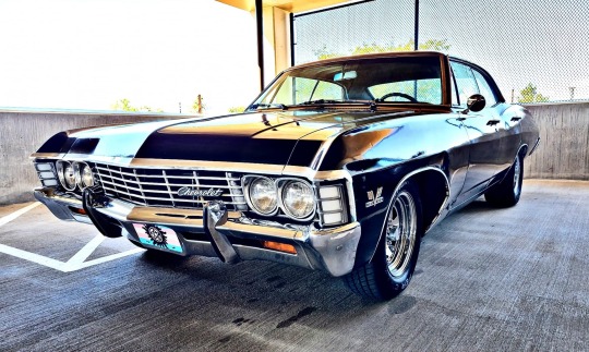
This is the original photo I used--it's of a fan car ("Night Moves") that was at Denver con 2022. What a great photo!
Posterize
In Photoshop, I posterize the photo to get chunkier blocks of color. I just play with the number of levels until I get a good representation.
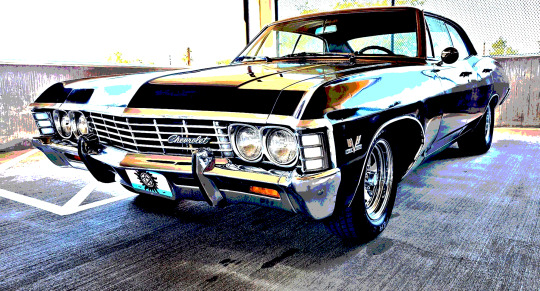
Draw Lines
I place the posterized image in Illustrator (reversed) and then go to town drawing lines. The rule for pieced quilting is that every line you draw must go all the way until it hits another line. So for the first couple of lines, they go all the way from one end of the photo to the other.
I just keep drawing until I get something like this.
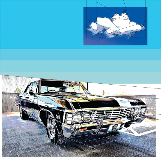
Paint the Pieces with Color
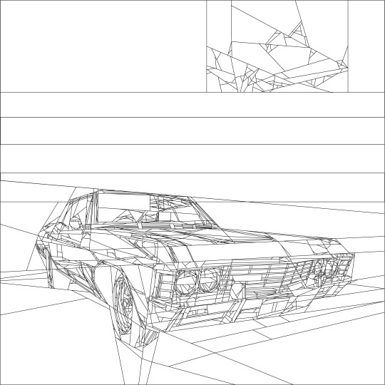
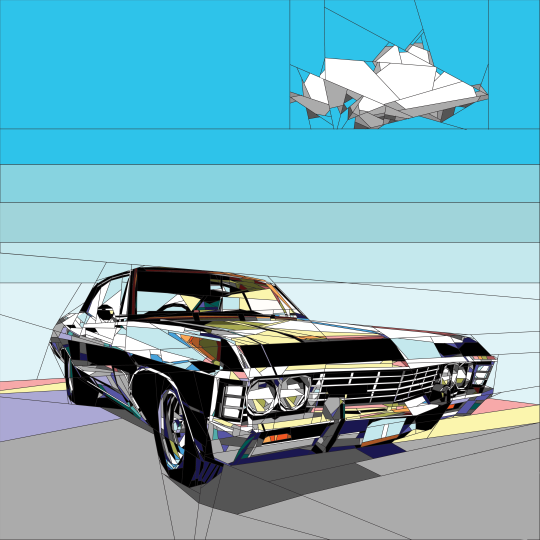
I bring the outlines into Photoshop so I can paint each individual piece with a solid color that will match the (future) fabric. Sometimes posterizing can result in dark colors, so you have some creative liberty to make changes. Note that these are still just screen colors; the actual fabric will differ again.
Outlines:
Colored:
Number the Sewing Order
Paper piecing means that you sew through the paper and fabric. That way, you can be sure to place your seam perfectly.
Generally, in quilting, you want to sew a seam from one end to the other without running into any already sewn seams. For a traditional patchwork, this means you would sew 10 blocks, then sew a row of 5 blocks, and then sew another row of 5 blocks onto the first row.
Paper piecing is the same, but because no "block" is repeated, it's an exercise to determine the sewing order of each block, and then the sewing order of the blocks to each other.
A quilt like the Impala has a few hundred blocks of 1-15 pieces of fabric each. Within each block, the sewn size is near perfect. But sewing the blocks to each other introduces a lot of variability: the seams can be wider or narrower, or the alignment can be off. That's why the actual quilt looks "wonky" compared to the pattern. It's just not possible--for me--to get it perfect. If I didn't work so small, it would be easier.
Back in Illustrator:
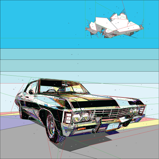
You can see that the black lines are pieces within a block. The red lines are blocks. And the green lines are sections of blocks. It all needs to be sewn in order. I will make small changes to the sewing lines at this stage to "make it sewable."
Printing
Because printers aren't the best at replicating onscreen colors exactly (good luck telling the difference between black and dark purple), I have to recolor it to "printable" colors and then do a swatch concordance.
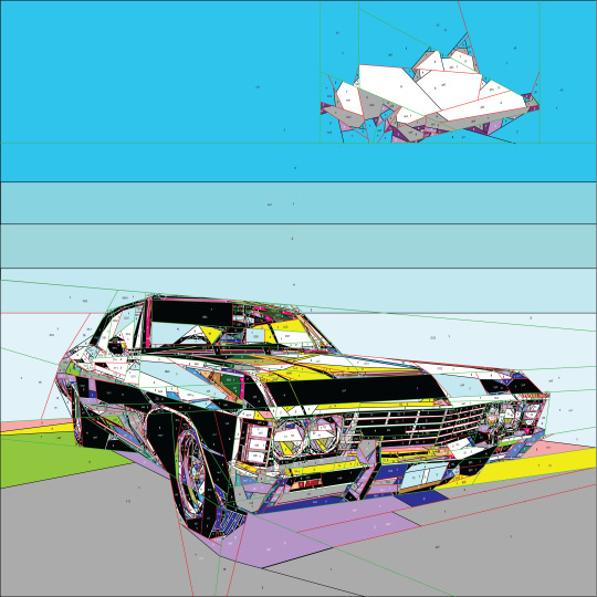
The bright green on the left actually represents lavender.
I print the pattern out on vellum, which is more durable than paper. Since this is 17" x 17", I will print out overlapping 8 1/2" x 11" sheets. Illustrator has a good printing function, so you can print the exact area you want.
Pick Fabric
I have collected a ridiculous amount of fabric. These want solids for the most part. Sometimes it's a challenge getting 5 shades of blue, or 6 beiges for their faces, so sometimes, I make color errors that I don't discover until later. Painful mistake. The above pattern uses 25 colors, but some of the faces use around 40.
Sew
This is a really challenging project. It would be easier if it were bigger! The pieces are so small, and when you start sewing blocks together, the layers get to be ridiculously thick with all the seam allowances. It's a true challenge to feed through the machine. Use a small stitch length; use a good machine with dual feed (Bernina!!! or maybe Pfaff).
Check out the back side of the previous Impala quilt.
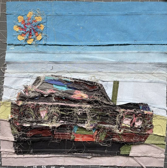
I pull out the paper as I go, otherwise it will get accidentally sewn in.
Finishing
I don't do complicated quilting here. The piecing is what's on show! I embroidered the Chevrolet and the license plate lettering. Some things are really too small to piece.
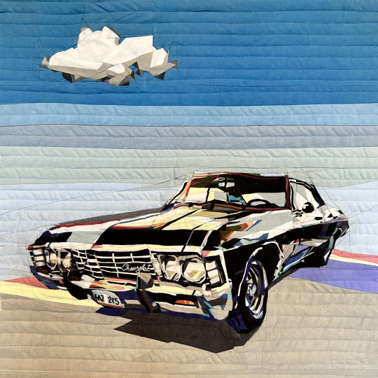
Original Photo Again:

Conclusion
I think anyone could do this, in theory. It takes a lot of patience. And your sewing machine needs to be quality. And it helps to know how to use Photoshop and Illustrator. And you need to "get it" when numbering the pattern, in a mathematical way. And it's helpful owning all the fabric.
If you do try it, make a larger quilt; this size with this level of detail is crazy making.
Check out all my supernatural quilts on Instagram! https://www.instagram.com/catnipster69/
142 notes
·
View notes
Text
Once upon a time, as a wee child, I dreamed of writing a book and getting it published, of seeing it on shelves and hearing of people's reactions and excitement for what I wrote.
One fanfiction in particular is near and dear to my heart, so when I got it into my head to bind one of my own fics, there was really only one clear choice: Green Sarabhas.
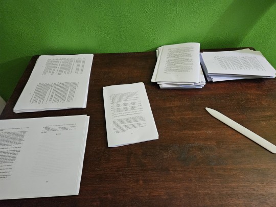
The first big decision was whether I'd do the series in four volumes or in one. Because I was making two copies, I opted for one volume because I really didn't want to make 8. 😅 The typesetting was a pain in the neck and the table of contents is four pages long, but we survived.
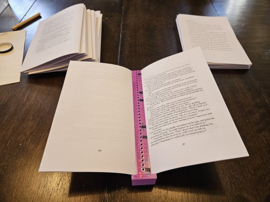
Shout out to @purplephloxpress for hosting me for a weekend and spending about twelve hours at their dining room table with me, lending me tools I didn't have and helping me troubleshoot such a large undertaking. 🥰 I still need to get one of these punching tools.
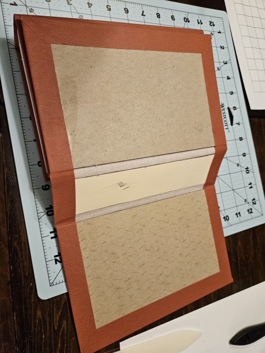
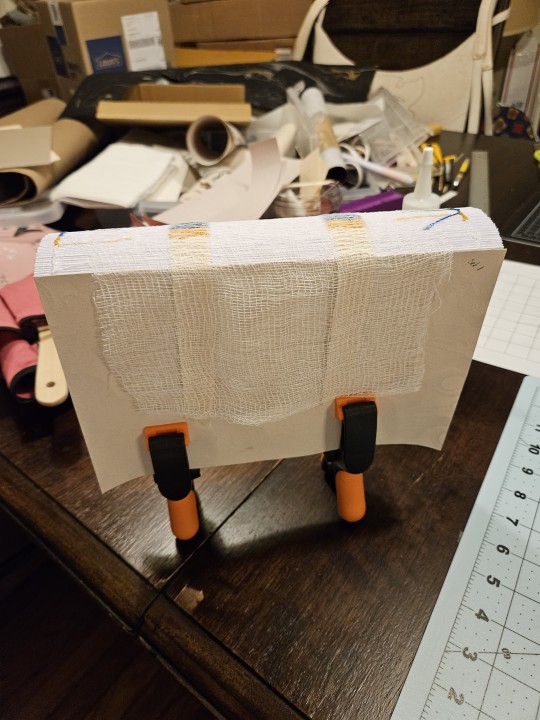
This is the first bind where I used book cloth, and it was a dream. I don't know if you can tell in the picture, but the book is sewn with four different colors of thread, one for each section of the fic. I contemplated doing four different colors in the end band too, but that was a step too far for me for this one. 😅
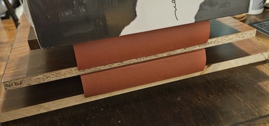
squiiiiiiiiiiish
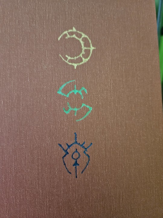
I bought my own foil quill after playing with phlox's, so I did Claude, Sylvain, and Felix's Crests on the cover.
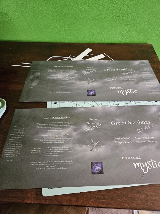
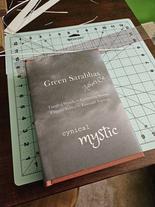
Now, here's the part I'm arguably most proud of and that made me cry for many different reasons: the dust jacket. I designed it in Canva, complete with end flap summaries and comments from the fics on the back, and printed it on poster board. I had to set my printer and computer to print a custom size paper and print on the non-glossy side of the poster board, but after much trial and error we got there. And when I say I cried, I am not kidding.
This fic was a labor of love, this bind is a piece of my soul, and I gave half of it to @astaraxion because we became friends due to this fic, so be sure to take care of it. 😉 I look forward to losing it together over the revisions and art that I did!
#bookbinding#fanbinding#green sarabhas#intrepid mystic bindery#mystic binds#claudesylvix#fe3h fanfiction
89 notes
·
View notes
Text
Random Kunikida Thought
What if before he was under the influence of All Men Are Equal anything Kunikida wrote appeared in real life.
So if he wrote something on a large piece of paper then he could summon large objects or if the size was unspecified, (like a ball can be any size) it would be the dimensions of the paper or surface he wrote on, say like a chalkboard.
Imagine baby Kuni learning how to write and stuff just keeps materialising out of nowhere and using his ability so much is draining him alot. It took him longer than average to learn to write because of this.
His parents were panicking TM. Kunikida was put in homeschool after an incident where he materialised a bird and it started attacking the teacher who had struck it with a broom and ended up killing it, and this freaked his classmates out.
From then on he always had to be very careful about the kanji he used and not to materialise a cat instead of a bat. (I don't know Japanese so I don't know which words can be easily confused with each other)
Then they figured out that if he misspelt something it wouldn't materialise so he was just having to misspell something by one letter or leave out characters if he couldn't risk changing the spelling.
Then as he got older he got a computer and it was the best day of life because he could now type out all his notes and join regular school.
That's why he became a maths teacher because he could write equations and numbers anywhere and they wouldn't materialise anything.
(Imagine during this time he has a fricking google doc of his ideals, in Times New Roman, 12 point font)
When he needed to leave notes about Homework or Upcoming tests he'd print out a paper with the words and tape it to the door, or he'd type the words and project them onto the chalk board with the projector.
But you know how teachers always have those big posters. You can't just type them out because there aren't many printers big enough for that size paper. One time Kunikida was making one of those about squaring and cubing things and several cubes the size of the giant poster paper appeared and he couldn't get them out of the door because they were just barely too wide too fit through the door so he was stuck using an ax from the janitor's closet to cut them up.
And by this time Kunikida was PISSED at his ability so he was taking it OUT on these blocks and decimating them! The kids who were serving lunchtime detention in his class (for not tucking in their shirts) were really scared. The principal walked in to see what the noise was about and then fired him.
Fukuzawa heard about this and scooped him up into the ADA.
#bungou stray dogs#bungo stray dogs#bsd#bsd kunikida doppo#bsd kunikida#doppo kunikida#kunikida doppo#the matchless poet#all men are equal
37 notes
·
View notes
Text
So I've been unhappy about the lack of physical media these days (and, unrelated to Good Omens, mightily pissed off at streaming services), which made me decide if I want to have my favourite shows on my shelf, I will do it myself if I have to. And since Amazon still doesn't look like it plans to sell me a nice DVD or Bluray set for season two, I went and did it my bloody self. I own a DVD writer and a printer and nobody can stop me.
Had lots of fun playing around designing sleeves, labels and on-screen menus. Behold my beautiful creations!
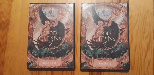
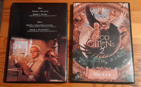
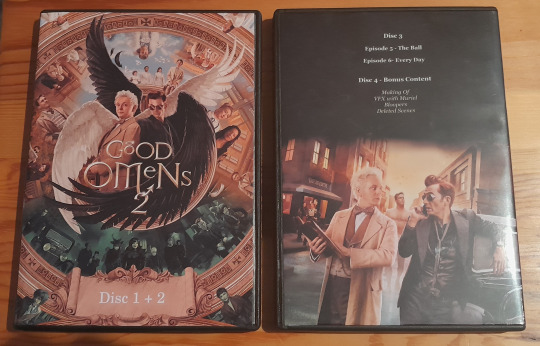
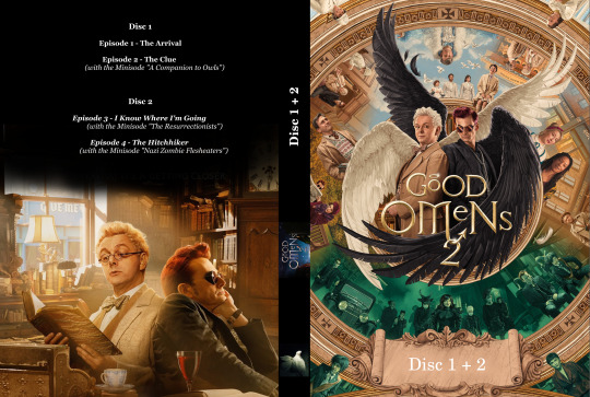

I used some of the very cool official posters for the covers. I loved the one that became my front cover; there's so much to see on it. (Also has this super handy scroll bit at the bottom where one only had to remove some Amazon logos to have space for labeling!)
Splurged on a couple of sheets of glossy photo paper to print the sleeves on. You wouldn't believe how much of a difference good paper makes for printout quality. The photos don't do them justice. The black is really black, the colours have great depth. I sat here giggling gleefully when these came out of the printer.
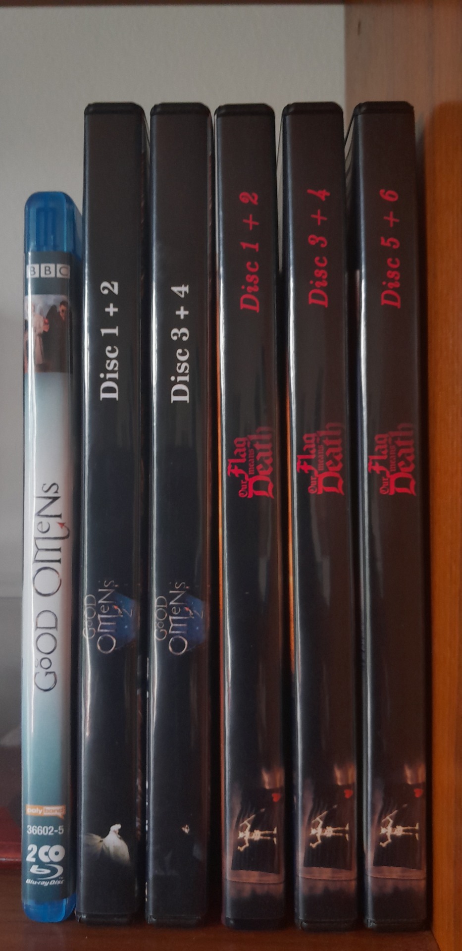
Here's the spines, sitting next to my season one Bluray (which I was happy to buy, hey Amazon please sell me stuff, you love selling things, I will buy things if you sell me things!) and my other self-made fave-show-on-shelf-putting-project.
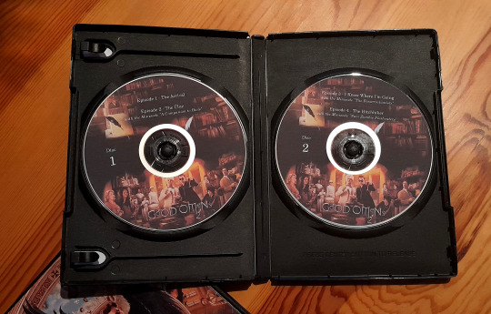
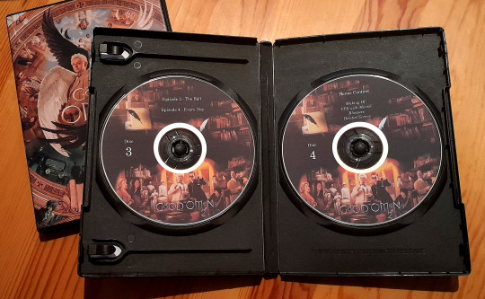
If I do something, I do it properly. Disc labels with pictures on them!
Designing them was a blast; printing them was a fucking nightmare. I had a few pages of premade disc labels (sticker paper with perforated circles of the right sizes, so no cutting, yay). Already printing the sleeves took a good amount of test prints and template tweaking; I don't know why printing exactly to scale is still so difficult in 2024. I think Crowley was involved in designing printers. The things are definitely haunted. Printing a rectangle to scale? Difficult, but okay. Printing two circles to scale, in the exact correct position? Oh god I cursed so much. But look at them, aren't they beautiful? Definitely worth all the sweat and tears.


Menu screens! (Had a video of the first disc menu, mostly to show that it plays the Good Omens theme, but Tumblr hated it. Please imagine that all discs have this menu and that you can hear the theme playing while on the menu, thanks.)
DVDs fit 120 minutes of video, and I was super chuffed that I could get two episodes squeezed on one disc. So I have three discs with episodes, and an additional one with bonus stuff. Deleted scenes and VFX breakdowns with Muriel and Making Ofs. You know, the kind of things that are fun and cool about a box set for a show you like. Which I now have on my shelf. You gotta do everything yourself these days.
25 notes
·
View notes
Note
Can someone pleeeeease let artists know that it's so incredibly frustrating when I buy prints and they're in weird sizes?
It hard to find frames for them.
I've got prints that are 15cm x 21cm (6"x8.2"). Juuuust oversized where I need to get a frame up with a matte.
But then I've got another poster that's 19.6cm x 28cm (7.8"x11"). Like, I can get a frame that fits, of course because it's undersized A4. But damnit it's got an ugly gap which doesn't feel right.
Please please please! I bought these things to be on display but my walls are bare because I need to spend several hours to find a solution and fit them right.
Please just stick to the international A4 A3 A2 format, or the photo size formats 6"x8", 8"x10" etc.
I want to support people, but I'm left with buyers regret when I need to problem solve purchases and don't want to "just tack it to the wall, it'll be fine".
Kiriska: This is an understandable frustration!
I've had plenty of customers ask me what sizes prints are prior to purchasing -- a totally fair thing to do if you know you want to frame it. Size has been a deal-breaker for some people.
That said, for perspective, it's often more affordable for artists to print at other sizes. For example, in the US, letter (8.5"x11") and tabloid (11"x17") are both extremely common print sizes in Artist Alley, but while frames of these sizes exist, they aren't common.
Artists still prefer these sizes though because these are sizes that are easy to print at at office supply stores or personal printers, which is what many have access to when starting out. If anything, the infuriating thing is that standard printer paper sizes are not the same as standard photo sizes.
8"x10" is close to 8.5"x11" but requires trimming, which is either extra work or extra cost.
Depending on the convention, the demographics may skew younger. If that's the case, a majority of attendees won't intend to frame their print purchases. They are being pinned or taped to dorm room walls, etc. The art is meant to be affordable -- for both the artist and the buyer. ($10 prints are pretty rare at most pop-up art fairs and farmer's market-type settings, because standard size giclee prints probably cost double that to print.)
Still, I agree -- artists should strive for more standard sizes when possible, especially if they're going to shows with an older demographic of people who are more likely to want to frame things.
That said, I've been wanting to transition my 8.5"x11" prints to 8"x10" for years and still haven't gotten around to it because all of my packaging supplies are for the former, and putting prints of the latter size in oversized packaging looks Bad, but stock levels of packaging and prints never line up that I'm not gonna be stuck with some mismatch... at some point I'm sure I'm just gonna have some prints in one size and some in the other, but that sounds like a nightmare...
46 notes
·
View notes
Text
Slap this on every beginner art class

*In general- Some specific software may have reasons to use specific DPI in a pixel canvas, such as text clarity or brush size. But if you know that, you know this. Some tutorials I've been seeing and TikToks popped up on my feed have been confusing for people setting up their DPI settings and canvas settings and I was asked about this. When you set up a canvas and print something the dots per inch (the DPI!) will determine the amount of pixels your canvas has and the clarity your print has. Each printer has a max, inkjet printers may range from (what your software will call) 300 to 720 DPI. Setting your canvas to 600DPI if your printer is 300 max will not better your print. ((for the purpose of simple settings- Getting into line tones and half tones and how printers have like 9kDPI and can have different DPI in the print head axis direction is unimportant to the beginner artist-printer)) An 8.5x11 inch canvas with 600DPI is 5100x6600 pixels This will look good printed on 8.5x11 paper, perhaps even upscaled at small poster size if its very successful! A canvas set to 612x792 pixels at 72DPI is also an 8.5x11 size paper, but it will end up pixelated. If you bump the DPI to 300 but leave the canvas at 612x792 pixels, It will still be unclear. Its only clear at 2x2.5 inches when printed! (Also note that your monitor has its own PPI (pixels per inch!) and if its low, when you zoom out on any screen your art may look pixelated.) So what's the solution? That depends on what you're doing with your art! If you're printing, learn your frame sizes, paper sizes and conversions. Maybe you're only planning for a mini-print, but what if its really good? Will you want to be able to print it as a poster later? 300 DPI at the end product size may not be enough to print it bigger later. I would recommend setting up your canvases in the measurement unit of your paper at 300/600/1200 DPI as your machine is capable of. If your doing digital and have no intentions of printing it depends- If you are having trouble with not reaching the clarity you want and still want to use pixel canvases, you can use a ratio calculator to figure out how much to increase your pixel canvas if you want to keep your canvas height to width aspect ratio. And of course! You don't have to listen yo me at all if your don't want to, If you're satisfied- its not a problem.
18 notes
·
View notes
Text
Going on yet another rant about “merch”
If you did not screen print that shirt yourself, you did not make it.
You made the design on it, which I’m sure would be a nice poster or sticker perhaps? Which of course you didn't print yourself, that sounds hard! An embroidered design? Maintaining a 12 needle embroidery machine capable of producing a design with that many colors for the number of orders being received is a lot of work, that's pretty impressive! Not to mention maintaining proper tension on the frame working with a hundred stretchy t shirts, which idk came from somewhere who knows! Your repeating pattern looks very nice on a skirt that you did not make and was mass produced by some Vietnamese person getting paid pennies so that ~50 gay people on the internet could pay for international shipping for a design you “made”. Wow that mug is awesome didn’t know you got into sublimation printing! And have a cylindrical heat press to be able to do not just mugs, but tumblers too! Woah your sublimation set up can do bed sheets (any size)? And shower curtains? And three different shapes of throw pillow stuffed with poly fill, which will never decompose and isn't comfortable to begin with?
Your poorly digitized vector art looks lovely as an enamel pin now that someone else (Who? More like who cares!) cleaned it up for you and then created moulds for and maybe even hand injected the enamel into only for you to sell maybe seven or eight of them. Aw damn your design got ripped off? Who could have guessed that with the distribution power of an entire manufacturing plafffnt that has hundreds, if not thousands of moulds sitting around that they might have used your mould to make themselves a profit for a change! Those money grubbing Chinese bastards! After all, you were there every step of the way, casting the negative of the mould, running the injection of liquid metal into that mould, mixing each color of enamel, and precisely filling each segment of the design, which you refused to simplify! You just can't compromise with art.
Ohhh I see they’re made to order so its more sustainable. So this factory (Guatemala? India? The Philippines? Pakistan? Could you point to it on a map? They just don't teach you this stuff in school!) Anyways this factory in some poor country has to keep your design on file, oh and for your enamel pins they have to keep the mould too! Ahh right but it’s sustainable, because it's a limited run. You’re the 100th person this week to place an order, and they're only printing 50 of your design, you should complain to the manufacturer about how slow your orders are being filled.
I love supporting small businesses - it’s just you after all! With all the hard work you’ve put into fiddling around in procreate who has time to figure out material acquisition, and production runs, and printer calibration, and inventory management, and machine maintenance, and payment processing, and international shipping, and packaging, and
#eaii#accidentally clicked on someones redbubble and they call it that because i started seeing red#i'm so fucking sick of this shit#look i think its great that people have more avenues to sell their art#but idk i feel like i'm crazy for thinking that should actually involve MAKING the art that they sell#the upfront investment is prohibitive I get it#but then connect with someone#preferably who lives on the same continent as you#to produce it locally#and like. a printer capable of printing nice stickers and posters is not like heavy duty machinery#again#expensive - sure#but i can almost guarantee that someone living in your city has a wide format printer they'd be willing to let you use#i make custom embroidered patches#im in the middle of building my own embroidery machine. obviously you do not have to do this#the machines that i use currently i borrow time on from someone else#'where do you get cute packaging?' i have brown paper envelopes that i decorate with washi tape and stamps which people seem to like#'how do you calculate shipping?' i don't usps does that for me#'what happens if an order gets lost?' it sucks and is inconvenient but i send them another one or refund their choice#'where do you get materials?' scrap fabric almost 100% of the time unless its a very custom order i spend very little on materials#i'm not asking anyone to reinvent payment services or whatever like if you want to use your neighbors printer and then sell those on etsy#great! thats what i do!#(and also fuck etsy - for different reasons)#but if you outsource the actual labor of producing the good that you are selling to easily exploitable people on the other side of the worl#im judging you. hard.
2 notes
·
View notes
Text
Experiments
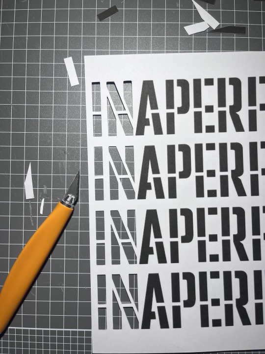
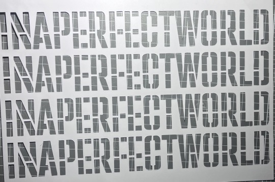
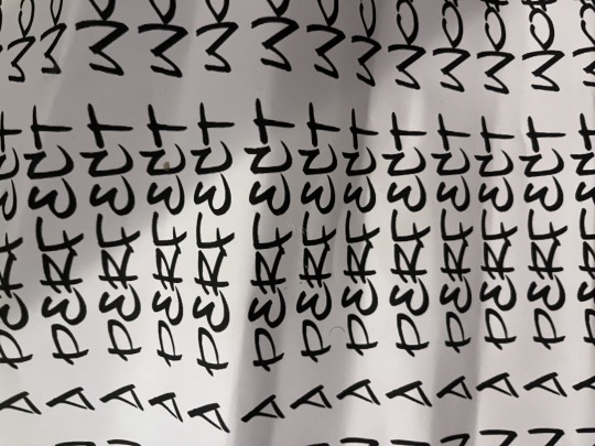
made this stencil in photoshop, just used one of the fonts on PS , i did play around with fonts but found that the spacing, size, and form of the letters didn't fit what theme i was aiming for
in this experiment i actually used different paper, i found that working with normal printer paper was not ideal for cutting stencils as the paper wasn't strong enough to hold the weight between two cuts (like the line in the middle , the thine ones) , when cutting the stencil the paper would often break when cutting smaller stencils or lines, and i could reuse them instead of them being crumpled up and used as a once off which led to works having trouble showcasing bold results from the stencils (i also used the same paper for the joker stencil) , the paper was heavier more like card stock - 210gsm
the cutting of the stencil actually felt like it was the most difficult part, which is what i have noticed when working with stencils, its very time consuming to make sure that i am cutting away not too much and not too little, whilst also ensuring that the figure/words could be easily seen like the curved bits so that the audience can make out the object
The text is actually lyrics from Kendrick Lamars song PRIDE, i felt that the lyrics best represented the theme i was looking or aiming for,
i think for the theme i was trying to head down this poster feel like the ones with big bold letters that feel as if they are attacking you or something
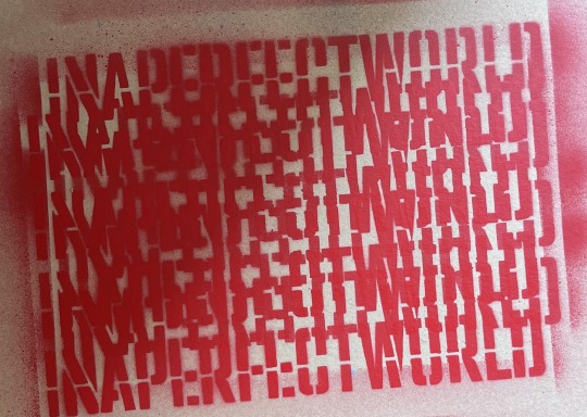
i then made a practice/mock of what colours i wanted the text to be
alongside this i played around with layering to see the effects however from this i found that the words could only be red from the top and the bottom line
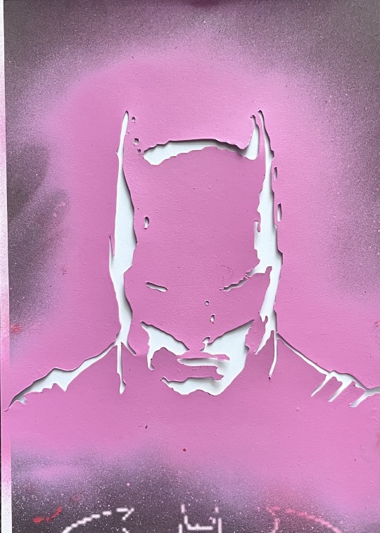
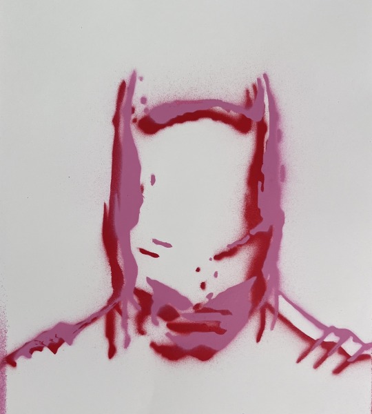
i then made this batman stencil, i think it might've been because i used the joker as a stencil but also i like his posture, it gave this intimidating feel like he's looking down on you or something, like big brother spying on you (1984 George Orwell)
i knew i wanted to layer it with the text as i felt it would work well contrasting against each other
when making the stencils i used this free website that makes stencils, and edited the photo to remove any noticeable things like the bat on his chest to not label it or give the audience that visual relationship
at first i only did the red stencil but then added the pink slightly off from the previous and the results where quite interesting, i actually like the look
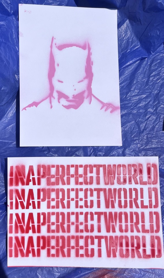
i then created two new mocks to see what works best the image behind the text or the text in front of the image
i decided to use the red and pink because of the previous mock above
i do see that the text stencil did not come off as well as i would've liked especially the "in" "per" and "wor"
after this i then layered the two stencils onto the pages
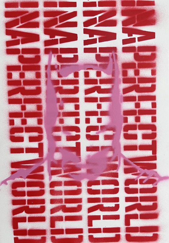
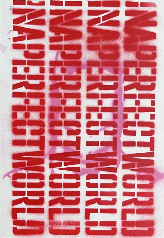
from this i found that the best one was the one that had the image layered on top of the text (left)
the one on the left doesn't hade the face too much where as the on on the right you can hardly make out the character/image however this combined with the text stacked vertically creates this feeling of jail bars, like the one on the right is behind bars and the one on the right is in front i also feel like the one on the left is contrasting better, like its more readable and defined whereas the left is not on the same level
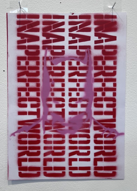
i then installed it vertically like a poster and the results where better than i expected, i mean when looking at it uninstalled it didn't give the same effect as it did installed
too me it comes across as different, maybe because if haven't done something like this, or because it kind of makes me want to investigate this work i don't know if that makes sense
i mean the image of batman still is obscured, like it still doesn't have to definitive, bold lines
i do feel like it is comedic though, like you could read it very literally as in the text read "in a perfect world" and then you see batman, so is it this thing where the work is saying in a perfect world i'd be batman , however maybe it feels this way for me because i know what the image is or if im playing onto that big brother is it either all for big brother or against, i don't know
i fell like it could also be read as this thing that is bringing awareness to something like shedding light onto topics that are hidden ?
Failed Stencil:
0 notes
Text
London's Low Cost A3 Poster Printing I Print A3 on the Same Day in London
Specialist High Quality A3 Poster Printing
Our specialty is producing high-quality prints in small quantities and for individual usage, such as fine art prints and CAD drawings, for a variety of applications. We only print using genuine 8-colour Epson inks and printers which guarantee sharp, vibrant, colour saturated prints every time.
Best Value and Quality on All A3 Printing
Our precisely sized A3 posters are available in matt, satin, or photo gloss finishes, with the option to laminate them. Printing is done at a magnificent resolution of 1440dpi. In addition to providing all of our posters with the highest caliber production and materials, we will match any UK rivals' prices for identical products.
Selecting the Ideal Coating for Your A3 Poster
For your poster, we provide five different paper finish options: matt, satin, picture gloss, plastic paper, and pastable paper.
Matt Premium:
Matt poster paper is ideal for black and white, less detailed, and posters that will be viewed in well-lit environments because it doesn't reflect light. Matt poster paper has the advantage of not showing smudges, so you don't have to worry as much about keeping your poster clean.
Satin Premium:
Matt paper and picture gloss are not as good as satin poster paper. It showcases colours, details and contrasts very well, but doesn’t produce as much glare as photo gloss paper. This kind of paper also makes smudges less noticeable, so you can display this kind of poster without a protective cover.
Gloss Premium:
Photo gloss paper reflects light well, bringing attention to the colors and details on your poster. This is especially helpful when the poster will be viewed in dimly lit areas. It is preferable to cover photo gloss paper with plastic or glass as it tends to show fingerprints and dirt. Gloss paper can be very reflective in extremely harsh lighting conditions, making the graphic difficult to see from all sides.
Pastable Paper:
The pastable blue-backed paper is specifically made for outdoor use and is recommended for short-term use. It is resistant to cracking and flaking, even when folded after being wet. It is thicker—125gsm—than the industry standard, which increases its durability and facilitates hanging. Additionally, the blue backing keeps the poster from showing through the background surface. This inexpensive outdoor poster material is frequently used for billboards and event posters. It is advised to use this material for larger posters that will be viewed from a distance because of its texture, which can lower print quality when compared to other poster materials. The material's blue backing could cause the artwork to slightly darken.
Plastic Paper:
It should go without saying that SyntiSOL plastic paper is plastic that is ideal for outdoor use. It is a satin-finished, incredibly resilient, and waterproof substance that yields superb print quality. For posters that will be viewed up close, such entry and point-of-sale displays, we advise using this type of paper. If used properly, the product is guaranteed to last a lifetime.
Need a Frame for Your A3 Poster?
A frame is a fantastic method to present your poster and make a presentation that looks incredibly polished. We carry Trappa poster frames, which feature a unique front opening mechanism that allows you to hang your poster without taking the frame off the wall. With relatively little work, Trappa frames can be used to create professional-looking, easily renewable advertising displays. The frames are made from anodized aluminium in a choice of silver or black finish and are suitable for outdoor use.
Additionally, we have premium hardwood A3 poster frames in store that come in a variety of finishes (oak, brushed silver, white, and black). These frames are a terrific way to showcase your A3 prints. Although the acrylic glazing used in these frames resembles regular glass, it is far less dangerous if damaged by accident and far harder to break.
Don’t Have a Design for Your A3 Poster Yet?
Struggling to design your poster artwork? No problem! Just select the ‘Design & Print’ option and choose the standard or advanced package, if you’re not sure which suits your needs best please contact us. After that, you can submit any assets you have, including logos and images, and leave a design brief in the notes box. After that, continue to the checkout to pay for your A3 poster. A member of our design team will get in touch with you after we process your order and present you with a design for your approval.
For other standard sizes see our A2, A0, 2A0, & A1 poster printing services or check out our main poster printing page for a full overview of all the poster printing options we offer. In addition, we offer a broad range of additional big format printing services, such as vinyl, pop-up stands, PVC banner printing, mesh banners, roller banners, fabric banners, and flag printing. printing for walls, windows and floors.
Cheap A3 Poster Printing London is the cheapest poster printing solution if you are in the budget. Because our A3 posters are digitally produced, we can print them rapidly and reduce costs by conserving labor. We produce A3 posters in any quantity, ranging from one to many. Save Our best-selling poster product is the A3 poster printing service in London. Customers adore the value and quality, and we guarantee that you will be happy with our service as well. You may get our A3 poster for fast printing or same-day delivery to London. When you can obtain affordable A3 poster printing London, there's no reason to pay more to get an A3 poster printed in London.
Colorprinting.co.uk offers Instant Print and 24/7 days printing service in London.
Our wide product range cover Business Card, Flyer, Folded leaflet, Poster, Banner, Roll Up Banner Banners, Post cards, T-Shirt Printing and low cost all colorprinting.
Our customer service is open 24 hour 7 Days and If you are looking for a late night printer and print shop open in weekends then we are here for you.
https://colorprinting.co.uk/product/funeral-program-booklet-printing/
https://colorprinting.co.uk/product/order-of-services/
https://colorprinting.co.uk/product/stapled-booklet/
https://colorprinting.co.uk/product/a3-poster-printing-london/
https://colorprinting.co.uk/product/a2-poster-printing-london/
https://colorprinting.co.uk/product/a1-poster/
https://colorprinting.co.uk/product/roller-banners/
0 notes
Text
As someone who works in printing/manufacturing I want to give some input from the other side of the counter.
First off: there are a lot of print shops out there where you can get things made, there’s really no reason to use the same ones as other artists. For prints, posters, etc, any print shop will do, even Staples. They’ve got decent prices and fast turnaround times, usually. And most products can be picked up in store to avoid shipping costs.
Seriously: go to a local shop as often as you can, to avoid shipping costs. (Unless you can find someplace online cheaper, despite the shipping)
For T-shirts: screen printing shops are pretty common these days, so try to find a local one. Doesn’t have to be big. Most places use the same shirts (usually Gildan) and the same printing method. Keep in mind that for screen printing, each color is printed via a different screen, so the more colors in your design the more expensive it will be. Shops usually charge a “frame fee” for each color, around 40-80 dollars each. Anything more than 6 colors is kinda pushing it and anything more than 12 might not be possible. If you want a shirt that has a full color print or gradients, that’s not screen printing, that’s Direct to Garment (or the newer Direct to Film). Screen-printing shops may or may not have that available you’ll just need to ask around. There’s also sublimation, but that only works on light colored shirts so your design options are limited. Ask your screen-printer what your options are. No harm in shooting them an email with your design and asking if it’s printable.
Also screen print shops will not save the frames after the order is done- you’ll be paying that frame free each time your order so plan accordingly.
People don't really like wearing white shirts.
When ordering shirt sizes: DON’T just get 10 or each size S to XXL or whatever. Sizes are in a bell curve, so get, for example, 3 small, 5 medium, 8 large, 5 XL, 3 XXL.
Don’t try to buy your own shirts (or other materials) and bring it in to be printed- just don’t, please. Printers can get the same thing cheaper and at a consistent quality, so let them handle it. (Also if a print messes up we can just get another blank from the back room instead of of ruining your shirt)
CustomInk is good but tbh a lot of their stuff is outsourced to local screen printing shops. You might be able to cut out the middle man and get it cheaper at a local shop.
^all that t-shirt stuff also applies to tote bags
Also keep in mind the print on a t-shirt can go up to 12 in x 16 in usually.
For stickers, try to find a place that sells vinyl or banners, like a print shop or trophy shop. They might also do bulk stickers of good quality. If there isn’t a place like that locally, do research and find a store online.
Trophy shops are your friend! They often do a lot of different custom printing, so ask your local shop what they have available.
For buttons: try print shops or trophy shops. But honestly this one might be better to do at home, especially if you’re doing a lot of different little things. The materials are cheap, the prints can literally be made on a regular printer with regular paper, and a cheap button press costs about $100
For pins and acrylic charms: always order about 10% more than you need, especially if you’re ordering overseas. The industry has a 10% margin of error and not everyone does quality control. Any extras you get can be sold as B-grades or leftovers.
For plushies: I don’t know anything about plushies. Sorry, you’re on your own for those.
Buying in bulk is always cheaper, so plan accordingly. Get an idea of how many you want before walking into a store.
Pretty much everything prints at 300 dpi, which means if you want to print a 5 in x 7 art print, your image needs it be AT LEAST 1500x2100 pixels, or else it’ll come out pixelated and there’s nothing anyone can do about it.
Also if something is going to be printed up to the edge of the material (like an art print) make sure there’s .25 inches of safe space around all the edges- things in that space could get cut off, so no important details like writing.
I don’t know how else to say this, but: KNOW WHAT YOU WANT BEFORE YOU ORDER. Have a design, know your size and material, know how many you want. CUSTOM printing means all these things change the price of the order and nothing can get started until you make these decisions.
Most shops will send you a mock-up (or “proof”) before printing, so keep and eye on your email and respond in a timely matter if you want things to be printed in a timely matter. Of course, any changes you make to your product during the process could slow things down, but that’s to be expected. Basically, if you make a dozen changes don’t get mad that stuff isn’t ready at the agreed time. (One or two changes are normal but please don’t do a whole bunch if you don’t have to)
Most places know what they’re doing and don’t want to bother with sending you a sample for something they’ve printed a thousand times (t-shirts, tote bags, acrylic charms, stickers). Look at their sample products and judge the quality of those. They’ll send a mock-up instead. Anything that isn’t just a printed blank is another story. Plushies, pins, and custom clothing (anything more complicated than a graphic tee), you’ll probably want a sample. Any good shop would recommend a sample if it’s necessary.
You DO have to do your own research. Your budget and location are going to determine what shop works for you. Just decide what you want, google it, and make your own decision based on their prices.
My last piece of advice: START SMALL. Do one stack of art prints, one stack of stickers, the smallest batch of pins you can do- test out the shop and the product before going all in and wasting your money. Don’t drop a ton of money and place a ton of orders unless you’ve tried a shop and are confident in their abilities.
would anyone be interested if I made a breakdown post of reasons why merch artists don't share their manufacturers? it's oversimplified as "artists are just gatekeeping" in part because I think there's just not a lot of awareness that it's a significantly more complex situation and involves some level of risk compared to sharing simpler resources such as brushes
artists also don't tend to explain beyond "sorry, I don't share my manufacturers" (for good reason, they're not going to write an essay to answer a quick question) but maybe diving into the details will help people understand why so many merch artists are protective of their manufacturers and will not share with strangers
#Art advice#printing#I am weirdly passionate about this stuff#im an artist but I’ve never tried to sell prints or anything so for this post I’m taking as a printer
810 notes
·
View notes
Text
W6
This week has been all about finalising our designs for the hand in next week. In class we went through a brief tutorial, we were tasked with recreating a layout provided to us - improving our skills in InDesign and specifically with the tables function that it allows. This lesson really strengthened my understanding of the application and really provided my with some much needed tips and knowledge on using tables within the program. As this feature is new to me, I am still getting the hang of it, however, found it really interesting how we were able to create a whole layout within the table. Something I admit to not being the best at is containing my text inside a singular text box, and often find that I am creating lots of different paragraphs. This is something I definitely need to work on as I continue my design practice. I have started and attempted to do this as much as I can within my own InDesign document however I have struggled at ensuring that the spacing between different elements is to my liking so I have used quite a lot of different type boxes for my headings and paragraphs.
After the demonstration we were once again given some time to work on our own projects, with refining I was mostly at the printer doing lots of test prints and fixing my point sizes, perfecting my layout and composition, and ensuring that my colour palette was working as effectively as I wanted it to. This week I felt as though I was in a good position as we approach our hand in - with the majority of my brochure and pamphlet design done what was left was only a little bit of perfecting and finalising on all of my elements.
Looking at my pamphlet side, I felt as though there was way too much white space, making the pamphlet feel quite flat and the different areas of the publication merge together in a way. There wasn't a clear separation between the introduction, the information about the different speakers and then the back side of the pamphlet. I knew that I wanted to incorporate the gradients from my poster side of the pamphlet within the brochure somehow and felt as though it might be a good idea to try and incorporate this within the back and introduction pages within my brochure. I ended up really liking how this looked and experimented with including some gradients over the speakers and what that might look like as a spread but wasn't really happy with where it was going if I'm honest. I felt as though I would've needed to include too much beige border around the images and type to ensure they were legible and still stood out against the page; but the amount necessary ended up overpowering the gradient and defeated the purpose of including it in the first place in my opinion

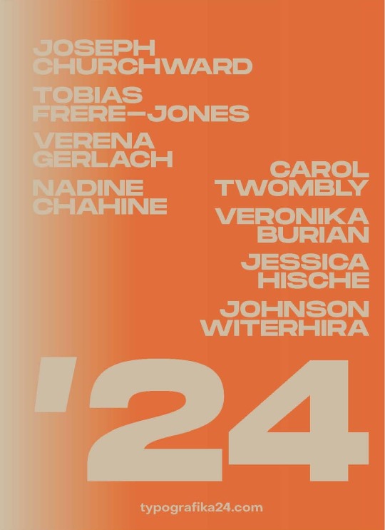
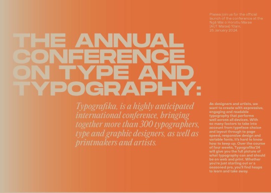
Above are my new back cover and introduction spread pages which I've inputted with the new gradient backgrounds inputted. The back cover was something I really struggled with for a long time, I found it really difficult to think of what to put there, initially thinking of doing something interesting with the '24 but because the font I've chosen is an extended typeface, the characters don't take up much of the page without being cut off so I found it quite challenging to work with. Eventually I found that I liked the idea of having all the speakers on the back cover as a sort of 'lineup' for the event. I found this really effective and a nice touch as well so that you could see all the names of people included without having to fold out the brochure completely.
0 notes
Text
Zine production
I spent the day figuring out how big I want my zine to be, and how many pages it will have. Most tutorials online suggest using a single sheet of 8½ by 11 folded and cut like so


but that leaves one side completely blank, and you only end up with 8 really tiny pages (actually only 6, plus the front and back cover). That's not gonna cut it for what I'm trying to do, so I started thinking about production costs. This zine is a labor of love, I'm not looking for or expecting a profit, but I do want to keep costs down so I can send it to as many people who want it without completely breaking the bank. I would ideally like to make it full sized, like a real magazine, but that would be prohibitively expensive (in no small part because I'd need to find jumbo sized paper and a compatible printer).
I'm sticking with standard 8½ by 11 copy paper because it's readily accessible, but how am I gonna divide it up? My first thought was to fold it hamburger style so each page is 5½ by 8½ and then stapling them together in the centerfold, BUT that only gets me 4 pages per sheet. I want it to have some heft, I'm thinking 32 pages minimum, which comes out to 9 sheets of paper when we include a cover. 9 sheets per zine out of a stack of 500 is 55 copies and some change (I don't expect to distribute 55 copies per issue; hell, even 10 seems lofty to me, but 5 is probably achievable, so doing the math means I could make 11 issues of 5 printings per ream, but I digress). That a pretty good start, but I could stretch it twice as far if I instead cut the sheets in half before stapling them together. This means each individual sheet of paper produces 8 pages. I would only need 4½ sheets per issue, meaning I could get 22 5-print issues per ream, or 11 10-print runs if I exceed expectations.
Let's call it 5 sheets. Half a sheet for the front and back cover, 4 sheets for content (32 pages), and the remaining half sheet could be an insert, like the maps in National Geographic, or a mini poster you can remove if you don't mind the staple holes (I loved it when the magazines I read as a kid included posters in the center, though always ended up tearing them up and taping them back together)
Like so:

Each page is now 4¼ by 5½, smaller than I would like but closer in size to the standard amateur zine. Worst case scenario I can scale it back up to 4 pages per sheet, if I desperately need more space. I'll be hard pressed to consistently fill 32 pages of content by myself, and 16 wouldn't be bad at that scale, so we'll see how things go. Nothing is set in stone, this is still the very early stages of development. All I'm doing right now is visualizing the scale of my endeavor.
I'll keep you posted.
16 notes
·
View notes