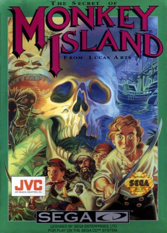
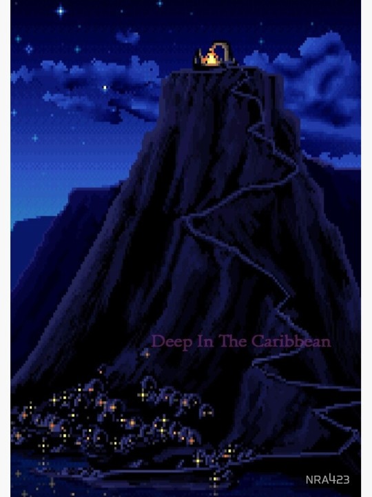
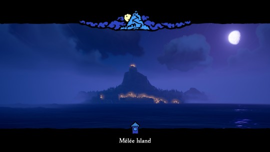
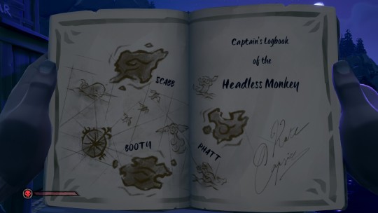
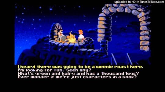
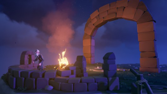
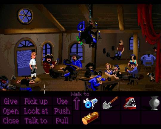
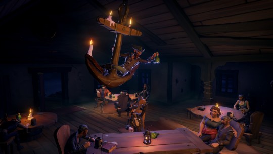
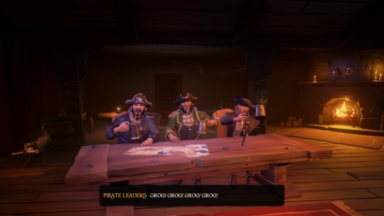
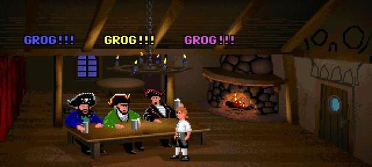
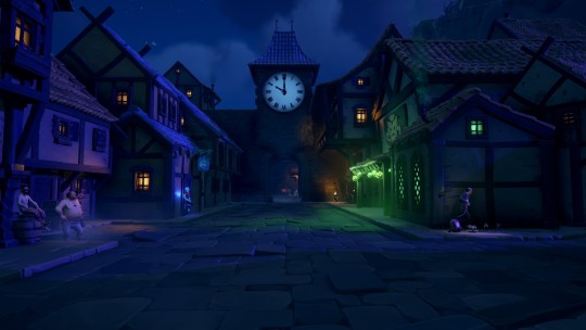
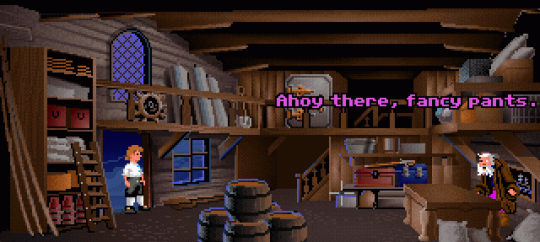
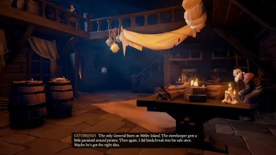
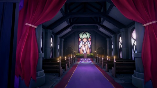
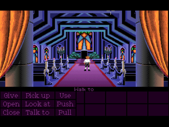
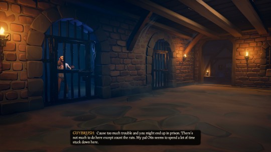
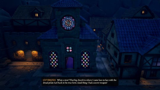
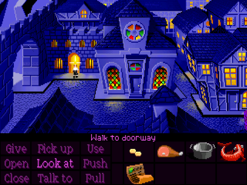
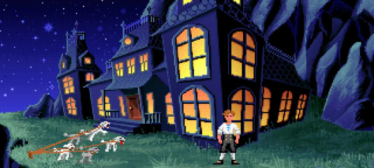
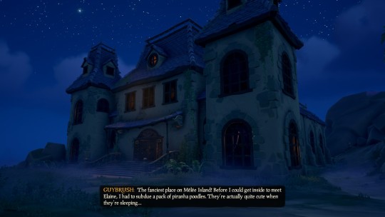
#i did just grab the pictures of the original game off google images but technically i could start the game and take those myself properly
Explore tagged Tumblr posts
fischtoria · 1 year ago
Text
Tumblr media Tumblr media Tumblr media Tumblr media Tumblr media Tumblr media Tumblr media Tumblr media Tumblr media Tumblr media Tumblr media Tumblr media Tumblr media Tumblr media Tumblr media Tumblr media Tumblr media Tumblr media Tumblr media Tumblr media Tumblr media Tumblr media Tumblr media Tumblr media Tumblr media Tumblr media Tumblr media Tumblr media Tumblr media Tumblr media
bro the amount of details sea of thieves did with the monkey island crossover its everything i wanted since sea of thieves came out
123 notes · View notes
jamiekturner · 6 years ago
Text
How to Design Scannable App Screenshots
Let’s play a game. Pick an app on your phone that you really like. You are the creator of this app and are looking to raise money from investors. You have a minute to pitch your app to VCs. Money is up for grabs but only if you can convince them in 60 seconds. How do you do it? Do you describe what the app does? Do you tell how the app is unique compared to its competitors? Do you show how good the user experience is?
It takes an average of 7 seconds for a user on the App Store to make up their mind whether they want to download your app or not. A research study on download decisions involving 25,000 visitors and 10,000 installs rated screenshots as the second most reason to install, with rating taking the top spot.
We discovered that the average time people spend on a store listing is 7 seconds. The fact is, the vast majority of people leave the page even sooner. Engaged users hang around for a little longer, but they all follow the same process: check the icon, view the first two screenshots, and scan the first line of the app description — Peter Fodor, Why 7 seconds could make or break your mobile app
Screenshots are a mirror of your app’s user stories and are reflective of its user experience. I studied the top 100 apps and their screenshots using the data gathered by the good people over at Incipia. I will be referencing key findings from multiple studies here.
App in focus: HeyDoctor
Tumblr media
HeyDoctor is an app that allows users to get medical prescriptions online without the need to visit a primary care doctor. HeyDoctor can prescribe and refill prescriptions for medicines ranging from birth control, hair growth to urinary tract infection treatments, lab reports and more. You can also get treatment for primary care cases like acne treatment, UTI, cold sore treatment and more. HeyDoctor’s mobile app has been well received in the App Store with 122 reviews rating it at 4.7 stars.
We will be redesigning HeyDoctor’s screenshots and learning about scannable screenshots.
Disclaimer
Please note that I don’t work at HeyDoctor and views expressed in this case study are strictly my own.
Unlike designers, product managers and everyone responsible for making key decisions involving design working at HeyDoctor, I do not have access to analytics on its user base and may not be looking at the complete picture.
Design decisions can be based off on business objectives, resource prioritization or technical constraints. Hence any unsolicited case study is not exhaustive, and I am certainly not suggesting that HeyDoctor abandon their current screenshots and adopt my redesign.
Tumblr media
“Make your app flat” — some guy. Meme credits:@parasmael
The Current Design
We are going to be working on HeyDoctor’s iOS app. Here’s what the existing screenshots look like:
Tumblr media
It follows the standard title and subtitle setup which does a good job of explaining the app’s user stories. We are not interested in redesigning the brand or the UI, so we will try to keep them consistent in our redesign.
User Stories
Before we dig in and start making visual changes, we need to learn what users install HeyDoctor for and what they are searching for when they discover this app.
Get Prescriptions and Refills. Users are looking to find an easy way to get their prescriptions and refills online without the need to visit a doctor.
Get Treatment for illness. Users are searching how to get treatment for their illness online.
Talk to a primary care physician. Users want to talk to a doctor but they probably cannot visit one at the moment due to time, financial or commute constraints.
Do all of these without involving any insurance paperwork. Users don’t want to involve their medical insurance because either they don’t have one or their copay is too high.
Screenshots or Thumbnails?
Screen sizes have grown by 72% since the original iPhone launched with the 3.5-inch screen. The average screen size of smartphones sold in the US in 2018 is 5.5 inch. Screens are bigger than ever and product designers are constantly evolving to make use of this extra available space. One would think that bigger screens would entice designers to put more text captions on screenshots. But what we are observing is quite the opposite.
We consistently observed that fewer than 4% of users looking for an app enlarge portrait screenshots, and only 2% enlarged landscape screenshots. For gamers, it’s even less at just 0.5%. This is probably because the gameplay is usually clear enough even from thumbnails —Peter Fodor
Less than 4% of people coming to your app page tap on your screenshots.
Designers have started to pay heed to this metric with a lot of apps treating their screenshots as thumbnails to peek at instead of something to tap into. Users in 2016 could be expected to tap the screenshot to read text in it. But with the new app store layout and bigger screens, users are not tapping on your screenshots anymore.
Let’s look at some screenshots redesign from 2016 to 2018. Notice how almost every one of them have fewer words and bigger fonts.
Tumblr media
The Magic Number 2
78 of the top 100 apps have five screenshots, 13 apps have four screenshots, 6 apps have three screenshots and 3 only have two. As a developer, you would think to go for five screenshots because more content is better, right? Wrong.
Only 9% of users scroll past the first two screenshots. Landscape screenshots perform worse at 5%. This makes it imperative to lure the user in the first two screenshots itself. Tell your users what your app does in the first screen and expand upon that in the corresponding screenshots.
The findings of our research make it clear that you HAVE to explain the core benefit of your app in first two (iOS10, Google Play), or three (iOS11) screenshots if you are using portrait images. If you really want to use a landscape image, you’ve got just one — Peter Fodor
Let’s examine the first two screenshots of some popular apps.
Tumblr media
Highlighted UI Elements
Users glancing at your screenshots are trying to gauge the functionalities of your app. Text captions help them understand the context behind the screens. Designers are making it even easier for users by highlighting UI elements that the text caption is trying to explain.
Let us look at some examples.
Tumblr media
Learnings
Explain the most important user story of your app in the first two screenshots. Only 9% of users coming to your app listing will scroll past the first two screenshots.
Increase the font size and cut down on text. With bigger displays, users are getting conditioned to scan and glance the screenshot instead of tapping on it and reading. Less than 4% of users will tap on your screenshots to read it.
Highlight UI elements that represent text captions. It makes scanning the screenshots easier and improves your screenshot’s glance-ability.
Now that we know a little about how to make screenshots more readable, let’s start applying our key findings to HeyDoctor’s screenshots.
Step 1: Update the iPhone to the newer generations
HeyDoctor’s screenshots is using the older generation of iPhones. While not a deal breaker, I like my iPhones like my apps. Updated and on fleek (sorry).
Step 2: Cut down on text and make it more readable
We will try making the captions a bit more readable by stating the user stories in a concise format. We will also be doing away with the subtitle and descriptions to accommodate the bigger titles.
Tumblr media
The third screenshot shows the app’s settings page while its caption is talking about how the app doesn’t require an insurance policy. Let’s replace it with a more relevant screen. I’m going to replace it with the first screen you see when you try to get prescription in the app, indirectly implying that you don’t need an insurance to get started.
Tumblr media
Step 3: Highlight relevant UI Elements
As we learned above, highlighting relevant UI elements that references the captions makes them more glanceable and readable. It also helps the user to scan the screenshot more easily.
Chat UI
Let us see how Tinder highlights their chat UI:
Tumblr media
It cleverly uses profile pictures and chat bubbles with brand elements like colors to mimic its real chat UI.
Let us try doing something similar:
Tumblr media
Let us insert this asset into the screenshot:
Tumblr media
I tried to integrate HeyDoctor’s brand into the chat bubbles. I did not feel the need to include profile pictures because doctors that you talk to in the app don’t have a profile picture.
Cards and Drop Shadow
Let us have a look at how Uber highlights their UI Elements.
Tumblr media
I love this minimal way of highlighting UI elements with cards and drop shadows. We are going to use this style to emphasize some elements in our screenshots.
Tumblr media
I decided to shift captions below the phone so the user sees the highlighted UI element before they read the caption.
Tumblr media
Step 4: Cosmetic Changes
We have made multiple changes to our screenshots to optimize for scannability. Now let us make it look better. Good visual design can be an incredible lure for users and it shouldn’t be ignored while redesigning screenshots.
Add Perspective Screens
Isometric screens look modern and polished. You can see isometric phones almost everywhere from Apple’s perfectly rendered product commercials to highly polished mockups on Dribble (crazy to think that Dribble was originally started as a website to share low level WIP design prototypes!)
I made a couple of perspectives from the screens available to us.
Tumblr media
I will choose the first perspective mockup and split it into two screenshots because we only have 3 screenshots at the moment and we can add up to 5 in the App Store.
Tumblr media
I added a caption to the first page — “Your personal doctor”. Easy to read, summarizes what the app does, and concise.
Change Background Gradient
The contrast between the background and the foreground is a bit too harsh for me right now. Let us change it to a lighter shade of blue.
Tumblr media
We will be making a gradient with the new colors that we choose.
Tumblr media
Let’s see how this looks in our screenshots.
Tumblr media
Perfect!
I’m going to add some ridges just below the text so it acts as a differentiator between the text and the phone.
Tumblr media
  I was able to snag a cool isometric vector from the web. Let’s use it to make the last screenshot.
Tumblr media
Final Designs
Before
Tumblr media
After
Tumblr media
Conclusion
All in all, we made just over four small, iterative tweaks. But the final result are screenshots that are easy to glance over and feel modern. Moreover, none of these tweaks required an innate artistic skill. Studying a handful apps in the App Store helped us to know what issues to look for.
Thanks for reading! This was a fun weekend project for me and I enjoyed writing about it here. Hopefully, this post gave you an insight on the state of screenshots in the app store.
The post How to Design Scannable App Screenshots appeared first on Design your way.
from Web Development & Designing https://www.designyourway.net/blog/user-interface-design/scannable-app-screenshots/
0 notes