#i did a redesign but honestly i still prefering the original? There's something about it that captivates me
Explore tagged Tumblr posts
Text

I drew this a while ago and completely forgot to post 💀 But here's my take on Dewey's redesign, for the only reason that I think his original Quack Pack design doesn't quite match his personality so well? (except for the hair)
Please, he's a nerdy teenager in that rock-addicted emo phase (and an artist), he NEEDS a plaid coat and a band t-shirt. I also added his camera to the design, so he can easily carry it anywhere :)
(fun fact: only after I finished the drawing i did notice that he looked just like Donald as a kid in Ducktales 2017 and I swear the resemblance was not purposeful... Like uncle, like nephew i guess lol)
#my art#ducktales#quack pack#dewey duck#ducktales 2017#duckverse#disney afternoon#i love his long hair#NERDY *points to him and laughs*#dewey is the first influence for all the 90's emo kids with sibling issues#i did a redesign but honestly i still prefering the original? There's something about it that captivates me
58 notes
·
View notes
Note
May I request a CacaoLily (Dark Cacao x White Lily) fan child if you haven’t done one already?
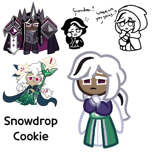
All right, I made her, this is Snowdrop Cookie
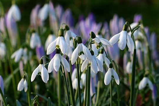
So as for her name, it’s mostly because snowdrops are white flowers, and the Dark Cacao Kingdom has a lot of snow. I was going to originally go with chocolate lilies, but then I looked at the two and realized that their kid would probably have white hair, whereas chocolate lilies are a dark brown, so I went with snowdrops instead
Snowdrop:
I’m gonna be completely honest, I think I should have spent more time on her design. I’m not too satisfied with it, and honestly I think I kind of rushed it, just because I had some ideas for her today. Her hair’s…good I suppose, and I definitely plan on keeping the eye shape. I added the black streaks so she’d bear more resemblance to her father. I was also debating between a bun or a ponytail, but my friend said ponytail was better, so I did that. Originally I planned to have her hair all down, but I couldn’t get it to look right. But as for her outfit, I really didn’t think about it as much as I should have. I wanted to incorporate snowdrops into her design, but I couldn’t figure out how, so I sort of gave her a cloak/scarf that resembles it, and then I just came up with something random for the rest of it that looked like the rest of the Dark Cacao Kingdom, since that’s where she lives. And as for the colors, I just sort of went with whatever random thing I could think of, mainly just giving her White Lily’s colors
Yeah, I definitely think I’m gonna redesign her and give her more time to actually be fleshed out in my head. I’ll probably draw her more as I flesh her out
Also technically what you see here isn’t what she looks like in “current day” Kingdom. This is her when she’s around 20 or so. In current day, she’s more around her mid 40s (though granted I’m not sure how to portray that), but we’ll get to that
So as for her character, so I was going to say that nothing much had changed since I talked about her this morning, and that I hadn’t fleshed her out at all, but while making this post I took a break and started thinking of her more. So what I say may not be accurate to the picture shown
Anyways, so the things I said before still apply. Snowdrop is the princess of the Dark Cacao Kingdom, and is Dark Choco’s older half sister. Though their age gap is a lot bigger than the other half siblings I’ve made for him (at least for now, I think the affocao one is going to have them beat out), with her being around 15 years older, or whatever Cookie terms that applies to, since she would have been around pre Dark Enchantress, but Dark Choco would be very young at the time of the Dark Flour War, which from what I understand has a few centuries in between them. But whatever, the timeline of Cookie Run is weird. Let’s just say she’s 15 years older and move on
So with this large age gap, while yes she was close to her little brother, she tended to be closer to a babysitter than just an older sister, given she’d be an adult by the time he’s like 3. Given Dark Choco had very little frame of reference for sibling relationships, he never saw this as weird
Anyways so let’s move on to Snowdrop on her own. …Okay I’ll be honest, I don’t have much on her personality other than she’s sweet and a bit timid at times. I think I’m also going to keep the aspect that she helped with the physicians in the Citadel, possibly learning parts of their trade. However, don’t take her somewhat meek appearance as a sign she’s not a threat, she’s still a Dark Cacao warrior, and one trained by Dark Cacao at that. She’s absolutely nasty with a dagger, her preferred weapon of choice. Also, she’s not short, not by a long shot, with her height rivaling that of her father, meaning she towers over most people. She’s just a bit lanky
Anyways, so one day, back when Dark Choco was young, around 5 or so (but after White Lily disappeared), Snowdrop suddenly disappeared without a trace, and she hasn’t been seen since. The last person to see her was Dark Choco, where the previous night, he had gone out of his room for a glass of milk, only to see Snowdrop sneaking through the halls wrapped in a cloak. He asked where she was going and she said she was just planning on going out for a little evening stroll outside the castle. She helped him get his glass and tucked him back in bed, telling him to keep her walk a little secret between him, before kissing him goodnight. The morning after, no one could find him. Eventually after a few days, Dark Choco felt bad and that maybe something had happened, and told his dad that she said she had gone out for a walk, but still no trace of her could be found. No one knows why she left, but Dark Cacao can’t help but blame himself (also in truth I haven’t figured out why she left either. Maybe something to do with her mom. I just wanted her to be missing). If she ever returns, and especially after the incident with Dark Choco, Dark Cacao will keep his gates open
I may end up drawing her post-disappearance, but I haven’t decided
But yeah, that’s Snowdrop. Definitely feel like I should have spent more time on her, but I hope you still like her regardless
#cookie run#cookie run kingdom#dark cacao cookie#white lily cookie#cacaolily#cookie run oc#fankid#fanchild#snowdrop cookie#my ocs#my art#requests#answers
110 notes
·
View notes
Text
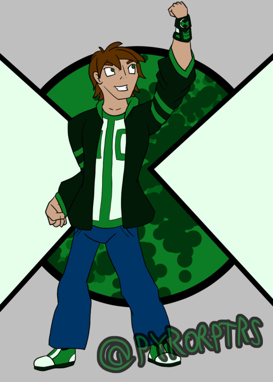
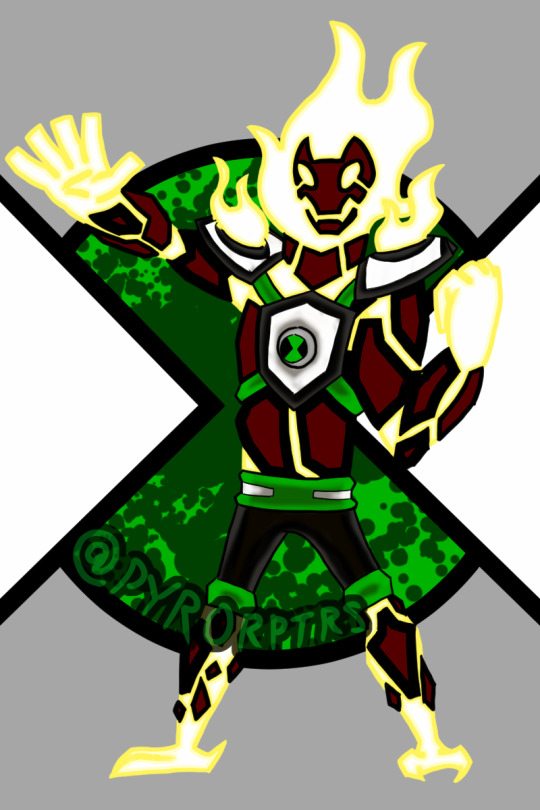
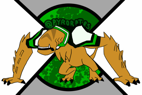
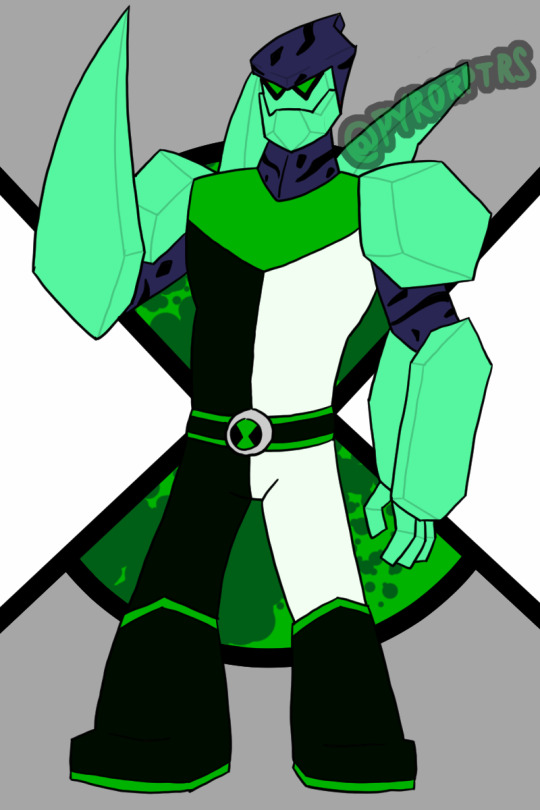
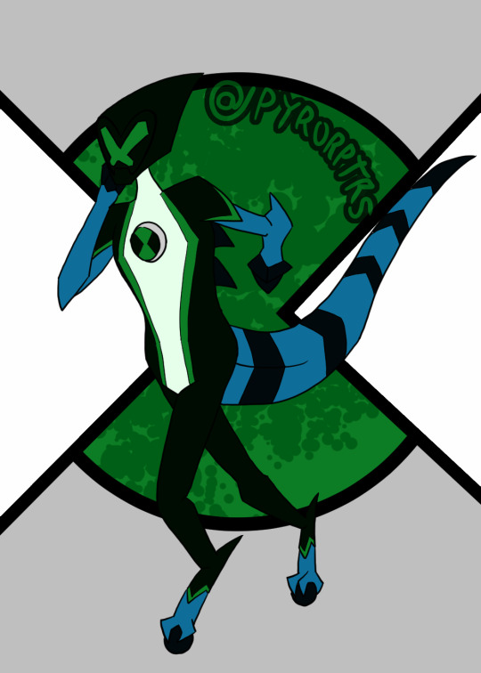
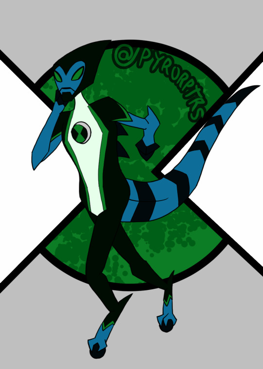
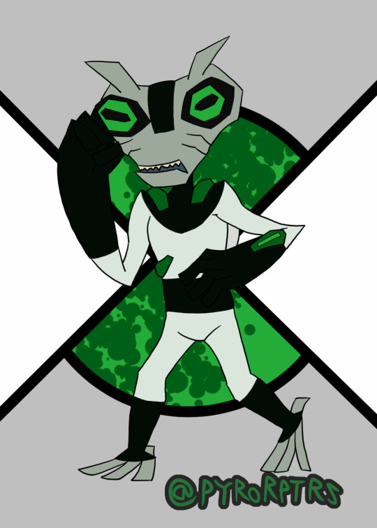
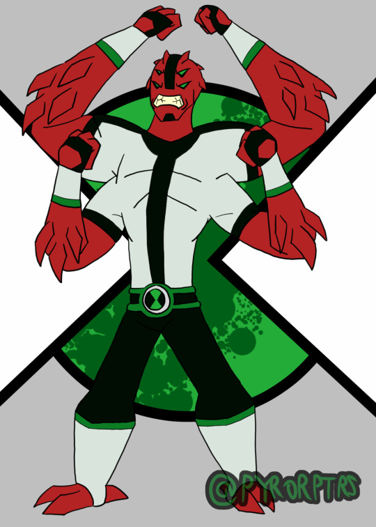
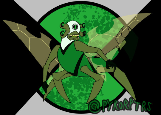
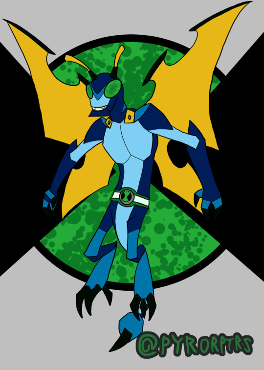
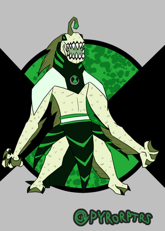
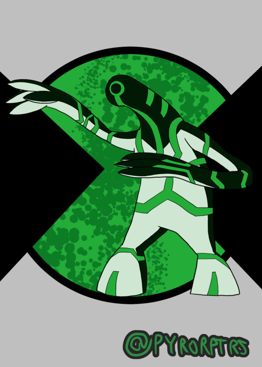
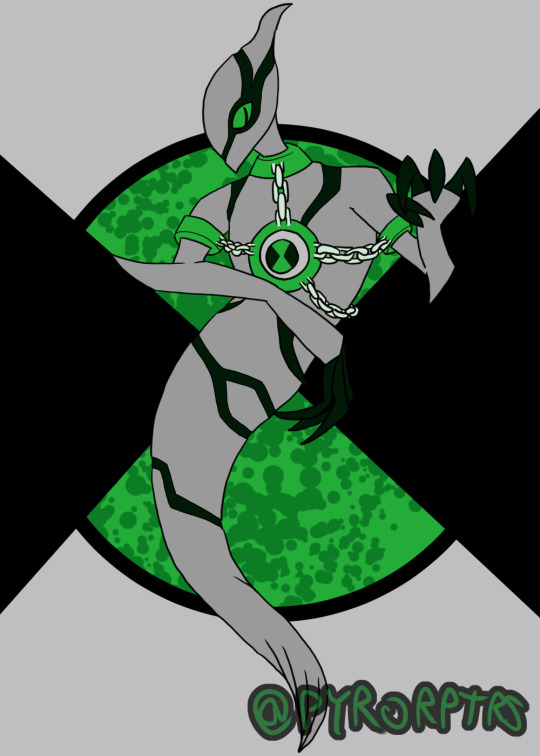
Ben 10 Redesigns Playlist 1
Did redesigns of Ben's first 10 aliens awhile back.
I think Ben 10 designs as a whole work best when you have a specific color scheme to work with, so I tried to incorporate green as the primary with a greenish shade of black and white as the secondary's and highlights. I also made it a rule that unless the alien has some way to properly incorporate the omnitrix into the body, they need some sort of suit or device on them to house the badge
Ben - Honestly doing a design for Ben is kinda hard to do, most of the better takes you can do were done by the original canon and the fandom at large have pretty much filled out the rest. I think the soccer shirt with stripe down the middle is probably the most iconic part of his design, so I tried to incorporate that with his undershirt while messing with the colors. Took some inspiration from both the jackets he wore in the past for his hoodie. Coming up with an Omnitrix design was probably the hardest bit, I'm not a fan of when it looks like a normal watch, but addign too much detailing it can make it a pain to redraw, so I tried finding something simplistic but still kinda techy..
Heatblast - In terms of overall design I tried leaning towards Omniverse, but I also wanted to lean a bit into the 10,000 design from the OG series with the shoulder pauldrons. The reason why I gave him shoulder pads is that I like both the ideas that the aliens grow with ben and that they're the "peak of their species"; which isn't necessarily a good thing. so the shoulder pads act like kind of like "braces" for the shoulder pauldrons since the flames burn more intensely than on other Pyronites.
Wildmutt - Went with a mix of his OG and OV looks with a bit of 10,000 influence to make him look older. I feel his shoulder pad is kind of iconic to his design, so I tried to incorporate it and a similar one on his right shoulder into his suit. I also used the collar idea from OV to round out his suit, with the rest extending over his back since Wildmutt tended to be used as a mount a lot. Finally the stripes and tail are nods to his 10,000 design.
Diamondad - I honestly feel a bit bad for anyone that has to do a design for Diamondhead, because he has such a solid look. Nonetheless I tried to come up with a decent look for him. His OG split outfit look is easy his best suit design, so I wanted to use that as a primary inspiration, but I also liked the the collar that the reboot version had, so I wanted to call back to that. I also liked the earth look he sported in UAF and wanted to take some inspiration from that as well.
XLR8 - Similar deal to Diamondhead, XLR8 just has a solid design, so really was more about adding a couple personal tweaks here and there for personal taste. Did add the back spikes from the reboot version though
Greymatter - I always thought his suits looked like hazmat suits so I wanted to lean into that with his redesign, making it look a bit more techy. I also added some of those falangy thingies other older Galvans tend to have in order to make him look a bit older too.
Fourarms - Another case where the OG design was just so good that it's hard really do another take to it that doesn't amount to personal preference. I obviously used the OG look as a base for the suit and face (mostly because I didn't like the ponytail on UAF or the Goatee on OV), but I also added a belt and bracers on his arms on the arms to spice things up. Finally made his spikes more prominent to make him look a bit older.
Stinkfly - I'll bring up the second design I did in a minute, but for the more classic Stinkfly I leaned toward OV in terms of general proportions and colors, but I also wanted to call back to his OG design with his head being a different color from the rest of his suit.
Slopfly - Obviously this is based primarily off of the design from the reboot, which I have mixed feelings about. Didn't like the almost exclusively humanoid look, so I tried to make him look much more insectoid with more prominent Dragonfly aspects and a bit of Hornet thrown in too. Lore wise, I like to think of his as being from the same planet, but an evolutionary offshoot; think of it like the difference of an ant vs a bee. Overall I tried to make them different, despite basically being the same character. My idea is that classic stinkfly is a bit hardier and can use his claws and stingers more offensively, while "slopfly" as I call him is a bit weaker, but can more effectively use his slime.
Ripjaws - I liked the way OV handled him and wanted to push that more monstrous look a bit further. In terms of his suit, I wanted to add a rebreather so he doesn't immediately start to suffocate, but still kept that weakness.
Upgrade - I lean very hard into Classic as far as my fav designs for him go and wanted to keep that sort of feeling. So I tried to keep his general body shape that same sort of gloppy look he used to sport before OV bulked him up. I also tried to keep the high contrast color he used to sport since I feel it helped his circuitry pattern stand out more.
Ghostfreak -Honestly both easy and hard to come up with a ghostfreak design; their are good aspects in every design, but something also holding them back. I did ultimately lean more toward OV in terms of the overall look, but I also tried to streamline some bits and included the claws from his unskinned form
#ben 10#heatblast#wildmutt#Diamondhead#xlr8#Greymatter#Fourarms#Stinkfly#Slopfly#Ripjaws#Upgrade#Ghostfreak#redesigns
7 notes
·
View notes
Text
Part Two (Stellaron Hunters)
Like the last one with the Astral Express, I am listing my opinions on aspects of the HSR designs, including things I kinda dislike or at least would change about certain playable designs in HSR to help myself with planning some of my own designs/redesigns for future art!
And I am so excited to get onto three of my favorite designs in this game!! The Stellaron Hunters are my babies and I originally was going to include them in the AE part 1 post, but sadly exceeded some kind of limit on the post while rambling about both of the groups designs, so they get their own post! And y'know what if that gives me more room to talk about them, I am not upset!
Ofc, Disclaimer: I am not a professional character designer, I'm not saying any of my ideas for them are objectively better or improvements even, nor am I bashing any of these designs. This is just my opinion and I like most if not all of the playable designs at the moment! I just have a few thoughts regarding them.
The List part 2:
Silver Wolf: I really like her design, I think honestly the Stellaron Hunters (at least for the trio, still forming my thoughts on Sam's) are easily some of the best designed characters in HSR so far. I do think out of those three designs though, Silver Wolf might be the weakest? Not that it's bad ofc, as I just said I think they're some of the best designs, but alongside Kafka and Blade, it feels like there's more that could be done with her design. They went ham on having so many like "Haha look she's a gamer!" details on her outfit that it ends up a bit eye rolling when you keep seeing all the details. The buttons hanging from her belt, the controller garter, the pattern on the fabric hanging from her hip for no reason, the power button logos on her her belt in multiple places and the strap that hold her knife, and that's not even all of them. It's just a bit much. Yes, she's a gamer, we get that. It doesn't need to be sprinkled throughout her design this much, at least not in this way. Because the way they did it, admittedly looks a bit gimmicky since it's only visual details rather than anything more is the best way I can describe it. I would maybe give her a few more items in place of all of these little things. Give her a visible earpiece, or some other kind of hands off communication device. Give her more devices if you're gonna have her adorned with all these straps, make them useful. Though I have two (maybe three?) other bigger ideas that could either work for changing her up physically, either separately or somehow together in a design. I'm stuck between the idea of giving her comfier clothes, both to reflect her more laid back personality and also to fit more so with what she does, or giving her more of a tech wear influence in her design, especially considering PunkLorde is meant to be a cyberpunk themed place. I feel like there's a better way to reflect that influence in her design. Also I dunno about you, but when I think cyberpunk I think of Neons a bit. I’m not saying turn her whole color palette that, but I think in a few of the patterns or in little details adding tiny touches of neon would look cool and help make her pop out a bit. (Sorry this ended up rambling, when I actually draw my thoughts for her, it will come through cleaner and clearer. Overall, I really like her design still even if there's a lot of details I would preferably change.)
Kafka: Kafka is one of my favorite designs, I adore her, I adore the spider, the web, and even the butterfly motifs present in her design. Her color scheme has a sense of allure to it if that makes sense, well balanced throughout her from head to toe. If I were to change something, it would be to make her design more show-y, a little more over the top. As it stands, Himeko has a more ostentatious design than her. Which feels off to me. "Oh but she's going on missions, taking people out, and collecting Stellarons. Her practical design makes sense." Very true, but also these missions aren't merely just missions. They are performances, displays of acting according to Elio's scripts in order to obtain the results he needs for the future. Kafka, of the rest of the Stellaron Hunters we've seen so far, seems to be the one that best fits into the role of Elio's dramatic villain/anti-hero. I mean just compare her presence in the Luofu quest to like Blade also in the Luofu quests, or Sam in the Penacony ones. There is a difference in dramatics and performance. She beckons the audience's (and law enforcement's) eyes towards her, as she strings them along with her schemes and plans. She is made to be the one in the lime light, delivering monologues and putting on the best show for everybody. When we look at the few missions of the Stellaron Hunters we’ve seen so far, Kafka does fit the bill as the star of his show, his leading actor in the role of the antagonist. As such, I think Kafka could benefit from making her outfit a bit more dramatic, leaning into the role she plays even further. Especially when thinking about how playing up that dramatized version of herself would work with the facade she's hinted at putting up. I do adore it the way it is, I just think more could be done with it. Lean a bit harder in, and by nature of making her more over the top, that could lead to the potential for a more interesting silhouette depending on how it's handled. Maybe even some more elements to influence like making it more over the top could be inspired from the Kafka Stigmata in HI3rd
Blade: I can’t lie to y’all. I think his design is close to perfection. I think it’s so well done (even though the silhouette could use some work? Depending?), it’s absolutely packed with symbolism. However, aside from just some silhouette adjustments, something I would change is the emphasis of how injured he is. The injuries he feels every single day of his life, that can’t heal because of Jingliu essentially overriding the default state his body is trying to restore. It’s a big thing in his lore, so much so that it’s been mentioned multiple times including in a main companion quest and literally up front show to us face to face. That cg of him with the sword in his chest feels like somebody stuck a sword in mine every time I see it, I swear. But design wise, I feel like this point about him and his history doesn’t shine through as well, and it feels like the gravity of that time isn’t properly portrayed in his design. Like let me emphasize, Bailu’s words might suggest that the default state for some of his injuries is literally open and bleeding so... And you might think “Oh that’s funny, when he’s literally covered in bandages like his arm and chest.” Well, I’ll one up you by clarifying if you look up his jacket as he runs, you’ll see his model has bandages ALL the way down his torso!! But the thing is, this is covered by his jacket. We only see his hand bandaged and a little peek at his chest, but his face? Completely fine. The rest of his body? Perfectly covered not showing anything. If I could change his design just a bit, first off, I’m making his coat more tattered and broken. Yes he gets his coat replaced at times, but that doesn’t mean we need to always see it in pristine condition. He’s a fighter, making his coat have tears in it, leave the edges worn down, more fabric than just his red ribbons to be frayed at the ends. In those tears of his clothes, either show bandages (left up to you whether to be seen as fresh injuries covered waiting to heal or more wrapped remnants of Jingliu’s slashes) or scars on every single bit of skin that manages to peek out from that coat. And for some flavor, add some scars to his face however big or small. There’s no way I can believe Jingliu killed him hundreds of times and didn’t at least once go for a head shot. I bet that woman knows the extent of his healing like the back of her hand, I bet she could answer my question about how exactly Blade’s body would heal if his limbs were severed. If he has some part of himself not covered, it should have evidence that he was harmed there! Never let us forget that part of his lore! NEVER!!
(I promise I’m totally not insane about him, what ever could lead you to that conclusion?)
I want to say, I will eventually update this once we have more Sam lore, perhaps I’ll include Sam with the Penacony characters post to make it easier or I’ll just redo the Stellaron Hunters post and revise and revisit my ideas for these three! As it stands, I want to wait until we have more Sam lore and more things cleared up about them before I jump into talking about the armor design or things I know from leaks until it’s been confirmed or disproven so I can give better my thoughts about the design in relation to the character!! Please stay tuned, I can’t decide if I should go for Overworld Belobog first because I have more clear ideas (including a rant about one specific character) or if it’s best to go to Herta Space Station first in order to just go in order essentially. Who knows ! Well! I hole you enjoyed this, I adore the Stellaron Hunters and any time I am able to talk about them I am very happy :D
#basically to sum it up#kafka and blade’s designs need to lean in more to certain aspects#(the drama and the trauma)#and sw’s needs to ease up on the gimmick#but overall?#some of my favorite designs in the game#MWAH love them#okay im finishing this at 3:30 am and i need to sleep so ill schedule this for later#have a good day y’all <3#the stelle redesign btw is cooking in my wips im just making notes about what i would change or explore#so i can start making concept arts for the different ideas i hav#after her will probably be either himeko or march bc im still thinking of ideas for dh#and once i have this post done i might be doing belobog next#which as a heads up#will feature one of the character design opinions I feel so strongly about that it inspired this whole series of posts#(spoiler alert: the belobog design is servals and youll understand what i mean when i say i feel strongly soon enough)#hsr#honkai star rail#hsr blade#hsr kafka#silver wolf#stellaron hunters
11 notes
·
View notes
Text
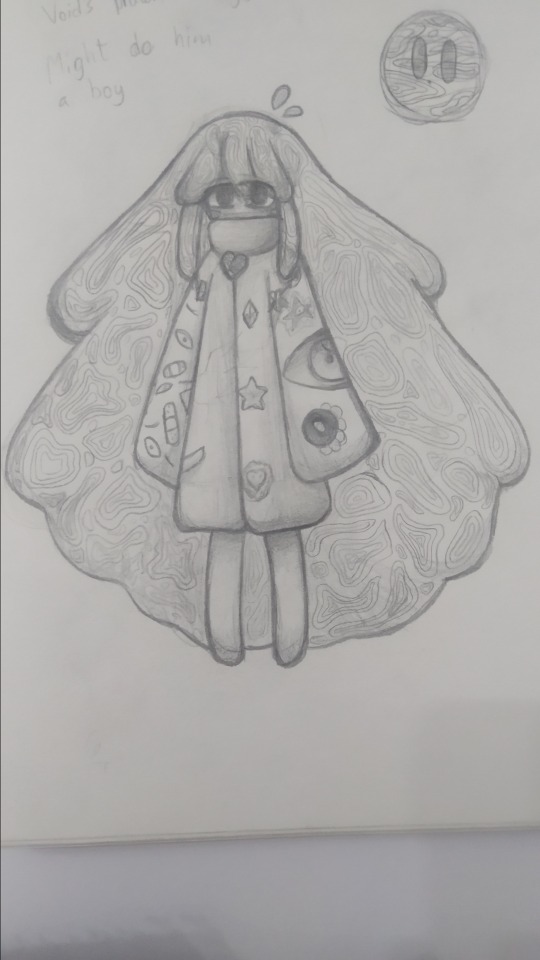
Void Termina gijinka redesign
woke up and felt like drawing on paper, i drew a zan, fucked up and then decided it was finally time to redesign my void.
i dont tend to use his gijinka very much, in fact i only drew him 3 times, the original, a slight redesign, and this one.
well i suposse i should show it already
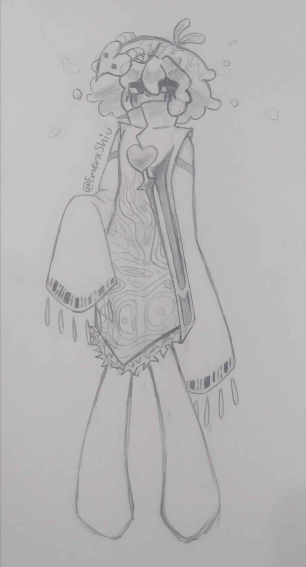
honestly i really like it! :3
tho i used to like the other one too, now i think its abhorrent, so maybe i end up hating this one too overtime. i didnt want to clutter it with too many things so i tried to not go overboard, tho i did struggle as i did not want it to look to plain or simple, im thinking i might change some stuff, like the sleeves, wich i think are okay but they feel way too empty to me rn, but sometimes i just need to let the design grow on me. and i dunno, do something with his legs i guess, also if you are wondering why are they shaped like that, sometimes i prefer doing them like this, and other times i prefer for them to look more normal.
the mask thing had stuck with me for various months so i didnt want to discard it. the 3 lines under the eyes is something i do in all my drawings (unless i forget :p) but here i tried to make them longer, and in fact, im thinking of making them red, 3 in each eye, 6 in total, referencing zero, btw, i only did this sketch, but void's body has more markings like those and such.
the lines in the sleeves around the shoulders dont represent anything, i just added them so the sleeves werent so lacking, but the bar codes like lines at the end of them, are indeed, a reference to Zero two's boss fight's background, and the small oval shape thingyes are too, but instead a reference to the blood vessels in 02 wings. 6 on each sleeve, i thought of adding a 7th one that was more blu-ish (i know this is a sketch without colors) and diamond like, in reference to the titular crystal shards but it didnt look good so i scraped that.
the heart is something that was in the original design, but in a slightly different place, at the end i that downwards line (i dunno how to describe it) , basically, make it look like the heart spear, i saw lots of void gijinkas have heart spears somewhere and i wanted to include one too, and eventually did it like that. i tend to draw inspiration from other gijinkas a lot of the time, since i sometimes struggle with making designs, tho im trying to better at it, and remake some gijinkas so they dont resemble others' so much.
the thing next to the heart is from void termina's phase one, in his titan body, next to their shoulders, in fact, it looks very similar to the one's the three mage sisters wear in their attire's.
the pointy thing in their shoulders wasnt originally planned, but while drawing i accidantally made it pointy there and ended up liking the idea, and having it like a section so to say
i was going to have the hair have the patterns, but remembered this was more especifically void, the grey one (tho here things from all forms are mixed kinda) so his hair has the rainbow cracks, and i ended up using the weird swirly patterns in the clothes, they are really hard to draw but it feels rewarding when getting it right and ends up looking nice.
around the knees, where the clothes end, there are these feathers, purple more especifically, as i wanted to include the mane he has in phase one but i didnt know how due to how i was making the neck area, then, i thought around the shoulders but it didnt look good, before eventually setting on to add them at the end of their clothes.
before i ramble more and more about my void in general, im going to talk about the original gijinka
yikes.
three years do sure make a difference.
im not gonna complain that much about style, since i wasnt consistent and have gotten beter at drawing and honestly the eyes being so close togheter and taking up like 95% of the face is something i still accidentally do on ocassion but...
just talk about the design, in the remake, i tried making the references a bit more subtle, i think thats mainly my problem with the old gijinka, the references are way too straightforward.
its way too simple to me, yet has too much going on the sleeves, especially the left one god i dont like it, but at least i can support it, for now...the right arm is probably where the reference problem is easier to spot, having a literal drawing of a dark matter, and an eye, and oh yeah i guess dark nebula is there too but who cares about that dude.
honestly i dont know how to explain why i dislike the gijinka now (i used to kinda like it back then) that isnt basically repeating points. also it looks weird, i dunno why (aside from the eyes) but it does, tho mad props to 2022 me for drawing the patterns all over void's hair, it was so unnecessary but i appreciate her efforts.
Now, now, lets stop talking about, that, and talk about my void
i dont think it can be like, my characters interpretation, its more like an AU, but not quite, im not sure so just like, yeah im going to use au since my interpretation of how characters are in canon vs what i do with them, as in fics, drawings, things i think of them, etc differs, especially with void,
ok so, they are capable of shapeshifting, i mean, that kinda canon, but we'll just ignore whats canon or not. i mainly just choose that, aside from making him have and eye on his face from time to time, because i still do like long-haired void, so he sometimes just switches from a hairstyle that resembles kirby, to a longer one (because extremely long haired gods are soooooo)
when their angry, their hair becomes spikier, they can make their fingers longer, pointier, same with every limb they have. it can become more straight when sad, stuff like that, i also like thinking that it kinda looks like it is made of clouds, or like, perpetually under the sea, like, the hair is perpetually floating or moving around, never staying still for long, with small chunks separating and dissapearing like if they were smoke. his face can contort at will and more typical void stuff.
the original gijinka was focused more on the void termina from the story mode, the pink one, while the redesign was more on thinking about all forms he has (including the titan ones) and also after he got purged of negative emotions by kirby, so he sometimes tries to resemble him, hence the hair thing (in fact, the slight redesing i mentioned that was second, was just me making him more like kirby, shorter hair and stuff, basically the note that i had written in the og design) and sometimes i might just call him niru or nil, when refering more especifically to the post-ksa void, because i headcanon he reincarnates and basically gets adopted
sorry for rambling way too much about void, i love talking about this guy so much alongside fecto elfilis (i have way too much to say about the dude, i literally know almost all their attack names from memory)
and also for the lack of posting, tho winter break i gonna end soon and ill have to go back studying and shit, i dont want to.
but uh yeah! Jambuhbye :D
#art#fanart#kirby#kirby fanart#kirby gijinka#silly#traditional art#void termina#void termina gijinka#gijinka#shiu rambles about void for half an hour(yes it took me that long to write all of this in the most cohesive way i could) more at 11#void kirby
9 notes
·
View notes
Text
okay i've played enough to the point where i want to get my thoughts out SO i'll put them in a read more in case anyone doesn't want to be spoiled 🫡 wall of text incoming lol
there is. so much new stuff happening mechanically, but i wouldn't say it's overwhelming either??? i think i'm still getting used to how mel feels a lot more... deliberate than zag did? i was very much used to just zipping around and getting quick hits in and then dodging back out again, and you can still do that in 2, but you have to think a bit more about enemy placement and things like that. your dash is slower, too - sometimes to the point where it feels like there's too much of a delay when i press the button tbh, but that might be something they'll change - so i find myself often grouping a bunch of enemies together in a cast, dodging out, dealing with the stragglers and then picking them off one by one. when it clicks, it really clicks, and it's very satsifying. i actually swapped around the buttons for the cast and special, since.. the special is more like 1's cast, and the cast feels like a special? so that way it feels a bit more natural and i'm not pressing the wrong buttons all the time lol
i know they've said some of the art is still work in progress (and you can kind of see it with some of the backgrounds), but everything looks GORGEOUS so far. something that really struck me was how, when you get a boon from one of the gods, it really feels like they're taking over your screen with how the colours of the dialogue box changes, the background art changes, the lighting changes - whereas in the original it felt a bit like you just had a visitor who was calling in to help you out for a bit, this really feels like you're having an audience with them while they're elsewhere, and it's really cool to look at
honestly the designs in general are amazing??? i was very curious to see how they'd redesign anyone that's coming back from the original game, and i don't think there's a single design i dislike so far. like,,,,, THEY GAVE DEMETER A LIL BUN. I LOVE IT. she was the first god i got a boon from besides apollo and i was SO happy she showed up so quickly, she's probably my favourite from 1!! they also made artemis look a lot more… friendly, for lack of a better word, which makes sense since she seems to be to mel what thanatos was to zag? i have to wonder if she'll appear back at the base at some point, because she looks ADORABLE. even the gods i wasn't the biggest fan of in the original, like poseidon and aphrodite, got REALLY good redesigns. (and they somehow managed to make aphrodite hotter. HOW.) i will say i haven't found hermes, dionysus or ares yet, so if they pop up later on i'd LOVE to see what they do with them specifically - especially ares, i feel like he'd have really good potential for a redesign of some kind (which is saying a LOT since i loved his design in the OG)
new designs-wise, though, I LOVE HESTIA SO MUCH ALREADY. she might be another of my new favourites, she's just. so fucking adorable. i really like odysseus, too, and he has great dialogue to match it! just like the original, dying ironically feels like a reward since i get to go back to the base, talk to everyone, pet the frog AND give the lil familiars some treats so. 10/10 on that
on a different note, i am. slightly scared (in a good way, though) as to how much content seems to be in early access? if what supergiant have said is true and this already has more content than the FULL base game of hades 1, then. even if it's not finished, that's. a bit insane? so i'm curious to see how many different areas there are, especially since it seems like we're going downwards this time instead of upwards every time you finish an area! there's a lot of new mechanics for upgrades and skill progression, too, and i love all of them so far - i already prefer the arcana and grasp system to the mirror in the original, since you can change your loadout each run in a more minute way if you want to! there's a LOT more potential for customisation here, and now with how you can pick up materials in the environment after clearing a room, it seems like you're encouraged not to rush through everything and really take advantage of what the game is offering you, which. i love, everything feels very well planned out so far
also, side note, but with the amount of baldur's gate i've been playing, i. really thought i was losing my mind hearing hecate speak for the first time. but. nope! just the same VO as the narrator 😅 the VO is great as expected, though! i got a lil emotional hearing mel say some of the same lines as zag ngl this game has made me an emotional mess so far and i've only beaten the first boss lol
hades 2 has dropped i am about to be so insufferable im so sorry
#SO MANY THOUGHTS#ough i cannot wait to play more of thisssss#it still doesn't feel fully... real? like i'm having a hard time realising it exists. and i'm playing it#insane#hades 2
1 note
·
View note
Note
there's so many cool but missed opportunities in rwby for their characters, like sun! yk how he's based of "sun wukong" from journey to the west? IK its FOUR characters to a team but i think it would have really been cool if they took more inspo from journey to the west and made HIS team journey to the west characters
Honestly I think that'd be really cool to base the rest of SSSN on the other Journey to the West characters, especially when the basis for a four-man team is already there. And knowing that SSSN was modeled after K-pop boy band Big Bang, imagining the Journey characters as modern hot boys already sounds like an otome-game level move that would fit RWBY pretty well.
That said, if you're making your own interpretation of SSSN, such as by rewrite or AU, you're free to do so. It depends on whether you put more stock into a more cohesive theme for the team, or their original canon inspirations.
...Which is a good opportunity for me to talk about the sketches I did for Sun's team in RWBY: Remnants some time ago. They won't be appearing for a super long time, but I might as well talk about them now.
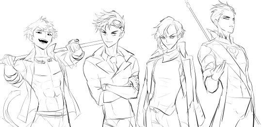
Here, I renamed them as Team SNSD (pronounced "Sunset"), with Sun Wukong, Neptune Vasilias, Sage Ayana and Scarlet David. (yes, I am aware there is a K-pop group with the same name, the synchronicity is not lost on me) They're still based on their original allusions as I wanted to work within the constraints of canon here, but the full Journey team may be too good to pass up, so I'll consider coming back in the future to tackle it.
People have always been divided on Team SSSN's name, with many preferring to rename them as SSNS ("Seasons"). I do get it - Team SSSN ("Sun") has that kind of dumb, corny "how do you spell?" vibe that matches a team of himbos. But I think having three S's for one word is just going a step too far into... just plain dumb.
Sun is pretty much the same here, but I decided to dial back towards his Asian features and grey eyes - though they're black here cause I like black eyes too. I also added the Monkey's King's famous golden headband, the jǐn gū zhòu, around his neck.

Neptune is pretty much the same here - honestly I really like his original design and think it's one of those "if it ain't broke don't fix it" situations - but I do want to redesign him more in the future to better reflect his allusion as Poseidon.
For Scarlet, I wanted to lean more into their "pirate king" vibe and androgynous appearance, so of course the coat-cape slung over the shoulders is a must. I also wanted to change their Semblance into something similar to their canon one but... not boring.
Instead of just gliding, Scarlet can either control air currents (and I do mean that in a very loose, fantasy way) or affect the trajectory of any moving object their Aura recently comes into contact with. This Semblance is called Pixie Dust, and instead of a gun and cutlass, Scarlet wields two guns, either named Hook and Darling like in canon... or Faith and Trust (geddit). They can use this Semblance to fly, and infuse their bullets with their Semblance when loading them to cause them to curve in midair when fired. Yes, basically like that one movie, Wanted.
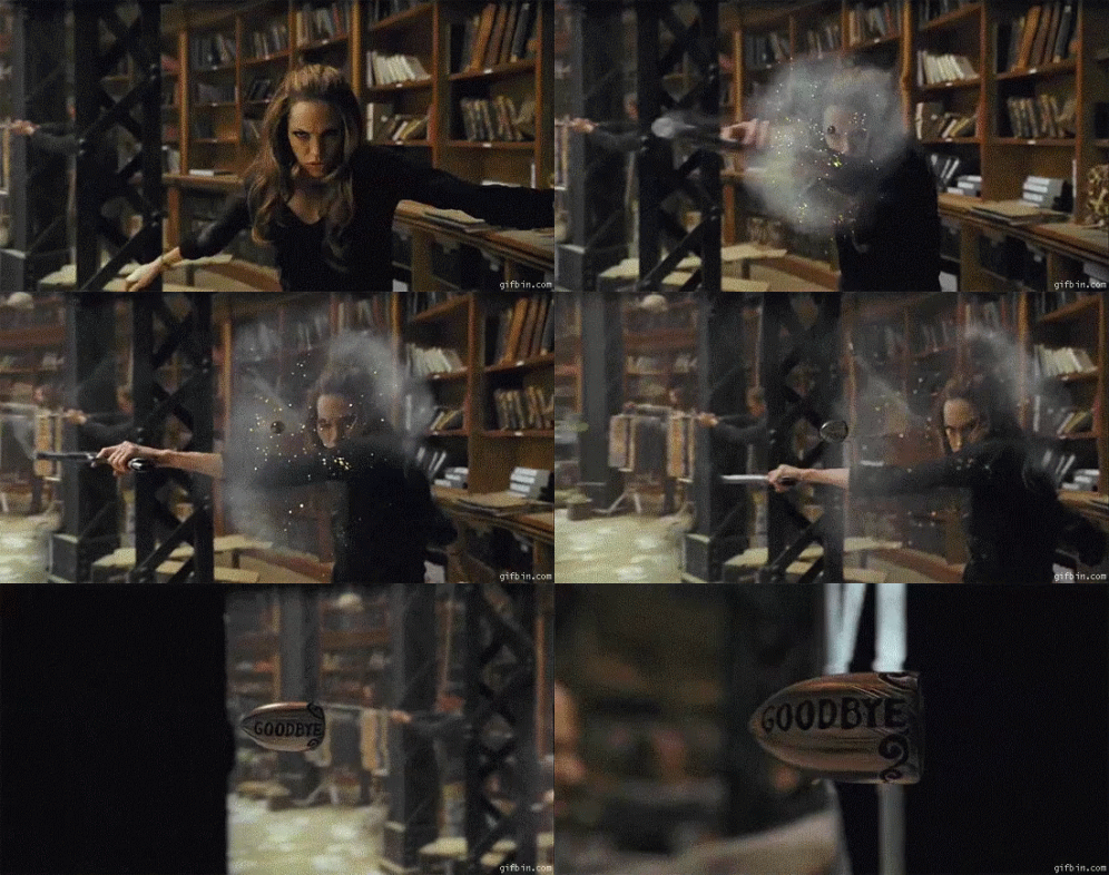
People who don't like physics breaking in live action movies hated the bullet curving mechanic, but I think it'd be a perfect fit in RWBY's universe. It adds a much-needed cool factor, and picturing Scarlet engraving smug comments and poetic farewells onto their bullets like lethal fortune cookies injects an element of charisma and playfulness to what I think is a really underutilised character, and one based on Peter Pan no less.
Now for Sage, he had a very ambiguous allusion. Some say he was based on an Aesop fable, and others on Hindu mythology.


Glad to know Miles Luna doesn't know the allusion to one of his own characters, especially knowing that SSSN is one of the earliest teams designed for RWBY, predating JNPR. But sure, let's give him the benefit of the doubt like we always do for CRWBY. /s
Given that this was so ambiguous and he also had no Semblance, I decided to take some liberties with Sage, and given his surname and appearance, I decided to look to Hindu mythology for Sage's allusion - a really cool but unexplored source of inspiration in RWBY. I was looking at some famous warriors and gods of myth like Arjuna, but I eventually settled on Kartikeya.
Kartikeya is the Hindu god of war. Known for riding a peacock and sometimes depicted having six heads, he also wields a spear with a leaf-shaped blade called a vel. In other countries he is named Murugan, and has a famous statue of him in Malaysia's Batu Caves.

I've redesigned Sage's clothes to more reflect Indian fashion (albeit a fantasy version of such) and with peacock feather motifs on his collar and chest. Sage here also fights with this spear instead of a greatsword, which you can see him holding in the sketch. His Semblance, Sanmukha ("Six-faced"), allows him to see in six different directions at once, having total 360° vision around himself. This vision can also pierce solid objects within a certain range.
While not immensely powerful by itself, Sage uses this to gain an almost unparalleled martial prowess, spatial awareness and foresight in combat, reflecting the god of war's own wisdom and skill. While I do really like the Roman numeral tattoos on his neck, I was also considering using Sanskrit or Tamil script - I should try that next time I go back to his design.
So yeah, that's Team SNSD from me! I'm pretty attached to Indian Sage, but next time I come back to them I want to take a shot at basing them after Tripitaka, Zhu Bajie (Pigsy) and Sha Wujing (Sandy) from Journey. I also need to be sure actual Hindu people are fine with him, since Kartikeya is still a widely-worshipped god in current times unlike Thor or Poseidon, so I hoped this portrayal of Sage as alluding to him is respectful enough.
#syto asks#rwby#remnants#rwby au#rwby rewrite#team sssn#sun wukong#scarlet david#sage ayana#neptune vasilias#character design
73 notes
·
View notes
Photo
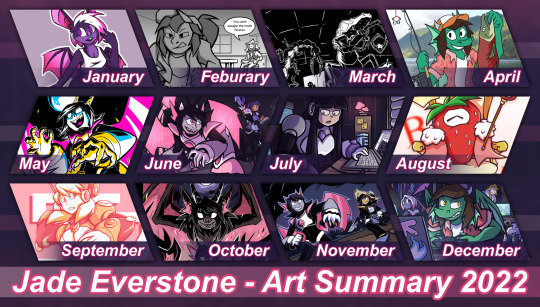
The yearly tradition returns: 2022's Summary of Art!
And hey, I did something a little more design-y than my past ones! Will admit it was a bit tricky to fit each month's pics into the frames this time but I'm glad I tried a different look than usual
thoughts on each pic + reflection on the web + how I want to handle art going into the new year below:
January - Iri Intro!
From a somewhat short-lived thing I wanted to try out: Doing sketches of OCs just to serve as an introduction reguardless of quality. The good thing is, because quality's not a factor I can do these whenever in whatever format or polish. I just prefered doing larger pics this year
-
Febuary - A 'Cereal' Debate (comic short)
Ok, but she's got a point when you think about it.
From a comics class I took spring this year. The only prompt was "conversation"... well, heated debate in this case.
-
March - The School Mystery (comic short)
Another one from that Comics class and goddamn I think the panel featured here alone is one of the hardest things I drew that semester. That's pen and ink with minimal digital edits and damn hoping one day I could somehow make a longer comic with a similar style bc it was really fun to ink honestly.
-
April - The Fish Project
JADE WITH THE FRESH SALMON???? REAL!
Ok but for the real context, this was an April fools project I had in the works since 2021. I turned all my active art accounts at the time into an OC Fishing irony page and sent Jade, Iri, Risa, Jpeg, and both Prisma's on a fishing trip. Not sure how I'll top that in the future... I'm not revealing until April >:)
-
May - MOONROT
May was when I redesigned & revealed Io to the public! They got a bunch of art this month, but the CN challenge art is my favorite of all of them.
Huh. Suprised I didn't immediately burn out because that semester was extreme in terms of work. I guess wanting to draw Io was that strong.
-
June - Life, After Wither
A pre-Artfight 2022 pic: I was Team Wither! I like doing splash pics for my own page for Artfight and this stayed my main banner for just about most of the year.
The mini-story I made up for this is these three teamed up across dimentions or something to visit this forest.
-
July - In the Studio, fr
I don't normally do post-Artfight related pics, but Moog ended up getting the most attacks this year and I wanted to give her an extra pic based on it.
Seems she kept a souviner from the forest in the last pic.
-
August - B-Hold! The Portal King!
For Clockday on Newgrounds, Strawberry clock the portal King himself!
Kept getting swept up with other things to jump on Newgrounds events, I wasn't gonna miss one of the bigger ones!
-
September - // DIRECTION //
(outside of being gay for the robot-) I just wanted to draw Alia tbh. With a similar energy she had in her older art too.
-
October - HELLSPAWN
ABSOLUTELY NEFARIOUS HALLOWEEN PIC!!!
Featuring Io's true/original form + their 'powered-up' state
-
November - The Fowl Pest (Mock-Cover)
The last two are for my Digital Illustration class. This one is a mock-book cover based on a worldbuilding project of mine (still need to organize it before sharing).
Though tbh if I do want to do more art for said project I might go tra-digital or use a grittier style. During crit I was told this looked "middle-grade"... when the world is "older-YA/Adult"... still like the pic, but damn.
-
December - Lan Party!
*Sigh* Always wanted to go to one of these! But alas, me and my irls are all busy these days. This is based off a different project I'm working on.
I ended up debuting some different designs for my OCs for said project (notably; Iri, Risa, and Human!Midi) but separate pics for them will have to come next year. In terms of digital lineart, this was the most intense I did this year (traditional lineart comes easier to me than digital).
---
So... 2022. Jesus Christ
This year was rough for me on things personal, and things non-personal. I mean jesus christ every other week something came out that was hostile to artists one way or another on top of some rough patches in my life. I don't want to jinx 2023 or leave things on this note though...
I think my biggest takeaway from this year is I need to rethink a lot of things. How I want to do art, where I want to go, or even my 'digital wellbeing'. This year, I realized keeping art a Hobby or staying "part-time" (as in small gigs & private comms only) might be healthier for me in the long run. I've already had my doubts with a lot of "professional" practices when I was shooting for it (a tl:dr it felt like "no fun allowed" half the time). But realizing how horribly i've treated myself and my art with this chase? That was another thing.
I think i've done a lot of strong pics compared to past years. Especially in terms of backgrounds and not being afraid to draw them (though I could always use more practice, lol). But I've also come to terms with I've been affected by social media without realizing it and how it hurt how I do art. Basically, for the past two years I've been working under the fear of being boxed into doing one thing. Be it fanart, genres, etc. To the point I stopped doing things to force a "brand". Specifically, I stopped doing fanart unless it's oc-centric. I hid straight-up fanart, and started getting irrationally upset over the metrics fanart gets over my original works.
And I hate it. I hate how I let myself judge the value of my work over "numbers and engagement". I hate how I boxed myself in trying to avoid being boxed, because of chasing this corporate measurement of worth. And most importantly, I hate that I nearly forgot that I enjoyed making fanart, because of some dumb culture caused by social media numbers and algorithms. I'm exhausted. So for 2023, I think I want my main resolution to do better with my online life & how I treat myself and my art. I want to pull away from social media a bit more (ironic considered i just came back here heh), spend more time on the slower web & offline if possible, and break that cycle of letting numbers judge my self-worth. And maybe help others do the same. It's much easier said than done, but I don't want to do nothing about this toxic hellscape that is how art is treated online, I want to do something even if the only person I directly help is myself.
And for what it's worth, focusing on my site so far has been cathartic. It's somewhere I can set up my art, projects, weird shit, etc. on my own terms, how I like it. It's quieter over there. And I'm glad I kept working on it beyond just a "portfolio site".
But I guess I have all of 2023 (and what's left of 2022) to process that. For now, I could use some extra time to pretty-up my website some more and take a few more naps before the year ends.
---
extra note: this post is a (slightly modified) mirror of a post over on the everlogs:
Website Version Here!
2 notes
·
View notes
Text
Pokemon Gold/Silver Beta Pokemon: The April 2020 Leak
Look, 2020 was a rough year. So maybe I shouldn’t be so surprised that the April 2020 Gold/Silver source code leak flew almost entirely under my radar. If you Google about it, you’re find it’s very rare for news outlets to cover it. This is probably because many folks are hesitant to cover leaks. Also, the US was warming up to a truly awful pandemic around that point, not to mention other civil unrest, so it’s no surprise some people were a tad distracted.
But the fact is, another leak turned up in April of last year, following a recent trend of huge Nintendo leaks. And this one was a doozy. I’ve only truly realized its full extent in the past few days. As such, I’d like to do a post that covers some of the new information. In particular, I’m focusing on beta pokemon that were cut or heavily reworked.
Now, back in 2018, the Spaceworld ‘97 Pokemon Gold/Silver Demo was leaked online. I made a post about some of my favorites. So, from this leak, we already knew of a while slew of beta pokemon. However, as it turns out, there were still more new faces to find-- and a lot of them! I list 45 new beta pokemon here, in fact!
In the April 2020 leak, several sprite sets were found as internal files, each at different phases of game production. The sprite sets were dated May 6, 1998, June 13, 1999, June 21, 1999, and September 17, 1999. The August 17, 1999 Spaceworld ‘99 Demo build was also found, so we have information on that as well.
Essentially, if you want to see this information at The Cutting Room Floor, then head to this page for the sprites discovered as internal backups/sprite banks. Head to this page for the Spaceworld ‘99 demo information page. And, if you need a refresher for the older leak, you can go to this page for the Spaceworld ‘97 demo build.
For this post, we will focus on the May 6, ‘98 set of sprites, which contain the vast majority of new faces. So, without further ado, onward to the pokemon!
(#300) Kokopelli Pokemon/Celebi

(May 6, ‘98) (Spaceworld ‘99 Demo)
This first pair of sprites looks very much like Kokopelli, a fertility deity of some Native American cultures. This deity can be seen in ancient Native American petroglyphs, as a humpbacked flute player with feathers on the head. Surprisingly, we find that Celebi in the Spaceworld ‘99 Demo seems to be an updated version of this design, making Celebi’s design origins much different than expected. However, its fertility diety inspiration is still somewhat apparant in the modern Celebi, as a creature that causes plant life to flourish.
(#301) Eel Pokemon

While the sprite files did not reveal a name or other data, this eel’s sprites were numbered right beside the Gurotesu (Grotess) and Ikari (Anchorage) sprites, suggesting it once was the start of their evolution chain.
(#304) Fire Fox Pokemon

This little fellow is a fox that seems to have a fiery tail. It’s possible this fire fox was inspired by kitsune (just as Vulpix/Ninetails were) and that it was later redesigned as Fennekin.
(#305 - 308) Snow Bunny Evolution Line
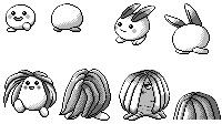
These four pokemon seem to belong to the same evolutionary line. The second one seems to based on the Yuki Usagi, a ‘Snow Bunny.’ In Japan, these cute little critters are made in the snow (using leaves for the ears). They also sometimes make these Yuki Usagi as little marshmallow or mochi treats. So this pokemon line could be inspired by either of these. Considering the leaves and the snow, I would guess these would have been Grass/Ice.
(#309) Elephant Pokemon

You might wonder if this chonky boy-- looking tough with horns on his head and back-- was an early version of Donphan, but Donphan and Phanpy were present in the Spaceworld ‘97 demo. Indeed, this elephant and Phanpy/Donphan both exist in the same set of sprites from May ‘98, so it was simply a case of two types of elephants. This pokemon also calls to mind a glimpse of a cut beta pokemon we saw from Generation 1 (from ‘Satoshi Tajiri: The Man Who Made Pokémon’):
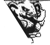
Same fierce eyes, at any rate! Alas, these both never saw the light of day. However, it’s possible this elephant was reworked into Piloswine, which is not in the May ‘98 collection but does appear in the June 13 ‘99 collection (although Swinub is absent). While Piloswine and Swinub are more akin to wild boars, there is also some relation to mammoths (an inspiration more heavily leaned on with Mammoswine in later games). Then again, there’s another pokemon you’ll see a little further down this list that might have inspired Piloswine instead.
(#311) Natu/Xatu Mid-Evolution

What is clearly a mid-evolution (its file number sits between the two). Has a peacock-like tail. Honestly, I think this works really good as a mid-evolution, and I don’t know why it was cut. I want to name it “Watu.”
(#313) Drunk Kiwi Pokemon

This one is just hilarious to look at. It appears to probably be a kiwi-bird? A very crazy-eyed, loopy one. I can see why this one was cut. The goofy, simple design kind of looks like a knockoff cartoon character for children.
(#314) Scorpion Pokemon

A pretty badass-looking scorpion, although a rather basic design. I dig the funky head, though. It seems like it has a single, beady eye and is rather menacing. This pokemon may have been later reworked into Gligar, a pokemon that first appears after this sprite set, in the June 13 ‘99 group:

Admittedly this is rather different from the Gligar we know, but it is an early design.
Or, who knows-- maybe this little fellah was later reworked into Skorupi. (If so, it’s a shame, as I don’t dig the weird accordian-like design of its limbs and its evolution.)
(#315) Quail Pokemon

A pudgey little quail pokemon. Doesn’t seem related to the kiwi pokemon. It’s a very cute little thing, and has lots of potential to evolve into something interesting, but it seems they scrapped it pretty quickly.
(#316) Music Note Bird Pokemon

Although these sprites are numbered right after the quail, and they are both birds, the designs are very different, so they seem unrelated. It seems the beta pokemon were simply blessed with a lot of birds. This little bird is in the shape of a clef, giving this bird a musical theme. It seems very likely it was later reworked into Chatot, a bird with a music-note shaped head and metronome tail.
(#319) Boar Pokemon

A cute, grumpy little boar with antlers. Probably what eventually led to Piloswine found in the June 13 ‘99 group. A bit of a shame, in my mind, as I kind of prefer this design.
(#325) Spikey Dog Pokemon

The curious thing is that this dog looks very similar to “Pudi,” a pokemon we saw in the Spaceworld ‘97 demo, which was intended to be a pre-evolution of Growlithe. But Pudi is also in this same collection of sprites!

Perhaps they were toying with the idea of re-designing Pudi (and had already scrapped a bunch of baby pokemon) and just hadn’t bothered to remove the old Pudi yet. It’s hard to say. Ultimately, these both were scrapped, but at least we still have Subbull/Granbull.
(#331) Yūrei Ghost Pokemon

This little ghost has two things that are common in Japanese folklore: the hitaikakushi (the white cloth headband it wears) and the two little balls of fire called hitodama. It is unknown why this ghost pokemon was scrapped, but perhaps they thought the little fellow wouldn’t translate well overseas?
(#344) Viking Ship Pokemon

Look at this beauty! A pokemon based off some sort of Viking ship. I absolutely adore this one. It’s creative and charming. I hope to see it in the future.
(#349) Wooly Dog Pokemon

This canine-like creature is fluffy as all out. Honestly I think it’s a tad odd, with how tangled and disheveled its fur looks. I can’t help but compare it to the early desings of the three Legendary Beasts, since they also are very canine-like:

These three designs are present in this same May 6, 98′ sprite collection as the representations of Raikou, Entei, and Suicune. Were they possibly playing with a different design idea for the Legendary Beasts? Perhaps Suicune. The Wooly Dog is just such an imposing sprite, that I can’t help but wonder. All pure speculation, of course.
(#350) Rabbit Pokemon

This rabbit has a rather intense look about him, and it makes me curious what the ideas were behind it. TCRF suggests it’s a possible pikachu clone.
(#351) Snake Pokemon

This cute little worm or snake seems to be wearing a feather headdress, suggesting its design may also be Native American inspired, like the Natu line. On the other hand, this could be inspired by Quetzalcoatl, a feathered serpent deity in Aztec culture. I would have loved to see this little guy’s evolutions.
(#352) Scarecrow Bird

A bird with a hat that kind of looks like a scarecrow. Honestly, it’s a super-cute idea.
(#353) Gargoyle Pokemon

This crouching beastie sort of looks like a gargoyle with a long, sharp tail. I can’t quite tell if those bits on the side are little wings or just a part of its legs. It would be interesting to see this creature standing in a different position-- I feel like that would give us a better understanding of what it looks like. Interestingly, there are striking similarities with Aerodactyl:

I wonder why they are so similar?
(#354 - 356) Manbō Evolution Family
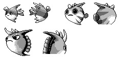
The first of these three fishies was someone we already met in the Spaceworld ‘97 demo-- it was named ‘Manbō 1.′ In the demo, it evolved into Ikari (Anchorage) and then Gurotesu (Grotess). It seems it’s now been split off from those and given a new evolution family here. While I find that neat, and I quite like the expressions on these fish, they are admittedly a little bland.
(#360) Flying Squirrel(?) Pokemon

TCRF guesses this is a flying squirrel, and it seems to be wearing a sheathed sword. Not sure about the headgear it’s sporting. Is that a ninja star?
(#364) Early Cyndaquil

So, this May 6, ‘98 collection is really exciting. The original Gold/Silver fire starter line we saw in Spaceworld ‘97 (Honooguma’s line) is still present in this collection (as is the water-type ‘Cruz’ line and Chikorita’s line). So, what we have here seems to be an early Cyndaquil before they decided to turn it into a fire type and make it the fire starter! In fact, those spikes might even be icicles (like Alolan Sandslash), for all we know. If so, Cyndaquil’s typing pulled a 180.
(#377) Early Furret?

Possibly an early Furret. Looks pretty awkward, not gonna lie; I’m glad it was probably refined into modern Furret, with more body definition between the head and tail.
(#378) Stork Pokemon

It’s a stork, based on the myth of where babies come from. A cute idea, although its curly ‘hair’ looks a little funny to me.
(#380) Squid Pokemon

A squid with drills for its mantle and arms. Since that’s kinda Beedrill’s thing, I’m glad they scrapped the idea. The backsprite lacks drills so it’s probably from a different design stage.
(#382 - 383) Early Burmy/Pineco

Burmy/Wormadam/Mothim is based off the bagworm. Bagworms are grubs that use silk and lots of bits of leaves, bark and other objects to create a camouflaged cocoon. When they turn into adults, some species of female bagworms just look like their larval stage, while the males turn into winged moths. That is why Burmy/Wormadam/Mothim have their unique evolution situation. Clearly, these two beta pokemon are playing around with the bagworm idea. They probably went on to inspire both Pineco (another pokemon based on bagworms!) and the Burmy line in gen 4.
(#386) Koala Pokemon

It’s so cool to see they were thinking about a koala pokemon this early. We would not finally get one until gen 7′s Komala.
(#387) Tanuki Pokemon

A Tanuki that is carrying campfire kindling on his back, but the kindling has caught fire. Apparently based on the Kachi-Kachi Yama folktale, which is a surprisingly violent story, but I suppose folktales often are. Who knows why it was cut, but Sentret is the closest thing we have to a tanuki pokemon for now.
(#392) Megaphone(?) Bird Pokemon

Yet another bird pokemon! There sure were a lot of beta birds. This one appears to have a megaphone-shaped beak. Or, possibly, its head is shaped like a gas mask (the strange eyes seem to support this idea). Honestly I really dig the look of this one.
(#397) Frog Pokemon

It’s tough to tell but it has a small horn on its head. It has a long tongue and is probably shouting “ribbithhhhhh!” It’s cute, but a little plain.
(#400) Tiny Hippo Pokemon

Look at this little weirdo. I think it’s a tiny hippo? With a mohawk and a big grin and wild eyes. It doesn’t really seem to have a head, its mouth/eyes/ears are just stuck directly to a body. Looks pretty awkward, probably needed some polish. No idea what they were going for with it, but it’s interesting.
(#401) Skeleton Pokemon

A very spooky, bipedal, living skeleton beast. It has a long snout and sharp teeth, almost like a crocodile or a dinosaur-like creature. Its head and shoulders have bony spikes and the front of its snout has markings that seem to be a nasal cavity. Very detailed. It also reminds me of Missingno, as some Missingno used the fossil skeletons as their front sprites. I would have loved to have this pokemon, and it’s a real shame they didn’t use it.

(#402) Rodent Pokemon
A mouse or bunny with gigantic, spotted ears and no arms. Those are some serious ears; it almost looks like it could fly with them.

(#403) Fly Pokemon
A bug-type!! It has a huge, creepy face, curly antenna and wings strangely really close to its head. I love it?? But it’s a bug, so of course I do.

(#404) Plant Pokemon
The Snow Bunny was likely part grass-type, but other than that, this is our first grass beta! It has one eye, a spikey head, and almost foot-like roots. I love how grumpy it looks. There’s a possibility it was a pre-evolution for Sunflora, before they had created the idea of Sunkern (which is not present in this collection).

(#405) Ant Pokemon
Another bug!! This one looks a lot like a winged ant. (Those do exist-- usually a temporary thing for mating flights) It’s possibly related to the fly pokemon above, sporting very similar wings. However, it doesn’t really seem like an evolution.

(#406) Dinosaur Pokemon
A little dinosaur-like pokemon, looking up at you. It’s unclear if that’s a tough, bony skull, or if it’s maybe a hat. The clubbed tail makes me wonder if it’s related to #415 below, but it’s probably unlikely. However, it is pretty likely that this later became Cranidos.

(#407) Early Cherrim
This clearly was a design that was picked up later, in gen 4, to create Cherubi/Cherrim’s sunshine form. I am glad the design was improved, because the lips on this one scare me.

(#412) Early Dunsparce
Dunsparce looking quite different. No wings, no drill tail, with a much more typical snake-like face.
(#415) Dinosaur Pokemon

It looks like an aquatic version of an Ankylosaurus or something similar. It’s possible it’s related to the Viking Ship pokemon (as a pre-evo), but there’s no way to know. I quite like it, though.
(#416) Flying Fish Pokemon

This magnificent beast, this miracle of creation, is surely my favorite beta pokemon of all time. Revel in its glory. You may not like it, but this is the ideal pokemon body. What a perfect way to round off our collection of betas.
#pokemon#pokemon gold/silver#beta pokemon#april 2020 leak#pokemon betas#pokemon beta content#mycontent#pokemon discussion
215 notes
·
View notes
Photo
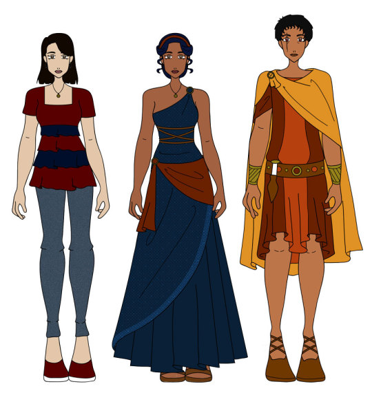
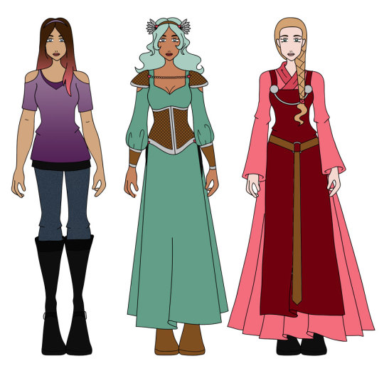
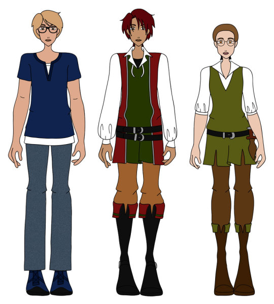
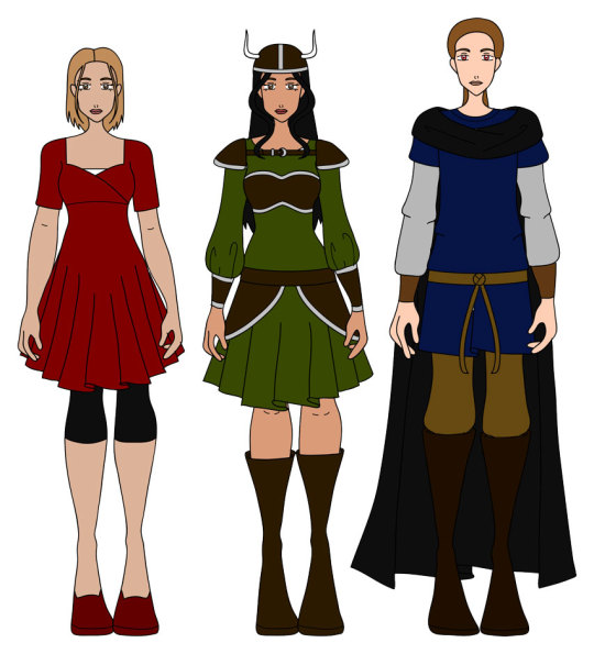
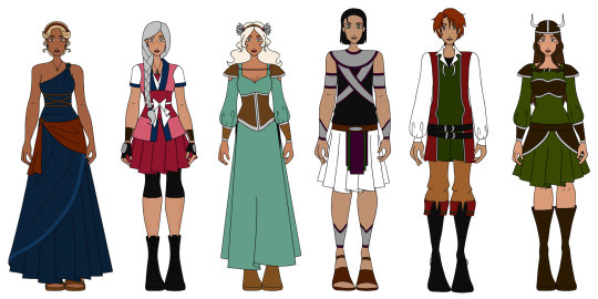
Since APPARENTLY I did the designs all wrong (I won’t lie - doing my own design of Evangelia was sort of a thinly veiled attempted to get @callistochan87 to redesign her herself. >.>), I figured I’d make it my life mission this week to go through and, like, fix them. Partially because in my fuming about finding out that two of the people were talking about this behind my back, I kept giving myself ideas. >.<
I am pleasantly pleased with the design that @callistochan87 did for Evania/Evangelia, although I’m worried how much is actually influenced by my design and how much she actually decided to do on her own. *shrug* I just like the simplicity of it and how it does make her look like a goddess. I kept forgetting to add in the pieces in front of her ears, lol.
Antigonus I did fiddle with a little bit. Mostly, @callistochan87 mentioned that she thought it was funny having this super old guy traveling with a bunch of teenagers, and she wondered why I didn’t just...make someone new. Well, mostly because I didn’t want to, and mostly because when she did create someone new when I decided the Guides were supposed to be younger, it felt...wrong.
SO, I decided to age him down a little. Which I suppose sort of defeats the purpose of @callistochan87 creating another character when I wanted to do the same, but ignore that. He basically has the same backstory - he was the youngest Guide of the previous generation. He’s the heir of the empire, being the Emperor’s nephew, and now that his Guide duties are over, he’s preparing to take over the Empire. EXCEPT, the idiot new Guide managed to get himself killed, so Antigonus is temporarily taking over the duties as they try to find someone else to take over. BUT THEN GUESS WHAT? He’s about 35, so while he’s old, he’s not stupidly older than than, and is sort of more of a chaperone than anything else.
His outfit come from an old one @callistochan87 designed, and I figure it’s just, like, a traveling outfit? idk
Freyja...omg, Freyja. She caused most of my strife. Like, I honestly didn’t change THAT MUCH of her design, just sort of little piddly stuff to make it look more visually appealing, but APPARENTLY, that was still bad. I stewed and hemmed and hawed on this for quite a while, annoyed before it hit me - this is a a redesign. Shizuka sort of went back to her roots. Why couldn’t Freyja as well?
(And yes, I realize I was in the wrong, but like I said, I hadn’t changed her that much from her last design, and, well, these were done years ago so I sort of...forgot that she didn’t originally look like that. >.<)
And I figured, ya know, since I had minorly changed Freyja and she didn’t like that, I had better change Desiree, too, because I drastically changed her. I don’t care what @swankifiedcos says about this one, I am IN LOVE with her outfit. <3 Her hair, though, was inspired by a recent picture of @swankifiedcos of her hair between dye jobs where it was pink at the tips and she looked SO PRETTY. Sure, Desiree is brunette, not blond, but I like that look on her so much I wanted to recreate it somewhat, and she looks so nice!
Frejya, well, I did sort of tweek her design slightly to what @callistochan87 did, mostly giving her cold shoulder sleeves as a sort of call back to her old sleeves. I won’t lie - I did attempt to do them again and failed spectacularly. Sorry. But apparently she approves of this sleeve, so that’s...one less problem for me to deal with. XD Just so you know, I gave her hearts rather than flowers merely because I can’t draw flowers. Consider it a style thing. Like, in reality, she has flowers, but i just draw them as hearts. I am SHOCKED that I was able to make the feathers as nice as I did, though! This look makes SO MUCH more sense than the way we used to draw it. Me likely.
(Also, you might be thinking that she’s still wearing the pants. I originally indended that, with the thought that she comes from a cold kindgom, but then decided they’re actually shorts that she ended up added to her outfit for modesty sake, much like Sethos did with his shirt. :P)
I really wanted to redo Nannin’s outfit as well, but I’m sorry - I’m lazy, and her original outfit is both too detailed and too simple. So I just made her top layer a darker pink, and I like it better. Also made her a blond again with the idea that the people of Melohdia like like normal ass humans, and the Chosen have colored hair, and the Guides have unnatural colored eyes, which is how people can tell they’re Guides.
Geoffrey (I’m thinking of renaming him Geauffery, because that’s how I prenounce it in my head) over there gets a new design as well because I didn’t care for his other one. >.< Also, decided, as much as I like the name Dimitri Kaminiski, I;m going to go ahead and make him Owen again. Mostly because he’s sort of shifted more into being Owen. I was sort of going with this old look while making it look a little more medieval, and I like it. I also decided he’s not a soothsayer, but rather a magician.mage.
Which is sort of similar to Evangelia’s power, but not quite. She uses the power of miracles, whereas he uses actual magic. Its sort of like how Shizuka and Freyja’s power is similar, but Frejya’s is a little weaker. (Shizuka has mastery over all weapons, whereas Freyja just has mastery over bludgeoning people with a huge ass axe. But she has the benefit of also having magic, whereas Shizuka can just use some fire magic.)
The next design is where it get all long and involved. Basically as I was stewing about having my feelings hurt and how I was going to hide everything in my annoyance, I THINK I was briefly reminded of the last time I screwed up and within that instance a brilliant idea came to me, mostly because I needed more villains.
I remember I really like Astrid’s design, but looking back, I’m sort of confused as to why? It doesn’t look at all better than Freyja’s. >.< Anyway, the thought is simple - when the Chosen are originally yanked into Melohdia, Nuncio replaces one of them with one of his own that would be easily manipulated. Why Freyja, you ask? Plot reasons, since it does help explain the whole Nannin thing a lot better. The thing is, though, that Ariadne and Atalo sort of find out and drag Freyja in as well, except she ends up in Baldernan rather than Azibo with the rest of the Chosen.
So the Chosen are in Azibo thinking Astrid is one of them, except they don’t really vibe with her that well. They just figure it’s because they can’t like everyone, and ignore it. Astrid herself doesn’t really suspect anything. But then they travel to Baldurnan and find Freyja there, who they do vibe with very well, and they find out that Astrid is a fake.
Which would be all fine and well. Even Freyja’s willing to give the girl a chance because, hey, it’s not her fault she was falsely brought into this world with no purpose. Except Astrid is a spoiled bitch and takes it as an affront that they would even want to include Freyja at all. So she just sort of runs off and Nuncio catches up to her, and convinces her that she’s the real one, and and she goes around antagonizing the group from time to time. They think she’s in league with Atalo at first until they find out of the truth.
NEW IDEA. I actually had this very vague idea while musing around, but @callistochan87 had another idea that was similar enough that I can change things to make it work WAY better. So, the new idea is mostly that Nuncio pulls Astrid into Melohdia way before the others. The people are rather confused, certainly, but it’s not 100% unheard of one Chosen being brought over. So she’s treated like something of a god and spoiled further, and Nuncio pretty much convinces her that she’s the soul savior of Melohdia. He assigns Thor to be her Guide, although he’s just some Random Dude (because I decided that matching genders to the Chosen is sort of weird, so Nannin is a full Guide now).
BUT Ariadne and Atalo end up pulling the REAL Chosen a month or so later, which REALLY pull the people for a loop, and they realize that Astrid is a fake once they realize that Thor isn’t a real Guide and that Nannin claims Freyja. The group attempts to assimilate Astrid in with them, because they realize it’s not HER fault all this happened, but since she’s a fake Chosen AND a narcissistic bitch, they end up not viving all that well, and she ends up running away in anger and embarrassment.
Nuncio sort of blames the whole thing on Atalo somehow, since the people forgot that Ariadne is the only one who can pull true Chosen into the world, mostly to save face.
Astrid and Thor do end up joining with Atalo for a little bit, because he’s trying to be sympathetic to her as well, but their goals aren’t really the same. She does prove to be a major threat to the group because she DOES have the power of a Chosen, although they’re sort of weak.
Her real name is Katelyn Davis, and she’s pretty much the opposite of the other Chosen. She’s a complete social butterfly, the sort to think the world revolves around her. She’s not happy unless she’s around people, whereas the other Chosen are pretty much introverted and would prefer to keep to themselves.
Her Guide’s name is Thor (I keep calling him that in my head, I think because of Frejya being named after a god), and he is, in fact, a true Guide. It’s just that he’s not a very good one, nor is he a good person. He’s a bandit and delights in the misfortunes of others. The other Guides avoided him at all costs, and wasn’t sure why he was chosen to be a Guide. He goes off with Astrid after they kick him out of the group when Freyja chooses Nannin over him. (The two of them became close in the month Frejya was stuck there on her own, so of course she’d want to have her stay with her.)
The last picture was just me giving them their original hair colors just for the hell of it, and now I’m torn. >.< Because I like these as well. I mean, I like the idea of the colored hair being how you can tell they’re the Chosen, BUT I also, you know, like the original colors BECAUSE they are the original colors. >.<
23 notes
·
View notes
Text
GUESS WHO’S ON VACATION, BITCHES

You guys seriously have no idea how fucking AMPED i am to not be at work this week. All normal “work sucks” stuff aside, it’s been especially full of shit in the last two weeks and I have every intention of leaving as soon as possible.*
BUT IN THE MEANTIME, I have a week to myself to just exist in the world as I see fit, and I have a lot of things I’d like to do with you lot in that time! This probably isn’t a comprehensive list and I’m not guaranteeing I’ll accomplish them all, because I’ve met me and that bitch gets distracted easily, BUT here are things I hope to do here this week!
Open a new online yard sale! I have a lot of new things I’ve never posted before and they seriously need to go, they’re cluttering up my space and not even being properly loved while doing so. Maybe one of y’all can give them a better home!
Post the newest ep of Brotherhood: Origins. This, obviously, definitely WILL get done because all I have to do is copy/paste and hit “post,” but still it’s just something to look forward to.
Finally get around to posting some of my Guardian redesigns, which I first brought up weeks ago! I was thinking recently about how I never got around to that and how I still have designs I never finished working out in the first place, and since we’re almost done with Kayla’s arc, I think you guys deserve a look at her and Jarvis. Please definitely harass me on this one so I don’t lose sight of it.
Also, character themes! I recently tripped over a song that’s well-suited to Kayla and decided it’s been a while since I’ve gone through and done some themes, so I might post songs for her and Jarvis soon. (I have other songs picked out for other characters too, BUUUT we’ve not gotten to them yet, so I haven’t decided if I’ll post them yet.)
Update my animation art gallery! I have a lot of items that have gotten backed up waiting to be added (more than I realized, honestly), and I apparently only update the gallery on odd-numbered years, so now’s as good a time as any to get it did and finally file these items away proper.
I was thinking lately that an open Q&A might be fun? I’ve gotten more asks lately than I usually do, and honestly it’s really fun answering them! (Plus it’s really nice to know that people DO take an interest in this stuff and want to hear more about my stories and how the architecture behind them works.) I don’t really have any official date or time set aside for this, but I think I might just make a post openly calling for any and all asks regarding the stories I do, and then maybe I’ll just answer them all at once on a given day. WE SHALL SEE!
So yeah, I think these are all things that’d be cool to do this week! Maybe more! Hopefully at least these though! Let me know in the comments what you’re more interested in seeing happen if you have a preference~
*Well, less “as soon as possible” and more “as soon as doesn’t screw me,” because I still have another week of vacation time I don’t want to waste and my company’s doing a huge raffle in like 3 weeks. I have no illusions that I’ll win, but fuck if I don’t have great luck with raffles, so I owe it to myself to at least be available for that.
10 notes
·
View notes
Text
The Three Caballeros Ride Again Review!: And Ladies (Ride of the Three Caballeros)
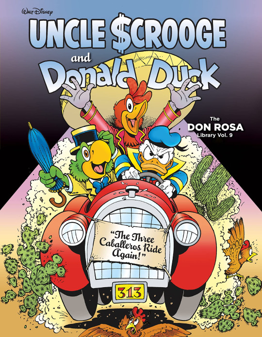
Saludos Amigos! I’m back with yet another comics review! And we’re back on The Ride of the Three Cablleros! Thanks again to WeirdKev27 for commissioning this retrospective. It’s going to get pricey and I greatly appreciate it. PREVIOUSLY ON RIDE OF THE THREE CABLLEROS
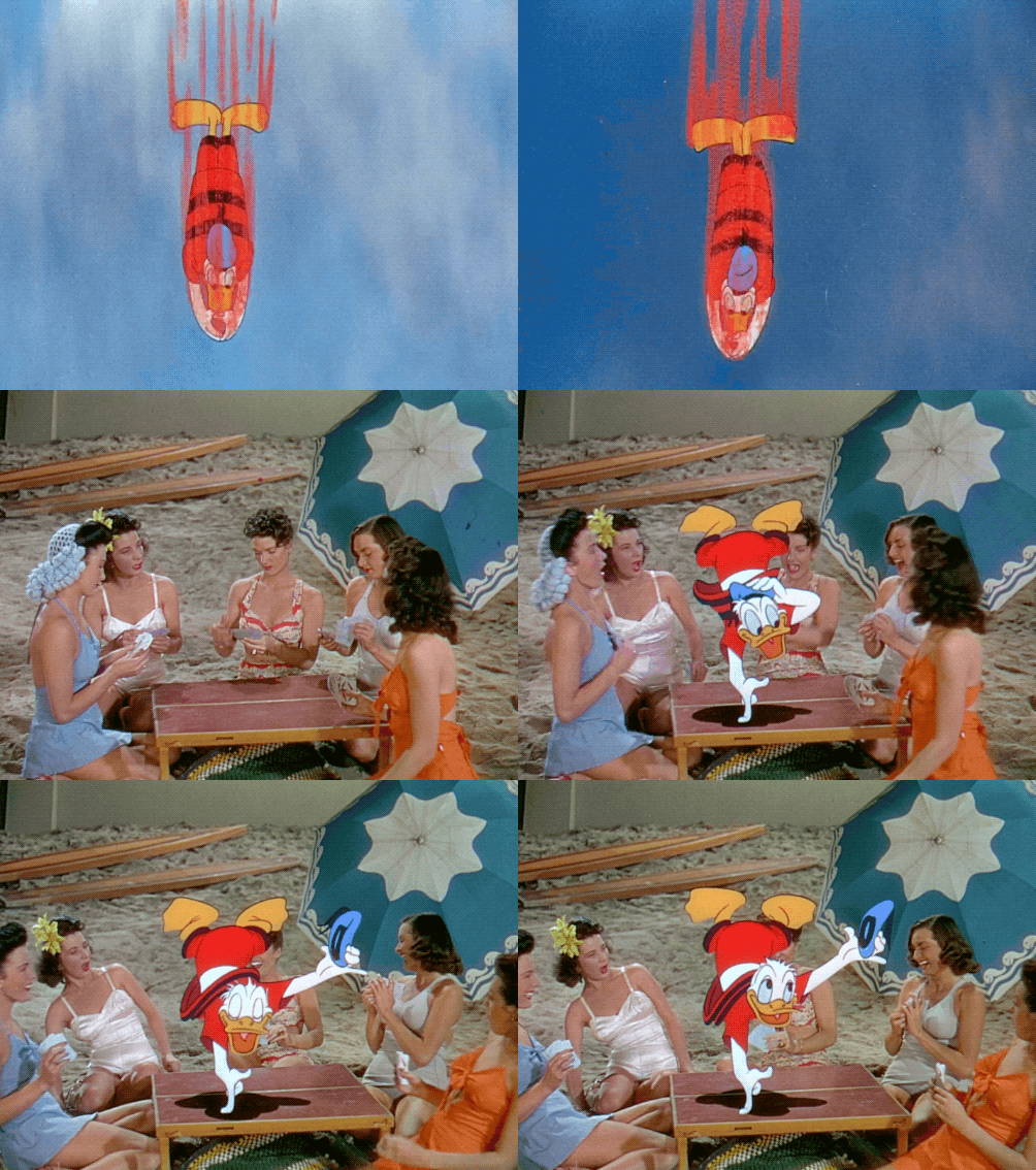
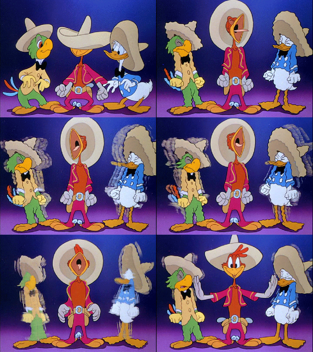
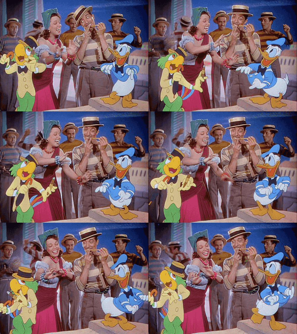
In short.. a bunch of short segments of varying quality, a very thirsty Donald hitting on ladies, the first appearance of Panchito and some very good music. A fun time was had by all. Along with a LOT OF drugs by the Disney Animators. The film wasn’t a huge success, but out of the 6 package films, it was a fan faviorite alongside the Mr. Toad and Ichabod movie, and thus was rereleased quite a bit, as well as being one of the first of this era to end up on VHS due to it’s cult popularity. As for Panchito and Jose they’d get plenty of success overseas, with both getting solo series in their respective home countries, Jose himself having just resumed having comics again this year, and being rightfully massive characters. But despite being a hit with fans across the world.. in the US... they were pretty much shoved in the Disney Vault for a few decades. Jose would show up on the Wonderful World of Disney, in it’s various forms, three times after the Three Caballeros while Panchito just vanished aside from reuses of the Three Caballeros footage. Their careers in the US just sorta vanished for a few decades. But as suddenly as they vanished, our boys returned triumphantly. Naturally being the most used out of the duo, Jose would show up for the first time in decades during Mickey Mouseworks, a show full of new late 90′s produced Mickey Mouse shorts, all but two of which would end up being recycled for the much more popular and well loved House of Mouse, which would feature the triumphant return of the Cabs to animation after so long away. We’ll get to that next time, as just a year before the Cabs had already reunited in the pages of Walt Disney’s Comics and Stories in one of Don Rosa’s best loved tales. The Ride of The Three Caballeros was something Don Rosa had wanted to do since he got the job writing Duck Comics in the first place. As he explained in the back of the complete library edition named after this tale, Uncle Keno isn’t the biggest fan of the Donald Theatrical shorts. Having experienced the Carl Barks comics first, and having built his career around them later, he just wasn’t a fan of the goofier, angrier, less nuanced theatrical short Donald, often feeling like he was an entirely different character from the one he loved. And.. honestly he’s not wrong. Both were built for entirely different kinds of comedy: While both did slapstick, Slapstick, along with standard comedy shenanigans, was the main weapon in Shorts Donald’s comedic arsenal. Barksian Donald, while not immune to slapstick, was more like a well built sitcom character: Multi layered, sympathetic when he needs to be, but still having tons of faults to be exploited for laughs and to play off other characters. As a result while I like Donald in the shorts I do prefer Barks version of him, and the shorts Barks did are usually the best of both worlds, combining Donald’s everyman schtick with his slapstick schtick. Of course later cartoons would pick one or the other or combine both, but I do get his point and at the time he wrote this story the only cartoon show starring Donald was.. Quack Pack.. which I can only imagine his reaction to seeing that train wreck.
But as you can probably guess there was one exception and it was The Three Caballeros. Don genuinely enjoys the beautiful music and the wonderful chemistry the three have. So after a trip to Mexico gave him the perfect setting and the fire in his belly to finally do it, he finally wrote the story. And since they weren’t Barksian characters and hadn’t had any other apperances in decade, Don also took a dive into their comics. Since Jose was more of a fancifial freeloader in his comics, Don decided to ignore this characterization and go with his own based on the film: A latin playboy and lounge singer. And i’m okay with him doing that, as unlike say with Marvel and DC when they destroy a character, Disney characters are both more fluid continuity wise and his is still rooted in a version of the character, and he’s fully accepting and apologetic that some fans hate him for this. Also for some damn reason they redesigned Jose at some point in his Brazil to look like this:
This is far from the dumbest comic book costume change i’ve seen, but it’s certainly one of the most lame, as his original outfit is dapper, stylish and fits the Brazilian version of him well. And it’s not like you CAN’T update the classic Disney characters with modern appearances. Quack Pack, which has somehow come up twice in this review, did so great with Donald and Daisy, giving them new clothes and a haircut in Daisy’s case but both still look great. Same with Goofy for Goof Troop who just wore a dad sweater and bow tie, which puts him in the small but significant club of “Bow Tie Wearing Characters who have defined my life” with Opus the Penguin and the 11th Doctor. You can update a classic character’s’s appearance without coming off like...
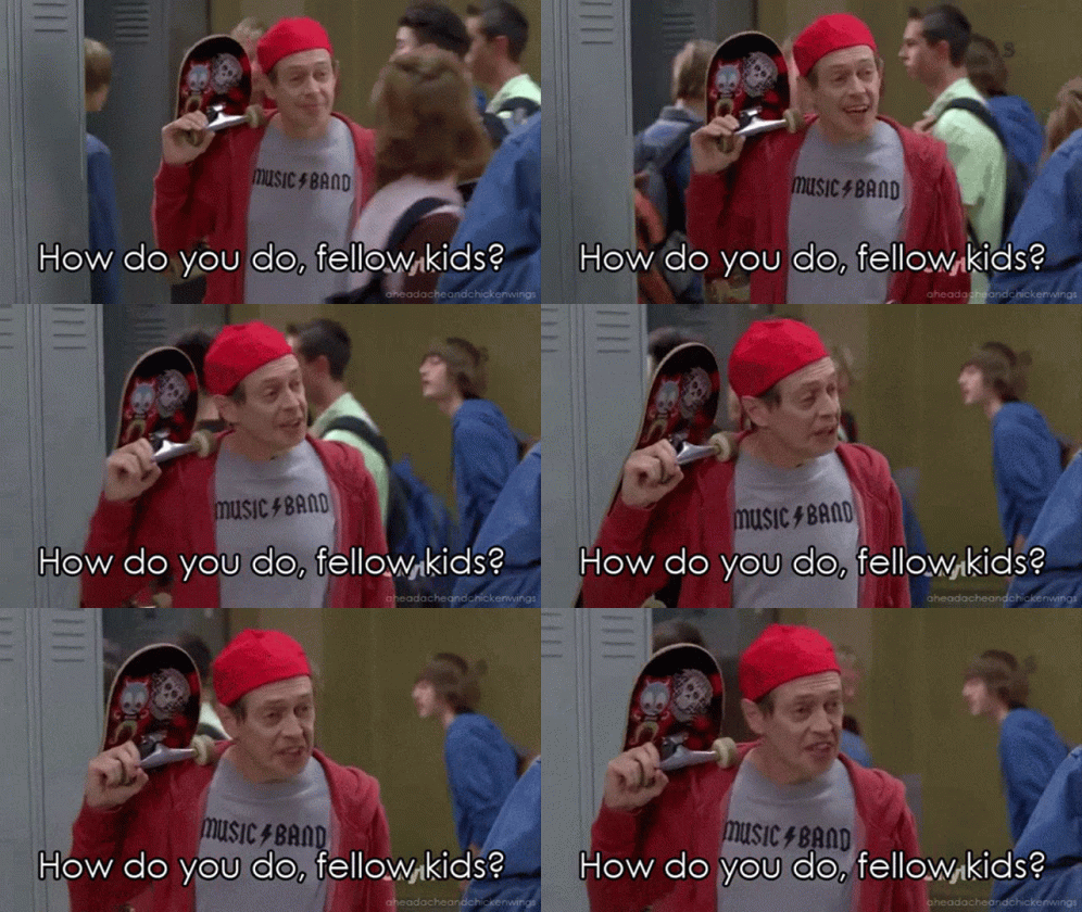
Which given Jose’s outfit there is horrifyingly similar, says something. Anyways, Rosa had more use for Panchito’s stories, which had him as a cowboy protecting small towns with the help of his trusty steed Senor Martinez. Rosa loved both aspects and thus used them here, with Martinez getting a makeover to fit Rosa’s style better. Rosa is also the one to popularize Panchito’s last name, having found it on a scrap of research, not realizing the character’s last name was not at all widespread and thus giving him a canon one that has stuck to this day, and sighing in relief when he finally got conformation from another fan this name was indeed something Disney had used after loosing his research scrap. So with the two boys characters set, a plot set up and a whole sequence planned we’ll talk about on the way “The Three Caballeros Ride Again!” was born. How good is it? Well join me under the cut and i’ll tell you.
We open in Mexico, specifically near the Barranca Del Cobre, aka The “Copper Canyon” of the Sierra Madre, a natural land formation simlar to the Grand Canyon that Don Rosa saw during his trip and thought would make a great setting. While larger than the Grand Canyon, Rosa figures in his notes it simply isn’t as popular because it’s more isolated than the Grand Canyon and that, combined with it having trees inside distracting from it’s rugged beauty, makes it much harder to build a tourist industry around. The four are headed to El Divisadero, because this comic is determined to kill me with it’s difficult to spell names apparently, where Huey, Dewey or Louie spouts off for no particular reason about the currently being built Chihuahua El Pacifico Railway. Seriously the boys might as well be the security guard from Wayne’s World in this comic, their role for most of their brief page time is just to set up stuff for later. I mean i’m fine with setting up your setting but there are better ways than just spouting off tons of exposition apropos of nothing.
Donald has driven the boys here for a Woodchuck Jamboree. I did actually look into Jamborees, as before this it only had ever come up in one of my favorite movies of all time, Moonrise Kingdom, and mentioned occasionally in the Ducktales Reboot. Jamboree was first used for a worldwide scouting Jamboree but has gone on to mean a huge gathering of scouts, with the Boy Scouts of America having one every four years, so odds are it’s just a big yearly or quarter yearly thing for the woodchucks. Still it would be nice to see a big gathering like this in the series, especially since several of our cast are involved in them, including the possible power trio of Huey, Violet and Boyd, and Della and Launchpad could easily be slotted into the plot as seen in this season’s premiere.. as could Dewey and Louie if they really want to since according to Frank their members.. they just aren’t nearly as invested as their brother, and thus don’t do Woodchuck stuff unless he drags them into it, as seen with “Day of the Only Child” in the series itself. It does make sense: Dewey doesn’t have the survival instinct or patience for camping, and Louie hates effort, the out doors, and doing things for anything but profit. Scouting is all of that. So the boys have driven all this way for the Mexican Jamboree, as they’ve been carefully raising their tarantula Tara, and the Tarantula Breeding Badge is only given out in Mexico, which is plausible: Different branches of a worldwide organization would have different awards and what not in different countries. And Tarantula’s are also native to mexico so that makes sense.. and I want you to apricate that I’m afraid of spiders, not cartoony ones, for instance, this is adorable.
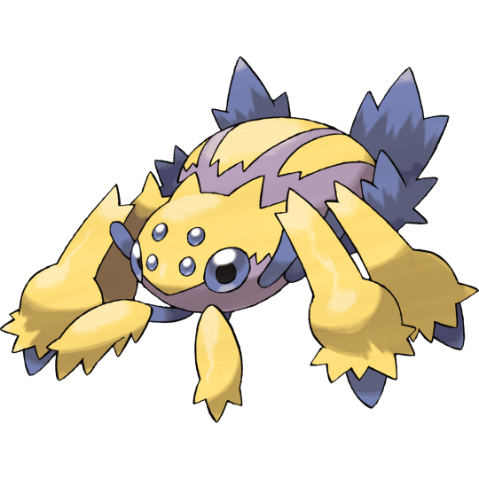
Galvantula4Life. But real life ones or realistic looking ones? Yeah no fuck that. So I had to go to the Wikipedia entry and see several horrifying looking sizeable spiders for this one tiny fact. Your welcome. Tara ends up on Donald’s face with the boys assuming Donald is sad to see her go instead of you know FUCKING TERRIFIED A GIANT SPIDER IS ON HIS FACE. This gag does not work.. but probably because as I said i’m afraid of spiders and this is my nightmare, you little sociopaths.
The boys however worry about what Donald will do for the weekend as they prepare to board the bus to the Jamboree... why it’s meeting in an out of the way town like this I have no idea, but i’d guess plot convince. They realize he has no friends, which Donald shrugs off, and they REALLY shouldn’t say to his face, but ruminate on it once he leaves to do whatever after vaguely talking about friends he had in the past.
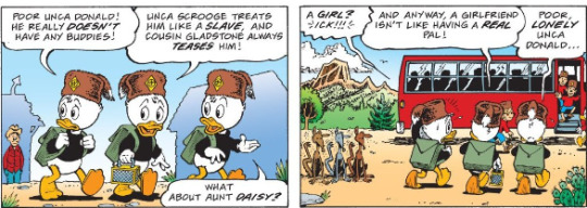
I like this scene even though it annoys me a bit: Ilike it because it does set up how Donald really DOSEN’T have any friends in the comics. It’s part of WHY Rosa was drawn to the Cabs: Their one of the few equal relationships donald’s ever had, people who treat him as a partner, in both sense probably, a friend, a true amigo. As the boys point out Scrooge is a monster to him in the comics, paying him 30 cents an hour which I actually put into an inflation calculator to get an accurate read on how little that was by 2020 standards.. and it’s 3 dollars an hour. Hence why I call him a monster, why that bit hasn’t aged well, and why Rosa REALLY, REALLY should’ve retired it. It dosen’t help reading that knowing Disney largely treated Rosa the same way is cringe inducing at best, if not for any fault of his own. It being cringe inducing for an employer horribly mistreating and underpaying his employees though is his fault, he’s a grown ass man, even in the 90′s this had to be a problem, be better.
And yes i’m being hard on Don Rosa but just like with the comics thing, I simply expect better from the man given just how much respect I have for the guy. His art is gorgeous, his research is immaculate, his knowledge of old films is wonderful and his love for them so infectious i’m tempted to seek the ones he’s mentioned in notes out. He’s a truly wonderful guy and one of my faviorite comic writers.. but I have to treat him fairly like I do ANY of my idols. Just to prove that, I love Grant Morrison, especially his run on New X-Men, but a lot of it hasn’t aged well including some of the language and the entire subplot with Emma manipulating Scott into having an affair when he wasn’t in the best mental place and she knew that and was acting as his therapist, and treating that as a regular affair REALLY doesn’t play well nor should it have. I love Al Ewing, with all my heart and soul, but his run on Ultimates, while having some great worldbuilding and a spectacular cast, ultimately wasn’t very good after the first arc. Not terrible but not good. John Aliison, of Scary Go Round and Giant Days fame, while impressive has had plenty of stories I just didn’t like for various reasons and will probably get into some day and some parts of his stories haven’t aged well. It’s the hard but necessary part of being a critic: You have to be objective and see all the parts of a creator’s creation, not just the ones you like and call them out when they screw up. To me being a fan isn’t about just blindly loving something, it’s about knowing WHY you love it and being willing to call out faults while still thoroughly enjoying the work. There’s a fine line between being blindly loyal to someone, which has created Zach Snyder's awful cult of personality that I hate so much, and being an overly critical shithead and I hope I’m straddling that line.
Back on the scene after that filibuster they point out Gladstone, who himself is a monster to me for how he doesn’t lift a finger to help his nephews or cousin, and constnatly flaunts his luck to Donald, and is a bit more than teasing especially since he tried to, you know, steal your house once boys. That’s canon.. that’s a barks story so it’s canon here. You.. You remember that right? He tried to steal your house. And we will be getting to that one next month, just you wait. Finally the Daisy part that annoys me slightly. The boys being sexist.. was sadly the style at the time this story is set, the 1950′s, and thus plays better for me than it does in Ducktales, as their just little boys and don’t know better. Them assuming Girlfriends aren’t like having friends, while accurate though does bother me a bit, but only because the way this story treats Donald’s relationship is PRETTTTTYYYY bad and this sets that up. But we’ll get to that. Thankfully this foreshadowing of terrors to come is quickly forgotten as we get a GENUINELY great two panels of Donald lamenting his lack of friends. It just works really well, selling his loneliness and how isolated he truly feels without any, which while I have friends I can relate to as I only really hang out with on regularly.
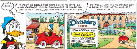
This is what I was talking about. While I will point out Rosa’s flaws.. their truly outweighed but his artistic mastery. In just three panels he really has a truly emotional and heartrending scene, and just that one close up among them is all we need to get the true depths of Donald’s loneliness. I can be hard on the guy, but it’s because he’s one of the best there is, best there was, and best there ever will be and thus I hold him to a high standard. But with that we transition to...
Or rather first his boss at the hotel, whose pissed his headliner has skipped out on him again to woo a lady, and while he plans to fire the guy, only isn’t throttling him because he figures one of his “Senorita’s” boyfriends will do that for him. And while I do like Jose as a playboy i’m not really fond of him trying to have sex with someone in a relationship, as it puts both him and the person he’s having an affair with in a really bad light. It does fit the character, I just don’t have to like it. As for this particular Senorita, it turns out her boyfriend is a notorious Bandito and is thankfully out of town. So yes, Jose is essentially acting out Come A Little Bit Closer by Jay and the Americans.
youtube
Naturally just like the song, said Bad Man returns, Alfonso “Gold Hat” Bedoya, a machete wielding baddie who while understandably pissed about another man making time with his girlfriend, is less understandably about to murder Jose. Though unlike the song, Alfonso’s Lady, rather than help Jose, encourages her boyfriend to murder him and clearly has a fetish for cheating on her boyfriend with various men and watching as he kills him which.. Jesus. This is why while I don’t LIKE the idea of Jose hitting on women in a relationship it does work here, as he’s still not nearly as bad as either of these two, so it evens out. Jose escapes with his umbrella but crashes.. right into the back of Donald’s car. Rosa, Alfonso’s lady, encourages him to murder both of them for funsies, and being a brutal thug, Alfonso obliges and shoots at the car. And since, to quote the duck himself, Donald doesn’t like being killed “Even a little”, he books it out of there.
Alfonso doesn’t peruse them though. He’s on the trail of a treasure hunter who has a map to the lost town of Tayopa, which contains untold silver, but before he can do that he has important buisness to get to.
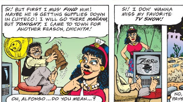
I fucking love that gag and that Rosa snuck more adult gags in there knowing plenty of Duck Fans, such as myself, are grown men, women and others who can handle this sort of thing, while still slippnig it past the kids.
Donald, once the fear’s worn off a bit, starts to wonder WHY he’s running when he’s not the one who pissed off the guy, and ignores Jose’s good point about the fact Alfonso really dosen’t seem like a guy who sees nuance.. until Donald sees a wanted poster for Alphonoso and keeps driving. He eventually gets far enough away to feel safe.. and confront the guy who got him into this mess.
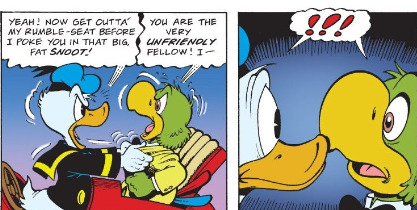
Now kiss. While sadly, they do not, we do get a lovely warm reunion between old pals. Rosa keeps their past vauge as, correctly, he pointed out in his authors notes that the Cabs movie really had no plot, accurate, so instead just vaguely alluded to Donald having known the two in his pre-daisy and boys past and likely had similar adventures to the movie, but adapted more for Rosa’s barksian universe. Jose explains he often finds himself cash poor and thus hits the road to drum up some money, and Mexico is a great place for that as it has plenty of tourist money.
Though as Jose talks about their past we get the most uncomfortable running gag of the story.
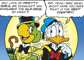
While Donald’s paranoia here is played for laughs.. it just.. isn’t all that funny that Donald’s relationship with Daisy in the Rosa canon is apparently sooooo deeply unhealthy that just HEARING about him having a romantic past before him, as Rosa confirmed this was pre-daisy in his notes, causes Donald to panic and worry she actually somehow heard this. It just isn’t funny.. it speaks of MASSIVE relationship issues and some form of domestic abuse on Rosa!Daisy’s part. It’s stuff like this why there’s only a handful of Donsy relationships I like: Her treating him like shit is reduced to a punchline, instead of being used for character growth. It’s also why I’m deeply dreading covering “Legend of the Three Cablleros” at the end of this retrospective. I just don’t like when Disney media treats Daisy expecting too much of Donald or being hyper jealous of him as hilarious and while I take this more as the story not ageing well rather than barks fault, as since then Domestic Abuse against Males has become a more widely known and talked about issue, it still doesn’t’t make it plesant. It just makes this not entirely his fault. Just like it’s not Stan Lee’s fault this panel is both deeply hilarious and uses a now kinda racist term.
I named an entire youtube channel after that.. we all have our regrets. I also bring it up since currently Harry’s become terrifying villain Kindred... and thus the current big bad of an entire Spider-Man run and the being hopefully bringing one more day into the light and hopefully leading to it’s undoing.. once had a goofy mustache he genuinely referred to a “Fu Manchu Face Fuzz” that for all we know he regrew under the mask.
Donald fondly remembers the old days of being a badass adventuring team and decides, screw it, let’s go show that Gold Hatted Paloka whose boss.. but being Donald ends up driving them into The Copper Canyon instead. Our heroes end up lost in the canyon and , fitting for Donald get shot at. I can only imagine his thoughts right now.
Their mysterious attacker threatens them.. before revealing himself to be Panchito, whose glad to see his friends having mistook them for Alfonso. Turns out HE’S the mysterious treasure hunter Alfonoso was after, to no one’s surprise. We get another deeply unfunny “Daisy’s only a thousand miles away gag” as the boys reminisce and get introduced to Panchito’s horse, Senior Martniez. He also tells the boy about his map.. but how he’s hit a snag as the lost town where the silver, from a silver mine.. is now buried under pounds of volcanic rock, a volcano having erupted. This is artistic license as Don Rosa admits there aren’t any known volcano’s in Mexico, but that they also still haven’t found that missing town, so this was his explanation. All is not lost as Donald’s globetrotting with Scrooge meant he knows his history.. and thus spots an old mission which, at the time, were used by preists as cover for secret mines. Donald naturally bungles his way in and we get the much better running gag of the Cabs thinking Donald did something amazing when he really just wondered into slapstick. They end up down the shaft, with Jose deciding Donald can’t do all the work, and finding a secret entrance under a sanctum sanctorum.. a religious thing I have no idea what it ii s but is clearly where Dr. Strange got the name. Regardless they find some old kegs filled with pure silver. As Panchito puts it:
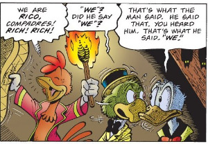
And he did ideed. In a nice moment that shows off his character, Panchito has no hesitation for sharing the wealth: He wouldn’t of got this far without his friends, and he wont get the Silver cashed in without their help. He also fires off his guns in celebration.. forgetting their in a cave, a gag I genuinely like.
After some off screen loading and hoisting, the boys are slowly on their way out of the canyon, with Donald’s Car and Senor Martinez pulling the cart with the silver together. With some downtime the three talk about what they’ll spend the money on.
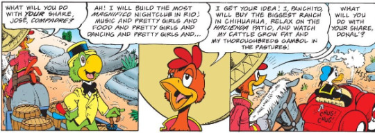
About what you’d expect. A big beautiful music venue

For Jose, and a nice ranch to retire at for Panchito. Both despite being wondering souls would love a simple place to call home, in their own personal styles. While they are BIG goals, their also likeable and understandable ones: Jose just wants to stop having to do all these tours and carouse and party and perform at home. Be his own boss, and live his own dreams instead of working for whoever will put up for him. Panchito just wants to retire from being a wondering hero to a peaceful life of farming, an honest reward he well earned. And Donald?
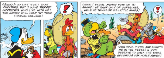
This is easily one of my faviorite moment’s of Rosa’s, one that really cuts to comic donald’s character: Sure he can be lazy, a trickster, hot tempered, and overconfident.. it’s why we love him.. but at the end of the day he genuinely loves those boys and their his first prority and I can see why the reboot took that trait and made it his defining one. They may annoy and frustrate them and he may pull a switch on them, 50′s after all.. but he loves his boys and knows they’ll do great one day and despite his spendthrift ways when given big money.. their all he can think about. Sure Donald probably has his own personal dreams, but instead of going big and retiring he’d probably just take only a small sliver of that money to open a humble hot dog stand or something, so he could have something of his own to provide them, while still giving most of the money to their college. Scrooge is who we all want to be.. Donald is who we are at our core: Flawed people who just want to do our best. It’s why I love the guy so much. The boys rest in the small town of El Divisadero, which like the town we started in is a real place, though both are much smaller, even as of 2000 when Rosa made his visit, so he had to embelish slightly. THey stop at a local watering hole only to find Alphonso. While Jose is naturally worried, Gold Hat has moved on to Panchito and wants to know why he’s here. However Donald thinking quickly says he’s part of their nightclub act, and we get a rousing version of the three cablleros, which when reading this I synched up to the song. I won’t put it here, as it’s too big for tumblr and it really works more as a whole, but needless to say, it’s the highlight of the comic. While Rosa did have doubts about putting a musical number in a comic, and it’s often trickey, he makes it work with the energy, vibrance and number of gags, that compensate for the music not being there. There’s tons of great gags, from Donald getting thrown out window, to the stone faced crowd who only cheers when Alphonso ends the number by whacking the three with one of their own guitars. Alphonso quickly realizes what’s goin on, finds the silver, and then hyjacks the train. The boys take off after him in the car, as Donald triumphantly states “The Three Cablleros Ride Again!”. The three head after Alphonzo, who finds them when trying to release the other cars to increase speed, and then shoots at them. It seems hopeless... until donald gets launched into the air, into a cactus then back into Alphonzo knocking his guns out in a great bit of slapstick. The Conductor, likely not knowing about the others or not carring, detaches the cars though, so our heroes and villian are now sent rocketing through the world’s most dangerous railway. Which, as you’d probably already figured out, is very real and what inspirited rosa to use this setting and thus indeed wind through dangerous mountainsides and over thin cliffs like a real life Donkey Kong Country level. Eduardo still has his machete though and easily beats Jose’s umbrella, but some more Donald slapstick and him apologizing to daisy about the senioritis as he wishes her goodbye seriously GET SOME COUPLE’S COUNSELING IF THAT EXISTS IN THE 50′S. It puls his sombrero down over his head, and with jose’s umbrella top landing on it, carries him off where he ends up in a lazy asshole sheirff’s jail for a gag. The boys however continue going back.. and the railway is unfinished at this time in history and while they save the silver, their fucked. But Donald has a plan, running to the back of the cars to get his car, and while it has trouble starting, Panchito throws some chilie’s in the tank to get it moving again. The boys find the silver.. but when one barrel spills they find out it’s not actual liquid silver.. but quicksilver, which was used for silver refinment. So while i’ts shiny, and toxic so of course Jose sticks his hand in before knowing what it is, it’s worthless. Probably. The boys.. all have a nice laugh over it. I love this moment. Sure the boys lost their dreams.. but like Scrooge, the three belivie theirs always another rainbow. What matters is the journey they had and the reunion that restored their friendship. Donald also muses the boys are smart enough to get their own scholarships anyway, so it’s no big loss.. but he does have to get back to Disvadero as the jamboree ends tonight and Jose agrees as he now needs a job again. The owner balks, understandably since Jose missed a performance to get laid and then disappeared overnight.. but the Hotel Owner is visiting so as long as he can provide a big act he’s good, and while Jose is worried as he already gave them his best, the boys naturally pitch in to be the cablleros once more. After all
So we close on Huey, Dewey and Louie returning, still worrying about donald, when they find him on stage. We then end on a truly heartwarming and great last few panels.
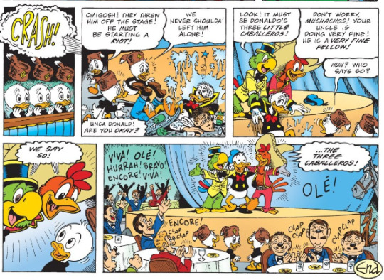
Final Thoughts: What else can I say? This story is beautifully drawn, as usual for Rosa, well paced, fun and really fleshes the Cabs out from the movie. It has a warm, fun adventurous tone and it’s nice to see Donald in the lead since Rosa usually did Scrooge stories and thus Donald was the justifiably surly sidekick instead of the main man> here he’s in the spotlight and gets to show just what he’s made of, while still being the hilarious mess we all know and love. The story honors the original film well, while forging it’s own path and is beautifully built into history. My only real complaints are the nephews being annoying, Alphonso’s somewhat overwrought accent, and of course the daisy gags.. but it’s all HEAVILY outweighed by one of Rosa’s finest hours and easy enough to ignore. Check this out if you can. It’s a classic for a reason.
If you liked this review, you can commission your own by messaging me on here or at my discord technicolormuk#655 for five dollars a comic story or animation episode. Whenever the ride resumes next, we’ll coming on down to the house of mouse to see the boys return to the screen. In the meantime keep an eye on this space for regular Ducktales reviews every Monday, including once this run ends as I intend to start playing catchup, loud house reviews whenever, my tom retrospective that’s returning soon, and my retrospective on the Life and Times of Scrooge McDuck, with chapter 2 of that also coming soon. Until then, there’s always another rainbow.
#the three caballeros#jose carioca#panchito pistoles#donald duck#don rosa#ride of the three caballeros#the three caballeros ride again#huey duck#dewey duck#louie duck#daisy duck#mexico#comics#reviews#elmo keep
50 notes
·
View notes
Text
god
fucking
DAMN
Mass Effect Legendary Edition is so fucking good
i’m not gonna go so far as to say it’s the only way you should ever play these games again. i think it’s the best way to play them, especially if you’ve never played them before. but the originals still have value if you’re a Mass Effect superfan like me.
Legendary Edition 1 fixes a lot of the clunkiness that the original ME1 had. this is mostly a good thing.... but also, that clunkiness had a certain charm, and i absolutely want to revisit it on occasion.
i don’t know much about LE2. i haven’t experienced much of it myself. if i had to guess, i’d say LE2 is probably the only one that outright obsolesces the original; everything looks way better, and ME2 didn’t have much clunky charm to it to begin with. but of course, OG ME2 inherently just still has value since you’d want to import from ME1 and to ME3.
and then from what i’ve heard, LE3 is largely identical to the original ME3, just with AI-upscaled textures (which makes sense, even by modern standards OG ME3 is a really good-looking and graphically impressive game). this’d also make it the definitive way to play ME3... if it weren’t for the fact that it removed the multiplayer, and the multiplayer is still really good. i fucking adore ME3 multiplayer. and the fact that it came out in 2012 does it a lot of favors, because that’s when studios were just starting to experiment and test the waters with lootbox mechanics. back then, lootboxes were still an unproven concept, studios didn’t know if they could get away with them, so they weren’t as disgusting as they are in modern games. honestly, if it weren’t for the mere presence of microtransactions (which are inherently exploitative), i’d say ME3′s lootboxes do more good than harm. i’d actually honestly recommend new fans pick up the original ME3 (it’s pretty cheap these days anyways) just so they can experience the multiplayer. don’t touch the microtransactions, just use the in-game currency. there’s enough of it to reasonably get new lootboxes regularly, don’t worry.
all that, and the fact that there are mods for the original trilogy that haven’t come out for the Legendary trilogy.... yet. but i’ve heard for a fact that the Expanded Galaxy Mod- the ME3 mod- is getting ported over, and i’d imagine a lot of the other essential mods (like the ones that re-implement the gay versions of Ashley, Kaidan (ME1), Tali, and Thane’s romances) will also eventually make their way over. so that’s only an issue for now.
but enough about the original trilogy still having value, let’s talk Legendary Edition.
for some background: the Mass Effect trilogy is collectively my favorite game of all time. i replay the entire thing at least once a year, and i have since i first got the trilogy collection on PS3 in 2013. so i fucking know these games like the back of my hand. i can basically play them in my head. and it’s especially true for ME1, since it’s the first one (and thus, if i start a playthrough and don’t finish it, i’ll at least have seen ME1) and also imo the best one (just to clarify though, while i AM a “Mass Effect 1 is the best Mass Effect” person, i’m NOT a “Mass Effect 1 is the only good Mass Effect” person; i’m actually one of those weirdos who genuinely loves ME3, and i honestly hold equal amounts of affection for both, with ME2 not far behind).
and god.
i’m just constantly finding myself blown away by how good Legendary Edition 1 looks.
even on the ultra-high graphics settings, OG ME1 looks super rough in a LOT of ways. i think OG ME1 is a good-looking game, for sure, but it’s a testament to how a good art style can salvage a game with garbage graphics. ME1 only looks good because the style they were going for is so unique and beautiful. the actual graphical capabilities? it’s bad even by 2007 standards, and imo 2007 was the worst year for video game graphics since the N64-PS1 days. games from 2007 almost universally look super weak now.
but here....... god. everything looks so good and intense and sharp and detailed.
the Mass Relays are a standout. they looked cool in the original, but god they’re so beautiful now. i’m constantly finding myself thinking “jesus i really understand what Tali means when she talks about how Quarians appreciate the aesthetic value of the Mass Relays”.
there have only been two major annoyances i’ve had so far:
the dumb Femshep redesign is still dumb after all these years, and when they announced New Femshep could actually work in LE1/2 now, i was really hoping they’d also do the reverse with Old Femshep, and.... only kinda. when you go to customize Femshep’s appearance, the first preset it tries to go to does actually look a lot like the old default, even moreso than what you’d get if you tried to import ME1/2 Femshep into ME3 (that was actually a bit of a pleasant surprise). but it’s still not perfectly like her. they outright removed the old default hairstyle. it was already baffling when they removed it from OG ME3, it’s even more baffling now. that used to be the default, why is it not even an option anymore UGHHH
they STILL haven’t fixed the menus. i’m used to these games on PS3 and only migrated to PC last year, and god, navigating the menus is a pain with mouse and keyboard. if you want to back out of a menu, you have to either hit “escape” (which is in the corner of your keyboard) or click a tiny little button in the corner of the screen. it’d be so great if you could just back out of a menu by right-clicking or something, like how on PS3 you could back out of a menu by hitting the circle button. i know Legendary Edition also finally fixed the controller support on PC, but when i migrated to PC, i realized i did actually prefer mouse and keyboard for actual gameplay. it’s just the menus that suck with mouse and keyboard.
4 notes
·
View notes
Text
Ninjago Unpopular Opinions
Following on from my watch of the entire old series (combined with already having seen the last two series), I have enough material to work with to make a sort of unpopular opinion list. Some of these are lightweight, some of these are...uh, not so much.
These aren’t in any particular order, this is more of a “I’ll just put them down as I remember them” sort of deal. That’ll be why they appear so messy.
-Even after all this I prefer the newest seasons to the older stuff. There have been a surprising number of good to great older seasons, but I just love that hit of S1/S2 campiness with the more developed writing of later seasons.
-Cole sucked as a leader, aside from in the pilot episodes. In the series proper he varied from complete meathead I hated (first part of S1), to having the same mentoring personality as everyone else (S1 - S2), to being consumed by the love triangle which made him pull a really shitty move (I don’t need to tell you what that refers to). He eventually gets ironed out in season 4, but Lloyd had already taken over as leader at this point. And rightfully so, even if Lloyd’s material got knocked from season 3 as a result.
-I couldn’t really warm up to Ronin that much for some reason. I get the reason why he’s popular, since it was pretty obvious he was supposed to be like an off-beat mentor figure to Nya, but...I dunno, unlike with Dareth, it felt like his skeevy moments were more off-kilter, plus I didn’t really like his arc in Skybound (even if that was written out of reality). That being said, his was strong in Possession even with said moments. Maybe I just need a future appearance to see how I ultimately swing with him.
-I mentioned this in my Hunted overview, but I think Skylor’s just bland. Part of the problem is that she’s mainly just wedged in as an action girl and doesn’t have too many moments to interact outside of that. That’s mostly reserved for moments where she acts as Agony Aunt (which is fine, that shows that being supportive is in her nature), but she needs more to work with. And as an obvious offshoot, if Kailor is the intended endgame it sucks in its current form. They don’t have chemistry or a decent dynamic.
-The other Ninjago ship I don’t particularly like out of all of them is...actually Geode. Yeah, Rebooted obviously wasn’t good for it considering the love triangle, but what actually did more damage to it for me was Skybound. It went so far in trying to oversteer back that it beat you over the head with the fact they were making Cole and Jay best friends after said love triangle (made really obvious when Jay is worried about Cole’s reaction to him seeing Nya in his reflection in both Possession and Skybound, when Cole isn’t even phased when he’s told). It was just really off-putting.
-Jay is a better big brother figure to Lloyd than Kai. Yeah, Kai’s true potential moment in Rise of the Serpentine hinged on realising he (and the others, mind) were supposed to protect Lloyd, they all spent Legacy of the Green Ninja’s first half being Lloyd’s proper mentors, Zane’s death prompted Kai to hover with thoughts of the Green Ninja again (which seemed to me for different reasons to being envious of power at the start, although its handling was very clunky after that), and he had the first episode in Possession which was arguably the strongest showing of a dynamic with Lloyd, but Possession didn’t have much about it outside of said episode, and the show seemed to just forget it from that point beyond some very, very fleeting and sparse bits. In the more modern seasons, it feels like Jay’s stepped up to be more supportive of Lloyd on a more consistent basis (which would make sense with the common fanon that Jay is the youngest of the original Ninja, he’d be closer to Lloyd’s age). It’s something I kind of want tapped into in a proper way at some point.
-Sensei Garmadon is a bit overrated. Just a smidge. When he’s good, he’s good, but most of the time he’s no more interesting than Wu would be in the same position. And I feel like they didn’t really develop his fatherly bond with Lloyd too well despite that being what his character was there for. Again, aside from moments where he was really good.
-Most underrated season of the old batch for me was the last minute shock, March of the Oni. I did enjoy Day of the Departed (which has a worse reputation), but I can understand why someone wouldn’t like it considering how bare it was. March of the Oni is far from my favourite season but I thought it came together really well, so the fact it’s generally panned legitimately confuses me. I guess Hands of Time would be a contender too, but I think opinion on that has swayed in its favour after the new seasons came out (and Secrets of the Forbidden Spinjutsu would be here if I included the new batch) so that’s why it’s edged out.
-Most overrated season for me was undeniably Tournament of Elements. It’s not my least favourite season, but Rebooted and Hunted are pretty maligned to begin with, while Tournament of Elements is usually considered one of the top ones. It starts strong, has an interesting premise and there are ideas that are executed well. The thing is that the elements that people tend to praise the season for are ones I actually think the writers dropped the ball on, hence why this ended up the toughest season to get to the end of, even more than Hunted. It’s a shame, but it’s just not for me.
-Best ninja suits...honestly, I don’t really notice the suits unless they’re really bad, because I’m used to franchises where costume changes mark radical permanent redesigns, and are not just par for the course of the brand (it makes perfect sense with a toy brand who want to sell you the same characters over and over again but still). Not counting the S11 suits since they weren’t part of the old batch, I guess I’d honestly say the ZX suits, maybe? They’re simple, but they’re cute and very distinct. Also Sons of Garmadon Cole channelling the Movie costume was a very good move (and arguably looks even better ripped up in Hunted aethetically), and Kai’s suit was bleh in Sons of Garmadon but its overhaul in Hunted was way better. Also, just as a wildcard, Rebooted Lloyd looks like a more finely tuned ZX suit. Actually, just one last bit on a tangent to note a difference the show makes to the figures that demonstrates the figures’ limitations. For Kai and Jay’s S11 suits, their figures invoke similar feels (because underneath the accessories they do have a lot in common), whereas they feel very different in the show because while Jay sticks to the figure and looks snug, Kai has a lot exposed around the neckline, as if his gi is hanging loosely on the shoulders and should join Cole in the “For fucks sake it’s an ice realm wear a jacket please” club.
-Worst ninja sui--what the hell happened to Cole and Nya in Hands of Time?! Nya’s main issue is that it’s trying to work too many colours and they just don’t mesh well. I think this was the time they were partially adapting the movie’s change, but they were clinging onto her having red to both represent Samurai X and her ties to her brother, but they should have just picked one or the other because it just doesn’t work the way it did in Skybound. And Cole’s outfit is just hideous. Its balance of colours and accents is all off-kilter, and to top it off the shoes just don’t work and somehow look like socks with sandals. I didn’t know that was doable with a whole suit. Finally, on a general note, I’m not a fan of when the suits are all very similar bar some very, very minor differences. One could argue that it makes them look more like a team, but I prefer the individual personality to come out.
-It’s hard to judge the best and worst episodes, honestly. The seasons from Tournament of Elements onwards are done so tied to each other that picking an episode is rather difficult outside of designated finales (or the odd Jay-focused/Zane-focused episodes that happened in seasons 7, 8 and 9). I guess for best I’d say stuff like The Quiet One, or The Fall, or Grave Danger, or stuff like that would be up there. Worst episodes in those seasons are even harder, because usually it’s how arcs over episodes are written that get to me, not individual episodes. This all being said, it’s much easier to do this with the more episodic first three seasons, and to that end I would still say that Tick Tock is my favourite standalone episode still, and Home is still my least favourite. For all the times the writing has dropped the ball, nothing has legitimately pissed me off more than what this episode did because it’s in its own category of bad writing.
-There have been some concepts thrown in that, while they definitely wouldn’t work out in the long term, make for interesting snippets of what-ifs. Like, I loved the bit where Jay was a show host and got around the stage using his lightning powers. That seems like such a natural fit outside of his ninja identity I wish I’d thought of it. Imagine Bradley Walsh using lightning to get around the studio, that would be metal as fuck.
-On the other side of that coin, the bizarro Ninja are the single most overrated concept in the show. I don’t like Scourge the Hedgehog to begin with, but he at least had some efforts to make him unique (that fell flat, but eh). The bizarro Ninja are the equivalent of Evil Sonic; cliche and undeveloped. They’re not even useful for the cliche idea of framing the actual Ninja since even though they’re seen doing delinquent behaviour, this is never addressed. Heck Nadakhan was more effective with this idea. Thing is that I can’t blame the show at all for this. While the concept is naff, the show itself treats them as they actually were; Garmadon’s puppets and the scheme of the episode. Aside from bizarro Jay’s behaviour to Nya being full of unfortunate implications, there is no greater purpose for their existence, and the show never tries to do it again. It’s really the fans that have inflated their appearance in this case because I guess the idea of “take this nice character and give them an evil version” is just so appealing to the teenage demographic. Screw that, corruption is way more fun and interesting.
-What I can blame the show for is the single worst execution of an idea, because to this point I still consider Kai’s green ninja “arc” in Tournament of Elements to be the single worst executed arc (yeah, even worse than the love triangle, but that one is still bad). The sad thing is it managed to convince me that it wasn’t such a bad concept when they explained it by being an offshoot of his depression following Zane’s death (before that I was very sceptical it could fit it in naturally after the last three seasons). But then it was used once when Skylor tried to get Kai to stab Lloyd in the back during the skating match (which Kai completely rebuffed and seemed over his depression-rooted negative vibes on Lloyd), and once more when he was overcome by the power of the staff. The latter is especially infuriating since this would have been the perfect opportunity for a character moment. Like, Lloyd and/or Skylor could have fought to get Kai out of the trance of the staff and see that his friends mean more to him than having power. It practically writes itself and is a perfect set-up. What happens instead is that Cole is technically the one to save Kai from himself as he rams the Roto Jet into the chamber and makes the rocky serpentine structure come crashing down on Kai. Maybe interesting to read into if you want a Lava reading of the show, but in that moment is just a wasted opportunity. Come on!
-Actually, also talking about other bad concepts, I don’t miss those weird energy dragons they could summon starting from Tournament of Elements. The dragons in Rise of the Serpentine/Legacy of the Green Ninja were fine because they had a logical reason for being there and actually were integrated into the plot (so you got to watch them being maintained and having moments with the ninja). The energy dragons in Tournament of Elements existed for one character as a plot thing (Zane’s, because he always had the good plots in the earlier seasons), but then everyone else suddenly could do it too and they became convenient plot devices and nothing else. Airjutsu I was more okay with because it seems more like a tool they’d use and could be integrated better, but I can also see why that stopped being used (outside of that one bit in Prime Empire).
-The Elemental Masters are both over-hyped and underdeveloped. The normal civilian cast really got the shaft once the series decided it wanted to explore this lore, yet the only ones I really got interested in in any way were the villain EMs and Karlof. And even Karlof is overlooked by the fandom, by the looks of it.
-Jay actually came off the best in the Rebooted love triangle. He’s not entirely perfect, but he is essentially the biggest victim as a result of it in that season, and what Nya and Cole did either bordered on or was outright callous for different reasons. I think if people gave Jay the biggest shtick for Rebooted’s events, it’s influenced with how Skybound botched trying to patch it up.
-The movie was a net positive influence on the show. Aside from me preferring the designs of the movie anyway, it forced the characterisation to actually pick a lane for each character and stick to it, mitigating a lot of the haphazard characterisation issues. The inconsistency in later seasons is tone instead, which is maybe why people thought the characterisation was inconsistent between Sons of Garmadon/Hunted and March of the Oni/SotFS (when really, they weren’t that different if at all). The show also made a good call in ignoring movie Zane’s characterisation; as much as I enjoy it in the film, it really didn’t gel up with what the show had done with him, so trying to force it in would have been more of a characterisation jolt than any of the early season stuff.
-I’m generally fine with Jaya and Pixane. The former I can see why people would be off about it because there have been some badly written periods for them, but I think on the whole it manages to hold it together. The latter was written in surprisingly smoothly given the circumstances, so it’s no wonder I don’t see discourse about it.
-Oh yeah, I don’t get Wu/Faith as a ship. Like, she was the cool drill instructor/aunt to everyone, including Wu. This is a quick one because it’s just a very small aside.
-Also I can’t really get behind Polyninja either. If the characters had a fairly even spread of interaction and moments between each other I could, but the spread ends up like lots of moments between Cole and Kai varying from little moments to huge dollops, and Cole and Jay having a whole best friends affirmation arc due to the fallout of the love triangle, to Kai and Jay having barely anything to work with and anyone with Zane getting a couple of table scraps occasionally. It’s not even enough.
-Following on from that though, Zane feels the least integrated with the group dynamic in general. He’s has some of the best plots and stories in the show, but nearly all of them have been focusing on him solo. And not even SotFS or Prime Empire helped with this one. Hopefully MoM can smooth this one out a bit.
-Finally for this post, after going through all those seasons I still prefer Nya’s movie voice to her show voice by a significant margin. Sorry Kelly Metzger.
I think that’s it. I’ve actually been on this for a week but I’ve been allowing time for more thoughts to come to me, because there have been a lot of thoughts coming in batches. I think I’ll leave it at this though, because I think most of it is covered pretty well.
I have at least two more text posts like this planned, but they’re not strictly about the old seasons so I’ve left them for after. I’m looking forward to them though, because they’re on specific topics and that is my bread and butter pudding.
29 notes
·
View notes
Text
Let’s Talk About Pokemon - The Rolycoly Family
837: Rolycoly
OHHHH!!!! OH OH!!!!! THE COAL MONSTER!!! THAT I PUT ON MY WISHLIST! OH How I instantly fell in love with this little guy when it was first revealed. This design is so neato in its lovable simplicity. At first glance it's little more than a chunky hunk of coal with a single eye. Oh, but they eye GLOWS as if it has coal burning on the inside! That on top of its general body shape makes it look like a living miner's helmet! Hah, how clever and original for a little coal critter!
It even has a unique ability that has it interacting with Fire and Water, boosting the Pokemon's speed if its hit with moves of those type! Cool! And how I LOVE that grumpy little visage it has. It's just a single eye but it still lends so much fun personality to the thing. But Rolycoly comes with a little something extra:

It's on a WHEEL! It has an entire wheel-shaped shard of coal on its underside that allows it to roll around like a unicycle! That is PRECIOUS! And boy howdy has the excitement for what this thing could possibly turn into get me pumped. So many neat Fakemon ideas floating around. That and I absolutely KNEW I was gonna be using a Rolycoly once I started playing the game myself. I just HAVE to see what this coal dude turns into!

Personal Score: 10/10
838: Carkol
Oh, well... hrmmmm. We're not off to a fantastic start, I guess. My instant turn-off on the other side of that evolution screen was that Rolycoly instantly lost its cool cycloptic eye in favor of a much more regular looking face. Why does it just look like Golem's face??? Like I can't stress this enough. If a Pokemon has a unique feature, especially one that is a rarity like a single eye, or a droopy face, or having shaggy hair cover the majority of its face, or even a complete LACK of face, it absolutely should NOT lose these features unless it has a compelling enough reason to, like fulfilling a design theme. There are so little Pokemon that are cycloptic that it's SO ANNOYING that it instantly fails at step 1.
I also don't really like that's already SORTA lost the wheels. They're there, and they function as wheels, but they're behaving a lot more like legs most of the time. It doesn't even keep its glowing eyes. They light up during certain animations but that's it. Nor do I like that a pile of coal is precariously going over its back. It makes it stop looking like a coal monster and just that it's a monster that carries coal. The shape of its back should evoke the look of a mine cart filled with coal and not BE a mine cart full of coal, if you get what I'm saying?
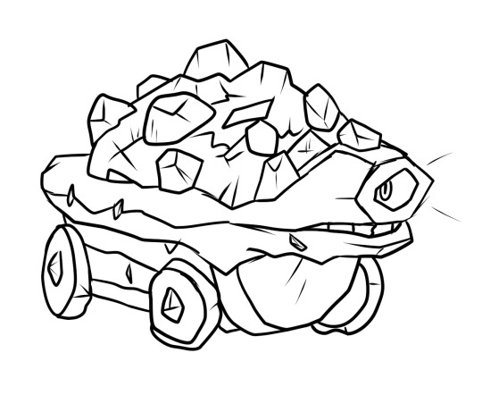
Even if it was just the face that was redone, I would've taken it. But if I could do a little tidying up and redoing of Carkol, it wouldn't take a TON to do it. The basic shape is fine to me, just good lord please give it its face and wheels back.

Personal Score: 5.5/10
...But not all hope is lost just yet! There's loads of Pokemon with a good beginning, and low middle, and a good end. Awkward teenage stage am I right? Even if its face isn't just a single eye anymore, at least it's keeping the wheeled theme! In fact, you could really build off of that! Like making it a train! A TRAIN POKEMON, LIKE ON MY WISHLIST AGAIN! That'd be knocking out two birds with one piece of coal! Surely they couldn't possibly think of ditching that aspect of this line, especially since it's been present in two stages so far! Surely the least possible thing that could happen would be if this almost literal mine cart Pokemon had suddenly lost all its wheels and miraculously turned into a generic bipedal dinosaur that walks like literally any other Pokemon out of nowhere. That’d be like, the worst case scenario. But that wouldn’t happen, right?
...
...Right?
839: Coalossal

Not to come off as blunt right off the gate here but this did it. I didn't think it was gonna be possible. Gallade is no longer my least favorite Pokemon of all time. Because in the end, as much as you could say Gallade sullies the Gardevoir line's unique take on a knight just by association, you can at least IGNORE Gallade. Just evolve your male Kirlia into a Gardevoir anyway because Gardevoir is just better than Gallade in every way anywho. Gallade? Literally WHO??? But Coalossal is impossible to ignore if you were a fan of what Rolycoly was putting down. And even Gallade had a FEW merits to it. Coalossal has almost systematically taken every little bit of what has cool and unique about Rolycoly and thrown it out the window in favor of being an all-around copy-paste job.
Okay, for a moment, let's pretend Rolycoly and Carkol never existed. Coalossal was just a single-stage Pokemon on its own in a cave somewhere or whatever. What about Coalossal is individually unique to it and it alone? Sincerely close to absolutely nothing. No single individual aspect of this design is unique in any way. Want to know the major reason why? Because Coalossal already existed. We've already had Coalossal for about ten years now. But back then, we called it Rhyperior.

I'm personally not a gigantic fan of Rhyperior either, but look at this. This is absolutely comedic. They're the fucking same. They are the SAME creature. Coalossal is nothing but an off-color Rhyperior. Like come ON. At least Rhyperior has the benefit of having is rough body serve a visual motif where it's wearing construction gear, with sound-canceling headphones, complete with wrecking ball tail. A solid rock monster design, even if I personally prefer Rhydon. I can confidently look at Rhyperior and see that it’s gone through revisions, redraws, and polishes to make it unique even in its own evolutionary line.
Can I say the same for Coalossal? I honestly can't say I do. With Rhyperior fresh in mind, what's Coalossal's visual motif? It's made of coal, I guess? Its face SORT OF looks like a cowcatcher on a train. But here's a question, why doesn't it look MORE like a train if train was clearly a motif they wanted to go with? If it's a train monster, why is it bipedal in the first place?
The only bit of its design that's even a little eye-catching is the pile of coal clumsily piled onto its shoulders, but I already said why I don't like that. It makes it look like Coalossal itself isn't a coal monster, it just carries coal around. Besides, most well-done designs aught to still have at least some value to them even if you took away one aspect of said design. Rhyperior with a plain tail with no wrecking ball is still a funny construction site rhino man. Even Carkol with no coal on its back would've still been a weirdo mine cart monster. Coalossal without the pile of coal is just naked Rhyperior.
Things only get worse when you add Carkol and especially Rolycoly back into the equation. Rolycoly's unique features were that it was a coal monster with one eye, riding on a wheel and it's shaped like an object. Carkol at least continues most of this, mostly ridding of the single eye thing. Coalossal gets rid of all that's left. No more wheels, no more object shapes, no more fun, it's just a coal thing now. Literally the first thing that comes to your mind when you think “I want to make a coal monster.” A rough draft in monster design form, printed and published for the full release.
I have to wonder, how many questions of whether this looked good or not the decisions to make in a train monster but also a bipedal dinosaur-thing was a well enough thought-through idea? Is being a dinosaur with a cowcatcher on its head visually interesting? More visually interesting than its previous stages, where it had far more visual motifs going on? Was it a conscious decision to say yes or was there a time crunch where they had to settle on a “close enough” design to pad out the Pokedex?
And you know what's more than likely the thing that murdered this line? Time.
I feel bad for possibly implying it was going to be nothing but smooth sailing this Gen when I made my little Sword and Shield pre-review. Because the more I've dug into Gen 8 the more I've realized how many designs in here are heavily flawed. And I can only blame the very evident drop in quality on the clear lack of time Gamefreak has these days. Generations are getting shorter and shorter and it's starting to show. Had SwSh not happened for another couple years, I guarantee I wouldn't be making this rant right now. This kind of blunder is simply so uncharacteristic of Gamefreak's art department. Like say what you will about the games themselves but Pokemon's been running strong from Gens 5 to 7. It's hard to believe the same company that made creatures like Mimikyu, Buzzwole, Sigilyph, or Pumpkaboo churned out Coalossal here.
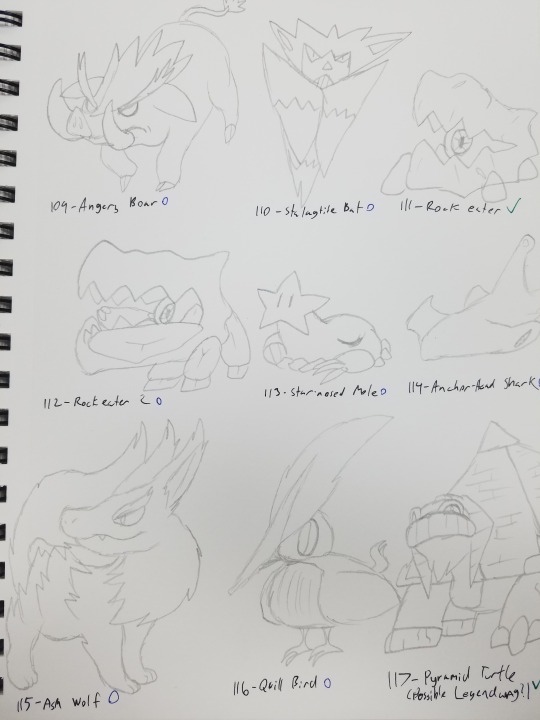
Here, I'll embarrass myself and share a bit of concept art of a personal project of mine. These designs aren't too terribly spectacular, are they? That's because they're just the rough drafts. The very first instance of me drawing a creature in order to have their design idea on paper, because I can flesh them out later. They’re very wonky looking, weirdly generic at best because later on, “Ash Wolf” there would later become...
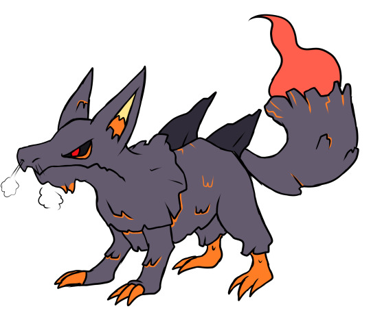
“Billowolf”. And heck, it’s plenty possible that it’ll go through one more redesign or so before I’m fully satisfied with it. Coalossal feels like the former. A sketchbook doodle of a “coal dinosaur” base idea that was meant to be more fleshed out later but wasn’t given the opportunity.
And I'm noticing more and more that this is gonna be a repeat complaint going into Gen 8. Lots of ideas with decent or even excellent potential not being lived up to because the designs haven't been through enough revisions. We're well aware of an internal approval process that happens within Gamefreak for these Pokemon to get accepted, and I can only wonder if they just settled with “good enough” designs simply because they were running out of time. Like for PETE'S sake this annual release schedule needs to stop. I hope this new trend of DLC will alleviate the Pokemon Rush. Hell, I'd encourage it so long as they're fairly priced and maybe even bring in a handful of new Pokemon designs each. It's not quite a year off the constant Poketrain but DLC is a lot easier to make than an entirely new game or even a “deluxe edition”. I don't care if we go back to a release schedule of one generation per major Nintendo system. Just let these guys have the time and leeway to do their dang jobs without the stress of ridiculously tight deadlines. There's still so much talent within Gamefreak and it's maybe easy to forget that they're the ones that made the more beloved entries in the series back before they forced a game out almost every year.
And to be clear I DO NOT mean to say all this to shame whoever designed Coalossal, even if they themselves are proud of it. Nor am I shaming anyone that does like Coalossal (just given I’ve gotten comments before acting like I’m being the opinion police with this review series.) Alarmingly enough, my taste isn’t law! And that’s fine. I’m just wondering if the higher-ups on the art team have given Coalossal a pass under less time-constrained circumstances? Or would they have sent it back in to go a few more rounds in a feedback loop? The basic point of this rant is just

Obviously, I'd want this line to follow through on the train motif and have Coalossal actually be a goddang train. And of course keep the single eye.

I do hear one of the defenses of Coalossal being dinosaur-shaped being that “it's a fossil fuel coming back to life.” If that was the intention, that should've been the theme from the very start instead of the rolling wheel idea. (Even under this light, I still wouldn't call Coalossal a very good design. It's far too generic to be doing even that cool idea justice. If that WAS the idea, I’d say it’d be way cooler to do a monster that’s moreso crudely trying to imitate the look of a dinosaur.)
...Awkward thing is, Coalossal wound up sticking in my team for the whole game. Mostly because I wasn't sure if any more new Fire types would be coming afterward (there weren't) so. My Sword team has my least favorite Pokemon on it. I still love ya though, Obsidius. It's not your fault your design wasn't finished. ):

Personal Score: 1/10
I'm sorry if it feels like I'm just dunking on Pokemon after Pokemon here. I PROMISE there's some Pokemon I'm excited to talk about coming up later. In fact, oooh, Applin's next! Applin will be a good palette cleanser, yes.

G-Max Coalossal:
Oh yeah, Coalossal has a G-Max form too. It's better, I'll give it that, and it SORTA brought the wheel thing back but only in having tire-shaped thighs. Pbbbth. The scale is imposing and at least its eyes look a little bit cooler again. I can't bring myself to like it much better just by association with Coalossal. It's fine, I guess. I'm not even gonna rate it. I just don’t like it. It’s fine. Eh.
[Archive]
35 notes
·
View notes
Text
been feeling like venting, so just some random vents- then afterwards, JSRF ramblings because I just beat that game
turning 29 at the end of the week, not looking forward to it- turning 30 next year terrifies me
mother’s funeral was friday, got that out of the way relatively painlessly (other than having to spend an extra 800 dollars just to bury my sister with her, about $4500 by the end of it
gofundme raised about $2000, other donations about $1300 last I counted (probably higher), so most of it was covered
yesterday my mother’s 70 year old best friend held a party at a bar for my mother’s friends and I was obligated to go, bunch of crazy old women talking like sailors, drinking and smoking pot and laughing about all the drugs they did and all the times they got raped (yeahhhh), the only person I was comfortable around was the best friend. And then the party ends two hours late, we’re getting kicked out of the bar, and this friend falls bending down to grab a picture of my mother that she dropped, smashes her face into the floor, and collapses with a pool of blood under her face, unmoving, right in front of me. I couldn’t get the words out that I’d go and pick the photo up for her before she went to get it, and I regret it
Thankfully, she only had a concussion and a broken nose, she started responding after about a minute of just lying there, but it messed me up, I think.
I’ve been debating if I want to start drinking. I never tried before, mainly because my father was an abusive and violent alcoholic. The other reason is because I’m afraid what I’d do to myself if I had no inhibitions in place, I feel like I’d be very dangerous to myself.
neck has been stiff for two days. Probably slept on it wrong. Also keep feeling like I get different symptoms of covid every so often after exposing myself to the public (that bar was packed with old people who wouldn’t wear masks and had no concept of personal space). Today my throat’s been sore and I can barely breathe.
my boss told me I can go back to work as soon as the funeral’s finished- not sure if I should call her to remind her or wait for her to call me, she texted me last week and I told her the funeral was on friday. But my coworker was also wondering and asked me today, and I didn’t know what to tell her, since my boss doesn’t want me to let her know just yet because of how limited they’re open (three days a week, four hours a day)
relationships are very hard
I’m a terrible person who does the bare minimum to help someone who’s terribly lonely and depressed, and it’s like I’m backed into a corner in desperation from being unable to do anything about it. I’ve caused so much harm to this relationship that I wonder if there’s any way it can survive sometimes
It’s always the case, though- I can’t get myself to do more than the minimum effort it takes, and my social anxiety prevents me from ever initiating anything, which has cost me so many people that I shouldn’t be surprised at this point. And I can feel that awful, selfish bitterness inside of me, that part of my father and my sister that’s in me that I try to suppress, and I hate it.
my diet is going well enough, lost over five pounds since starting it late August. But it’s mostly because I just dislike eating, so eating in portions is easier for me. And then there are days like today, where I just don’t eat at all. Just ate one slice of bread, 30g of peanut butter, and a small cup of ice cream today, and I don’t even feel hungry. Normally I try to get some food in me, but today I’m just too disgusted to even try to make dinner.
My sleep’s also been weird, still. Been going to bed later and later again, but can’t stay asleep. Usually only sleep in bouts of 3-4 hours, then just lay awake until I’m half asleep long enough that I feel the urge to give up and get up. It’s been like that for weeks now, I can’t remember the last full night of sleep I’ve gotten.
In lighter news, finally got back to playing JSRF. Beat it the other night after 24.5 hours of game time, just have a few more challenges left (did everything from Dogenzaka Hill to the Bottom of the Sewage Facility so far), got all graffiti and souls possible before beating the final boss. Played it via emulator (which worked great except for crashing when entering the graffiti selection occasionally) with a Switch Pro Controller, felt really good. I own it and the original Xbox for it, but just am spoiled by a PC experience, I suppose.
The gameplay is great, but the level design leaves a funny taste in my mouth. Aesthetics are worse than JSR for me, while music... it’s tough to say, it’s different than JSR, but really grew on me. Sometimes it felt more like noise (I remember the Sewage tracklist not speaking to me too much at first with the more ambient-ish tracks), but it did grow on me a lot. Baby-T was my Garage theme the entire game, such a great track.
Naganuma’s music in the first game was definitely the weakest of the original’s OST (still good of course), but in Future I feel he really stepped up his game. Teknopathetic is one of my favorite songs in the new OST.
speaking of favorite music, here’s mine from each game:
Bout the City
Dragula
Magical Girl
Miller Ball Breakers
Mischievous Boy
On the Bowl (A.Fargus Mix)
Rock It On
Super Brothers
Yellow Bream
Aisle 10
Baby-T
Birthday Cake
Count Latchula
I'm Not a Model
Like It Like This Like That
Rockin' the Mic
Statement of Intent
Teknopathetic
The Scrappy
(shout outs to Girls from the one JSR CD, haven’t listened to much of the other exclusive songs to it, but Girls was good)
but yeah, my minor gripes with Future
Linear level design was a bit painful (missing a jump and not being able to backtrack a lot was bleh), and the later levels were very painful (the sewage area and the rooftops are come to mind, skyscraper to a lesser extent but I liked the skyscraper one a bit more), but at the same time, they force you to get good, which I can appreciate, so hm. Still, a checkpoint system (especially since there are save points) or unlocking shortcuts would be a bit more convenient, if not entirely necessary.
Not having a way to stop auto-grinding, even if just holding down a trigger or something- the way I latched onto rails especially in the sewage area was painful
Points challenges mainly being “find the special points rail and just spamming Y” on it was a bit odd (mainly for the Jet Techs so far, just five minutes of spamming Y...), but I like how the combos feel in this game, especially X combos to speed up. Has a rhythm that’s hard to explain but just feels natural.
Also street challenges should’ve been explained better in general, had to look up most of the special ones (and glitched out the Shibuya Terminal one many times until realizing the fix was just “hop all over each platform multiple times and hope it counts”, the second one next to the tilted platform specifically for me
Mew/Bis/Rhyth’s redesign still hurts, but you better believe she’s the character I used throughout the entire game after unlocking her
Storywise, I think I like JSR’s take better- Professor K being a neutral party and more amusing/less insulting, Onishima > Hayashi, and the character designs and artstyle I overall prefer from the first game
Felt like it tried to add things that just didn’t really work sometimes (Death Ball comes to mind, though I haven’t messed with Versus yet, the story mission was very easy compared to how they hyped it up), and the boss battles were all... strange. Tagging enemies on that roller coaster level, having to grind up to that one Hayashi boss fight over and over and over, then even moreso for the final boss... never got much use out of targeting enemies, spinning circles around them, or things like the railgrab for high jumps or skidding to slow down for graffiti, either, but maybe they have their uses.
But man, the game did feel fun to play, just frustrating to explore, I think. I still like the idea of making Skatered, even more after playing this game. Maybe I could learn modding, or something...
Oh yeah, also got all the pieces of my costume together (minus some eva foam), we’ll see how that goes. Not looking forward to assembling it, honestly, but I can’t back out now. Main regret I think is the tights, being unable to find striped ones (and the solid ones I bought being a bit too see-through, I should’ve bought a size up maybe). Still not confident enough in my makeup abilities, either.
and one last bit of light news- I finally got my Kuja figure, he’s so beautiful and detailed and I need a good place to put him
#text stuffs#nyrants#lots of venting I apologize feel free to skip to the JSRF portion if you even feel like reading
1 note
·
View note