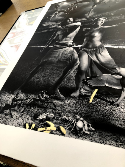
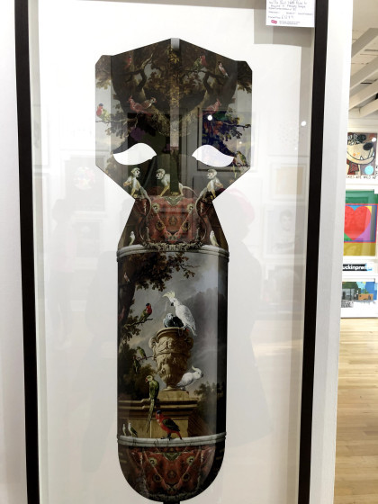
#i can make a collage right now without permission and sell it and if its transformative it's legal.
Explore tagged Tumblr posts
Visit Tumblr Blog
Explore Tumblr blogs with no restrictions, modern design and the best experience.
Last Seen Tumblr Blogs


Fun Fact
Total funding amounts to $125.3M.
Text
If you are capable of replacing any ai complaints with the word Photoshop and match the quote to things people actually said back when that was introduced maybe you should think about how wrong and silly we see those anti Photoshop people now. That's just my salt on the topic. Idk.
#boomer mindset that it's taking jobs it's shifting jobs just like Photoshop did#just as many jobs available. just different ones now.#ri rambles#like it sucks photography studios are dead now but it happens unfortunately.#and there still are some!#and people still appreciate it!#sigh#ai discourse#for tag blocking#it is wrong for the thievery but art theft has been a thing as long as art. it sucks that it's easier now and it's shitty it happens#but it is fair use guys. it's transformative. please learn fair use#i can make a collage right now without permission and sell it and if its transformative it's legal.#i can remix or parody a song right now without asking#i agree that artists need to be treated better and acknowledged and loved and used but it's always been an issue there#this comes from someone trying to do art i should say in case anyone finds this and gets mad
3 notes
·
View notes
Text
The Marvel of NFT’s

NFT or “Non-Fungible Tokens” are the latest cryptocurrency marvel. Everyday we hear something exciting from the crypto world. At one point it gives us money making and investing opportunities, however, it’s not only that. Blockchain technology is growing day by day and providing solutions in al industries. Whether it’s a financial solution, gaming, sports or crypto domains.
What is NFT?
NFT’s specifically, where “Non-Fungible” means something unique and cannot be replaced. NFT’s convert Digital piece of art and other collectables into unique, one of a kind, verifiable assets. These assets can be traded on the blockchain. In actual, it is a unit of data stored on a digital ledger, called a blockchain. This certifies a digital asset to be unique and therefore not interchangeable. NFT’s are becoming mainstream now, especially after Christie's auction house sold the first-ever NFT artwork for a huge amount of $69.3 Million. This was a collage of images created by digital artist, Beeple. Since then payoff has been huge for many artists, musicians, influencers and investors who are spending Millions to own NFT versions of digital images. Another example is Jack Dorsey's first tweet which is now bidding for $2.5 million, a video clip of a LeBron James slam dunk sold for over $200,000 and a decade-old "Nyan Cat" GIF went for $600,000. NFTs can be used to represent items such as photos, videos, audio and other types of digital files. Access to any copy of the original file, however, is not restricted to the buyer of the NFT. While copies of these digital items are available for anyone to obtain, NFTs are tracked on blockchains to provide the owner with a proof of ownership that is separate from copyright.
The Year of NFT’s
Undoubtedly, 2021 is now being considered as the year of NFT’s. There has been an enormous curiosity in using NFT’s. Various Blockchains like Ethereum leading the way, Flow and Tezos have their own standards in support of NFT’s ensuring that the digital item represented is authentically one-of-a-kind. Simply, NFT can be anything, digital art, drawing, music, video and as mentioned above, Tweets, that is available digitally
Authenticity
Anyone can copy a digital file as many times as they want, including the art that’s included with an NFT. However, the specialty of NFTs is that they are designed to give something additional that can’t be copied i.e. the real ownership of the work. To understand clearly in terms of traditional art, anyone can buy a Monet print but only one person can own the original.
NFT Market value
Remarkably, NFT market value increased many folds in 2021 reaching up to $22.5 billion where it was only at $250 Million in 2020. Seems unbelievable, right? But trust me, it is and its increasing day by day. The economic momentum NFTs have in the crypto market has exploded because of a trend towards digital collectibles
NFT Formats
NFT’s can be in various formats explained briefly below
Digital art
Digital art is an artistic work or practice that uses digital technology as part of the creative or presentation process. Such art work was adapted at the earliest because of the ability of Blockchain technology to assure the unique signature and ownership. Various art pieces sold at very huge prices, few mentioned below: ArtistNamePrice SoldBeepleEverydays - The First 5000 Days$69.3 Million in 2021BeepleCrossroad$6.6 MillionDylan FieldCryptoPunk #7804$7.5 MillionDylan FieldApe, Fedora #6965$1.5 MillionKrista KimMars House$0.5 MillionJa RulePortrait of Fyre Media logo$.12 Million
Collectibles
NFTs can represent collectibles like card collections, tickets, but in a digital format.
Games
NFTs can also be used to represent in game assets, such as digital plots of land, which are controlled by the user instead of the game developer. NFTs allow assets to be traded on third-party marketplaces without permission from the game developer.
Music & Musicians
Now for the musicians, as various social media channels like YouTube, Instagram or TikTok help them to market their music to their audiences, NFT’s allow them to sell their music online. Musicians can tokenize their work on blockchains using non-fungible tokens. For example, Kings of Leon, released their first album i.e. WHEN YOU SEE YOURSELF on NFT (Blockchain platform). This NFT went on to generate a reported $2 million in sales.
Motion Picture
And then comes the Film, Motion pictures industry reacted a bit slower than others to the NFT craze. However, on March 13, 2021, Adam Benzine's Oscar-nominated documentary “Claude Lanzmann: Spectres of the Shoah” became the first motion picture, documentary and Academy Award-nominated film to be minted and auctioned as an NFT. Not only that, Legendary Entertainment will release an exclusive Godzilla vs. Kong NFT collection on the same day the film hit theatres and similarly many others coming up
Sports & Athletes
How can we forget sports? NFT’s are becoming very advantageous for sports people & Athletes. In September 2019, NBA player Spencer Dinwiddie tokenized his contract so that others can invest into it. Additionally, Dapper Labs, a blockchain technology-based company, has collaborated with the NBA to create "N.B.A Top Shot", a marketplace for digital highlight clips. In March 2021, pro tennis player Oleksandra Oliynykova offered prospective NFT buyers the lifetime rights to part of her right arm.
Fashion
In 2019, Nike acquired a patent that allows for blockchain technology to attach cryptographically secured digital assets in the form of NTF's to physical products, such as a pair of sneakers, under the name "CryptoKicks". NFTs challenge the norms of contemporary art with an approach to creative expression that is entirely digital and verifiably unique thereby pushing the art world into new territory.
How can I buy and sell NFT’s?
There are several marketplaces specifically around NFTs, which allow you to buy and sell. Few of them are OpenSea, Rarible, Superfarm, Ethernity, Enjin and Nifty Gateway, but there are plenty of others. You can very easily upload your art work on any of these platforms and put them up for sale. Pricing can be in various crypto currencies but most preferable is Ethereum. There are some charges involved in uploading your art which included platform fee and transaction charges. However, it’s worth trying. And the good part is that even if your art work is sold various times among investors, every time it is sold you will get the royalty. Sounds good?
NFT’s, An opportunity or….
So, what do you think about NFT’s? Is it something you look forward to invest in? or you have rolled up your sleeves and ready to put up your digital art or music piece for sale. Whatever is in your mind this is a booming market and worth checking out. Hopefully few deserving artists can make good money out of it without asking agencies, recording companies or producers to help them out. But to close this article, 2021 IS THE YEAR OF NFT’S Read the full article
0 notes
Text
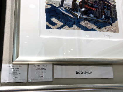
Where can you see Banksy, Damien Hurst, Grayson Perry, Sir Peter Blake, Bob Dylan, Ronnie Wood, and Billy Connolly originals within a few yards of each other in right-on-the-street galleries? Yesterday*, a friend and I went to Brighton.
*Yesterday is now several weeks ago, life having got between me and this write-up.
Castle Fine Art Gallery
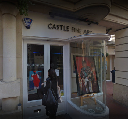
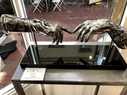
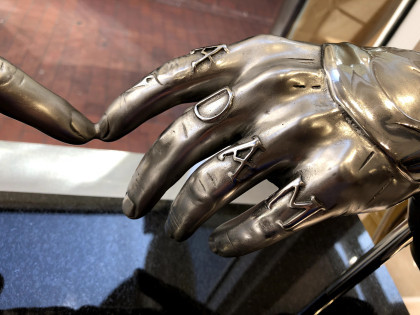
Castle Fine Art is right slap bang in the middle of Brighton near The Lanes, and my goodness I had not expected to see so many originals by ‘names’ from both art and show business. First though were these metal sculptures, each of them different and but one based on the Michelangelo painting ‘Creation of Adam’ c. 1511. By Dan Lane, this one – Modern Relic Arms | Creation of Man – is intricately embellished and looks like the metal or burnished leather of protective armoury. They seem almost wearable.
I found these less attractive, rather saccharine in fact.
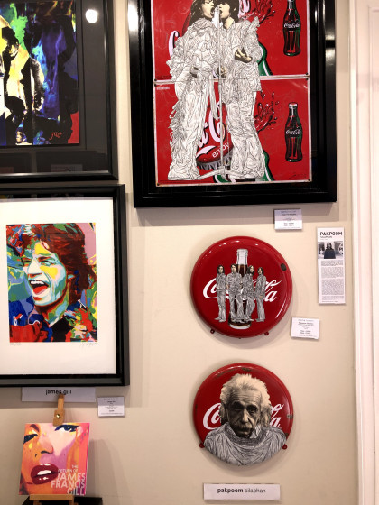
I am not really a fan of celebrity-based art, so much of it seems essentially derivative and harking back to those Marilyn Monroe prints by Andy Warhol. Those were nearly sixty years ago, these feel like 21st century children dressed in the same clothes as their great grandparents. There were plenty of them so presumably they sell.
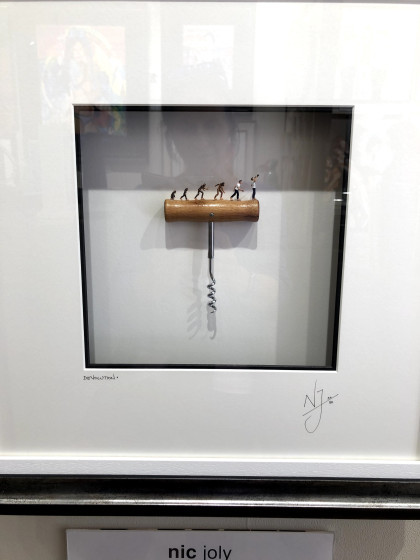
I have no idea what this represents – the ascent of man atop a corkscrew? The title is Devolution and so I am assuming a reference to the impact of alcohol. Perhaps the final figure, swigging from the bottle, is about to fall off the edge.
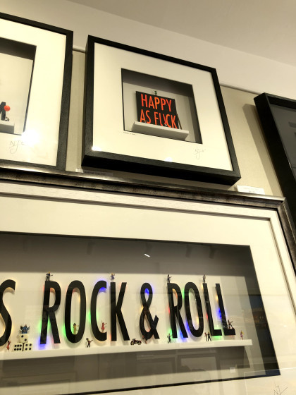
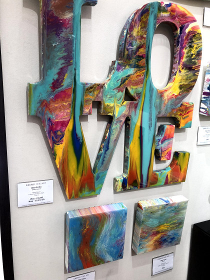
These are also by Nic Joly who seems to be a statements man. I was interested at first in the ‘shop window’ presentation – the piece of art sitting on a platform behind glass as though it would be taken out and wrapped separately for sale. It’s usually the little item in the window you buy, not the shop or its window.
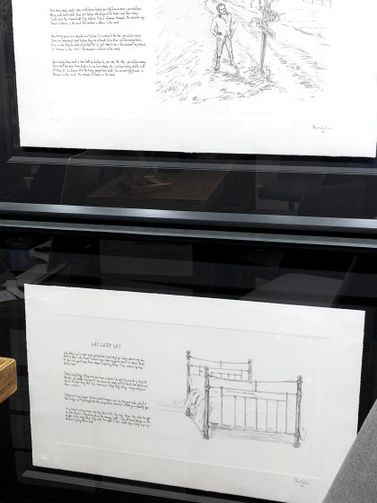
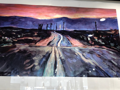
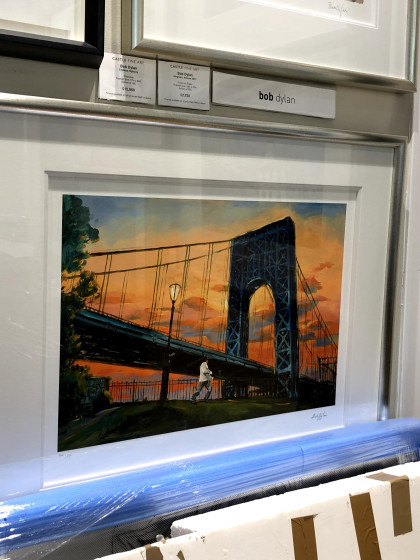
Astonishingly, these are by Bob Dylan who took to illustrating his own songs. Seeing these first, I rather wished he hadn’t. The paintings, on an adjacent wall, I thought were redemptive.
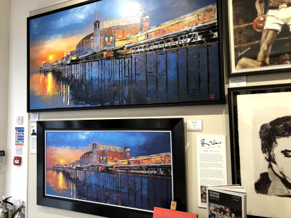
I am a sucker for some drama in colour, and I’m coming to realise that I also favour broad horizons and associated horizontals in landscapes. I believe this comes from watching The Bridge where the production values ran to extraordinarily cinematographic visuals.
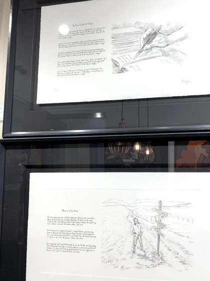
This painting is full of difficult perspectives and planes – the foreground is more or less straight on, the bridge runs from a high close left to a low distant right, and the clouds head very slightly along the other diagonal. So much trouble to get into, making those convincing.
And here’s another with all kinds of tilts and diagonals, all of them ending in a focal point behind the white building which is the only element (almost) straight on vertical and horizontal.
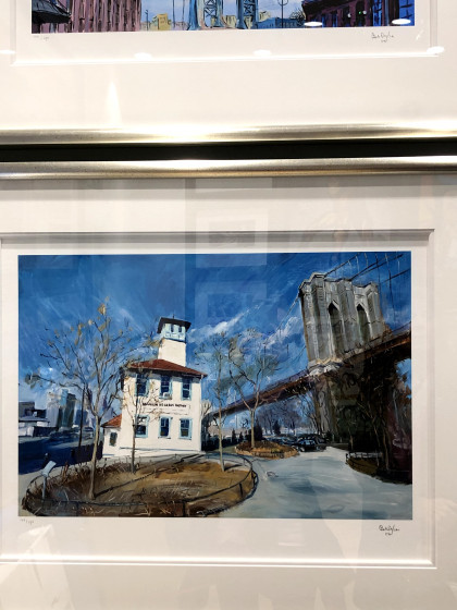
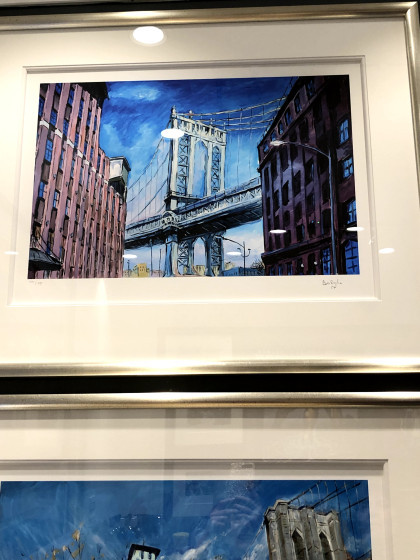
I hadn’t noticed at the time but Dylan must really have a thing about bridges. This one links two tall and intimidating buildings made less so by being quite jauntily coloured.
Sometimes when I look at something, my first thought is that it’s a cheap shot – fur coat and no knickers, as the phrase went in my northern upbringing. It meant all show with nothing substantial underneath although it sometimes seemed to have a more literal application. This is one of those; an original-ish idea with an original-ish execution, and a wholly unoriginal message. Even the artist’s name is a cover – Alex Echo? Really?
These, on the left, are by Paul Kenton who uses an aluminium base for his work – something that was a bit of a theme in a number of other galleries. Aluminium is this season’s go-to support which suggests that using it next year may not be a good move. As for these, again the magpie in me was attracted to the colours while my inner beginner artist fretted over the perspectives I struggle with.
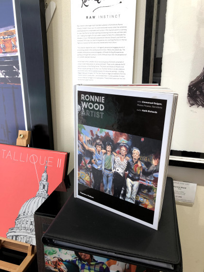
The gallery was very accomodating with regard to photographing their exhibition. The only exclusion was Ronnie Wood’s work, Wood having placed that constraint in the contract. When I asked out of curiosity why that was, the reason seemed to be related to the layers in the works that would not photograph well by visitors, especially through glass, and looking carefully at these elements, I could see his point. There are patches and squares in the mix, textures and scrubbings of colour that would not resolve easily under the casual lens. I don’t know how he made the images and neither did the person I asked. I also don’t know how to judge them. I liked them but are they ‘good’? And by what standard? Would they have achieved prominence if Ronnie Wood had never been a Rolling Stone? Big questions.
Kellie Miller Gallery
No photography was allowed in this gallery, other than of the 3D (ceramic) pieces which I didn’t find very interesting.
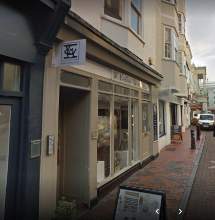
There were some intriguing pieces which appeared to be digital/photographic although the artist had said they were neither. There were no clues as to what the artist’s method might be but if I were to set an anchor point, it would be the colours, size, and orientation of the Kenton pieces above. These are far less direct though; with elements emerging from shadows and shapes resolving only on close inspection. There is a hint of collage but no real indication of that additional slight depth or texture. Perhaps he made these items physically and then printed them so that all the tiny bumps were ironed out. I realise now, too late, that being unable to take a photo means I should take a note, at least of the artist’s name, and I didn’t. When I go back to a new exhibition, I will remind myself that notes were what we made before we made Facebook posts.
The exhibits in a nearby gallery were very varied with some, I thought, verging on the amateur. I’m aware of taking a judgmental stance here that has an unedifying strand of superior attitude beneath it. It requires some thought to recognise that, like fiction, it’s possible to recognise something of quality (although how I judge that is a mystery to me) that I may not like, and to like something that I regard as being targeted at ‘the popular market’. Snobbery? Maybe, but creative products are all judged and the measures we use differ according to our understanding, experience, and motivations. As with Ronnie Wood’s work, I wonder if some accrue value because they have a name while other – better? – works are passed over due to their lack of profile.
These pieces seemed to me to be appealing to a less savvy – some might argue, a less easily fooled – audience. Wall pictures in nice colours that could seem sophisticated. That said, I would be delighted to have something hanging in there because I can be as hypocritical as anyone else with a product to shift.
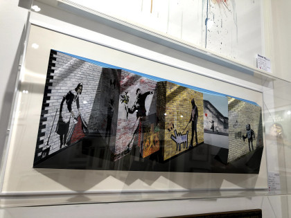
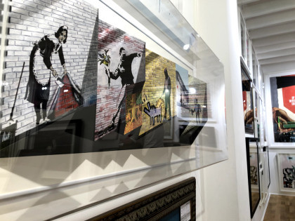
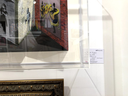
Art Republic
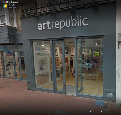
Art Republic is a different matter altogether and without knowing whose work was on show, I immediately felt that here, quality took precedence. The Brighton branch is in Bond Street which is again in the Lanes, and just inside the doors were original pieces by Banksy, Peter Blake, Damien Hirst, and Grayson Perry. This is a street. In a town centre. You just walk in. To say I was taken aback is putting it mildly.
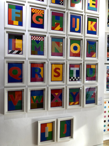
Peter Blake, I think, and while it’s easy to dismiss as ‘just’ alphabet bricks in primary colours, these are designed bricks carefully assembled and mounted in an impactful array. I gather they could be purchased separately.
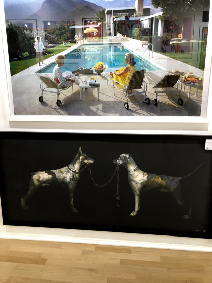
I have no idea who made these but the first struck me for its Hockney-ish colours and subject matter, it’s 1960s Hollywood gloss, and the feel it has of an advert for the aspirational lifestyle. Americans had walk-in fridges before we had fridges at all, we saw them in TV shows while we kept our milk, butter, and cheese in a larder under cloth covers. These were different worlds.
The one beneath is striking for very different reasons – the metallic appearance of the dogs, the stark singular images on the dark ground, the lead of one being held by the other. But look, the one whose lead is being held als has hold of it, and her ears are up, she looks assertive and in control. The other, still holding the far end of the lead, has her ears down and seems to be considering whether or not she has the power over the other dog that she’d imagined. But their coat patterns are flowers; are the dogs are decorative? Statement dogs left to look after each other?
These were being unwrapped when we visited and even though I was given permission to take a photograph them, I decided on an angular shot to defeat plagiarists. This artist – and here we are again, anonymous due to my note-taking deficiencies – places modernistic features in classical style so here are people who seem to come from a film poster but with Brighton pier in the background and cherubic forms in the sky. He also adds dabs of gold colour onto the prints as a final touch. Here, it’s highlighting chips being stolen by Brighton’s ubiquitous and opinionated sea gulls.
Top: Grayson Perry’s detailed, line-based, ambiguous naked figure in a domestic setting full of clutter. It’s like a cartoon; one of those where you have to find the five baskets or ten pieces of fruit. I’m not certain, but it may have become one of the tapestries he produced for a TV documentary a while ago.
By Ian Davenport, this attracted me because it seemed to be taking the mick out of Hirst spots. I have no idea if that’s true, but I like to think there was a subversive plot afoot here. I also like the randomness of the drips and dribbles, to me far preferable to Hirst’s dotted regularity.
Joe Webb’s Transmission shows two lads, looking like young Bowies, using the tin-can-and-string method of communication so many of us thought we’d invented as 1950s kids. Who knew that within our lifetimes we would be watching men walk on the moon and, right now, the Mars 2020 rover being built and live-streamed from NASA’s clean room. This image makes that point, I think.
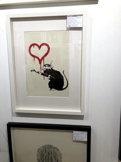
I asked the gallery staff about this and the use by the artist of Banksy’s images in this piece which is actually an expanded folding card. It seems he, Patrick Hughes, knew or worked with a mentor to the group known now as the Young British Artists (YBAs) at Goldsmiths college, who then approached Banksy for permission. I should have asked then if anyone could confirm Banksy is male. There can be no better disguise than everyday sexism – who pays any attention to a woman scoping out suitable walls to paint on?
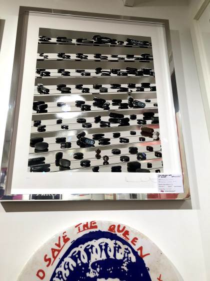
Damien Hirst: in contrast to his spots and dots but clearly along similar lines, this depiction of drugs – pills and capsules – all in black and sitting on glass shelves as if they were shoes on display in a shop seems to point to a commodifying of illness. As a piece of imagery, I think the perspectives and tilted lines, the effect making the mirrored images more prominent lower in the picture and doubling the quantity of pills, has a dramatic effect. I was drawn to it without knowing whose it was, which tells me something about judgment and the internal wrestling that goes on for me about quality versus market price. I saw quality here before I saw market value in a name.
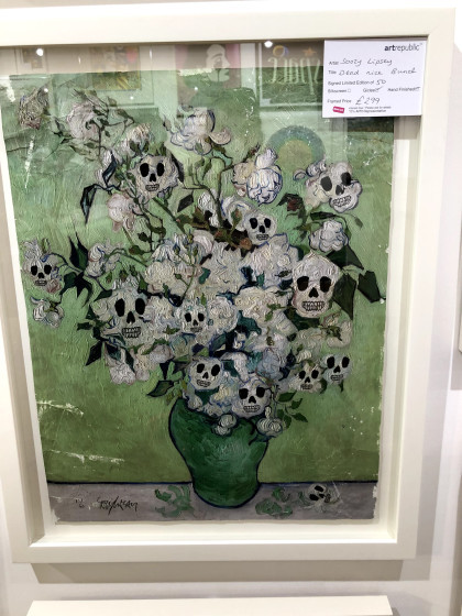
What to say about Soozy Lipsey’s Dead Mice Bunch! For me it was an antidote to some of the more saccharine floral images I had seen in galleries elsewhere, and as a bonus has a skillful combination of line, texture, and a simple limited palette. I might have been tempted to buy that.
Yep, that’s our man – or woman!
By Euan Roberts, I’m really not sure what this is about but it seems to be saying something about being simultaneously trapped and not in need of assistance – the moon waving not drowning? Who knows, but it has the clean look of a postcard you might write a cryptic message on the back of and send to a knowing friend.
Peter Blake reprising his Sgt Pepper format. At the top is BBC1, and the bottom BBC2. They look like a point in time of popular programming.
Unfortunately, even with zoom I can’t make out the name of the artist but in fact what had intrigued me was the application of colour: the scratches and runs held together by one or two precise marks that contain them. When I can’t get these colours myself, it’s helpful to know that some, like Klimt, use gold leaf.
Magnus Gjoen: The devil hath power to assume a pleasing shape. These look like a form of applique but the artist doesn’t give his technique away. There’s the Victoriana/modern warfare juxtaposition and also, as the title suggests, the knowledge we all have that big money often drives wars. If you are a maker of arms, they will please you when another power likes the look and buys them from you.
I think the card on these top pieces reads Dan Hillier. Photographic, Pythonesque, surreal, with striking diagonals of negative space. I don’t know if they’re drawn, or if they are whether they’re physical or digital but there is an intricacy of pattern and the two together make a separate composition. You would have to have both.
There were other galleries but none that offered the qualities of the ones I have described here. There are many more; Brighton has modern and traditional within walking distance of each other and interspersed with as many coffee shops and restaurants as you can manage. My plan is to visit Kellie Miller and Art Republic again soon, plus some of the ones we didn’t have time for, including the Pavilion which I last visited ‘back when god were a lad’.
Brighton of course, is a gallery in itself.
Footnote: at every gallery I asked about their photography policy before looking at any of the exhibits. Without exception, they were accommodating and clear. Only one had an exclusion and that was on the artist’s instruction.
Brighton galleries Where can you see Banksy, Damien Hurst, Grayson Perry, Sir Peter Blake, Bob Dylan, Ronnie Wood, and Billy Connolly originals within a few yards of each other in right-on-the-street galleries?
0 notes
Text
Industry Insider: Building a Visual Voice for your Brand
Originally written by Hannah Thiessen, who has given us permission to reprint this article in its entirety here.
It is never too late or too early in your business' process or development to change, enhance or define your style. I also want to stress that although you are the dyer, and probably are the center of your business, and your taste comes from what you love, your brand does not have to be identical to your personal taste at all times - it needs to have a more refined, defined voice than that. I personally fluctuate drastically from loving bright, brilliantly colored things to soft neutrals, to moody backdrops. For years, I struggled with developing any kind of visual style because I felt like my personal style was all over the place. It is not disingenuous to your customer to choose a voice for your brand and stick to it. It is OK to have a strong brand identity that changes slowly over time, rather than try and incorporate all of your favorite things into one visual voice.
Determine your visual voice through branding words
The first thing that I do for any new client is ask for 5 - 10 visual 'direction' words that help me determine what we're aiming for as a voice. For instance - if your dye style is all about soft, semi-neutral tones, gentle colors, natural dyes, you should be pursuing a very different photographic voice than another dyer who is all about ultra-bright, neon acid-dye colors.
The first company's words might be: gentle, soothing, calming, natural, neutral, soft
While the second company's words might be: energetic, exciting, fun, wild, optimistic, edgy
(I try to get everyone to stay away from words like influential or inspirational - these words can mean anything to any particular person.)
Build a guide board on Pinterest
After you have your 'brand words', it's time to take to Pinterest! I made this board to share with you this morning: Sample Brand Board - Warm & Bright
As you can see, this pretend brand's theme is Warm & Bright. If I had defined this brand with words, I would have chosen words like: handmade, happy, cheery, glowing, saturated color, clarity, warmth, familiar, home
Then, I went through my Pinterest Inspirations board and looked for images that conveyed this. The first image I came across was a very happy picture with a house, and I decided that this would be a great focus point for the brand. I love the strength of color, the pop of bright red against a sort of dusty blue, and the clear, crisp photography, so these are the guidelines I used to select the other images on the board. You'll notice that although the first few images have a very holiday feel (probably due to my current post-Christmas, early New Year vibes), the board eventually morphed into something that was more about saturated, rich color.
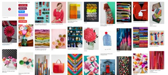
From here, I take photos that fully embody what I want for the brand and pull them into a grid-building program. While I use Adobe Illustrator most often, I love to recommend Big Huge Labs' Mosaic Maker - a free program that makes beautiful collages for you. All you have to do is create an account and save the images to your computer, then you can use them in collages. Since these are for personal use only -- and are frequently not seen by anyone other than the brand partner and myself -- I feel that it is ok to use the images in this way. For the purpose of this blog post, I'm sharing my image collage below, with attributions that I could find through Pinterest.

Catherine Gratwicke Photography ; The Purl Bee ; Bryan Gardner Photography ; Saskia Wilson / Fashion Gone Rogue ; Annie Larson ; Unknown Handbag ; Brit & Co ; Paper & Stitch
As I collected eight images that best represented this brand to me, I noticed a few things:
Images that showcased bright colors on an equally saturated background felt 'fresher' to me than using only simple ones on a white background. They felt more editorial than traditional product photography. I would probably use both, but in different ways, for the brand photography.
I frequently pinned images that had the elements in clusters or in linear arrangements, which might be good to use later as direction for styling on social media features or advertisements
I loved when similarly colored elements were grouped together on a background that echoed that color. We very rarely see this in yarn photography, so if this was a real brand, I would probably look at the yarn and see if I could draw some visual parallels and look for props and backdrops that would give me this effect.
Determine your brand's photography rules & restrictions.
All of the images I had chosen for the board had one thing in color: really strong, saturated color. This means that it's likely in the post-processing (the part where you load your images into Lightroom or Photoshop, or when you're editing them on your phone), that the contrast and saturation have likely been enhanced, and that the whites are balanced to appear as clean and crisp as possible.
For any product, this presents a unique challenge. No dyer wants to misrepresent the color they've dyed by doing too much editing on their photos, but sometimes, a photo turns out a bit darker, less crisp, or clear than the brand photography guide would want us to follow. I'm going to tell you something - it's OK to edit your image a little bit.
Selling yarn is a lot like selling food: if you set up a meal at home and take a photo without any fancy lighting or post-processing, it's going to look less appetizing than a photo from a cookbook, and it has nothing to do with the tastiness of your chicken pot pie. This isn't just because magazines and bloggers have better cameras -- it's also due to post processing.
Turning up the lights and brights, editing your saturation, and making the yarn more visually stunning isn't lying to the customer, as long as the yarn looks that good in person when they receive it. The problem lies in turning things up too much. Do as much as you can with the photography setup to achieve the right results, but don't be afraid to pop it into a photo editor for final tweaks. That's the difference between a professional-looking photo and an amateur one. Don't feel guilty about stepping up to the proverbial 'plate' and doing some styling -- as evidenced by these Ravelry photos of all the exact same yarn, your customers will expect some variation from this professional photo of the same skein, taken by Hedgehog Fibres:
Stick to it, but allow for gradual change.
I think the most challenging aspect of developing a brand voice is maintaining that voice. If I developed this brand and didn't choose to match my tags, wrapping, packaging, font choices, and dye style to these principles, why am I using it in the first place? Building a strong starting point and then sticking to it throughout all of my business platforms -- Instagram, Facebook, Ravelry, my blog, etc. -- is essential to change an idea into an identity. Remember that your customer might only see one of your images every week. You want every image to be as close to representing your brand as possible.
With a product-based brand, it's important to try and maintain visual consistency for best results. If you feel that you want to include photos of your behind-the-scenes, try and stage or post-process them to match your brand's visual identity. Don't include photos taken late at night (unless you have a lightbox setup and that style of photography is your goal). Don't include anything grainy or sub-par. Put the time in to be selective -- it will make a difference!
As artists, you also have to allow yourself room for growth and change. If, as the seasons change, you find yourself moving away from your initial visual direction, see how you can draw parallels to the work you're doing now versus the work you began with. Be willing to slowly transition your visual style. Keep building onto your Pinterest board, and consider revising your mosaic every six months. Development is a healthy part of any business that is succeeding, so don't resist it -- just guide it visually so that your customers don't feel a sharp cutoff or disconnect from who you 'were' to who you are.
Independent dyers can join us for more photography, branding, and visual voice discussion this month in the Dyer Supplier Facebook Group!
0 notes