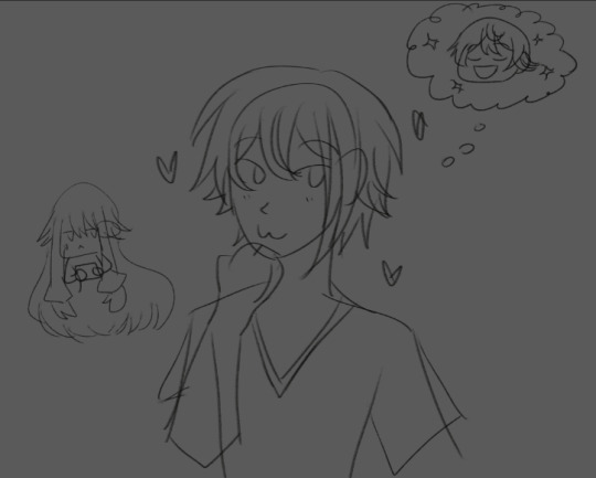
#i accidentally put the bg color and the drawing on the same layer so you get to see all of my lines
Explore tagged Tumblr posts
Text
hasn't drawn in a while
decides to change that
opens clip paint
tries out a pencil i had downloaded but never used
draws the first thing that came to mind

#prince's talk tag#i accidentally put the bg color and the drawing on the same layer so you get to see all of my lines#its just a warm up but i wanted to still share it bc i think i drew rui's expression cute here#hes just :3c#the thing i want to actually draw isnt even for this series thats how prominent they are in my mind especially my boy#i like to rotate him in my head like food being cooked in the microwave#rui kamishiro#prsk fa
6 notes
·
View notes
Note
How the frick frack diddlydack thumbtack lumberjack snick snack crackerjack do I make transparent angst???
OK! So, it’s taken me a couple of experiments to figure out my favorite way of doing it. (and I’m still experimenting a bit so, there’s that.)
But, overall, start w/ your sketch, w/ both your ‘visible’ elements and your transparent elements. (If you’re doing something like shifting a character’s expressions or pose w/ the transparency, I suggest drawing your transparent element over your visible one, so that you get a feel for what works when you merge it together. play with were you can get away w/ adding white vs where it’ll look too off.)
Then do line-art/color of your visible elements, I’ve begun to shade-in my visible elements in transparency, so that the transparent and the non-transparent characters have the same look and feel when the transparency is shown.
Tumblr will, overall, make anything you leave black invisible when someone clicks the transparency. (I found that out the hard way heh.) Use that to your advantage when appropriate, but, if you want something to show up from your initial image, you have to have it colored/transparently shaded somehow.
You’ll only use one color when doing your transparent sections, white. If you use any off-white, your transparent will be visible, (if slightly…there’s a bit of wiggle room in certain areas, but, you will want to keep double-checking to make sure you’re still using white. I’ve accidentally turned a lot of transparencies grey, and your only option is to pretty much start over when you do that).
I like to make the bg a mid-tone color so I can see all the elements of the picture while I’m working, but I also use black when all my elements are ‘colored’ and I just need to do the shading and stuff.
A shaded transparent kinda acts like my preferred charcoal technique, if you think about it. What you do is fill in a spot w/ white, while your bg is on a color so you see both the outline/sketch and where you’re putting the white, and then lower the opacity of that layer so that it fits the mid-tone of that segment of the element. Do that for all sections of your transparently shaded elements.
Then, after you have your mid-tones, go in w/ highlights in white, and then, to make shadowed areas, use the eraser on a lower opacity. I found using the eraser as my outline/’line art’ matches it w/ the black outline of the visible elements in my art. and again, makes it all a bit more unified. But, you could outline w/ white and give the more ghostly appearance.
When you’re shifting a visible character’s expressions/pose, you’ll have to take into account the line art. This is where the whole black disappearing effect will come handy. Your black only ‘disappears’ when there’s nothing white behind it, and, if you have your white on the layer above the outline, you’ll be putting white lines that cut across your visible area. In some areas you can get away w/ putting white on top, but, in general, it takes a bit more maneuvering to make it look right.
SO, what you’ll want to do, is to either, make the initial pose something that you can just, add too it like I did here:


or, work around it somehow, and leave black (which I don’t have a very good example of. w/ pose)
Then, after you’re done, don’t forget to make your background layer transparent, and then save as png. (also, before you upload to tumblr, I suggest double-checking it works by saving it as a draft or to the queue and then test-clicking/unclicking, just to see if you didn’t accidentally leave your bg white or if any of your transparent elements show up when clicked. -also, raw text tends to be funny and will show up w/ little lines, so, just, add a very light opacity white backdrop behind the text and the lines should go away.)
…That’s generally how I’ve found works for me best, but, there’s plenty of ways to work through it, and, really, you should just, try out ways you’d figure it’d work best. I just say go out there and try your hand on it and have fun!.
(…..oddly enough though, I’ve done more transparent fluff than angst tho…. it’s kinda funny.)
also all this talk about transparencies gave me an idea. (its for ocs stuff but it might be pretty neat…….I may or may not try and figure that one out.)
54 notes
·
View notes