#hyosub
Explore tagged Tumblr posts
moonymiw · 6 days ago
Text
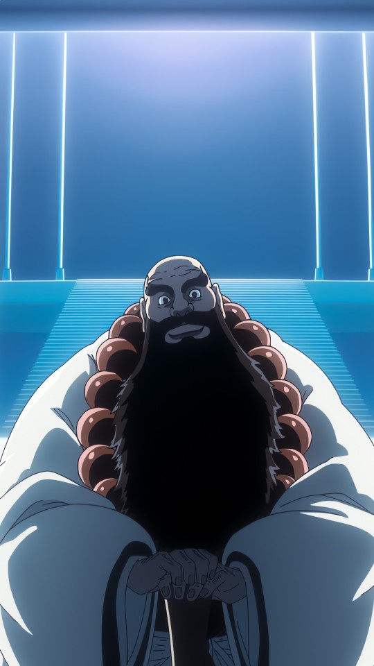
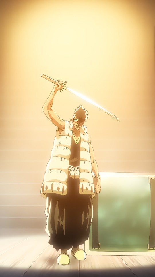
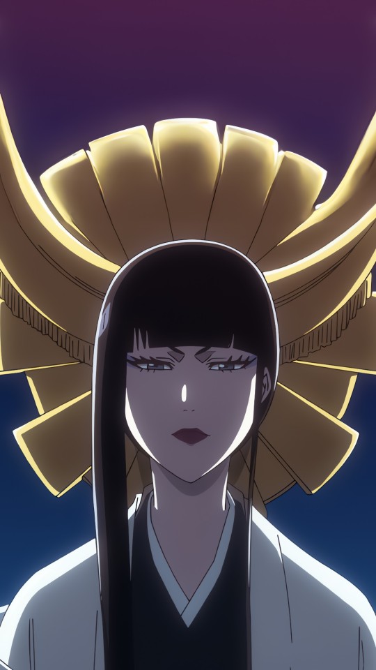
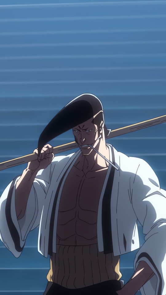
If Kenpachi was there when Gotei 13 met Squad 0
Tumblr media Tumblr media Tumblr media Tumblr media
☀️chaos☀️
351 notes · View notes
demifiendrsa · 2 months ago
Text
Tumblr media Tumblr media
New Senjumaru Shutara and Ichibē Hyōsube illustration by Tite Kubo
177 notes · View notes
gallusrostromegalus · 5 months ago
Text
Tumblr media
An Elephant Is Warm And Mushy Episode 3: Me, Myself and Eye.
Shinso and Ichibei learn more about Nobody. Shinso learns A Lot more!
Please note: This chapter contains explicit content, not for audiences under 18.
226 notes · View notes
auntyokula · 1 year ago
Text
Tumblr media
kenpachis family hanging out with squad zero 🤭
/fem.zaraki x unohana
479 notes · View notes
goatei13 · 2 months ago
Text
Tumblr media Tumblr media
Senjumaru Shutara and Ichibē Hyōsube drawn by Tite Kubo.
113 notes · View notes
makebleachgreat · 4 months ago
Text
(Almost) Every single character who has carried the Title of Captain (Part 1)
Tumblr media
142 notes · View notes
Text
Tumblr media
The Five War Potentials
90 notes · View notes
everth1ne · 1 year ago
Text
Tumblr media Tumblr media Tumblr media Tumblr media Tumblr media Tumblr media Tumblr media Tumblr media Tumblr media Tumblr media
Bleach - wallpapers
454 notes · View notes
gebo4482 · 2 months ago
Text
Tumblr media Tumblr media Tumblr media Tumblr media Tumblr media Tumblr media Tumblr media Tumblr media Tumblr media
兵主部 一兵衛 - 不転太殺陵
Hyōsube Ichibē - Futen Taisatsuryō
56 notes · View notes
carolnx0 · 20 days ago
Text
Tumblr media
32 notes · View notes
reikorun · 8 months ago
Text
BLEACH TYBW Anime Cour 2 Booklet: Behind the Scenes [Translation - Part 1]
Translated by @reikorun
Director's Note × Author's Eye
We pick out several points from all 13 episodes (#14 ~ #26) of the second cour. For each point, pay attention to the explanations by Director Tomohisa Taguchi and the perspective of the original creator and general supervisor, Tite Kubo!
Section 1
Start with Yhwach again
1. A baby being held. As that being, raised up by countless hands, grows and opens its eyes, cour 2 "The Separation" begins. (ep. #14)
D: Tomohisa Taguchi
"Let's place the focus on the Sternritter for the second cour", from the early stages, this is what was decided among the staff. On top of that, in order to make a link with the first cour which began with Yhwach reciting the Kaiser Gesang, we thought "let's begin the sequence of events in cour 2 with him as well." In that case, that scene depicting his origin would be appropriate. In the original work, it was drawn in a manner which took a comprehensive view reminiscent of folklore, but I struggled with how to go about creating a similar impression in the anime. As a result, the visual expression became closer to an art film represented through images alone, without the use of any narration or dialogue at all.
A: Tite Kubo
From the moment I laid my eyes on the storyboard for the first time, I had a feeling that it was going to turn out really good. Regarding this scene, there were actually various changes made until we arrived at the final cut, and even the versions we didn't use were very interesting. During the dubbing session, the process of overlapping the collective "Yū, Ha, Vē, Ha" was also enjoyable to listen to.
2. In addition, there was a memorable scene where Yhwach's 'power' was portrayed through a visual representation. This is the scene where a 'shadow' extends from the throne as Yhwach falls asleep, leading to the appearance of Haschwalth. (ep. #18)
D: Tomohisa Taguchi
The portrayal of that shadow was an idea I received from Kubo-sensei. In the original work, we were able to gain an insight into the power of Yhwach as well as the connection between Yhwach and Haschwalth through Haschwalth's words to Uryū, but since there was no concrete depiction in itself for the transfer of power, it lead to discussions where we considered that It would also become an element linking to the subsequent cour, so we thought “let's do that in the anime!”
A: Tite Kubo
At first, the manner in which the shadow emerged looked as if it were surging up from below, but viewing it from a choreography standpoint, I suggested that the shadow itself should appear in a sort of sliding manner, giving the impression that it had some mass to it. The transfer of power occurred while Yhwach was sleeping, so in order to preserve the nuance that the transfer to Haschwalth happened while he was in that state, I also had Haschwalth depicted standing with his eyes slightly lowered.
Tumblr media
Section 2
Storytelling 
3. In the second cour of 'BLEACH: Thousand-Year Blood War Arc', the war situation changes moment by moment due to the Sternritter invasion, and the outward appearance of the Soul Society also undergoes transformation. As a free-for-all breaks out in various places where enemies and allies intermingle in a state of chaos, the anime adds a scene where the newly appointed Captain-Commander, Kyōraku Shunsui, issues orders to each soldier. (ep. #14, #18)
D: Tomohisa Taguchi
One component of that is our desire to include explanatory scenes and scenes where the narrative is refreshed so that the audience are not confused by the ever-changing situation of the war. Another component was our desire to depict the organization that is the 'Gotei 13', which includes Kyōraku who became the Captain-Commander, in a renewed light, and these components overlapped seamlessly.
As a result, I think we were able to depict his status as Captain-Commander inherited from Yamaji, as well as his work ethic. In combination with the scene depicted in the original work that evokes the essence of Kyoraku, i.e. the handing over of Soul Tickets to Tatsuki and the others in the Human World, I'm happy if we were able to successfully delve deeper into the characters. 
A: Tite Kubo
It was a really nice scene with both the essence of Shunsui and the essence of a Captain-Commander coming through.
4. In addition to Kyōraku, the appearance of the other troops were added, including Vice-Captains. (ep. #16)
D: Tomohisa Taguchi
While the scenario building sessions were moving forward, I realized that I also wanted to depict the Shinigami's point of view as they strive to fight back against the invasion and try to fulfill their duty to the Gotei. Rather than simply portraying the scene, we added a series of shots with the intention of showing the state of the Shinigami who remain unyielding even as the war situation worsens and they are gradually forced into a disadvantageous position.
A: Tite Kubo
Even in a fan service sense, I think the audience enjoyed being able to see a variety of characters in the anime. 
5. With regard to the main character, Ichigo, extra scenes have been added, such as the manner in which he received training under Hyôsube Ichibei. (ep. #14 and others)
D: Tomohisa Taguchi
As mentioned earlier, the foundational principle for the second cour is to place the main focus on the Sternritter, while that's true, 'BLEACH' is still the story of Kurosaki Ichigo, isn't it? There were some concerns that the number of episodes in which Ichigo does not appear in the anime may end up feeling longer than it was in the original work, so we came up with the idea of showing what Ichigo is doing at the present time. The knowledge that Ichigo was training at the Soul King Palace is also depicted in the manga, so I speculate that even though Kubo-sensei undoubtedly had a concept and an image in his head, perhaps he deliberately chose not to draw the specifics. We had the privilege of making suggestions and consulting with Kubo-sensei about how we would go about incorporating the event into the story; those scenes were the result. In a sense, it's to be expected, but we were able to receive a tremendous amount of material from Kubo-sensei, far more than what we expected…. It made us think, "Ichigo, that's what you were doing in such a place!?'' As a fan of the original work, I was delighted, and I also maintained the feeling that I needed to put all my effort into portraying it.
A: Tite Kubo
About the Irazu Sandō part, I didn't include it because if I tried to draw it in the manga, the scene depicting the agonizing ordeal would span across multiple pages and end up too long. I'm glad that it could be expressed in the anime~!
6. The stage upon which Ichigo undergoes his training, Irazu Sandō. A mysterious and beautiful sight, yet it is also a peculiar place where a solemn air, a stillness and a sense of awe all coexist. (ep. #14 and others)
D: Tomohisa Taguchi
There's torii gates, a cobblestone pavement, shide (*zigzag-shaped paper streamers) adorning both sides…. If we hadn't received materials from Kubo-sensei, I don't think we would have been able to find our way to this point. Whilst enduring something which tries to push him away from the approach path, the more he walked, and the more he advanced, the heavier the wooden sword in Ichigo's right hand became. When he walks, he walks by moving his legs forward without letting his feet leave the ground. A lot of detailed images and ideas were provided, such as scenes of rain falling outside the path. This was then projected into anime visuals, and the Irazu Sandō came to a state of completion. I think this is a training ground packed with every element that is typical of BLEACH, down to the smallest detail, and that cannot be found in any other work. We've also incorporated an abundance of elements that will be connected to the third cour and onwards such as what happened to Ichigo during his training and the scenes he witnessed, so I would be happy if you could take another look.
A: Tite Kubo
Originally, the mental image I had was 'a sacred place, but at the same time, there is a sense that one is being cursed.' However, I thought that if I communicated this to the production team, the eeriness might end up being too pronounced, so I deliberately didn't mention it. The impression I had was that it was like an abandoned path. As a result, I think the team were able to capture that balance in the sense that it is a sacred yet potentially frightening place, and thus they were able to express it well. 
Tumblr media
Section 3
Design & Color Concepts 
7. After the invasion by the Sternritter, the sky of the Seireitei was dyed red, and the squad barracks were transformed into unfamiliar, inorganic blue-white buildings. Director Taguchi's production plan is markedly reflected in those colors as well. (ep. #14)
D: Tomohisa Taguchi
The main goal was to dramatically shift the setting away from Seireitei in a time of peace. Additionally, the upper part of the frame is red and the bottom is blue, which serve as completely opposite elements in terms of hue, so the aim of the production was to consider how the image could be made into something vivid. After the invasion, the Seireitei became perpetually uniform to that coloring, so there were some concerns about whether it would be acceptable as there are very few anime that employ a color scheme which breaks away from the norm to such a degree. However, we wanted to convey the might of Yhwach's power and also the sense that his power had indeed transformed the world. Furthermore, since blue is also the color of 'Quincy Reishi', I considered that perhaps this extreme staging effect in which the space itself ends up dyed in the colors of the Quincy side would make it easier for viewers to perceive the phenomenon where visually, it no longer feels like the Seireitei = the world of the Shinigami.
A: Tite Kubo
When I first received this proposal for the color scheme, I thought the expression might be too extreme, but the way Taguchi-san uses backgrounds is masterful, so I decided that I would try to leave it with him. I harbored some concern that colors of the characters may become difficult to distinguish, but that aspect was also rendered in a well balanced manner. At various points during meetings and dubbing sessions, I often get the feeling that Taguchi-san is someone who can clearly see the final visual outcome. 
8. From the standpoint of color, the attire and laboratory, which Kurotsuchi Mayuri contrived as a countermeasure against the Sternritter lurking in the shadows, are also very interesting. (ep. #15 and others)
D: Tomohisa Taguchi
Initially, the glowing Mayuri was only supposed to shine yellow. However, this time, Mayuri's lab itself also shines brightly, so it meant that when we tried to station him there, he ended up blending into the scenery quite a bit. While searching for a way to make Mayuri shine, an idea came from the color scheme designer Gōda-san: "How about a lighting method which shifts into a variety of colors like a gaming PC?" We adopted the idea thinking "it'll probably look great on screen!" We proposed the idea to Kubo-sensei, who readily approved, and it started to take form in the visuals. The colors continuously shifting midway through the plot is an interpretation that can only be represented in the anime, so I believe we were able to exhibit Mayuri's natural presence by using a different approach from the original work.
A: Tite Kubo
This was indeed an interesting portrayal that could only be done in the anime. It's also interesting that it was intentionally made to look like a moiré pattern. After all, this cannot be pulled off by any character other than Mayuri.
9. Mayuri's laboratory is designed to completely eliminate any shadow as a countermeasure against the Sternritter invasion. Evidently, it took a great deal of trouble to express this. 
D: Tomohisa Taguchi
It took a lot of trial and error to figure out how to express 'no shadows' in the anime. The most significant factor in creating a three-dimensional effect in an illustration is the contrast of the shadows, isn't it? Given that it was necessary to reject that, we said "there is likely no other way to do this but to test an array of other patterns!" The art staff and I went through the process of trial and error a many number of times. As a result of taking into consideration various opinions that came up along the way, we translated them into the concept of 'creating gradation within the light', ultimately representing three-dimensionality.
A: Tite Kubo
When drawing it in the manga, the way I used to express the idea of 'glowing without shadows' is by erasing around the circumference of what I had drawn. I'm glad that I was able to have it portrayed in such a satisfying manner in the anime too.
10. Hirako Shinji's Bankai, "Sakashima Yokoshima Happōfusagari". A Bankai, which did not appear in the original work (※first appeared in the novelization), is made to enter the stage in the anime, therefore a great deal of enthusiasm has also been poured into its rendition. (ep. #16)
D: Tomohisa Taguchi
The bud of Hirako's Bankai pedestal is formed by the petals narrowing inward when open, retaining their form to become the bud, however I thought that if we produced it with cel animation, the petals would inevitably lose their shape, rather, there's a high possibility that it wouldn't look like a rigid object. So, in order to show the precise movement of a rigid object, we deliberately used CG. At first, what I imagined for the texture was a brass-like luster, similar to the lotus flowers used in Buddhist altar fittings. We struggled while attempting to express the feeling of that material and searched for ways to depict it using CG surface reference / textures and such.
11. Many characters have made their Bankai debut in the original series. Ōtoribashi Rōjūrō's "Kinshara Butōdan", and Humanized Komamura Sajin's "Kokujō Tengen Myō'ō: Dangai Jōe" were also portrayed by utilizing 3DCG technology. (ep. #18, #17)
D: Tomohisa Taguchi
I think 'Kinshara Butōdan' managed to incorporate a finely tuned quality that doesn't look like it was made with cels, having said that, nor does it overly emphasize CG elements, rather it strikes a delicate balance between the two. Similarly, "Kokujō Tengen Myō'ō: Dangai Jōe" was also developed in 3D, I think we were able to well execute the way the gigantic body moves freely and abundantly as opposed to the challenges of producing it with cel animation, which is susceptible to making the movement appear choppy. In the story, there are various Bankai, but in terms of compatibility with 3DCG, rather than the type where it's just the sword changing, it's my opinion that Bankai transformations where the appearance changes completely or another entity emerges, is the kind that fits better from a direction perspective. As mentioned earlier, expressing it in 3D has the effect of altering the feel, so you can stress the distinctness and change in atmosphere brought about by performing Bankai. In a certain way, I suppose it's possible to convey a stronger sense of harnessing something that is not of this world. Therefore, from now on, I intend to continue requesting (to those in the field), that one doesn't adopt a cel animation look completely. 
A: Tite Kubo
Both were really good. As Taguchi-san also mentioned, I wanted to avoid having the CG elements coming to the forefront in an odd manner. I think CG shines particularly during Bankai transformations that feature inorganic matter. The CG was skillfully utilized, especially in critical moments where traditional animation eventually tends to falter, like when Myō'ō comes in with a slashing attack, for instance, making it quite impressive to watch.
12. 3DCG is not the only technique utilized for showcasing Bankai. The skills of various staff members have also been brought together.
D: Tomohisa Taguchi
Even though I understood the principle behind it, figuring out how to visually represent Muguruma Kensei's Bankai "Tekken Tachikaze" in the anime, among other things, was challenging because how we'd go about expressing that is a different story. While the blades remain in contact with the target, it continues to explode infinitely. It creates the illusion that the punches being thrown are repeatedly landing tens of thousands of times without the arm ever being pulled back from the point of impact, doesn't it? We worked strenuously to express how immense the power of Kensei's Bankai is by doing things like deliberately adding cel style motion blur to make it look as though the opponent was being hit, aiming for a visual effect that makes it seem like he's trembling after being struck multiple times, and using an approach where we incorporated sound effects reminiscent of a drill used in road construction. In terms of his character and Bankai visualization, Rōjūrō is likened to an Opera, implementing theatrical staging such as the rapidly changing movement of his conductor's baton and the lighting. The music attached to the scene also became particularly important, director of audiography Nagasaki-san and re-recording mixer Hoshino-san fine-tuned it masterfully. 
87 notes · View notes
moonymiw · 10 days ago
Text
Tumblr media
62 notes · View notes
dont-look-up · 1 year ago
Text
Tumblr media Tumblr media Tumblr media Tumblr media Tumblr media Tumblr media Tumblr media Tumblr media Tumblr media
Bleach TYBW S02E01: Renji & Rukia
321 notes · View notes
gallusrostromegalus · 1 year ago
Text
AEIWAM Chapter 3: Wheel In The Sky is now up!
-There's a lot of world-building in this chapter because it was literally faster to write the fic than to attempt to answer all the asks. If you sent me an AEIWAM ask, thank you so much, you helped a lot!
Title Card:
Tumblr media
161 notes · View notes
goatei13 · 2 months ago
Text
Tumblr media
Yhwach and Ichibē drawn by animation director Komatsubara Sei.
114 notes · View notes
makebleachgreat · 3 months ago
Text
EVERY SINGLE BANKAI IN BLEACH
Tumblr media
Every freanking BANKAI that has appear in Bleach, i freaking dare you to mention one that i forgot
Obviasly i coundn't put Kurayashiki's Bankai because there's no picture of it and i cound't put Senjumaru's Bankai because it's an anime's exclusive.
It was very hard to find all colored pages of these Bankai's so please Like, share, reblog and reply or just Like it.
80 notes · View notes