#homage to malevich
Text
Currently watching the Good Nurse (2022) because I've heard good things about it, but boy is my enjoyment of the cinematography and acting hampered by the fact that I
can't
see
shit.
I mean, look at this:

Homage to Malevich's "Black Square" or netflix movie still? You decide!
The brightest spots in the picture (the reflections on her eyes) are 15 % luminosity in HSL. 15!!!
15 notes
·
View notes
Text
lately I've been thinking about starting an Abstract Art In Pixels project of recreating "my child could draw that" -tier artwork as pixel art. probably w/ a predefined maximum resolution and also color palette. aiming to cover artists' fairly thoroughly (so yes with 50 approximate Rothkos etc.) & all pixel recreations as such to be released in the public domain, at least in a couple of different resolutions and perhaps even in SVG. perhaps also without direct attribution prominently attached, they'd be supposed to be "inspired by" rather than exact copies after all. like Malevich's Black Square And Red Square does not actually have unicolor surfaces, or janky pixelated edges for the red square at an exactly 22.5° slope, does it?
moreover to be played with plausible deniality either way on if it's done in homage or to criticize abstract art as technically trivial. main motivation being kinda neither really but it would be all the more funny to leave people room to read it as either
3 notes
·
View notes
Text
Square - Artists
Joseph Albers: His square paintings paid particular attention to a new abstract series that explored his ideas about colour. The series was called Homage to the Square; they would become his most famous works and he would continue working on them until his death in 1976. Albers tended to paint the pictures on simple, textured Masonite board, applying his colours with a knife, straight from the tube, freehand, rather than with a brush. He also wrote the names and manufacturers of the paints on the backs of his paintings.


Black Square (also known as The Black Square or Malevich's Black Square) is an iconic 1915 painting by Kazimir Malevich. The first version was done in 1915. Malevich made four variants of which the last is thought to have been painted during the late 1920s or early 1930s.

Dame Barbara Hepworth - 1962 "Square forms"
Square Forms was made of seven elements projecting from a rectangular column screwed to a square base and selectively patinated green.


I like Joseph Albers use of bright colours in his artwork, his artwork has a sense of optical illusion in them. I also like the black painting and bronze artwork, these are vey abstract and the use of the stark black colour would have a massive impact on a white or bold colour wall. It would really stand out.
0 notes
Text
Squares, Thoughts, and Feelings

Study for Homage to the Square: Starting
Date: 1969
Medium: Casein and oil on Masonite
Dimensions: 40 x 40 cm
Josef Albers
Soft edges or hard edges, it’s a trick. There is simultaneously neither and both.
There is no escaping the smallest number of edges to create a feeling in the viewer’s imagination. What is this feeling? Straight lines, simple shapes, few colors?
What is the minimum number of squares in a painting that are required to elicit various feelings, when it is viewed?
[When it is not viewed, nothing happens.]
Compare viewing a square with viewing two squares, and so on — four squares, sixteen....
I imagine the number of squares required is proportional to the complexity of the ‘feelings’ one may have.
Does anyone look at a single square and start weeping?
I imagine so.
Though I can imagine differently, I doubt this hypothetical person would be doing very well in our current society.
In so far as communication to the greatest number of other individuals, it would require a greater number of squares, of colors, it seems. This conjecture is seemingly so obvious that it barely deserves any mention!
Nevertheless, a feeling of a fundamental unit of square color is a feeling of great importance and significance, and primal to us. But not primal like curves, dots, splatters, and what not.

Black Square
Date: 1915
Medium: Oil on Linen
Dimensions: 80 x 80 cm
Kazimir Malevich
The earliest cave painters, it was apparently discovered, painted abstractly. It would defy our ‘common sense’ that this would be otherwise.
So there is so much more painting exploration to paint in squares. So many many squares to paint. Only squares, from now on, I paint squares, of one size and number or another, in some colors until I die a very painful death.
Well, I think the feeling to me of painted squares is mostly the physical qualities of the materials inside the square, the colors of light, which are alone miraculous, independent of the number of corners. The natural substances and the colors of light are the feelings alone, and that is inescapable whether staring at a grid or a sea shore.
Four squares is a pretty good minimal number for feelings to start happening, however. Two or three squares of soft edges, it can be argued, compose many Rothko paintings. And only three faces of a cube can be seen at one time by a single eye.
Soft edges, hard edges. Squares, numbers, thoughts:
The fundamental units of feeling are locked into square: pleasure and pain, squared.
0 notes
Photo

Homage to Kazimir Malevich #art #arte #collect_artwork #hintology #shutter_hub #outsidein_uk #thegalleryofeverything #atlasgallery #tristanhoaregallery #michaelhoppengallery #pic #picsart #pics #photo #photoart #photos #image #imageart #images #photography #photographersgallery #conceptualphotography #artphotography #contemporaryphotography #abstractphotography #myworld_in_black #my_world_in_black #artformentalhealth #mentalhealthmatters #blackandwhitephotography (at Black Hole) https://www.instagram.com/p/CjaJmnToTJ5/?igshid=NGJjMDIxMWI=
#art#arte#collect_artwork#hintology#shutter_hub#outsidein_uk#thegalleryofeverything#atlasgallery#tristanhoaregallery#michaelhoppengallery#pic#picsart#pics#photo#photoart#photos#image#imageart#images#photography#photographersgallery#conceptualphotography#artphotography#contemporaryphotography#abstractphotography#myworld_in_black#my_world_in_black#artformentalhealth#mentalhealthmatters#blackandwhitephotography
0 notes
Text
Grey on grey square - inability to decide, non-imaginaton-void
#Grey on grey#square#homage#malevich#Dots#undecided#Void#greyscale#nothingness#A-void#artists on tumblr#new media art#monochrome#mediaart#ivo3d
15 notes
·
View notes
Photo

Black Square Eclipse, painting
3 notes
·
View notes
Photo

I love the language of A Clockwork Orange a lot, because it’s heavily based on Russian in a way that for me is super fun.
(Btw this is a visual homage to a Malevich poster.)
#a clockwork orange#clockwork orange#kubrick#anthony burgess#stanley kubrick#handlettering#typography
57 notes
·
View notes
Photo
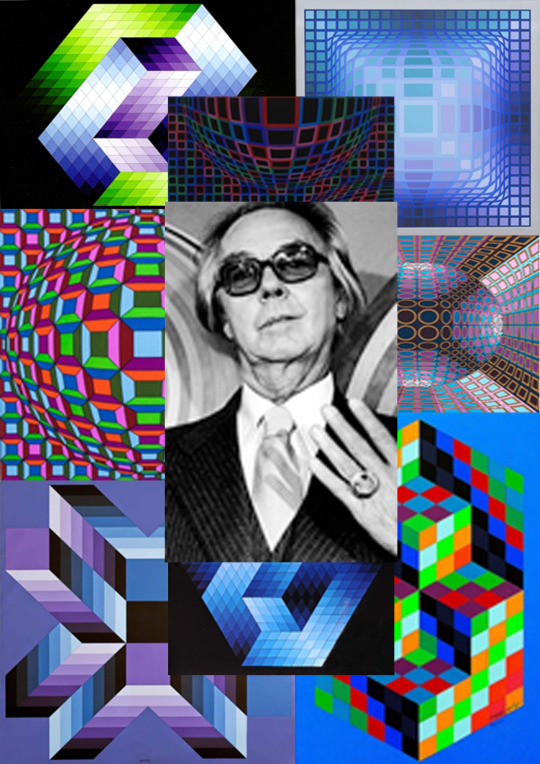
Research VICTOR VASARELY
evasively was born in Pecks and grew up in Postmen (now Pisani, Slovakia) and Budapest, where, in 1925, he took up medical studies at Eotvos Loran University.
In 1927, he abandoned medicine to learn traditional academic painting at the private Pasolini-Volkmann Academy. In 1928/1929, he enrolled at Sandor Bortnick’s private art school called Muhly (lit. "Workshop", in existence until 1938), then widely recognized as Budapest's center of Bauhaus studies.
Cash-strapped, the muhly could not offer all that the Bauhaus offered. Instead, it concentrated on applied graphic art and typographical design.
In 1929, he painted his Blue Study and Green Study.
In 1930, he married his fellow student Claire Spinner (1908–1990).
Together they had two sons, Andre and Jean-Pierre.
Jean-Pierre was also an artist and used the professional name 'Viral'.
In Budapest, he worked for a ball-bearings company in accounting and designing advertising posters.
Vasa rely became a graphic designer and a poster artist during the 1930s combining patterns and organic images with each other.
Outdoor Vasarely artwork at the church of Palos in Pecks
Vasarely left Hungary and settled in Paris in 1930.
He worked as a graphic artist and as a creative consultant at the advertising agencies Havas, Draeger, and Defames (1930–1935).
His interactions with other artists during this time were limited.
He thought of opening an institution modelled after Sandor Bortnick’s muhly and developed some teaching material for it.
Having lived mostly in cheap hotels, he settled in 1942/1944 in Saint-Care in the Lot department. After the Second World War, he opened an atelier in Arcelia, a suburb about 10 kilometers from the center of Paris (in the Val-de-Marne department of the Île-de-France).
In 1961, he finally settled in Anent-sur-Marne (in the Seine-et-Marne department).
Vasarely eventually went on to produce art and sculpture using optical illusion.
Over the next three decades, Vasarely developed his style of geometric abstract art, working in various materials but using a minimal number of forms and colors:
1929–1944: Early graphics: Vasarely experimented with textural effects, perspective, shadow and light.
His early graphic period resulted in works such as Zebras (1937), Chess Board (1935), and Girl-power (1934).
1944–1947: Les Fusses Routes – On the wrong track: During this period, Vasarely experimented with cubistic, futuristic, expressionistic, symbolistic and surrealistic paintings without developing a unique style.
Afterwards, he said he was on the wrong track.
He exhibited his works in the gallery of Denise René (1946) and the gallery René Bertheau (1947).
Writing the introduction to the catalogue, Jacques Prévert placed Vasarely among the surrealists.
Prévert creates the term imaginaries (images + noir, black) to describe the paintings.
Self Portrait (1941) and The Blind Man (1946) are associated with this period.
1947–1951: Developing geometric abstract art (optical art): Finally, Vasarely found his own style.
The overlapping developments are named after their geographical heritage.
Defer refers to the works influenced by the white tiled walls of the Paris Defer – Rocher au metro station.
Ellipsoid pebbles and shells found during a vacation in 1947 at the Breton coast at Belle Île inspired him to the Belles-Isles works.
Since 1948, Vasarely usually spent his summer months in Gourdes in Provence-Alpes-Côte d'Azur.
There, the cubic houses led him to the composition of the group of works labelled Gourdes/Cristal.
He worked on the problem of empty and filled spaces on a flat surface as well as the stereoscopic view.
Tribute to Malevich (1954), Ciudad Universitario de Caracas
1951–1955: Kinetic images, black-white photography’s: From his Gourdes works he developed his kinematic images, superimposed acrylic glass panes create dynamic, moving impressions depending on the viewpoint.
In the black-white period he combined the frames into a single pane by transposing photography’s in two colors.
Tribute to Malevich, a ceramic wall picture of 100 m2 (1,100 sq ft) adorns the University of Caracas, Venezuela which he co-designed in 1954 with the architect Carlos Raúl Villanueva, is a major work of this period.
Kinetic art flourished and works by Vasarely, Calder, Duchamp, Man Ray, Soto, Tonguely were exhibited at the Denise René gallery under the title Le Movement (the motion).
Vasarely published his Yellow Manifest.
Building on the research of constructivist and Bauhaus pioneers, he postulated that visual kinetics (plastique cinétique) relied on the perception of the viewer who is considered the sole creator, playing with optical illusions.
Supernovae (1959–61) in Tate Modern
1955–1965: Folklore planetaries, permutations, and serial art: On 2 March 1959, Vasarely patented his method of unites plastique’s.
Permutations of geometric forms are cut out of a colored square and rearranged.
He worked with a strictly defined palette of colors and forms (three reds, three greens, three blues, two violets, two yellows, black, white, gray; three circles, two squares, two rhomboids, two long rectangles, one triangle, two dissected circles, six ellipses) which he later enlarged and numbered.
Out of this plastic alphabet, he started serial art, an endless permutation of forms and colors worked out by his assistants.
(The creative process is produced by standardized tools and impersonal actors which questions the uniqueness of a work of art.)
In 1963, Vasarely presented his palette to the public under the name of Folklore planetaries.
1965–: Homage à hexagon, Vega: The Tribute to the hexagon series consists of endless transformations of indentations and relief adding color variations, creating a perpetual mobile of optical illusion.
In 1965 Vasarely was included in the Museum of Modern Art exhibition The Responsive Eye, created under the direction of William C. Seitz.
His Vega series plays with spherical swelling grids creating an optical illusion of volume.
Kedzie-Ga, 1970, Screen-print in colors, Edition of 250, 50.8 cm × 50.8 cm (20.0 in × 20.0 in)
In October 1967, designer Will Burton invited Vasarely to make a presentation to Burton’s Vision '67 conference, held at New York University.
On 5 June 1970, Vasarely opened his first dedicated museum with over 500 works in a renaissance palace in Gourdes (closed in 1996).
A second major undertaking was the Foundation Vasarely in Aix-en-Provence, a museum housed in a distinct structure specially designed by Vasarely.
It was inaugurated in 1976 by French president Georges Pompidou, two years after his death.
Sadly, the museum is now in a state of disrepair, several of the pieces on display have been damaged by water leaking from the ceiling.
Also, in 1976 his large kinematic object Georges Pompidou was installed in the Centre Pompidou in Paris and the Vasarely Museum located at his birthplace in Pecks, Hungary, was established with a large donation of works by Vasarely.
In the same decade, he took a stab at industrial design with a 500-piece run of the upscale Suomi tableware by Timo Sarajevan that Vasarely decorated for the German Rosenthal porcelain maker's Studio Linnie.
In 1982, 154 specially created serigraphs were taken into space by the cosmonaut Jean-Loup Chrétien on board the French-Soviet spacecraft Salyut 7 and later sold for the benefit of UNESCO.
In 1987, the second Hungarian Vasarely museum was established in Zach Palace in Budapest with more than 400 works.
He died age 90 in Paris on 15 March 1997.
A new Vasarely exhibit was mounted in Paris at Muse end Herbed in 2012.
In 2019, a temporary exhibition of Vasarely's work entitled Le Partage des Forms was displayed in the Centre Georges Pompidou in Paris.
1970–1996: Vasarely Museum in the Saint-Firmin Palace in Gourdes, Vaucluse, France (closed in 1996)
1976: Foundation Vasarely, Aix-en-Provence, France
1976: Vasarely Museum, Pecks, Hungary
1987: Vasarely Museum, Zach Palace, Buda, Budapest, Hungary
2 notes
·
View notes
Photo

Paul Lorenz
IMPLIED SQUARE (homage to Malevich)
#paul lorenz#implied square#malevich#digital+camera#gay artist#kunst#contemporary drawing#contemporary photography#contemporary gay art
36 notes
·
View notes
Photo

Osvaldo Romberg (1938-2019)
♥
(image: Osvaldo Romberg, 1-160 White Spots from Yellow to Yellow, 'Homage to Malevich', 1976, ‘Color Analysis of paintings’ series, 1974-1976)
29 notes
·
View notes
Text
Rubber Stamping

Extract from ‘circles, squares and halves’ zine - rubber stamp on paper.

Extract from ‘circles, squares and halves’ zine - rubber stamp on paper.

Extract from ‘circles, squares and halves’ zine - rubber stamp on paper.
The last day of term was spent taking part in Stephen Fowler’s rubber stamping workshop. Stephen allowed us access to just a snippet of his archive of rubber stamps to experiment with and create our own zines and greetings cards.
What began as a very mindless and therapeutic session quickly turned in to a systematic and obsessive one. I ended up creating a zine that utilises repetition of circles, squares and halves throughout as a skewed homage to minimalism and suprematism.
I have long been intrigued by Kazemir Malevich’s Suprematist works and enjoyed using this exercise as a way of planning compositions in a playful manner. Malevich’s manifesto ‘The Non-Objective World’ is revered to be one of the most influential theoretical pieces of literature regarding abstract art. He stated that he explored the square as a means to help art escape the restrictions of reality. Further to this he expanded to explore other geometric shapes, predominantly against a white background.
With only having the one day a week to explore the printmaking studios I sometimes feel restricted to just let loose and play - choosing instead to aim to create finished pieces every week. That is not to say I do not explore processes and techniques, but I explore this with a view to realising a final idea. This workshop has led me to understand that exploring compositions and layouts is as important as the method of print itself. I ought to dedicate more time to explore every aspect of my practice as they all inform and influence each other.
#processes#rubber stamps#malevich#kazimir malevich#stephen fowler#zine#suprematism#minimalism#geometric#abstract expressionism#abstractart#printmaking#masters#mamdp
10 notes
·
View notes
Photo

Apertural 11-18-01 (Homage)
Oil on two canvasses
16 x 20 x 3/4 in
2018
This work synthesizes the three painters who I claim as the forebears of my painting: Giotto, Malevich, and Matisse. Kindly note that Agnes Martin’s lines are simply too different from mine. I signed this painting, also in oil, after executing the documentation above.
2 notes
·
View notes
Photo

‘The placard at this museum reads: Climbing a ladder to NO FORM’ (Homage to Malevich’s Suprematist Painting 1917-18) #digitalart #instagram #iphone #instagood #ipad #art #drawing #formless #museum #malevich #avangarde https://www.instagram.com/p/BuAwnJtBbyU/?utm_source=ig_tumblr_share&igshid=2r2y7tbf2fab
1 note
·
View note
Text
First Draft Manuscript
I still need to find information about colour theory so will add this on as I research further
In terms of the structure, I think I might put a series of work at the start of each chapter that relates to the specific subjects that are covered in the chapter, e.g. The Altarpieces + the caption about the series followed by the information about religion/spirituality, Primordial Chaos + caption followed by gender & sexuality and so on. - the altarpieces are the main pieces of the temple / most spiritually important while primordial chaos is the series that looks the most in depth at gender/gender binaries.
Introduction :
A female painter, a pioneer of abstract art, a spiritualist and a dedicated believer in the occult: Swedish artist Hilma af Klint was nothing if not before her time. To the outside world, she spent her life creating a series of unexciting portrait and landscape paintings which challenged neither her own talent, nor the academy, working out of a Stockholm studio next door to the Swedish Association of Painters. By night, however, she conducted séances as part of a secret assembly of five woman painters who named themselves 'The Five,' taking commissions from a spirit she named Amaliel, one of her so-called ‘High Masters’, and seeking oneness of the soul in the colour green. Perhaps most extraordinarily of all, Af Klint experimented in, and ultimately founded, the geometric and colourful abstraction that would be attributed to male founders Wassily Kandinsky, Piet Mondrian and Kazimir Malevich many years later.
Recognising that the world was not ready for her belief in the occult, she worked in complete isolation from the European avant garde, and included a clause in her will that stipulated that not a single item from her 1,000 piece estate be shown until 20 years after her death. She was correct in her estimation: although Af Klint wasn’t alone in her fascination with spiritualism – her male contemporaries, too, made work influenced by the occult – when her sprawling archive was offered to the Moderna Museet in 1970 it was dismissed as trivial. Her work was not to be shown publicly until 1986, and even now, never-before-seen pieces are going on display.
After almost 100 years of being overlooked by the establishment, Af Klint’s work was finally shown to the masses in 1986 – a tender and fluid, emotional and poignant code of colours, shapes, symbols and forms. Now The Paintings for the Temple comes to London in a new exhibition at London’s Serpentine Gallery. “Hilma Af Klint is a pioneer of abstract art and the earliest artist we have ever exhibited at the Serpentine,” Serpentine directors Julia Peyton-Jones and Hans Ulrich Obrist say. The show includes a number of never-before-seen recently restored works, and forms an englightening and admiring homage to the late artist, whose work has been too long overlooked.
https://www.anothermag.com/art-photography/8490/decoding-the-spiritual-symbolism-of-artist-hilma-af-klint
Religion & Spirituality:
Look at the paintings of Swedish artist Hilma af Klint, and you will feel the power of her vision. Through vivid compositions of shapes and symbols, she presented philosophical and spiritual concepts in physical form on canvas—a visual manifestation of her thinking for us to see and reflect upon.
Af Klint’s unprecedented artistic expression was greatly inspired by her devotion to spiritualism, a movement popular in the late 1800s and early 1900s whose followers believed in our ability to communicate with otherworldly beings. Her involvement in spiritualism was not unusual among artists and others in the creative realm in Europe and America at the turn of the century. This was a period of massive change: With industrialization, people moved from the countryside to the towns, cutting off their social networks. Discoveries within the natural sciences, such as radio waves and X-rays, made people realize that there are aspects of our world that we cannot perceive with our five senses. In this atmosphere of upheaval and uncertainty, a variety of religious and philosophical movements took shape, as people from all levels of society were searching for something new to hold on to.
Af Klint, too, was a seeker—a serious and critical one. Throughout her lifetime, she took part in a number of different, yet often related, religious and philosophical movements, each of which had its own impact on her thinking and work. In 1879, at the age of 17, she participated in Spiritist séances, wherein participants attempted to make contact with the dead, and she became a member of the Spiritist Literature Association. The following year, her younger sister, Hermina, passed away, and af Klint tried to communicate with her deceased sibling. Soon after, the artist left the Spiritist movement, feeling it provided a mere shortcut for people to gain information that they were not yet ready to receive. The movement that af Klint soon joined, however, shaped her and her work for years to come: Theosophy.
Established in 1875 in New York by Helena Blavatsky together with Colonel H.S. Olcott, Theosophy was later headquartered in Adyar, south of Madras in India. According to the Theosophical movement, human beings have seven states of consciousness. The Theosophical movement believes in reincarnation, and maintains that the entire universe (from the atom to the galaxy) is a single unit—thus the “Macrocosmos” is equal with the “Microcosmos.” All of these concepts are expressed in af Klint’s abstract paintings.
In 1887, Blavatsky established the European Federation of the Theosophical Society in London, and the Federation was introduced in Sweden in 1889, when af Klint joined. The Theosophical Society, Adyar was also established in Sweden, in 1895, and af Klint joined that organization and was a member until 1915. She participated in the Theosophical World Congress held in Stockholm in June 1913.
Af Klint was also influenced by the Rosicrucians, a fact that is well recorded in her notebooks. Her abstract paintings are sprinkled with various Rosicrucian symbols, and she habitually wore a necklace with a plain silver cross, in the middle of which was engraved a rose within a circle.
In 1896, af Klint also joined the Edelweiss Society, a Swedish association with an ecumenical base established in 1890 by Huldine Beamish. Af Klint left that group a year later, feeling it did not give her the feedback she desired for her spiritual development. Instead, she and four other women who were members of the Edelweiss Society established their own spiritualist group called “The Five.”
The Five met regularly between 1896 and 1907. Each of their gatherings started with a prayer, meditation, and a sermon in front of an altar with a triangle and a cross with a central rose, a Rosicrucian symbol. They continued with analysis of a New Testament text, followed by a séance during which they made contact with spirits and spiritual leaders. The spirits were individually identified by names, while the spiritual leaders were simply referred to as “The High Ones.” The spiritual contacts were verbally expressed by the group’s medium, as well as by automatic scriptures and drawings. The Five recorded these sessions in a series of notebooks.
After The Five had met for several years, the spirits started making recurrent references to an important mission lying ahead. One spirit predicted the creation of future paintings, while another foresaw the building of a temple. He indicated that af Klint would be requested to make the necessary architectural drawings for this temple.
On January 1, 1906, a spirit that the group referred to as Amaliel gave af Klint a monumental task: She was to create the artwork for the temple’s interior—The Paintings for the Temple. “Amaliel offered me a work and I answered immediately Yes,” wrote af Klint in her notebooks. “This was the large work, that I was to perform in my life.” Af Klint went on to paint 111 paintings during the period from November 1906 to April 1908—one painting every fifth day.
In July 1908, soon after she had completed this remarkable time of creative productivity, af Klint met the Austrian philosopher Rudolf Steiner, then the leader of the Theosophical Society in Germany. Steiner is best remembered now for Anthroposophy, the movement that he initiated in 1913, when he broke away from the Theosophists, and the Waldorf system of education that he founded based on Anthroposophical thought. Af Klint sought Steiner’s response to her work, turning to him as one of the most prominent spiritual leaders of the time. However, Steiner did not understand the message of her work, and questioned her way of painting and her mediumistic role.
This was a great disappointment to af Klint, who at the time was exhausted in the wake of creating the first portion of The Paintings for the Temple. Steiner’s response to her paintings seems to have greatly affected the artist, as she ceased painting in abstract form until 1912. During the intervening four years, she cared for her mother, who was blind and in ill health. Af Klint also spent this time painting portraits and studying Western philosophers, and she read Blavatsky’s Theosophical two-volume work The Secret Doctrine, in which the author reconciles ancient Eastern wisdom with modern science. Af Klint finally resumed her artistic work, and in 1915 she completed The Paintings for the Temple, which constitute 193 paintings in all.
Despite Steiner’s reaction to her paintings, af Klint became a member of the Anthroposophical Society in 1920, and primarily studied Anthroposophical teachings for many years after 1922. She stepped away from her artistic creation for a time in 1921 and intensively studied Goethe’s Colour Theory, which Steiner had edited. In 1922 she resumed painting again, influenced by Goethe’s writing, in the “floating colors” style that was also espoused by Anthroposophy—a style she employed for the rest of her life. The Anthroposophical Society had established a center in Dornach, Switzerland, and she conducted research in their archives there with the aim of deciphering the message inherent in her works. She did not find what she sought, and in 1930, she finally broke with the Anthroposophical Society. From that time until her death in 1944, she never returned to Dornach.
Af Klint’s art was designed to convey transcendental messages to humanity. One may say that af Klint’s abstract paintings are firmly based on Rosicrucianism, Theosophy, and Christianity—and also on concepts familiar from Buddhism, whose tenets were woven into the Theosophist teachings. While she was rooted in movements born out of the turbulent turn of the century, in many ways her practice speaks directly to the spiritual and philosophical perspectives of today.
https://www.google.com/search?q=Goethe%E2%80%99s+Colour+Theory%2C&oq=Goethe%E2%80%99s+Colour+Theory%2C&aqs=chrome..69i57j0i22i30l6.322j0j7&sourceid=chrome&ie=UTF-8
Gender and Sexuality:
Clairvoyance is the ability to see beyond the immediate into another time and place, to the then and there. To see clearly is to see how things truly are. Tuning in to a frequency where it is safe to transmit messages, recognizing the meaning of a certain color in a certain back pocket, turning to dead generations to find others who share your secret: these are forms of extrasensory attention practiced by queer people.
I thought of queer clairvoyance amidst the rainbows of the Hilma af Klint show, closing soon at the Guggenheim. I wanted to drink the color, as if the dusty lavenders and burnt oranges could nourish me.
We spiraled up the exhibit, trying to put our finger on what made the art, to us, unquestionably queer. I had a vague memory of hearing that af Klint was a lesbian, but I couldn't place whether I had actually heard it or if it was simply a message received.
How would it shape our understanding of af Klint's art if the show made her queerness central to understanding her vision of the future?
In the months that the show has been up, I waited to see if anyone else would draw that connection between af Klint's sexuality and her vision of the future, and no one did. It felt like af Klint's queerness was a ghost in the show.
Calling af Klint queer is a delicate claim. We only have the usual signs to go by: never married, lived only with women, enjoyed intimate lifelong friendships with women, communed with other astral planes only with women. There are no salacious diaries or letters available, no rumors of her alleged lesbianism, as there are with the founder of Theosophy, Helena Blavatsky. When you research her, you either find no references to her sexuality at all, or you see her, here and there, claimed plainly as gay. Here she appears in the Lavender Review of lesbian poetry and art; here she is on the LGBT Daily Spotlight.
Af Klint's work as a Spiritualist medium, like queerness, was an attunement to signals others didn't pick up. And as with her queerness, her mysticism has been less of a critical preoccupation: too messy, too biographical, too woo.
How would it shape our understanding of af Klint's art if the show made her queerness central to understanding her vision of the future? Erasing her queerness is not merely a problem of representation, but a roadblock for interpreting her work. The critical reluctance to make any claims about what her art does or what kind of future she imagined has everything to do with ignoring the queer implications of her work.
Perhaps because the show is titled Paintings for the Future, critics have tended to defer to af Klint's vision for the future rather than making their own conjectures as to what kind of future, exactly, she envisioned. Peter Schjeldahl, for instance, writes in his New Yorker review, "I don't know what to do with or about it. Maybe some of our artists will. Meanwhile, looking seems a good start." Jillian Steinhauer offers that af Klint helps you "open yourself up to an unfamiliar and more expansive way of seeing the world." Roberta Smith observes that even if af Klint got "there" first in pioneering abstract art, her "'there' seems so radical, so unlike anything else going on at the time." Why is it so hard to put a finger on where "there" is, to name the kind of future she imagines? Why have so many reviews of her work amounted to nothing more than a marketable slogan: the future is female?
If you are attuned to a certain frequency, you can receive the kind of queer future af Klint envisions. But if you are too mired in the here and now as opposed to the then and there, you might not pick up what af Klint puts down. Not everyone is clairvoyant. If most critics have brushed aside her queerness along with the mystical implications of her work as speculative concerns, at best, then perhaps not everyone is spiritually commissioned to receive her messages.
For Hyperallergic, John Yau comes close to calling her queer when he compares her decision to withhold her work from the public until two decades after her death to Emily Dickinson's own reluctance to publish her poetry in her lifetime. Both have been treated by critics as unsexed recluses, in spite of their respectively intense relationships with women.
And as with Dickinson, critics have treated af Klint's vision of the future as hyper contemporary and yet impossibly distant, a horizon that we can see but not reach. It's a familiar kind of future for queer people who aspire towards a liberation that would mean a form of life so radically different it is almost unimaginable. Over the rainbow, somewhere.
It is as if she could only process a binary sexuality on the subatomic level, and call it chaos.
Af Klint's vision of the future is not one that reproduces more of the same. While her work does play with binaries, including the one that pairs up the masculine and feminine, her investment is in the alchemical union of opposites to create something new. She takes up a gendered sense of color — yellow for "male" and blue for "female," green for the harmony of the two — only to name her series of biomorphic forms Primordial Chaos. Her series of canvases struck me as a form of processing, of working through a complicated subject and examining it from every angle and distance. Diagramming, for af Klint, is a way of breaking down the world into its component parts and processing these parts to arrive at a new conclusion. It is as if she could only process a binary sexuality on the subatomic level, and call it chaos.
While male and female bodies may combine to create more male and female bodies, af Klint treats such biology with the eye of a diagrammer, not a sensualist. Contrast this nonsexed creation of life with her Eros Series: a gradation of pink and lavender, a fluid sensuality of shape and color. Reproductive and erotic are not synonymous in her book.
To appreciate af Klint's work is to disregard an art-historical narrative of direct lineage, of artist responding to artist. Instead of a vertical model of inheritance, her work suggests a horizontal model of community collaboration. She was interested in order and structure, but not necessarily hierarchy: "It was not the case that I was to blindly obey the High Lords of the Mysteries," she said, "but that I was to imagine that they were always standing by my side." Even her mediumship was horizontally organized.
Af Klint's vision of the future has deep roots in the past, as her Spiritualist practice suggests. To contact the dead, after all, is to communicate with lost elders, a queer project in itself. Perhaps this is why af Klint appears as a figure of fascination for Kristen Stewart's character, Maureen, in Olivier Assayas' film Personal Shopper. Maureen is a medium, too, and like the painter, seeks to contact a dead sibling but receives messages from a more ambiguous source. Maureen's queerness is notable only if you know what you're looking for — her tepidity with a male suitor, her Shane affect — but there is a direct line between her ability to commune with the unseen, the magnetism that pulls her towards af Klint, and the unspoken object of her sexuality.
Af Klint's work is a collaborative effort between women and the unseen world. Making her queerness explicit in the show would also allow her audience to understand why she was uninterested in being put in a mainstream lineage of artist begetting artist. Her decision not to show her work until twenty years after her death is a queer refusal of parenthood, favoring her lived community of both earthly and heavenly bodies.
As with queerness, the occult is a body of knowledge, welcoming only to those who wish to be initiated, that has in recent years been exploited by capitalism. If we do not discuss af Klint's lesbianism in line with her art, we forget that she and her Spiritualist collective were queer practitioners of the occult, not straight women dabbling in woo or influencers who use aesthetic as an adjective. Her contemporary queer audience, like the Spiritualists before her, can see what others can't and receive messages about the future from voices of the past.
https://www.papermag.com/hilma-af-klint-guggenheim-2635306186.html?rebelltitem=11#rebelltitem11
Paintings of the Temple
During a séance in the year 1906, a spirit called Amaliel allegedly commissioned Hilma af Klint to make paintings for the temple. The artist documented the assignment in her notebook and wrote that it was the largest work she was to perform in her life. This series of artworks, called The Paintings for the Temple, was created between 1906 and 1915. It features 193 paintings that are divided into various subgroups. The general idea of The Paintings for the Temple was to depict the monistic nature of the world. The works should represent that everything in the world is one.
The spiritual quality of the series is also apparent in Hilma af Klint’s description of its making: “The pictures were painted directly through me, without any preliminary drawings, and with great force. I had no idea what the paintings were supposed to depict; nevertheless I worked swiftly and surely, without changing a single brush stroke.”
Primordial Chaos
The paintings of the group Primordial Chaos were the first of Hilma af Klint’s extensive series The Paintings for the Temple. They were also her first examples of abstract art. The group consists of 26 small paintings. They all depict the origins of the world and the Theosophical idea that everything was one at the beginning but was fragmented into dualistic forces. According to this theory, the purpose of life is to reunite the fragmented and polar forces.
The shape of a snail or spiral visible in some of the pictures of this group was used by af Klint to illustrate evolution or development. While the color blue represents the female in af Klint’s work, the color yellow illustrates masculinity. The use of these predominant colors can therefore be interpreted as the depiction of the two opposite forces, such as spirit and matter, or male and female. Hilma af Klint said that the group Primordial Chaos was created under the guidance of one of her spiritual leaders.
The Ten Largest
Instead of being guided by the high masters, like when working on her previous group Primordial Chaos, af Klint’s creative process became more independent during the making of The Ten Largest. She said: “It was not the case that I was to blindly obey the High Lords of the mysteries but that I was to imagine that they were always standing by my side.”
Paintings in the group The Ten Largest represent different stages of human life by illustrating childhood, youth, maturity, and old age. They also illustrate how we are connected to the universe. Hilma af Klint displayed different states of human consciousness and development by painting bright geometrical shapes. The artist explained the works in her notebook: “Ten paradisiacally beautiful paintings were to be executed; the paintings were to be in colors that would be educational and they would reveal my feelings to me in an economical way…. It was the meaning of the leaders to give the world a glimpse of the system of four parts in the life of man.”
Paintings in the group The Ten Largest show various symbols that are characteristic of af Klint’s art and her involvement with spiritual ideas. The number seven, for example, refers to the artist’s knowledge of Theosophical teachings and is a recurring theme in The Ten Largest. In this series, the symbol of the spiral or snail is a representation of the physical as well as the psychological human development. The almond shape that occurs when two circles intersect, like in the painting No. 2, Childhood, symbolizes a development resulting in completion and unity. The shape is a symbol from ancient times and is also called vesica piscis.
The Altar Pieces
The Altarpieces are the last works of Hilma af Klint’s series The Paintings for the Temple. This group consists of three large paintings and was supposed to be placed in the altar room of the temple. Af Klint described the architecture of the temple in one of her notebooks as a round building with three stories, a spiral staircase, and a four-story tower with the altar room at the end of the staircase. The artist also wrote that the temple would exude a certain power and calm. Choosing to place this group in such an important room in a temple shows the significance of her Altarpieces.
The meaning behind the Altarpieces can be found in the Theosophical theory of spiritual evolution, which is characterized by a movement running in two directions. While the triangle in No. 1 of the Altarpieces shows the ascension from the physical world to the spiritual realm, the painting with the triangle pointing downwards illustrates the descending from divinity to the material world. A wide golden circle in the last painting is an esoteric symbol of the universe.
0 notes
Text
Homage a Malevich - 'white on white' video version
#white on white#homage#Malevich#screen#newmedium#new media art#artists on tumblr#ivo3d#media artist#ivo3d.com#visual#konstruktivismus
14 notes
·
View notes
Last Seen Blogs

sunarin185
Elena Vyazemsky

shelley-sweet
Hanya Aku, Kamu yaitu Kita

xavimusic87
Música, A Darle!

ashanifah
Oh, hi!

junk-and-clutter
Junk & Clutter