#highlights compiled in case the talk as-is isn't accessible to someone
Explore tagged Tumblr posts
Photo
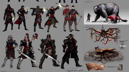
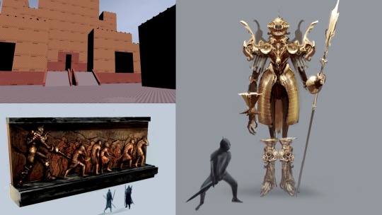
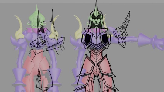
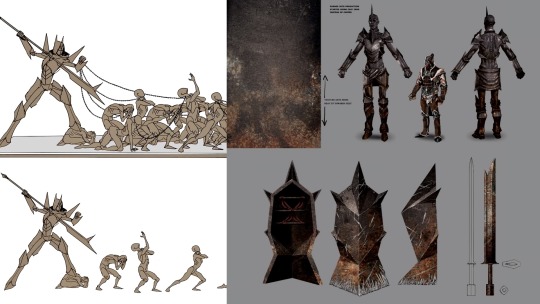
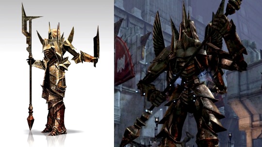
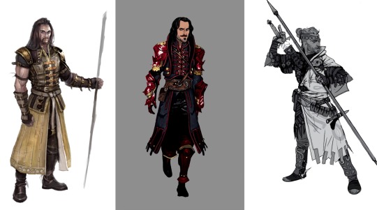
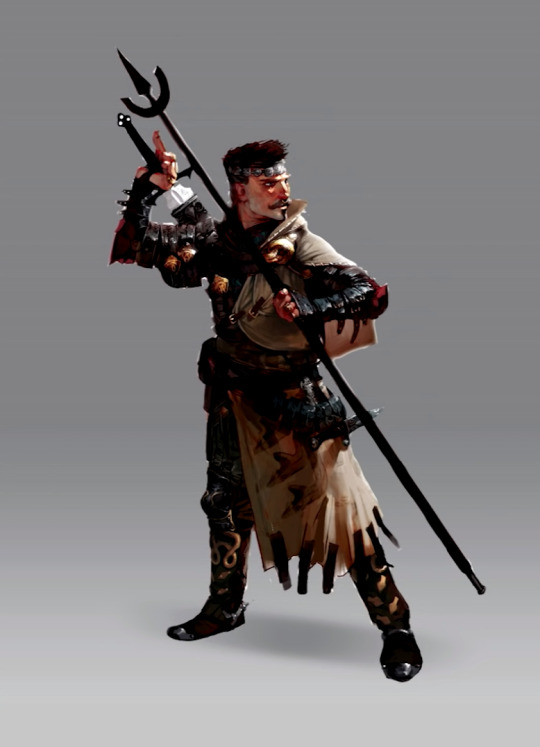


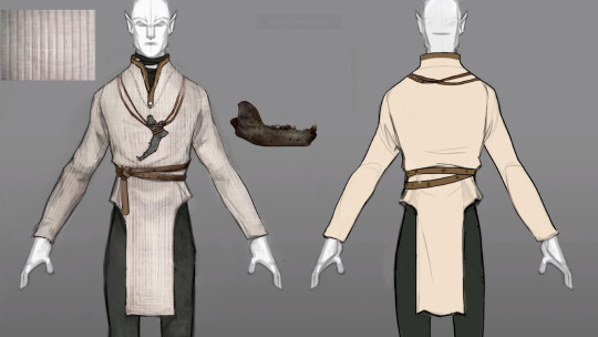
Dragon Age II and Dragon Age: Inquisition concept art & assets from a 2016 talk/presentation by Matt Rhodes, titled “The World of Concept Art” [watch link & source]
It’s an interesting and insightful talk which I recommend watching, especially if you have an interest in concept art and related things like character design and how it fits into the overall game dev process. It’s also interesting to see a bit about how the DA team’s art direction/process has changed over time between games, and hear a bit about how they’ve been doing things going forwards for the next game.
This is Part 1. [Link to Part 2]
(Some notes on the commentary given on the images and in general in the presentation under the cut due to length.)
On image 2: DAII had a fast, hot production period where decisions were made very quickly. The devs knew that the central hub, Kirkwall, had been a center of an old slavery-based empire in the past, and wanted to have indications of this [in its art direction]. There were going to be giant statues that the PC eventually fought - on the right is the design for the statues as they originally were. In the top left, this is all they had for the location [owing to the intensive prod period]. They also had a general idea that they wanted to have tableaus that came to life, shown in the bottom left.
On image 3: Going back to the design of the giant statues, the beautiful golden clockwork version of the design doesn’t really say ‘tool of an ancient slavery-based empire’, so they took the model and tried to come up with something that had more of the kinds of shapes that get into the back of your head and say things like ‘aggressive, hard, simple’.
On image 4: So here they had started doing concepts trying to find some of the right poses, accessories etc that these things would have. One of the hearts of the internal ‘DA art [direction] codex’ is “gray and pointy”; if they give a concept like this to [then] Art Director Matthew Goldman he instinctively wants to go “Yes! Approve!”, and so has to kind of reign himself in a little bit.
On image 5: This is where they ended up getting to and how the concept art turned out in terms of the model, with some negotiation back and forth. This is an example of how their art direction process now tries to tell a story with the art (i.e. it tries to support the story through art aspects of the setting and the environment). Historically, they would have just thrown the French-looking, Baroque clockwork version of the statue into the game and gone with it. They are getting more and more intentional with this sort of thing.
On this image: This was an internal image made for internal discussion. The characters in it aren’t ones that exist or that became other characters, with the exception of the Warden, who kind of became Blackwall. In this image, they were trying to think about visual separation among members of a group at the most basic level (simple graphic design principles, like different shapes and colors). This image is part of trying to solve the design problem of having 4 different characters on-screen in the party at once in their games - as in, players of course need to be able to easily tell who is doing what and where.
A general comment: At BioWare, the concept artists nowadays involve themselves in the character design process much earlier than they used to. Historically, as in earlier games, the writers would write up a bunch of characters and then concept artists would be brought in to draw them. Through negotiation and back-and-forth they would then come up with something. Nowadays though, the concept artists are involved from Day 1. The writers now write down 2 words to describe a character and the artists do sketches based on that. The writers then will write a sentence and the artists will do more drawings based on that. Then it progresses to a paragraph and drawings based on that and so on. In this way it goes back and forth and they build it up so that the visual aspects and the writeup/content of the character are developed completely in tandem, complimentary to one another. This is their goal. They aren’t quite there yet, but this is what they’re trying to strive for in this area.
On image 6: These are Dorian concepts. His initial 2-word writeup was “rockstar mage”. They had different artists take different swings at him. The middle concept is Matt’s. The third concept is by Casper Konefal. Everyone was very excited about it and so it was then taken up to a more final stage (image 7).
On image 8: Casper is one of Matt’s favorite concept artists because he goes in and lovingly details absolutely everything - all the pieces of jewelry etc. Each ring has a story. This attention and level of detail and thought behind it adds authenticity and verisimilitude.
On image 9: In game development, there is an effect on character design that can happen during review meetings. The concept/character artist will know what they need visually from a particular character’s design in order to visually tell the story and to help the character support that. Oftentimes, people who aren’t artists don’t have the language to describe this or realize that’s what’s going on in a character’s design, and instead they just see imperfections in the presented faces. What this can lead to is that unintentionally a group review meeting can slowly trim away all the features of a character that make them interesting or distinct. This is why, for many characters across the game industry, if they were shaved and had their facial decorations etc removed, it would be kind of hard to tell many of them apart, as they have all been subjected to this sort of “council sandblasting” process. Casper figured out an idea to help with this; annotating concept drawings with artistic knowledge that artists know intuitively, as has been done here. Artists know, for instance, that certain shapes and angles can allow for certain assumptions about the character to be made (for example, think about Cassandra’s personality and then consider the angular, straight strong lines that make up her face). Annotating like this and then presenting both versions alongside one another helps these aspects of character design be recognized in the review process, and helps characters remain more distinct.
On image 10: They knew that in DAI there was going to be a character who would be with the PC for the whole game - the humble little hermit, non-intrusive, someone quite closed off who the player wouldn’t know much about. “[quote] And at the very end of the game you’d basically find out that he’s Loki himself, or the embodiment of this ancient god that had been tricking you and basically manipulating you the whole time, characterized by a wolf.” And so Nick Thornborrow hung a wolf’s jaw bone off his neck and it was just there in plain sight the whole game. Because this detail was in the drawings at an early stage, it sparked conversations with the audio department, and the audio department could add touches from their end like having wolves howling when he walked into a new area. They could then get all of these different elements and things that could be hinted at, so that when you play the game a second time it’s like ‘They weren’t even hiding it!! It was there the whole time!!’ He loves that.
A general comment: Any one of BioWare’s 3D modelled characters standing in-game talking or animating probably ends up costing them something in the 40,000 - 60,000 dollar range (they calculated this).
A general comment: For DAI, the concept artists also started to get heavily involved in the storytelling side of things at a deeper level, doing things like quick’n’dirty storyboards for the cinematic designers and spending more time with the writers talking about what emotions they were trying to convey at different points and so forth. Since starting doing this, this has become a built-in part of their process.
A comment in the context of giving advice to up-and-coming and student artists, on the subject of how concepts and ideas are naturally thrown out during the process of iterating on ideas etc: “[quote] Right now, the project that I’m working on that I can’t talk about, I have 3 versions of the story in the garbage, and it’s awesome. Because now I’m working on the fourth with our lead writer and it’s so much better than it would have been otherwise and we’re doing it so much earlier so that we can actually change things up.” Said project could be DA4 or something else. (Please remember these comments were made in November 2016. MEA came out in 2017 and DA4 has been rebooted)
[source]
#dragon age 4#the dread wolf rises#dragon age#bioware#solas#cole#cassandra pentaghast#slavery cw#spirit boy#my lady paladin#long post#longpost#da4 tag for the insight into post-DAI era art direction/design process#& for the reference to the project which may or may not be da4#highlights compiled in case the talk as-is isn't accessible to someone
217 notes
·
View notes
Photo


Dragon Age: Inquisition concept art from a 2016 talk/presentation by Matt Rhodes, titled “The World of Concept Art” [watch link & source]
It’s an interesting and insightful talk which I recommend watching, especially if you have an interest in concept art and related things like character design and how it fits into the overall game dev process. It’s also interesting to see a bit about how the DA team’s art direction/process has changed over time between games, and hear a bit about how they’re doing things going forwards for the next game.
This is Part 2. [Link to Part 1]
(Some notes on the commentary given on the images and in general in the presentation under the cut due to length.)
On images 1-3: This is iteration after iteration, getting to know the main character of the game for DAI. Instead of just trying to change aesthetics here, what they were trying to be really intentional about was changing the story - so like, what is the information, what is the backstory? Change that, and then the drawing changes. (He said that here they were only about ~50% of the way towards achieving this aim) They eventually worked their way up to roughly what is seen in image 3, although there was still some work to do after that.
A general comment: Matt has a soft spot for fantasy as a genre. BioWare have the DA team and the ME team and the majority of the artists tend to move around, but there are these kind of like, core teams. Over the years he has embedded himself into the DA team.
[source]
#dragon age#bioware#video games#highlights compiled in case the talk as-is isn't accessible to someone
86 notes
·
View notes