#help with programming
Explore tagged Tumblr posts
Visit Tumblr Blog
Explore Tumblr blogs with no restrictions, modern design and the best experience.
Last Seen Tumblr Blogs


Fun Fact
Tumblr.com rank in the US is 25.
Text
humanformers au where these two get to bond because they’re both tech savvy programmer nerds or somethibg


more of this au!
#had this lying around for a week or so here it is!#soundwave’s gamer posture is vital to his character design#ratchet helps raf with his programming homework but when he’s busy raf goes and finds soundwave instead#walks out of the most comically shady evil looking alley a few hours later like ‘bye soundwave! see yo next time! :D’#people aren’t even sure if this soundwave guy exists or if he’s some urban myth raf made up#like 3 people max have seen him in the daylight#nobody has ever heard him speak they’re not even sure there’s a human guy under there#turns out he very much exists. he plays minecraft with raf#transformers#maccadam#soundwave#tfp soundwave#tfp bumblebee#tfp#transformers prime#tfp raf#zorangetf#artists on tumblr#raf is seemingly oblivious to his Cryptid aura and jusy goes like#[gestures to the gangling dark figure looming in the far corner] ‘that’s my pal soundwave :D’#bee is stressed out 24/7 HAHA
2K notes
·
View notes
Text
It makes me so uncomfortable to see people post blatantly anti-Jewish content and then turn right around and stan Jewish historical figures. Like, do they hate us or love us?
#this is about the bizarro twitter side of the manhattan project physicist fandom. not talking about our community on tumblr.#stop lusting over our people if you hate us and don't believe we should have a safe homeland#stop lusting over our people if you think oct 7 was justified#oppenheimer and teller helped israel start its nuclear program goddamnit#jumblr
2K notes
·
View notes
Text

projecting my agony onto baau crepe bc learning blender is hell
#also an excuse to draw them with shadow milk#smth smth learning blender will help them build his body lmao#strawberry crepe cookie#shadow milk cookie#crk#beast ancients au#cjj arts#i really wanna draw cookies yg but the summer program im in is workin me to death
437 notes
·
View notes
Text


I love tv
#mettatenna#deltarune#tenna fanart#mettaton#mr tenna#tennaton#tenna deltarune#deltarune fanart#deltarune chapter 3#im so normal about them#help#love bots go brrrr#looking at them gives me a static shock#zzzzt#this is so not my usual programming but whatever my blog my rules#you Will look at these robots#lausart#my art
402 notes
·
View notes
Text

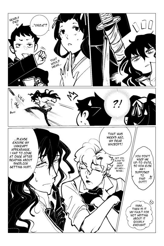


tgaa fan comic ft. my oc mycroft, set some time after 1-5 (shortly after susato's return to britain),, i learned a lot making this, and i'm excited to share more comics in the future!! ^^
special thanks to my best friend jamie who came up with iris's nickname for mycroft (which, ironically, is similar to yujin's)!!
also i haven't drawn ryunosuke in so long and it's him choking on his own spit lmao
and now for some silly extras:


#i'm a hmmk girlie but i think mycroft is FULLY valid in disliking yujin lmao (he also held him in high respect initially which doesnt help)#<- btw i dont draw hmmk much bc im not happy with how i draw yujin but hopefully that'll change#feel free to interpret them as platonic or romantic here idc <3#and THANKS FOR READING!!! I LOVE U!!! <- hype cuz i got accepted into my choice program AND finished this on the same day hehe#the great ace attorney#dgs spoilers#tgaa spoilers#ace attorney#dgs sherlock holmes#herlock sholmes#iris wilson#iris watson#susato mikotoba#mikotoba susato#ryunosuke naruhodo#ryuunosuke naruhodou#yujin mikotoba#genshin asogi#gawd so many tags#ALMOST FORGOT#oc: mycroft#tgaa oc#my ocs
285 notes
·
View notes
Text
American jews 🤝 Israeli jews
"holy shit, I'm so scared for you in your country - it isn't as bad for me in mine!"
#jumblr#jewish politics#antisemitism tw#personal thoughts tag#help why are they/we like this!!!#specifying american vs israeli because i am american and interact with a lot of israelis if i'm interacting with people online or whatever#also. i'm scared for french jews - i don't know many personally but france is........ absolutely infuriating#if the french government said they are investing €55B to space programs to find the Jewish Space Lasers I wouldn't be shocked#i would be more shocked that they haven't already tried to find those mythical space lasers before
652 notes
·
View notes
Note
Following SotM, would you ever be interested in writing a DCA x Reader story based in the SotM factory/story? There's so much detail and worldbuilding to the game, I think your writing would really shine working with the setting :D
I love the setting of SotM factory and just how tragic and lonely it all becomes with the Murray family, and I had a thought about a Y/N hired as a sort of secretary/investigator.
Technically, you're only here for the secretary part of the job. Edwin Murray has also instructed that you dig through all employee records, emails, and messages to find out who betrayed him. Sure. Why not. You're getting paid either way, and Edwin seems satisfied that you're not working for "them".
(You feel bad for the guy. He seems stressed and paranoid, and maybe he's dealing with a few things that more qualified professionals should broach than you.)
So, you get to work, day after day, on the slow and high-pitched droning computers before you notice a program on one of the security room monitors. Moon.exe. You boot it up, confused, before you understand that it's some kind of game. At least, that's what it must be, right?
It doesn't stay so. At least, you thought it was a game. The Moon character is no longer confined to the borders of the program but is now right there, popping up in your daily work schedule. You're very nervous about a possible virus that you accidentally downloaded, but the character doesn't seem to do much. His text boxes will bubble up every now and then, and his haunting gaze will occasionally pop over the files you're combing over in all of his low pixilated glory. (Who gave this computer figure sculpted pectorals?)
He has some odd lines, random script you assume, mindlessly being triggered by... you don't know what. None of it ever makes sense, but you like to read it, just for one moment's break from the mundane and often drivel work you've signed up for. Sometimes it's funny. He tells you to go to bed when the clock runs late, and that must be due to time-based triggers, or so you figure.
You think he's just here for... you don't know, moral support? A fun little distraction that someone must have worked on between big projects due at the factory. Who's to say.
One evening, vision blurry from reading a screen in a too dark room after hours of rehashing lines after lines, trying to decide if a disgruntled employee is suspicious or the average working joe for complaining about the boss to a coworker, when you drag the mouse onto The Moon's face and start clicking, and clicking. Out of dire boredom and need for something, anything new, you click and click as if to magically fix that clock and send you straight out of here. Click. Click. Click.
A new dialogue box pops up.
Stop.
You lift your finger off of the left click.
That's new.
So, you click again, and again.
What do you want?
The Moon's face almost seems annoyed in its half-eclipsed expression. You chuckle to yourself.
"Just pressing your buttons," you snicker. "What else can you do?"
Then you immediately look around the messy, file-filled room, as if you would somehow be caught dorkily chatting to yourself, well, a computer program. Good thing it's only you in the building. Occasionally Edwin will burst into the security office as if he might catch you red handed in something you shouldn't be, but you let your work speak for yourself, and that usually calms the man down.
You need to get out and enjoy your weekend, don't you?
You slump back into your chair and stare at the screen. Just you and The Moon.
You click on The Moon's face again. The satisfying sharpness of the mouse click fills you with bubbling amusement at the childish prodding.
The next dialogue box flips into view.
I can press your buttons too.
A loud slam falls behind you, pushing you out of your seat as you whirl back to find the heavy door locked into place. Heart in your throat, you blink as the lights cut out. You're plunged into tar-black blindness, save for the green glow of the computer screen.
Silenced by terror, you crank your head slowly back to your work desk. The computer hums quietly.
The green glow intensifies as The Moon stares at you. He fills the pixels, one eye piercing you like the end of a knife.
Your eyes snap to the next line of dialogue.
Boop!
For several, terrifying heartbeats, you stand and listen to the frantic scarping of your breath. Like prey spotted by a hunter, you dare not move. The darkness is absolute, and the only light is before you; a lighthouse or the last flicker you see before it all plunges into eternal night.
Who did that?
Then the flick of lights buzzing back on spares your half-suspected heart, and you unlock your limbs when the security door slides back open.
You hardly skim the next box of text as the computer returns to where you left off, files and emails crowding the screen side by side, and The Moon's head set in one corner.
You snatch your backpack and book it through the door. That's it. You're off the clock. You don't care if Edwin loses his marbles about you ducking out a few minutes early. You will not stay a moment longer.
It is only on your drive home, twisting your sweaty palms around the steering wheel, that your brain unscrambles enough to recall the final words on the screen.
Nighty night.
#so yeah#that's a thought!#secret of the mimic#you come back to work on monday and think that you figured it out: it's some prank program that was just messing with you#probably by the same people that edwin suspects of betraying him (and it gained control of the doors and lights... somehow)#so it was nothing and the moon program doesn't freak you out at all!#not that you try to put a sticky note over the moon face in the corner of the computer#only for a box of text to pop up and call you naughty naughty for doing so#you're totally not freaked out! you've got worked to do! so it's fine!#probably!#but you can't help and sometimes grumble out loud and receive an answer from the moon#it's not like he's listening#but you can vent your frustrations#and it's like a rubber ducky to squeeze when you've got too much info before you and does it matter that you're talking to a program?#secret of the mimic moon#run moonware#< au title for the moment#naff writing
202 notes
·
View notes
Text

been tux painting that mob psycho
#i drew something#i love those silly brushes in tux paint . I think i'll be drawing here more. also bc in serious programs i haven't been able to draw a line#idk tryin to make smth ''good' has made drawing a lot more draining than it's supposed to be and the results weren't even +#anyting i could be proud of. So lately i've just been trying to have fun creating things again#I don't think i'll be posting anything super rendered finished or detailed for a while. I just wanna get comfortable with drawing again man#so using silly programs like this one that make noises whenever you use a brush and that are really limited do help +#a lot to take away that pressure +#that i've started to relate to it and just remind myself that this is smth I do bc it makes me happy yk#man i love rambling in the tags#mob psycho#mob psycho fanart#mob psycho 100#mp100#mp100 shigeo#mp100 fanart#mp100 ekubo#ekubo#mp100 dimple#teruki hanazawa#shigeo kageyama#dimple#mp100 teruki
159 notes
·
View notes
Text
weekly navel-gazing update: this week is most consequential event in long time. keyword search: "scared" "is it ok to be scared" "beaten and tortured by the ogre"


#old director of south asian studies just talked to me to let me know theyll be joining me to sit on my panel while i present two projects#in two days and intimated they could discuss supervising potential grad work or dissertations despite funding freezes#she is respected used to do the gender studies program coordinating too#and their TA PhD student super severe standoffish goth walked up to me in front of seminar to thank me for my portfolio of essays#on poverty homelessness and environmental stuff and said it was TOUCHING and i should be proud and shell also be attending#after the director of student research invited them#and research director happens to specialize in borderlands and caribbean and empire and she emailed me to say#she left me a signed copy of her book with a really lovely message#and a protein bar because she knows i have diabetes and other illnesses but bike like ten miles a day between work and school#and then she emailed me and offered car ride if i wanted#and i was touched and surprised and now im like uh oh this is important i guess#and like uh oh i really shouldve taken the week off work or something why am i working forty hours for this#well precarious rent i guess but still wish i hadnt spent past four months just going to retail job and had instead hung out more with#faculty and hope i didnt waste my chance to get to know them#also is im just going to wear that outfit to conference hope not perceived as too informal#no family whatsoever so there was no one like interested or checking in on me to like help me see that the developments were significant#a year ago i was nothing but nightshift retail with NO prospects and rapidly worsening health#and there wasnt even a glimmer of hope for possibility of positive social environment let alone school
207 notes
·
View notes
Text
So You Just Killed Palpatine
In Which, Much To Obi-Wan Kenobi's Surprise, While Dealing With The Consequences of One's Own Action's Can Be A Lot, It Isn't Always Entirely A Bad Thing
originally inspired by this and this from anon and husborth Part One, Part Two, Part Three ... Part Fo ... uh ... there's memes somewhere... Anyway Here's Part Five:
Obi-Wan blinked awake, head cloudy and body heavy, as if under unusually high gravity. But no, there was the all-too-recognizable ceiling of the temple healing halls, its mosaic ceiling drifting in lazy, clockwise circles.
What did I do this time? Wait, there was something I had to tell the rest of the Jedi...something important...
Oh dear, he was on the good painkillers, wasn't he?
“Obi-Wan?” someone familiar asked, voice and force presence ringing with a startling jab of hope.
“Bant?” he tried to reply, only to be met with burning pain in his throat. The only thing he managed to get out was an unintelligible coughing fit which pulled sharply at his gut.
“Take it easy!” she urged, moving into his blurry line of sight. “You’ve had extensive abdominal surgery, and your throat was — was crushed rather severely — it’s going to take more time for the grafts to heal.”
Obi-Wan nodded, chastened, before cautiously starting the process of pushing himself up in bed, Bant hovering nervously all the while. The effort made his muscles ache and the room spin faster, but things settled down once he was sitting up.
He looked around, sagging in relief at a small oily handprint on one of the otherwise sterile visitor chairs. Anakin had been here recently, and was in good enough health to be tinkering. Good, that was good. That was important.
He suddenly realized half his vision was obscured and sluggishly raised a hand to his face, only to find heavy cloth.
“I’m sorry, we weren’t able to save your eye,” Bant said softly. “Once you’re a little more healed we can discuss artificial or bioengineered replacement options.”
She plucked a cup off a counter overcrowded with a dizzying array of flowers. “Here, drink some of this if you’re feeling up to it, it’ll make talking a little easier.”
Obi-Wan accepted the drink, only to feel it slide out of numb hands. Bant gently closed her hands around his, helping to guide the drink to his lips. He grimaced at the taste.
“Bacta infused water,” she apologized. “You’re going to be drinking bacta infused liquids for some time, I’m afraid.”
A wave of exhaustion swept over him and Bant set the cup down as Obi-Wan sagged.
“Anakin?” he managed to rasp out.
“Anakin’s fine, he’s completely safe,” Bant said with a comforting squeeze of his shoulder. “He’ll be annoyed to know he missed you waking up, he very much wanted to be there.”
Obi-Wan was going to say something else, but sleep dragged him under first.
//
Obi-Wan opened his eyes — his eye — to the sight of Quinlan Vos scowling over a datapad. The dark spot on the left side of his vision was more noticeable than before. What the kriff did I do to myself?
He shifted, irritated at how lethargically his body responded. The pad fell to the ground with a clatter as Quinlan lurched towards the bed.
“Obi-Wan! Hold on, let me — you’re supposed to have the water before you try to talk.”
Quinlan helped hold up a cup and straw so Obi-Wan could take several short sips of the unpleasantly viscous and vaguely pineapple flavored water.
“How are you feeling?” Quinlan asked, hovering with uncharacteristic anxiousness.
Obi-Wan paused to think. “Weak,” he replied in a hoarse whisper. “How long have I been...”
Guilt flashed over Vos’s face. “You were in and out of Bacta tanks and surgery for a full two weeks. And then another week in an induced coma. And then another week in a self-healing trance. You had...a lot of internal injuries. I’m so sorry Obi-Wan—this is all my fault.”
Obi-Wan stared at Quinlan blankly for a moment. His face helped the memories to start trickling in.
"Yes..." he said slowly. "Yes — you knocked on my door... you said... Vos... please just... just tell me if I hallucinated anything — did I try to assassinate the Chancellor of the Republic?"
"I'd say you succeeded," Quinlan replied, half-smiling, half-grimacing.
"Did I — did we think he was a pedophile, only—”
He had to pause, throat burning as he fought a coughing fit. He swallowed more disgustingly flavored water before finishing the thought.
“—only to discover that he was in fact not sexually grooming Anakin, but was doing a number of other terrible things? And did he... did he — did he electrocute me...”
Obi-Wan’s voice trailed off and he took several more sips, throat filled with an uncomfortable fizzing sensation.
Quinlan nodded, wincing. “I mean parts of that you know better than me but yeah, that matches with what I understand.”
“Hm.” Obi-Wan finished the cup, mulling it over.
Quinlan Vos muttered something under his breath that Obi-Wan couldn't quite make out, but the word "dramatic" almost definitely featured.
Grey crept in around the corners of his vision, then black.
//
When he opened his eyes — his eye, he'd have to get used to that — next, he was greeted by a convenient and increasingly familiar cup at his bedside, as well as Master Windu. Obi-Wan quickly reached for the water, clutching it in both hands and taking a long drink.
Spurred on by the sight of the Master of the Order, he also reached for the urgent thought from earlier, wanting to get it out before he slipped back under —
“Chancellor Palpatine’s a Sith Lord!!”
The corners of Mace’s eyes crinkled. “Yes, Knight Kenobi," he said. "We’re aware of that now. You’ve proved it to be the case quite publicly. And ended the threat with remarkable... thoroughness.”
Obi-Wan head fell back. “A Sith Lord... the Chancellor!” he said in amazement. He was relieved to find his throat only barely twinging at his outburst.
“It truly stretches the imagination,” Mace agreed tolerantly.
“You’re telling me!” Obi-Wan took another long drink, head spinning.
Master Windu smoothed a crease from his robe before saying, with extreme delicacy, “I don't wish to pressure you into speaking before you've healed... but I admit, we’ve all been wondering how exactly you knew.”
"He force choked me and electrocuted me with Sith Lightning. Lighting! I thought that was a myth!” He drained the cup, hands shaking slightly.
“Yes,” Mace said quietly. “The healers were amazed you survived so long... let alone had the strength to fight back with such strength. We’re all extremely grateful to the Force for keeping you alive long enough for us to reach you.”
Obi-Wan made a mental note to feel grateful later, but his mental space was a bit of a mess at the moment, and he wasn't entirely certain he had filed it away correctly.
Master Windu sighed. “We would have been there sooner but I’m afraid none of us had any idea that you were going to confront a Sith.” A twinge of reproach crept into Windu's voice, but Obi-Wan set it aside along with the gratitude, to be examined at some later date. Ideally when his head felt less full of bantha wool.
“I had no idea,” Obi-Wan said numbly.
“Well you figured it out before the Council at least,” Mace replied, not without humor.
He couldn't help but snort. “Yes, because he shot lightning at me. I mean the force choking happened first but... lightning. Lightning!”
Lines formed between Master Windu's brows as he looked down at him. “As much as it pains me, I understand the risk assessment in not telling the High Council about a Sith Chancellor of the Republic, and goading a public fight was probably the best political move possible. But why start the confrontation so privately? It seemed rather — apologies, we can debrief on that when you're rested. I presume you were trying to get a confession about the droid and clone armies?”
Obi-Wan stared at Mace Windu wide-eyed.
“The what.”
The lines on Master Windu’s face deepened. “The... Kamonian clone army — the clones of Jango Fett...”
Obi-Wan’s eyes got wider. “Jango Fett—you mean Galidrean Jango Fett? The Jedi Killer? Palpatine made a clone army of him?”
Mace was silent for a long while, staring at Obi-Wan as though he were a particularly concerning puzzle. Obi-Wan chewed on the straw, mind wandering to whether or not it would be appropriate to ask Master Windu for a refill. As unpleasant as the flavor was, the fizzing did make his throat feel better.
“Knight Kenobi...” Mace finally said, speaking very slowly. “Do you remember why Chancellor Palpatine attacked you? The soul healers were quite certain the Sith Lord didn’t breach your inner shields but I think you might be suffering from some memory loss...”
His left eye itched; he resisted the urge to reach for it. Obi-Wan sank further into the cushions behind him, trying to think. Were there gaps in his memory? No, as usual, it all seemed a fairly clear path from Quinlan Vos knocking on his door to Obi-Wan ending up unconscious in the healing halls.
“Why Palpatine starting attacking?" he mused. "I suppose he wasn't going to just dance around forever — force, when he dodged my blaster shot, I simply could not understand how — it all happened so fast, but the next thing I knew I was pinned against the wall by a Dark —”
“Stop,” Master Windu ordered, raising his hand. He took a deep breath, radiating calm into the force.
“Do you remember what Palpatine said immediately before you shot him?” he asked patiently.
Obi-Wan shifted, feeling a pang of awkwardness as he muttered the answer guiltily under his breath.
“I’m sorry, Knight Kenobi, I didn’t quite catch that.”
“He said, ah, ‘you’re a Jedi’ and ‘you can’t kill an unarmed man.’”
Mace Windu stared at Obi-Wan.
There was a long pause while Obi-Wan fidgeted with the straw. He was starting to feel that perhaps his thoughts were even less clear than he had assumed them to be, and he was not handling this conversation particularly well.
Windu took another deep breath, radiating slightly less calm then before.
“Knight Kenobi. Why did you shoot the Chancellor of the Republic?”
“...I was trying to kill him,” Obi-Wan said, looking down.
“Why?”
Obi-Wan mumbled.
“Kenobi, speak clearly.”
“Well—ah—it actually turns out that I had misunderstood...I mean it had certainly seemed like...but he wasn’t actually...doing exactly what I thought...”
Windu stared at the recumbent Knight, who flushed.
It occurred to Obi-Wan for the first time, that, considering his plan of running away and becoming a bounty hunter was no longer possible nor, perhaps necessary, he could have misrepresented some of the timeline of events vis a vis sith slaying. Or better yet, pretended to have memory loss.
In his defense, the whole experience had been extremely unnerving! For all that weeks had clearly elapsed for everyone else, Obi-Wan was still processing Chancellor Palpatine shooting lightning out of his fingers.
A wave of exhaustion flooded over him, and he sank into it with relief, recognizing now the sickly sweet painkillers pulsing through his blood, clouding his thoughts and pulling him under.
//
Unfortunately, Mace Windu was still there when he woke up. Kriff.
He opened his mouth to try and backtrack, but Windu raised his hand, cutting off any poorly thought out explanations.
Master Windu took a deep breath, radiating very little calm by this point.
“Let me get this clear. Nod if yes, shake your head if no, did you go into the Chancellor’s office with the intent to assassinate the Chancellor of the Republic?”
Obi-Wan nodded.
“Did you know he was a Sith before you went into his office?”
Obi-Wan shook his head.
“Did you suspect he was a Sith?" Mace asked, slightly desperate.
Obi-Wan shook his head, cringing in apology.
“Before you went into the Chancellor’s office, were you aware that he was working with the Kaminoians to commission a clone army?”
Obi-Wan shook his head, biting back questions.
“Did you know he was working with the trade federation to commission a droid army?”
Another no.
“Did you suspect anything about these armies? Anything about a larger plot to destabilize the Republic? Destroy the Jedi? Become Emperor?”
Obi-Wan shook his head at each question, eyes widening with shock.
Mace Windu was radiating absolutely no calm at this point.
“Knight Kenobi...” he asked with a pained expression. “Did you... attempt to assassinate the Chancellor of the republic for personal reasons born out of some sort of misunderstanding? Only to inadvertently save the Republic?”
“I mean once I found out that he was a Sith... I of course changed tactics... and personal is a bit... but... that... Well. More or less sums the situation up, yes.”
Mace WIndu stared at Obi-Wan Kenobi, who wasn’t sure if he should keep talking or not. He didn't entirely trust his ability to explain things well at the moment, and ultimately decided to err on the side of silence.
Obi-Wan vaguely wished he could slip into sleep, but was fairly sure that it would be rude and possibly obvious to do twice in one conversation. His throat itched and he considered once again asking for more water, ultimately deciding against it.
Minutes passed, Master Windu staring blankly at the wall above Obi-Wan’s shoulders, while Obi-Wan's mind started to wander.
Who on earth had been paying to feed a clone army? How was Quinlan doing at getting Anakin to brush his teeth? Am I going to prison? Ohh that’s why the force was so insistent on killing Palpatine. Maybe that would help explain things to Master Windu? Though 'the force told me to' is generally not considered a good excuse, in of itself, for acts of violence...though this is a rather unique situation...
Eventually Master Plo walked in, letting out a pleased noise.
“There he is! The Hero of the Republic!”
Mace Windu closed his eyes.
“Is that what they’re calling me?” Obi-Wan asked weakly, when it became clear Master Windu wasn’t ready to address everything wrong with that.
“Oh! Your drink is empty! Mace, Vokara was very clear with her instructions!” Master Plo scolded.
Mace Windu didn’t reply.
Plo-Koon snatched the cup, filling it up from a pitcher across the room and talking boisterously. “Well, the public is throwing around a lot of titles, but since you already had Sith Slayer...”
“Oh dear,” Obi-Wan said faintly, accepting the terrible water and drinking it for lack of anything better to do.
Plo-Koon patted him on the shoulder reassuringly. “I’m afraid to tell you it’s going to be very difficult for you to dodge commendations for your actions. Now that you’re awake you’re going to be faced with quite a backlog of requests for ceremonies and interviews—”
Obi-Wan choked. “Ceremonies?” he repeated in a higher pitch. He snuck a look at Master Windu. His eyes were closed, though he didn't appear to be meditating.
That probably wasn't a good sign.
"Yes, ceremonies," Plo-Koon said with far too much relish. "Turns out there are quite a lot of old traditions on the books regarding —"
Master Healer Vokara Che entered the room at brisk pace. “I thought I heard voices — I will remind you that before he is the ‘Sith Slayer Returned’ or ‘The True Chosen One’ or any such nonsense he is first and foremost my patient.”
She gave a sharp look to both Council Members. Plo-Koon nodded contritely while Master Windu continued to not say or do anything.
“The — no, no Anakin’s the chosen one —" Obi-Wan sputtered. "Anakin’s the reason — people aren’t actually calling me that, right?” he asked, drugs doing an admirable job at suppressing the panic he was fairly sure he was going to feel later. The device in Master Che's hand beeped faintly in answer.
“That and more, young Kenobi,” another familiar voice suddenly added, below his field of vision. “To collect your honors, expect to survive, you did not, mmn?”
“Master Yoda! No, I—I really didn’t expect... any honors... at most I was hoping that people would understand...” Obi-Wan protested weakly, shooting Windu a beseeching look which yet again failed to garner a response.
Che rolled her eyes, flipping a lek behind her somewhat sarcastically as she attached a glowing device to his chest. "Of course you didn't."
He barely refrained from wincing as several needles bit into him.
“Perhaps we would have had a better chance of understanding had you left us any of your evidence,” Master Koon chided gently.
“Put together the pieces we did, in our time,” Yoda added, hopping up on the nightstand to affectionately poke his shoulder.
Obi-Wan leaned back, feeling increasingly light-headed.
“Your vitals look good, all things considered,” Master Che said, sounding smug. “You should be back to getting into trouble in a year or so.”
Obi-Wan jerked his head in her direction, aghast. “A year?!”
“Busy, you will be, if work you wish. A seat, open there is for you. Comfortable chair, good company, important duties.”
Master Windu’s eyes squeezed further closed.
“What?” Obi-Wan asked, bewildered.
The healer scowled. “You were bleeding heavily into more or less all your major organs, including your brain. Really, it would be faster for me to list organs that weren't damaged. The fact that you recovered at all is only because Master Gallia conducted ill-advised on-scene amateur healing—"
"Is she alright?" Obi-Wan asked.
"—ill-advised, but successfully non-self-detrimental amateur healing, and I’m a miracle worker, and, credit where credit is due, you’re a stubborn bastard; not to mention your padawan has far too much energy to throw around — you really should consider enrolling him some healer’s courses—”
“Is he alright?” Obi-Wan asked, more urgently.
“He’s fine,” Master Plo reassured him with a gentle hand on the shoulder. “Everyone is fine except for you. He just tired himself out a few times, but Knight Vos has been keeping a close eye on him, and Anakin understands that the best thing at this point is to let you heal under your own power."
“Can I see him?” he asked. His voice was growing hoarse despite the dutifully refilled cup.
Vokara’s face softened. “Of course. He’ll be stopping by after class, in another hour or so. He’s been very punctual.”
“Master Windu? Alright are you? Silent, you have been.” Mace flinched upon being prodded with a stick. He opened his eyes, pinning Knight Kenobi with a steely gaze. Obi-Wan shrunk back, but Windu just sighed.
“You...” he trailed off. He stood up slowly, as if the movement pained him.
"I —" he said authoritatively, quieting the room. "—am taking a sabbatical. Call me when—” Windu gestured vaguely. “—you all sort out this mess.”
He walked out.
A long moment passed. “What did you tell him?” Master Plo finally asked in a hushed whisper.
"Ah..." Obi-Wan paused, limbs heavy with fatigue. "Well — you see— " He closed his eyes, feeling slightly cowardly as he did so.
//
When he opened them again, the light hadn't shifted nearly as much as other inbetweens, and his bandages hadn't been changed. Master Plo was still there, speaking quietly with Yoda.
Shit.
"Not too long that time," Vokara said, pleased. "I've lowered the dose on some of your medications, it should make it easier to stay awake."
"Oh. Good," Obi-Wan replied.
"Young Kenobi." Plo-Koon moved closer. "I dislike pressuring you in your current state, but... Master Windu appears to have left the temple. We were wondering..."
Obi-Wan opened his mouth, then closed it again, considering. His mind was, at last, starting to catch up with mouth. “He asked me... some questions. About how I came to suspect Palpatine," Obi-Wan said carefully. "It would appear I may have forgotten some details. About the evidence...Master Windu was — distressed regarding what I did and did not recall."
Vokara nodded. "Memory loss is completely understandable with the type of injuries you recieved."
"Alright, it is, if remember everything, you cannot," Yoda added kindly. "Our own investigations, ongoing are."
"So if I, ah, can't quite remember everything that led up to our fight," Obi-Wan asked, feeling guilty, but force, that blank look in Master Windu's eyes. "I mean I definitely remember the force willing me to decisively seek his end — really it was unusually loud about it," he added hastily. "If that helps."
Yoda nodded slowly. "This reason, understand we do. But, present to the public, perhaps not a good idea would be."
"Yes," Obi-Wan said. "I think — I'm not certain but I believe Quinlan Vos may have helped me collect some evidence..."
"Said as much, he did. Wait to confer with you, he wanted."
Obi-Wan sagged backwards with relief. "Yes. Yes! We had security concerns... Palpatine was so highly placed..." he trailed off.
"Considering Sifo-Dyas's and Count Dooku's entanglement in all this I can hardly blame you for hesitating to reach out to the council," Plo-Koon said, exhaustion audible even through his vocoder.
Obi-Wan choked on his spit; the following coughing fit was soon rewarded with a fresh bacta drink from Vokara.
Dooku?? Sifo-Dyas??
"Perhaps after I speak with him I'll be able to better assist with the current investigations," he offered hoarsely after recovering.
"Of course," Plo-Koon said gently. "Again, we apologize for interrogating you so early into your recovery but you really can't imagine the public and political scrutiny we've all been under —" He hesitated. "Master Windu was joking about taking a sabbatical right now, was he not?" he asked, sounding strained. "I know he's been under a lot of pressure, but surely you having memory issues couldn't—"
He was thankfully interrupted by the sound of small feet moving rapidly and a gangly body launching itself at highspeeds through the doorway.
Vokara just managed to snag the back of Anakin's robes before he crashed into Obi-Wan's medbed.
"Padawan Skywalker," she said, voice tight. "I believe I have mentioned the numerous injuries your master is recovering from and the need for —"
"Care in my movements," he said sheepishly. "Apologies, master, thank you."
"Anakin," Obi-Wan said, something in his chest relaxing at the sight of his dangling student.
"Obi-Wan." His padawan's eyes immediately started filling with tears.
Obi-Wan reached out instinctively. "Oh, Anakin."
"Give you a moment, we will," Yoda said, hobbling out, as Vokara sighed, then gently placed his pupil on the floor.
"Of course," Plo-Koon agreed. "Take all the time you need." He hurried to catch up with Yoda. Obi-Wan heard him begin to say, "Mace can't actually be leaving us to deal with this clusterfu—'' Then the door closed, and Anakin was weeping at his bedside.
"Shh," Obi-Wan said, tugging his padawan up, ignoring the protestations of his abdomen. "There, there, it will be alright."
Anakin crawled up, movements ginger and uncertain around Obi-Wan's numerous injuries. Together, they somehow managed to shift Obi-Wan enough for Anakin to fit beside him. His padawan shook with suppressed sobs, and parts of him were almost certainly hanging awkwardly off the edge of the bed.
Obi-Wan ran one hand through Anakin's hair, the other hand gently resting where he could reach without twisting too much, probably an elbow, though the boy was pointy enough these days that he couldn't be sure. If Obi-Wan was also shaking, well. There was reason enough.
"Sheev," Anakin finally said, oozing misery and an overwhelming tangle of other unpleasant emotions into the force.
"...I know he was your friend—" Obi-Wan said, after what was hopefully not too long a pause. This was another conversation that probably wouldn't be helped by painkillers.
"But he wasn't, really." Anakin curled up, even more miserable. "I know. I should let go."
The side of Obi-Wan's head throbbed. On second thought, painkillers were the way to go here. "That's not what I meant," he said. "He was a friend to you. He's gone now. Because of me, your master. And... I'm sure you've found out a lot while I've been asleep. I can't imagine a single padawan learner who wouldn't be struggling with their emotions right now. I'm struggling."
"I'm angry," Anakin said into his side. "Master, I'm so full of anger."
"You think I wasn't?" Obi-Wan asked dryly.
Anakin hiccuped a sob. "I'm angry at everyone."
"It's alright, Anakin," Obi-Wan soothed. "You'll work through it in time. I'll be here to help, whenever you want. Even when I'm the one you're angry with."
Anakin sobbed another minute, force presence roiling, before finally pulling himself in with a deep breath, and wiping his nose on the sheets. "You looked so cool when you were angry," he mumbled into Obi-Wan's side.
"Oh force," Obi-Wan groaned. "Of course there was holofootage. Of course you watched."
"Are you... still angry?" Anakin asked.
Fuck.
Obi-Wan tried to think of the right answer for a padawan learner. His head throbbed again.
"Honestly? Right now I'm mostly just tired. I feel like I was run over by a pack of bantha. It's never a good idea to try and deal with large emotional gnarls while you're this exhausted, remember that my young padawan."
"You've been asleep for years," Anakin whined. "How are you still tired?"
"Years?" he asked, amused.
"At least three," Anakin huffed, curling up against him.
Obi-Wan stroked his hair in peaceful silence for a moment.
"...Did you really smash in his skull with a metal chair to protect me?"
"I would do a lot of things to protect you," he confessed. "I'm sorry Anakin — I should have talked with you when I grew concerned with his behavior. I felt at the time I had to act swiftly, but I worry I only caused you more pain."
"It was a really cool fight."
"...Thank you, padawan."
"Can you teach me how to choke people with my ankles like that?" he sniffled.
Obi-Wan groaned internally. "Of course, as a Jedi, violence—"
"Violence is our last resort," Anakin interrupted. "Right, yeah —but if it is needed—"
"—Such as when someone," Obi-Wan said over him. "After careful consideration, is found to be both politically insulated and positioned to commit great further harm—"
"Actually, I think you, the person who killed my trusted friend, lecturing me on why he was ultra especially irredeemably evil is traumatizing, even more traumatizing than all those holo compilations of you —"
"Oh force above, of course there's — oh. Oh no — please don't tell me—"
"The latest Jizz music," Anakin said, far too gleeful.
Obi-Wan groaned. Unfortunately, the extra movement in his chest triggered an admittedly ghastly sounding coughing fit and Anakin immediately lost the small edge of grace he had managed to cultivate during their back and forth.
"Master?" he asked urgently. "Master — hold on — I'll go get—"
"I'm fine," Obi-Wan rasped. "Any more of that —"
Anakin was already scrambling to fetch the pitcher.
Such a good boy, he thought affectionately, watching him pour and carry over a glass with the same care others might have when handling molten gold.
Obi-Wan drank with a reciprocal amount of delicacy, knowing his padawan was watching falcon-eyed for any wasted drops.
"Perhaps we should finish this conversation a little later," Obi-Wan said, once his airways calmed down.
Coughing should not be this exhausting.
"Of course," Anakin said, subdued, but he crawled back into bed readily enough when Obi-Wan patted it.
“Really, though —” Obi-Wan started to say, feeling it was duty to try and wrap up the lesson, but he was fortunately cut off before he was forced to figure out exactly what that lesson was.
“It’s alright,” Anakin chimed comfortingly. “We have time to talk about it, master. Can’t you tell?”
“Hm?” Obi-Wan replied, fighting the droop of his eyelids.
“The force clears,” Anakin said, voice sonorous. “The dark retreats.”
“Oh.” Obi-Wan’s eyes started falling closed. “That’s nice.”
“So we have time. To figure out the rest.”
“Very nice,” Obi-Wan murmured.
His padawan curled against him, force presence like ocean waves rocking him to sleep.
“The force says it’s going to be alright,” Anakin whispered, wonderingly. “It’s going to be alright.”
Obi-Wan smiled, then once again slipped back to sleep.
#star wars#star wars au no 41#star wars fanfiction#just kill him au#my au#ayyyyyyyy guess who just finished writing a fanfic from three years and several fandoms ago#ahahahahahahahaha#this one goes out to bullet journeling and my new antidepressants!#Antidepressants and bullet journeling! Sometimes they help you do stuff on purpose!#lol i'm writing these tags before actually finishing the fic. it's November 2024 for the sake of the record#POSITIVE VISUALIZATION BABY#if anyone wants to do a beta read on this for typos/grammar before i put it on ao3 feel free to message :)#senate investigation committee: what do you mean most of the evidence you collected before your duel is gone#Obi-Wan: it. it—#Vos: it exploded!#Obi-Wan (through clenched teeth): yes. as my colleague says. it. exploded.#senate investigation committee: [nodding] ah yes things connected to him do have the tendency to do that don't they#Obi-Wan: ...mhm#Plo Koon (on his third mug of space red bull that day): alright sith killer we found ANOTHER sith lab because — get this —#Vos: it exploded when he died?#Plo Koon: [making finger guns] it EXPLODED when he died!!!#Obi-Wan:#Obi-Wan: why is there a small jango fett clone attached to you#Kit Fisto: we're testing out an emotional support jango fett clone program. do you want one?#Obi-Wan: ...i genuinely have no idea if you're joking or not#Kit Fisto: to be honest neither am I#Obi-Wan: ...#Kit Fisto: there are a LOT of small jango fetts
327 notes
·
View notes
Text
no, but really, we need to talk about the casual objectification that has become the fallback discourse of the internet: if you're pretty and dressed nicely, you're a slut. and if you're even vaguely outside of their body standard, you're fucking disgusting.
too-frequently, people position sex workers as being "the problem". they sneer you're addicted to pornography, you don't know what a real woman looks like. but real women are in pornography. the real bodies on display are not the issue here: the issue is that other people feel extremely confident when commenting on someone's physique.
2000's super-thin is slowly worming its way back into the public ideal. recently i saw someone get told to "go for a run", despite the fact she was on the thinner side of average. not that it would ever be appropriate to say that: but it's kind of like sticker shock when you see it. people think that is fat? holy shit. do they just have no idea about things?
but what are you going to do about it? that's the problem, right. because chances are - you're a normal person. we can say normalize carrying fat on your body, but we are not the billion-dollar diet industry. we are not the billion-dollar fashion industry. we are just, like. people. who are trying to make content on the internet, without being treated shittily.
as someone who has been on both sides of things: you are treated better when you are thin and pretty. this is statistically correct. i am not saying that you cannot be bullied for being thin; i'm saying there are objective institutional biases against certain bodytypes. there are videos of men and women who lost weight all saying: i now know for a fact exactly how much worse you're treated. in the comments, some asshole inevitably says something akin to you deserved to be dehumanized when you were fat.
which means that ... the easiest thing to do is be pretty and thin. it is the path of least resistance, because of course it is, because any time you post a picture of yourself without a thigh gap, someone immediately comments something like you need to try a diet.
the other half is also dehumanizing though, huh, just in a different way. when i put on makeup and nice clothes, i am told i slept my way to the top as a professional. do you know how many women in STEM have told me they purposefully dress to "unimpress" because they already struggle to be taken seriously and if they're ever considered pretty - it for some reason takes away from their authority.
so they make it seem like it's your fault. you, existing in a body - it's your fault! if you didn't want shitty comments, don't have a body. they position us against each other like chess pieces; vying for male attention we don't even need.
and i can be an authority on this unless you think i'm fat and unattractive. when i am pretty and thin, i'm an activist. when i am just a normal person who makes a good point: i am immediately dismissed. nobody fucking believes you if you're not seen as attractive. you literally lose value. you cease to exist.
but the whole time, it feels like - is anyone actually grounded the fuck in reality? the line of "pretty and thin" keeps shifting. nobody seems to understand what "a normal weight" even looks like, because it's not something that exists - you cannot tell a person's health by looking at their body. even if you think you could tell that, even if you're sure a person is dangerously overweight - people are not your dolls. they do not need to be dressed up or displayed properly to soothe your aesthetics. you aren't concerned for them, you're stealing their agency. you don't get to say if they're "allowed" to take pictures and post them on the internet - you don't get to tell them how to exist.
people hide behind "the obesity epidemic" without any actual qualifications. they crow things about "normalizing unhealthiness".
but it's bullshit. i have visible abs. there is a pair of parallel lines on my body, even when i'm relaxed; where my obliques meet my abdominal wall. i am proud of this because it means i'm strong, because i overcame an eating disorder only to be ripped as fuck. it is genetic and physical luck that i even get any definition, i'm pleased as punch.
but it does mean that my abdominal wall sticks out a little bit. the other day i posted a video of myself dancing, and, for a moment, my shirt slipped. you could see a little bit of my stomach. i was cartwheeling to the floor. moments before this, i'd had my foot over my head.
a guy slid into my DMs. a row of vomiting emojis prefaced: you should really lose some weight before you think about dancing.
i stared at it for a long time. there was a time when i would have been triggered by this, where it would have encouraged me to starve myself. i would have ignored the fact i'm flexible, agile, good at jumping: i would have lost the weight for a stranger's passing comment. i would have found myself and my body fucking disgusting.
and for what? to please what? because why? so that he can exist in this world without an unchallenged eyeball? what would my self-hatred even accomplish? usually i write paragraphs. obviously. on this particular occasion, in this body i've been at war with for ages: i just felt exhausted.
it shouldn't be even worth saying. it shouldn't be hard to explain. all of this emotional turmoil when he cannot even comprehend the most basic truth: i am not an object on display for him.
#spilled ink#writeblr#warm up#like if im getting fatshamed. babe......... wake up#is there fat on my body? yes :)#btw this behavior wouldn't be okay even if I WAS overweight!!! that is my point!!!#it is both that people have no idea what weight is supposed to look like#and even if they DID... they do not seem to understand that PEOPLE ARE NOT DOLLS#YOU DO NOT GET TO TELL THEM HOW TO EXIST#if you respond anything akin to ''but raquel there IS an obesity epidemic''#you're blocked and reported.#go fucking DONATE TO A FOOD BANK THEN. volunteer in a food desert. start a free fitness program#GO GET A DEGREE AS A MEDICAL PROFESSIONAL AND PRACTICE IN NUTRITION IN UNDERPRIVILEDGED LOCATIONS#FIGURE OUT HOW TO LOWER FOOD COSTS. FIGURE OUT HOW TO NORMALIZE AND STANDARDIZE#ACCESS TO FARM-FRESH FOOD. PROVIDE ACTUAL FREE ACCESS TO OUTSIDE ACTIVITIES#FIGURE OUT HOW TO TEACH PEOPLE HEALTHY CHOICE MAKING WHILE ALSO LOWERING THE COST OF MEALS.#THE AVERAGE GROCERY BILL OF THE AMERICAN CITIZEN HAS QUADRUPILED IN THE LAST YEAR.#SHUT. THE FUCK. UP!!!!!!!!!#you don't want to help these people!!!!!#you want to bully them but still feel like a good person!#you want to be justified in your hatred of an entire CLASS of people!!!#you don't give a fuck about how it makes them feel!!!!#you care ONLY about whether or not YOU get to VIRTUE SIGNAL that YOURE so thin and pretty!!!!#it is BECAUSE of people like you#and the fact you tolerate fatphobia - BECAUSE of that normalization. that men like the one who called me fat#feel like they can get away with it.#bc there's a line for you where you WOULD be okay with it. where if i WASNT thin you'd be okay with it.#which means the line can always be pushed in a certain direction. and it's always going to appeal to male aesthetics.#''well you didn't deserve it'' maybe fucking NOBODY does babe. maybe we should just all agree not to comment on ppls bodies!!
2K notes
·
View notes
Text
Imagining a random Batfamily dinner table conversation where someone asks about a certain rigorous training program Bruce declined to use with the Robins.
Alfred: “It’s hell on your feet. All of your toenails will fall off by the fourth week.”
Cue horrified disbelief as 8+ batkids turn to Bruce, who’s quietly slicing his steak at the head of the table.
“It’s true,” Bruce says, switching his fork over to the other hand. “All your toenails do fall off.”
Tim: “Oh my god.”
Dick: “That’s disgusting.”
Jason: “All of them? At the same time?”
Tim: “Oh my god.”
#why does alfred know this?#dealers choice if it’s because he ran the same program one#or he helped Bruce after he did#point is#ewww brother#bruce wayne#batman#dc#batfamily#micro fic#the most micro of micro#fic ideas#alfred pennyworth
679 notes
·
View notes
Text
this will forever be #my personal headcanon for the independent vegas ending

#fallout new vegas#fnv#benny gecko#courier six#yes man#sometimes found family is you#the ugly fuck who tried to kill you#and your non binary child who is programmed to help you achieve world domination
290 notes
·
View notes
Text
Since I'm apparently feeling political today, I don't think the right would be as opposed to taxes if tax revenue weren't so mismanaged
#also if there were more oversight to government assistance programs and such...#I don't think people would be mad about helping poor pregnant mothers with no support net if the government was actually helping them#or with helping disabled people who can't work#it's the fact that these services are taking our money and then not actually helping people#so it's like what's the point? it's just theft
355 notes
·
View notes
Text
of all the arguments around ai that i agree with none of them have actually made me artistically interested in it that much, i think i value seeing inspirations and allusions and cohesiveness in art quite a lot and while people making art with ai can do those things the addition of ai adding a layer of inscrutable cultural abstraction kinda makes it not ever hit for me even for the pieces that i see might be genuinely interesting. its the same reason i don't really use it myself i find greater control over my artistic messaging to be important to me as an artist and ai takes that control away from me. the commentary on art it can be used to create is certainly evocative tho
#all productions of ai inevitably being filtered by the mishmash of milleau it's been exposed to makes the result a little flat#and discordant in my opinion#it doesn't help that it doesn't offer anything new it simply offers an easier way to accomplish things that many digital art programs can#already accomplish#i mean i ai photo editing in minor ways has existed longer than this ai boom and it didn't exactly revolutionize anything#it's more a timesaver than anything else so my only objection is basically being snobby lol
87 notes
·
View notes