#from absolutely beautiful fully rendered pieces with background and everything
Explore tagged Tumblr posts
Text
Hogan's Heroes Characters on a Period Cramp Simulator
Special thanks to @anna-pineappel and @frau-wilhelm-klink for encouraging this crackhead impulse 😆
Colonel Robert Hogan
“So this thing is gonna put me in your shoes, huh?” Skepticism dripped from the cross-armed colonel’s words, and as badly as you wanted to smack it off his face, you had a piece of technology that was going to do that for you. All you did was agree lightly as you stuck electrodes to his bared skin. Anticipation rose, floating up your chest like a balloon, at the thought of finally seeing the infamous Robert E. Hogan’s tough act crumble. He didn’t give you the satisfaction at first, just a wince. A whitening of his knuckles about his elbows. “Yeah, this isn’t pretty,” he remarked, trying his damndest to keep casual. “No,” you agreed with a shake of your head, “But it’s still workable. You could put in a full day like this, eh?” His eyes tightened a bit, but he agreed. “Good thing this is baseline, huh? Now how about our worst days? This is days two and three for a good number of us,” you added, clicking four more times, “This pretty?” “Beautiful.” Shaking your head, you chuckled to yourself. For once, Hogan was quiet. You could get used to that. “How about now? Ready for a good eight hours?” “Alright, you got me there. They don’t give you sick days for this?” “Nope,” you shook your head, “And you men don’t like giving us breaks, either. How’s about a little sympathy next time?” “How’s about a lot of sympathy?” “That’s more like it,” you answered with a grin and a cheeky salute.
Corporal Peter Newkirk
"Are you sure you want to do this?" You gave him one final out before anything was attached, but Peter shook his head, adamant. "After everything I've been through? I can handle it, love." You smirked as the machine was set up. Peter had never fully understood how the pain had you incapacitated at times, even going so far as to wonder aloud if it was really that bad and of course piss you off in the process. "Alright," was all you said as the second electrode stuck. You watched Peter with raised brows and otherwise mild expression as he began bearing less than half the full brunt of your simulator job. “Handling it?” For once, Peter Newkirk had been rendered speechless. Nothing smart in response, just a nod. “Then care to join me in a day’s work? Some drills perhaps?” “God, no!” “Well, you’re not nearly as strong as a woman,” you shot back, positively grinning that time. “Why, you—” Bam. Eight. Choking on whatever he was floundering to come up with, Peter finally dropped his composure, hips bending. Instinctually folding. Yep. “You what?” You asked, adopting a sweet tone. “You absolute angel,” he finally breathed, daring peer up at you, cockiness finally melting to awe.
Sergeant James Kinchloe
Whatever you’d done to deserve Kinch, you hoped you’d do it again and again. What other man would voluntarily subject himself to pain to understand you? To, in his words, know what helps you best? You found yourself maintaining a gentle touch as you attached everything as if it wasn’t about to contract muscles and nerves into oblivion anyway. Kinch’s eyes surveyed the working of the device with curiosity as you dialed it on. “Holy cats. This is no joke. I think I’ll quit making those jokes about your mood from now on.” “See how a person might get a little down in the dumps?” At that, he just nodded. “The real kicker is that this is background noise for me. Not even half what this thing can do.” “You’re kidding.” “For my sake, I wish I was. Did you wanna know what a bad day feels like?” “Never,” Kinch shook his head, but waved a hand, “But go ahead anyway.” Stoic as he often was, even your steadfast rock Sergeant Kinchloe let loose a grimace when you took the sensation up four more notches. You found yourself reaching out to hold his hand as if he was going into labor or something. He peered into your eyes as if he’d never seen them before, speaking your name like a question. “Yes?” “After this, we’re going to the nicest place in town, on me. I feel like I owe you plenty of apologies.”
Corporal Louis LeBeau
“I was shot once. If any man can take this, it will be me,” Louis bragged. For your part, all you did was snort and bid him to prepare the area the electrodes were to be attached to. A small shock of guilt crossed your chest at the nerves he tried to hide, but still had flashing across his eyes. It faded, though, when you remembered he asked for this. Swore it would be alright. You didn’t want to see him in pain, but the understanding hopefully achieved would be satisfying. One, two, three, four. Louis’s eyebrows furrowed in silent, momentary question only to shoot back to normal as his eyes narrowed. “You put it on the highest setting right away, didn’t you?” He asked, attempting an even tone. “This is less than halfway, Louis,” you suppressed a snicker at the suspicion burning in his dark eyes. “Less than—” “See for yourself,” you told him, waving a hand over the four illuminated on the screen. “You cannot be serious with this! This thing makes you feel like a chicken being carved.” “Need I remind you that I do get carved out? A whole organ’s worth of—” “I feel faint.” “Better or worse than getting shot?” “Well…” Six, seven, eight… “Worse. I didn’t get shot that hard.” “Worse than getting kicked in the—” “Yes. I’m sorry I ever doubted you.”
Sergeant Andrew Carter
Andrew had always been pretty understanding of what you went through. He didn’t like pain, you said you were in it, he didn’t question it. It was hard, then, to derive any satisfaction from the naïve eagerness on his face when the machine is hooked up, drawing his focus with its workings. Curiosity was all you saw on his face until the moment the dials were turned, beginning with ramping the painful stimulation up to a 4. A 4 which was considered in menstruating terms a low to average. “Yowch!” Big puppy dog eyes yanked away from the machine to stare into yours. “You didn’t have to kill me with it right away.” “This isn’t even half as far as it goes,” you replied, feeling even worse. “No kidding? How bad can it get for you? This bad?” “It can get twice that,” you told him. “Gee, no wonder they say girls get a little mad sometimes. I’d sure have a hard time being nice if I had a day like this.” “Try three to seven.” Andrew’s eyes bugged. “Three to—” “That’s right.” “They oughta send you guys to war, then. You’re invincible! …Boy, after this I’m gonna go out and buy you the biggest box of chocolates and bouquet I can find!”
Sergeant Richard Baker
Somehow the resolve in his eyes has you the one feeling bad, almost having second thoughts. “Don’t worry about me, all right?” His voice, low and reassuring, cuts into your swirl of concern. “I want to do this. I may kick myself for it later, but I want to understand what you go through.” Nodding, you allow him to pull up his shirt and receive the electrodes. “Not every man would ask for this,” you tell him, “I appreciate it, you know.” “Remember that if you catch me crying,” Richard joked. “It’s you who should remember that when I laugh,” you fired back, getting started. He tilted his head slightly, winced. “Yeah. Yeah, that’s…pretty bad. I feel like a jack-o-lantern getting my insides scraped out.” “Well, that is exactly what’s happening.” “Hey, isn’t this bad enough? No need to make me sick, too!” “Oh, don’t make me laugh, honey! Just let me know when you’re ready to feel a peak day.” “This wasn’t? Sweetheart, I’ll be busting out the fans and grapes next time if it gets worse than this!”
Colonel Wilhelm Klink
“So this is going to cause me some sort of electric pain?” Wilhelm Klink was afraid. You could see it in his eyes even if it didn’t also weave its wavering way around his words. “Think of it as muscle contraction,” you replied soothingly, “That’s what this does, after all. You’ll feel like I do and maybe even stop quipping about a woman’s moods.” The last bit came with a pointed gaze and raise of your eyebrow at him as well as several ramping clicks of your device. “You forget, my dear, I am a German officer. A Klink! The greatest military stock to…oh dear. I think you accidentally turned it up a little too high,” he chuckled nervously, offering you a comically wide smile. A smile you just shook your head into. “I’m afraid not. This is it.” “I’ve seen you working like this! With these… these knives carving you from the inside! There is no way!” “No way?” “…no way save for you being understandably a little bit short sometimes.” Five, six, seven, eight. Pure whimpering from the colonel, a sight which did make you want to spare him. “My dear! Why have you never told me it could be this agonizing?” “I did. You didn’t believe me.” As you shut the device off, relief flooded his blue eyes and he grabbed your hand and kissed it. “Next time you shall have breakfast in bed, and blankets, and…and…” “A hot water bottle?” You supplied. “Two hot water bottles!”
Sergeant Hans Schultz
“So these little things are going to hurt me?” You frowned slightly at that. “It sounds sad when you put it like that! This is just so you understand what it’s like when my week hits.” “It’s a week?” “You thought I dumped it all out in one day?” You raised an eyebrow. Schultz, for his part, immediately winced and got quiet. Click, click, click. “Oh!” You’d expected a bit of dramatics, but you hadn’t expected the satisfaction rushing through you, the immediate vindication. “I thought the bad part was if you had the baby!” “That’s worse. This isn’t even that bad.” “You have not tried it.” One glare shut him back up. “Alright, you have made your point, now make it stop, please!” “Not until you feel what it’s like on a bad day.” “You call this a good day?” “Wait and see what you think,” you replied. “Oh, please!” Eight had been reached. “I will give you anything you want! A-ny-thing!” “I don’t want you to give me anything,” you replied, resting a hand on his shoulder, “I just wanted you to understand.” “I understand,” he nodded, blue eyes wide, “I understand that you are amazing!” “And you might think twice before making any jokes about women being weak, huh?” “Oh, yes!” “Then you have given me what I want already.”
General Albert Burkhalter
“You think your little machine can scare me?” “No,” you smirked, resting a hand on your hip, “But I think it can hurt you.” “Ha! You forget, my dear, that I am a General. A general who has fought, and won, plenty of duels.” “Well, then just think of this as if you’ve had a little saber accident,” you remarked as he got hooked up, “Just…quite a low saber accident.” The general laughed at that and you shook your head, aware he’d likely stop laughing quite soon. Sure enough, he was silent at one, silent at two… He tensed at three, glanced down with raised eyebrows when you didn’t stop. “So there are five settings on this, then?” “Ten, my brave general. I’m starting you off easy. Why? Having a hard time picturing doing your day-to-day marches and drives like this?” “Not in the slightest,” he challenged, fire burning in his dark eyes despite his shaking hands. Grinning wickedly, you turned the general up to a bad day with great haste and, more importantly, no warning. Dropping him just as hastily to his knees. “You’d think someone threw a grenade in here, sir. Get up, you’ve got work to do.” “You are mocking me. Turning this thing up to a ten!” “This is an eight,” you corrected, “And science will tell you that many—” “To hell with science, turn this thing off!” “I had a feeling you’d say that,” you purred, patting his cheek.
Major Wolfgang Hochstetter
“Feels a bit backwards, doesn’t it?” You asked, smirking unabashedly at the major. “Normally it’s you doing the torturing, not the other way around.” “Bah,” he waved a dismissive hand as the simulator was dialed up, “With all the things I have seen, you call this torture?” “I don’t call it a relaxing evening,” you sassed back, arms crossed and smirk growing when you saw him bolt suddenly upright, “But you see that now, don’t you?” “I, I could still work under these conditions,” Wolfgang protested, but you saw an entirely different answer glossing over his eyes. It took everything in you to suppress a snicker as you glanced over to the simulator, which was only on a four. A four. A low to average day depending on the person. Five. The Gestapo major tried his to disguise gripping the back of the nearest chair as a casual shift in posture. “Awww, want me to hold your hand?” “Nein!” “What, turn it up to a nine?” You continued teasing him. “No!” Urgency. Pleading. A complete drop of his facade. “Alright, we’ll only do an eight. That is what a bad day for me is like, after all,” you told him, enjoying the grit of his teeth and white of his knuckles a little too much. Only because he’d talked so big. When the eight dialed in, he crumpled immediately, body folding clean in half. You felt it. You understood. But at the same time? You worked like that. You put on a façade when that happened as best you could. Had god knows what other symptoms going on, too. Not that you were a sadist, but his pain almost had you laughing. “Perhaps the Gestapo could use this device,” Wolfgang panted, his kneed still buckled, “Any man would talk beneath this.” “Keyword there being man,” you shot back, “Care to apologize?” “Never!” “Alright, if it’s not that bad I’ll keep it on th—” “I apologize! I apologize!” “That’s what I thought.”
Colonel Rodney Crittendon
He could assure you, he had been trained for this. Trained for all sorts of injuries, and he supposed you had been too if you got a wound of sorts every month. This was a method of more thorough training, a way to experience what many he stood among had not, and just as importantly what you had. “Alright, all ready whenever you are!” “You’re awfully eager for someone whose body is about to be forced into a series of painful involuntary movements.” “All for you, love. …Well, and the additional endurance training, yes.” You took the all for you part and smiled, giving a fond shake of your head. “Just to show the depths of my own training, I’ll not even—” The colonel’s words died upon his lips in favor of a choked sound and a frantic reach for the lip of the table. “Right. Yes. I’ll maintain this posture as a show of resistance. …I say, isn’t this a bit much? This certainly couldn’t be what it’s like every time.” You just smiled right into his nervous chuckle, eyelashes fluttering. “Every time.” “By jove, I certainly understand why they say be kind to your wives and mothers!” “Does that mean you approve of my training, then?” A nod. “That you’re going to be kind to me?” A swallow, another nod. “Certainly.” “Then we can end this early if you’d like the chance to leave it there.” “There’s more? Good heavens, how on earth do they call you the fairer sex?”
#60s television#hogan's heroes#hogans heroes#hogan's heroes headcanons#hogan's heroes x reader#hogan's heroes au#robert hogan#peter newkirk#james kinchloe#louis lebeau#andrew carter#richard baker#wilhelm klink#hans schultz#albert burkhalter#wolfgang hochstetter#rodney crittendon
15 notes
·
View notes
Text
the people seem to be enjoying my pmv and someone said they d like to hear me ramble about it, and i want to ramble about it. so here we go
the struggles of making neglected space
part 1: this thing has been haunting me for at least a year now
so as i said in the description of the video- yes i know this song from the warrior cats map. for those who don t know there s a warrior cats map (multi-animator project) to this song, and it s absolutely beautiful, and you should watch it. it s actually one of my favorite warrior cats maps and that s saying a lot, there s a lot of really good ones-
anyways so i was watching the warrior cats map one day and. i don t remember exactly which part of the song it was, but i believe it was the line that goes "save me the ache of slow decay", that i heard and i was like, haha that kinda sounds like rain world. and then i listened to the rest of the song. and i was like holy shit this DOES sound like rain world- i mean. i think i realised this after i d had the idea for the pmv, but the song is literally about an abandoned building slowly deteriorating, there are very few stories where your characters are literally abadoned buildings lol, it just works too well
the final version of the pmv is in fact not my first attempt at making it- i always imagined the finished thing with beautiful colored backgrounds and some fully animated segments and cool lighting (probably because of the warrior cats map, which, again, is really beautiful) but i didn t think i d be able to pull that off. the final thing is 4 and a half minutes long, which doesn t sound like a lot, but my previous longest ever animatic was 3 minutes long and nowhere near as detailed and i spent the entirety of last summer on that one. this was a big project
the first attempt at making neglected space was in october 2023. i decided that i wasn t gonna do the pretty bgs and fancy lighting, but i was going to animate it! well, not exactly animated, more like manual frame by frame twinning (kind of like what i did for the terrible things saint animatic, but a bit smoother) it was going to have different color palettes for all the different flashbacks and stuff, but i only ever got the first 4 shots done
youtube
(unlisted yt video because tumblr won t let me put more than 1 video in a post)
i think the reason i gave up on it the first time is because i was trying to make it in an animation program, and my poor laptop could not handle it- it was really laggy and annoying to draw in, so i just gave up eventually. i really don t like the art for it anymore
oh yeah, it should be mentioned, i have a kind of dumb way of making my animatics. apparently some people make them in animation programs. i just draw everything in a drawing program, save all the pieces as pngs and edit them together at the end. idk if that s weird but that s how i ve always done it lol
attempt no 2 was in april 2024. this attempt got a bit further, i got to the shot of survivor and monk reaching for eachother in the void (so i d made about a minute of it). i didn t get to editing everything i had drawn of it, but here s the first few shots of it
youtube
oh yeah, this is the one where i got the idea to write the lyrics in the color of which character in meant to be saying them :D i think it looks a lot cooler as subtitles tho. that yellow was barely visible on some of the bg colors
i think i gave up on this one cuz i just got burnt out. i still thought the idea was cool. but in my head i was still imagining it very beautifully rendered and i didn t like a lot of the art i d made for this attempt, so i gave up
attempt no 3 is from may 2024, and this one was colored! this time i had actually planned out some of the color palettes
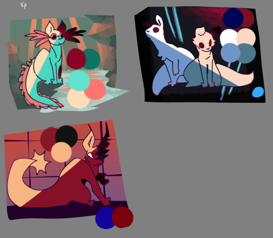
and this one was once again going to be kind of animated! still making it in my drawing program (even tho i think this was after i got my new laptop that i have now, but i wasn t gonna try with the animation program again), but it was essentially gonna look like the final one, except with slightly nicer color palettes and slightly less detailed bgs. this one didn t get very far
youtube
it is the only one that didn t get to the shot with the title. i assumed that i got burned out so quickly because i was trying to make it so detailed, so i decided that even tho i really want to make it as pretty as it is in my head, that s probably not going to happen
i briefly fantasized about making neglected space a storyboarded map, but then i remembered that i ve never hosted a map before and no one knows who i am so that would take forever to be finished and probably wouldn t end up looking exactly how i wanted it. still, a fun thought
attempt no 4 was called "neglected space storyboard edition", in honor of the idea of making it a storyboarded map. i knew that wasn t happening, but i was like ok, i just want to see some version of this idea realised. let s just make it some messy sketches, as if it was the storyboard of a map. just to see it put to paper. i never edited any of it together, but here s some bits of it!
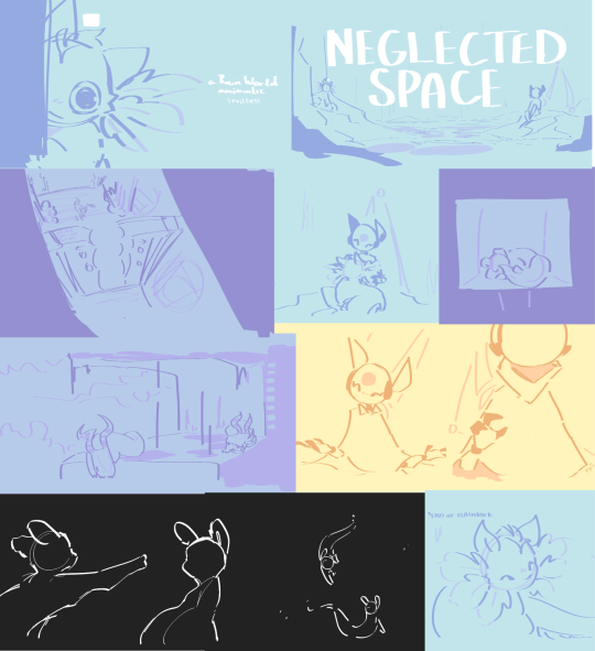
ah yes, this was during the very brief time when i was drawing iterators with 3 fingers on their hands to match the scugs. i would still do that but drawing these guys is the only reason i somewhat know how to draw hands and i don t want to lose my practice so. i don t do that anymore. but it s fun.
i actually still really like the art for this one!! the colors are nice and at this point my style was pretty close to how it is now. in fact for the shot of survivor and monk in the void in the final version, i was struggling with drawing it and i ended up just using the sketches from this version lol
this one s fine. but again in my head this thing had always been beautifully rendered and i just wasn t happy with it as a low effort animatic
and then summer vacation came
and i had spent the entirety of last summer vacation making the fall, my previous biggest project, that i was really proud of. and now i had the time and i felt the need to work on another big animatic
and i was like. fuck it. we re making neglected space
and we re making it beautiful, with beautiful shading, and beautiful fully rendered backgrounds, and if i feel the need to animate bits of it then i am. i m making this thing the way it is in my head if it s the last thing i do.
and i did. i m kind of surprised i finished it, but then again i kind of think i did it out of spite. usually i get bored of big projects and take months long breaks but for this one i never did. i really wanted to make this thing man
see you in part 2 for more rambling about how i made the one i actually finished!
9 notes
·
View notes
Text
2023 ART SUMMARY!!!
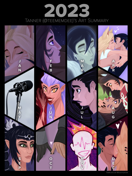
2023 was uhhhhhhh a year! And I made art! And I’m going to talk for a long time about everything I did month by month! Yippee!!!
original individual posts can be found in my #tanner art tag!
JANUARY
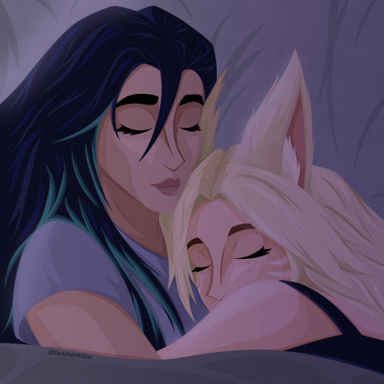
Started off the year with my favorite skrunklies sleepy and snuggling. Then sleeping together while holding one another is so incredibly important to me, they’re so cute and I needed to draw it. Struggled with Kai’Sa’s face but I particularly like the drapery of the pillow behind them.
FEBRUARY

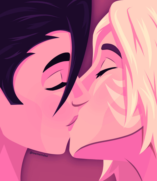
First off, just a simple Kai’Sa piece for the Vibes(TM) and background practice. I was also fairly miserable and when I get miserable I draw Kai’Sa being miserable as well. I love my favorite character of all time <3
Then a quick Valentine’s Day piece, soft gradient map stuff. Love my skrunklies, hopefully this year I can make something for the day that isn’t rushed
MARCH
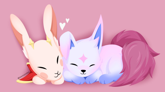
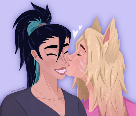

In March I FINALLY finished my Star Guardian Kahri fic, be the light to carry me, and drew Kiko and Ina being adorable together to go along with it. They’re SO cute and people LOVE that fic. Chapter 3 ended up being a whole 20k words and every time I re-read I’m amazed that I wrote it.
A kiss for Kai’Sa’s birthday! This was actually two sketches mashed together because I had a good Kai’Sa and a good Ahri on separate attempts. Love Kai’Sa’s smile on this one.
NOW. Strong contender for my favorite piece of the year. Captioned “please don’t lose yourself,” my K/DA-verse Kassadin’s very dead wife’s ghost weighs on him, begging him to not get lost in his grief and lose sight of their daughter. Kassadin feels lost and broken without her. I love the emotions in this one, and I think the idea comes across even without knowledge of my headcanons. Love it so much.
APRIL
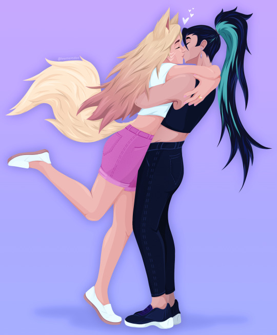
Full-body piece that took me all month. I just love this one so much. It’s just pure Kahri, pure love, pure joy. Pose inspired by Blake Belladonna from RWBY’s leg pop during the long-awaited Bumblby kiss. This piece just makes me so happy.
MAY
Oops! No art! Was too busy being on a (student) film set every weekend as well as dealing with classes and multiple other stressors. I did START a piece though, but wouldn’t finish it until the middle of June.
JUNE
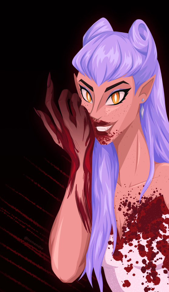

I actually did the first sketch of the Evelynn piece in February, but I decided to revamp it in May, and then when school finally set me free I finished it, and it turned out exactly how I wanted it to. Her hair was a labor to render but I'm so so pleased with how it looks, as well as the blood. The first time I've finished a fully rendered Evelynn piece!
Naafiri is so fucking cool. Upon her reveal, I was seeing so much incredible fanart and I just needed to get in on it. The shapes and points are just so good. I used to draw dogs all the time as a kid, and my younger self would absolutely flip out at seeing this. I did this piece in one day, and I have no idea how I pulled that background off but hopefully I can do it again some day lol
JULY
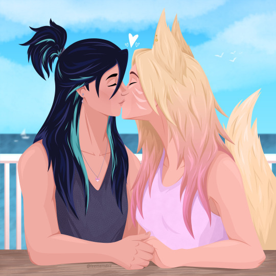

Two drastically different vibes here. Realized it had been forever since I had drawn Kahri so I just wanted to make a cute summertime piece. Their hands should be bigger and it bugs me but this is still really cute, I missed my girls dearly.
And then my very very sad man Kassadin being very very sad about his very very dead wife. This is what I call his phase 2 design, when he's at the peak of his grief (spiraling, as emphasized by the background) and feels just so sad and alone. In my head this and the March piece are part of a series that I hope to continue.
AUGUST
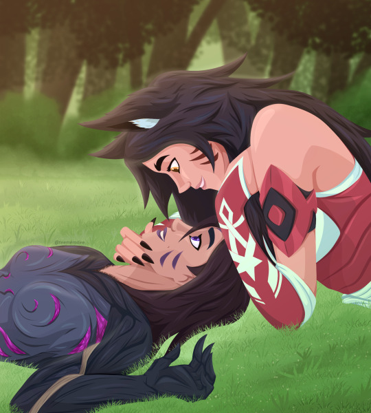
Just one piece that took me all month because I was quite busy in August, and Runeterra Kahri pieces take forever, but as I always say, it's always worth it. This pose comes from mellon_soup on instagram, who makes a lot of really great pose references for artists to use, highly recommend checking them out. This piece is just so soft to me. Captioned "'you're beautiful, you know that?'" they're saying it to each other, two people that struggle with their self image finding love and confidence in the other. Also I'm so very happy with the background. I love these two so so so so much, they're my world.
SEPTEMBER
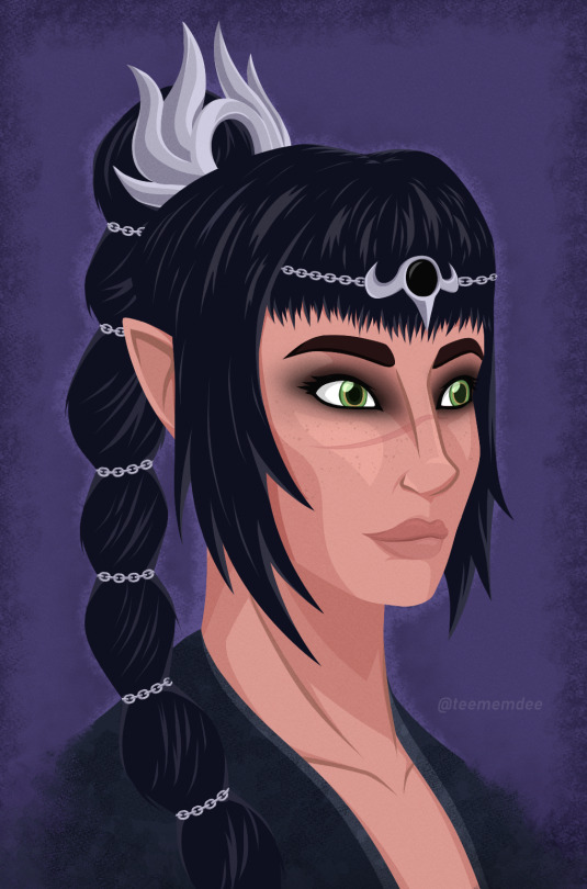
One of my goals for this year was to branch out in the fanart I made. Baldur's Gate 3 came along and I love watching my best friend play it, we love Shadowheart and I just wanted to draw her. This came after a lot of sketches of both her and our favorite Tav that ended up changing how I draw eyes. The rendering of her face here is also something I'm proud of, her nose looks great. And again, the background! This piece didn't get a lot of attention at all but that's okay, I made it for me and I'm very happy with it.
OCTOBER
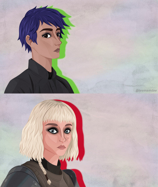
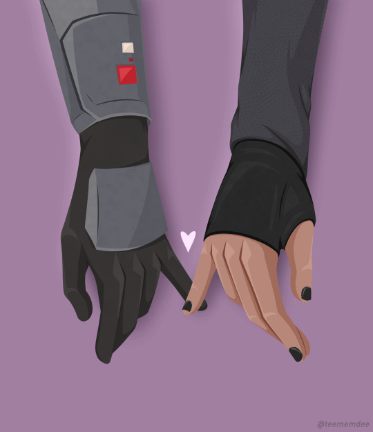
STAR WARS TOXIC YURI WENT CRAZY THIS YEAR!!! Wolfwren (Sabine Wren x Shin Hati, from the Ahsoka TV series) had me by the THROAT for a solid two months or so, I haven't been that feral and deranged over a ship in a hot minute. They had me frothing at the mouth every episode even though I did not like the show overall. Anyways. First piece is a redraw of the part in episode 4 where they just have the most charged eye contact of all time, and I decided to take that in stride with inspiration from Horimiya, a favorite anime of mine, during particularly emotionally charged moments, the background changes and there's a particular color silhouette behind them. It really fits that moment of the show and I am SO proud of these faces, especially Sabine's. Drawing from a real human face reference was kinda new to me but it's taught me a lot. The file size also ended up enormous somehow idk lol
Then, my most popular piece of the year, on both tumblr and twitter. I LOVE hand imagery, I love subtle hand touches, I churned this out in I think exactly one day, it's so soft it's so cute and I totally understand the overwhelming positivity it received.
NOVEMBER
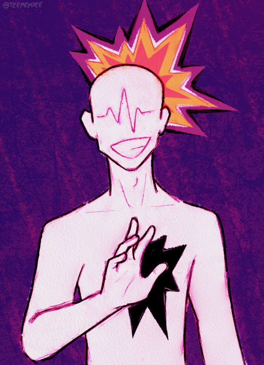
I was not doing well at this time in the year. The state of the world just had me in a horrible mental state, I wasn't taking care of myself well at all, I couldn't get myself to make art, especially something happy or cute, it just felt wrong. But then sometimes you feel something so strong and specific there's no other way to process it than to make art. To make a long story short, earlier in the year I thought a girl liked me, I liked her back, but it turned out she did indeed have a boyfriend the whole time. We didn't see or talk to each other for a few months but in November we (and the bf, lol) met up again. When she saw me at the door she smiled at me so sweetly and it was just the worst feeling ever and I just had to hide it behind a smile and a wave. Oversharing aside, this is a style I'd wanted to execute for a while and I'm really pleased with how it turned out, would love to make more like this.
DECEMBER

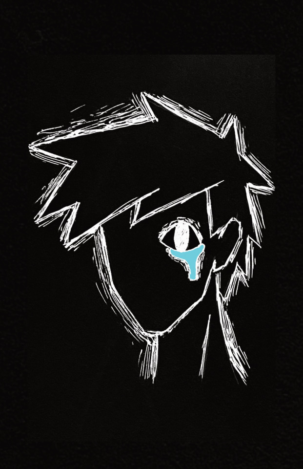

All of this was done / finished in the first two weeks of the month because then I got sick + was visiting family + jet lag took me out. Kinda sad I didn't get something done for Ahri's birthday or a traditional Kahri Winter piece but that's what January is for. Anyway.
Sometimes you just want to draw girls kissing and sometimes you wanna make it a little suggestive. Not much to say. Proud of the drapery on Kai'Sa's sleeve and you can always tell I love drawing hands.
Now it's time for classwork. Here I just have two pages but I've posted the whole comic on its own, this was for my "Art and Text" class, I have it printed in a booklet and my classmates + friends have responded to it so sweetly I'm really proud, I really really want to make more comics. This project was a culmination of so many inspirations from other artists and I'm really happy with the execution even if it was really rough for me to manage my time well for that class.
Then for my "Fiction and Allegory" class, two of my friends and I made a storyboard film (which I don't want to share publicly, but if I know you you can ask for a link) and during the all-nighter two of us pulled to get it done on time, I decided one scene needed music instead of diegetic sound, so I churned this out on garageband in about an hour. Would definitely love to try my hand at making more music in the future. Wish my classmates / teacher liked / understood the film more but oh well. I learned a lot and for the thousandth time, I'm proud of what I did.
IN CONCLUSION:
I ended up with less full pieces than 2022 but what I did create in 2023 are big, detailed, emotional pieces, and I'm more than satisfied. I think my skills in rendering, backgrounds, and colors really improved and I'm looking forward to how I continue to improve in 2024. This upcoming year has a lot of scary stuff ahead (namely graduating college) but I will come out the other side regardless, hopefully with just as much art I'm proud of.
If you read all of this, thank you!! If you've liked, shared, or commented on any of my art, thank you!!!!!! It means the world, always.
#2023 art review#long post#this year had some good highs but also some drastic lows so idk#but making art is always a high#happy new year!#artists on tumblr#tanner art#tanner talks
8 notes
·
View notes
Photo
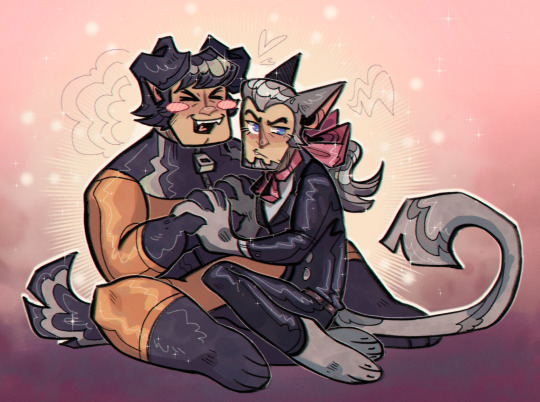
dogboy/catboy superior ship dynamic
#I put ponies in the main fandom tag but somehow I'm shy about putting this there#I don't want the kids to bully me on the playground or whatever#made with lighthearted irony and unironic love for 2008 anime ship fanart where everyone had animal ears for some reason#ship fanart should cover all the bases#from absolutely beautiful fully rendered pieces with background and everything#to 2010 be my bad boy nightcore amv 240p art#you guys understand me right#you get it
184 notes
·
View notes
Text
Vamptober Week 4 Reflection & Final Thoughts
Week 1 Week 2 Week 3
Its complete! Its done! I am overjoyed to rest my eyes and hands- and I’m ecstatic I have one hell of a portfolio! Of course, I have my Ko-fi for donations. Working on getting that set up to take other payments besides paypal for donations. Donations are always optional.
And HERE WE GO! Vamptober Days 22-31
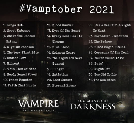
Vamptober Day 22: It’s A Beautiful Night To Hunt
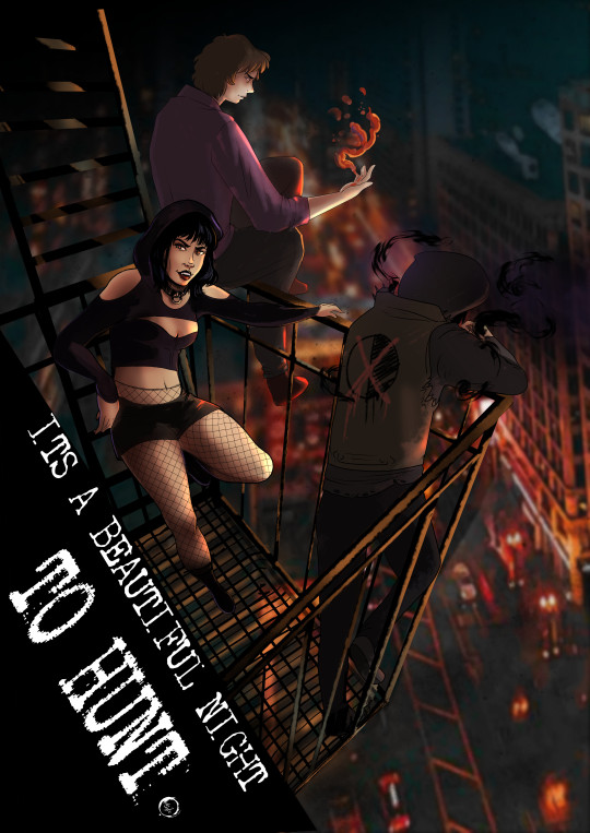
After Day 21, I needed to have some fun. I wanted to depict my Tampa!verse thinbloods, prowling and poaching. What could possibly go wrong with two Lasombra and a Tremere with thinned blood?
The background is actually a photo I took in Chicago. I tried to look for anything from Tampa online or in my own travels, and found nada. I started by utilizing the Auto-color features, where the program renders a set of colors and lines from the images. I usually have this setting set to low, for ease of my RAM and Graphics Card. But for this, I set it to High Quality. I was a little disappointed by the results after waiting 5 ish minutes for it to render, but I noticed the colors were bolder. I then got to work blurring. I actually painted a large portion of the building blur, and auto-rendered the street below.
Next came the thinbloods. This part was easier, aside from the perspective. I had set up some perspective guides, which I found somewhat helpful. I’m certain that tool will come in handy when I attempt to do comic work soon. I am proud that im getting much better about my color choices. Pulling tones from backgrounds is really paying off to help make everything look in in the same place.
The note I have for myself is that I needed to “pop” Damien’s silhouette a bit more. Both Hazel and Tommy have enough lighting (or too much). Damien just needed a little rim lighting and on his shadow manipulations to separate him from the background to the foreground.
Vamptober Day 23: Forbidden Pleasures

I really wanted to make this prompt non-sexual. Being horny for vampires or vampires being thirsty is certainly part of the fun of the monster- but I didnt want to depict another “forbidden romance.” So I latched onto the forbidden aspect of the prompt. The desire for knowledge often leads vampires along paths that are far from savory- paths that plenty would consider forbidden.
So boom. Got to work on drawing a new House Carna Tremere. I laugh at my labeled Book of the Grave War- as if Carna got an ISBN for that. But I could not really think of a clever way to clearly depict what was so forbidden in this image without plain text.
I really like the stipple shading of this person- but I realized one major problems with this piece. When finalizing the rendering, I really need to make sure I give my devices ample time. I was incredibly frustrated when posting this piece that the shading on her legs looked pixelated and distorted. I am still not sure what I need to do with my output settings to assist with that- other than letting my devices take the time they need to fully load the image.
Vamptober Day 24: The Prince
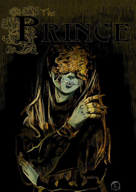
I had fun with this one. I absolutely love choosing unexpected clans to be Princes in Camarilla Domains. Everyone has seen the Ventrue and Toreadors in charge. A Malkavian? Absolutely bonkers. A Tremere? Oof! A Nosferatu? Now there’s something really fun! Gleam in decay you Horrid Prince!
I am really happy with the shading on this piece- and I had another breakthrough. I worked up from black on this piece. Working from a black background rather than grey or white has a number of challenges in traditional media. But digital? I was pleasantly surprised at how easy it was to get bold colors and let my washes show the dark tones underneath.
I then utilized this process for my Fall of London tokens and just ZOOMed through those. I continued working from a black background for a lot of pieces after this one.
Vamptober Day 25: Blood Magic Ritual

This one I took my time on. I worked up from black and layered my water color brushes and gouache brushes. I am so pleased with the color choices here- I really just....I impressed myself.
The technique I used here is something I learned from being a scenic artist. The term is called scumble, where you criss-cross your brush strokes to create a base texture. From there, I worked in digital washes. If this were a physical piece, I would absolutely soak it in paint and water, and leave it to dry for hours- possibly days before continuing with the next layer. To get the water color effect, I set the brush to paint as a multiply blend. So each time I went over a particular spot, it would get more saturated and darker. This more effectively mimics how physical watercolors work. I just kept playing with the wet blends and splatter brush until I thought it was enough.
The magic circles are from stock brushes from Clip Studio’s material catalog.
The figure is a depiction of Hazel’s adoptive sire, Mary Andrews. A fearsome Tremere of House Carna. Although Mary was known for Cauldron of Blood not Creatio Ignis- I do believe that Tremere would have that ritual in her arsenal if she could.
Vamptober Day 26: Ceremony of the Dead
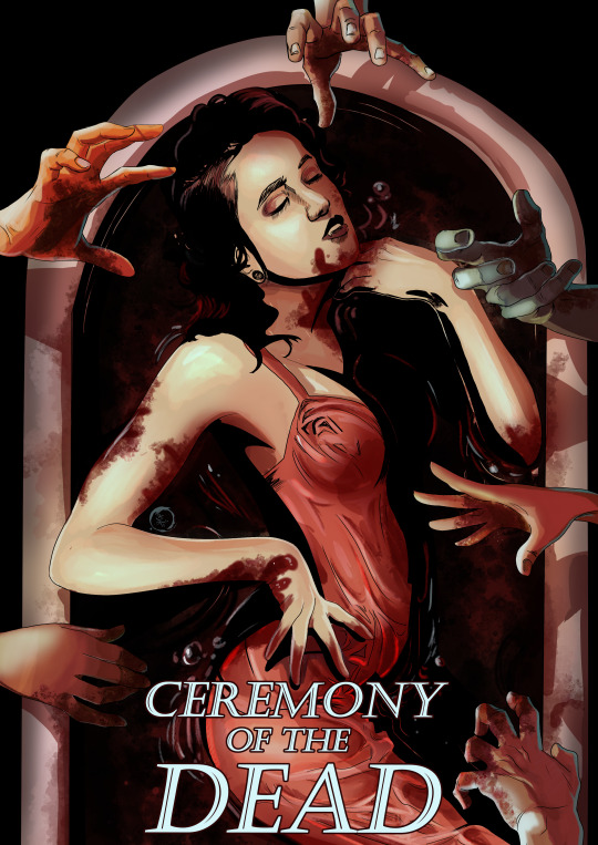
HANDS! I pulled from a reference image for this one. I really needed it to see how wet fabric pulls across her body, and I really did a good job.
The lighting from all the hands was especially challenging- since each hand was modeled after my own- and I forgot to keep the lighting consistent. I ended up just trusting my gut and soft light layers.
I initially painted this piece to be far more saturated. In post, I actually used a subtract layer to dull some of the reds in the text and skin. This kinda creates this blue/green hue over the white highlights- as if we are under flourescent lights. Ceremonies of the dead do not need to be lavish. The notes I have for myself on this piece are: I definitely wish I could have manipulated this into something a little less like the reference- but its fine. I could have given the blood in the bathtub some more tones- indicating depth to the ceramic fixture. I should have also created a clip layer over my line art and pushed some highlights a touch further.
Vamptober Day 27: You’re Bound To Me

This one was much simpler than my other designs. I took photos of myself in the mirror to get the body postures correct. I like the body language of the foreground character a lot- I think I did a good job showing distress and an odd desire simultaneously.
If I was to redo this piece I would spend more time pushing highlights. I think the piece needs some more white tones to give it that dramatic lighting. Looking back at the layers it looks like I had toned these down- I should have left them bold. I think it would make the piece more dramatic. I also think both figures need an outline to push them forward from the background.
Vamptober Day 18: Bats!
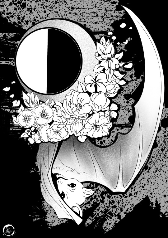
BATS! Since creating Hazel as a character, I have had a lot more fun drawing and reblogging bats. I pulled my design from her jacket from 2020, with the thinblood mark and flowers, and a large flying fox. I redrew the piece, updating the design.
I streamed this one to my friends who play in the Tampa Verse or have role played with Hazel in the past. It was really nice to just chat and draw.
I think this piece is a little weaker than my other vamptober, but its certainly one of my favorites because I just had fun.
Vamptober Day 29: Night Off
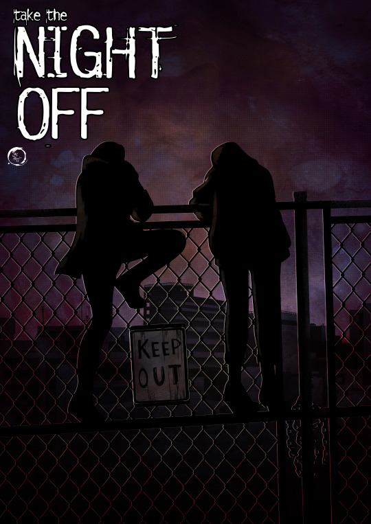
I had a hard time figuring out what I wanted to do with this piece. I considered painting my Tampa Thinbloods in the blanket fort, but found the composition repeatedly not conveying a night off. So instead, I focused on what happens when you take a night off as a powerful vampire. Some one is going to break in and take advantage of your lack of vigilance.
I recall being rather tired when working on this piece and decided to only work in silhouettes. It was actually quite freeing to just work in black and white and then add in tones. The watercolor background is something I painted forever ago- I frequently use it as texture overlays.
My notes for this piece are that I think I got too dark and it is hard to distinguish figure from chain link fence from city. Had I toned things a bit more effectively, I think this would not be an issue.
Vamptober Day 30: Too Old To Die

*Cackles in artist* Hello old lady- lets make some artwork. This is one of my friend’s characters. Originally, I had planned to have this piece mirror day 15: Blue Blood, showing an opponent to Antonia Vicario. But my ambitious self had bolder plans and decided to not pit the Ventrue against each other tonight. Back in 2020 when I had just started using Clip Studio, I made a call for people to send me their OCs and I would just play with the new tools for an hour drawing them. I took that piece and redid it. A full year of artistic growth and knowledge to create this. I had so much fun making this. I forgot how much I enjoy my dripping paint effects. I used to do them all the time in fine arts classes. I think its gonna be one of my stylistic calling cards. I love the movement of the hair in the new piece. I did a good job with the soft glow to push her forward from the paint drips. I am proud of the subtle perspective that looks as if she looms over the viewer. I could have easily spent several more hours adding details and flowers.
The original:

Vamptober Day 31: The Sun Rises
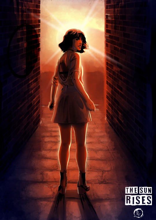
I always let the final piece take as long as it needs. I spent 3 hours painting Hazel in a fiery red sunrise, knowing she will not burn. Utilizing my skills from the past 30 days, I try to incorporate all the techniques I learned. Although I didnt work up from black, I pulled and layered colors in the exact same fashion. I utilized pre-rendered tools for stones and bricks. I have a wonderful sense of depth from the alley to the sunrise. I think the fiery red tones were fun to paint. Whenever I tried to tone the piece to be softer, it felt off.
My only note is to figure out how to bold her thinblood mark on her back. Since it is in shadow, it is hard to see it. I think if i had used a purple tone or blue, it would pop a little more against the reds. I really like how her hair looks so fluffy in the breeze. The shading is really well done. Originally I had it the same color as the sun behind her, but I made the right choice to tone it to red to help enforce distance.
Lastly, the little bit of sun looks like a halo around her. We all know vampires are far from angelic, but oh its tasty.
Week 4 Reflection and Final Thoughts
I slept in almost to 11 am. I was so so so tired. I knew trying to juggle it all was going to be a lot- I knew that I needed to be kind to myself through this process. I tried so so so hard. But seasonal affective disorder is a bitch and my brain is a liar.
I think my final week was a resounding success. I had created a lot of beautiful pieces, and had a lot of fun with them towards the end. But there is one thing that kinda is a big blow to this entire thing. Sometimes- it stopped being fun. It was painful to get something on the screen. It was agony to find something I believed was Good Enough.
I think in Week 3 I struggled with that the most. I was repeatedly frustrated with what I wanted to create versus time and work obligations and scheduled games. There was a part of me that understood that I needed to cut myself some slack, it was very busy. There’s another part that demands perfection, and failure to meet it is simultaneously unthinkable and repeatedly experienced.
I usually treat this with rest and time away from my stressor. Bubble baths and hot chocolate. But I wanted really badly to do all 31 days. I pushed through it- despite my best judgement.
I am proud of myself. I really truly am. This work is beautiful. The repeated acknowledgement from World Of Darkness’s official accounts was sweeter than vitae. But if I am going to continue to create content- I need to address this internal battle. I often reach a state of “Fuck it!” when making these pieces that allows me to kinda have fun with it again. But I’m getting real tired of being in this cycle of 1. I got this! 2. I hate this 3. Its terrible 4. Fuck it who cares Not Me! 5. I love this and am unstoppable.
So what to do? I don’t know. I, understandably, feel rather drained after all of these. I’ve already decided I will be checking my finances to see if some light guidance through therapy is affordable. Because people don’t normally want to cry over things they want to do for fun. Because it isn’t healthy to drive myself to exhaustion over something I do for leisure. But theres also a confidence boost. I am going to start utilizing World Of Darkness’s Dark Pack for some of my content. I already do all this for free, why not be able to slap their logo on things? I feel like that is a good next step for continuing to make fan stuff.
The other thing is that I learned how I like to do digital art. I started utilizing techniques and tricks from my traditional mediums. And God I missed those. Its all just so fun to see how they translate to a digital canvas.
And from there, I recall a discussion I had with a local manga/comic artist I admire. She instructed me to practice getting loose and having fun. Because after all- if it isn’t fun what is the point? I think that is one of the most critical pieces of advice I have ever received. That and “stop using the fill tool its garbage.” The pieces I just let myself play and have fun are some of my favorite ones. The ones where I just let myself relax and move with confidence that I’m going to enjoy this process- and be excited to see what appears on the canvas. Going forward, I think I need to embody that attitude more.
Let the fun be the journey- not the final result.
And that’s where I am going to leave it for a bit. I need to take a few days if not a week to not draw vampires. I have a few non vtm commissions on my radar and can set up. The holidays are coming up and I need to prep a few slots for that.
But for now:
Just play. Have fun. Relax. Draw sexy lesbian vampires on the internet.

~Steph
Instagram Ko-fi
30 notes
·
View notes
Text
Half-Empty, Half-Full (FE3H Fic)
hey hi what’s up lads, so I like, 100% forgot I could post my piece for the @threehouseszine Beneath The Banner (also available on Twitter under the same name) and as such I’m like ten years late. :) But the zine has been sent out, and I finally noticed like the fool I am that others have posted their pieces, and thusly, I too will post mine! Because I can. And I want to.
My focus was on the Golden Deer post-skip, specifically in some nebulous point during the war. Being part of this zine was really, really cool -- I can’t wait for all the books and merch to arrive with everyone!
(will reblog with links because we all know tumblr likes to break things.)
A beat of something nice, amid the fragments of harder times.
In the spaces between war — between scattered supply checks and ration distribution, bandit skirmishes and long watch nights — Hilda finds the time she needs to breathe.
It came easier, back in the academy. She could simply step back and let the world move around her, steadfast in her belief that it would still be standing when she returned. Nowadays she steals the air in her lungs from glances at the sky and quick delivery walks, from the chip of chisel and steel against stone and wood, from the sensation of gems and petals inlaid on clothes, chains and hooks when she can afford to lay down her axe. Infrequency makes the beats between battles all the more precious.
With the professor around she can afford more pauses still, but Hilda watches herself. She knows, all too well, just how young she is. Claude lies at one year her junior and the professor, with their five year hiatus, sits at two. It wouldn't do for her stubborn leaders to find someone they can’t believe in among their ranks, now.
She’s on the run for errands when she spots a hint of not-plant green and wood not far off the beaten path, and she wastes no time following that tried and true Deer instinct to take a peek. Ignatz is there, as expected, easel propped on a patch of flat land, what she can see of the canvas a tasteful blend of browns and golds. He leans in, fingers dabbed in the same off-white his paintbrush dusts onto his scene.
Now, Hilda doesn’t paint, but she does understand the stress and struggle of art, different forms aside. Which is why she waits until he leans back before she steps forward and taps his shoulder.
“Hey, Ignatz.”
Ignatz yelps, almost drops his brush and earns himself a stripe on his palm for his troubles. “Hilda! Hi. I’m sorry, I didn’t notice you there.”
“Don't worry about it.” She clasps her hands together. “What’re you painting?"
"I wanted to capture the cathedral, while it's still under repair." He gestures to his piece — the white forms the glint of sunlight off patches of rubble, steel and glass, along with the robes of monks and priests as they shift and sweep aside what debris they can. "A lot of artists depict places in their prime, or utterly destroyed, or after they've been restored to their former glory. I thought it would be nice to show the in-between for once. People from every background imaginable, coming together to rebuild for the future. A little different from what I usually paint, but sometimes a little variety is nice."
"And you're doing it all the way out here because…"
"I didn't want to be in anyone's way, and I come out here a lot. I've got plenty of references with me, so it's not a problem." Ignatz shifts and Hilda catches sight of a stack of sketchbooks, some more worn than others, half-spilled from a bag. The top one gets plucked up and held between them as he flips from page to page. Statue busts, the altar and rows of pews among pillars rendered in charcoal and sleek pigment lines. Sometimes, she catches glimpses of green and blue and other colors, or shapes that don't quite match the church art he focuses on, but Ignatz flips too fast for her to see.
Or, almost. "Go back two pages," Hilda says. A grin tugs at her lips. "Was that Claude?"
"Oh! Uh, yes." Though Ignatz learned to leave embarrassment and nerves about his art behind, something in his chest still squirms, just a bit. An image of their leader in the library, face cast in candlelight and more at peace than he ever is during daylight, stares up at the duo. "It's easier when I’m with a person, but sometimes I'll do studies on my own. Practice makes perfect, after all."
"It's beautiful." She reaches out, pauses. "May I…?"
He passes it over. "Here. You can look at the others, too. I don't mind." Then he turns back to the easel and reaches for his paint. "Anyway, I thought this was as good a spot to work as any. There's a field down that way you can see best in the spring, and I like the view of everything from here."
"You'll have to show me when it's in season."
Her eyes flicker over thick paper. Statues. Flowers, trees, forest paths. Distance shots of people, strolling towards town. Swirls of filigree and patterns fill whole pages in patches, tiny stylized animals and the occasional dragon tucked into the empty space. Silhouettes crowd around the pews, and even if she recognizes clothes, many of these smaller figures are faceless.
But she finds a loose sketch, hair popping blond against black ink, of Raphael and a young girl with the same square jaw and broad shoulders. Claude himself appears once more, this time in wireframe form, ordinary steel bow drawn all the way back and arrow pointed to the left. When she plucks one of his other books from the stack it follows a similar trend — renderings of the cathedral, inside and out, stuck in among horse-drawn carriages and sunlit grass patches and clothes and people, both familiar and unfamiliar, faceless and defined. A few drawings are from the past few months: Sylvain in his armor, Baltie with his open-chested shirt, Leonie and her long hair, the monastery scaffolding.
Most of his drawings are from the academy days.
Lindhardt, leaned against a tree, the shadow of leaves mottled on his lap. Herself and Marianne seated in the dining hall. Lysithea, with a book in one hand and a swirl of magic in the other. Claude and Lorenz mid-argument. Felix as he trains blade blurred and bent as he lunges. Dimitri and Dedue bent over a table in their classroom. Edelgard as she strides across the courtyard, Hubert one step behind. Busts of the professor and Jeralt, side by side, the faintest quirk in their lips.
Hilda looks up and pauses. Ignatz presses so close to the canvas he’s peering over the wire frames of his glasses rather than through, brow furrowed and jaw set. She shuts an eye as the sun slips out from behind what’s left of Garreg Mach’s spires. Greyscale flowers peer up from the pages, a reflection of the few asters scattered around their feet. Mountain monastery air goes down sweet and full in her lungs.
"I gotta say, Ignatz,” she says, the edge of her thumb smudged in stray charcoal. "These are amazing. How long have you been doing art?"
"Since I was little." He leans back, considers his work, then leans in again. "My parents are merchants, so we delivered paintings and statuettes to a lot of noble houses in the Alliance. One day I found some extra supplies lying around so I just… picked it up and gave it a shot."
"Well, I'm glad you did. Even these plain sketches look much nicer than anything I could do, and don't even get me started on painting. No offense, Ignatz, but no thank you. Definitely not my wheelhouse."
Ignatz pauses. "None taken, and thank you. You draw?”
"Not much." She waves a hand. "My talents lie in accessories. I like to plan before I start working, figure out how it should come together and doodle in the margins a little sometimes, that's all."
"You're always wearing beautiful jewelry, but I didn't realize you made them yourself." A smile breaks out across his face. "That's amazing, Hilda!"
A blush rolls across her cheeks and she can't stop the tug of her lips into a matching grin. "Oh, stop it. Really?"
"Of course! The colors and shapes you use match your hair, complexion, and the clothes you tend to wear quite beautifully." His brush plunges into a cup of water by the foot of his easel and faces her fully. "When did you start?"
"A long time ago, now – I'm not even sure exactly how long, anymore. I used to make flower crowns and necklaces with my big brother, and it just spun out from there." The book lies closed in her hands now. Her finger runs up and down the paper, feels the grooves between unaligned pages. "I could make them as pretty or ugly as I wanted, so long as I was happy in the end. No one ever expected anything more or less. Not that I ever made something ugly, mind you."
Ignatz hummed. "Have you ever considered selling them?"
"Not really.” Hilda tilts her head. “Do you think it'd be a good idea?"
"Absolutely! You should consider it, once the war is over. I bet people would love them."
She taps her chin. “I’ll give it some thought. What about you, Ignatz? What do you plan on doing once this whole mess is behind us?”
“Well… Ideally, I’ll keep painting,” he says. “Even if I have to do it between my duties as a knight. It might make it hard to find a household to serve, but I don’t want to just stop.”
“Why are you aiming to be a knight? How come you’re not just going off to be an artist or something like you want to?”
“My parents sent me to the academy since my brother’s taking over the business. They didn’t really approve of the whole artist thing.” Ignatz shrugs. “I don’t really think I’m all that cut out for it, to be honest. Fighting’s never been my strong suit.”
“Well that’s a shame,” Hilda says. “Have you ever spoken to them about it?”
He shook his head. "Not much recently, at least."
“You should. Maybe you can convince them, after all this. And if you can’t, then just come to House Goneril, okay? I’ll let you paint as much as you want.”
“That would be nice.” He smiles, then bends to reach for his bag. “Thank you, Hilda.”
“Any time.” She holds the sketchbook out. Ignatz takes it, tucks it gently alongside the others. Before he can put his brush away, he pauses.
“If you have time,” he starts. "Would you like to join me out here again tomorrow? We could work on our projects together, if you have any."
Hilda smiles. "I'd love to, but I'm on stock duty tomorrow. No shuffling off the responsibility for that."
"I see. That's too bad. Maybe next time?"
"... Sure. I'd like that."
#Fire Emblem Three Houses#FE3H#FE3h Fic#FE3H Zine#Beneath The Banner zine#Blacknovelist Writes#long post#(in case readmore breaks tho it shouldn't really)
3 notes
·
View notes
Text
20 Best Rogue & Gambit Covers (Part II)
Here’s the same stuff I said before:
For the hottest couple in the Marvel universe, there are surprisingly few truly great (and truly hot!) Rogue & Gambit covers to be published since the characters began flirting literal decades ago.
In the run up to our BIG RELEASE of Rogue & Gambit #1 on 1/3/18…and with a all of us aching for the lettered preview to drop, I thought I’d count down the 20 best Gambit & Rogue covers.
I AM including Kris Anka’s publicly released covers for our series in the running, even though they are not yet published…because…well, because this is the FIRST EVER ROGUE & GAMBIT COMIC AND HOW COULD I NOT???
If you think I missed something…it’s possible. But it’s also possible I’m just not a fan of that cover. To each their own as they say.
Most importantly…can anything we’ve seen yet beat the most iconic Rogue & Gambit cover of all time? (C’mon, you know the one!)
Anyway, here’s to A LOT MORE Gambit & Rogue hotness in our future and onto the list! :D
And HERE’S Covers #1 - #10!
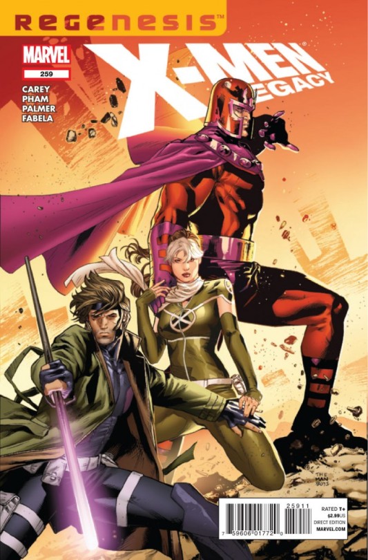
10. X-MEN LEGACY #259 - CLAY MANN. Absolutely gorgeous. Again, BIG points off for Rogue bringing another dude to the party, but this is gorgeously illustrated, has a ton of tension and heat. What Mann manages to do with just Magneto’s hand on Rogue’s shoulder and Gambit’s on Rogue’s thigh and her hands on both of theirs is...sorta awe inspiring? And the fact that she’s got her eyes locked on the reader just puts it over the top intensity wise. It’s ironic, because this loses points for including Magneto...and yet the things that make it work like gangbusters demand that Magneto be there...conundrum. I think what it really highlights is what a shame it is that we never got a hot canon Rogue & Gambit cover from Mann.
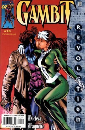
09. GAMBIT #16 - YANICK PAQUETTE. Finally THEY. ARE. KISSING. Omg. I can’t believe we had to get to #9 before we’ve got them actually kissing! AHHHH. So. This is a great illustration. Beautiful treatment of both Gambit and Rogue...I love the body language especially. And I don’t mind the minimalist red background - and it might even be intended as a call back to the red background on that iconic Rogue & Gambit cover (you know the one). The big problem with this has nothing to do with Paquette’s lovely work at all...it’s that hideous absolutely massive “storyline banner” that takes up more than a fifth of the entire cover. It honestly wrecks EVERYTHING and makes me furious tbh.
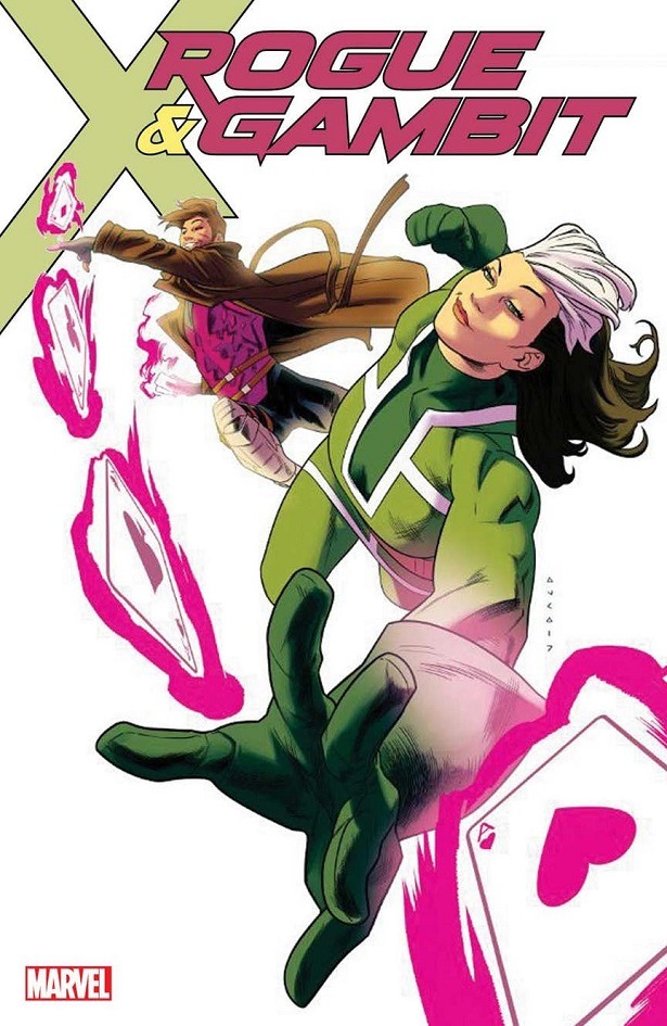
08. ROGUE & GAMBIT #1 - KRIS ANKA. Amazing energy and movement, love the confident use of white space, and the sassy attitude they both have in body language and expression. I am also a really big fan of the title block text as it is here...BUT that’s not how the final is going to look as it will have the “Marvel Legacy” trade dress...which is fine, but not as good as this. So slight points off there. I still like the actual “Rogue & Gambit” title block itself a lot. And the “Ring of Fire” part 1 text banner is small/high/unassuming, so it’s pretty good overall! You’ll see. And yes, I’m very biased here. Fully admit that. I’m a huge fan of Kris Anka’s work, he’s my friend, and this is my book. I come with ALL THE BIAS AND AM HAPPY TO ADMIT IT. ;D
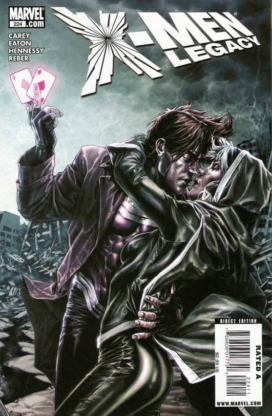
07. X-MEN LEGACY #224 - LEE BERMEJO. This is a little dark compared to what we’re used to seeing for these two in covers and a little more realistic than I tend to prefer...but I totally dig it. It’s got a ton of intensity, and the body language and expression work is awesome. They really feel almost about to kiss, which, if you’re not going to get the actual kiss, is quintessential Gambit and Rogue, right? The title block stuff is really simple and unassuming as well.
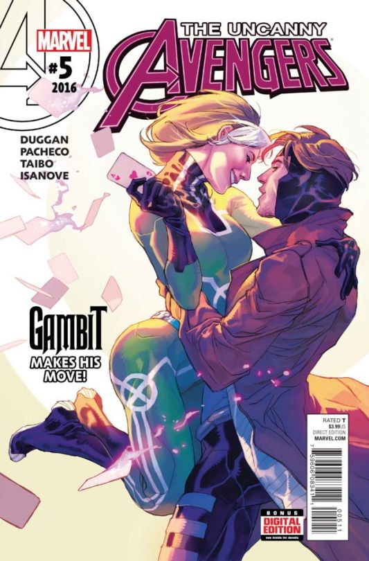
06. UNCANNY AVENGERS #5 - CARLOS PACHECO. A really nice homage to the accepted most iconic Rogue & Gambit image of all time...it doesn’t beat it, but it’s totally lovely. A gorgeous illustration that feels like that old cover, but nicely updated and its own thing. It loses points for a little bit too much text nonsense going on...and the expressions don’t QUITE work for me, plus I’ll never love Rogue with short hair ;D but all in all, a beautiful piece.
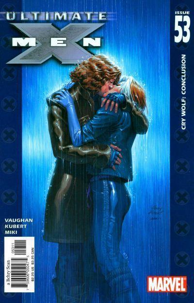
05. ULTIMATE X-MEN #53 - ANDY KUBERT. If you can believe it...this is the only other cover on the list (ever?) with an actual lip lock! Crazy. But at least it’s GORGEOUS. I really do love this one - the blue tones, the rain, the intensity, the simplicity, I just love it. It loses a few points for really dumb stuff though. I hate the blue borders with the X symbols (so dumb) and some slightly obnoxious title block/giant numbers stuff, but mostly...I just...really hate Remy’s hair? Yeah, it just doesn’t look like Gambit with that weird wavy hair. That’s honestly my biggest beef with this otherwise gorgeous piece.
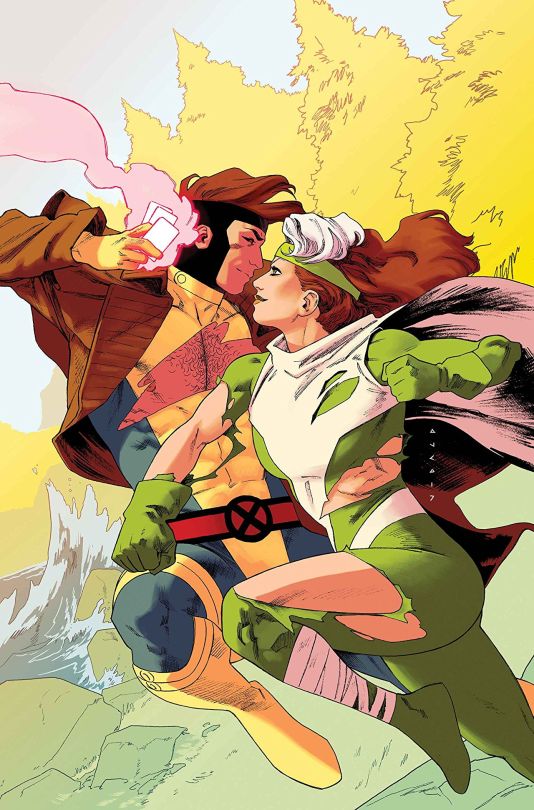
04. ROGUE & GAMBIT #2 - KRIS ANKA. Admittedly this is getting a bit of a pass for not having the title block on it, but since I know about what that will look like, I think I know enough to be okay with it. And I think people will love this cover even more when they see what’s inside the issue. But based on what we have here - it gets so many points for pure fun, plus it has great energy and movement. PLUS the obvious connection/chemistry between our leads. Bonus points for Rogue’s glorious thighs. Bonus points for Gambit’s conveniently torn uniform (and hairy chest). And Bonus points for Gambit’s perfect smirk! Again, noted that I’m highly biased...and I don’t care!
*runs away, fingers in ears*
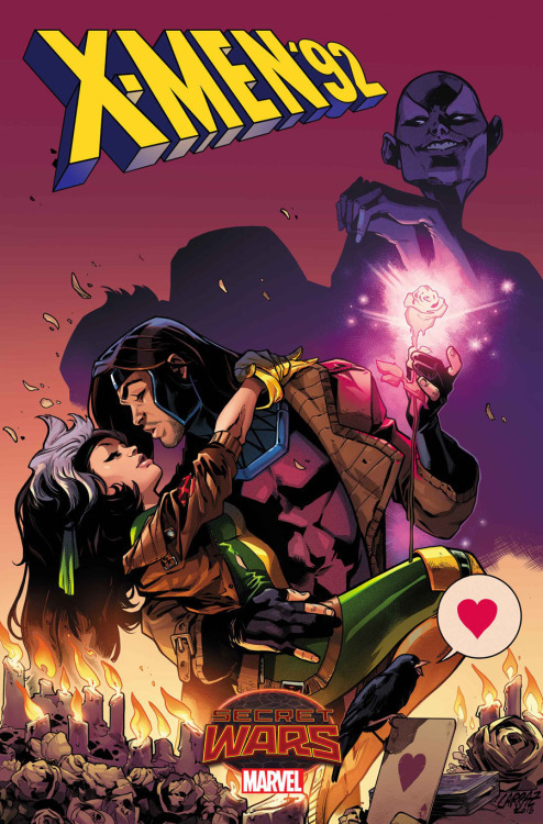
03. X-MEN 92 #2 - PEPE LARRAZ. So here’s how much I love this cover...I don’t buy print comics any more (no room!) just digital and then trades for some stuff for my shelves. But for this I went out and bought a print copy. Had to have this in my hands. I love everything about it. Well, okay, in a PERFECT world Cassandra isn’t in the background, but everything else is perfection. The swooning, the love, the drama, even the little raven with the “heart” word balloon. LOVE IT. And no surprise really because Pepe Larraz is a hell of an artist who went on to draw a spectacular Rogue (and sometimes Gambit) in Uncanny Avengers!
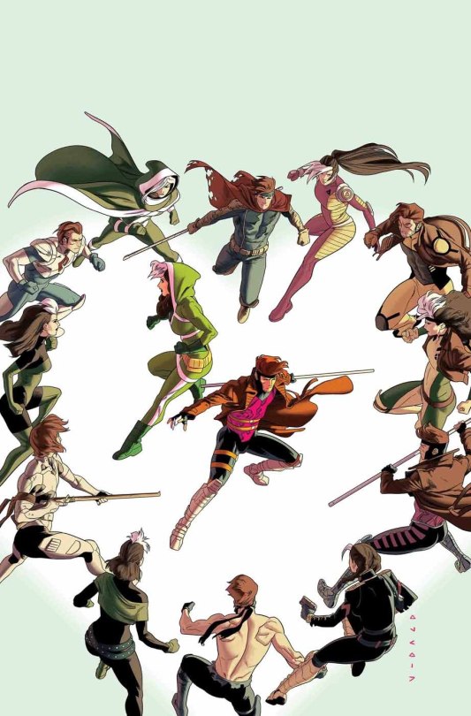
02. ROGUE & GAMBIT #3 - KRIS ANKA. So...there are great, beautifully illustrated covers...and then there are great, beautifully illustrated covers that are also PERFECTLY CLEVER and instantly become iconic. That’s this one for me. As if a dozen versions of Gambit and Rogue weren’t fun enough, the heart shape they make... *kisses fingers* ...it’s perfection. I wish nothing more than us not having to put ANY text on this. I wish we could just send it out as is. Alas, no. And that is gonna knock it down JUST ENOUGH to NOT unseat the iconic classic. (But maybe issue #4 or #5 will??? We still have time!) :D
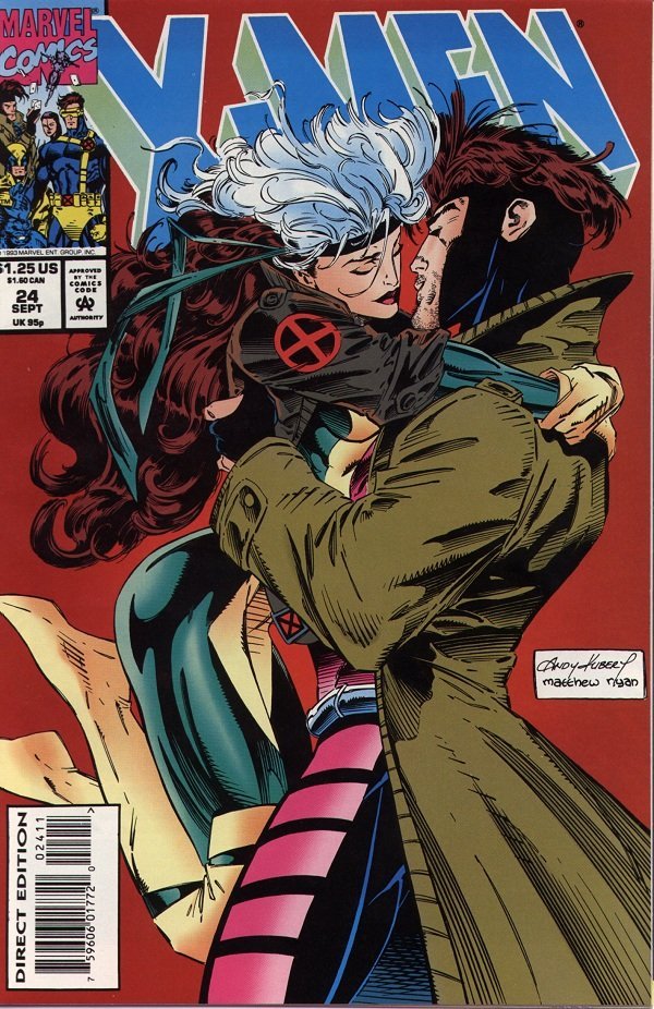
01. X-MEN #24 - ANDY KUBERT. It all comes down to this, as you knew it would. The classic cover that launched a thousand ships...or rather... CEMENTED them. It’s just gorgeous. It’s perfectly 90′s. It just BATHES in the nostalgia of classic Gambit and Rogue. it’s not afraid to cover up more than half the title block (YOU KNOW WHO THEY ARE, YOU DON’T NEED NO PESKY TITLE BLOCK!). That it rocks the most classic, well-known, and beloved looks for both of them only cements things further. And because they were still doing the “no touching dance” in these early days...their state of almost touching is just...PALPABLE. I’ll also say that though Rogue’s face gets the focus, Gambit is just really lovingly rendered too.
HOTT.
So. There you have it. My picks for the 20 Best Rogue & Gambit covers of all time.
Don’t forget to hit up your LCS on Wednesday 1/3/18 (or Comixology) for Rogue & Gambit #1 and keep reading to see if we (ahem, KRIS ANKA) can unseat the 20+ year title holder of “Best Rogue & Gambit Cover of All Time”
No pressure, Kris! :D
460 notes
·
View notes