#four deaad queens
Explore tagged Tumblr posts
Text
2019 Debut YA Covers Megapost (part 1)
I’ve fallen off the wagon of keeping up with cover reveals even a little, and there were a whole bunch in the past few weeks, so to get back up, i’m gonna try to do quick and dirty rundowns of as many 19 debuts as have had cover reveals (that I haven’t already talked about) as I can this week! HERE WE GO (these are in no particular order):
1) BLOODLEAF by Crystal Smith

Oh Bloodleaf, you expensive little TOG rehash. What have you brought us. This is another Billelis creation, and I actually like the type! The hypercondensed slight serif feels appropriate but fresh for YA fantasy and the color scheme, the central flower image, and the silver thorns are all really working. BUT I have the exact same issue that I had with the updated Dark of the West cover; the “fancy border with illustrated story-relevant elements” thing doesn’t really work for me when it’s uneven and almost-random the way this is. The crown, moon and tree up top are so symmetrical and balanced that you expect the same thing in the opposite corners, and instead you get a castle with a lot more visual weight than the others, plus a raven and a bow that are just...... hanging out? This would have been a stronger cover with the additional symbols completely removed; the flower and thorns are plenty of visual interest alone.
2) THE PIONEER by Bridget Tyler
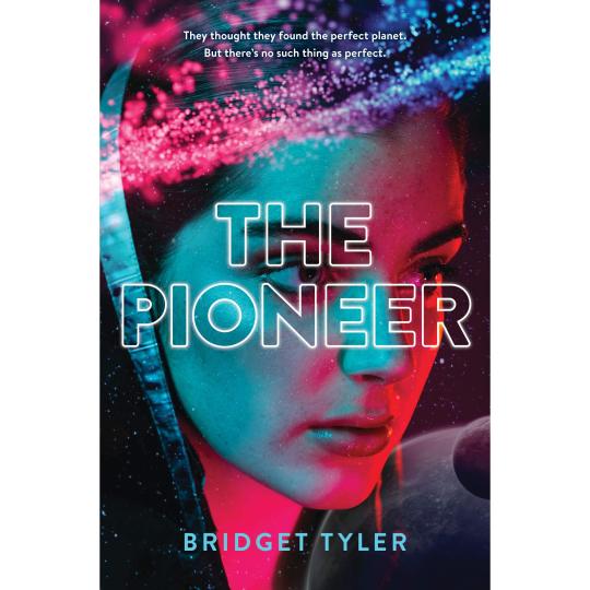
I am obsessed with this one. I don’t know a damn thing about the book, haven’t seen it hyped on twitter or anywhere else, but this cover is gorgeous and perfect and evocative; there’s DEPTH and DRAMATIC COLOR and it’s got BISEXUAL LIGHTING and the outlined type is INTERESTING. It’s an aesthetic cousin to the UK Edition of THE DEVOURING GRAY that i talked about here and it looks like a movie poster and I want it on my wall.
3) ENCHANTEE by Gita Trelease
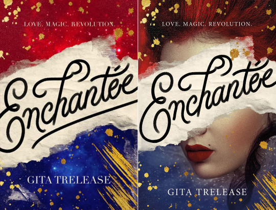
Poor Enchantee has already had a cover redesign (old on the left, new one on the right, with the face). It was for the better, although they didn’t address my biggest issue with the original, which is that tYPE. The even-width, sort of chalkish calligraphy SCREAMS “art director’s instagram” and “cloyingly cute NEVERTHELESS, SHE PERSISTED posters you can buy on Etsy”, and “chalkboard signage your high school friend pinned to her WEDDING INSPO pinterest board”, rather than. Yknow. Sexy Magic Revolutionary France, which is the book. Where is the CONTRAST. where is the impression of ACTUAL INK. (Also: I didn’t crop these weird, the type being cut off/ a tangent on the edge there is Actually Like That.)
The Lipstick-ed face DOES say Sexy Magic Revolutionary France, so I appreciate its presence and also think it looks good (it def is victim to looking a little like a tumblr graphic, a phenomenon i have mentioned before, but that’s pretty harmless here); and the gold paint splotches and red-blue starry textures are pretty! They could have done a less halfassed job getting the vivid blue cropped around her chin, but. C'est la vie. I like it and I’m actually super hype for the book itself.
4) THE FEVER KING by Victoria Lee
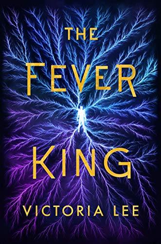
This is......... a weird one. I love the colors! the blue and purple (veins?) lightning is really striking (LOL) and the texture is super visually interesting. I’m very curious to see the print choices eventually; I think matte vs glossy vs texture vs foil could make a big difference in how this one feels overall. I sort of wish SOMETHING was different, just to make this a little less symmetrical or abstract, whether that’s a different text layout or an additional focal point in the imagery or whatever, but I do think it fundamentally works as-is.
5) FOUR DEAD QUEENS by Astrid Scholte
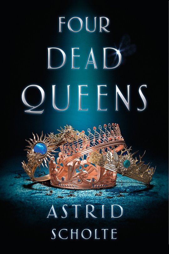
Thanks, I hate it! this shares a lot of problems with the Burning Glass cover and everything I dislike about lazy object covers generally: the imagery is unclear at first glance (what a waste of all that detailed rendering) and not evocative of anything in particular in terms of mood, setting, or themes, and the type’s layout COULD NOT BE MORE BORING + is an ineffective use of the space and has a totally unnecessary glowy effect. The “spotlight” effect could generously be considered to be a visual signifier of the ~ murder mystery element but. oof. is a 90s crime drama aesthetic really what you want your secondary visual to be on what seems to be a pretty serious YA fantasy book?
(Okay, it could be worse, at least the hierarchy is clear and sensible. but that DNA crown, lmfao.)
6) AGAIN, BUT BETTER by Christine Riccio
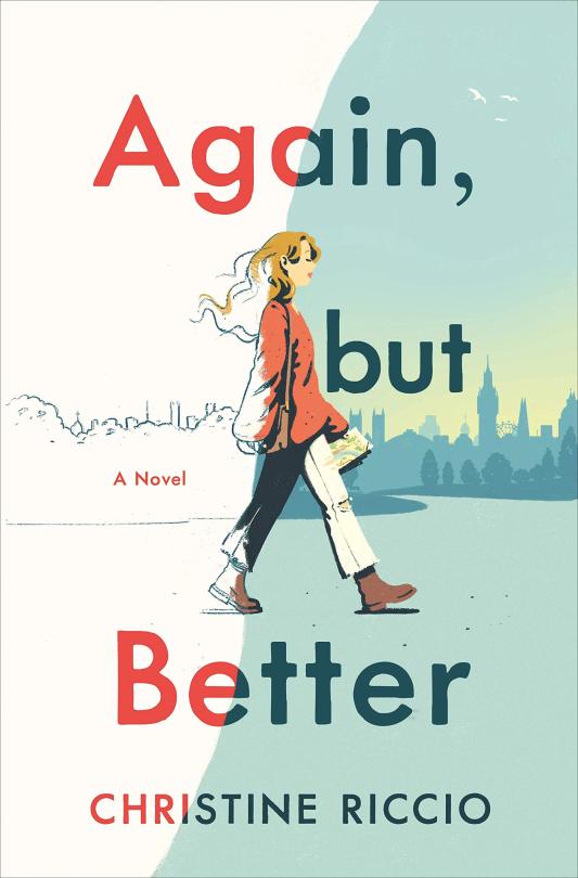
I got a couple requests for this one, and I really like it!!! i think the illustration style is SO cute and the whole layout is simple but effective. The little touches like the birds in the corner and the placement of “a novel” are all perfectly balanced; it’s a more successful version of the illustration on WHAT IF IT’S US (and a few others, like HOT DOG GIRL by Jennifer Dugan; that general style + palette is a trend right now) and the concept of the line across and the girl coming into full color is a clever little representation of the coming-of-age story elements.
7) HOUSE OF SALT AND SORROWS by Erin Craig

I really! WANT! To like this cover! I think the layout and rendering of the text and the various nautical effects are sophisticated and pretty! HOWEVER COMMA! It’s just so low-contrast. This entire cover has the same single gray-green color and [lack of] depth; it’s like an intricately detailed dining room table. Nothing, not even the text, stands out immediately, so your eye wanders looking for a focal point; the title is readable, but not.... amazingly so. Kind of an unfortunate misfire despite having some of the most thoughtfully designed ~ fantasy ~ text I’ve seen in a while.
8) WE RULE THE NIGHT by Claire Eliza Bartlett
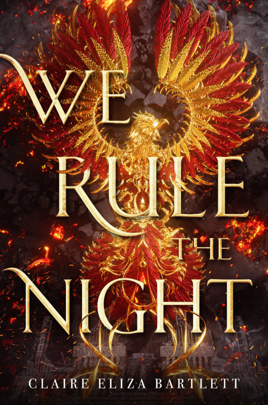
This is, quite obviously, another Billelis creation, so we’re back to talking about the various foibles and failings of art directors trying to integrate type with his illustrations. And this one. uH. IT’S ROUGH, although the bigger question here is why that gorgeous, intricately rendered phoenix (?) isn’t centered on the damn cover. (neither is the.... fortress? on the bottom.) It’s so symmetrical that it’s clearly meant to be! Perfect centering and a tighter crop would have done a lot towards offsetting...... whatever is happening with the type, which feels VERY awkward. I do think the sort of ~random placement of words could work with a little more thought but into it, but as it is. Woof. It’s cohesive enough that I still feel okay about it as a cover overall, but some sTRANGE choices happened there.
Also, having looked this up, it’s actually dieselpunk? IE vaguely fantasy WWII? And as with our last vaguely fantasy WWII book (RIP Dark of the West’s OG cover) that is..... not being expressed. Here, I would say that a different typeface, one that feels more militaristic/ modern as opposed to ~ high fantasy ~ might have been the play.
MORE 2 COME
142 notes
·
View notes