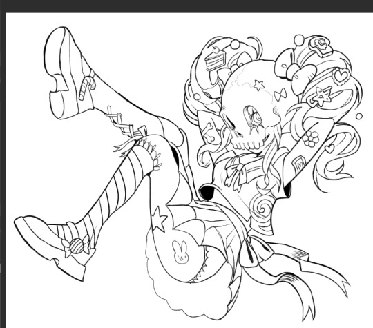
#found this really nice brush for csp
Explore tagged Tumblr posts
Visit Tumblr Blog
Explore Tumblr blogs with no restrictions, modern design and the best experience.
Last Seen Tumblr Blogs


Fun Fact
The most popular pages on Tumblr are about Minecraft, GIFs, and David J. Peterson.
Text
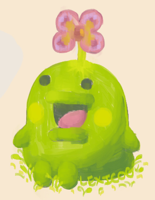
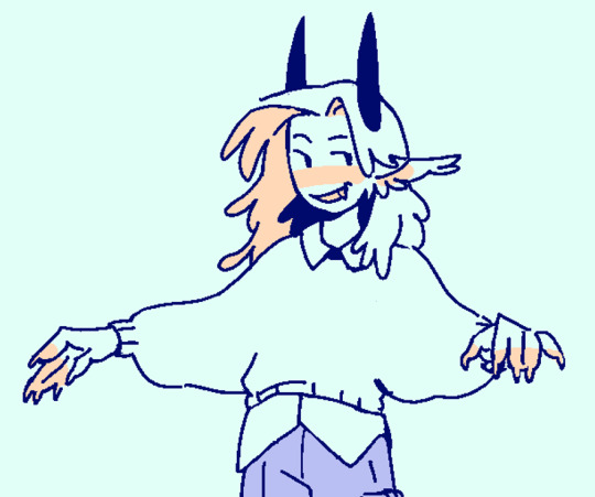
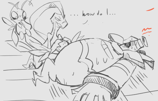
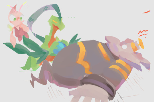
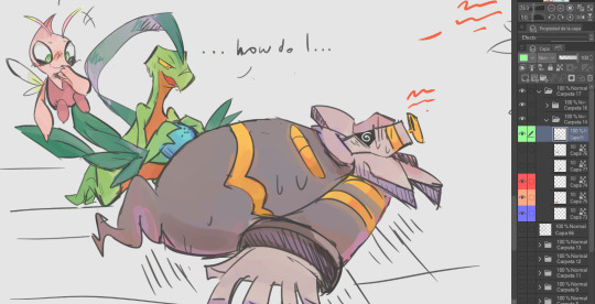
fuck it. kuchipatchi grow a flower
#art#digital art#drawing#painting#digital painting#artists on tumblr#my art#creature#funny guy#kuchipatchi#tamagotchi#tamablr#<- what no way is that the tumblr tamagotchi tag. that's so great#eggblr. roundblr. what if a website was an oval#anyhow. honestly it's not my best work cause i wasn't confident in the underlying sketch but i was too eager to try the rendering#can you tell i was looking at momopatchi's art before drawing lol#really fun though. used a brush called PEN_P that i found on the CSP asset store. free and really nice to write with#and apparently great for painting too
302 notes
·
View notes
Text
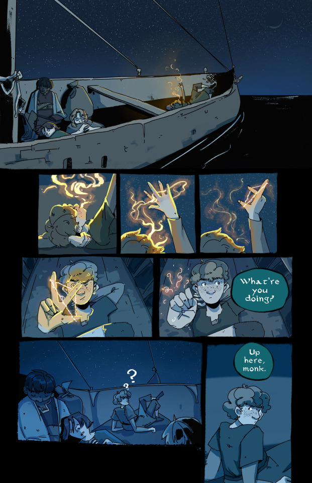
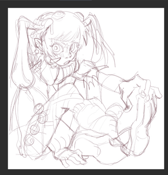
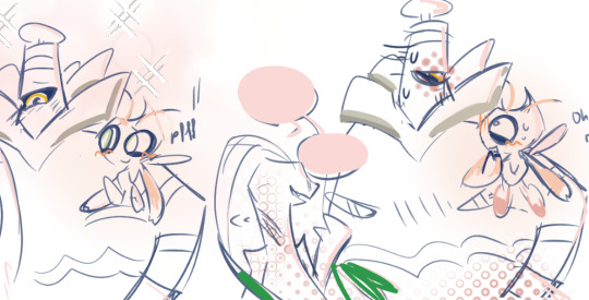
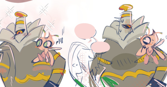
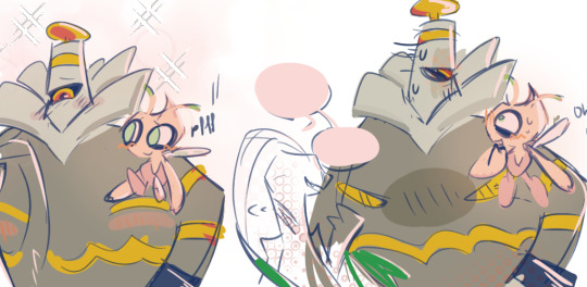
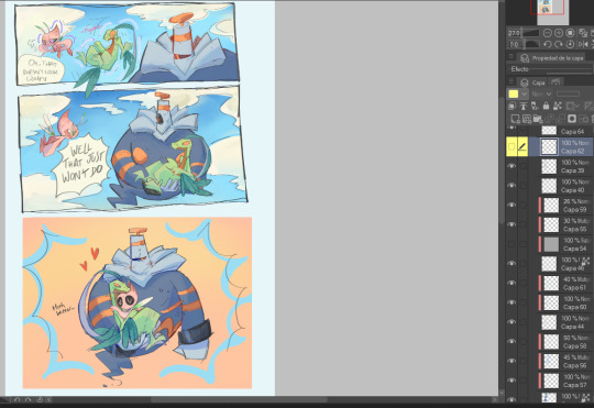
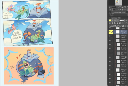
still got it :3 sneak peek of a mini 7 page comic of my ocs made just for me
#my art#wish i could say this is like canon tfbosc#but its instead a short comic proof of concept of the kids magic#also ive finally weaned myself off desktop photoshop and this was dont fully in ipad csp!#finally found some brushes i liked (my old faves just didnt really transfer across nicely) and a good workflow <33#also while i do love this scene and its one of the first i thought up im so glad it wont be canon because drawing ships is hellllll <3
1 note
·
View note
Note
Heya! Im new to using CSP and haven't found brushes I really like yet, what brushes do you use/recommend? Any tutorials on messing with the brush settings that you find useful? Im coming from PS to CSP and am still adjusting ! Thank you !
This is personnally what I use for lineart:
Which gives this kind of lineart, a bit crunchy and ink -like:
And this is what I use for sketching:
Which feels really nice to sketch with and gives beautiful roughs:
I usually don't mess with settings lmaoo I'm lazy. I just love to look for the right brush until I'm satisfied! My advice is to take the time to find the right ones for you as CSP have a big supply of them, just look by popularity!
364 notes
·
View notes
Text
hi everyone!! my wrist is too sore to draw today, so instead i thought i'd share some of my favorite csp assets + how i like to use them! i also linked some procreate brushes at the end of the post!!
lineart brushes:
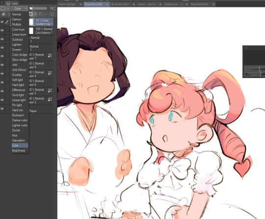
SU-Cream Pencil: i swear by this brush and i use it very often!! if you lower the pen density and use a gradient map over it when coloring your drawing, it has a nice effect. that's what i did in this drawing here! i also use this brush like i would draw on paper, so as a sketching tool. recently i've been enjoying blending it for shading. the pics below are drawn on one layer; left is more manga style while the one on the right is from a WIP of my singer sargent study, so it can be used for more realistic styles pretty well!


Found Pencil: another pencil brush that feels really nice to use, created by @/pigpenandpaper.
PS style brushes: a recreation of photoshop's (i believe) default brush. very versatile and also blends well!
analog wind variant pen: a nice pen that i like to use for lineart that is intended to have a bit of a sketch look.
zakutoro real g-pen: i used it for the lineart of this piece. although, it was drawn before i started using 600dpi in my works, so the lower resolution might make it look a bit unclear.
sets of rough pens: great for manga lineart with a rougher vibe; some of them have varying line weight.
coloring brushes:
zaku brushes: very nice and painterly mixing! i definitely recommend it for those who like to leave their colors a bit unblended.
softie marker: as the name implies, it's very soft! i like to use it for blush in chibi illustrations.
analog watercolor brushes: realistic-looking watercolor brushes. i recommend using it with csp's default paper textures, or those i linked below!
993 coloring pen: it's very soft and watery, though it can be made more solid by adjusting the paint density. i actually think it works very nicely for lineart too.
rock dog pen: another soft marker brush i like, that i once again also use for lineart and doodles.
thick coating brush set: recommended for paintings that show brush strokes.
cartoon cloud: don't let the name narrow your vision!! this has to be one of the BEST brushes for painting in my opinion, and of course it's great for clouds and explosions but so so much more!! and it's FREE try it try it!!
decoration/miscellaneous brushes:
neon pen
paper textures
symmetry move brush
close and fill without gaps
rope brush
sphere fisheye guide
flash balloon
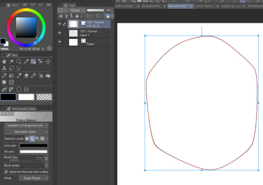
speech bubble set: a lifesaving collection for comic artists!! dimensions and line weight can be adjusted by using the operation tool.
gradient map to use in color mode at 15% and another gradient map to use at 20%: the percentage refers to the opacity of the gradient map layer, but they are just the creator's recommendation and i tend to actually increase it. to use gradient map efficiently, i recommend putting all your colors (and lineart if you want) in a folder. then, right-click the folder, select "new correction layer" and then "gradient map". this allows you to modify the gradient map without worrying about affecting the original colors in case you decide not to use it in the end. to import a gradient map from your downloaded csp assets, click the wrench icon next to the name of the gradient set that's currently in use, then select "add gradient set".


you'll also notice that the creator recommends to use their gradients in "color mode". of course, this is also only a recommendation and i suggest trying as many layer modes as you like! to change a layer's mode, simply highlight the layer and click on "normal" (the default mode) and csp will display the available modes.

fruit ninja gradient map: fun to use if you want really drastic/vibrant colors! the names of the gradients are cute too, as you can see in the above screenshot!
BONUS: jeremy fenske's free photoshop brush pack: these aren't csp brushes per se, but they can be imported into the program! excellent for environments, i recommend watching fenske's video on how he uses the brushes to get a clearer picture since there are so many in this pack!!
BONUS 2: my good friend clem has a few brush packs for procreate that are ideal for painting,decorating drawings, and y2k-inspired illustrations, i definitely recommending checking out her shop!
in conclusion i hope this post can be helpful to you!! i tried to explain how to use the brushes as best as i could, but feel free to let me know if anything is unclear!! i hope you will enjoy using them! :D
#clip studio paint#clip studio paint brushes#csp#csp brushes#procreate#procreate brushes#brushes#tutorial#art tutorial#sort of hehe
150 notes
·
View notes
Note
you’ve probably gotten this a hundred times (and I’m sorry if you have ^^’) but I wanted to ask about your brushes/resources! I’ve been astounded with your textures for a while and you’ve inspired me to texture up my art! agrghh your colour choices, your halftone use, your anatomy stylization and your rendering have me rolling over in my grave whenever I see your art. I’ll actually never get past the way you use texture! I’d be grateful for any resources you could throw out here, if you wanna - no pressure obviously, I’d be more than content just continuing to consume your art whenever it drops :> I’m curious about what brush/s that you use for lining and rendering, assuming you use csp. agrhgedsjk sorry for the ramble and request!

hello! sorry for the late reply, i've been incredibly busy with con prep as of late, but yes, i do use CSP! here's a little brush update.
for sketching, i primarily use this modified version of the default charcoal brush and i very often use it to color as well. this is typically the brush i use for flat colors and for textured paintovers. i used it to sketch the malevolent fanart above, as well as color most of the elements (except for the dark wash behind john) including john's face. i also drew this chibi solely using that charcoal brush:

i recently also found this set (ID: 2147968) of two textured brushes, one for color, and the other for blending. you can see them in the dark gray wash behind john in the drawing at the top!

as for my halftones, they come from my blending brushes! you can find those (as well as my tma inspired gradient map set) here, and i plan to update that page if i ever upload more.
i also used to use paper texture #5 from this texture kit. it's been a long while since i've used it on anything, but it can look really nice.
i would use it on procreate by merging the entire drawing to one layer, putting the paper on a layer below it, and setting the drawing to color burn(? it's been a while) and then messing with the darkness on that layer until the colors look how i intended them.
i suggest messing with paper, canvas, and paint textures with layer modes in general! pixelbuddha is a great place to find free textures that work really well for things like this.
40 notes
·
View notes
Note
What pens do you use? Assuming the program is csp
If you’re asking about what I use for these little doodles,,,,
It’s goodnotes actually lmao
I use the fountain pen at 0.35 mm thickness! It’s got a really nice sort of thinning effect for higher speeds and it’s a vector program so you don’t lose any resolution when resizing or moving things around :)
If you’re asking about my usual art brushes, then they’re on procreate! I need to reorganize them at some point but most of the ones I use can be found on gumroad or by searching for ‘brushes’ on my page!
#I love when I answer asks and my doodle notebook is just filled with little stuff everywhere#I’ll never get tired of telling people that I draw in goodnotes tbh#my friend calls it hingeless behavior
99 notes
·
View notes
Note
hi! what brushes do you use for CSP? your art looks great!
hi! thank you
i use standard gouache brush a lot, airbrush, simple round brush, simple mixing brush and some textured brush (i dont really remember where i found it but you can basically replace it with any textured brush, i use it for backgrounds mostly), but my favorite one is a brush with one hard side and one soft side, works really nice for rendering
18 notes
·
View notes
Note
Hi, your art is stunning. May I ask what program you use to draw digitally, and if you have any tips on how to get the forms and colors as incredibly accurate as you do?
Aw, thank you! I still feel like very much an amateur at this; my first digital painting of this type was this one, a month ago, and I don't really know what I'm doing, so take my advice with a grain of salt.
I use Clip Studio Paint currently, though an older version from when it was a one-time purchase instead of a subscription. (Why is everything subscriptions these days.) In the past, I've used Krita, which was free, but I haven't used it for this kind of painting per se.
For these paintings I've been using the default "Dense watercolor" brush for laying out blobs of color and the "Transparent watercolor" brush for subtler shading and smoothing. I expect these are not the ideal tools for this or anything, just sort of the brushes I've gotten most used to working with in coloring in CSP, which I stumbled into kind of randomly while messing around.
To get the forms right: something I started doing for my Good, the Bad and the Ugly kick early when I'd started on that in September was to do a rough sketch with the screenshot on the canvas at the same size and every now and then drag the sketch layer over the screenshot to check myself off - see if I'd made some feature too small or positioned it weirdly, etc. This felt a little like cheating but it did also just kind of help give me a better sense for it and for the ways in which my initial eyeballing tends to be off so I can adjust for it, and then once I had the very rough sketch of where everything is, I could detail freehand on a second sketch layer from there which feels a lot less like cheating.
However, for the last three paintings I did, instead of doing that I have been using a trick I saw my dad using when doing traditional oil painting, namely using a grid: enable the grid option in the CSP view settings, line the reference up with the grid, and then focus on each individual 'tile' of the grid. While working on this latest one, my canvas looked like this, for example:

So when sketching and while working on it from there, I could look at the individual square on the grid that I was working on and try to match it to that individual bit of the reference, which is a lot easier than trying to eyeball the whole thing at once.
As you may be able to tell, the colors don't feel super accurate to me when I'm working on it and actually looking at the screenshot beside it; it's all a little off and less detailed, but then it looks a lot nicer once you crop the reference out of the canvas. For this one I actually experimented with using the color picker tool to pick out some of the extremes of the colors I worked with for each given area - some of the brightest highlights on the face, a nice midtone, some of the deepest shadow - but this isn't all that helpful because film grain means the overall impression of the color is different, and there are a lot of nuances. Something I did do, also for some of the previous paintings where I specifically didn't use the color picker as a challenge to myself, is try painting a brush stroke on top of the area in the screenshot whose color I'm trying to replicate and keep adjusting until it feels like it just about blends in. But even then color is very hard. There are so many subtle nuances and shades and it's hard to adjust the exact shade of some color I've already put down other than by just painting over it again and then redoing the details - unless, of course, I just put another layer on top and set it to Hue or something. I did that a little with the barbed wire around his neck on this one, to make it less blue after I'd first put it down.
Buuuut mainly I think the key to making these sorts of things look good, as far as I've felt, is just to be willing to spend a whole lot of time noodling on them. There's always more you can do with it to make it better.
I found the checking myself off by dragging the sketch on top of the screenshot trick very helpful, even if it does feel like cheating, just by virtue of the fact it makes the outcome look better, which makes me less likely to ultimately go "ugh, this isn't right" and just want to stop working on it and move on. And that's very helpful, at least to me.
Finally there's the general just draw a lot, etc. I have been posting art daily on this blog since the beginning of 2016, and it's been a slow journey of my very intermittent efforts at human portraits getting slightly, slightly, slightly better each time. Just these feel like a pretty massive level up in the space of a couple of months, though, and I think that's largely just because I got obsessed enough with a movie to want to spend the time to draw one million cowboys instead of doodling Pokémon, and also allowed myself to use whatever neat tricks would help me make them come out well enough to stay motivated on it.
7 notes
·
View notes
Text
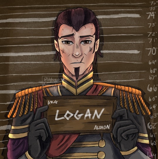
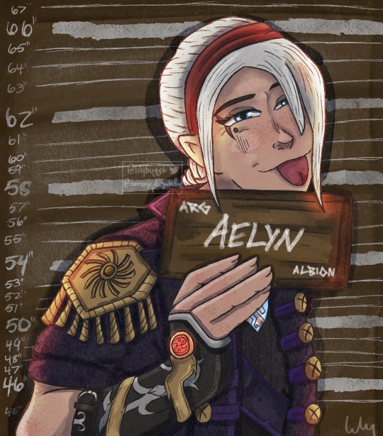
You know I had to do it.
Barbie and Ken meme featuring Albion’s notorious sibling duo, Logan and Aelyn.
What did they do? Aelyn blew up Reaver’s mansion probably. Property damage, arson, the likes. Just because she’s queen doesn’t mean she can get away with arson.
Meme format and details under the cut.
If you haven’t seen it, here’s the meme.
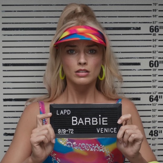
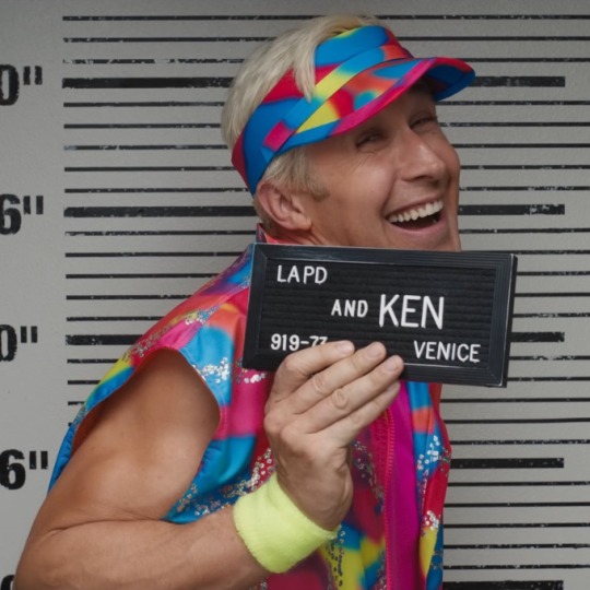
When I saw people drawing their characters like this for the first time, I knew I had to do this. There are so many characters I could have chosen, but it’s been a while since I drew the Fable siblings so thought it was perfect.
I’ve been using procreate lately since I got an iPad solely for that and have been trying to find brushes similar to the old ones I had on CSP. I’ve had no luck, but have a lot of other cools brushes that may help me develop new art styles. Including the above style. I found these really nice ink and ink wash brushes and really wanted to use them. I think they work wonderfully for silly meme art like this. It has a very nice cartoon look to it. It’s also just been super amazing to be able to draw wherever. I have more motivation to draw since I can carry this tablet with me everywhere. Much less of a hassle to hook up a drawing tablet to my computer and then actually have to sit down at the computer and draw.
Some details about the drawings themselves: When trying to decide what to replace the LAPD with, I wondered what would the police force in Albion be considered. I went with ARG which is for Albion Royal Guard. Because who else can arrest the queen and prince? I also wanted to make the plates look wooden since Albion is y’know, ye olden days. And then there’s the height things. If you look closely, you can see what I headcanon Logan’s height to be and what Aelyn’s height to be. I could have left those background pieces out, but I thought it would be cool to add that little bit of detail. I also wanted it to look like the names and such were painted on so that one brush came in clutch to add to the aesthetic.
And finally, as always, here are the lovely speedpaints.
(I am just now realizing that I have not drawn Aelyn and Logan in a serious piece at all. They’ve always been shitposts. Might need to fix that…)
#Art#my art#fable#fable 3#fable III#barbie and ken meme#art redraw#fable meme#Fable art#King Logan#Fable logan#Fable hobw#Hobw#hero of brightwall#g-a67#Timelapse#speedpaint#procreate#OC: Aelyn
86 notes
·
View notes
Note
I’ve been peeking in your art for a bit and it’s absolutely lovely ! Specially your hades fanart? It’s so so good, I wanted to ask what brush you use for your lineart? It gives such a nice touch to your art I’m curious haha, so sorry if you’ve answered this already
thanks a lot! and i don't think i've said what brushes i use before so i might as well give a full rundown. i use CSP with a mix of default and downloaded brushes
i'm assuming you're talking about my chaos drawing? for the lineart here i used the default milli pen with anti-aliasing set to minimum. this is basically just a round pixelated brush with no pressure sensitivity so i think you should be able to get a similar effect on other software pretty easily. (this specific illustration also used the technique of copying the lineart layer, setting it to a strong saturated color (eg bright pink or purple), blurring it a little and setting the layer to reduced opacity. this adds to the crunchyness and might be the effect youre looking for!)

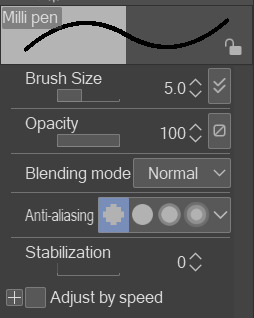
this pixelated effect is one i find really fun personally. the optimal brush size in my experience has been 5-9 with this brush, with occasionally 3-4 for detail lines
as for other art, sometimes when i'm not feeling the pixel effect i used the same milly pen brush but with the second anti-aliasing setting. it keeps the lines crisp but not pixelated (example)

although recently i found the wiggly brush on the asset store that can work as an inbetween alternative. still in progress with the drawing im testing it on and while i think i'll stick to the milli pen it adds an interesting texture

you didn't ask about rendering brushes but i'll say anyways. my other three main brushes come from the arubrush set i saw someone mention on tumblr i believe? theyre by knight zhang the link is in the faq section. i downloaded a the motherboard set and experimented until i found a few i liked, though there's a lot of stuff worth checking out in there!

i used the painterly and alector brush for any painting and rendering. the chaos piece was done using a mix of both (mostly the alector brush) for the shading.
this oc painting was done almost exclusively with the alector brush, while this melinoe piece was done with the painterly brush, if you want to compare the textural differences.


and i use the last one for sketches occasionally! its more textured than i prefer for finished works but its really nice to draw with

that's about it! hopefully this helps
7 notes
·
View notes
Note
Do you have a set process for coloring and rendering / adding texture to your art? If so, would it be alright for me to ask what goes into that process? I'd love to learn how an artist I admire goes about their work!
Omg I'm so flattered, I'll try my best to explain it!! ^^
Tho, okayyy, I apologize beforehand for how incoherent this might be, since I don't really have a set process at all and mostly I fake it 'til i make it haha. I'm the first to admit that I don't have a ver consistent method and that shows in how irregular in quality my art can look, even inside the general sketchy look.
(Btw sorry if some of the fanart i use for example doesn't make you comfortable but I've tried to find the best examples for each type of coloring haha)
I'll start with the brushes I rely on the most, tho I admit i made the mistake of downloading too many brushes and textures so I might use others on rare occassions xddd
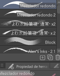
These are basically the brushes I use the most. The "mezclador redondo" is just CSP's default paintbrush and I only tweaked it to find sth I liked and felt comfortable with for both lining and painting
As you can see here I only used one layer for lines and other three for each of the guys' colors. I colored it all with the default brush (tho unfortunately I lost the settings I used for this drawing in particular and haven't found them again rip). In drawings like this I just do a sketch, clean the lines (no lineart) and then paint it. After the base color I start laying out different hues to make the coloring more interesting.
This one was the same. One layer for coloring, manually adding lighter hues (see the more light and yellowish color on grovyle's left leg compared to the shadow) or darker tones. I try to add color to the shadows as well to make them feel less flat, and an airbrush in overlay tends to help with that (tho here I just used a brush).
Here you can see that I often paint over the lines on another layer to correct mistakes in the "lineart" lol. I also applied an airbrush (layer mode overlay) over celebi to make her more bright. I wanted to put this one to show that coloring doesn't have to be detailed to look nice enough. Here Celebi basically has no shadows at all but the tone of the drawing makes her look cute anyways imo ^^
In these two you can see adjustements over the full image again (yellow layer), but I also wanted to show that I don't have a set number of layers either, it depends on how many I feel like using. Again, sorry for the lack of consistency but im too lazy to have a proper method lmao
I will also use harder brushes and tone changes sometimes, instead of blending them with less dense brushes. I am also fond of adding hard lighting in some drawings. You can experiments with it on a top layer and delete it if it doesn't fit, so it's always worth a try.
Another thing I recommend is studying and copying artists you admire or like. Add things from their styles into yours, see how they work with proportions and try to use that in your own art. It has helped me a lot and, without looking to fully copy anyone's style, it does give you some ideas of how you wish your drawing would look, which motivates me (when it doesn't depress me lol)
Finally, the texturing isn't consistent either. I use one of CSP's/Downloaded texture packs, put a grainy texture on the canvas, set it to overlay and adjust the opacity until I'm satisfied. In these two images you can see I am not consistent in coloring even in the same comic lmao. But we are doing this for fun, so I think experimentation is always sth worth exploring ^^
And I think that's all I have to say. I don't control color theory at all, so I can't really explain how I choose colors. I look up some tutorials on youtube and pretend I understand lol. Ig the one thing I tend to do a lot is changing hues in a base color to make it look less flat, the same as with shadows.
Anyways I hope this was helpful or that it at least waas what you asked for haha. Thank you for the interest!! :DD
#ask#art process#i guess???#anyways thank you for the ask sofie i hope this was helpful <333#I am KIND OF A BIG MESS IN ORGANIZATION#but hey we have fun hahaha
10 notes
·
View notes
Note
Oh it was only 3 actually, counting that one animatic on YouTube (that BTW i had no idea was yours! I was pleasantly surprised <3)
And I found it so funny that you have somewhat an idea of who I might be PFFF you can throw the guess, it would be funny if you get it right (don't have to say my name if you don't remember it, you can just go for something you remember NFKDSJ)
also time for an actual question since i'm already here, what program did you used for the animatic? I've always wanted to get into animating but most softwares cost money or are free but really bad so I could use some recommendations 👀
Good to hear there is no imposter lol. I should probably start using the false pfp so people know it’s me but I’m too lazy to change them all 💀 also my guess was right as to who you were but probably mainly because I put on my Aziraphale detective hat and you were the last notification before the ask inbox notification and your icon had a red beanie. We meet once again.
As for the animatic I used procreate for drawing and capecut for composting. Not the most efficient method but I liked it. I ended up segmenting off each camera angle into a different canvas and making any animation for the shot that way. I love capecut because the free version has every editing function you need for an animatic and the watermark only appears as a black screen at the end so it’s so easy to crop out. It’s probably the best free editing software I’ve found. (I also used a screen recording device to record the audio cause even if you buy a song it sometimes doesn’t allow you to put it in the program.)
I honestly recommend procreate if you have a device that supports it. I think it’s still only a 10 dollar onetime purchase. But if you don’t have a device that supports it, I have used things like flip a clip which is free, and the paid version is pretty cheap. I have also dabbled in an app called rough animate, also free (you don’t have to pay for the onion skins) which was also okay. I got frustrated cause of the lack of brush choice but other than that it’s not bad at all. If you can’t pay anything at all I’d recommend this because, unlike flip a clip, you don’t have to pay to unlock the a lot of the really helpful features. Ibis paint also added an animation feature I think so that’s an option. Idk if you need the paid version for it, but I remember only having to watch ads for a minute to unlock all the brushes so maybe it’s the same for the animation feature lol.
If you have a computer set up, I’ve also heard nice things about Krita for animation. It’s free and from what I remember it had a really good timeline set up. I actually tried to use it, but my computer at the time was old and slow and it lagged to much, and then I had a shitty no screen tablet and my hand eye coordination when it came to drawing and writing is quite bad, so it just wasn’t a good set up for me personally. But I know people make it work. I mean, people make this kinda shit in MS paint, if you’re dedicated enough you can technically do it in almost any program (though you may not be able to make it as polished as you’d like.)
Then there is Clip Studio Paint, which does cost money but is way less expensive than like, harmony or adobe. The EX version which gives you a second of free animation per project is a $5 monthly subscription for once device, PC MaC IOS, and the Pro version (which is more expensive) gives you unlimited animation animation access for I believe around 10 -15 dollars a month (still less than most streaming services lol). There’s also a one time purchase version that is $50 dollars, but it goes on sale A LOT for $25! Although I don’t think it gives you more than a second of animation. CSP also has a very long free trial period, for EX it was legit like 3 months. so if you try it out and like it, I’d definitely suggest finding a way to pay for it. It’s actually used in some professional studios in Japan, so if you have any professional aims for your work it’s a good starting platform to get into industry software. However a lot of the nice things CSP offers for animation are not needed in the story boarding/animatic stage, so if that’s as far as you wanna take your animations it maaaaaaay not be worth it unless you love it.
If anyone else has other cheap or free recommendations feel free to add on. I have attempted to make animatics on procreate, rough animate, and flip a clip; all of which I have uncompleted projects on. It just so happens that procreate is what I was using when I finally made an animatic I liked enough to see until completion. Whatever software you do use, just make sure you learn how to use it before attempting a big project. Do some smaller stuff before you try anything big.
Edit to check the comments! We got other good recommendations for computers!
8 notes
·
View notes
Photo
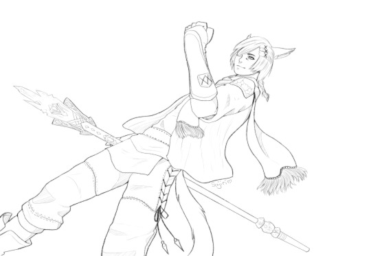
Havent found anything quite like the marker brush I had made recently in Sai 2, but I think this one looks nice too.
Finished lineart of my G’raha sketch from this morning. Gonna give a try to colouring this tomorrow, I’m really excited to play around with that in CSP now!
20 notes
·
View notes
Note
Jonah I gotta know what program/brushes you use for your art all your textures are So nice
OH!! yeah of course!! i use csp and i tend to usually do lines with some of the csp preset brushes. i usually use the real g pen for my lineart with the anti aliasing turned up all the way so it's a very Hard shape that it makes

i have a halftone brush i like to use for shading but i can't remember exactly where i found it? it's on the csp shop, you could probably find something similar if you looked for halftone brushes.
a couple of my recent art posts were sketched/lined (and actually i did flat colors using it also lol) with the thin gouache brush, which is another csp preset i believe. i also use the design pencil preset for sketches sometimes :3

i also use a couple rake brushes from this post, this person has some really nice textured brushes available that i like using for my rendering process :-)
4 notes
·
View notes
Note
i LOVE your art and was just wondering if you wouldnt mind sharing what program and pen/pencil you use, i struggle to find a pen i enjoy drawing with and i like how loose and easy and soft your art is!
THANK TOU SO MUCH AAAA 😢💜💜 I appreciate that!! And, it really depends what art you're looking at I feel like I experiment with different things a lot. Some are drawn on a program called drawpile, some are in csp with a bunch of different things. The pencil looking ones are done with enpitsuP Brushes by @pharanbrush and some others might be the sai 2 brush found here (I think)
Mostly though, I really recommend pharan's brushes he's a friend of mine and he makes really nice ones that are pretty comfy imo. But I kinda jump around a bunch (at least lately)
11 notes
·
View notes
Text
The brushes I am using (currently)
Hello! Today I'm sharing my current go-to brushes. I tend to change between brushes quite often, but I've found a set that works for me and my current painting style. All of these except for one is free to download btw! (most are for CSP but some are available for Photoshop/Procreate as well)
Sketching

For sketching I like it when the brush has a bit of texture, but it's still clean enough that it can work as lineart. This set has two brushes, a 2B and 6B pen, both are really nice!
Painting
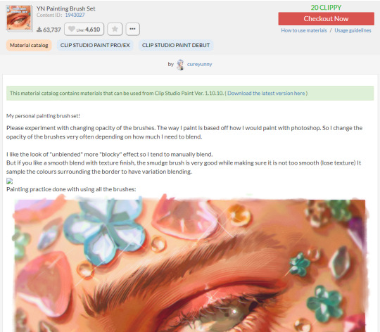
This set has been my go-to for painting for a while now and I really love it, has a nice variety of brushes but not too many of them so you won't get overwhelmed. Also has a pretty nice Inker brush for lineart! I remember getting it for free but seems like it costs something now, nevertheless still very cheap for the quality of the brushes.
Special brushes
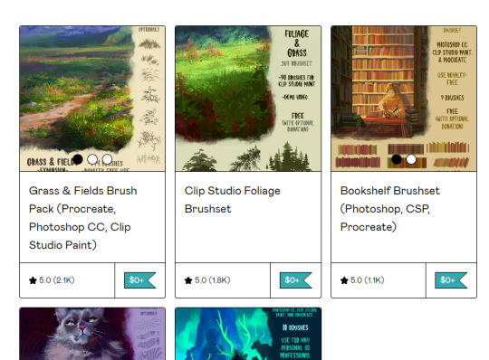
For grass, flowers, foliage etc I've recently started using Devin Elle Kurtz's brushsets and I can't recommend them enough!! I love experimenting with these so much, there's plenty of variety and different kinds of plants, grass, trees, etc. I also highly recommend her Rake Brush Pack!
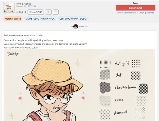
I've also fallen in love with tone brushes and this set has worked for me well!
And that's it! I have a lot of other brushes downloaded but these are the ones I find myself coming back to. If you're using CSP, I highly recommend browsing through the asset store - there are a lot of good brush sets available :>
2 notes
·
View notes