#foreground is mostly traditional with digital touch ups
Text

ah yes. me. my barnmate. and her 500 dollar four foot tall stuffed alien.
alts:
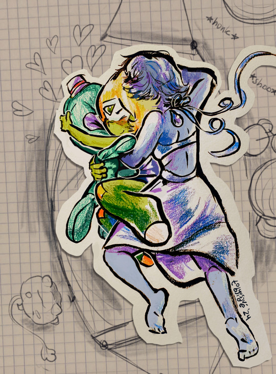
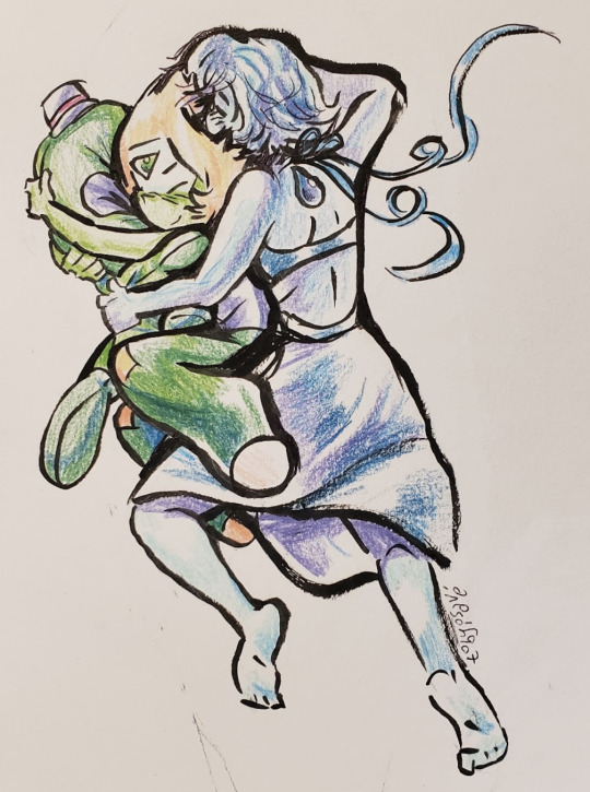
#your honor ive been reading fluff#steven universe#su fanart#lapidot#su lapis#lapis lazuli#su peridot#peridot#my art#mixed media#mock traditional#traditional#fanart#foreground is mostly traditional with digital touch ups#bg is from pexels#alt bg is a photo of paper with digital pencil
560 notes
·
View notes
Text
Environment Concept Art Tutorial
Intro
Hey everyone, it’s Nicole, Noodlets Studio’s Visual Director! I also happen to don the hat of the team’s concept artist. That’s what this article-slash-tutorial is all about!
So, what exactly is concept art? Concept art falls under the umbrella of illustration; its main purpose is to be a visual representation of an idea (or concept…!) for usage in games, films, etcetera. There are many different types of concept art - characters, environments, props. We’ll be focusing on the latter in this tutorial!
I will not be covering any digital art software basics here; I’ll assume that anyone reading this knows their way around their drawing software.
I’d just like to preface by saying that I am, by no means, a master at this craft, and that I too am learning more about creating concept art day by day. Nevertheless, I’d like to share my process and some tips and tricks I use that I’ve picked up over my years exploring the realm of digital art. Let’s begin!
The Process
Step 1: Thumbnailing
Thumbnailing is an important step in the concept art process. It facilitates the speed of the initial idea flow, allowing artists to try out different angles and compositions before deciding on the one they wish to detail further.
The Conventional Way
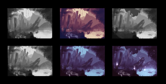
I start out in grayscale. Which means completely black-and-white, like the two thumbnails on the left!
I personally like keeping my thumbnails loose by blocking shapes in with a medium-sized textured brush and the lasso tool. At this stage, I play around with the composition, placement of items, and try out different colour palettes to see which would fit the best. Some tips:
Keep values in mind! When in the grayscale stage, the balance of lights and darks should be there, with ample contrast so that the elements do not look muddy when colour is added later on.
Check if your composition is balanced. The placement and size of objects can carry significant ‘weight’.
Separating stuff into the foreground, middleground and background helps to create depth. Use values to show the distance!

(Notice how the closer the plane is to the camera, the darker it gets?)
The Time-Saver Way (art purists, close your eyes)
*Note: These time-saving methods are just that: methods to work faster. They do NOT replace learning the fundamentals of art, though they can be helpful for studies! They should mostly be reserved for studio projects.

Usually people would sketch or block their thumbnails out, but well…when you’re really pressed for time...using your own 3D assets and shifting the camera around to try out different compositions might speed up the process. (Here, I’m using @theboynoodlet’s environment block-in assets)
There’s been an age-old debate about ‘cheating’ in art but really, when you’re on a tight deadline, digital tools have opened a vast array of options to speed up your work. Lots of concept art pieces are created by photobashing and using 3D models. As long as you don’t trace over other people’s work and claim it as 100% your own effort, there’s nothing stopping you from using tools to get your work done fast on a deadline. Remember: work smart, not hard.
Step 2: Blocking

Once you’ve selected the thumbnail you like best, it’s time to enhance it! Start blocking in the details with a smaller brush. I still do this step in grayscale, so I can keep an eye on the composition and values as I’m painting.
Step 3: Detailing and Colouring

After blocking comes the colouring! The method I use to add colour is by using adjustment layers on top of the grayscale layers. The adjustment layers I usually use are:
Colour Balance
Curves
Levels
I play around with the shadow, midtone and highlight hues until they fit the colour scheme that I’m looking for.
I then render more using normal raster layers and a round watery brush. Don’t be afraid of multiply and luminosity layers! They can help with adding shadowy and light areas.
Textures
In the event that you’re working on concept art that is more photorealistic, using textures from stock images and free brushes can help to add a whole other layer of realism to your piece! Play around with layer modes and lighting to help integrate the textures more seamlessly. My usual go-to layer modes for these are multiply, overlay and soft light.
Step 4: Final Touches
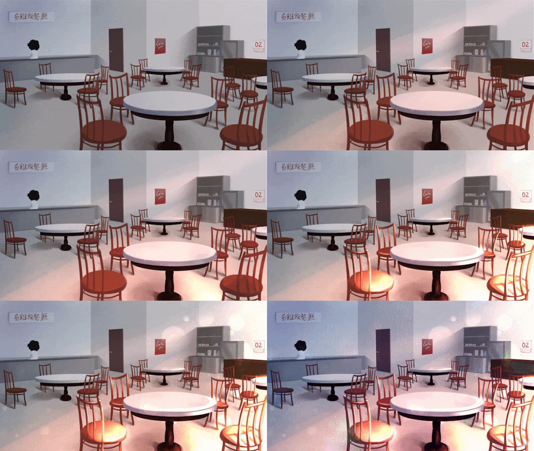
At this stage, I add lighting, particles and textures to spice up the environment art more. With the power of digital magic, adding final touches is much easier than in the traditional medium. Many free brush packs are available online for download. (I recommend Brusheezy for Photoshop brushes and Clip Studio Assets for Clip Studio Paint!)
I also use more adjustment layers to balance the colours and ensure that the picture has a decent contrast overall.

Conclusion
That’s it for this tutorial! While there are many techniques that other talented artists use for doing concept art, these are the steps that I take. I hope it’s been informative and at least a little bit helpful <3
Till next time!
8 notes
·
View notes
Text
UNIT 2: The Truth About Everything
To start off this project, we talked to local poet and performer Jonny Fluffypunk, who gave us our brief. We were sent the transcripts from conversations between Jonny and his team and the people of a residential home. I read through all of the transcripts individually and underlined certian quotes I really enjoyed. Most of these turned out to be from the resident Della. I thought she had very interesting memories and insights, especially into things I’m interested such as ghosts and gender and such. Here’s a selection of the quotes i particularly liked.
DELLA: My father had a rat up his trousers once.
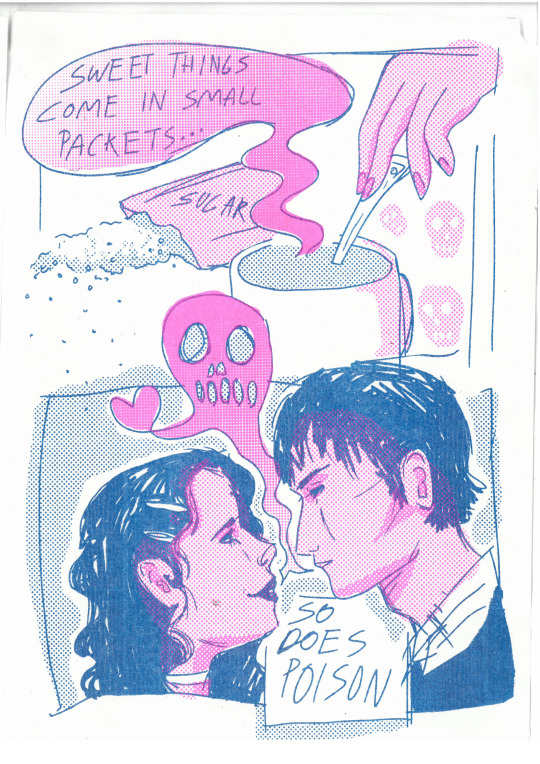
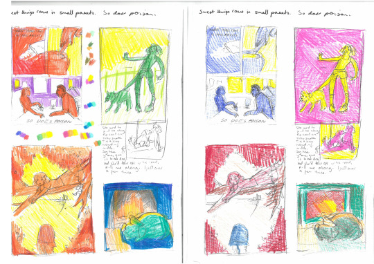
DELLA: Yes. I used to say ‘sweet things come in small packets’. And my husband says ‘So does poison’
JULIEN: A rat is a pirate. A mouse is a civilised animal but a rat is a real pirate.
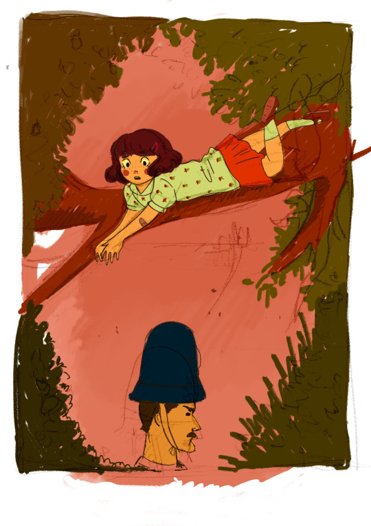
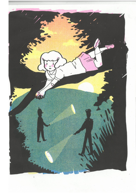
DELLA: ‘Did you often get in trouble?’ Not often. But I did do things I shouldn’t do. Climb trees for a start. I loved climbing trees. I remember lying on the branch of a tree, it must’ve been half an hour, before the policeman went. He came to the playing fields and was looking around and I don’t know why but he suddenly decided to stay around. So I lay along the branch and waited for him to go. It seemed an awful long time
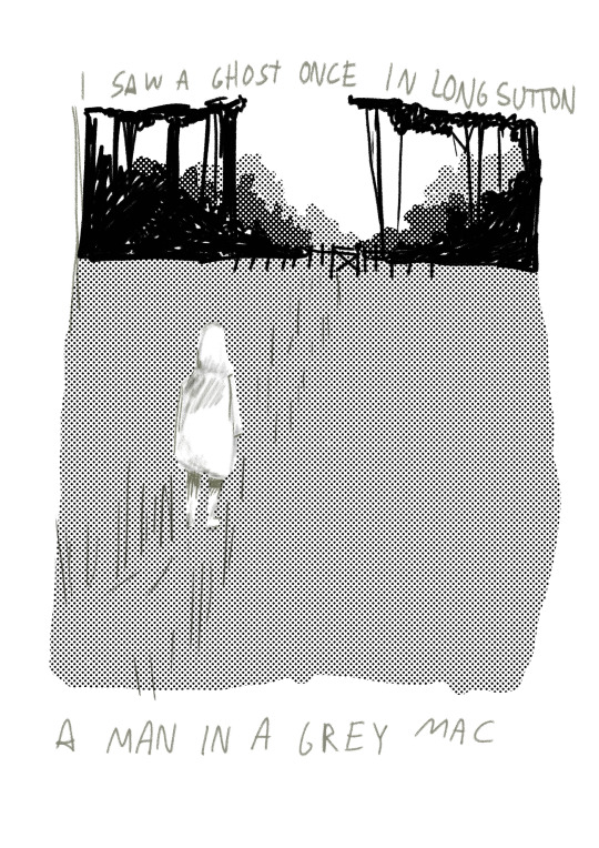
DELLA: I’ve seen a ghost. In Long Sutton. A man in a grey mac.
DELLA: My cousin did… but it turned out that it wasn’t a ghost. It was a goat. In those days the toilet was outside, and Fred went out and he saw this white thing, and he reckoned it was a ghost.
DELLA: I saw my husband, when he was at sea. I woke up, and I could see my husband standing at the end of the kids’ cot. He stood there, and I said What’s the matter, Eric? Oh don’t worry, he said, it’ll be alright. And then he vanished.
DELLA: Frankenstein never came to our church. But you just think; if spiders were bigger than what they are… Like a tarantula? No. If they were six foot. Six foot in length. They’d be scary then. Absolutely.
EDNA: I always thought I was more beautiful than anybody else. I wasn’t.
What Piece Of Advice Would You Give Us For Life? EDNA: Shut up.
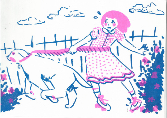
DELLA: She used to pull me along the road on roller skates. Tie a scarf around my middle, say here y’are, give it to the dog, and she’d take off up the road, pull me along. I fell over a few times.
DELLA:Well, our dog Sandy always sat in front of the fire with a budgie on his head. Every day. He’d sit there for hours, asleep... But Sandy knew the time. He could tell the time.
JS: You’ve always dreamed a lot? DELLA: One of my first dreams was when I was tiny; [...] I put the purse in one of the draws in the bedroom, and in my dreams the drawer opened and the little elephant popped out, and I was so afraid I ran, and the elephant run after me. So by the time I was finished dreaming, I’d got the whole house waking up…
JS: Is there any places you would go? Well, in 1963, as a student I went to Lourdes, to the village of St Bernadette. I had acne rather badly. [...] but that day, when I was in Lourdes, there was a storm, I got drenched, then as I say, from that point on, the spots started to disappear. But I didn’t go back.
DELLA: I can’t remember how old he was. He was in the navy, in one of the destroyers, the arctic convoys. It was so cold, if you touched any metal without your gloves, it took your skin off.
_________________________________________
Here I have put the specific lines I liked in bold.
After deciding which resonated with me the most, I created some sketches
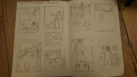
I also had a risograph induction the same day, and tested one of my ideas, which was the image of Della being pulled along the road on her rollerblades. It was just a two colour print but I really enjoyed how it turned out. The vividness of the colours and the sweetness of the blue and pink really helps push the narrative of a childhood memory.
I decided after this that I wanted to do all of my pieces in risograph after a failed digital illustration attempt. I decided upon this after getting feedback that the story was not clear enough due to the composition of the policeman within the scene. I also think this piece didn’t work due to it looking to flat. I put everything in the foreground, giving the piece no sense of depth or space.
I did some research into different graphic styles for each poster, the ‘policeman’ story, I took inspiration from Enid Blyton illustrations and Tintin. I really like the very cute style of drawing eyes in Tintin, and so I took that into my illustration. I also really liked the look of the callipgraphy pens, so part of the lines are thicker than others, which can be seen in both Blyton’s and Herge’s work. The risograph, I decided should be as many colours as I could do, which is blue, black, yellow and pink. I used gradients and opacity to mix new colours which i think was very effective in the end, especially the sunset sky. I also reflected on my earlier statements about my first attempt at this illustration and added things into the background to create a sense of space.

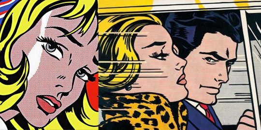
For my ‘Poison’ piece, I took a lot of inspiration from comics and pop art obviously, but mostly I took inspiration from Roy Lichenstein, which is why i decided to use so much halftone in these pieces. From his work I also took the composition, where he often has a man and woman facing each other in profile. The colours I ended up using in the risograph were pink and blue again, as that combination is often used in reference to candy and other sweet things. The pink is almost sickly however, which adds that threatening dimension that the quote has. Also, my accident, the pink and blue could be said to reflect the energies of the male and female I suppose, if you ascribe to that idea.
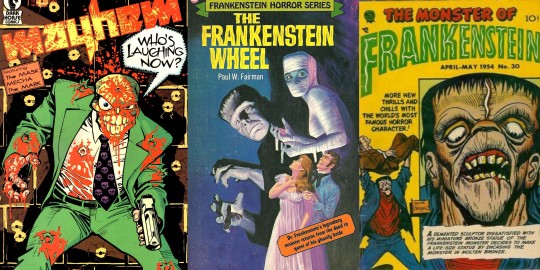
for the ‘Frankenstein’ piece, I looked into comics again, especially late 80′s/90s style, such as The Mask, which utilised thick black lines and almost neon colours. I also looked into pulp book covers and horror movie posters for the sort of composition I wanted to use. I ended up going with a classic low angle, low yellow lighting, very much reminiscent of vintage horror films; combined with the halftone to bring it back to that comic book style. I then have Della at the bottom with the quote, as I felt that this piece needed maybe a bit more context.
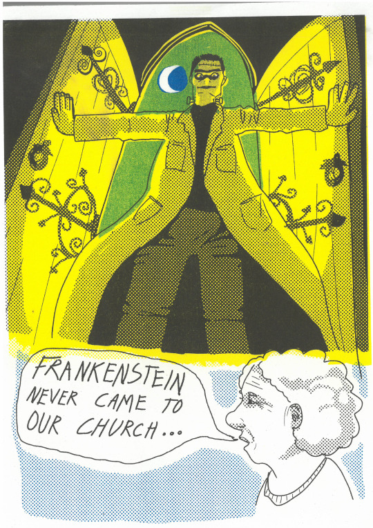
I also designed another one to put through the risograph, but due to thinking it was a little too simple and not that readable, plus time constraints, I didn’t finish it.
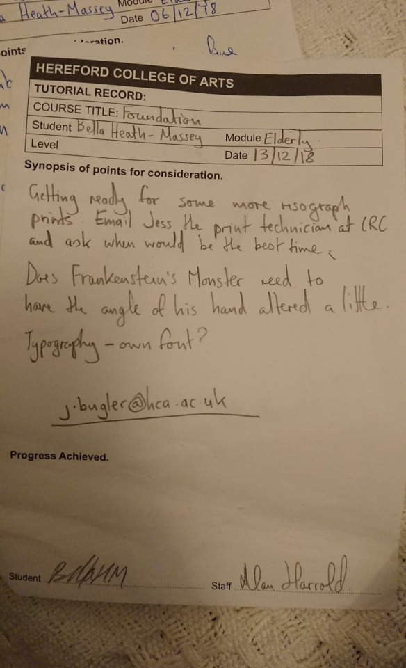
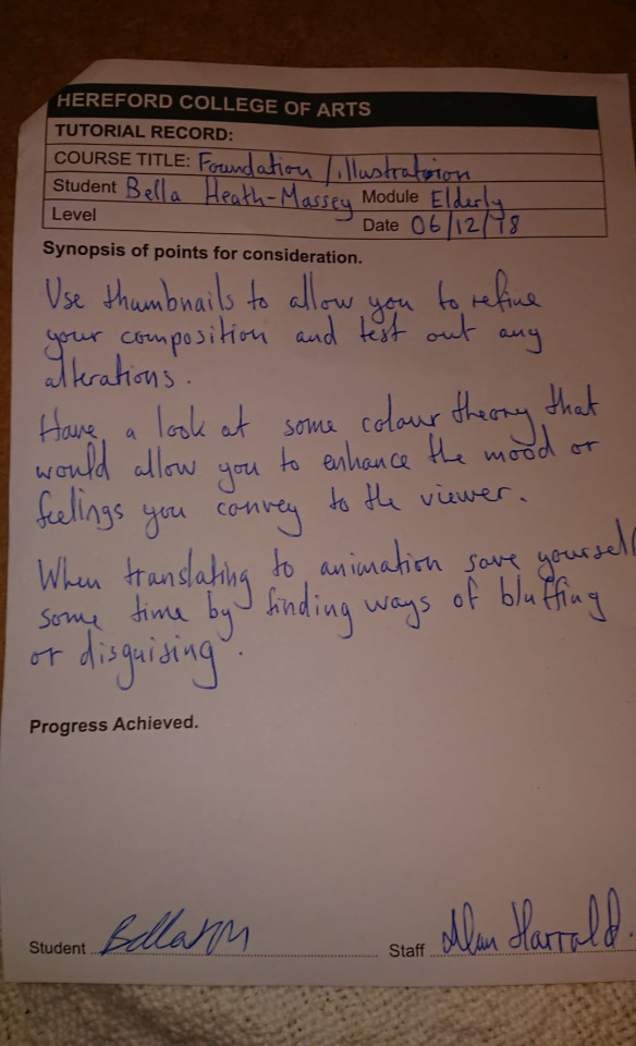
Just before the project came to end, I experimented with doing some more traditional hand coloured drawings and testing colour theories at the request of Alan, however, due to time, none of these really came to fruition.
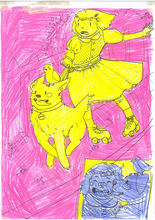
Nonetheless, I am very pleased with the outcome of this project. I think the pieces are very striking and reflect the stories of Della faithfully, but still with a flair that means that they dont all necessarily need the context of the conversation and work as stand alone posters. I fell in love with the process of riso this project and would love to use it more in future if possible.
0 notes
Text
18 great parallax scrolling websites
Today’s advanced web technologies make it possible to create remarkable effects in the browser. While these effects can be gimmicky, when employed in the right way they can result in a distinctive and memorable website.
One fairly recent web design trend is parallax scrolling, which involves the background moving at a slower rate to the foreground, creating a 3D effect as you scroll down the page. It can sometimes be overwhelming, but when used sparingly it can provide a nice, subtle element of depth. You’ll find more advice in our pro tips for building parallax websites post.
But to show how it should be done, we’ve collected together sites that employ the technique to good effect. In some cases the parallax scrolling is the star of the show; in others it simply adds a touch of depth that makes the foreground seem to pop out a little. We hope you find this a useful source of inspiration for your next project, and if you come across any creative examples that we’ve not listed, we’d love to hear about them in the comments.
The 41 greatest free web fonts
01. A-dam
A-dam uses parallax to showcase its stylish pants
A-dam designs original boxer briefs and shorts for men with character, using GOTS-certified organic cotton and hand-made by people with fair wages and normal working hours. They’re an ethical and stylish alternative to your usual supermarket pants, and their site, created by Build in Amsterdam, showcases them nicely, with assorted parallax elements popping in from all directions as you scroll.
02. Myriad
Bareface’s site for Myriad shows off the furniture system’s infinite possibilities
Myriad is a range of modular office furniture by Boss Design that’s designed to be flexible and reconfigurable, allowing you to build your own working spaces as you see fit. As part of its work on the launch, Bareface created a site showcasing Myriad’s infinite possibilities with clever use of parallax elements, pulling in inspiring arrangements of furniture as you explore the site.
03. Firewatch
Each layer of trees moves independently
One of the most beautiful examples of parallax scrolling we’ve seen is this website for the game Firewatch, which uses six moving layers to create a sense of depth. It’s great because there’s no scroll hijacking (something that often accompanies the parallax effect), and it’s only used at the top of the page – the rest of the site is still so you can read the information without getting seasick. If you want to see how it’s done, here’s a nice demo on CodePen.
Choose a website builder: 16 top tools
04. Garden Studio
Layering of the landscape makes it seem three dimensional
In a similar vein, Garden Studio have also opted to use the parallax technique in a sensible and delightful way at the top of their site, before moving into a mostly static page. The shifting landscape is subtle and unobtrusive yet also the star of the show – we found ourselves scrolling up and down again and again.
05. GitHub 404
GitHub’s 404 breaks the rules of parallax for a disorienting effect
This isn’t strictly parallax scrolling as the effect happens on mouse wiggle as opposed to scroll, but it’s a really fun page that uses layering to add depth. Unlike “proper” parallax, the background moves faster than the foreground, creating a disorienting, otherworldly feel.
06. Jess & Russ
Every illustration has a sense of depth
Fancy scroll effects and illustration are the main attraction here, used to create a beautiful site that tells a story. Parallax scrolling is used throughout to add depth to the illustrations.
07. Alquimia WRG
Alquimia WRG uses parallax elements to simulate a 3D space environment
Based in Milan, Alquimia WRG is a digital agency that aims to create amazing and effective experiences for brands on digital media. Clean and minimal, and only black and white, the website uses a mixture of the usual suspects (HTML5, CSS, and JavaScript) to achieve a neat package.
HTML5 canvas is used to animate the initial loading image. Subtle “parallax elements in the homepage are dynamically created and animated to simulate a 3D space environment through mouse movement,” says Andrea Bianchi, creative director at Alquimia.
Page navigation is achieved via a simple and smooth page sliding effect, which is implemented by changing CSS properties with JavaScript. The works page contains a simple list of selected projects, which, when selected, reveals further information in a smooth sliding effect.
When such content is loading, a JavaScript animated preloading bar appears at the bottom of the screen, which is a nice touch.
The site achieves its goal, which, as Bianchi says, “was to create an ideal balance between content, usability and user experience”.
08. Costa Coffee
The Graphite Design team chose an illustrative approach for more flexibility
This impressive one paper website, The Costa Experience, is the brainchild of Brighton-based agency Graphite Digital. Having worked previously with Costa Coffee, the team was recently tasked with better communicating its products.
The result was this visually rich, parallax website full of animated illustrations and interactive elements.
09. Make Your Money Matter
Manage your finances with information and advice from Make Your Money Matter
Finance and money are hardly the most interesting of subjects. But New York-based digital agency Firstborn are quids in with this dynamic parallax scrolling website Make Your Money Matter for the Public Service Credit Union.
With the aim of teaching the public the benefits of joining a credit union, rather than using a bank, this brilliant site includes everything from how a credit union works, where to find one and apply as well as a calculator showing just how much banks profit from customer’s deposits.
10. Seattle Space Needle
Scrambled egg all over my face. What is a boy to do?
The site for Seattle’s iconic Space Needle starts at the base of the 605-foot tower and invites you to scroll all the way up to the top, taking in views of Seattle and the SkyCity Restaurant along the way. And if 605 feet isn’t quite high enough for you, keep on scrolling and see what you find!
11. Madwell
New York agency Madwell uses parallax scrolling to add a sense of depth
Design and development agency Madwell, based in New York, show off their portfolio with a range of parallax scrolling effects to create a noticeable 3D style that adds a huge amount of depth.
12. Peugeot Hybrid4
Peugeot uses parallax scrolling to create an auto-playing web comic
Peugeot has gone all out with using parallax scrolling to create an auto-playing comic in the browser. The comic plays as you scroll down the page (or use their autoplay feature which automatically scrolls) and helps to advertise the car manufacturer’s new HYbrid4 technology.
13. Cultural Solutions
The circles move at different speeds for a subtle 3D effect
Arts consultancy Cultural Solutions employs a subtle parallax scrolling effect to introduce depth to its homepage. Their main brand image is the use of colourful circles – the circles in the background move slower than those in the foreground, creating a subtle 3D effect.
14. The Whitehouse’s Iraq Timeline
The White House uses parallax scrolling to heighten the emotion of its Iraq War timeline
To display the timeline of the war in Iraq, the White House used parallax scrolling to tastefully add something unique. While the content scrolls as normal, the emotional background images remain static – which help them to stand out further.
15. Walking Dead
Walking Dead uses parallax scrolling to pull you into its gory world
We’re big fans of TV zombie drama The Walking Dead at Creative Bloq, and we were gripped by this website launched to promote it. The imaginative site harks back to the show’s comic strip origins and makes clever use of parallax scrolling to pull you into its sick and depraved world.
“We came at this as fans of the show, first and foremost,” says lead designer Gavin Beck. “With this drive, we wanted to create a world within the Walking Dead that fans could explore and appreciate.
“To achieve this, we looked to several existing technologies and techniques such as HTML5, CSS3, JavaScript/jQuery, Web Audio/HTML5 Audio, and parallax scrolling. The challenge was to find a unique approach to incorporate all these methods into a single engaging experience across all platforms.”
16. New York Times: Tomato Can Blues
A beautiful experience is to be had with this parallax scrolling New York Times article
In today’s era of low attention spans and bite-size media, how do you attract people to longform journalism? Here’s a great response to that problem from the New York Times, combining some clever web design techniques with storytelling and comic-inspired illustrations created by Atilla Futaki.
One of the best examples of parallax scrolling we’ve seen lately, the article takes you through the story of a cage fighter written by Mary Pilon. As you scroll through the content, the illustrations come alive with clever animations and alterations, allowing you to fully immerse yourself in the content.
Futaki’s illustrations were based on police records, witness accounts, photographs and the reporter’s notes, and the attention to detail shines through. All in all it’s a great reading experience – is this the future of online journalism?
17. Snow Fall
The New York Times’ ‘Snow Fall’ article kickstarted a whole new craze for rich parallax sites
Snowfall is the latest buzzword to hit the world of design, drawing on the best traditions of editorial layout and combining them with the exciting possibilities offered by multimedia, including parallax scrolling and web video.
The term is named after The New York Times ‘Snow Fall’ article, about the horror of an avalance at Tunnel Creek, which was published online in December 2012. The newspaper presented the Pulitzer-winning article in an innovative way that grabbed the design community’s attention worldwide.
18. The Reykjavik Confessions
Here’s the BBC News take on a Snowfall-style story
Here’s another page using the Snowfall technique. Written by Simon Cox, The Reykjavik Confessions explores the mystery of why six people admitted roles in two murders when they couldn’t remember anything about the crimes. The presentation makes great use of white space and makes a large amount of text, which might seem intimidating in a more traditional web news context, a pleasure to navigate.
Contributions: Creative Bloq staff
Related articles:
5 quick ways to improve your portfolio dramatically
3 tools to get started with modular design
Build complex layouts with PostCSS-Flexbox
This post comes from the RSS feed of CreativeBlog, you can find more here!
The post 18 great parallax scrolling websites appeared first on Brenda Gilliam.
from Brenda Gilliam http://www.brendagilliam.com/18-great-parallax-scrolling-websites/
0 notes